This blog post is a slightly modified excerpt from a recent TSI commentary.
Back in July of last year I pointed out that in a world where official short-term interest rates are close to zero, some short-term market interest rates are also going to be very close to zero, and that, in such cases, interest-rate dips below zero could occur as a result of insignificant price fluctuations. A topical example at the time was “gold backwardation”, meaning the price of gold for immediate delivery moving above the price of gold for future delivery. Gold backwardation is still a topical example and, thanks to the persistence of near-zero official US$ interest rates, is still not significant. What I mean is that the “backwardation” has almost everything to do with the near-zero official short-term interest rate and almost nothing to do with gold supply/demand. So please, gold analysts, stop pretending otherwise!
When the gold market is in backwardation, something called the Gold Forward Offered Rate (GOFO) will be negative. A negative GOFO effectively just means that it costs more for a major bank to borrow gold than to borrow US dollars for a short period. In a situation where the relevant short-term US$ interest rate (LIBOR) is close to zero, why would this be important or in any way strange?
The answer is that it wouldn’t be. What’s strange is an official US$ interest rate pegged near zero. Given this US$ interest rate situation, it is not at all surprising or meaningful that the GOFO periodically dips into negative territory and the gold market slips into “backwardation”.
The charts displayed below illustrate the point I’m attempting to make. The first chart shows the 1-month GOFO and the second chart shows the 1-month LIBOR. Notice that apart from a couple of spikes in one that don’t appear in the other, these charts are essentially identical. The message is that GOFO generally tracks LIBOR, so with the Fed having effectively pegged LIBOR near zero since late-2008 it would be normal for GOFO to fluctuate around zero and to sometimes be negative.
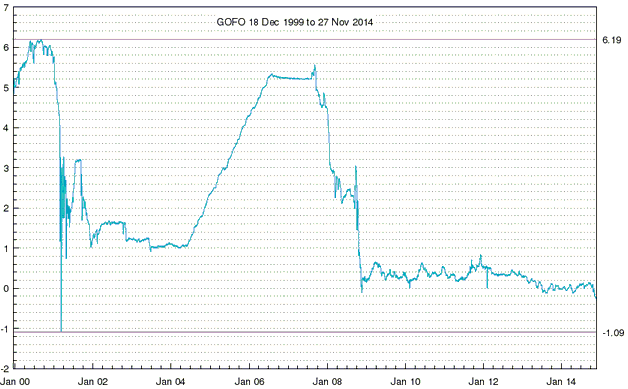
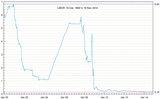
The upshot is that a negative GOFO (and, therefore, a “backwardated” gold market) would be a meaningful signal if LIBOR were at a more normal level (say, 3%), but with LIBOR near zero it should be expected that GOFO will periodically move below zero. In other words, there won’t be a useful signal from GOFO until official US$ interest rates move up to more normal — or at least up to less abnormal — levels.
Before ending this post, here are two related points on gold-linked interest rates:
First, the Gold Lease Rate (GLR) that you see quoted in various places is equal to LIBOR minus GOFO. It is a derived quantity and not the actual amount that is paid to borrow gold. The actual amount that any gold borrower pays in interest will be negotiated on a case-by-case basis with the gold lender and will NEVER be negative. In other words, although the derived GLR will sometimes go into negative territory, this doesn’t mean that people are being paid to borrow gold.
Second, a lower GOFO implies a higher (not lower) cost to borrow gold. GOFO’s recent dip into negative territory therefore implies that the cost to borrow gold has risen, although the percentage changes have been tiny and, as noted above, the lease rate paid by a specific borrower will generally not be the same as the GLR published by the LBMA and charted at web sites such as Kitco.com.

