The US$ gold price has essentially gone nowhere in a boring way over the past 2 weeks, which probably means that a sharp 1-3 week move is about to start. The question is: In which direction?
Obviously, no one knows the answer to this question. The most we can do is look for clues in the price action.
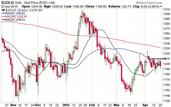
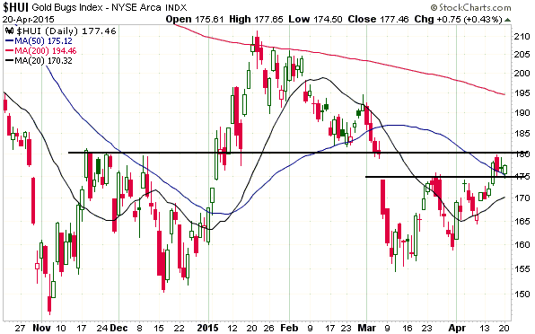
On the minus side, gold closed below its 20-day moving average (MA) on Monday 20th April. This was the first daily close below this MA since mid-March and in isolation would be a sign that the price was rolling over to the downside. On the plus side, however, the price managed to hold at the 50-day MA on Monday. More importantly, the gold-stock indices made small gains despite an $8 decline in the gold price. This small bullish divergence between the bullion and the mining stocks tilts the odds in favour of the next $30+ move being to the upside.
Here are the relevant charts:
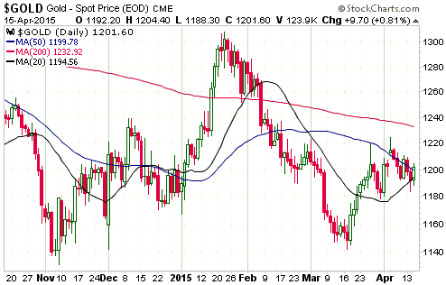
1. The first chart shows that gold has near-term resistance at $1210. A daily close above $1210 would suggest that the price was headed to at least $1230 and possibly as high as the $1280s.
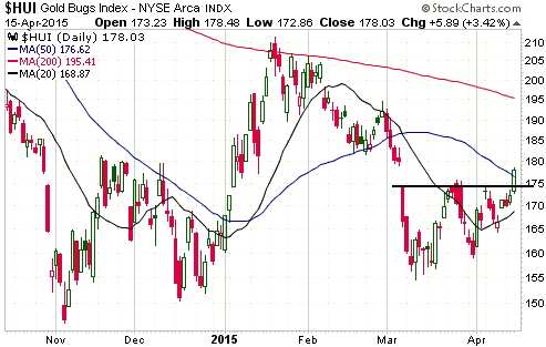
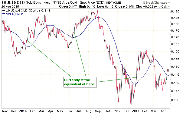
2. The next chart shows that the HUI has managed to hold last week’s minor upside breakout, but has more resistance at 180. There is near-term (1-3 week) upside potential to 195.
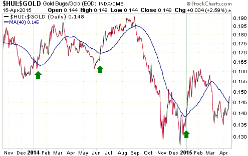
3. The final chart paints the most bullish picture.
Gold’s true fundamentals (the fundamentals that many gold bulls studiously ignore as they instead choose to fixate on irrelevancies such as the amount of gold being imported by China) are neutral and gold/euro does not yet appear to be close to completing the intermediate-term correction from its January-2015 ‘overbought’ extreme, so the start of a major gold rally is probably not imminent. In other words, if the recent choppy price action leads to a quick advance over the next couple of weeks it probably won’t mean that we’ve seen the last opportunity to buy gold below $1200.