Late last month Sprott Asset Management made an offer to acquire all of the units of the Central Gold Trust (GTU), a gold bullion investment fund, in exchange for units of Sprott’s own gold bullion investment fund (PHYS) on a net asset value (NAV) for NAV basis. This implied — and still implies — a small premium for GTU unitholders, the reason being that GTU units were — and still are — trading at a discount of several percent to their NAV. GTU’s Board of Trustees subsequently recommended that its Unitholders reject the Sprott Offer for reasons that were outlined in a Trustees’ Circular, which was followed by dueling press releases. What’s the average retail GTU unitholder to do?
To answer the above question it is necessary to consider the benefits, if any, of exchanging GTU units for PHYS units. As far as I can tell and despite the numerous reasons given by Sprott for voting in favour of the proposed unit exchange, there is just one benefit: PHYS, the Sprott bullion fund, offers a physical redemption facility that — although it can only be used by large investors — prevents the units from trading at a sizable discount to NAV.
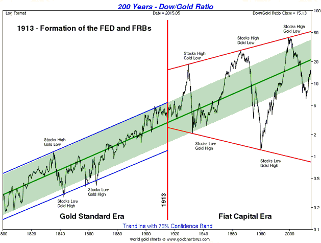
The thing is, the historical record indicates that GTU units only ever make significant and sustained moves into discount territory during multi-year bearish trends in the gold price. In other words, the historical record indicates that Sprott’s benefit only applies during gold bear markets.
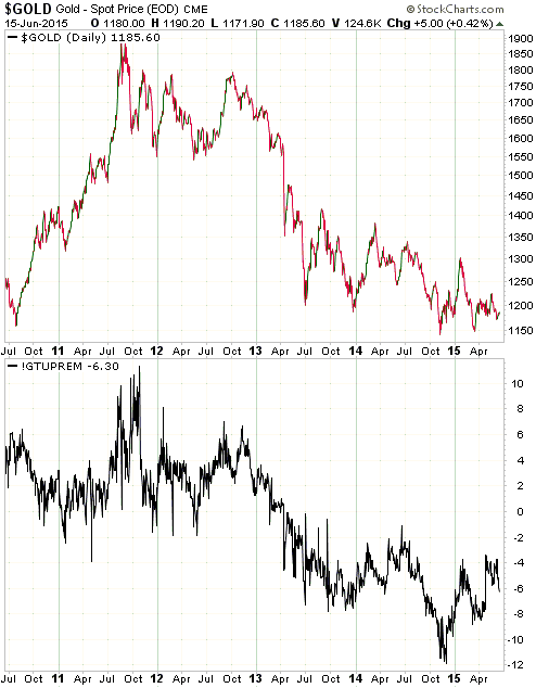
Of course, there’s no guarantee that past is prologue in this case and that GTU’s discount will disappear in the early part of a new multi-year upward trend in the gold price, but recent performance suggests that nothing has changed. As evidence I point to the following chart comparing the US$ gold price and GTU’s premium to NAV (a negative premium is a discount). Notice that the bounce in the gold price from last November’s low of around $1140 to January’s high of around $1300 caused GTU’s discount to shrink from 12% to 4%. It’s not hard to imagine that if the gold price had extended its rally to $1350-$1400, GTU’s discount would have been eliminated.
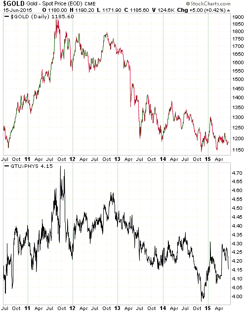
Also of potential interest is the next chart showing a comparison between the gold price and the GTU/PHYS ratio. This chart shows that GTU has generally performed better than PHYS in strong gold markets and worse than PHYS in weak gold markets. Again, we can’t be sure that the past is an accurate predictor of the future, but there is no evidence at this stage that anything has changed.
Returning to the question “What’s a retail GTU unitholder to do?”, I think the right answer depends on the unitholder’s timeframe. Someone planning to hold GTU during the remainder of the gold bear market and well into the next gold bull market should reject the Sprott offer by taking no action, whereas someone planning to exit within the next few months should accept the Sprott offer.