There have recently been far more than the normal number of interesting trading opportunities in the stock market, causing me to be busier than usual. This is due to the time involved in researching the larger number of opportunities with the aim of deciding what to present in the weekly TSI reports and what to do with my own money. I’m not complaining; this is just a roundabout way of explaining why I’ve posted less at the blog over the past two weeks, why this post on Goldmoney will not be as detailed as originally intended, and why blog posts could be sparse over the next few weeks. As a non-profit enterprise conducted mostly for fun, the blog necessarily plays second fiddle to preparing the TSI reports and planning/executing my own trades.
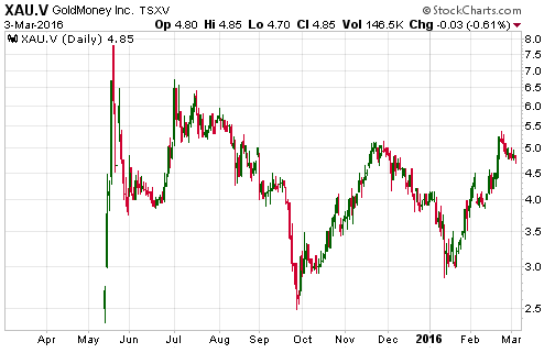
Getting to the point, here’s how I concluded my last post on Goldmoney (XAU.V): “At this stage I don’t have enough information to value Goldmoney, although I suspect that ‘reasonable value’ is a long way below the current price. I’ll post some updated thoughts when I have a clearer view of what the stock is worth, which might not be until February next year. In the meantime I’ll stay away. I have no desire to own the stock and, despite the apparent valuation-related downside risk, no desire to short the stock.” More information about Goldmoney’s financial performance has since become available.
I currently don’t have the time to go through the information in detail, but a cursory look at the company’s latest financial statements confirms my earlier impression that Goldmoney will have trouble making a profit. It made another loss in the final quarter of last year and continues to consume cash.
From the perspective of a Goldmoney user, the business is great. Customers can store gold, use gold as a medium of exchange and even take delivery of physical gold in manageable quantities, all at a low (or no) cost. From the perspective of a Goldmoney shareholder, however, the business is not so great. Of particular significance, unlike a mutual fund that charges a fee based on AUM (Assets Under Management), Goldmoney charges nothing to store its customers’ assets (gold bullion). This means that the larger the amount of Goldmoney’s AUM, the greater the net cost to the owners of the business (Goldmoney’s shareholders).
It’s important that under the current fee structure, Goldmoney will generally lose money on customers who use the service primarily for store-of-value purposes. This is where PayPal has a big advantage over Goldmoney. Nobody views their PayPal account as a long-term store of value. Instead, they view it as short-term parking for money to be spent, and when the money is spent PayPal usually gets a commission. This results in PayPal being very profitable, with earnings of US$1.2B (US$1.00/share) in 2015. Many of Goldmoney’s customers, however, view the service as a convenient way to store their physical gold. They don’t want to spend their gold, they want to save it.
Based on what I’ve seen to date I continue to believe that Goldmoney offers a great product, but is operating an inherently low-margin business deserving of a low valuation. Use the service, but don’t buy the stock.