The relentless COMEX fear-mongering

May 6, 2016

321gold.com’s Bob Moriarty recently took someone to task for making the wrongheaded assertion that there was a high risk of the CME (usually still called the COMEX) defaulting due to the amount of paper claims to gold being orders of magnitude greater than the amount of physical gold in store. Bob makes the correct point that a default isn’t possible because the COMEX allows for cash settlement if necessary. However, the assertions being made by the default fear-mongers aren’t just wrong due to a failure to take into account the cash settlement provision; they would be complete nonsense even if there were no cash settlement provision. I’ve briefly explained why in previous blog posts (for example, HERE). In this post I’ll supply a little more detail.

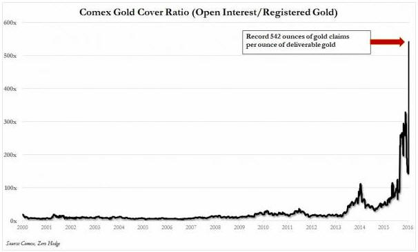
I suspect that when it comes to the idea that a COMEX default is looming, ZeroHedge.com is “fear-monger zero*”. Every now and then ZeroHedge posts a chart showing the total Open Interest (OI) in COMEX gold futures divided by the amount of “Registered” gold in COMEX warehouses. An example is the chart displayed below, which was taken from the article posted HERE. The result of this division is supposedly the amount of gold that could potentially be demanded for delivery versus the amount of gold available for delivery, with extremely high numbers for the ratio supposedly indicating that there is a high risk of a COMEX default due to insufficient physical gold in storage. I say “supposedly”, because it actually indicates no such thing. The ratio routinely displayed by ZeroHedge — and other gold market ‘pundits’ who spout the same baloney — is actually meaningless.

ZH_goldcover_050516

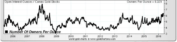
One reason it is meaningless is that the amount of gold available for delivery is the amount of “Registered” gold PLUS the amount of “Eligible” gold, meaning the TOTAL amount of gold at the COMEX. It is true that only Registered gold can be delivered against a contract, but it is a quick and simple process to convert between Eligible and Registered. In fact, much of the gold that ends up getting delivered into contracts comes from the Eligible stockpile, with the conversion from Eligible to Registered happening just prior to delivery.

Taking a look at the ratio of COMEX Open Interest to total COMEX gold inventory via the following chart prepared by Nick Laird (www.sharelynx.com), we see that it has oscillated within a 3.5-6.5 range over the past 7 years and that nothing out of the ordinary happened over the past three years.

COMEXOI_TOTINV_050516

Another reason that the OI/Registered ratio regularly displayed by ZeroHedge et al is meaningless is that the total Open Interest in gold futures is NOT the amount of gold that could potentially be demanded for delivery. The amount of gold that could potentially be demanded for delivery is the amount of open interest in the nearest contract. For example, when ZeroHedge posted its dramatic “Something Snapped At The Comex” article in late-January to supposedly make the point that there were more than 500 ounces of gold that could potentially be called for delivery for every available ounce of physical gold, in reality there were about 15 ounces of physical gold in COMEX warehouses for every ounce that could actually have been called for delivery into the expiring (February-2016) contract.

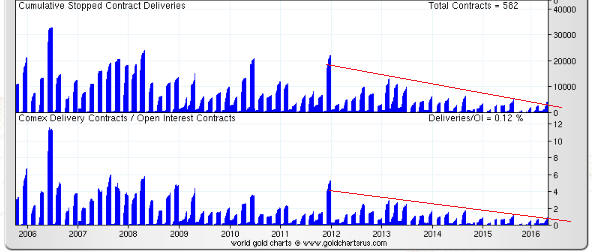
Although it provides no information about the ability of short sellers to deliver against expiring futures contracts when called to do so, it is reasonable to ask why the ratio of total OI to Registered gold rose to such a high level. I can only guess, but I suspect that the following chart (also from www.sharelynx.com) contains the explanation.

The chart shows the cumulative stopped contract deliveries, or the amount of gold that was delivered into each expiring contract, in absolute terms and relative to open interest. Notice the downward trend beginning in late-2011. Notice also that the amount of gold delivered to futures ‘longs’ over the past two years is much less in both absolute and relative terms than at any other time over the past decade.

It is clear that as the gold price fell, the desire of futures traders to ‘stop’ a contract and take delivery of physical gold also fell. In other words, the unusually-small amount of gold maintained in the Registered category over the past two years reflects the unusually-low desire on the part of futures ‘longs’ to take delivery.

It’s a good bet that if a multi-year gold rally began last December (I think it did) then the desire to take delivery will increase over the next couple of years, prompting a larger amount of gold to be held in the Registered category.

COMEXDELIV_050516

In conclusion, the fact is that at no time over the past several years has there been even a small risk of either a COMEX default or the COMEX falling back on its cash settlement provision. However, this fact is obviously not as exciting as the fiction that is regularly published by scare-mongers in their efforts to attract readers and separate the gullible from their money.

*The equivalent of Patient Zero in an epidemiological investigation.

A critical juncture for gold

May 4, 2016

The US$ gold price is testing important resistance defined by last year’s high, which opens up the possibility that a useful price signal will soon be generated. There are two ways that this could happen.

One way is for the price to achieve a weekly close above last year’s high of $1308. This wouldn’t necessarily point to immediate additional upside, but it would suggest that the overall advance from last December’s low was set to continue for another 1-2 months. The other is for the price to trade above last year’s high of $1308 during the week but fail to achieve a weekly close above this level. This would warn that the overall advance from last December’s low was over (meaning: a multi-month correction was probably getting started).

Note that not all price action contains clues about the future. For example, during the first two days of this week the US$ gold price consolidated below last year’s high, which doesn’t tell us anything useful.

gold_blog_030516

Gold’s true fundamentals* turned bullish early this year but are currently about as neutral as they get, with half of them bullish and the other half bearish. Moreover, of the two fundamental drivers that exerted the greatest influence over the past 12 months, one (the relative strength of the banking sector) recently turned bearish while the other (the real interest rate) is still bullish. This suggests that an additional large short-term rise in the gold price will depend on increased speculation in the futures market. Interestingly, Keith Weiner comes to a similar conclusion from a very different assessment of gold fundamentals.

*The gold market’s six most important fundamental drivers are the real interest rate, the yield curve, credit spreads, the relative strength of the banking sector, the US dollar’s exchange rate and the general trend for commodity prices.

Making stuff up

April 30, 2016

This will be the shortest TSI blog post to date. I just wanted to point out that newsletter writers, bloggers and other posters on the internet who claim knowledge of what was discussed in secret conversations between high-level policy-makers are just making up stories. If you take this BS at face value, more the fool you.

Who gets the new money first?

April 27, 2016

The main reason that monetary inflation (creating new money out of nothing) is an economic problem isn’t the effect it has on the economy-wide purchasing power of money. The general decline in money purchasing-power is very much a secondary negative. The primary negative revolves around the fact that new money does not get evenly spread throughout the economy. Instead, it gets injected at specific points, causing some people (the early recipients of the new money) to benefit at the expense of others and causing some prices to rise relative to others. One consequence is an undeserved transfer of wealth to the early recipients of the new money and another consequence is the falsification of price signals. I’ve discussed both of these consequences in detail in the past, but I have never homed-in on the question: Who gets the new money first?

The answer to the above question will depend on whether the new money is created by the private banks or the central bank, and in the case where the private banks are doing the bulk of the money-pumping it will vary from one cycle to the next. A comprehensive answer to the question would therefore require a lot more words than I want to use in this blog post, so rather than trying to cover all the possibilities I am narrowing-down the question to: Who gets the new money first when the Fed implements QE (Quantitative Easing)?

By the way, if you think that the Fed’s QE adds to bank reserves and doesn’t add to the total quantity of money available to be spent within the economy then you do not understand the mechanics of the QE process. An explanation of how the Fed’s QE creates money can be found HERE.

Since about 60% of the assets monetised in the Fed’s various QE programs were US government debt securities it could superficially appear that the government was the first receiver of most of the new money created by the Fed, but this was not actually the case. The government benefited from the Fed’s QE programs to the extent that these programs lowered the cost of debt*, but it’s unlikely that QE resulted in the government borrowing more than it would otherwise have borrowed. In other words, the amount of money borrowed by the government probably wouldn’t have been materially less if QE had never happened. It’s therefore more correct to view the government as an indirect beneficiary of the Fed’s QE rather than as an early receiver of the new money.

It helps to answer the question “who got the new money first in the Fed’s QE programs?” by re-wording it thusly: As a result of the Fed’s QE, who initially found themselves with a lot more money than would otherwise have been the case?

The answer is the group called “bond speculators”. This group comprises institutions and individuals, including banks, hedge funds and mutual funds, who invest in and trade large dollar-amounts of debt securities.

To explain, the government issued about $2.5T of debt that was purchased by the Fed with newly-created dollars. If not for the Fed, the issuing of this debt would have necessitated the transfer of $2.5T of money from “bond speculators” to the government. It is therefore fair to say that the Fed’s monetisation of Treasury debt left “bond speculators” with $2.5T of extra money. This money was naturally ‘invested’ in other financial assets, giving the prices of those assets a boost.

Under its QE programs the Fed also monetised (purchased with newly-created dollars) about $1.7T of mortgage-backed securities (MBSs). In this case the fact that “bond speculators” ended up with a lot of extra money is obvious, since the Fed replaced existing MBSs owned by “bond speculators” with cash created out of nothing.

In total, “bond speculators” found themselves with about 4.2 trillion additional dollars** courtesy of the Fed’s QE programs. The average productive salary-earner found himself with a negative real return on savings and negative real earnings growth courtesy of the same programs. And yet, Bernanke and Yellen appear to genuinely believe that the Fed’s actions were righteous.

    *The Fed’s debt monetisation not only lowered the interest rate on all new debt issued by the government, for the $2.5T of Treasury securities bought by the Fed the interest rate was effectively reduced to zero. This is because interest paid on government debt held by the Fed gets returned to the government.

    **Just to be clear, the Fed’s QE didn’t directly create $4.2T of additional wealth for “bond speculators”, since the Fed replaced bonds with money. Bond speculators initially had more money and less assets as the result of Fed asset monetisation, but the new money was a proverbial ‘hot potato’ and was quickly used to bid-up the prices of other bonds and financial assets.