Print This Post Print This Post

Revisiting the gold market’s “London bias”

January 9, 2017

Whenever I write about gold-market manipulation in an effort to debunk the story that gold has been subject to a long-term price suppression scheme I am always careful to point out that ALL markets, including the gold market, are manipulated. They always have been and they always will be. Presenting evidence that the gold market is manipulated is therefore like presenting evidence that the Earth revolves around the sun — perfectly true, but not useful information in this day and age. However, whenever I write on the topic I invariably receive vitriolic responses in which I’m called a manipulation denier. Sigh.

The main point I was trying to make in last week’s blog post on this controversial topic is simply that evidence of gold-market manipulation is not evidence of long-term price suppression. Yes, if long-term price suppression has occurred then it would be an example of market manipulation, but market manipulation generally does not involve long-term price suppression. To further explain using an analogy, it’s a fact that a poodle is a dog, but armed with this fact it would be logically incorrect to point to an animal and say “that animal is a dog therefore it must be a poodle.” The animal might be a poodle, but there is a vastly greater probability that it is some other type of dog.

As far as I can tell, none of the evidence of market manipulation presented to date constitutes evidence of long-term price suppression. At best it falls into the “evidence that the Earth revolves around the sun” category — true, but not useful in this day and age. At worst it is designed to paint a misleading picture.

This brings me to the “London gold bias”, an issue that is often cited to support the long-term price suppression story.

I have been aware of the “London bias” in the gold market for a long time and dealt with it in a blog post about two years ago. It’s time to revisit the issue.

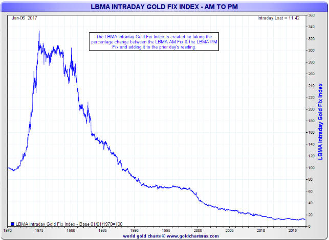
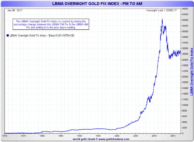
The idea behind the “London bias” is that there is a tendency for the London PM gold fix to be lower than the London AM gold fix. The result is that you would have lost money almost every year, through gold bull markets and gold bear markets, by simply buying a position at the London gold AM Fix every day and selling the position at the London PM Fix the same day. Here’s a chart from Nick Laird’s goldchartsrus.com web site illustrating the dismal performance that a hapless investor would have achieved if he had done exactly that:

Londonbiasdown_090117

That’s the type of chart that would be presented by someone who was keen to prove long-term price suppression. The thing is that by using exactly the same data a case could be made that the gold market has been subject to long-term price ELEVATION.

Here’s the backup for the above statement in the form of another chart prepared by Nick Laird, this time showing the performance that would be achieved by buying a position at the London gold PM Fix every day and selling the position at the London AM Fix the next day. This chart could be used to ‘prove’ upward manipulation of the gold price over a very long period.

Londonbiasup_090117

The first of the above charts can be used to support the claim that the gold price has been unjustifiably suppressed and the second could be used to support the opposite claim. Furthermore, the claim of long-term upward manipulation supposedly supported by the second chart has an advantage in that it assumes manipulation during a part of the day when the market is relatively illiquid. If you were intent on manipulating a price in a particular direction over the long-term, would you be more likely to act during the most-liquid part of the trading day, when shifting the price would be most costly, or during the least-liquid part of the trading day, when shifting the price would be least costly?

In no way do I believe that the gold market has been subject to a long-term price elevation scheme. My point is simply that it is possible to ‘mine’ the same set of data in order to substantiate diametrically-opposed preconceived conclusions.

Humans love to find patterns and there are all sorts of patterns to be found in gold’s price action and the price action of every other widely-traded commodity or financial asset. However, these patterns often aren’t tradable, because if they were then they would be traded and the effect of the trading would be to make the pattern disappear. For example, if gold has a strong tendency to fall between time A and time B each day then there is money to be made by repeatedly selling at time A and buying at time B, but doing this trade in significant size will raise the price at time B relative to the price at time A and eliminate the opportunity.

The very-short-term patterns in the gold market (the price rising at certain times and falling at certain other times during the day) must have cancelled each other out, because over the past 20 years the gold price has generally done what it should have done based on measures of economic and financial-market confidence (the true fundamental drivers of the gold price). Also, like most markets the gold market tends to overshoot in both directions, thus creating excellent profit-generating opportunities for investors and speculators who remain objective.

Print This Post Print This Post

China’s Incredible Smog

January 7, 2017

Global Warming, or Climate Change as it is now called, is not a problem. Earth’s climate has always been changing and will continue to do so, regardless of what anyone does. Pollution, however, is often a problem and in China the pollution problem has grown to the point where it could collapse the economy.

Here are a couple of Youtube videos that show the horrendous smog that engulfed Beijing over the past week. The commentary is in Chinese, but you don’t need to understand Chinese to understand what’s going on.

The first video shows several vehicle collisions caused by the near total lack of visibility on the road.

In the second video, a couple of guys stop their cars on the road due to the lack of visibility. They get out, walk a short distance and are then unable to find their way back to the cars. The video is obviously staged, but it does a good job of showing the absurdly-bad air quality.

How are China’s policy-makers going to deal with this without shutting down a lot of power plants and refineries and without substantially curtailing the use of cars, that is, without crashing the economy? I have no idea.

Print This Post Print This Post

Market manipulation is not price suppression

January 3, 2017

One of the most annoying claims made by manipulation-focused gold-market commentators is that evidence of market manipulation constitutes evidence of long-term price suppression. The claim is annoying not so much because it is obviously false, but because many people get fooled by it even though it is obviously false.

Experienced traders are well aware that banks and other large-scale operators regularly attempt to shift prices one way or the other in most financial markets to benefit their own bottom-lines. It has always been this way and it always will be this way. As I mentioned in previous blog posts (HERE, HERE and HERE, for example), when news emerges that banks have been caught manipulating prices in a market it isn’t really news at all.

Sometimes the manipulation is unethical and/or illegal (what’s illegal and what’s unethical aren’t always the same), but a lot of the price manipulation attempted by private operators in the financial markets is neither illegal nor unethical. A lot of the time it is a legitimate business practice.

From the perspective of manipulation-focused pontificators about gold, the big story over the past two years was the evidence that major banks had been scalping profits by manipulating the London Gold Fix. Deutsche Bank even settled lawsuits over allegations it manipulated gold and silver prices via the London Fix, thus providing plenty of grist for the conspiracy mill.

Assuming that banks were indeed using the twice-daily London Fix to manipulate gold prices, then in this case the manipulation was probably illegal and almost certainly unethical. If nothing else, it involved a breach of trust. However, as noted in a previous post on this topic the price manipulation that potentially occurred via the London Fix could only have affected prices by small amounts for very brief periods. Furthermore, the small effects would have been to both the upside and the downside.

The ‘news’ that banks used the London Gold Fix to illegitimately increase their profits is therefore completely irrelevant to the claim that there has been a successful price suppression scheme in operation in the gold market over a great many years. And yet, it has been portrayed as if it were the veritable “smoking gun” evidence of such a scheme.

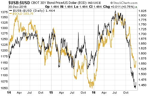
If the gold market had really been subject to price suppression over a long period then gold’s performance would be totally ‘out of whack’ with related financial markets. However, that is not the case. For example, the following chart shows the close relationship over the past three years between the US$ gold price and the bond/dollar ratio (the T-Bond price divided by the Dollar Index).

gold_USBUSD_020117

All of that being said, you are allowed to make money in the financial markets by doing something other than buying/owning gold. Therefore, if you truly believe that a powerful group has both the means and the motive to suppress the gold price then the solution is obvious: don’t buy gold.

Print This Post Print This Post

“Gold has peaked for the year”, revisited

December 30, 2016

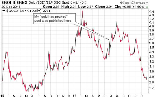
I published a blog post in late-June titled “Gold has peaked for the year“. In this post I argued that relative to other commodities (as represented by the Goldman Sachs Spot Commodity Index – GNX) gold’s peak for 2016 most likely happened in February. As evidenced by the following chart, I was correct.

gold_GNX_291216

The reason for this follow-up post is not to give myself a public ‘pat on the back’. I’ve made my share of mistakes in the past and I will make mistakes in the future. The sole reason for this post is the vitriolic response that my earlier article received.

My earlier article should not have been controversial. After all, the February-2016 peak for the gold/GNX ratio wasn’t just any old high, it was an all-time high. In other words, at that time gold was more expensive than it had ever been relative to commodities in general. Furthermore, it is typical for gold to turn upward ahead of the commodity indices and to subsequently relinquish its leadership.

With gold having outperformed to the point where it was at its highest price ever relative to the prices of other commodities and with other commodities likely to recover, saying that gold had probably peaked for the year in commodity terms should have been viewed as a statement of the bleeding obvious. It would have taken a financial crisis of at least 2008 proportions during the second half of 2016, that is, it would have taken an extremely low-probability financial-market outcome, to propel the gold/GNX ratio to new highs during the second half of the year. That some readers took my “Gold has peaked” article as an affront was therefore remarkable.

Remarkable, but not really surprising given that in the minds of some gold devotees the gold price is always too low. It doesn’t matter how high the price is or what’s happening in the world, the price is always about to skyrocket. The only obstacle in the way is a cabal of evil market manipulators that will soon be overwhelmed by the forces of good. And in any case, a financial crisis of at least 2008 proportions is always about to happen.

Gold’s poor performance during the second half of 2016 was consistent with what I refer to as the true fundamentals*. This means that it wasn’t the result of downward manipulation. That being said, the great thing about believing that market trends have almost nothing to do with “fundamentals” and almost everything to do with manipulation is that you never have to be wrong. If any market goes against you it was due to the distortive effects of manipulation rather than a fatal flaw in your analysis.

*The true fundamental drivers of the US$ gold price are, in no particular order: US credit spreads, the US yield curve, the real US interest rate, the relative strength of the US banking sector, the US dollar’s exchange rate and the general trend in commodity prices.

Print This Post Print This Post

Why the Trump Presidency will go down in history as a disaster

December 27, 2016

[This post is an excerpt from a recent TSI commentary]

There are three reasons that the Trump Presidency will very likely go down in history as a disaster for the US, only the last of which has anything to do with Trump. The first two reasons are inter-related in that they are primarily the consequences of distortions/imbalances created by the Federal Reserve.

Due largely to the aggressive interventions of the Fed, including the creation of trillions of dollars via QE programs and keeping interest rates pegged near zero for eight years, the mal-investment problem in the US economy today is more serious than the mal-investment problem that led to the “great recession” of 2007-2009. This means that the next recession will probably be even more severe than the previous episode. It is possible that the extension of ultra-easy monetary conditions combined with fiscal ‘stimulus’ in the form of tax cuts will delay the start of the next recession by another 6-12 months, but for no fault of Trump it will almost certainly happen on his watch.

Also due to the aggressive interventions of the Fed, the US stock, bond and real-estate markets are now valued at levels that all but guarantee terrible performance over the coming few years. As is the case with an economic recession, it is possible that the extension of ultra-easy monetary conditions combined with fiscal ‘stimulus’ in the form of tax cuts will delay the start of the coming period of terrible performance; however, for no fault of Trump there will very likely be bear markets in the major US asset classes during his first — and almost certainly only — Presidential term.

While the coming severe recession and the bearish trends in asset prices were bound to occur and clearly have nothing to do with Trump, it looks like Trump is unwittingly setting himself up to take the blame.

His one chance of avoiding blame and paving the way for a genuine recovery to be in progress by the time of the next Presidential election would have been to stay out of the way and allow a major liquidation of the mal-investments to happen during the first half of 2017. This would have enabled the blame for the debacle to be appropriately placed at the feet of the Fed and the preceding Administration. However, having previously (and correctly) chided the Fed for having created a “big, fat, ugly bubble”, it seems that the deadly combination of hubris and ignorance has convinced Trump that he can set in motion a long period of strong growth with no intervening painful purgation.

In summary, certain bad economic and financial-market outcomes are currently set in stone. What’s not set in stone is who gets the blame. Unfortunately, Trump appears to be positioning himself to take the blame for the economic damage caused by others.

Print This Post Print This Post

How the fundamental backdrop could turn bullish for gold

December 16, 2016

Here is an excerpt from a TSI commentary that was published about a week ago.

A cottage industry has developed around manipulation-focused gold commentary. In this industry, gold’s price changes are portrayed as the outcome of a never-ending battle between the forces of good and evil, with the evil side constantly trying to beat the price down and the good side constantly buying or holding. Also, in the world imagined by this industry the fundamental backdrop is always gold-bullish. The implication is that all price rises are in accordance with the fundamentals and all price declines are contrary to the fundamentals and likely the result of manipulation by the forces of evil.

In the real world, however, the fundamentals are always in a state of flux — sometimes bullish, sometimes bearish, and sometimes mixed/neutral. Furthermore, our experience has been that gold tracks fundamental developments more closely/accurately than any other market.

When the gold price was topping in July-August of this year, the fundamental backdrop wasn’t gold-bearish; it was neutral. The ‘fundamentals’ therefore didn’t signal a top, but they did indicate that additional gains in the gold price would not have been fundamentally-supported and would therefore have required a further ramp-up in speculative buying.

From early-July through to early-November the ‘true fundamentals’ shifted between being neutral to being slightly-bearish for gold and then back again (we thought they were slightly bearish from mid-September through to mid-October and otherwise neutral). They turned bearish, however, a couple of days after the US Presidential Election and since around mid-November have been their most bearish in at least three years.

The fundamental backdrop is now definitively gold-bearish because we have a) real interest rates in an upward trend and at a 6-month high in the US, b) US credit spreads immersed in a major contraction (indicating rising economic confidence), c) dramatic relative strength in bank stocks (indicating sharply-rising confidence in the banking/financial system), and d) the Dollar Index in a strong upward trend and near a multi-year high. Given these conditions, any analyst/commentator who is now claiming that the ‘fundamentals’ are bullish for gold is either clueless about gold’s true fundamentals or is trying to promote an agenda.

That’s the situation today, but the situation will change. In broad-brushed terms, here are the two most likely ways that the situation could change to become supportive of an intermediate-term gold rally:

1) Rising inflation expectations

US inflation expectations have been rising since 11th February and have been rising at a quickened pace since late-September, but since Trump’s election victory the rate of increase in nominal interest rates has exceeded the rate of increase in inflation expectations. This has brought about a rise in REAL interest rates.

In effect, over the past month economic growth expectations have risen faster than inflation expectations. This doesn’t make a lot of sense considering the plans of the Trump Administration, but when speculating in the financial markets we must deal with ‘what is’ rather than ‘what should be’.

It’s certainly possible that at some point over the next few months the markets will figure out that the combined plans of the US government and the Fed will lead to more “price inflation” than economic growth, resulting in a relatively fast increase in inflation expectations. As well as causing real interest rates to fall, this would result in a weaker US$ and a further steepening of the yield curve. All told, it would result in the fundamental backdrop becoming gold-bullish.

2) A banking crisis in Europe

The major banks around the world are intimately and intricately connected via their massive derivative books, so a banking crisis that began in Europe would not remain confined to Europe. It would lead to concerns about the profitability of US banks, which, in turn, would lead to relative weakness in bank stocks and a general shift towards safety. Interest rates on Treasury debt would fall faster than inflation expectations, resulting in a lower real interest rate in the US. Also, short-term interest rates would fall relative to long-term interest rates due to a flight to liquidity and the market beginning to anticipate a shift in the Fed’s stance, resulting in a steepening of the yield curve. The overall effect would be a fundamental backdrop that was gold-bullish.

Either of the above could happen within the next few months, but neither is happening now.

Print This Post Print This Post

The second most overbought market since 1980

December 13, 2016

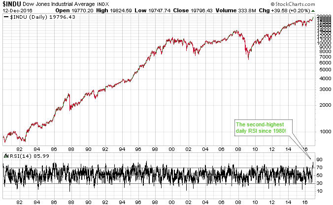
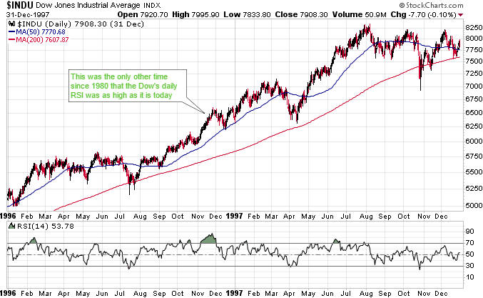
By one measure, the Dow Industrials Index is now at its second-most ‘overbought’ level since 1980. The measure I’m referring to is the 14-day RSI (Relative Strength Index), a short-term momentum oscillator shown in the bottom section of the following Dow chart.

Dow_LT_121216

Being the most something-or-other (the most overbought/oversold, optimistic/pessimistic, etc.) since a distant past time often isn’t as important as it sounds. For instance, the only time since 1980 that the Dow’s daily RSI(14) was as high as it is today was in November of 1996 (interestingly, almost exactly 20 years ago), but nothing dramatic happened during the days, weeks or months that followed the November-1996 momentum extreme.

As illustrated below, a pullback to the 50-day moving average (MA) got underway within a few days of the momentum extreme, after which the Dow resumed its long-term advance. There was a more significant short-term pullback (to the 200-day MA) a few months later and an intermediate-term correction a few months after that (more than 8 months after the momentum extreme), but the bull market continued for another 3 years.

Dow_1996_121216

A short-term momentum extreme occurred at the price peak that was followed by the October-1987 stock market crash, but it is a lot more common for such extremes to be followed by nothing more serious than a routine multi-week correction. With measures of market breadth pointing to a 6-12 month extension of the bull market we probably won’t get anything more bearish than a routine multi-week correction within the next couple of months, although I admit that the near-vertical rally since the Presidential Election has me ‘on edge’.

Print This Post Print This Post

An Australian gold producer sells high and buys low

December 9, 2016

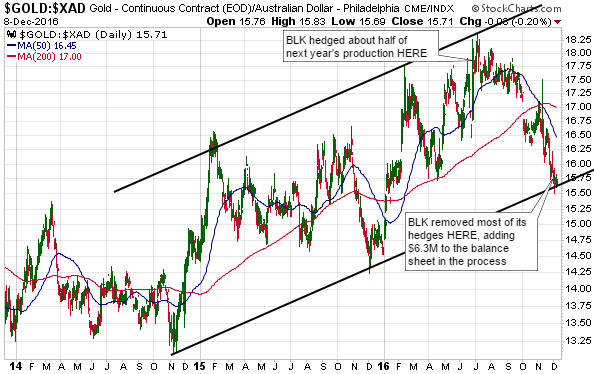
Blackham Resources (BLK.AX), a junior gold producer that has just begun to ramp-up production at a newly-commissioned mine in Western Australia, reported something interesting earlier this week. Having forward-sold about half of next year’s expected gold production a few months ago when the gold price was near its highs for the year, the company recently took advantage of gold’s price decline by closing-out the bulk of its forward sales. It did so by purchasing gold and delivering it into the forward sales contracts, thus realising a cash profit of A$6.3M.

In other words, having sold high during May-September, BLK’s management turned around and bought low over the past couple of weeks. Sell high, buy low. Sounds like a good strategy to me. More gold producers should try it.

gold_A$_081216

Print This Post Print This Post

The problem is a single central bank, not a single currency

December 5, 2016

The euro-zone appears to be on target for another banking crisis during 2017. Also, the stage is set for political upheaval in some European countries, a general worsening of economic conditions throughout Europe and widening of the already-large gaps between the performances of the relatively-strong and relatively-weak European economies. It’s a virtual certainty that as was the case in reaction to earlier crises/recessions, blame for the bad situation will wrongly be heaped on Europe’s experiment with a common currency.

The idea that economically and/or politically disparate countries can’t use a common currency without sowing the seeds for major problems is just plain silly. It is loosely based on the fallacy that economic problems can be solved by currency depreciation. According to this line of thinking, countries such as Italy and Greece could recover if only they were using a currency that they could devalue at will. (Note: The destructiveness of the currency devaluation ‘solution’ was covered in a previous blog post.)

The fact is that economically and politically disparate countries throughout the world successfully used a common currency for centuries up to quite recently (in the grand scheme of things). The currency was called gold.

The problem isn’t the euro; it’s the European Central Bank (ECB). To put it another way, the problem isn’t that a bunch of different countries are using a common currency; it’s that a central planning agency is attempting to impose the same monetary policy across a bunch of different countries.

A central planning agency imposing monetary policy within a single country is bad enough, in that it generates false price signals, foments investment bubbles that inevitably end painfully, and reduces the rate of long-term economic progress. The Federal Reserve, for example, has wreaked havoc in the US over the past 15 years, first setting the scene for the collapse of 2007-2009 and then both getting in the way of a genuine recovery and setting the scene for the next collapse. However, when monetary policy (the combination of interest-rate and money-supply manipulations) is implemented across several economically-diverse countries, the resulting imbalances grow and become troublesome more quickly. That’s why Europe is destined to suffer a monetary collapse well ahead of the US.

It should be kept in mind that money is supposed to be neutral — a medium of exchange and a yardstick, not a tool for economic manipulation. It is inherently no more problematic for totally disparate countries to use a common currency than it is for totally disparate countries to use common measures of length or weight. On the contrary, a common currency makes international trading and investing more efficient. In particular, eliminating foreign-exchange commissions, hedging costs and the losses that are incurred due to unpredictable exchange-rate fluctuations would free-up resources that could be put to more productive uses.

In conclusion, the problem is the central planning of money and interest rates, not the fact that different countries use the same money. It’s a problem that exists everywhere; it’s just that it is more obvious in the euro-zone.

Print This Post Print This Post

Every central bank wants a weaker US$

December 2, 2016

This post is an excerpt from a recent TSI commentary.

Every central bank in the world, including the US Federal Reserve, now wants a weaker US$, which proves that central banks can be overwhelmed by market forces even when they are united in their goals.

Central banks outside the US want a weaker US$ due to the long-term consequences of the actions that they themselves took many years ago to strengthen the US$. To put it another way, they now want to strengthen their own currencies against the US$ because their economies are suffering from the inevitable ill-effects of the currency-depreciation policies implemented at an earlier time. As discussed in the past, currency depreciation/devaluation is always counter-productive because it “engages all the hidden forces of economic law on the side of destruction, and it does so in a manner that not one man in a million will be able to diagnose.” It is still a very popular policy, though, because at a superficial level — the level at which most economists and all central bankers operate — it seems practical.

Unfortunately for the central banks that are now trying to prop-up their currencies relative to the US$, a central bank’s ability to weaken its currency is much greater than its ability to bring about currency strength. The reason is that weakening a currency can usually be achieved by increasing its supply, and if there is one thing that central banks are good at it’s creating money out of nothing. Actually, creating money out of nothing, and, in the process, engaging all the hidden forces of economic law on the side of destruction, is the ONLY thing they are good at.

The problem they are now facing is that once confidence in the currency has been lost, bringing about currency strength or at least a semblance of stability will generally require either a very long period of politically-unpopular monetary prudence or a deflationary depression. There is no quick-and-easy way to obtain the desired result.

The crux of the matter is that there is very little that central banks outside the US can now do in the short-term to stop the US$ from rising. The best they can do is to NOT inflate. Other than that, they should simply avoid the temptation to ‘do something’ and instead just wait for the current trends to exhaust themselves.

The US central bank also wants a weaker US$. This is because the senior members of the Fed operate at the same superficial level as their counterparts throughout the world. They see the direct, short-term positives that a weaker currency would bring to some parts of the economy, but are incapable of seeing the broader, longer-term and indirect negatives.

The difference is that the Fed actually has the power to create short-term weakness in the US$. It could, for example, surprise the world by not hiking its targeted interest rate in December. That would knock the Dollar Index down by at least a couple of points. To build on the decline it could then start emphasising the sluggishness of US industrial production and dropping hints that another QE program is coming.

Doing so would, however, be a reckless course of action even by Keynesian standards. The US dollar’s upward trend would be over, but at the cost of a total loss of credibility on the part of the Fed and breathtaking instability in the financial markets.

Once lost, confidence is difficult for a central bank to regain. The Fed is therefore now backed into a corner where for the sake of appearances it will have to take small steps in the direction of tighter monetary policy, even though it would prefer a weaker US$.

Print This Post Print This Post

An economy can’t be modeled by simple equations

November 29, 2016

A modern economy typically involves millions of individuals making decisions about consumption, production and investment based on a myriad of personal preferences. It should be obvious that such a ‘system’ could never be properly described by any mathematical equation, let alone a simple one-line equation. And yet, many economists and other commentators on economics-related matters base their analyses on simple equations.

One of the most popular of these simple equations is also one of the most misleading. I’m referring to the following GDP formula:

GDP = C + I + G + X – Z, where C is consumer expenditure, I is investment, G is government expenditure, X is exports, and Z is imports.

This equation has numerous problems, beginning with the fact that GDP, itself, is a fatally-flawed measure of economic performance in that it treats a dollar of counter-productive spending as if it were just as good as a dollar of productive spending. In essence, it measures activity without considering whether the activity adds to or subtracts from total wealth. But rather than dealing with all of this equation’s problems, I’ll zoom in on its implication that an economy can be boosted via an increase in government spending (G). This implication is not only wrong, it’s dangerous.

Government spending involves taking (stealing or borrowing) money that would have been used by the private sector and then directing the money towards politically-motivated, as opposed to economically-motivated, uses.

Even if we put aside the most basic problems with the GDP concept and the above equation, there’s no good reason to believe that an increase in G will lead to an increase in GDP. This is because C, I and G are not independent variables. In particular, since the government obtains all of its resources from the private sector it is reasonable to expect that an increase in G would lead to an offsetting reduction in C+I. Furthermore, this reasonable expectation is supported by historical data, which reveal a long-term inverse correlation between government-spending growth and GDP growth.

Moving on, another of the most popular of the economics profession’s simple equations is also misleading. I’m referring to the famous equation of exchange, which can be expressed as M*V = P*Q where M is the money supply, V is the velocity of money, Q is the total quantity of transactions in the economy and P is the average price per transaction.

There are numerous problems with this equation, starting with the fact that it says nothing other than the total monetary value of all transactions in the economy equals the total monetary value of all transactions in the economy. In other words, it’s a tautology. As such, it provides no useful information.

In this tautological equation, V (velocity) is nothing more than a fudge factor that makes one side equal to the other side. V doesn’t exist outside of this equation, meaning that it has no relationship to the real world.

In the real world there is money supply and there is money demand. There is no “money velocity”. It makes no more sense to talk about the velocity of money than it does to talk about the velocity of gold or the velocity of bonds or the velocity of bananas or the velocity of houses.

Some of the people who talk about “money velocity” as if it were a genuine economic driver probably mean “money demand”, in which case they should say “money demand”. Money demand is certainly both real and important, but it can’t be calculated via a simple equation.

For more on the Equation of Exchange and the irrelevance of Money Velocity, please refer to my June-2015 blog post on the topic.

In conclusion, when a piece of analysis treats equations such as the ones mentioned above as if they were realistic models of how the economy works, at a superficial level it can make the analysis seem more scientific. However, it actually makes the analysis less scientific.

Using mathematical models that don’t reflect reality is part of why the economics profession has such a dismal track record and is generally held in low regard.

Print This Post Print This Post

Which of these markets is wrong?

November 23, 2016

The US$ oil price and the Canadian Dollar (C$) have tracked each other closely over the past 2 years. When divergences have happened they have always been eliminated within a couple of months, usually by the oil market falling into line with the currency market.

In a 25th May blog post I wrote that an interesting divergence had developed over the preceding few weeks between these markets, with the C$ having turned downward at the beginning of May and the oil price having continued to rise. This suggested that either the currency market was wrong or the oil market was wrong. As I stated at the time, my money was on the oil market being wrong. In other words, I expected the divergence to be eliminated via a decline in the oil price.

The oil price was $49 at the time. Over the ensuing two weeks it moved a little higher (to $51) and then dropped by 20% within the space of two months. The result was that by early-August the gap between the oil price and the C$ had been fully closed.

The oil price and the C$ then traded in line with each other for about 6 weeks before another divergence began to develop. Again it was the oil market showing more strength than was justified by the currency market, and by early-October it was again likely that there would be a gap-closing decline in the oil price.

As expected, there was a significant decline in the oil price from mid-October through to early-November. However, the following chart shows that the gap was only partially eliminated and that a rebound in the oil price over the past 1-2 weeks has potentially set the stage for another significant gap-closing move.

I won’t be surprised if the oil price trades a bit higher within the coming two weeks, but my guess is that it will drop to the $30s within the coming three months.

oil_C$_221116

Print This Post Print This Post

Where did all the money go?

November 21, 2016

The prices of US government debt securities have been falling since early-July and plunged over the past two weeks. This prompts the question: Where did all the money that came out of the bond market go?

It’s a trick question, because not a single dollar has left the bond market. The reason is that for every sale there has been an exactly offsetting purchase. For example, if Bill sells $100M of T-Bonds, then $100M of cash gets transferred from the account of the buyer (let’s call him Fred) to Bill’s account. After the transaction, Bill has $100M more cash and $100M less bonds while Fred has $100M less cash and $100M more bonds. There has been no net flow of money out of or into the bond market.

In general terms, no money ever goes into or out of any market. A market, after all, is just a place where people go to trade. A market can grow or shrink, but it is not an entity that receives or disgorges money. Furthermore, every transaction in a market involves an increase in demand and an exactly offsetting decrease in demand. For example, in the case of the hypothetical bond traders mentioned above, the transaction involved an increase in the demand for bonds on the part of Fred and an exactly offsetting decrease in the demand for bonds on the part of Bill. Or, looking at it from a different angle, it involved an increase in the demand for money on the part of Bill and an exactly offsetting decrease in the demand for money on the part of Fred.

Related to the fact that no money ever goes into or out of any market is the fact that apart from a relatively small physical float, all of the money in the economy is always in the banking system*. It just gets shuffled around between the accounts of buyers and sellers. This, by the way, is why the “cash on the sidelines” argument that is regularly made to support a bullish stock market forecast is nonsense. In effect, all of the money in the economy is always on the sidelines.

Why, then, do market prices rise and fall?

Market prices rise and fall because one side (the buyers or the sellers) become more eager than the other side. If buyers are generally more eager than sellers then the price will rise by the amount required to encourage enough new sellers and/or discourage enough buyers so that a balance is established, whereas if sellers are generally more eager than buyers then the price will fall by the amount required to encourage enough new buyers and/or discourage enough sellers to establish a balance.

That’s why it sometimes happens that the prices of ‘everything’ (equities, bonds, gold, commodities) trend upward or downward together. One price doesn’t have to go down in order for another price to go up, and prices in one market going down will never be the direct cause of prices in another market going up. Although it is certainly the case that rising/falling prices in one market can alter the motivations of buyers and sellers in another market. The price of gold, for example, is determined mostly by what’s happening to prices in the bond, currency and stock markets.

Clearly, then, US government bond prices have fallen simply because, on average, bond sellers over the past few months have been more eager/motivated than bond buyers, not because any money has come out of the bond market. The reason for the change in motivation is a good topic for a separate post.

*If governments and banks get their way, at some point in the not-too-distant future there will be no physical float and 100% of the money supply will be in the banking system.

Print This Post Print This Post

Gold and the Real Interest Rate

November 16, 2016

The real interest rate is one of gold’s true fundamentals, with a rising real interest rate exerting downward pressure on the gold price and a falling real interest rate exerting upward pressure on the gold price. However, it is important to keep in mind that the real interest rate is just one of several fundamental drivers of the gold price.

Due to the relationship between gold and the real interest rate, the gold price will often trend in the opposite direction to the 10-year TIPS yield. This is because the TIPS yield is a practical, albeit not theoretically correct, proxy for the real interest rate. For example, the sharp rise in the TIPS yield between March and November of 2008 (Period A on the following chart) coincided with a substantial downward correction in the gold price, and the multi-year decline in the TIPS yield from its November-2008 peak coincided with a powerful upward trend in the gold price.

Note, though, that the downward trend in the TIPS yield continued until September of 2012 whereas the gold price peaked in September of 2011. The period of divergence is labeled “B” on the following chart.

That the gold price stopped trending with the real interest rate for 12 months beginning in September of 2011 is related to the real interest rate being only one of several (six, to be specific) fundamental drivers of the gold price*. Other fundamental price drivers turned bearish during the second half of 2011 or the first half of 2012, thus counteracting the bullish influence of the declining real interest rate. That being said, substantial weakness in the gold price didn’t show up until after the real interest rate began to trend upward.

The real interest rate reached its post-2011 peak in December of 2015 — at around the same time that the Fed made its initial rate hike. The December-2015 downward reversal in the real interest rate marked the start of an intermediate-term rally in the gold price.

The most recent low in the real interest rate occurred in early-July (the end of Period C on the following chart) and coincided almost to the day with gold’s price top.

TIPSyield_LT_151116

Prior to the Trump election victory there was no way of knowing whether the choppy sideways move in the real interest rate since early-July was a ‘pause for breath’ within a continuing downward trend or the start of a new upward trend. Prior to last week I therefore viewed this particular gold-market fundamental as neutral. It had stopped being a tailwind, but it hadn’t become a headwind.

The next chart shows that one consequence of last week’s post-election volatility was an upside breakout by the 10-year TIPS yield from its 4-month range. This means that the ‘real interest rate’ has temporarily become a headwind for gold.

TIPSyield_ST_151116

The TIPS yield is just one of six true fundamental drivers of the US$ gold price, but the post-election shift in this one indicator tipped (no pun intended) the overall fundamental balance from neutral to slightly-bearish for gold. This won’t prevent a multi-week rebound in the gold price, but the next major rally won’t begin until the fundamental backdrop has become more supportive.

*The other fundamental drivers of the gold price are the US yield curve (as indicated by the 10yr-2yr yield spread), credit spreads (as indicated by the IEF/HYG ratio), the relative strength of the banking sector (as indicated by the BKX/SPX ratio), the US dollar’s exchange rate and the overall trend for commodity prices.

Print This Post Print This Post

Update on the Comex fear-mongering

November 7, 2016

Over the past few years there has been a lot of irrational fear-mongering within the gold commentariat regarding the potential for the Comex to default due to having insufficient physical gold in its coffers. I most recently addressed this topic in a post on 6th May.

I’m not going to repeat all the information contained in earlier posts such as the one linked above. However, here’s a very brief recap:

1) The ratio of Comex Open Interest (OI) to “Registered” gold inventory that Zero Hedge et al employed to create the impression of high default risk was not, in any way, shape or form, a valid indicator of such risk.

2) The amount of gold available for delivery at any time is the TOTAL amount of gold in the “Registered” and “Eligible” categories, not just the amount of “Registered” gold, since it is a quick and easy process to convert between “Eligible” and “Registered”.

3) The maximum amount of gold that can be demanded for delivery is the amount of OI in the nearest futures contract, not the total OI across all futures contracts.

In the above-linked post I included a chart showing that the amount of gold delivered to futures ‘longs’ over the preceding two years was much less in both absolute and relative terms than at any other time over the past decade. The chart made it clear that as the gold price fell, the desire of futures traders to ‘stop’ a contract and take delivery of physical gold also fell.

This meant that the unusually-small amount of gold in the “Registered” category was almost certainly related to an unusually-low desire on the part of futures ‘longs’ to take delivery. To put it another way, the unusually-small amount of gold in the “Registered” category was nothing more than a natural consequence of bearish sentiment.

Here was my conclusion at that time:

It’s a good bet that if a multi-year gold rally began last December (I think it did) then the desire to take delivery will increase over the next couple of years, prompting a larger amount of gold to be held in the Registered category.

Finally, here are charts from goldchartsrus.com showing that this year’s strength in the gold price led to 1) an increase in the desire of futures ‘longs’ to take delivery and 2) a related and substantial increase in the amount of “Registered” gold.

Exactly as expected.

gold_COMEXdeliv_071116

RegisteredGoldStock_071116

Print This Post Print This Post

How should the real interest rate be measured?

November 4, 2016

Here is an excerpt from a recent TSI commentary.

Despite the popularity of doing so, subtracting the percentage change in the CPI or some other price index from the current nominal interest rate will not result in a realistic or reasonable estimate of the current ‘real’ interest rate.

The method of real interest rate calculation summarised above is wrong in two different ways, each of which is sufficient to render the result invalid. The first and most obvious way it is wrong is that the CPI does not reflect the change in the purchasing power of money. This is not just because it has been re-jigged over the decades as part of an effort to minimise its value, but also because the entire concept of a “general price level” is nonsense. There is no such thing as a general price level because disparate items cannot be averaged. To explain by way of a simple example, averaging the prices of a car, a potato and a visit to the dentist makes no more sense than averaging the goods/services themselves. Clearly, a car, a potato and a visit to the dentist cannot be averaged.

However, even if, for the sake of argument, we assume that the CPI makes sense at a conceptual level and is a satisfactory estimate of the change in the purchasing power of money, we still couldn’t use it to determine the current real interest rate. The reason is that the real rate of return obtained from an interest-producing investment has nothing to do with the historical change in the purchasing power of money and everything to do with the amount by which the purchasing power of money will change in the future. For example, if you buy a 1-year bond today your real return will be determined by how much the purchasing power of money changes over the next 12 months; not by how much it changed over the previous 12 months.

So, when you see a chart showing the nominal interest rate minus the 12-month percentage change in the CPI, what you are looking at is NOT a chart of the real interest rate.

How, then, should the real interest rate be calculated and charted?

The hard reality is that there are some things worth measuring that simply can’t be measured. The real interest rate falls into this category. By taking into account money-supply growth and population growth and by making a guess regarding productivity growth it is possible to come up with a realistic, albeit very rough, estimate of how the purchasing power of money shifted over a long historical period, but it will never be possible to calculate the current real interest rate.

The best we can do is use the financial market’s average forecast regarding the future CPI in our calculations. In other words, the best we can do is use the TIPS (Treasury Inflation Protected Security) yield as a proxy for the real interest rate, since the TIPS yield is effectively the nominal yield minus the expected CPI. A chart of the 5-year TIPS yield is displayed below and discussed in the next section (in relation to gold).

The TIPS yield is not an accurate reflection of the real interest rate because it is based on the CPI and because the market’s expectations are sometimes wrong, but for practical speculation purposes it seems to be good enough.

Print This Post Print This Post

Interesting aspects of the current financial situation

November 1, 2016

Here are a few aspects of the current financial situation that I find interesting:

1) The spread between the 10-year T-Note yield and the 2-year T-Note yield is a proxy for the US yield curve. When this yield-spread is widening it implies that the yield curve is steepening and when this yield-spread is narrowing it implies that the yield curve is flattening.

The following chart shows that the 10yr-2yr yield-spread broke above its September high late last week. This is evidence that the US yield curve has shifted from a flattening to a steepening trend, which is a recession warning and a bearish omen for the US stock market. It is also bullish for gold, although the overall fundamental backdrop is no better than neutral for gold.

yieldcurve_311016

2) As illustrated below, the Dollar Index has been oscillating within a horizontal range for about 20 months. It has worked its way upwards since May of this year, but is roughly unchanged since the beginning of the year and is about 2 points below the top of its 20-month range.

The fact that the Dollar Index is roughly unchanged since the start of this year is interesting because the dominant fundamental driver of intermediate-term trends in the US dollar’s exchange rate (the relative strength of the US stock market) has been US$-bullish throughout this year. By rights, the Dollar Index should be well above its current level.

There are two reasons that the Dollar Index is still trapped within its horizontal range. One is that there was a huge sentiment-driven overshoot to the upside during the first quarter of 2015. The other is mentioned below.

US$_311016

3) The following chart shows the Treasury securities held in custody at the Fed for foreign central banks (FCBs). Not all US government debt securities owned by FCBs are held at the Fed, but more than half of them are and trends in the Fed’s custody holdings should reflect trends in overall holdings.

The chart shows that FCBs stopped being net buyers of US government debt in December-2013 and have been relentless net-sellers since December of last year. This tells us that FCBs have made a concerted attempt over the past 10 months to weaken the US$. This, I suspect, is a reason that the Dollar Index has remained range-bound this year to date despite the upward pressure exerted by US$-bullish fundamentals.

FCBTreasuries_311016

4) The following chart shows the amount of money held in the US federal government’s account at the Fed. Prior to the past year or so the amount of money in the Treasury’s deposit at the Fed was usually below $100B and had never been more than $200B, but something changed in November of 2015.

Since early-November of 2015 there has been a net addition of about $400B to the Treasury’s account at the Fed. This means that the Treasury has temporarily withdrawn about $400B from the US economy over the past 12 months, an action that is, in effect, a monetary tightening. This action would undoubtedly have slowed the pace of US economic activity.

The Treasury is obviously not trying to reduce the pace of economic activity. Why would it, especially in the lead-up to an election? It is, instead, trying to build-up a larger cash buffer for risk management purposes, possibly in expectation of more inter-party haggling over the debt ceiling.

TreasuryGeneral_311016

5) The final chart shows that the S&P500 Index is precariously poised near a technical precipice. A downside breakout will probably soon happen, but until support at 2120 is decisively breached there will be an outside chance of a rise to new highs prior to a tradable decline.

SPX_311016

Print This Post Print This Post

Chanting “it’s a bull market” won’t make it so

October 28, 2016

I’ve seen a lot of commentary in which the author assumes that this year’s rally in the gold price is the first rally in a new cyclical bull market. It probably is, but at this stage — as the saying goes — the jury is still out. At this stage it’s best to reserve judgment, because blindly assuming something that might not be true can lead to large losses.

There are two main reasons that ‘the jury is still out’. First and foremost, at no time over the past 12 months have gold’s true fundamentals* been definitively bullish. Instead, they have oscillated around neutral. There have been periods, such as February-April of this year, during which the fundamentals had a bullish skew, but after tipping in the bullish direction for at most 3 months they have always tipped in the other direction for a while.

Considering what central banks have been doing to the official forms of money my statement that the fundamental backdrop is not definitively gold-bullish could seem strange. After all, the ECB is firmly committed to asset monetisation and negative interest rates based on the belief that these counter-productive policies are working, and the Federal Reserve is seemingly afraid to take even a small step towards “policy normalisation” despite its targets for employment and “inflation” having been reached more than three years ago. However, gold’s fundamentals are determined by confidence, not by sound principles of economics. To put it another way, whether the fundamental backdrop is bullish or bearish for gold is determined by the general perception of what’s happening on the economic and monetary fronts rather than what’s actually happening. Perception will eventually move into line with reality, but in the meantime years can go by.

Since early-July the true fundamentals have been neutral at best and over the past month they have, on balance, been slightly bearish. However, they are constantly in flux and it currently wouldn’t take much to shift them to bullish or make them definitively bearish. In particular, two of the most important fundamental drivers of the gold price are neutral and positioned in a way that they could soon shift decisively in one direction or the other. I’m referring to the real interest rate, as indicated on the first of the following charts by the reciprocal of the TIPS bond ETF (1/TIP), and the US yield curve, as indicated on the second of the following charts by the 10yr-2yr yield spread.

The real interest rate would turn decisively gold-bullish if 1/TIP were to break downward from its recent 4-month range and decisively gold-bearish if 1/TIP were to break upward from its recent 4-month range. The yield curve, which has been gold-bearish for the bulk of the past three years, would turn decisively gold-bullish if the 10yr-2yr yield spread were to break solidly above its September high. Note that it is very close to doing exactly that. As an aside, a break by the 10yr-2yr yield spread above its September high would also be a recession warning and a bearish omen for the stock market.

Realint_271016

yieldcurve_271016

The price action is the other reason for the uncertainty as to whether this year’s rally marked the start of a cyclical bull market. I’m referring to the fact that of all the rallies in gold and the gold-mining indices from multi-year lows, this year’s rally is most similar to the bear-market rebound of 1982-1983.

The gold rally that began in December of 2015 will differentiate itself from the 1982-1983 bear-market rebound if the gold price closes above its July-2016 peak AND the HUI closes above its August-2016 peak.

Fortunately, you don’t need to be a fervent believer in the ‘new gold bull market’ story to make money from the rallies in gold and gold stocks. You will just tend to be more cautious than the bulls with blind faith.

*Five of the six “true fundamentals” were mentioned in the September-2015 TSI blog post linked HERE. The sixth is the general trend in commodity prices as indicated by a broad-based commodity index such as GNX.

Print This Post Print This Post

“Price inflation” is not the biggest problem

October 18, 2016

All else remaining equal, an increase in the supply of money will lead to a decrease in the purchasing-power (price) of money. Furthermore, this is the only effect of monetary inflation that the average economist or central banker cares about. Increases in the money supply are therefore generally considered to be harmless or even beneficial as long as the purchasing-power of money is perceived to be fairly stable*. However, reduced purchasing-power for money is not the most important adverse effect of monetary inflation.

If an increase in the supply of money led to a proportional shift in prices throughout the economy then its consequences would be both easy to see and not particularly troublesome. Unfortunately, that’s not the way it happens. What actually happens is that monetary inflation causes changes in relative prices, with the spending of the first recipients of the newly-created money determining the prices that rise the first and the most.

Changes in relative prices generate signals that direct investment. The further these signals are from reality, that is, the more these signals are distorted by the creation of new money, the more investing errors there will be and the less productive the economy will become.

Also, although adding to the money supply cannot possibly increase the economy-wide level of savings, monetary inflation temporarily creates the impression that there are more savings than is actually the case. This reduces interest rates, which prompts investments in ventures that are predicated on unrealistic forecasts of future consumer spending. Again, the eventual result will be a less productive economy.

During any given year it usually won’t be possible to separate-out the pernicious effects of monetary inflation and the distortion of interest rates that goes hand-in-hand with it from all the other forces affecting the economy. There will simply be too many things going on in the world that could be influencing the data. However, by taking a wide-angle (that is, long term) view it will often be possible to see the effects on the economy of shifts in monetary inflation.

As an example of how long-term shifts in monetary inflation/intervention can be linked to long-term shifts in economic progress I present the following chart of the US Industrial Production Index. The chart shows that the industrial-production growth trend flattened at around the time that the ‘golden shackles’ were removed, that is, at around the time that the Fed was essentially empowered to do a lot more. This is not a fluke. The chart also shows that the ramping-up of the Fed’s monetary interventions in 2008-2009 has been followed by the weakest post-recession recovery in at least 70 years. Again, this is not a fluke.

IndustProd_181016

In economics, to have a chance of correctly interpreting cause and effect in the data you first have to know the right theory. That’s why Keynesian economists will not link the US industrial production slowdown with the Fed’s increasingly aggressive monetary interventions. From their perspective, the only negative effect that monetary inflation can possibly have is to make the cost of living rise at a faster pace than they believe it should be rising.

*Stable, here, means rising at around 2% per year. Note that it is not possible to come up with a single number that represents the economy-wide purchasing power of money, but this doesn’t stop the government (and some private organisations and individuals) from doing exactly that.

Print This Post Print This Post

The gold manipulation silliness continues

October 14, 2016

Not surprisingly, one of the silliest explanations for last week’s sharp decline in the gold price appeared in an article posted at the Zero Hedge web site. According to this article, the only plausible explanation for the decline is rampant manipulation while China’s markets were closed for the “Golden Week” public holidays*.

In an effort to prove that manipulators in the West routinely take advantage of China’s markets being closed to suppress the gold price, the article includes charts covering the 2015 and 2014 “Golden Week” holiday periods. These charts suggest that, as was the case this year, the gold price tanked during each of the preceding two years when China was closed for business. However, the charts are very misleading. Deliberately so, in my opinion.

For example, the following chart from the article suggests that the gold price plunged from the $1140s to around $1105 during the 2015 “Golden Week” holidays and then quickly recouped its losses after China’s markets re-opened, but that’s not the case. The “Golden Week” is from 1st to 7th October every year, so what actually happened was that the gold price fell from the $1140′s down to around $1115 during the days leading up to the 2015 “Golden Week” (while China was open for business) and then rebounded to the $1140s while China was on holiday.

gold_2015_141016

During the 2014 “Golden Week” holiday period there was no net change in the gold price.

The belief that manipulation is the be-all-and-end-all of the gold market is based on two false premises. The first is that the fundamentals are always gold-bullish. The second is that when financial markets are free from manipulation they always move in concert with the fundamentals. If you hold these two totally-wrong beliefs then every time there is a significant decline in the gold price you will naturally conclude that manipulation was the cause.

The reality is that gold’s true fundamentals have been deteriorating since July and that the pace of deterioration picked up over the past three weeks. At the same time, speculators in gold futures were adding to the risk of a steep downward price adjustment by stubbornly maintaining an extremely high net-long position.

The following chart compares the gold price with the bond/dollar ratio. The fundamental deterioration and the delayed response of the gold market can clearly be seen on this chart.

Gold market participants and observers who were looking at the right indicators will not have been surprised by last week’s price decline.

*China is apparently the bastion of honest price discovery in the gold market and corrupt Western bankers apparently wait for the Chinese to go on vacation before launching their bear raids.

Print This Post Print This Post