Print This Post Print This Post

Gold mining fundamentals remain supportive

September 29, 2020

[This blog post is a modified excerpt from a recent TSI commentary]

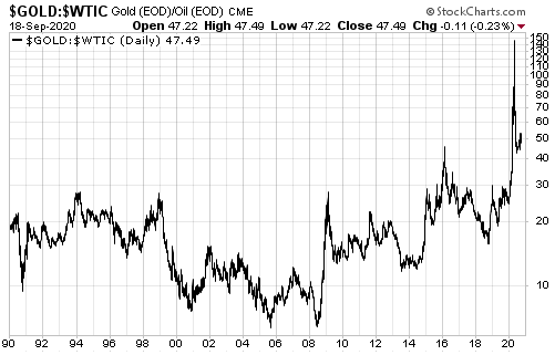
It is estimated that about 50% of the production costs of the average gold miner are linked to energy. That’s why the gold/oil ratio is a reasonable proxy for the average profit margin across the gold mining industry.

The gold/oil ratio peaked in April of this year and then plunged. Refer to the following chart for the details. It’s a good bet that the April-2020 peak was the major (long-term) variety since it was driven by a spectacular collapse in the oil price that almost certainly won’t be repeated within the next few years. This implies that the industry-wide gold mining profit margin peaked on a long-term basis during the first half of this year.
For two reasons, the high probability that the gold/oil ratio peaked on a long-term basis 5-6 months ago is not bearish for gold mining stocks.

The first reason is that the plunge in the gold/oil ratio from its April-2020 peak ended with the ratio at a multi-decade high. In other words, by historical standards the gold price is still very high relative to the cost of energy, meaning that gold mining profit margins remain elevated. That’s why we expect the gold mining indices/ETFs to trade at much higher levels within the next 12 months.

The second reason is that when the gold/oil ratio retains about half of its gain from a major low (in this case in 2018) to a major high, which it has done to date, the time from a major gold/oil ratio peak to a major gold mining peak tends to be 1.5-2.5 years. This implies that the cyclical advance in the gold mining sector that began in 2018 won’t end before the second half of 2021, although be aware that a sustained move below 40 in the gold/oil ratio would warn a multi-year peak was either in place or close.

Print This Post Print This Post

The inflationary depression of the 2020s

September 22, 2020

[This blog post is an excerpt from a recent TSI commentary]

The 4-8 year period beginning in February of this year potentially will contain three or more official recessions and come to be referred to as the Depression of the 2020s. If so, unlike the Depression of the 1930s the Depression of the 2020s will be inflationary.

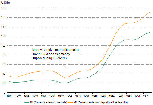
The Depression of the 1930s was deflationary in every sense of the word, but the primary cause of the deflation was the performance of the money supply. We don’t have the data to calculate True Money Supply (TMS) during the 1930s, but we have the following chart showing what happened to the M1 and M2 monetary aggregates from 1920 to 1953. The chart shows that there was a substantial contraction in the US money supply during 1929-1933 and that the money supply was no higher in 1938 than it had been at the start of the decade.

Clearly, the money-supply situation today could not be more different from the money-supply situation during the early-1930s*.

One reason for the difference is that during the 1930s the Fed was restricted by the Gold Standard. The Gold Standard was diluted in 1933, but throughout the 1930s the US$ was tethered to gold.

The final official link between the US$ and gold was removed in 1971. This made it possible for the Fed to do a lot more, but as far as we can tell the Fed actually didn’t do a lot more in the 1990s than it did in the 1960s. It has been just the past 20 years, and especially the past 12 years, that the Fed has transmogrified from an institution that meddles with overnight interest rates and bank reserves to a central planning agency that attempts to micro-manage the financial markets and the economy. After history’s greatest-ever mission creep, it now seems that there is nothing associated with the financial markets and the economy that is outside the Fed’s purview.

In parallel with the expansion of the Fed’s powers and mission there emerged the idea that for a healthy economy the currency must lose purchasing power at the rate of around 2% per year. This idea has come to dominate the thinking of central bankers, but it has never been justified using logic and sound economic premises. Instead, when asked why the currency must depreciate by 2% per year, a central banker will say something along the lines of: “If the inflation rate drops well below 2% then it becomes more difficult for us to implement monetary policy.”

As an aside, because of the way the Fed measures “inflation”, for the Fed to achieve its 2% “inflation” target the average American’s cost of living probably has to increase by at least 5% per year.

Due to the central-banking world’s unshakeable belief that money must continually lose purchasing power and the current authority of the central bank to do whatever it takes to achieve its far-reaching goals, the greater the perceived threat of deflation the more monetary inflation there will be. We saw an example of this during 2001-2002 and again during 2008-2009, but 2020 has been the best example yet. The quantity of US dollars created since the start of this year is greater than the entire US money supply in 2002.

It actually would be positive if deflation were the high-probability outcome that many analysts/commentators claim it is, because deflation is relatively easy to prepare for and because 1-2 years of severe deflation would set the stage for strong long-term growth. However, one of today’s dominant driving forces is the avoidance of short-term pain regardless of long-term cost, so there will be nothing but inflation until inflation is perceived to be the source of the greatest short-term pain. This doesn’t mean that a depression will be sidestepped or even postponed. What it means is that the next depression — which may have already begun — will be the inflationary kind.

*US True Money Supply (TMS) has expanded by 35% over the past 12 months.

Print This Post Print This Post

Money Creation Mechanics

September 10, 2020

Since the Fed implemented its first Quantitative Easing (QE) program in 2008-2009, many analysts have claimed that QE adds to bank reserves but does not increase the money supply (bank reserves aren’t counted in the money supply). Such claims are patently wrong.

Anyone who bothered to do some basic calculations would see that when the Fed monetises securities, as it does when implementing QE, it adds to the economy-wide supply of money. Specifically, if you add-up the increases in the dollar amounts of demand and savings deposits within the commercial banking system during a period in which the Fed ran a QE program and subtract from this the amount of money loaned into existence during the period by commercial banks, you will find that the difference is approximately equal to the net dollar value of securities purchased by the Fed.

The fact is that when the Fed buys X dollars of securities from a Primary Dealer (PD), either as part of a QE program or a non-QE open market operation, it adds X dollars to the PD’s deposit at a commercial bank AND it adds X dollars to the reserve account at the Fed of the PD’s bank. Another way to look at the situation is that the Fed’s purchases of securities add covered money (money in commercial bank deposits covered by reserves at the Fed) to the economy.

The process is described at the top of page 6 in the Fed document linked HERE. Some parts of this document are out of date in that it was written well before the Fed started paying interest on reserves and before commercial banks were able to reduce their required reserve amounts to zero via the process called “sweeping”, but the mechanics of the Fed’s direct money creation haven’t changed.

The persistent claims that the Fed’s QE doesn’t boost the money supply are not only wrong, but also dangerous. The creation of money out of nothing distorts relative prices, leading to mal-investment and slower economic progress. Consequently, the failure to identify the direct link between QE and money-supply growth makes the QE seem far less harmful than is actually the case.

Print This Post Print This Post

The best way to play the ‘ag’ bull market

September 8, 2020

[This blog post is an excerpt from a recent TSI commentary, with updated charts and minor modifications]

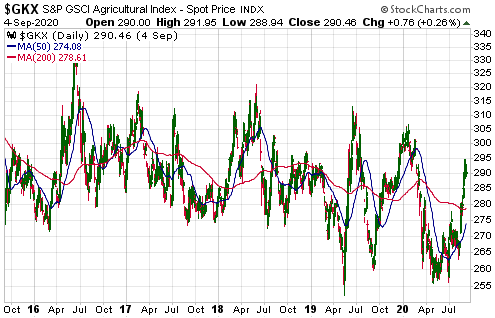
As is the case with the natural gas price, the price of the S&P Agricultural Index (GKX) appears to have made a cycle low via a double bottom in April and June of this year. At this stage the rebound from the Q2-2020 bottom doesn’t look more significant than any of the other rebounds of the past five years (see chart below), but the combination of rampant monetary inflation, rising inflation expectations and increasingly-volatile weather due to natural climate cycles is the recipe for a much longer and larger rally.

GKX_080920

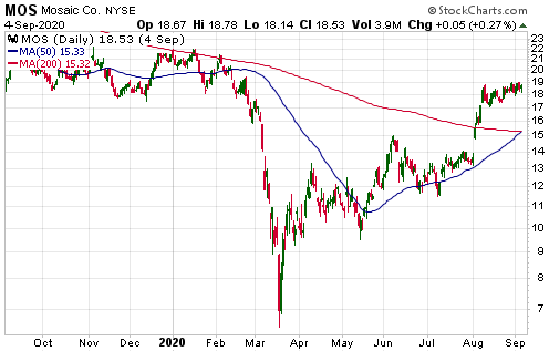
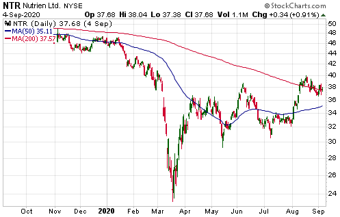
For at least the past 12 months we have argued that owning the stocks of fertiliser producers such as Mosaic (MOS) and Nutrien (NTR) is the best way for most people to participate in the agricultural (‘ag’) commodities bull market that potentially will unfold during 2020-2022. That continues to be our view. Although the fertiliser producers only provide indirect exposure to rising prices for ag commodities, obtaining direct exposure via the stock market involves owning ETFs that usually suffer substantial value leakage due to the “futures roll”.

The following daily charts show that the aforementioned stocks have rebounded strongly from their March-2020 lows but remain well below their highs of the past 12 months.

MOS_080920

NTR_080920

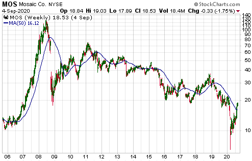
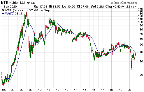
Not evident on the above daily charts is the fact that MOS and NTR are trading at small fractions of their 2008 peaks. The following weekly charts provide some additional perspective.

MOS_weekly_080920

NTR_weekly_080920

We think that the risk/reward ratios of these stocks are roughly equivalent, with NTR being less risky and MOS offering greater leverage. Both companies were very profitable in the June-2020 quarter and should become even more profitable over the quarters/years ahead.

Print This Post Print This Post