
A chart similar to the one below was included in a blog post under the heading “Bank C&I Loan Charge-Offs Soaring Again”. This chart caught my attention because it seems to indicate that bank C&I (Commercial and Industrial) loan charge-offs are happening at one of the fastest rates of the past 30 years — the sort of rate that would be consistent with the US economy being in recession.
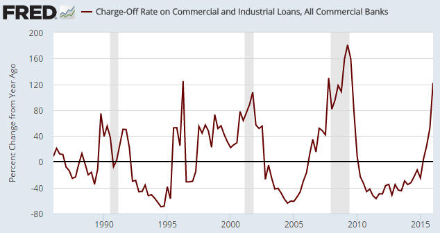
The problem is that the above chart shows the percentage change of a percentage, which opens up the possibility that what is in reality a small increase is being made to look like a large increase. For example, an increase from 1% to 2% over the course of a year in the proportion of loans charged-off would be a 100% increase if expressed as a year-over-year percentage change in the percentage of charge-offs, whereas all you’ve actually got is a 1% increase in the total proportion of loans that have been charged-off.
The next chart is based on exactly the same data, but instead of displaying the year-over-year percent change in the percentage of C&I loans that have been charged off it simply displays the percentage of C&I loans that have been charged off. This is not just a more correct way of looking at the data, it is a way that has not given any false recession signals over the past 30 years.
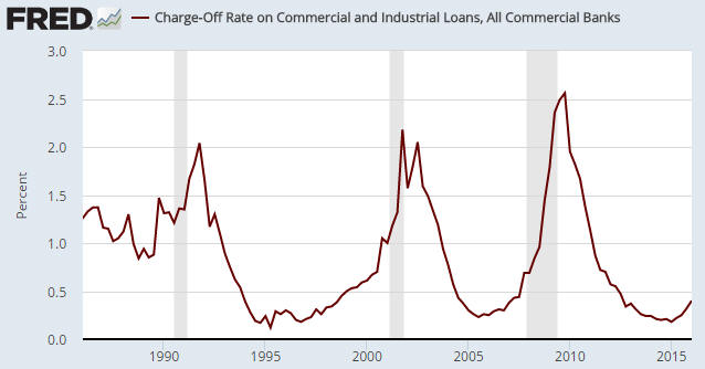
The first chart’s message is: an economic recession is either in progress or imminent. The second chart’s message is: the US economy is not in recession and is presently not close to entering recession.
The same data, opposite messages.