Sidebar right

Gold and the ‘Real’ Interest Rate Revisited

November 18, 2019

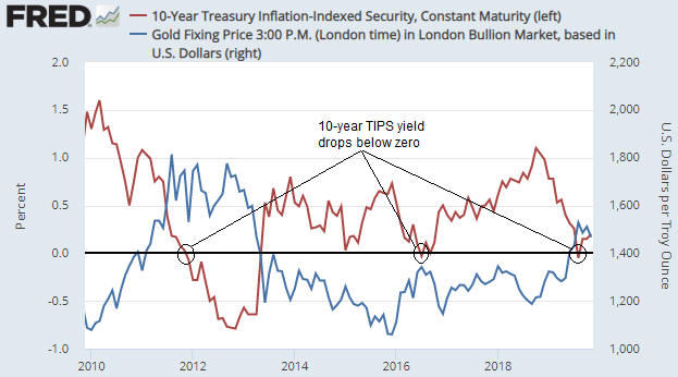
In a blog post in early-September I noted that the 10-year TIPS (Treasury Inflation Protected Security) yield had just gone negative and that the previous two times that this proxy for the real interest rate went negative (August-2011 and July-2016) the gold price was at an important peak. I then attempted to answer the question: If gold tends to benefit from a lower real interest rate, why would the gold price reverse downward shortly after the real interest rate turned negative?

In the earlier post I gave three reasons why a downward reversal in the gold price could coincide with the ‘real’ interest rate going negative. They were:

1) The dip into negative territory marked a low point for the real interest rate.

2) The real interest rate is just one of several fundamental gold-price drivers, so the upward pressure on the gold price exerted by a falling real interest rate could be counteracted by the downward pressure exerted by other fundamental influences.

3) The gold-bullish fundamental backdrop had been fully discounted by the current gold price.

At the time I thought that the third of the above-mentioned reasons may be applicable, because the speculative net-long position in Comex gold futures was very close to an all-time high and the weekly RSI (an intermediate-term momentum indicator) was almost as high as it ever gets.

As it turned out, the first and third reasons were applicable. Sentiment and momentum indicators pointed to extreme enthusiasm for gold on the part of the speculating community, and the following chart, which is an update of the chart included in the blog post linked above, shows that the 10-year TIPS yield reversed upward at the beginning of September.

gold_TIPS_181119

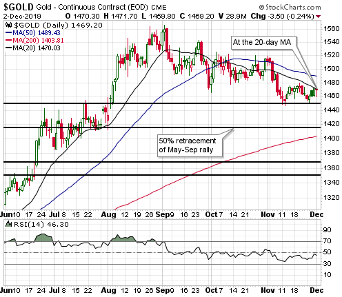
The current situation is that neither sentiment nor fundamentals are conducive to substantial strength in the gold price. There could be a counter-trend rebound at any time, but the conditions are not right for a resumption of the major upward trend that got underway in the second half of last year.

Print This Post Print This Post

Gold and Inflation Expectations Revisited

November 11, 2019

In an earlier blog post I discussed the relationship between gold and inflation expectations. Contrary to popular opinion, gold tends to perform relatively poorly when inflation expectations are rising and relatively well when inflation expectations are falling.

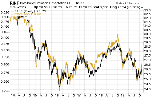
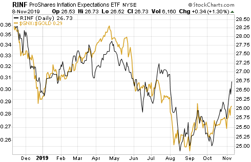
The relationship outlined above is very clear on the following charts. The first chart shows that over the past 6 years there has been a strong positive correlation between RINF, an ETF designed to move in the same direction as the expected CPI, and the commodity/gold ratio (the S&P Spot Commodity Index divided by the US$ gold price). In other words, it shows that a broad basket of commodities has outperformed gold during periods when inflation expectations were rising and underperformed gold during periods when inflation expectations were falling. The second chart shows the same comparison over the past 12 months. Notice that inflation expectations bottomed for the year (to date) in mid-August and the commodity/gold ratio bottomed about two weeks later.

GNXgold_IE_6Y_111119

GNXgold_IE_1Y_111119

A large part of the reason for the strong inverse relationship between gold’s relative strength and inflation expectations is the general view that “inflation” of 2%-3% is not just normal, it is beneficial. In fact, most people have been conditioned to believe that it’s a serious economic problem necessitating draconian central bank intervention if money fails to lose purchasing power at a slow and steady pace.

Eventually the rate of “price inflation” will rise to a level where it starts being seen by the public as a major economic problem, and, as a result, the desire to maintain cash savings will enter a steep decline. It is at this point that the relationship depicted above will stop working and the demand for gold will begin to surge in parallel with rising inflation expectations. In other words, at some point the relationship depicted on the above chart will reverse due to declining confidence in the official money. This point probably will arrive within the next 10 years, but probably won’t arrive within the next 12 months. Over the next 12 months it’s likely that gold will continue to be favoured during periods of falling inflation expectations and other commodities will continue to be favoured during periods of rising inflation expectations.

So, if you think that the recent inflation-expectations bounce is the start of a trend then you should be looking for opportunities to increase your exposure to commodities such as oil and copper, not gold. My guess is that inflation expectations bottomed during August-October of this year, but I’m open to the possibility that the bottoming process will extend into early next year.

Print This Post Print This Post

Banks versus Gold, Part 2

November 4, 2019

In a blog post on 30th September I noted that the banking sector (as represented by the US Bank Index – BKX) had begun to show relative strength, a ramification of which was that my Gold True Fundamentals Model (GTFM) had shifted from bullish to bearish. An update is warranted because the situation has changed since then in a way that is both interesting and a little surprising.

Just to recap, the relative performance of the banking sector (as indicated by the BKX/SPX ratio) is an input to my “true fundamentals” models for both the US stock market and the gold market, the difference being that when the input is bullish for one of these markets it is bearish for the other. In particular, relative weakness in the banking sector is considered to be bullish for gold and bearish for general equities.

As explained in the above-linked post, there was enough relative strength in the banking sector during the first half of September to flip the BKX/SPX input from gold-bullish to equity-bullish, causing the GTFM to shift from bullish to bearish. My guess at the time was that the GTFM would return to gold-bullish territory within the next two months, but I pointed out that it is usually better to base decisions on real-time information than on what might happen in the future.

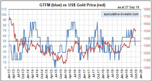
Within a few days of my 30th September post the GTFM shifted back to bullish, where it remains today. This means that apart from a 3-week period during September, the fundamental backdrop has been supportive for gold since the beginning of this year. Refer to the following chart for more detail (the fundamental backdrop is gold-bullish when the blue line on the chart is above 50). Furthermore, there is evidence in the recent price action that gold’s correction is over. However, the fundamental and technical signs of strength in the gold market were not accompanied by signs of weakness in the banking sector.

GTFM_041119

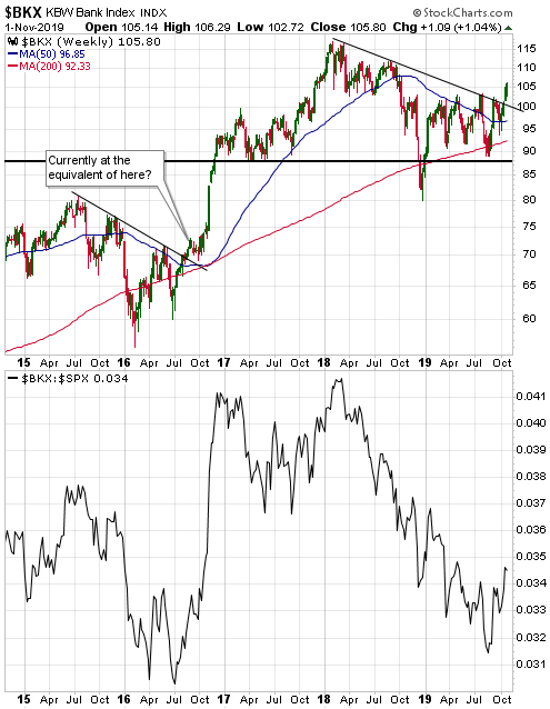
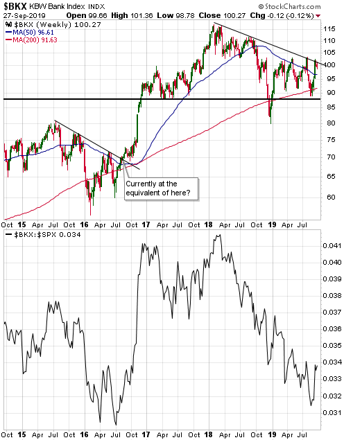
What’s both interesting and a little surprising is that the renewed signs of strength in gold have gone hand-in-hand with additional signs of strength in the banking sector. Specifically, since my 30th September post the BKX has broken out to the upside (refer to the top section of the following weekly chart) and the BKX/SPX ratio has broken a sequence of declining tops that dates back to early last year (refer to the bottom section of the following chart).

BKX_041119

The BKX/SPX ratio is just one of seven inputs to the GTFM, so there are circumstances in which the gold price can trend upward along with relative strength in the banking sector of the stock market. In other words, it isn’t out of the question that over the next few months we will get a gold rally in parallel with a continuing rise in the BKX/SPX ratio and strength in general equities. It’s more likely, however, that the emerging signs of strength in gold are warning of a short-term reversal to the downside in both the broad stock market and the banking sector.

Print This Post Print This Post

A potential game-changer from the Fed

October 22, 2019

[This post is an excerpt from a recent TSI commentary]

Once an equity bear market is well underway it runs its course, regardless of the Fed’s actions. For example, the Fed started cutting interest rates in January of 2001, but the bear market that began in March of 2000 continued until October-2002. For another example, the Fed started cutting interest rates in September-2007, but a bear market commenced in October-2007 and continued until March-2009 despite numerous Fed actions designed to halt the price decline. On this basis it can be argued that the Fed’s introduction of a new asset monetisation program roughly one week ago won’t prevent the stock market from rolling over into a major bearish trend. However, there is a good reason to think that it could be different this time (dangerous words, we know) and that the Fed’s new money-pumping scheme will prove to be game-changer.

The reason to think that it could be different this time is that in one respect it definitely is different. We are referring to the fact that although the Fed started cutting interest rates in the early parts of the last two cyclical bear markets (2000-2002 and 2007-2009), it didn’t begin to directly add new money to the financial markets until the S&P500 Index had been trending downward with conviction for about 12 months.

To further explain, when the Fed’s targeted interest rates follow market interest rates downward, which is what tends to happen during at least the first half of an economic downturn, the official rate cuts do not add any liquidity to the financial system. It’s only after the Fed begins to pump new money into the financial markets that its actions have the potential to support asset prices.

During the last two bear markets, by the time the Fed started to pump money it was too late to avoid a massive price decline. This time around, however, the Fed has introduced a fairly aggressive money-pumping program while the S&P500 is very close to its all-time high and seemingly still in a bullish trend.

The Fed has emphasised that the new asset monetisation program should not be called “QE” because it does not constitute a shift in monetary policy. Technically this is correct, but in a way it’s worse than a shift towards easier monetary policy. The Fed’s new program is actually a thinly-disguised attempt to help the Primary Dealers absorb an increasing supply of US Treasury debt. To put it another way, the Fed is now monetising assets for the purpose of financing the US federal government, albeit in a surreptitious manner.

This relates to a point we made in a recent blog post. The point is that when the central bank is perceived to be financing the government, as opposed to implementing monetary policy to achieve economic (non-political) objectives such as “price stability”, there is a heightened risk that a large decline in monetary confidence will be set in motion. One effect of this would be an increase in what most people think of as “inflation”.

Summing up, it’s possible that the Fed’s new asset monetisation program will extend the current cycle (prolong the equity bull market) and lead to more “price inflation” than earlier programs.

Print This Post Print This Post
Monetary Inflation and the Next Crisis

October 15, 2019

[This post is a modified excerpt from a recent TSI commentary.]

We regularly look at what’s happening with monetary inflation around the world, but today we’ll focus exclusively on the US monetary inflation rate. This is because of the recent evidence that the unusually-low level of this long-term monetary indicator is starting to have a significant short-term effect.

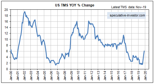
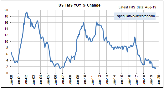
The following chart shows that the year-over-year rate of change in US True Money Supply (TMS), a.k.a. the US monetary inflation rate, made a new 12-year low in August-2019. Furthermore, the latest TMS growth figure for the US is very close to the 20-year low registered in September-2006.

Within three months of the TMS growth trough in September-2006 the first obvious crack appeared in the US mortgage debt/securitisation bubble. The crack was a trading update issued by HSBC on 5th December 2006 that noted the increasing “challenges” being faced by the Mortgage Services operations of HSBC Finance Corporation. This initial sign of weakness was followed by the appearance of a much larger crack on 7th February 2007. That’s when HSBC issued another trading update that included a profit warning due to substantially increased loan impairment charges. Within days of this February-2007 HSBC update, the shares of sub-prime lending specialists such as New Century Financial and NovaStar Financial went into freefall. This marked the beginning of the Global Financial Crisis, although the US stock market didn’t top out until October of 2007 and industrial commodities such as oil and copper didn’t top out until mid-2008.

The above-mentioned events could be relevant to the current situation, in that the recent chaos in the US short-term funding market could be the initial ‘crack’ in today’s global debt edifice. While the low rate of US monetary inflation was not the proximate catalyst for the recent chaos, there is little doubt that it played a part. Temporary issues such as a corporate tax deadline and a large addition by the US Treasury to its account at the Fed would not have had such a dramatic effect if the money supply had been growing at a ‘normal’ pace.

Generally, when the money supply is growing very slowly within a debt-based monetary system, a relatively small increase in the demand for cash can create the impression that there is a major cash shortage.

Now, if there’s one thing we can be sure of it’s that the next crisis will look nothing like the last crisis. The financial markets work that way because after a crisis occurs ‘everyone’, including all policy-makers, will be on guard against a repeat performance, making a repeat performance extremely improbable. Therefore, we can be confident that even if the recent temporary seizure of the US short-term funding market was a figurative shot across the bow, within the next couple of years there will NOT be a major liquidity event that looks like the 2007-2008 crisis. However, some sort of crisis, encompassing an economic recession, is probable within this 2-year period.

The nature of the next crisis will be determined by how the Fed reacts to signs of economic weakness and short-term funding issues such as the one that arose a few weeks ago. In particular, quick action by the Fed to boost the money supply would greatly reduce the probability of a deflation scare and greatly increase the risk that the next crisis will involve relatively high levels of what most people call “inflation”.

As an aside, there’s a big difference between the Fed cutting its targeted short-term interest rates and the Fed directly boosting the money supply. For example, in reaction to signs of stress in the financial system the Fed commenced a rate-cutting program in September of 2007, but it didn’t begin to directly pump money into the system until September of 2008. In effect, during the last crisis the Fed did nothing to address liquidity issues until almost two years after the appearance of the initial ‘crack’. As a consequence, the monetary inflation rate remained low and monetary conditions remained ‘tight’ until October of 2008 — 12 months after the start of an equity bear market and 10 months after the start of an economic recession.

Early indications are that the Fed will be very quick to inject new money this time around, partly because 2007-2008 is still fresh in the memory. These early indications include the rapidity of the Fed’s response to the effective seizure of the “repo” market last month and the fact that last Friday the Fed introduced a $60B/month asset monetisation program. This program is QE in everything except name. In other words, the Fed already has resumed Quantitative Easing even though GDP is growing at about 2%/year, the unemployment rate is at a generational low and the stock market is near an all-time high.

In summary, while it is too early to have a clear view of how the next major crisis will unfold, something along the lines of 2007-2008 can be ruled out. Also, there are tentative signs that the next crisis will coincide with or follow a period of relatively high “inflation”.

Print This Post Print This Post
The Coming Great Inflation

October 8, 2019

The events of the past 10 years have fostered the belief that central banks can create a virtually unlimited amount of money without significant adverse consequences for the purchasing power of money. Since the law of supply and demand applies to money similarly to how it applies to every other economic good, this belief is wrong. However, the ‘failure’ of QE programs to bring about high levels of what most people think of as inflation has generated a false sense of security.

The difference between money and every other economic good is that money is on one side of almost every economic transaction. Consequently, there is no single number that can accurately represent the price (purchasing power) of money, meaning that even the most honest and rigorous attempt to calculate the “general price level” will fail. This doesn’t imply that changes in the supply of money have no effect on money purchasing power, but it does imply that the effects of changes in the money supply can’t be explained or understood via a simple equation.

Further to the above, the Quantity Theory of Money (QTM) is not a valid theory. Ludwig von Mises thoroughly debunked this theory a hundred years ago and I summarised its basic flaws in a blog post two years ago. Unfortunately, QTM’s obvious inability to explain how the world works has strengthened the belief that an increase in the supply of money has no significant adverse effect on the price of money.

The relationship between an increase in the money supply and its economic effects is complicated by the fact that the effects will differ depending on how and where the new money is added. Of particular relevance, the economic effects of a money-supply increase driven by commercial banks making loans to their customers will be very different from the economic effects of a money-supply increase driven by central banks monetising assets. In the former case the first receivers of the new money will be within the general public, for example, house buyers/sellers and the owners of businesses, whereas in the latter case the first receivers of the new money will be bond speculators (Primary Dealers in the US). Putting it another way, “Main Street” is the first receiver of the new money in the former case and “Wall Street” is the first receiver of the new money in the latter case. This alone goes a long way towards explaining why the QE programs of Q4-2008 onward had a much greater effect on financial asset prices than on the prices that get added together to form the Consumer Price Index (CPI).

Clearly, the QE programs implemented over the past 11 years had huge inflationary effects, just not the effects that many people expected.

A proper analysis of the effects of the QE programs has not been done by central bankers and the most influential economists. As a result, there is now the false sense of security mentioned above. It is now generally believed that substantially increasing the money supply does not lead to problematic “inflation”, which, in turn, lends credibility to monetary quackery such as MMT (Modern Monetary Theory).

Due to the combination of the false belief that large increases in the supply of money have only a minor effect on the purchasing power of money and the equally false belief that the economy would benefit from a bit more “price inflation”, it’s a good bet that central banks and governments will devise ways to inject a lot more money into the economy in reaction to future economic weakness. As is always so, the effects of this money creation will be determined by how and where the new money is added. If the money is added via another QE program then the main effects of the money-pumping again will be seen in the financial markets, at least initially, but if the central bank begins to monetise government debt directly* then the “inflationary” effects in the real economy could be dramatic.

The difference between the direct and the indirect central-bank monetising of government debt is largely psychological, but it is important nonetheless. When the central bank monetises government debt indirectly, that is, via intermediaries such as Primary Dealers, it is perceived to be conducting monetary policy (manipulating interest rates, that is). However, when the central bank monetises government debt directly it is perceived to be financing the government, thus eliminating any semblance of central bank independence and potentially setting in motion a large decline in monetary confidence.

According to the book Monetary Regimes and Inflation, ALL of the great inflations of the 20th Century were preceded by central bank financing of large government deficits. Furthermore, in every case when the government deficit exceeded 40% of expenditure and the central bank was monetising the bulk of the deficit, a period of high inflation was the result. In some cases hyperinflation was the result.

In summary, growth in the money supply matters, but not in the simplistic way suggested by the Quantity Theory of Money. There’s a good chance that this fact will be rediscovered within the next few years, especially if legislative changes enable/force the Fed to monetise government debt directly.

*In the US this would entail the Fed paying for government debt securities by depositing newly-created dollars into the government’s account at the Fed. The government would then spend the new money. Currently the Fed buys government debt securities from Primary Dealers (PDs), which means that the newly-created dollars are deposited into the bank accounts of the PDs.

Print This Post Print This Post
Banks versus Gold

September 30, 2019

One of the past month’s interesting stock-market developments was the strength of the banking sector in both nominal terms and relative to the broad market. The strength in nominal dollar terms is illustrated by the top section of the following weekly chart, which shows that the US Bank Index (BKX) is threatening to break out to the upside. The strength relative to the broad market is illustrated by the bottom section of the chart, which reveals a sharp rebound in the BKX/SPX ratio since the beginning of September.

BKX_SPX_300919

Bank stocks tend to perform relatively well when long-term interest rates are rising in both absolute terms and relative to short-term interest rates. This explains why the banking sector outperformed during September and also why bank stocks generally have been major laggards since early last year.

Valuations in the banking sector are depressed at the moment, as evidenced by relatively low P/Es and the fact that the BKX/SPX ratio is not far from a 25-year low. This opens up the possibility that we will get a few quarters of persistent outperformance by bank stocks after long-term interest rates make a sustained turn to the upside.

On a related matter, the relative performance of the banking sector (as indicated by the BKX/SPX ratio) is an input to my “true fundamentals” models for both the US stock market and the gold market. However, when the input is bullish for one of these markets it is bearish for the other. In particular, relative weakness in the banking sector is considered to be bullish for gold and bearish for general equities.

Until recently the BKX/SPX input was bullish in my gold model and bearish in my equity model, but there was enough relative strength in the banking sector during the first half of September to flip the BKX/SPX input from gold-bullish to equity-bullish. As a consequence, during the second week of September there was a shift from bullish to bearish in my Gold True Fundamentals Model (GTFM). This shift is illustrated on the following weekly chart by the blue line’s recent dip below 50.

The upshot is that the fundamental backdrop, which was supportive for gold from the beginning of this year through to early-September, is now slightly gold-bearish. My guess is that it will return to gold-bullish territory within the next two months, but in situations like this it is better to base decisions on real-time information than on what might happen in the future.

GTFM_300919

Print This Post Print This Post
Gold and the ‘Real’ Interest Rate

September 10, 2019

[This blog post is an excerpt from a commentary published at TSI on 1st September 2019.]

It’s well known that the US$ gold price often trends in the opposite direction to the US real interest rate. This relationship is illustrated by the following chart in which the real interest rate is represented by the yield on the 10-year TIPS (Treasury Inflation Protected Security).

Notice that the 10-year TIPS yield has just gone negative and that the previous two times that this proxy for the real interest rate went negative the gold price was at an important peak. Specifically, the real interest rate going negative in August-2011 coincided with a long-term top in the gold price and the real interest rate going negative in July-2016 coincided with an intermediate-term top in the gold price. If gold tends to benefit from a lower real interest rate, why would the gold price reverse downward shortly after the real interest rate turned negative?

Considering only the 2016 case the answer to the above question seems obvious, because in July-2016 the TIPS yield reversed course and began trending upward soon after it dipped into negative territory. In other words, the downward reversal in the gold price coincided with an upward reversal in the real interest rate. However, in 2011-2012 the real interest rate continued to trend downward for more than a year after the gold price peaked.

We think there are two reasons why the gold price didn’t make additional gains in 2011-2012 after the real interest rate turned negative. First and foremost, the real interest rate is just one of several fundamental gold-price drivers (the 10-year TIPS yield is one of seven inputs to our Gold True Fundamentals Model), and after August-2011 the upward pressure exerted by a falling real interest rate was counteracted by the downward pressure exerted by other fundamental influences. Second, in August-2011 a further significant decline in the real interest rate had been factored into the current gold price.

The risk at the moment is that on a short-term basis the bullish fundamental backdrop, including the potential for a further decline in the ‘real interest rate’, is fully discounted by the current price. This risk is highlighted by the fact that the total speculative net-long position in Comex gold futures is very close to an all-time high. It is also highlighted by the fact that the RSI displayed in the bottom section of the following weekly chart is almost as high as it ever gets.

Print This Post Print This Post
The market leads the Fed…sort of

August 27, 2019

The relationship between short-term market interest rates and the interest rates set by the Fed is a complicated one. The market makes predictions about what the Fed is going to do and moves in anticipation, but at the same time the Fed’s interest-rate settings are influenced by what’s happening to market interest rates. Also, market interest rates are determined by factors other than what the Fed is doing or expected to do to its official rate targets, and as a result there are times when the market and the Fed seem to be at odds with each other.

At the moment there is no doubt that the market is leading the Fed. In particular, the Fed has been swayed towards rate cutting partly by the fact that the market has discounted rate cuts. This can be established by comparing recent movements in market interest rates with changes in the Fed’s interest rate targets, which I’ll get to shortly. It can also be established by referring to the Fed’s own statements. For example, the minutes of the July FOMC meeting included the following assessment:

Participants observed that current financial conditions appeared to be premised importantly on expectations that the Federal Reserve would ease policy to help offset the drag on economic growth stemming from the weaker global outlook and uncertainties associated with international trade as well as to provide some insurance to address various downside risks.

In essence, the Fed has admitted here to being worried that if it doesn’t cut rates like the market expects then financial conditions could get a lot worse. The implication is that if the market expects the Fed to cut rates, then to avoid disappointing the market (and risking the deterioration of financial conditions) the Fed will cut rates.

I mentioned above that the market’s current leadership can be established by comparing recent movements in market interest rates with changes in the Fed’s interest rate targets. Displayed below is a chart that makes this case. The chart shows the performance of the 2-year Treasury yield and indicates the last two interest-rate changes made by the Fed. Notice that:

1) The 2-year market interest rate began trending downward in early-November of 2018.

2) The Fed made its last rate hike during the second half of December 2018, that is, the Fed was still in rate-hiking mode six weeks after a short-term market interest rate began trending downward.

3) The Fed made its first rate cut at the end of July 2019. By that time, the 2-year market interest rate had been trending downward for almost 9 months.

UST2Y_270819

It’s reasonable to assume that additional Fed rate cuts are on the way. Bear in mind, however, that a few additional rate cuts have already been factored into market prices, so market prices won’t necessarily respond in the obvious way to future Fed rate cuts. Also bear in mind that market interest rates probably will begin trending upward while the Fed and other central banks are still in rate-cutting mode.

Print This Post Print This Post
Gold and freight rates point to an industrial metals rally

August 20, 2019

[This post is a modified excerpt from a recent TSI commentary]

Gold tends to lead the industrial metals sector at intermediate-term bottoms, that is, the US$ gold price tends to make an intermediate-term bottom and commence a multi-quarter (or multi-year) upward trend in advance of the Industrial Metals Index (GYX). Evidence of this can be found on the following chart comparison of the US$ gold price and GYX. Specific examples are:

a) The gold price reversed upward in April of 2001 and GYX did the same in November of that year.

b) The gold price reversed upward in October-November of 2008 and GYX did the same in February-March of 2009.

c) The gold price reversed upward in December of 2015 and GYX followed suit in January of 2016.

Gold’s most recent intermediate-term bottom was in August of 2018. It has since trended upward and over the past two months the trend accelerated. GYX, however, continued to make lower lows until June of 2019. It’s too early to tell if GYX’s June-2019 low was the intermediate-term variety, but regardless of whether or not it makes a new low within the next couple of months the performance of the gold market suggests that the industrial metals sector will commence an intermediate-term rally before the end of this year.

GYX_gold_200819

The Baltic Dry Index (BDI) is also predicting an industrial metals rally

The BDI is an index of dry bulk shipping rates. I generally don’t use it as an economic or a financial-market indicator, because it is influenced as much by changes in the supply of shipping capacity as by changes in the global demand for commodities. However, intermediate-term trends in the BDI often match intermediate-term trends in the Industrial Metals Index (GYX). Also, large short-term divergences between the BDI and GYX tend to be important, with one or the other subsequently making a big catch-up move in quick time.

As illustrated by the following chart, a large divergence has opened up over the past four months due to the BDI rocketing up to a 5-year high while GYX languishes near a 2-year low. This divergence could be closed by either a dramatic plunge in the BDI or a substantial rally in the industrial metals sector. I suspect it will be the latter.

GYX_BDI_200819

Print This Post Print This Post
Why a euro collapse will precede a US$ collapse

August 5, 2019

The euro may well gain in value relative to the US$ over the next 12 months, but three differences between the monetary systems of the US and the euro-zone guarantee that the euro will collapse (cease being a useful medium of exchange) before the US$ collapses.

The first difference is to do with the euro-zone system being an attempt to impose common monetary policy across economically and politically disparate countries. This is a problem. A central planning agency imposing monetary policy within a single country is bad enough because it generates false price signals and in so doing reduces the rate of economic progress. However, when monetary policy (the combination of interest-rate and money-supply manipulations) is implemented across several economically-diverse countries the resulting imbalances grow and become troublesome more quickly.

As an aside, money is supposed to be a medium of exchange and a yardstick, not a tool for economic manipulation. Therefore, it is inherently no more problematic for different countries to use a common currency than it is for different countries to use common measures of length or weight. On the contrary, a common currency makes international trading and investing more efficient. For example, there were long periods in the past when gold was used simultaneously and successfully as money by many different countries. However, if a currency can be created out of nothing then there is no getting around the requirement to have an institution that oversees/manages it. The euro therefore could not be ‘fixed’ by simply eliminating the ECB. The ECB and the one-size-fits-all monetary policy it imposes are indispensable parts of the euro-zone system.

The second difference is linked to the concept that a government with a captive central bank cannot become insolvent with respect to obligations in its own currency. For example, due to the existence of the Fed the US government will always have access to as much money as it needs to meet its obligations, regardless of how much debt it racks up. Putting it another way, should all other demand for Treasury debt disappear the Fed will still be there to monetise whatever amount of debt the US government issues. Consequently, the US government will never be forced to directly default on its debt.

It’s a different story in the euro-zone, however, because the ECB is not beholden to any one government. The provision of ECB financial support to one euro-zone government therefore requires the acquiescence of other governments. This hasn’t been a stumbling block to date and the ECB has provided whatever support was needed to prevent financially-stressed euro-zone governments from directly defaulting on their debts, but eventually a point will be reached when the governments of some countries balk at their interest rates and money being distorted as part of an effort to prop-up the finances of other governments. At that point there will be direct default on euro-zone government debt or the disintegration of the monetary union.

Once it becomes clear that direct default on government debt is a risk to be reckoned with, ‘capital’ will flee the euro-zone at a rapid rate. This is because the main (only?) reason to own government bonds is that they are supposedly risk free.

The third critical difference between the US and euro-zone monetary systems is similar to the second difference. In the US there is a symbiotic relationship between the Fed and the government, with one institution always prepared to support the other in a time of crisis. One consequence of this relationship is the impossibility — as discussed above — of the US government ever being forced to directly default on its debt. Another consequence is the impossibility of the Fed ever becoming bankrupt.

Several years ago there was much speculation that the Fed would go broke due to large losses on the bonds it was buying in its QE operations, but this speculation was never well-informed. Up until now the Fed has made out like the bandit it is on its ‘investments’ in Treasury and mortgage-backed securities, but even if these securities had collapsed in value it would not have resulted in the Fed going bust. It simply would have led to a line being added to the Fed’s balance sheet to keep the books in balance.

Again, though, it’s a different story in the euro-zone. Should the ECB begin to incur large losses on its bond portfolio there is no certainty that it would be able to keep going about its business as usual. To do so would require the support of governments/countries that never benefited from and never whole-heartedly agreed with the programs that led to the pile-up of low-quality bonds on the ECB’s balance sheet.

Summing up, the US monetary system is problematic in that it gets in the way of economic progress, but it is much less fragile than the euro-zone monetary system. That’s why the euro-zone system will be the first to collapse.

Print This Post Print This Post
The stock market’s “true fundamentals”

July 29, 2019

Below is an excerpt from a recent TSI commentary.

An investment’s true fundamentals exert pressure on its price. It is not unusual for the price to trend in the opposite direction to the fundamentals for a while, but if fundamentals-related pressure consistently acts in one direction then the price should eventually fall into line by trending in that direction. Our “true fundamentals” models for gold, the US stock market, the Dollar Index and commodities (the GSCI Commodity Index) are attempts to quantify the magnitude and direction of fundamentals-related pressure.

We have a lot of confidence in our Gold True Fundamentals Model (GTFM), because we understand why it should work and we know that it has worked well over a long enough period to rule out luck/randomness. It isn’t a short-term timing indicator, but all intermediate-term trends in the US$ gold price over the past 17 years* have been in line with the fundamentals as reflected by the GTFM. However, we have less confidence in our other true fundamentals models.

We recently have given more thought to the construction of our Equity True Fundamentals Model (ETFM), which is designed to indicate the direction and magnitude of fundamentals-related pressure on the US stock market (as represented by the S&P500 Index).

The version of the ETFM that we have been using takes into account credit spreads, the yield curve, the real interest rate (as indicated by the 10-year TIPS yield), the relative strength of the banking sector and the G2 monetary inflation rate, with the monetary inflation rate given a greater weighting than the other inputs. However, we now think it was a mistake to put extra emphasis on monetary inflation. This is because although the rate of change in the money supply is the most important long-term driver of the stock market, the time between a trend change in monetary inflation and the effects of this trend change becoming evident in the stock market is long and variable.

In an effort to make the ETFM more useful over the intermediate-term (6-18 month) periods that are of primary interest to us we have made two changes to the Model’s construction. First, we have reduced the emphasis on monetary inflation so that it has the same weighting as the Model’s other inputs. Second, the ISM New Orders Index (NOI) has been added as an input to the Model. This input will be set to 1 when the NOI is 55 or above and set to 0 when the NOI is below 55. This is being done because a) the stock market tends to perform much better when the NOI is greater than 55 than when the NOI is less than 55, and b) there is a strong tendency for the NOI to fall below 55 PRIOR to periods of significant stock market weakness, meaning that weakness in the NOI is not simply a reaction to weakness in the stock market.

The above changes didn’t make a big difference to the historical performance of the ETFM, but they did make the Model a little more sensitive to shifts in the fundamental winds. This is a plus, because the original model wasn’t sensitive enough. Note, as well, that these changes did not alter the current signal. Both the original ETFM and the new/improved ETFM switched from neutral to bearish on 19th April 2019.

Here is a chart comparing the new ETFM (the blue line) with the SPX since the start of 2002. Stock market fundamentals are considered to be bearish when the ETFM is below 50, neutral when the ETFM equals 50 and bullish when the ETFM is above 50.

The true fundamentals are equity-bearish at the moment. If they remain bearish then the price eventually WILL fall into line. Furthermore, the longer the price trends upward or stays elevated in parallel with a bearish fundamental backdrop, the faster the eventual downward price move is likely to be.

*For some of the GTFM inputs we don’t have data prior to the early-2000s, so we can’t compare the GTFM and the gold price during earlier periods.

Print This Post Print This Post