Sidebar left

Danger, data-mining ahead!

March 14, 2015

Depending on how it is manipulated, presented or interpreted, a set of data can be used to validate almost any theory or conclusion. For example, as I explained HERE, by changing the starting assumption the intraday London gold price data can be used to ‘prove’ either long-term suppression of the gold price or long-term elevation of the gold price. For another example, as I showed HERE, by cherry-picking the timescale of the data it is possible to demonstrate a relationship (in this case a relationship between the gold price and the US federal-debt/GDP ratio) that wouldn’t be apparent if a different timescale were chosen. I’ll now discuss a new example that was part of a 12th March article at Marketwatch.com.

I agree with the gist of the above-linked Marketwatch article, which is that the US stock market is stretched to the upside in a big way. However, the chart used in the article to make this point is a great example of data mining. Here is the chart.

The chart uses a 6-year rate of change (ROC) to suggest that the US stock market is almost as extended to the upside as it was at the top of the late-1990s mania, but why a 6-year ROC? Why not a 7-year or a 5-year ROC?

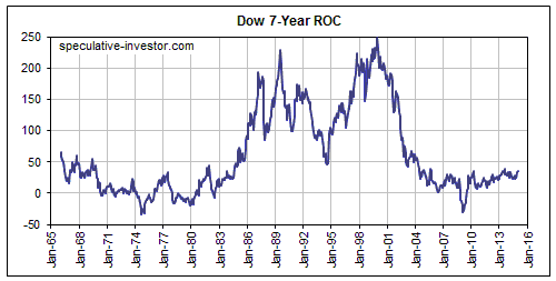
The answer is that only a 6-year ROC creates the impression that the author wants. A chart showing a 7-year ROC, for example, would actually appear to support an opposing view — that the market is not remotely stretched to the upside. As evidence I present the following chart of the Dow’s 7-year ROC. It makes the market look cheap!

Dow_7yrROC_140315

The reason that the 6-year ROC works so well to support the view that the market is dramatically extended to the upside is that the bottom of the major 2007-2009 bear market occurred exactly 6 years ago. What you are seeing in the past year’s spectacular rise in the market’s 6-year ROC is the reverse of the 2008-2009 crash. Even if the US stock market had traded sideways over the past year, the extraordinary market collapse of 2008-2009 would have ensured a moonshot in the 6-year ROC.

To put it another way, the near-vertical rise in the 6-year ROC over the past 12 months reflects the waterfall decline that happened many years ago. It does not reflect a manic upside blow-off in the current market.

If the market trades sideways from here then a year from now the 7-year ROC will show the moonshot that the 6-year ROC currently shows.

Print This Post Print This Post

Debunking the “London Bias” gold manipulation story

March 10, 2015

Some commentators who claim that the gold price has been relentlessly and successfully suppressed over many decades cite something they call the “London Bias” to support their claim. For example, a recent article by Ed Steer puts the London Bias forward as evidence of long-term price suppression. However, what the so-called “London Bias” actually proves is that some pundits who want to present evidence of unidirectional price manipulation are not above using data manipulation. As I’ve previously said, by carefully mining the data you can ‘validate’ almost any theory, even the most cockamamie one.

The idea behind the London Bias is that there is a tendency for the London PM gold fix to be lower than the London AM gold fix. The result is that you would have lost money almost every year, through gold bull markets and gold bear markets, by simply buying a position at the London gold AM Fix every day and selling the position at the London PM Fix the same day. More specifically, here’s how it’s described in the above-linked article:

…if you invested $100 at the London a.m. gold fix on January 2, 1970, sold your position at the London p.m. gold fix the same day, then reinvested the proceeds the next day at the London a.m. fix and sold at the p.m. fix once again — and did that every business day for 45 years in a row — you’d have had the magnificent sum of $12.13 in your trading account at the close of business on February 27, 2015.

…from January 2, 1975 going forward and with the exception of only a couple of years between 1975 and 1980, the yearly London price bias in gold has been negative ever since — for more than two generations. In other words, since January 2, 1975 — and with the very odd exception in the interim — the gold price has closed for a loss between the London a.m. and p.m. gold fixes for 40 years in a row regardless of what was happening in the overall gold market.

The blue line on the following sharelynx.com chart illustrates how someone would have fared if they had started with $100 and then bought/sold at the daily fixes as described above. The yellow line on the chart is the US$ gold price.

Can anyone spot the problem with the assertion that the “London Bias” proves long-term downward manipulation of the gold price?

There’s more than one problem, but the main one is that exactly the same data could be used to prove long-term UPWARD manipulation of the gold price. Here’s why:

The assumption underlying the claim that the London Bias shows relentless downward manipulation is that the London AM Fix is the right price and that downward manipulation regularly occurs between the two fixes, leading to the London PM Fix consistently being lower than it should be. This assumption is groundless. An equally valid (meaning: equally groundless) assumption would be that the London PM Fix is the right price and that upward manipulation occurs between the two fixes, leading to the London AM Fix consistently being higher than it should be. In this case the logic would be that the manipulators get to work boosting the gold price during the relatively thin trading hours, leading to an artificially high London AM fix, and that the price settles back to its correct level during the higher-volume trading hours.

Based on the second assumption, a chart could be constructed to illustrate the financial extent of the upward manipulation. The chart would assume that $100 was invested at the London PM gold fix on January 2, 1970, and sold at the London AM gold fix the following day, with the proceeds then reinvested later that day at the London PM fix, and so on, for every business day for 45 years in a row. The chart would show a huge return on investment thanks to the positive “London Bias”.

The point is that depending on your starting assumption, the same London gold-price data could be used to illustrate long-term price suppression or long-term price elevation. That is, you could assume that there is a negative bias in the PM Fix or you could just as validly/invalidly assume that there is a positive bias in the AM Fix. Alternatively, you could assume that the data is indicative of a market characteristic that has nothing to do with manipulation in either direction.

Clearly, there are people analysing the gold market who have a very strong belief that a successful, long-term price suppression scheme has been operated in this market. These people are eager to interpret data in a way that supports their belief. This is a bias that YOU should be aware of.

You can obviously choose to believe whatever you want, but if you choose to believe that powerful forces have both the motivation and the ability to suppress the gold price over the long term then it would be irrational of you to be involved in the gold market on the ‘long’ side. So, why are you?

Print This Post Print This Post

Tightening without tightening (or why the Fed pays interest on bank reserves)

March 9, 2015

When the Fed gave itself the ability to pay interest on bank reserves, it gave itself the ability to hike its targeted short-term interest rate (the Fed Funds rate) without tightening monetary conditions. In other words, it gave itself the ability to tighten monetary policy in the eyes of the world without actually tightening monetary policy. That’s one reason why it’s absurd that almost everyone involved in the financial markets is intensely focused on the timing of the Fed’s first 0.25% upward adjustment in the Funds Rate. It’s not only that a 0.25% increase is trivial, but also that, thanks to the payment of interest on bank reserves, it will almost certainly be implemented without making the monetary backdrop any less ‘accommodative’.

I’ve dealt with this topic a number of times at TSI, most recently last week. Here’s what I wrote last week under the heading “Why the Fed pays interest on bank reserves”:

“The Fed’s reason for paying interest on bank reserves has been addressed in previous TSI commentaries, but it’s an important issue and worthy of additional commentary space. That’s especially so because there is so much confusion surrounding the issue. In particular, the actual reason for the interest payments is at odds with the beliefs/assumptions of many journalists, newsletter writers and other commentators on financial matters.

Before getting to the real reason we’ll deal with the two most common false beliefs. The first of these is that the Fed started paying interest on bank reserves to prevent the commercial banks from rapidly expanding their loan books in reaction to the Fed-generated ballooning of reserves from Q4-2008 onwards. The second is that the main purpose of the interest payments is to provide financial support to the banks.

There is no truth to the first belief, because the interest payments on reserves have no effect on either the ability or the willingness of banks to make loans. The facts are that a) reserves cannot be loaned into the economy, b) there has been no relationship between US bank reserves and US bank lending for decades, and c) even if the amount of bank lending were influenced by the level of reserves as wrongly explained in outdated economics textbooks, an increase in a bank’s lending would not affect the amount of interest earned by the bank on its reserves. This last point is due to the fact that an increase in a bank’s loan book could shift reserves from the “excess” to the “required” category, but wouldn’t affect its total reserves. The Fed, however, pays interest on ALL reserves, not just “excess” reserves.

There is some truth to the second belief in that the payment of interest on reserves does provide some additional income to the banks. However, even with today’s massive reserve levels the financial impact on the banks is trivial (at the current interest rate we are talking about $6B/year of reserve-related interest payments across the entire banking industry, which is a veritable drop in the ocean).

The real reason that the Fed began paying interest on bank reserves in late-2008 was to enable it to maintain control of the Fed Funds Rate (the overnight interest rate on reserves in the inter-bank market and the primary rate targeted by Fed monetary policy) while it pumped huge volumes of dollars into the economy and into the reserve accounts of banks.

To further explain, prior to the extraordinary measures taken by the Fed in late-2008 in reaction to the global financial crisis, the Fed Funds Rate (FFR) could be adjusted by making small changes to reserves. However, after the Fed began pumping hundreds of billions of dollars of reserves into the banks, the central bank was in danger of losing its ability to control the FFR. With the commercial banks inundated with reserves and with plans in place for additional rapid monetary expansion, it became clear to the Fed that even maintaining an extremely low FFR of 0.25% was going to be impossible. Furthermore, the Fed was thinking ahead to the time when it would have to start hiking the FFR. With reserve levels way in excess of what they needed to be to set the FFR at 0.25%, even the superficially minor task of pushing the FFR back up to 0.50% would, under the Fed’s traditional way of operating, necessitate a large-enough contraction of bank reserves and the money supply to bring about another financial crisis.

Think of it this way: In October of 2008 the FFR was at 1% and the total level of US bank reserves was $315B. This suggests that $315B was consistent with an FFR of 1%. Today, the total level of bank reserves is about $2.5T. The implication is that to get the FFR back up to 1% the Fed would have to remove about $2.2T of covered money ($2.2T of money ‘backed’ by $2.2T of bank reserves) from the US economy, but there is no way that it could remove that amount without crashing the financial markets and the economy. Actually, we doubt that it could even remove a quarter of that sum without precipitating a stock market collapse and a severe recession.

This problem was obvious to Bernanke, and his solution was to pay interest on reserves. With this new tool in its kit the Fed gained the ability to set the FFR at whatever level it wanted without adjusting bank reserves and the economy-wide money supply. For example, if the Fed decides in the future that it wants the FFR at 1%, it could achieve this target by simply changing the interest rate on reserves to 1% while leaving reserve and money-supply quantities untouched.

A likely ramification of the Fed’s ability to control the FFR via the interest rate on bank reserves is that the Fed’s balance sheet has reached a permanently high plateau. There will be no traditional tightening of monetary policy in the foreseeable future.”

Print This Post Print This Post

Price manipulation is not inherently wrong

March 6, 2015

The Wall Street Journal recently broke the story that there is evidence of banks attempting to manipulate the prices of gold and other precious metals. In other breaking news, evidence has emerged that the Earth revolves around the sun, that the Pope is Catholic, and that bears sometimes defecate in the woods.

Kid Dynamite is happy that regulators are finally taking note, as he has studiously documented evidence of upward manipulation of the gold price for years, to seemingly no avail. Actually, what he has done is show that the same sorts of price/volume changes in the gold futures market that are routinely put forward to ‘prove’ downward manipulation can also be used to ‘prove’ upward manipulation. By carefully mining the data it is possible to validate almost any theory, even a ridiculous one.

In any case, my purpose in writing this post is not to delve into the murky world of gold-market manipulation theories, but to point out that “manipulation” is often a poorly chosen word. To manipulate is to skillfully influence or change to one’s advantage. As such, manipulation could be a legitimate business practice. In the financial markets, for example, there is generally nothing ethically wrong with a private (meaning: non-government) trader buying or selling with the aim of influencing the price. Trading with the express purpose of driving the price up or down will usually not lead to a profit, but one person’s reasons for buying or selling are not the business of anyone else.

“Manipulation” therefore doesn’t imply “wrong” or “unfair”. Other words must consequently be used to distinguish between the manipulation that could form part of legitimate business practice and the manipulation that involves a violation of property rights and/or a breach of fiduciary duty. Fraud is a good word. For example, if banks siphon money from their customers to themselves by front-running their customers’ orders or by misusing information given to them in confidence by their customers, as was alleged in a lawsuit filed by a jewellery firm last November, then the banks are engaging in fraud, not just manipulation.

Manipulation is not inherently wrong. Fraud, by definition, is.

Print This Post Print This Post

Total guesswork regarding China’s gold holdings

March 3, 2015

Last year I noticed an article by Alasdair Macleod containing an estimate that China (meaning: China’s government) had accumulated 25,000 tonnes of gold between 1983 and 2002. I would say that this estimate was based on rank speculation, but that would be doing an injustice to rank speculation. It is more like total guesswork. It is largely based on assumptions that are either obviously wrong or that have no supporting evidence. I bring this up now because it looks like the 25,000-tonne figure that was plucked out of the air by Mr. Macleod last year is on its way to becoming an accepted fact in some quarters. For example, it forms the basis of a new estimate that China’s government now has 30,000 tonnes of gold.

Here’s the supply/demand table from Mr. Macleod’s article. The top section of the table purports to show the total amount of gold supply that was created during 1983-2002 and the bottom part of the table shows guesses on how this supply was distributed around the world. If the top section contains figures that are either based on false logic or completely lacking in evidentiary support, which is definitely the case, then the figures in the bottom section are irrelevant. That’s because the figures in the bottom section have been chosen so that they add up to the figures in the top section.

Gold Supply 31102014.jpg

The most obvious error is the assumption that because gold was in a secular bearish trend during 1983-2002, there was no net buying of gold within the Western world over this entire period. Instead, it is assumed that not a single ounce of the 42,000 tonnes of gold that was produced by the global mining industry during this period was bought by anyone in Europe or North America. It is also assumed that the “West” reduced its collective gold holdings by 15,000 tonnes during the period.

This takes me back to a point I’ve made many times in the past in relation to similar misguided analyses of the gold market. The point is that the quantity of gold (or anything else, for that matter) transferred from sellers to buyers says nothing about price. The corollary is that price says nothing about how much was transferred.

The fact that the price of gold was making lower-highs and lower-lows during 1983-2002 does not imply that less gold was bought in the “West”. In fact, it’s just as likely that the opposite was the case — that sellers, including gold miners, had to lower their asking prices to account for the reduced eagerness to own gold and sell what they wanted to sell. It’s therefore quite possible that there was no net “Western” divestment of gold and that all of the gold produced during 1983-2002 was sold in the “West”.

I’m not claiming that all of the gold produced by the mining industry during 1983-2002 was sold to Western buyers, but such a claim would be no more ridiculous than Mr. Macleod’s guess that none of the newly mined gold was sold to Western buyers.

I’ll end this discussion by reiterating that even if you have enough information to do the additions accurately (which nobody ever will, by the way), there is no point adding up the amounts of gold being transferred between sellers and buyers in different geographical regions or different parts of the market. At least, there’s no point if explanations of past price movements and clues regarding future price movements are what you want. There could, however, be a point if your aim is to find a justification for being bullish no matter what’s happening in the world.

I should probably do a separate blog post titled “Total guesswork regarding China’s gold strategy”.

Print This Post Print This Post

Revisiting the global boom/bust indicator

March 2, 2015

This post is a slightly-modified excerpt from a recent TSI commentary.

Gold tends to fare relatively poorly during the booms, which are periods when confidence in central banks and the economy rises at the same time as mal-investment is setting the stage for a future period of great hardship, and fare relatively well during the busts, which are periods when the investing mistakes of the past come to the fore. Be aware, though, that the word “relatively” is critical to understanding gold’s relationship to the boom/bust cycle, because the relationship often doesn’t apply to gold’s performance in US$ terms.

To show what I mean I’ll begin with a chart of the US$ gold price covering the past 20 years. There were booms and busts during this period that are not evident on this chart. In particular, 2001-2011 contained huge booms and busts, and yet the gold price trended steadily upward throughout. How could this be?

Armed with the 20/20 vision called hindsight, analysts who did not expect the large 2001-2011 rise in the US$ gold price and who were completely baffled by it while it was happening eventually came up with explanations/rationalisations for it. Some of the most popular explanations involved identifying other things that trended relentlessly upward during the 2001-2011 period and assuming that the rise in this other ‘thing’ caused the rise in the gold price.

For one example, prior to the past two years it was possible to create a chart that demonstrated a strong positive correlation between the gold price and the US federal-debt/GDP ratio, provided that you started your chart in the early-2000s (starting the chart much earlier would reveal that there was actually no consistent relationship between gold and the debt-GDP ratio*). For a second example, prior to the past two years it was also possible to create a chart that demonstrated a strong positive correlation between the gold price and the US Monetary Base, again provided that you started your chart in the early-2000s (as is the case with the supposed relationship between the gold price and the debt/GDP ratio, the relationship between gold and the US Monetary Base disappears when a longer-term view is taken**). For a third example, some analysts belatedly linked the 2001-2011 upward trend and subsequent downward reversal in the gold price to the goings-on in the “emerging” economies. This explanation is a top contender for the “grasping at straws” award, since, unlike the linking of gold to the debt/GDP ratio or the Monetary Base, it has absolutely no logical basis. Not only that, but the net buying of gold by India, China and Russia, the three most important “emerging” markets, was greater when the gold price was trending downward during 2012-2014 than when the gold price was trending upward during 2009-2011.

As intimated in the opening paragraph, the overarching driver of the gold price (the boom/bust cycle) only becomes clear when gold’s RELATIVE performance is viewed. More specifically, understanding why gold did what it did over a long period requires looking at how it performed relative to industrial metals.

The fact is that the gold market is generally weak relative to the industrial metals markets during the boom phase of the inflation-fueled, central-bank-sponsored boom/bust cycle and strong relative to the industrial metals markets during the bust phase of the cycle. In other words, the gold/GYX ratio (gold relative to the Industrial Metals Index) tends to fall during the booms and rise during the busts. This is due to gold’s historical role as a store of purchasing power and a hedge against uncertainty.

By shading the bust periods in grey, I’ve indicated the global booms and busts on the following chart of the gold/GYX ratio. During the 20-year period covered by this chart there were four busts: the multiple crises of 1997-1998 (the Asian financial crisis, the Russian debt default and the LTCM blowup), the recession of 2001-2002 that followed the bursting of the NASDAQ bubble, the global financial crisis and “great recession” of 2007-2009, and the euro-zone sovereign debt and banking crisis of 2011-2012. On a relative basis gold was clearly very strong during the busts and generally drifted lower during the intervening periods when confidence was rising.

Note that monetary-inflation-fueled booms tend to fall apart more quickly than they build up, which is why the rising trends in the gold/GYX ratio tend to be shorter and steeper than the falling trends.

When gold/GYX made a new multi-year low last October it indicated that the global boom was going to extend into 2015, which it has certainly done. However, gold/GYX’s sharp rise from its November-2014 low to its January-2015 high could be an early warning that the boom is on its last legs.

Gold/GYX has pulled back far enough from its January peak that a solid break above that peak would now be a clear signal that the boom has ended or is about to end.

*Refer to https://tsi-blog.com/2014/09/does-the-debtgdp-ratio-drive-the-gold-price/ for additional information

**Refer to https://tsi-blog.com/2014/10/does-the-monetary-base-drive-the-gold-price/ for additional information

Print This Post Print This Post

Strange Bedfellows

February 28, 2015

Here’s a chart illustrating a relationship I can’t explain. The chart shows that over the past three years, every short-term trend and almost every ripple in Japan iShares (EWJ) has been mimicked by London’s FTSE Index.

EWJ_FTSE_3yr_280215

I have no idea why there has been such a strong positive correlation between the Japanese stock market’s performance in US$ terms and the UK stock market’s performance in Pound terms. Furthermore, it’s not like the relationship is a peculiarity of the past 3 years, as the following chart shows that it goes back at least 10 years.

EWJ_FTSE_10yr_280215

Print This Post Print This Post

Economics Myths

February 27, 2015

This is an update of something I wrote 12 months ago. I began the original piece with the goal of explaining where I agreed and disagreed with an article by Cullen Roche titled “The Biggest Myths in Economics“, but I ended up referring to the Roche article within the context of my own list of economics myths. Here’s my list. Unfortunately, it is by no means comprehensive.

Myth #1: Banks “lend reserves”

This is the second myth in the Roche article. He is 100% correct when he states:

…banks don’t make lending decisions based on the quantity of reserves they hold. Banks lend to creditworthy customers who have demand for loans. If there’s no demand for loans it really doesn’t matter whether the bank wants to make loans. Not that it could “lend out” its reserve anyhow. Reserves are held in the interbank system. The only place reserves go is to other banks. In other words, reserves don’t leave the banking system so the entire concept of the money multiplier and banks “lending reserves” is misleading.

Reserves held at the Fed cannot under any circumstances be loaned into the economy, and any analyst who takes a cursory look at historical US bank lending and reserves data will see that there has been no relationship between bank lending and bank reserves for at least the past few decades. I live in hope that the economics textbooks will eventually be updated to reflect this reality, although compared to some of the other errors in the typical economics textbook this one is minor.

Myth #2: The Fed’s QE boosts bank reserves, but doesn’t boost the money supply

Anyone who believes that the Fed’s QE adds to bank reserves but not the money supply does not understand the mechanics of the asset monetisation process. It’s a fact that for every dollar of assets purchased by the Fed as part of its QE, one dollar is added to bank reserves at the Fed and one dollar is added to demand deposits within the economy (the demand deposits of the securities dealers that sell the assets to the Fed). Refer to “How the Fed’s QE creates money” for more details.

A related myth is that the Fed is powerless to expand the money supply if the commercial banks aren’t expanding their loan books. It is certainly the case that prior to 2008 almost all new money was loaned into existence by commercial banks, but this wasn’t because the Fed didn’t have the ability to directly expand the money supply. From the Fed’s perspective, there was simply no reason to use its direct money-creation ability prior to September of 2008.

Myth #3: The US government is running out of money and must pay back the national debt

This is the third myth in the Roche article. The reality is that no government will ever run short of money as long as its spending and debt are denominated in a currency it can create, either directly or indirectly (via a central bank). The lack of any normal financial limit on the extent of government spending and borrowing is a very bad thing.

Myth #4: The federal debt is a bill that each citizen is liable for

This is similar to the fourth myth in the Roche article, although the Roche explanation contains statements that are either misleading or wrong. Before I take issue with one of these statements, I note that a popular scare tactic is to divide the total government debt by the population to come up with a figure that supposedly represents a liability of every man, woman and child in the country. For example, according to http://www.usdebtclock.org/ the US Federal debt amounts to about $57,000 per citizen or $154,000 per taxpayer. For most people this is a lot of money, but it doesn’t make sense to look at the government debt in this way. Rightly or wrongly, the government’s debt will never be paid back. It will grow indefinitely, or at least until it gets defaulted on. There are negative indirect consequences of a large government debt, but it is wrong to think of this debt as something that will have to be repaid by current taxpayers or future taxpayers.

The Roche statement that we take issue with is: “…the government doesn’t necessarily reduce our children’s living standards by issuing debt. In fact, the national debt is also a big chunk of the private sector’s savings so these assets are, in a big way, a private sector benefit.

The government doesn’t create wealth and therefore cannot possibly create real savings. To put it another way, real savings cannot be created out of thin air by the issuing of government debt. What happens when the government issues debt is that savings are diverted from the private sector to the government. In any single instance the government will not necessarily use the savings less efficiently than they would have been used by the private sector, but logic and a veritable mountain of historical evidence tells us that, on average, government spending is less productive than private-sector spending. In fact, government spending is often COUNTER-productive.

Myth #5: QE is not inflationary

My fifth myth is the opposite of Cullen Roche’s fifth myth. According to Roche, it’s a myth that QE is inflationary. His argument:

Quantitative Easing (QE) … involves the Fed expanding its balance sheet in order to alter the composition of the private sector’s balance sheet. This means the Fed is creating new money and buying private sector assets like MBS or T-bonds. When the Fed buys these assets it is technically “printing” new money, but it is also effectively “unprinting” the T-bond or MBS from the private sector. When people call QE “money printing” they imply that there is magically more money in the private sector which will chase more goods which will lead to higher inflation. But since QE doesn’t change the private sector’s net worth (because it’s a simple swap) the operation is actually a lot more like changing a savings account into a checking account. This isn’t “money printing” in the sense that some imply.

There is a lot wrong with this argument. For starters, in one sentence he says “when people call QE “money printing” they imply that there is magically more money in the private sector“, and yet in the preceding sentence he states that the Fed adds new money to the economy when it purchases assets. So, there is no need for anyone to imply that there is “magically more money” as a result of QE, because, as Mr. Roche himself admits, the supply of money really does increase as a result of QE. (As an aside, recall that in the previous myth Mr. Roche implied that the government could magically increase the private sector’s savings by going further into debt.)

The instant after the Fed monetises some of the private sector’s assets there will be more money, the same quantity of goods and less assets in the economy. Until the laws of supply and demand are repealed this will definitely have an inflationary effect, because there will now be more money ‘chasing’ the same quantity of goods and a smaller quantity of assets. However, the details of the effect will be impossible to predict, because the details will depend on how the new money is used. We can be confident that the initial effect of the new money will be to elevate the prices of the sorts of assets that were bought by the Fed, but what happens after that will depend on what the first receivers of the new money (the sellers of assets to the Fed) do, and then on what the second receivers of the new money do, and so on. It’s a high-probability bet that the new money will eventually work its way through the economy and lead to the sort of “price inflation” that the average economist worries about, but this could be many years down the track. This type of “price inflation” problem hasn’t emerged yet and probably won’t emerge this year, but the price-related effects of the Fed’s QE should be blatantly obvious to any rational observer. One of the most obvious is that despite being 7 years into a so-called “great de-leveraging”, the US stock market recently traded at the second-highest valuation in its history (by multiple valuation measures with good long-term track records, it was only near the peak of the dot.com/tech/telecom bubble that the market was more expensive).

Myth #6: Hyperinflation can be caused by factors unrelated to money

This is almost the opposite of Roche’s sixth myth. He argues that hyperinflation is not caused by “money printing”, but is, instead, caused by events such as the collapse of production, the loss of a war, and regime change or collapse.

While the events mentioned by Cullen Roche tend to precede hyperinflation, they only do so when they prompt a huge increase in the money supply. To put it another way, if these events do not lead to a huge increase in the money supply then they will not be followed by hyperinflation.

The fact is that hyperinflation requires both a large increase in the supply of money and a large decline in the desire to hold money. Over the past several years there was a large increase in the US money supply, although certainly not large enough to cause hyperinflation, along with an increase in the desire to hold money that has partially offset the supply increase.

Myth #7: Increased government spending and borrowing drives up interest rates

This is almost the same as Roche’s seventh myth. An increase in government spending and borrowing makes the economy less efficient and causes long-term economic progress to be slower than it would have been, but it doesn’t necessarily drive up the yields on government bonds. This is especially so during periods when deep-pocketed price-insensitive bond buyers such as the Fed and other central banks are very active in the market.

Myth #8: The Fed provides a net benefit to the US economy

It never ceases to amaze me that people who fully comprehend why it would make no sense to have central planners setting the price of eggs believe that it is a good idea to have central planners setting the price of credit.

The real reason for the Fed’s creation is of secondary importance. No conspiracy theory is required, because the fact is that even if the Fed were established with the best of intentions and even if it were managed by knowledgeable people with the best of intentions, it would be a bad idea. This is because the Fed falsifies the price signals that guide business and other investment decisions.

Myth #9: Different economic theories are needed in different circumstances

The myth that different times call for different economic theories, for example, that the valid theories of normal times must be discarded and replaced with other theories during economic depressions, has been popularised by Paul Krugman. However, he has only gone down this track because he is in the business of promoting an illogical theory.

A good economic theory will work, that is, it will explain why things happened the way they did and provide generally correct guidance about the likely future direct and indirect effects of current actions, under all circumstances. It will work for an individual on a desert island, it will work in a rural village and it will work in a bustling metropolis. It will work during periods of strong economic growth and it will work during depressions.

Myth #10: The economy is driven by changes in aggregate demand

The notion that the economy is driven by changes in aggregate demand, with recessions/depressions caused by mysterious declines in aggregate demand and periods of strong growth caused by equally mysterious increases in aggregate demand, is the basis of the Keynesian religion and the justification for countless counter-productive monetary and fiscal policies.

Rising consumption is an effect, not a cause, of economic growth. More specifically, an increase in consumption is at the end of a three-step sequence that has as its first two steps an increase in saving/investment and an increase in production. For higher consumption to be sustainable it MUST be funded by an increase in production. By the same token, an artificial boost in consumption (demand) caused by monetary and/or fiscal stimulus will be both unsustainable and wasteful. It is like eating the seed corn — it helps satisfy hunger in the short-term, but ultimately results in less food.

A related point is that there has never been “insufficient aggregate demand” and there never will be “insufficient aggregate demand”, at least not until everyone has everything they want. In the real world, the ability to demand/consume is limited only by the ability to produce the right things. Consequently, what is typically diagnosed as “insufficient aggregate demand” is actually insufficient production, or, to put it more accurately, a production-consumption mismatch resulting from the economy becoming geared-up to produce too many of some things and not enough of others.

Myth #11: Consumer spending is about 70% of the US economy

This and the previous myth are related, in that the wrong belief that consumer spending is 65%-70% of the total economy lends credence to the wrong belief that economic growth is caused by increasing consumption.

Consumer spending involves taking something out of the economy, so it is mathematically impossible for consumer spending to be more than 50% of the economy. Consumer spending does account for about two-thirds of US GDP, but that’s only because the GDP calculation omits about half the economy (GDP leaves out all intermediate stages of production). Due to the fact that the GDP calculation includes 100% of consumer spending and only about half the total economy, 35% would be a more accurate estimate of US consumer spending as a percentage of the total US economy.

Myth #12: Inflation is not a problem unless the CPI is rising quickly

The conventional wisdom that “inflation” is not a major concern unless the CPI is rising quickly is not only wrong, it is dangerous. It is wrong because monetary inflation affects different prices in different ways at different times, but the resultant price distortions always end up causing economic problems. It is dangerous because it leads people to believe that there are no serious adverse consequences of central-bank money conjuring during periods when the prices included in the CPI are not among the prices that are being driven skyward by the expanding money supply.

Myth #13: Interest rates are the price of money

People who comment on economics and the financial markets often state that the interest rate is the price of money. This is wrong.

The price of money is what money can buy. For example, if an apple is sold for $1, then the price of a unit of money (one dollar) in that transaction is one apple. To put it another way, the price of money is the purchasing power of money. It rises and falls in response to changes in the supply of and the demand for money and changes in the supply of and the demand for the things for which money is traded.

The interest rate, on the other hand, can be correctly viewed as either the price of credit or the price of time. In the case where there is no risk of default and no risk of purchasing-power loss due to inflation, the interest rate will be determined by the perceived benefit of getting money immediately versus getting it at some future time.

Myth #14: Policymakers should try to boost employment and real wages

The conventional wisdom that policies should be put in place to boost employment and real wages confuses cause and effect. Just as rising consumption is an effect, not a cause, of economic growth (refer to Myth #10), rising employment and real wages are effects of economic growth. For example, the rebound in the US economy from its 2009 trough wasn’t unusually weak due to the unusually slow recovery in employment, there was, instead, an unusually slow recovery in employment because the economy’s rebound was much weaker than normal.

Consequently, the best way to get rising employment and real wages is to remove the obstacles to economic progress. The government and the central bank are by far the biggest obstacles, so minimising the government and eliminating the central bank would be effective.

Print This Post Print This Post

Volcker’s Undeserved Reputation

February 24, 2015

There is a big difference between the general perception of Paul Volcker’s performance as Fed Chairman and his actual performance.

Volcker is generally considered to have been a hard-nosed inflation-fighter, but based on the annual rate of growth in US True Money Supply (TMS) he currently holds the record as the most inflationary Fed Chairman of the past 60 years. Ben Bernanke is in second place, followed by Arthur Burns (Fed chief during most of the 1970s), Alan Greenspan, and then William McChesney Martin (Fed chief during the 1950s and 1960s). Refer to the following bar chart for specific details.

Note that the chart omits George Miller, who was Fed Chairman for only 17 months during 1978-1979, and Janet Yellen, who hasn’t been in the job for long enough to establish a proper record.

Volcker is widely regarded as a hard-nosed inflation fighter simply because a commodity-price collapse got underway within 6 months of his August-1979 appointment as Fed Chairman. However, thanks to the steep decline in the money-supply growth rate that began in late-1977 and the fact that the US had spent the 6 months prior to August-1979 in monetary DEFLATION (refer to the following TMS chart for details), a commodity price collapse was ‘baked into the cake’ prior to Volcker taking the top job at the Fed .

If a drover’s dog had been appointed Fed chief in August of 1979, the dog would now have the credit for killing inflation. The reason is that by that time “inflation” (using the popular, albeit wrong, meaning of the word) was already dead. Commodity speculators just hadn’t realised it yet, perhaps because they were distracted by what was happening in the Middle East.

In the early 1980s, with a commodity bubble having recently burst and with both stocks and bonds having historically low valuations, the stage was set for the great ‘Volcker inflation’ to boost the prices of financial assets.

Print This Post Print This Post

Can the Bear get much worse?

February 23, 2015

First Mining Finance Corp. is the new venture of Keith Neumeyer, the founder of First Quantum Minerals (FM.TO) and First Majestic Silver (FR.TO). I don’t yet have an opinion on the new company’s speculative/investment merits, because I haven’t yet taken a close look at its assets and because I won’t know its market valuation until after it IPOs sometime in the next couple of months (almost any company can be a good investment or a bad investment, depending on the market price of its shares). The reason I’m mentioning the company in this post is that I stole the following chart from its corporate presentation.

Regardless of whether or not the market ends up pricing First Mining Finance Corp. shares at an attractive level, the following chart of the TSX Venture Exchange Composite Index (a proxy for the junior end of the mining sector) suggests that junior Canadian resource shares are now collectively being priced at close to their most attractive levels ever. I didn’t expect that the buying opportunity would get this good, but there it is.

Large profits are likely to be made by speculators who accumulate financially-sound junior resource stocks with economic mineral deposits over the next few months and are prepared to hold for at least a year.

CDNX_230215

Print This Post Print This Post

Why the next stock market collapse won’t be a “black swan”

February 20, 2015

In finance, a “black swan” is a major event that ‘comes out of the blue’. In a 13th February article in the New York Times, Mark Spitznagel succinctly explains why a large stock market decline is coming to the US and why it won’t be a black swan.

The coming large stock market decline won’t be a black swan because, while its timing is unpredictable, the market’s valuation has reached a level that has always been the precursor to a large decline. This point is made in the above-linked article via a chart of Tobin’s Q Ratio (re-produced below), which is similar to a price-to-book ratio for the entire stock market. Since 1900, Tobin’s Q Ratio was only higher than its current level near the peak of the dot-com bubble.

QRatio_Spitz_190215

More information on Tobin’s Q Ratio, including the following long-term chart comparison of the “inflation”-adjusted S&P Composite Index and the Q Ratio, can be found in Doug Short’s article posted HERE.

QRatio_190215

Why does the Q Ratio periodically get so far out of whack? After all, shouldn’t a market economy contain negative feedback that prevents such massive oscillations?

The answer is that we aren’t dealing with a free market; we are dealing with a market subject to intervention by non-market forces, chief among them over the past several decades being the central bank. As neatly explained by Mr. Spitznagel:

When rates are naturally low, caused by an abundance of patient savers, businesses have the incentive to spend on investment and production; this creates a negative feedback on the ratio. When they are artificially low, and savers are impatiently leveraging, businesses instead have the incentive to spend on stock buybacks and dividends in order to attract the investors who yearn for yields beyond what the artificially distorted market is offering. This drives the ratio, and stock markets, ever higher. Bubbles are not natural and inevitable.

Furthermore, it’s not as if the Q Ratio has somehow been skewed such that it is painting a far different picture from other value-based indicators with good long-term track records. For example, the message of the Q Ratio is echoed by the messages of the Shiller P/E ratio (the Cyclically-Adjusted P/E, or CAPE) and the Wilshire5000/GDP ratio, the latter of which is depicted below. Notice that the Wilshire5000/GDP ratio is now about 15% higher than it was at the 2007 major peak, although, like Tobin’s Q Ratio, it hasn’t made it back to the all-time high reached at the crescendo of the dot-com bubble.

wilshire_GDP_190215

The point is that nobody should be surprised when the next bear market in US equities turns out to be of historic proportions. But of course, almost everyone will be surprised.

Print This Post Print This Post
How the Fed’s QE creates money

February 16, 2015

One of the most persistent beliefs in the world of economics today is that the Fed’s QE (Quantitative Easing) adds to bank reserves but does not directly boost the US money supply. The popularity of this belief is remarkable considering that anyone who bothers to do a few simple monetary calculations will quickly see that it is completely wrong. The fact of the matter is that every dollar of QE adds one dollar to bank reserves AND one dollar to the economy-wide money supply.

Before I briefly explain the process by which the Fed’s QE injects money directly into the economy, I’ll show the simple calculations that anyone commenting on monetary matters should do. The calculations are based on the fact that new US dollars can only be legally created by the commercial banking system and the Fed.

The commercial banks create money when they make loans or monetise assets. More generally, commercial banks create money via an increase in credit. The increase in total Bank Credit over a period is therefore a rough, but reasonable, estimate of the MAXIMUM amount of new money that could have been created by the commercial banking system over the period. Note that changes in Bank Credit are recorded in the Fed’s H.8 Release.

At the end of August-2008, which was just prior to the start of the Fed’s first QE program, total Bank Credit was around $9T (9 trillion dollars). At the end of January this year it was around $11T. This means that the commercial banks have collectively created a maximum of 2 trillion new dollars since August-2008. They might have created significantly less than 2 trillion new dollars, but they have not created significantly more than that.

Let’s now consider what happened to US True Money Supply (TMS) over the same period, noting first that TMS is the sum of physical currency in circulation, demand deposits at private depository institutions and savings deposits at private depository institutions. TMS only counts money within the economy. It does not count bank reserves.

From the end of August-2008 through to the end of January-2015, TMS increased by $5.1T. Since we know that commercial banks created a maximum of $2T over this period, we know that at least $3.1T came from somewhere other than the commercial banking system. And since we also know that new US dollars can only be created by the commercial banks and the Fed, we therefore know that the Fed’s QE must have directly created a minimum of 3.1 trillion new dollars.

I’ll now move along to the process by which the Fed’s QE boosts the money supply.

The first point that must be understood is that the Fed conducts its asset purchases and sales via Primary Dealers (PDs). In many cases the PDs are banks, but in such cases the PD part of the business is separate. Of particular relevance, the PD part of one bank will maintain demand deposit accounts at other banks and these demand accounts receive the payments when the Fed buys assets from the PD.

Next, for the sake of explanation let’s assume that PDA (Primary Dealer A) is a subsidiary of Bank A and maintains a demand deposit at Bank B. When PDA sells assets to the Fed, the Fed deposits payment in the form of newly-created dollars into PDA’s demand account at Bank B. Since customer deposits are liabilities of banks, if the process ended with the Fed depositing new dollars in PDA’s account at Bank B it would increase Bank B’s liabilities by the amount of the deposit. To make the process balance-sheet-neutral for Bank B and the banking system as a whole, the same amount that was deposited in PDA’s demand account at Bank B is added to Bank B’s reserves at the Fed. In effect, the Fed adds dollars to demand accounts within the economy that are covered by reserves at the Fed.

One dollar of QE therefore involves one dollar being added to a demand deposit within the economy (part of the money supply) and one dollar being added to a reserve account at the Fed.

Let’s now take a look at how the mechanics of the QE process as outlined above explain the change in the money supply since the beginning of the Fed’s QE back in 2008.

I mentioned above that if we only consider the amount of money created by the commercial banks then we find that at least $3.1T is unaccounted for. If my analysis is correct then the Fed’s QE must have directly added a minimum of $3.1T to the money supply.

A very rough approximation of the amount of new money added by the Fed over a period is the change in Reserve Bank Credit, which can be determined by referring to the Fed’s H.4.1 Release. The increase in Reserve Bank Credit from August-2008 until January-2015 was $3.6T, which is in the right ballpark. However, a more accurate calculation of the amount of new money created by the Fed can be done using the knowledge that a) each new dollar added to the economy by the Fed will be associated with one dollar of additional reserves, and b) reserves at the Fed will remain at the Fed unless they are removed by the Fed or they are converted into physical notes/coins (in response to increased demand by the public for physical currency). The amount of money created by the Fed since August-2008 should therefore be equal to the net increase in Non-Borrowed Reserves at the Fed plus the increase in Physical Currency in Circulation over the same period.

The figure comes to $3.4T, which is roughly what it needs to be to explain the increase in True Money Supply.

A separate question is: Why hasn’t the large Fed-promoted increase in the US money supply led to a substantial increase in the ‘general price level’?

This is a question for another time as this post is already too long, but suffice to say right now that:

1) There has been a significant increase in the ‘general price level’ as a result of the monetary inflation, just not as significant as would normally be the case.

2) The general price level’s smaller-than-normal response to the money-supply increase of the past several years is probably related to the Fed’s abnormally-large role in the money-creation process. During more normal (pre-2008) times, almost all new money is created by the commercial banks. Consequently, the first receivers of the new money tend to be within the ‘general public’ (home buyers/sellers, private businesses, etc.). However, during the period since August-2008 about two-thirds of all new money has been directly created by the Fed. This means that the first receivers of most of the new money have been bond speculators, and that the second, third, fourth and fifth receivers of the new money have probably been bond speculators or stock speculators.

In conclusion, when I say that the Fed’s QE directly boosts the money supply I’m not stating an opinion or giving my interpretation of how the monetary system works. I’m stating a fact.

Print This Post Print This Post