Sidebar left

Charts of interest

May 18, 2016

Here are a few of the charts that currently have my attention.

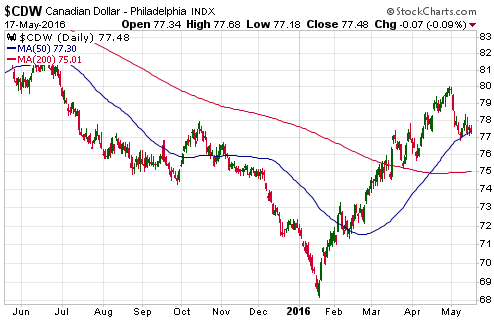
1) The Canadian Dollar (C$). The C$ usually trends with commodity prices, so the owners of commodity-related investments should view the C$’s recent performance as a warning shot.

C$_170516

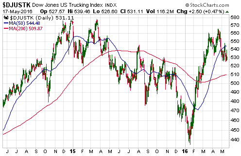
2) The Dow Trucking Index. The huge rebound in this index from its January low is a little strange given the evidence that the trucking industry is in a recession that is a long way from complete.

DJUSTK_170516

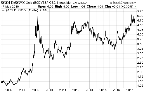
3) The gold/GYX ratio (gold relative to industrial metals). This ratio is a boom-bust indicator and an indicator of financial crisis. In January of this year it got almost as high as its 2009 peak (its all-time high) and remains close to its peak, so its current message is that an economic bust is in progress and/or that a financial crisis is unfolding.

I think that gold will weaken relative to industrial metals such as copper for at least 12 months after the stock market reaches a major bottom, but in the meantime a new all-time high for the gold/GYX ratio is a realistic possibility.

gold_GYX_170516

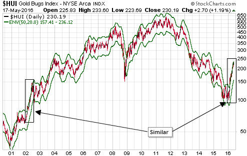
4) The HUI with a 50/20 MA envelope (a 20% envelope around the 50-day moving average). Although I think that the current situation has a lot more in common with the first half of 2001 than the first half of 2002, the way the HUI has clung to the top of its MA envelope over the past few months looks very similar to what it did during the first half of 2002.

HUI_MAenv_170516

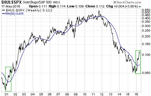
5) The HUI/SPX ratio (the gold-mining sector relative to the broad US stock market). Over the course of this year to date the performance of the HUI/SPX ratio has been similar to its performance from November-2000 through to May-2001.

HUI_SPX_170516

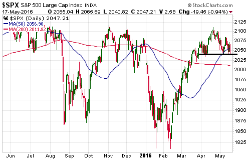
6) The S&P500 Index (SPX). The SPX is standing at the precipice. The probability of a crash within the next two months is almost zero, but a tradable decline looks likely.

SPX_170516

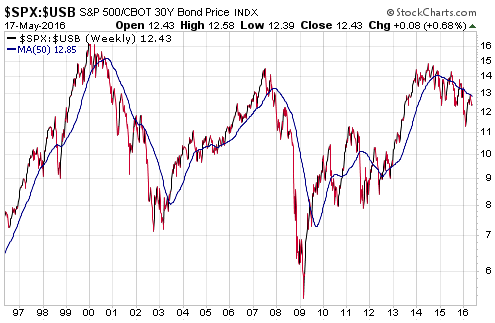
7) The SPX/USB ratio (the broad US stock market relative to the Treasury Bond). Notice the difference between performance following the 2014 peak and performance following the major peaks of 1999-2000 and 2007.

SPX_USB_170516

Print This Post Print This Post

A simple relationship between gold, T-Bonds and the US$

May 16, 2016

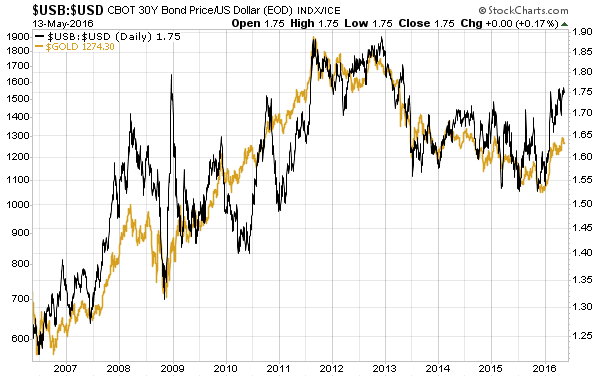
A TSI subscriber recently reminded me of an indicator that I regularly cited in ‘the old days’ but haven’t mentioned over the past few years. The indicator is the bond/dollar ratio (the T-Bond price divided by the Dollar Index).

The bond/dollar ratio not only does a reasonable job of explaining trends in the US$ gold price, it does a much better job of explaining trends in the US$ gold price than does the Dollar Index in isolation. As evidence, here is a chart comparing the bond/dollar ratio (USB/USD) with the gold price followed by a chart comparing the reciprocal of the Dollar Index with the gold price. The first chart indicates a closer relationship than the second chart.

USBUSD_gold_160516

recipUS$_gold_160516

From a practical speculation standpoint, an inter-market relationship is most useful when it has a lead-lag aspect, that is, when one market usually reverses trend in advance of the other market. Unfortunately, that’s not the case here, in that gold and the bond/dollar ratio usually change direction at around the same time. For example, they both reversed upward late last year. The simple relationship does, however, help foster an understanding of why the gold price does what it does.

At the risk of casting aspersions on a good manipulation story, I note that the first of the above charts points to the US$ gold price generally having done what it should have done each step of the way over the past 10 years.

Print This Post Print This Post

Consequences of a Trump Presidency

May 10, 2016

Now that Donald Trump has managed — against the odds and much to the chagrin of ‘war party’ loyalists — to become the Republican Party’s nominee in the Presidential election to be held in November, it is worth considering what a Trump presidency would mean. Here are some preliminary thoughts.

First, I expect that with the Primary campaign out of the way Trump will start to downplay some of the most hare-brained ideas he has spouted to date, such as building a giant wall along the US-Mexico border and banning all Muslims from entering the US. It’s unlikely that these wildly foolish ideas will ever be turned into actual policies, and in any case even if President Trump tried to implement them it’s unlikely that he would obtain the required parliamentary approval.

Second, I doubt that President Trump would go ahead with his threat to implement hefty tariffs on imports from China, because I don’t think he is stupid enough to believe that imposing such restrictions on international trade could possibly benefit the US economy. My guess is that when he uttered the protectionist nonsense he was pandering to voters who are struggling economically and willing to believe that their problems could be quickly fixed by someone capable of doing smart trade deals with other world leaders. But if I am over-estimating his acumen and he genuinely believes what he is saying on this matter, then President Trump would effectively be pushing for similar trade barriers to the ones that helped make the Great Depression greater than it would otherwise have been.

As an aside, just because someone relentlessly promotes himself as a great deal-maker, doesn’t mean he actually is. Also, the problems facing the US have almost nothing to do with poor deal-making in the past and could not be solved by good deal-making in the future.

Third, I doubt that the result of the November Presidential election will have a big effect on the US economy. The way things are shaping up, whoever gets elected this November will end up presiding over a sluggish economy at best and a severe recession at worst. This is baked into the cake due to what the Fed and the government have already done.

Furthermore, both Trump and Clinton appear to be completely clueless regarding the causes of the economic problems facing the US, which means that economically-constructive policy changes are unlikely over the years immediately ahead irrespective of the election result. For example, Trump has expressed a liking for currency depreciation and artificially-low interest rates, which means that he is a supporter of the Fed’s current course of action even though he would prefer to have a Fed Chief who called himself/herself a Republican. Trump has also said that he would leave the major entitlement programs alone, even though these programs encompass tens of trillions of dollars of unfunded liabilities.

Fourth, it currently isn’t clear that any major financial market will have an advantage or disadvantage depending on who is victorious in November. For example, regardless of who wins in November it’s likely that evidence of an inflation problem will be more obvious during 2017-2018 than it is today, resulting in higher bond yields (lower bond prices). For another example, how the stock market performs from 2017 onward will depend to a larger extent on what happens over the next 6 months than on the election result. In particular, a decline in the S&P500 to below 1600 this year could set the stage for a strong stock market thereafter. For a third example, gold is probably going to be a good investment over the next few years due to the combination of declining real interest rates, rising inflation expectations and problems in the banking industry. This will be the case whether the President’s name is Trump or Clinton.

Fifth, based on what has been said by the two candidates and on Hillary Clinton’s actions during her long stretch as a Washington insider, every advocate of peace should be hoping for a Trump victory in November. The reason is that a vote for Clinton is a vote for the foreign-policy status quo, which means a vote for more humanitarian disasters and strategic blunders along the lines of the Iraq War, the destruction of Libya, the aggressive deployment of predator drones that kill far more innocent people than people who pose a genuine threat, the intervention in Ukraine that needlessly and recklessly brought the US into conflict with Russia, the inadvertent creation and arming of ISIS, and the haphazard bombing of Syria. Based on what he has said on the campaign trail, a vote for Trump would be a vote for foreign policy that was less concerned about regime change, less eager to intervene militarily in the affairs of other countries, and generally less offensive (in both meanings of the word).

Summing up, a Trump presidency would probably be a significant plus in the area of foreign policy (considering the alternative), but there isn’t a good reason to expect that the US economy and financial markets would fare any better or worse under Trump than they would under Clinton. At least, there isn’t a good reason yet.

Print This Post Print This Post

The scale of the gold market

May 9, 2016

This post is a modified excerpt from a recent TSI commentary.

The amount of gold flowing into and out of the SPDR Gold Trust (GLD) inventory is often portrayed as an important driver of the gold price, but it is nothing of the sort. As I’ve previously explained*, due to the way the ETF operates it can reasonably be viewed as an effect, but not a cause, of a change in the gold price. In any case, the amount of gold that shifts into and out of the GLD inventory is trivial in comparison to the overall market.

Since the beginning of December last year the average daily change in GLD’s physical gold inventory has been about 3 tonnes, or about 0.1M ounces. To most of us, 0.1M ounces of gold would represent huge monetary value (at US$1250/oz, 0.1M ounces is worth US$125M), but within the context of the global gold market it is a very small amount.

To give you an idea of how small I point out that over the same period (since the beginning of December last year) the average amount of gold traded per day via the LBMA (London Bullion Market Association) was around 20M ounces. Also over the same period, average daily trading volume on the COMEX was roughly 250K gold futures contracts. A futures contract covers 100 ounces, so the average daily trading volume on the COMEX was equivalent to about 25M ounces.

Very roughly, then, the combined average amount of gold traded per day via the facilities of the LBMA and the COMEX over the past few months was 45M ounces. This amount is 450-times greater than the average daily change in the GLD inventory and still covers only part of the overall market.

As an aside, over the past few months the average daily trading volume in GLD shares has been about 15M. A GLD share represents slightly less than 0.1 ounces of gold, so this equates to about 1.5M gold ounces. The volume of trading in GLD shares is therefore an order of magnitude more significant than the volume of physical gold going into and out of the GLD inventory, but it is still a long way from being the most influential part of the overall market.

Once you understand the scale of the overall gold market you will realise that many of the gold-related figures that are carefully tracked and often portrayed as important are, in reality, far too small to have a significant effect on price. For example, the quantity of gold that trades via the combined facilities of the LBMA and the COMEX on an average DAY is about 45-times greater than the quantity of gold sold in coin form by the US Mint in an average YEAR.

An obvious objection to the above is that I am conflating physical gold and “paper gold” (paper claims to current gold or future gold). Yes, I am doing exactly that. When considering price formation in the gold market it makes sense to consider the ‘physical’ and ‘paper’ components together because they are tightly linked by arbitrage-related trading. In particular, in the major gold-trading centres the price of a 400-oz good-delivery bar of physical gold is always closely related to the prices of futures contracts and the prices of other well-established paper claims to gold.

So, don’t be misled by analyses that focus on relatively minor shifts in physical gold location. Just because something can be counted (for example, the daily change in the GLD gold inventory) doesn’t mean it is worth counting, and just because something can’t be counted (for example, the total amounts of gold traded and hoarded by people throughout the world) doesn’t mean it isn’t important.

*My last two blog posts on the topic are HERE and HERE. The crux of the matter is that neither a rising gold price nor a rising GLD share price necessarily results in the addition of gold to GLD’s inventory. Additions of gold only happen if GLD’s share price rises relative to its net asset value and deletions of gold only happen when GLD’s share price falls relative to its net asset value, with the process driven by the arbitrage-trading of Authorised Participants.

Print This Post Print This Post

The relentless COMEX fear-mongering

May 6, 2016

321gold.com’s Bob Moriarty recently took someone to task for making the wrongheaded assertion that there was a high risk of the CME (usually still called the COMEX) defaulting due to the amount of paper claims to gold being orders of magnitude greater than the amount of physical gold in store. Bob makes the correct point that a default isn’t possible because the COMEX allows for cash settlement if necessary. However, the assertions being made by the default fear-mongers aren’t just wrong due to a failure to take into account the cash settlement provision; they would be complete nonsense even if there were no cash settlement provision. I’ve briefly explained why in previous blog posts (for example, HERE). In this post I’ll supply a little more detail.

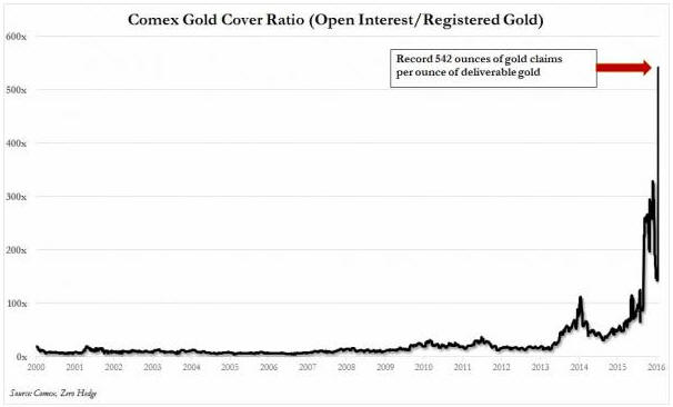
I suspect that when it comes to the idea that a COMEX default is looming, ZeroHedge.com is “fear-monger zero*”. Every now and then ZeroHedge posts a chart showing the total Open Interest (OI) in COMEX gold futures divided by the amount of “Registered” gold in COMEX warehouses. An example is the chart displayed below, which was taken from the article posted HERE. The result of this division is supposedly the amount of gold that could potentially be demanded for delivery versus the amount of gold available for delivery, with extremely high numbers for the ratio supposedly indicating that there is a high risk of a COMEX default due to insufficient physical gold in storage. I say “supposedly”, because it actually indicates no such thing. The ratio routinely displayed by ZeroHedge — and other gold market ‘pundits’ who spout the same baloney — is actually meaningless.

ZH_goldcover_050516

One reason it is meaningless is that the amount of gold available for delivery is the amount of “Registered” gold PLUS the amount of “Eligible” gold, meaning the TOTAL amount of gold at the COMEX. It is true that only Registered gold can be delivered against a contract, but it is a quick and simple process to convert between Eligible and Registered. In fact, much of the gold that ends up getting delivered into contracts comes from the Eligible stockpile, with the conversion from Eligible to Registered happening just prior to delivery.

Taking a look at the ratio of COMEX Open Interest to total COMEX gold inventory via the following chart prepared by Nick Laird (www.sharelynx.com), we see that it has oscillated within a 3.5-6.5 range over the past 7 years and that nothing out of the ordinary happened over the past three years.

COMEXOI_TOTINV_050516

Another reason that the OI/Registered ratio regularly displayed by ZeroHedge et al is meaningless is that the total Open Interest in gold futures is NOT the amount of gold that could potentially be demanded for delivery. The amount of gold that could potentially be demanded for delivery is the amount of open interest in the nearest contract. For example, when ZeroHedge posted its dramatic “Something Snapped At The Comex” article in late-January to supposedly make the point that there were more than 500 ounces of gold that could potentially be called for delivery for every available ounce of physical gold, in reality there were about 15 ounces of physical gold in COMEX warehouses for every ounce that could actually have been called for delivery into the expiring (February-2016) contract.

Although it provides no information about the ability of short sellers to deliver against expiring futures contracts when called to do so, it is reasonable to ask why the ratio of total OI to Registered gold rose to such a high level. I can only guess, but I suspect that the following chart (also from www.sharelynx.com) contains the explanation.

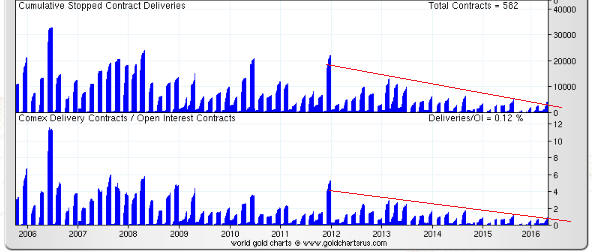
The chart shows the cumulative stopped contract deliveries, or the amount of gold that was delivered into each expiring contract, in absolute terms and relative to open interest. Notice the downward trend beginning in late-2011. Notice also that the amount of gold delivered to futures ‘longs’ over the past two years is much less in both absolute and relative terms than at any other time over the past decade.

It is clear that as the gold price fell, the desire of futures traders to ‘stop’ a contract and take delivery of physical gold also fell. In other words, the unusually-small amount of gold maintained in the Registered category over the past two years reflects the unusually-low desire on the part of futures ‘longs’ to take delivery.

It’s a good bet that if a multi-year gold rally began last December (I think it did) then the desire to take delivery will increase over the next couple of years, prompting a larger amount of gold to be held in the Registered category.

COMEXDELIV_050516

In conclusion, the fact is that at no time over the past several years has there been even a small risk of either a COMEX default or the COMEX falling back on its cash settlement provision. However, this fact is obviously not as exciting as the fiction that is regularly published by scare-mongers in their efforts to attract readers and separate the gullible from their money.

*The equivalent of Patient Zero in an epidemiological investigation.

Print This Post Print This Post

A critical juncture for gold

May 4, 2016

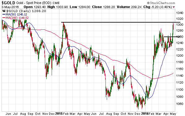
The US$ gold price is testing important resistance defined by last year’s high, which opens up the possibility that a useful price signal will soon be generated. There are two ways that this could happen.

One way is for the price to achieve a weekly close above last year’s high of $1308. This wouldn’t necessarily point to immediate additional upside, but it would suggest that the overall advance from last December’s low was set to continue for another 1-2 months. The other is for the price to trade above last year’s high of $1308 during the week but fail to achieve a weekly close above this level. This would warn that the overall advance from last December’s low was over (meaning: a multi-month correction was probably getting started).

Note that not all price action contains clues about the future. For example, during the first two days of this week the US$ gold price consolidated below last year’s high, which doesn’t tell us anything useful.

gold_blog_030516

Gold’s true fundamentals* turned bullish early this year but are currently about as neutral as they get, with half of them bullish and the other half bearish. Moreover, of the two fundamental drivers that exerted the greatest influence over the past 12 months, one (the relative strength of the banking sector) recently turned bearish while the other (the real interest rate) is still bullish. This suggests that an additional large short-term rise in the gold price will depend on increased speculation in the futures market. Interestingly, Keith Weiner comes to a similar conclusion from a very different assessment of gold fundamentals.

*The gold market’s six most important fundamental drivers are the real interest rate, the yield curve, credit spreads, the relative strength of the banking sector, the US dollar’s exchange rate and the general trend for commodity prices.

Print This Post Print This Post
Making stuff up

April 30, 2016

This will be the shortest TSI blog post to date. I just wanted to point out that newsletter writers, bloggers and other posters on the internet who claim knowledge of what was discussed in secret conversations between high-level policy-makers are just making up stories. If you take this BS at face value, more the fool you.

Print This Post Print This Post

Who gets the new money first?

April 27, 2016

The main reason that monetary inflation (creating new money out of nothing) is an economic problem isn’t the effect it has on the economy-wide purchasing power of money. The general decline in money purchasing-power is very much a secondary negative. The primary negative revolves around the fact that new money does not get evenly spread throughout the economy. Instead, it gets injected at specific points, causing some people (the early recipients of the new money) to benefit at the expense of others and causing some prices to rise relative to others. One consequence is an undeserved transfer of wealth to the early recipients of the new money and another consequence is the falsification of price signals. I’ve discussed both of these consequences in detail in the past, but I have never homed-in on the question: Who gets the new money first?

The answer to the above question will depend on whether the new money is created by the private banks or the central bank, and in the case where the private banks are doing the bulk of the money-pumping it will vary from one cycle to the next. A comprehensive answer to the question would therefore require a lot more words than I want to use in this blog post, so rather than trying to cover all the possibilities I am narrowing-down the question to: Who gets the new money first when the Fed implements QE (Quantitative Easing)?

By the way, if you think that the Fed’s QE adds to bank reserves and doesn’t add to the total quantity of money available to be spent within the economy then you do not understand the mechanics of the QE process. An explanation of how the Fed’s QE creates money can be found HERE.

Since about 60% of the assets monetised in the Fed’s various QE programs were US government debt securities it could superficially appear that the government was the first receiver of most of the new money created by the Fed, but this was not actually the case. The government benefited from the Fed’s QE programs to the extent that these programs lowered the cost of debt*, but it’s unlikely that QE resulted in the government borrowing more than it would otherwise have borrowed. In other words, the amount of money borrowed by the government probably wouldn’t have been materially less if QE had never happened. It’s therefore more correct to view the government as an indirect beneficiary of the Fed’s QE rather than as an early receiver of the new money.

It helps to answer the question “who got the new money first in the Fed’s QE programs?” by re-wording it thusly: As a result of the Fed’s QE, who initially found themselves with a lot more money than would otherwise have been the case?

The answer is the group called “bond speculators”. This group comprises institutions and individuals, including banks, hedge funds and mutual funds, who invest in and trade large dollar-amounts of debt securities.

To explain, the government issued about $2.5T of debt that was purchased by the Fed with newly-created dollars. If not for the Fed, the issuing of this debt would have necessitated the transfer of $2.5T of money from “bond speculators” to the government. It is therefore fair to say that the Fed’s monetisation of Treasury debt left “bond speculators” with $2.5T of extra money. This money was naturally ‘invested’ in other financial assets, giving the prices of those assets a boost.

Under its QE programs the Fed also monetised (purchased with newly-created dollars) about $1.7T of mortgage-backed securities (MBSs). In this case the fact that “bond speculators” ended up with a lot of extra money is obvious, since the Fed replaced existing MBSs owned by “bond speculators” with cash created out of nothing.

In total, “bond speculators” found themselves with about 4.2 trillion additional dollars** courtesy of the Fed’s QE programs. The average productive salary-earner found himself with a negative real return on savings and negative real earnings growth courtesy of the same programs. And yet, Bernanke and Yellen appear to genuinely believe that the Fed’s actions were righteous.

    *The Fed’s debt monetisation not only lowered the interest rate on all new debt issued by the government, for the $2.5T of Treasury securities bought by the Fed the interest rate was effectively reduced to zero. This is because interest paid on government debt held by the Fed gets returned to the government.

    **Just to be clear, the Fed’s QE didn’t directly create $4.2T of additional wealth for “bond speculators”, since the Fed replaced bonds with money. Bond speculators initially had more money and less assets as the result of Fed asset monetisation, but the new money was a proverbial ‘hot potato’ and was quickly used to bid-up the prices of other bonds and financial assets.

Print This Post Print This Post
Gold manipulation is apparently OK as long as the Chinese are doing it

April 26, 2016

The usual suspects made a big deal out of evidence that the banks involved in the London “gold fix” had used the ‘fixing’ process to clip unwarranted profits. As I explained last week, this evidence did not in any way support the claims that a grand price suppression scheme had been successfully conducted over a great many years, but unsurprisingly that’s exactly how it was presented in some quarters. Anyhow, the purpose of this post isn’t to rehash the reasons that manipulation related to the London “gold fix” could only have resulted in brief price distortions and definitely could not have been used to shift the directions of multi-month trends. Rather, the purpose is to marvel at the inconsistency of those who loudly and relentlessly complain that the gold market is dominated by the manipulative actions of a banking cartel.

The latest example of the inconsistency is the collective cheering by the aforementioned complainers of last week’s introduction of a twice-daily ‘gold fixing’ process in China. The “Yuan gold fix” will be implemented by a group of 18 banks (16 Chinese banks and 2 international banks) and will be subject to exactly the same conflicts of interest and abilities to clip unwarranted profits as the traditional London ‘gold fix’.

So, are we supposed to believe that manipulation of the gold price by Chinese banks would be perfectly fine, or are we supposed to believe that the average Chinese bank, which, by the way, has non-performing loans (NPLs) of greater than 20% but claims to have NPLs of less than 2%, is a paragon of virtue? It would be impossible for a rational and knowledgeable person to hold either of these beliefs, but those who regularly complain about gold-market manipulation by banks and also cheered the implementation of the “Yuan gold fix” must hold one of them.

Print This Post Print This Post
What happened to the “global US$ short position”?

April 22, 2016

At this time last year there was a lot of talk in the financial press about the huge US$ short position that was associated with the dollar-denominated debts racked up over many years in emerging-market countries. This debt-related short position supposedly guaranteed additional large gains for the Dollar Index over the ensuing 12 months. But now, with the Dollar Index having drifted sideways for 12 months and having had a downward bias for the past 5 months it is difficult to find any mention of the problematic US$ short position. Did the problem magically disappear? Did the problem never exist in the first place?

Fans of the US$ short position argument needn’t fret, because the argument will certainly make a comeback if the Dollar Index eventually breaks above the top of its drawn-out horizontal trading range. It will make a comeback regardless of whether or not it is valid, because it will have a ring of plausibility as long as the Dollar Index is rising.

I’m not saying that the argument for a stronger US$ driven by the foreign-debt-related US$ short position is invalid. I’m not saying it yet, anyway. The point I’m trying to make above is that if the argument was correct a year ago then it is just as correct today (since debt levels haven’t fallen) and should therefore be just as popular today. It is nowhere near as popular, though, because most fundamentals-based analysis is concocted to match the price action.

I actually view the “global US$ short position” as more of an effect than a cause of exchange-rate trends. Major currency-market trends are caused by differences in stock-market performance, real interest rates and monetary inflation rates. When these factors conspire to create a downward trend in the US dollar’s foreign exchange value it becomes increasingly attractive for people outside the US to borrow dollars. And when these factors subsequently conspire to create an upward trend in the US dollar’s foreign exchange value, debt repayment becomes more costly for anyone with US$-denominated debt outside the US.

So, if the Dollar Index resumes its upward trend later this year then anyone outside the US with hefty US$-denominated debt will have a problem, but the deteriorating collective financial position of these foreign US$ borrowers won’t be the cause of the dollar’s strength. It will just be a popular justification for the strength.

In general, fundamentals-based analysis will look correct and achieve popularity if it matches the price action, even if it is complete nonsense. A related point is that if fundamentals-based analysis is contrary to the recent price action then hardly anyone will believe it, irrespective of the supporting facts and logic.

Print This Post Print This Post
News of gold and silver price manipulation is not news

April 19, 2016

It was reported last week that Deutsche Bank has settled lawsuits over allegations it manipulated gold and silver prices via the “London Fix“. This is not really news, in that experienced traders would already be aware that banks and other large-scale operators regularly attempt to shift prices one way or the other in most financial markets to benefit their own bottom-lines. I just wanted to point out that this “news” does not, in any way, shape or form, constitute evidence that there has been a successful long-term price suppression scheme in the gold and silver markets.

As far as I can tell, the banks that were involved in setting the twice-daily levels for the London gold and silver fixes had two ways of using or manipulating the ‘fix’ to generate profits. The first is that the participants in the fixing process were privy, for two very brief periods (10-15 minutes, on average) each day, to non-public supply-demand information, making it possible for them to obtain a very brief advantage in their own trading. For example, if the volume of gold being bid for was significantly greater than the volume being offered near the start of a particular day’s fixing process, a participant would know that the price was likely to rise over the ensuing few minutes and could enter a long position with the aim of exiting at around the time the ‘fix’ was announced.

The other way of using or manipulating the ‘fix’ to generate profits is more sinister, as it essentially involves the ‘fix’ participants stealing from their clients. I’m referring to the fact that although the ‘fix’ is primarily a market price, in that it is designed to reflect the bids and offers in the market at a point in time, the participating banks would have the ability to nudge the price in one direction or the other. Situations could arise where a participating bank could improve its bottom line at the expense of a client by influencing the ‘fix’ in a way that, for example, prevented an option held by the client from expiring in the money or allowing the bank to purchase gold from the client at a marginally lower price.

I don’t know that the participants in the London ‘fixing’ process sometimes used the process to increase their own profits at their clients’ expense, but I wouldn’t be the least bit surprised if they did. There was certainly a huge conflict of interest inherent in the way the ‘fix’ was conducted.

Anyhow, it’s important to understand that price distortions resulting from the ‘fix’ would have existed only briefly (for less the 20 minutes in all likelihood) and could not have affected the price trends of interest to anyone other than intra-day traders. In particular, there is simply no way that a multi-month price trend could have been shifted from bullish to bearish or bearish to bullish by manipulating the London gold or silver fix.

Print This Post Print This Post
A great crash is coming, part 2

April 18, 2016

Last November I entered the crash-forecasting business. As explained in a blog post at the time, my justification for doing so was the massively asymmetric reward-risk associated with such an endeavour. Whereas failed crash predictions are quickly forgotten, you only have to be right (that is, get lucky) once and you will be set for life. From then on you will be able to promote yourself as the market analyst who predicted the great crash of XXXX (insert year) and you will accumulate a large herd of followers who eagerly buy your advice in anticipation of your next highly-profitable forecast. Furthermore, since a crash will eventually happen, as long as you keep predicting it you will eventually be right.

My inaugural forecast was for the US stock market to crash during September-October of 2016. The forecast was made with tongue firmly planted in cheek, since I have no idea when the stock market will experience its next crash. What I do know is that it will eventually crash. My goal is simply to make sure that when it does, there will be a written record of me having predicted it.

That being said, when I published my crash forecast last November I gave a few reasons why it wasn’t a completely random guess. One was that stock-market crashes have a habit of occurring in September-October. Another was that the two most likely times for the US stock market to crash are during the two months following a bull market peak and roughly a year into a new bear market, with the 1929 and 1987 crashes being examples of the former and the 1974, 2001 and 2008 crashes being examples of the latter. The current situation is that either a bear market began in mid-2015, in which case the next opportunity for a crash will arrive during the second half of this year, or the bull market is intact, in which case a major peak will possibly occur during the second half of this year. A third was that market valuation was high enough to support an unusually-large price decline.

A fourth reason, which I didn’t mention last November, is that if the bull market didn’t end last year then it is now very long-in-the-tooth and probably nearing the end of its life. A fifth reason, which I also didn’t mention last year because it wasn’t apparent at the time, is that the monetary backdrop has become slightly less supportive.

So, I hereby repeat my prediction that the US stock market will crash in September-October of this year, but if not this year then next year or the year after. My prediction will eventually be right, at which point I’ll bathe in the glow of my own prescience and start raking in the cash from book sales.

Print This Post Print This Post