Sidebar left

Shipping rates will never go to zero

July 13, 2016

When the Baltic Dry Index (BDI), an index of international ocean-going freight rates, plunged to a multi-decade low early this year it provoked excited commentary from the “economic armageddon is nigh!” crowd. An example can be found HERE. However, bearish commentary is unhelpful after the prices of useful things have fallen to the point where the suppliers of these things are financially in dire straits.

There’s always a risk that the stock price of an individual company will go to zero, but there’s never a risk that freight rates or the prices of useful commodities will go to zero. Therefore, the further they move into an area where they are low by historical standards, the lower the downside risk will generally be.

I’m lumping ocean-going shipping rates and commodity prices together in this post because they are linked. They usually trend in the same direction and reach important peaks/troughs at around the same time. A consequence is that it doesn’t make sense to be bullish on commodities and at the same time anticipating a large decline in shipping rates, or bearish on commodities and at the same time anticipating strength in shipping rates. For example, after commodity prices reversed upward during January-February of this year it made no sense to expect a continuing downward trend in shipping rates.

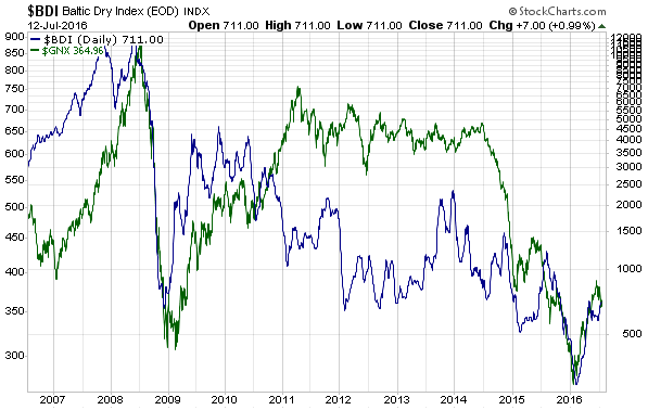
The link between shipping rates (as represented by the BDI) and commodity prices (as represented by the Goldman Sachs Spot Commodity Index – GNX) is illustrated below. The two indexes have been positively correlated for a long time. Divergences are not uncommon, but the divergences are always short-term.

BDI_blog_120716

So, here’s an idea: Rather than piling onto the bearish bandwagon, when the real price of an indispensable service or commodity drops to a multi-decade low it might make more sense to be bullish.

Print This Post Print This Post
The US banking system has no control over its reserves

July 12, 2016

A popular line of thinking is that the US banking system is not making as much use of its “excess” reserves as it should be because of the interest rate that the Fed now pays on these reserves. This line of thinking reflects a basic misunderstanding of how the banking system works.

There are two reasons why it is wrong to believe that the 0.50% interest rate now being earned by US banks on their reserves is encouraging the banks to stockpile money at the Fed rather than take a risk by making more loans. The first reason is that there is no relationship between bank lending (and the associated creation of new bank deposits) and bank reserves. I’ve covered this concept in previous blog posts, including HERE, so today I’ll focus on the second reason.

The second reason is that the banking system has no control over its reserves. An individual bank can reduce its reserves by lending reserves to another bank, but banks as a group have no say in the total quantity of reserves. In other words, even if the US banking system desperately wanted to reduce its collective reserve quantity it would be powerless to do so.

By way of further explanation, there are only three ways that reserves can leave the US banking system. They can be removed by the Fed (the Fed has unlimited power to add or delete reserves), they can exit in the form of notes and coins in response to increasing public demand for physical cash, or they can be transferred to governmental accounts at the Fed. The third way will always be temporary because the government is always quick to spend any money it gets, so there are really just two ways that the banking system’s reserves can decline: a deliberate action by the Fed or increased demand for physical cash within the economy.

In other words, regardless of how many loans are made and how many new commercial bank deposits are created, every dollar of reserves currently in the US banking system will remain there until the Fed decides to change the system-wide level or until it leaks into the economy via the conversion of electronic deposits to physical cash.

An implication is that changing the rate of interest that the Fed pays on reserves will not affect the pace at which banks expand/contract credit within the economy. For example, if the Fed increased the interest rate on reserves from 0.50% to 1.00% the banks would generate more interest income from their reserves, but there would be no change in the incentive to make new loans because the banks will earn this additional income regardless of whether they lend more or less money into the economy (the creation of a bank loan doesn’t cause bank reserves to disappear). For another example, if instead of paying banks a positive rate on their reserves the Fed started charging banks, that is, if the Fed adopted Negative Interest Rate Policy (NIRP), the banking system as a whole would have no additional incentive to grow its loan book since there would be nothing it could do to avoid the cost. In fact, the cost imposed by the NIRP could indirectly REDUCE the incentive to make new loans.

As an aside, this doesn’t guarantee that NIRP won’t happen in the US, especially given the evidence that the Fed’s senior management is almost as clueless as Mario Draghi. However, the obvious failure of the policy in Europe lessens the risk of it happening in the US.

Summing up, the interest rate paid on reserves cannot be a reason for either more or less bank lending. As explained previously, the only reason that the Fed began paying interest on bank reserves in late-2008 was to enable it to maintain control of the Fed Funds Rate while it pumped huge volumes of dollars into the economy and into the reserve accounts of banks.

Print This Post Print This Post
Gold is testing its 2011 high…

July 10, 2016

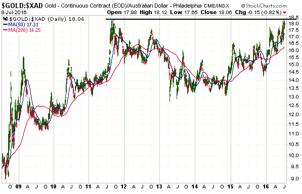
in Australian dollar (A$) terms.

The A$-denominated gold price (gold/A$) made a correction low in April of 2013, spent about 18 months forming a base and then resumed its long-term bull market in late-2014. It will probably soon make a new all-time high.

gold_A$_100716

It is useful to follow gold’s performance in terms of the more-junior currencies, for two main reasons. First, gold tends to bottom in terms of these currencies well before it bottoms in terms of the senior currency (the US$). Second, money can sometimes be made by owning the stocks of gold-mining companies operating in countries with relatively weak currencies even when the US$ gold price is in a bearish trend.

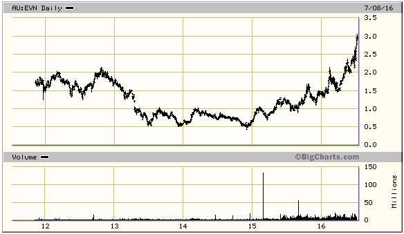
A good example is Evolution Mining (EVN.AX), an Australia-based mid-tier gold producer that I’ve followed at TSI for the past few years. As illustrated by the following chart, EVN commenced a powerful upward trend in late-2014 after basing over the preceding 18 months (just like gold/A$). It is now well above its 2011-2012 peak.

EVN_100716

As a gold bull market progresses, the more junior currencies and especially the commodity currencies begin to strengthen relative to the US$. This causes the mining companies with operations in the US to start doing relatively well.

Print This Post Print This Post

The hyperinflation and deflation arguments are both wrong

July 6, 2016

Most rational people with some knowledge of economic history will realise that the US$ will eventually be the victim of hyperinflation. The hard reality is that whenever money can be created in unlimited amounts by central banks or governments, it’s inevitable that at some point the money will experience such a dramatic plunge in its purchasing power that it will be at risk of soon becoming worthless. However, knowing this is only slightly more useful than knowing that the star we call the Sun will eventually die.

The relevant question is never about whether hyperinflation will happen; it’s about the timing, and at no point over the past 20 years (including right now) has there been a realistic chance of the US experiencing hyperinflation within the ensuing two years. Furthermore, the same can be said about deflation. A sustained period of deflation (as opposed to a short-lived deflation scare) will eventually happen, but at no point over the past 20 years (including right now) has there been a realistic chance of it happening within the ensuing two years.

So, when I say that the hyperinflation and deflation arguments are both wrong I mean that they are both wrong when dealing with practical investment time-frames. They are both actually right when dealing with the indefinite long-term.

By the way, when considering inflation/deflation prospects I only ever attempt to look ahead two years, partly because two years is plenty of time to take protective measures and partly because it is futile to attempt to look further ahead than that.

How do I know that neither hyperinflation nor deflation will happen in the US within the coming two years?

I don’t know, but I do know that neither will happen without warning. We are not, for example, going to go to bed one day with government and corporate bond yields near multi-generational lows and wake up the next day immersed in hyperinflation. Also, central banks are not going to be rigidly devoted to pro-inflation monetary policies one day, to the point where theories/models are never questioned and failure is viewed as the justification for ramping-up the same policies, and the next day be willing to implement the sort of monetary policies that could lead to genuine deflation.

Some people are so committed to the “deflation soon” forecast that they ignore any conflicting evidence. It’s the same for people who are committed to the idea that hyperinflation is an imminent threat to the US economy. However, an objective assessment of the evidence leads to the conclusion that it currently makes no sense to position oneself for either of these extremes. The evidence includes equity prices, corporate bond yields, credit spreads, the yield curve, commodity prices, the gold price, and future “inflation” indicators such as the one published by the ECRI.

The evidence could change, but what it currently indicates is that the signs of “price inflation” will become more obvious over the coming 12 months. No deflation, no hyperinflation.

Print This Post Print This Post

The Masters of the Universe Fallacy

June 29, 2016

Whenever there’s a major financial crisis, the largest commercial and investment banks invariably take big hits. This causes them to either go bust or go in search of a bailout. In fact, as far as I can tell there has never been a case over the past 50 years of an elite financial institution being on the right side of a major financial crisis. The same goes for central banks. Judging by their words and their actions, the heads of the world’s most important central banks have been blindsided by every major financial crisis of the past 50 years. And yet, I regularly see blog posts, articles or newsletters in which it is explained that the financial crises that have occurred in the past and are going to occur in the future are part of a grand plan hatched by the most prominent members of the financial establishment.

The idea that market crashes and crises are purposefully arranged by the financial elite is what I’ll call the “Masters of the Universe Fallacy” (MOTUF). For some reason this idea is very appealing to many people even though there is no evidence to support it. Furthermore, the simple fact that the supposed master schemers are always on the wrong sides of financial crises is enough to refute the idea.

As far as understanding economics and markets are concerned, the current heads of the world’s three most important central banks are complete buffoons. Obviously, if you don’t have a thorough understanding of good economic theory and how markets work then any strategies you concoct to bring about specific economic and financial-market outcomes are going to fail. The retort is that the heads of the most important central banks are just puppets whose strings are pulled by the real master manipulators. The real master manipulators apparently include the heads of the world’s most influential commercial banks, such as the senior managers of Goldman Sachs and JP Morgan.

Don’t get me wrong; it is certainly the case that the government takes advantage of crises to expand its reach and that the likes of Goldman Sachs and JP Morgan have great influence over the actions of the central bank and the government. This allows them to avoid the proper consequences of their biggest mistakes, but the fact is that they keep making mistakes of sufficient magnitude and stupidity to threaten their survival on an average of once per decade.

Take the specific example of the 2007-2009 global financial crisis. It wasn’t until mid-2007 that the senior managers of Goldman Sachs realised that there was a huge problem looming for the credit markets in general and the US sub-prime mortgage market in particular, but by then the company was so heavily exposed to ill-conceived investments that it was too late to re-position. If not for the combination of TARP, various asset monetisation programs implemented by the Fed, the US government bailout of AIG, Warren Buffett and changes to official accounting rules, Goldman Sachs would have gone bust in 2008 or 2009.

Furthermore, having either died (in the cases of Bear Stearns, Merrill Lynch and Lehman Brothers) or suffered near-death experiences (in the cases of Goldman Sachs, JP Morgan, Citigroup and Bank of America) in 2007-2009, the elite bankers of the world again found themselves in potential life-threatening situations just 2-3 years later due to the euro-zone’s sovereign debt crisis. This time the ECB came to the rescue.

In general, when a financial crisis happens it’s the outsiders who profit from the calamity, not the insiders. The insiders are always up to their eyeballs in the credit-fueled investment boom of the time. For example, in 2007-2008 it was the likes of Michael Burry, Steve Eisman, John Paulson, Kyle Bass and David Einhorn who correctly anticipated the events and reaped the large profits from the market action, while the likes of Chuck Prince, Dick Fuld, Lloyd Blankfein and Jamie Dimon were forced to either exit the banking business or go ‘cap in hand’ to the government.

It will be the same story in the next crisis. Goldman Sachs won’t see it coming and therefore won’t be prepared, which means that it will once again be in the position of needing a bailout to avoid bankruptcy.

So, if you want to make me laugh just send me an email explaining that the periodic crises are all part of a grand plan formulated by members of the financial establishment.

Print This Post Print This Post

Gold has peaked for the year

June 27, 2016

Gold has probably peaked for the year. Not necessarily in US$ terms, but in terms of other commodities.

In fact, relative to the Goldman Sachs Spot Commodity Index (GNX) the peak for this year most likely happened back in February. The February-2016 peak for the gold/GNX ratio wasn’t just any old high, it was an all-time high. In other words, at that time gold was more expensive than it had ever been relative to commodities in general.

Also worth mentioning is that when the US$ gold price spiked up to its highest level in more than 18 months as part of the “Brexit” mini-panic late last week, the rise in GNX terms was much less impressive. As illustrated below, last Friday’s move in the gold/GNX ratio looks more like a counter-trend bounce than an extension of the longer-term upward trend.

gold_GNX_270616

The February-2016 extreme in the gold/GNX ratio had more to do with the cheapness of other commodities than the expensiveness of gold, and the subsequent relative weakness in the gold price was mostly about other commodities making catch-up moves. This is actually the way things normally go at cyclical bottoms for commodities. The historical sample size is admittedly small, but it’s typical for gold to turn upward ahead of the commodity indices and to be a relative strength leader in the initial stage of a cyclical bull market. Gold then relinquishes its leadership.

Perhaps it will turn out to be different this time, but over the past 8 months the story has unfolded the way it should based on history and logic. An implication is that if the US$ gold price made a major bottom last December then the general commodity indices aren’t going to get any cheaper in US$ terms or gold terms than they were in January-February of this year.

Around cyclical lows, gold leads and the rest of the commodity world follows.

Print This Post Print This Post

The evidence be damned!

June 23, 2016

I was blown away by the following two charts from Jeffrey Snider’s article titled “The European Basis For New Monetary Science“.

As most of you probably know, the Mario Draghi-led ECB embarked on a ‘suped-up’ QE program in March of 2015. The idea behind this program was that by monetising 60B euros of bonds per month the ECB would promote faster credit expansion throughout Europe. The two charts from the aforelinked Snider article show the results to April-2016.

The first chart shows that as at April-2016, 727 billion euros of ECB asset monetisation had been accompanied by an increase in total lending of only 71 billion euros. As neatly summarised by Snider, this means that there was less than one euro in additional lending for every ten in ECB foolishness.

The second chart shows loans to European non-financial corporations, which actually contracted slightly during the first 13 months of the ECB’s suped-up credit-expansion program.

EZlending_total_220616

EZlending_NFC_220616

The QE program was therefore a total failure even by the jaundiced standards of the central-banking world, that is, it failed even ignoring the reality that faster credit expansion cannot possibly be good for an economy labouring under the weight of excessive debt. The weirdest thing is, the obvious failure is not viewed by Draghi as evidence that QE doesn’t do what it is supposed to do. Instead, it is viewed as evidence that more of the same is needed. Hence the increase in the pace of asset monetisation from 60B to 80B euros per month announced in March-2016 and implemented this month.

I shudder to think how Draghi’s monetary experiment will end.

Print This Post Print This Post

Central bankers believe that they can provide free lunches

June 20, 2016

[This post is a modified excerpt from a recent TSI commentary.]

A lot of good economic theory boils down to the acronym TANSTAAFL, which stands for “There Ain’t No Such Thing As A Free Lunch”. TANSTAAFL is an unavoidable law of economics, because everything must be paid for one way or another. Furthermore, attempts by policymakers to get around this law invariably result in a higher overall cost to the economy. Unfortunately, central bankers either don’t know about TANSTAAFL or are naive enough to believe that their manipulations can provide something for nothing. They seem to believe that the appropriate acronym is CBCCFLAW, which stands for “Central Banks Can Create Free Lunches At Will”.

ECB chief Mario Draghi is the leader in applying policies based on CBCCFLAW. Despite his economic stimulation measures having a record to date that is unblemished by success, he recently launched new attempts to conjure-up a free lunch.

I’m referring to two measures that were announced in March and have just started to be implemented, the first of which is the ECB’s corporate bond-buying program (starting this month the ECB will be monetising investment-grade corporate bonds in addition to government bonds). This program is designed to bring about a further reduction in interest rates, because, as we all know, if there’s one thing that’s holding Europe back it’s excessively high interest rates, where “excessively high” means above zero.

Unlike the situation in the US, very little corporate borrowing in Europe is done via the bond market. The ECB’s new corporate bond-buying program is therefore unlikely to provide even a short-term boost, but, not to worry, that’s where the ECB’s second measure comes into play.

The ECB’s second measure is a new round of a previously-tried program called the Targeted Long Term Refinancing Operation (TLTRO). Under the TLTRO program, commercial banks get encouraged — via a near-zero or negative interest rate — to borrow money from the ECB on the condition that the banks use the money to make new loans to the private sector.

The combination of the ECB’s two new measures is supposed to promote credit expansion and higher “inflation”. In other words, to the extent that the measures are successful they will result in more debt and a higher cost of living. In Draghi’s mind, this would be a positive outcome.

In the bizarre world occupied by the likes of Draghi, Yellen and Kuroda, the failure of an economy to strengthen in response to a policy designed to stimulate growth never, ever, means that the policy was wrong. It always means that not enough was done. It’s not so much that these central planners refuse to see the flaws in their policies, it’s that they cannot possibly see. They cannot possibly see because they are looking at the world through a Keynesian lens. Trying to understand how the economy works using Keynesian theory is like trying to understand the movements of the planets using the theory that everything revolves around the Earth.

So, the worse things get in response to counter-productive ‘economic stimulation’ policies, the more aggressively the same sorts of policies will be applied and the worse things will eventually get. This is what I’ve referred to as the Keynesian death spiral.

Print This Post Print This Post

Reversals

June 17, 2016

The price action in many financial markets was nothing if not interesting on Thursday 16th June. Of particular interest, there were several price reversals that could be significant (for TSI subscribers, the significance will be discussed in this weekend’s commentary).

One reversal of potential consequence happened in the gold market, with the gold price moving well above its early-May high and last year’s high ($1308) before turning around and ending the day with a loss.

gold_160616

Another reversal happened in the silver market. Silver’s reversal looks more important than gold’s because it resulted in an “outside down day” and created a bearish divergence between the gold and silver markets (a new high for gold combined with a lower high for silver).

silver_160616

Not surprisingly, the downward reversal in gold coincided with an upward reversal in the US stock market. For example, the Dow Transportation Average, which has led the more-senior US stock indices over the past 18 months, broke below short-term support early on Thursday and then recovered to end the day above support.

TRAN_160616

In the currency market there were actually two reversals, with the Dollar Index first reversing upward after trading well below the preceding day’s low and then reversing downward after trading well above the preceding day’s high to end the day roughly unchanged.

US$_160616

The financial markets are obviously being buffeted by Brexit-related news and are likely to remain more news-dependent than usual for another 1-2 weeks.

Print This Post Print This Post

I don’t love charts!

June 15, 2016

Chris Powell of GATA has taken issue with my recent blog post titled “Four charts that invalidate the gold price suppression story“. Interestingly, he did so without addressing the most important information in my short post. Instead, he dismissed the information because it was presented in chart form and simply regurgitated the usual GATA rhetoric*.

Responding to Powell’s article is not a good use of my time. This is not because my time is so precious, but, as mentioned above, because Powell’s article sidesteps the main points. If he develops an understanding of gold’s fundamental price drivers and employs this understanding to demonstrate errors in my thinking, I’ll gladly respond.

However, just to set the record straight:

1) I don’t have anything against technical analysts, but I’m not one of them. I do use some TA, but I’m primarily a fundamental analyst. Unbeknownst to Chris Powell, charts can be used to show fundamental relationships.

2) If my main purpose in writing was to increase the number of subscribers to my newsletter then I would pay lip service to GATA’s arguments. The reason is that I have lost many subscribers over the years due to my regular disparaging of these arguments. While I don’t go out of my way to lose subscribers, this is not a major concern because I am a trader/investor who happens to write a newsletter as opposed to someone who relies on newsletter sales to make a living.

3) Unlike Chris Powell, I am not promoting an agenda. I am not trying to sell a particular view of the financial world. Instead, I’m focused on trying to understand why the markets do what they do and profiting from it. Sometimes I get it right, sometimes I get it wrong. When I get it wrong, I acknowledge that the blame is 100% with me and try to learn from the experience so that the mistake is not repeated.

*He used exactly the same tactic in response to a previous blog post of mine.

Print This Post Print This Post

Four charts that invalidate the gold-price suppression story

June 13, 2016

Every experienced trader knows that the financial markets are manipulated. They always have been manipulated and they always will be manipulated. Railing against gold-market manipulation is therefore akin to railing against the Earth revolving around the sun. Moreover, the attempts to manipulate, which, by the way, will be designed to move prices upward just as often as downward, will never be effective beyond the very short-term. As evidenced by the following charts, there is certainly no sign of a successful long-term gold-price suppression scheme.

The first chart compares the US$ gold price with the bond/dollar ratio (the T-Bond price divided by the Dollar Index). This chart shows that the gold price has roughly done what it should have done, considering what was happening in the currency and bond markets, each step of the way over the past 10 years.

gold_USBUSD_130616

The next chart compares the US$ gold price with the SPX/BKX ratio (the broad US stock market relative to the banking sector). Those who understand gold would expect to see a positive correlation between the gold price and the SPX/BKX ratio, because gold should benefit from falling confidence in the banking sector and become less desirable during periods when investors are becoming increasingly confident in the banking sector’s prospects. There are naturally periods of overshoot and undershoot, but a positive correlation is readily apparent.

gold_SPXBKX_130616

The third chart compares the US$ gold price and the Yen (the Yen/US$ rate). The gold price held up much better than the Yen during 2013-2015, but the positive correlation has been maintained.

Due to the Yen carry trade, gold’s positive correlation with the Yen has been stronger than its negative correlation with the Dollar Index for at least the past 10 years. The Yen carry trade causes the Yen to behave like a safe haven (even though it isn’t one), because carry trades tend to get put on during periods of rising confidence and taken off during periods of falling confidence.

gold_yen_130616

The final chart simply shows the gold/commodity ratio (gold relative to a basket of commodities represented by the Goldman Sachs Spot Commodity Index – GNX). This chart indicates that relative to commodities in general gold is almost 3-times as expensive today as it was 10 years ago. Also, for anyone who clearly remembers what happened in the financial world over the past 10 years it reveals that large and sharp rises in the gold/commodity ratio occurred exactly when they should have occurred — during periods of crisis and plunging confidence. Specifically, there were large and sharp rises: a) from mid-2015 through to early-February of 2016 as equity markets tanked around the world, b) in late-2014 and early-2015 as the financial markets fretted over what the ECB was going to do, c) in the second and third quarters of 2011 in parallel with a substantial stock-market correction and rising fears of euro-zone government debt default, and d) from mid-2008 through to February-2009 in response to the Global Financial Crisis.

By the way, gold is in a multi-generational upward price trend relative to commodities that dates back to 1971.

gold_GNX_130616

I look at a lot of charts comparing gold’s performance with various financial-market and economic indicators, only four of which are presented above. The overarching message is that if gold has been subject to a long-term price suppression scheme, the scheme has been totally unsuccessful.

Print This Post Print This Post

Gold and the Keynesian Death Spiral

June 8, 2016

Almost anything can be a good investment or a bad investment — it all depends on the price. Relative to the prices of other commodities the gold price is high by historical standards and in dollar terms gold is nowhere near as cheap today as it was 15 years ago, but considering the economic backdrop it offers reasonable value in the $1200s. Furthermore, considering the policies that are being implemented and the general lack of understanding on display in the world of policy-making, there’s a good chance that gold will be much more expensive in two years’ time.

The policies to which I am referring are the money-pumping, the interest-rate suppression and the increases in government spending that happen whenever the economy and/or stock market show signs of weakness. These so-called remedies are actually undermining the economy, so whenever they are applied in response to economic weakness they ultimately result in more weakness. It’s not a fluke, for example, that the most sluggish post-recession economic recovery of the past 60 years went hand-in-hand with history’s most aggressive demand-boosting intervention by central banks and governments.

It’s a vicious cycle that can aptly be called the ‘Keynesian death spiral’. The Keynesian models being used by policy-makers throughout the world are based on the assumption that when interest rates are artificially lowered and new money is created and government spending is ramped up, the economy gets stronger. The models are completely wrong, because falsifying price signals leads to investing errors and therefore hurts, not helps, the overall economy, and because the government doesn’t have a spare pile of wealth that it can put to work to create real growth (everything the government spends must first be extracted from the private sector). However, the models are never questioned.

When a sustained period of economic growth fails to materialise following the application of the demand-boosting remedies, the conclusion is always that the remedies were not applied with sufficient vigor. More of the same is hence deemed necessary, because that’s what the models indicate. It’s akin to someone with liver damage caused by drinking too much alcohol being guided by a book that recommends addressing the problem by increasing alcohol consumption. A new dose of alcohol will initially make the patient feel better at the same time as it adds to the existing damage, just as a new dose of demand-boosting intervention will initially make the economy seem stronger at the same time as it gets in the way of genuine progress.

The upshot is that although gold is more expensive today than it was 15 years ago, the level at which gold offers good value is considerably higher today than it was back then because we are now much further along the Keynesian death spiral.

Print This Post Print This Post