Sidebar left

State-sponsored cryptocurrencies revisited

December 6, 2017

In a blog post earlier this week I briefly argued that “government-controlled cryptocurrency” was a contradiction in terms. It depends on what is meant by “cryptocurrency”, but now that I’ve done some more research on the subject I understand how a central bank could make use of blockchain technology and why the government would want to implement a type of cryptocurrency.

My understanding of the subject was improved by reading the white paper on the “Fedcoin” published a few months ago by Yale University. I also read about the difference between “permissioned” and “permissionless” blockchains. As a result, I now understand that a blockchain is a data structure that can be either distributed, as is the case with Bitcoin, or centrally controlled, as would be the case with a “cryptocurrency” issued by a central bank.

I also understand how the commercial banks could profit from the advent of a centrally-controlled cryptocurrency. This is an important consideration because the way the world currently works it is unrealistic to expect the introduction of a new form of official money that would result in substantially-reduced profits for the major banks.

The Fedcoin paper linked above lays out how a state-sponsored cryptocurrency could work. Here are some of the salient aspects:

1. The system comprises a central ledger of all transactions (the blockchain) maintained by the Fed, nodes (commercial banks) and users (anyone who wants to spend or receive a Fedcoin).

2. A user of Fedcoins must have an account at the Fed. Opening an account would involve providing the KYC (Know Your Customer) identity information that anyone who has dealt with a financial institution over the past few years would be familiar with.

3. Users would have digital wallets that held encrypted funds and all transactions would have to be digitally signed, so in this respect the term “cryptocurrency” would apply. However, the Fed and the government would be able to determine the identity of the users involved in any/every transaction (due to item 2 above), so the encryption would not result in genuine privacy. Moreover, the government would have the power to “blacklist” a Fedcoin account, effectively freezing the account.

4. Commercial banks (the “nodes” of the system) would maintain copies of the central ledger and would verify transactions to ensure no double spending. Also, all Fedcoin transactions would be announced to the network of nodes.

5. The Fed would audit and allocate fees to the nodes, with bonuses going to the fastest nodes. I suspect that the payments would be high enough to make this a lucrative business for the nodes (the banks).

6. Nodes would send sealed low-level blocks to the Fed for incorporation into high-level blocks that get added to the blockchain.

7. The Fed would guarantee that one Fedcoin could be converted into one dollar. This would ensure that the Fedcoin had the same stability as the dollar.

8. From an accounting perspective, a Fedcoin would be equivalent to a dollar note. In particular, like physical notes and coins, Fedcoins would be liabilities on the Fed’s balance sheet.

9. The Fed would have total control over the supply of Fedcoins, so the advent of this cryptocurrency would not reduce the central bank’s ability to manipulate the money supply and interest rates. On the contrary, the central bank’s ability to manipulate would be enhanced, because it’s likely that the Fedcoin would replace physical cash. Among other things, this would simplify the imposition of negative interest rates should such a policy be deemed necessary by central planners.

What would be the advantages and disadvantages of a government-controlled cryptocurrency such as Fedcoin?

According to the Bank of England (BOE), digital currency could permanently raise GDP by up to 3% due to reductions in real interest rates and monetary transaction costs. Also, the central bank would be more able to stabilise the business cycle.

The BOE’s arguments amount to unadulterated hogwash, for reasons that many of my readers already know and that I won’t rehash at this time.

Clearly, the driving force behind a centrally-controlled cryptocurrency would be the maximisation of tax revenue, in that the replacement of physical cash with a digital system that enabled every transaction to be monitored would eliminate a popular means of doing business below the government radar. Fighting crime and promoting economic growth would be nothing more than pretexts.

That being said, a currency such as Fedcoin would offer one significant advantage to the average person, which is that people could do on-line transfers and payments without having an account with a commercial bank. This is because currency transfers could be done directly between digital wallets.

Also, an official cryptocurrency such as Fedcoin would offer some advantages over Bitcoin, the most popular unofficial cryptocurrency. First, Fedcoin would not have the Bitcoin volatility problem. Second, Fedcoin would be vastly more efficient.

With regard to the efficiency issue, the Proof of Work (POW) aspect of Bitcoin is a massive waste of resources (electricity, mainly). Furthermore, Bitcoin’s inefficiency is deliberately built into the system to limit the rate of supply increase. To explain using an analogy, the high and steadily-increasing costs deliberately imposed on Bitcoin transaction verification and the resultant creation of new coins would be akin to forcing all gold mining to be done by hand, and then, after a certain amount of gold was extracted, making a new rule that required all gold mining to be manually done by crippled miners.

In a way, Bitcoin and the “altcoins” constitute a large and rapidly-expanding Keynesian make-work project. Too bad that such projects result in long-term wealth destruction.

Given the benefits that the government, the central bank and the most influential economists (all of whom are Keynesian) would perceive, it’s a good bet that state-sponsored cryptocurrencies are on the way. For the private sector the introduction of such currencies would lead to cost savings in the money-transfer area, but enhancing the ability of the government to divert resources to itself and enabling even greater central bank control of money definitely would be a barrier to economic progress.

Print This Post Print This Post

Are state-sponsored cryptocurrencies on the way?

December 4, 2017

The theme of a recent report from Casey Research was that the Russian government is planning to issue its own cryptocurrency (the “CryptoRuble”) that would be created, tracked and held on a state-controlled digital ledger. This was portrayed as being a huge plus for the Russian economy. I don’t see how giving the government greater ability to monitor financial transactions and thus divert more money into its own coffers could be anything other than a negative for any economy, but the Casey report got me thinking about whether a state-sponsored cryptocurrency is a valid concept.

I’m far from an expert on cryptocurrencies and so I could be missing something (please let me know if I am), but it seems to me that it is not a valid concept. The essence of the blockchain technology that underlies cryptocurrencies such as Bitcoin is that the ledger is DISTRIBUTED. This is what makes the system secure. Cryptocurrency exchanges and wallets can be hacked, but the blockchain itself is, for all intents and purposes, ‘unhackable’.

If a digital currency exists on a centrally-controlled ledger it is not a cryptocurrency, it is a garden variety electronic currency like the dollars in your bank account.

Central banks and governments want to eliminate physical cash so that there is a digital record of all transactions. This is not to promote economic growth or to fight terrorism or to reduce crime or to further any other noble cause; it is primarily to maximise tax revenue and secondarily to cut off a way of escaping from negative interest rates. Therefore, it’s a good bet that physical cash will be outlawed in the not-too-distant future. For exactly the same reason (they make it more difficult for the government to monitor financial transactions and thus maximise tax revenue) it’s likely that cryptocurrencies will be outlawed at some stage.

Another relevant point is that commercial banks generate a lot of profit by lending new money into existence and monetising securities. Given the banking industry’s influence on government and the reliance of government on the financial support of banks, there is no chance of the government implementing a monetary system that substantially reduces the profitability of commercial banks.

In summary, I expect that governments will attempt to make the official currency 100% digital/electronic, but not introduce their own cryptocurrencies. As far as I can tell, “government-controlled cryptocurrency” is a contradiction in terms.

Print This Post Print This Post

The Boom Continues

December 2, 2017

[This post is a brief excerpt from a TSI commentary published a week ago]

The US economic boom is still in progress, where a boom is defined as a period during which monetary inflation and the suppression of interest rates create the false impression of a growing/healthy economy*. We know that it is still in progress because the gap between 10-year and 2-year Treasury yields — our favourite proxy for the US yield curve — continues to shrink and is now the narrowest it has been in 10 years.

Reiterating an explanation we’ve provided numerous times in the past, an important characteristic of a boom is an increasing desire to borrow short to lend/invest long. This puts upward pressure on short-term interest rates relative to long-term interest rates, which is why economic booms are associated with flattening yield curves. The following chart shows the accelerating upward trend in the US 2-year yield that was the driving force behind the recent sharp reduction in the 10yr-2yr yield spread.

The above paragraph explains why a yield-curve trend reversal from flattening to steepening invariably occurs around the time of a shift from economic boom to economic bust. Such a reversal is a sign that the willingness and/or ability to take on additional short-term debt to support investments in stocks, real estate, factors of production and long-term bonds has diminished beyond a critical level. From that point forward, a new self-reinforcing trend involving debt reduction and the liquidation of investments becomes increasingly dominant.

The recent performance of the yield curve indicates that the US economy hasn’t yet begun the transition from boom to bust.

*The remnants of capitalism enable some genuine progress to be made during the boom phase, but the bulk of the apparent economic vibrancy is associated with monetary-inflation-fueled price rises and activities that essentially consume the ‘seed corn’.

Print This Post Print This Post

Sentiment Synopsis, Part 2

November 28, 2017

A blog post titled “Sentiment Synopsis” posted two weeks ago contained some explanatory remarks about the Commitments of Traders (COT) reports and briefly discussed the sentiment situations for gold, silver, the Canadian dollar and the Yen using the COT data as the indicators of market sentiment. In this post I’ll do the same for the euro, the Swiss franc and oil, again with the help of charts from Gold Charts ‘R’ Us.

As noted in the earlier post, what I refer to as the total speculative net position takes into account the net positions of large speculators (non-commercials) and small traders (the ‘non-reportables’) and is the inverse of the commercial net position. The blue bars in the middle sections of the charts that follow indicate the commercial net position, so the inverse of each of these bars is considered to be the total speculative net position.

Let’s begin with the euro.

For the past few months the net speculative long position in euro futures has hovered near an all-time high. In fact, the only time that speculators in currency futures, as a group, have ever bet more heavily on a rise in the euro was in 2011 when the euro/US$ exchange rate was peaking in the high-1.40s. Consequently, it could be argued that sentiment is more conducive to euro weakness than euro strength in the short-term.

There is, however, a caveat, which is that if speculators were to become as bullish on the euro as they were bearish in Q2-2012 or Q1-2015 then the speculative net-long position in euro futures will become much larger than at any time in the past. The current COT situation should therefore be viewed as a short-term warning of euro weakness, but not a reason to place a substantial bearish bet.

euroCOT_281117

Turning to the following Swiss franc (SF) chart we see the opposite situation. Whereas the COT report indicates that speculators in the futures market are almost as bullish on the euro as they have ever been, it also indicates that the same speculators are almost as bearish on the SF as they have ever been. In particular, it was only for a brief period in 2012 that currency speculators, as a group, were more short (that is, more bearish) on the SF than they are right now. It looks very much like speculators in currency futures have been buying the euro and selling the SF as a pair trade, undoubtedly to take advantage of the downward trend in the SF/euro exchange rate that got underway in April.

I view the current COT situation as a reason to be short-to-intermediate-term bullish on the SF relative to both the US$ and the euro.

SFCOT_281117

Last but not least, below is a chart showing the COT situation for US (West Texas Intermediate) crude oil futures. The chart tells us that the net speculative long position in oil futures made an all-time high two weeks ago and remains close to its high.

Based on considerations other than sentiment I expect the oil price to trade well into the $60s during the first half of next year, but oil’s COT situation is a short-term danger sign. In the absence of a steady stream of bullish news the oil price is likely to trade at least 10% below its current price within the next two months. I hasten to point out, however, that the risk/reward does not suggest that oil should be shorted.

oilCOT_281117

Print This Post Print This Post

Gold’s 47-Year Bull Market

November 24, 2017

The following monthly chart shows that relative to a broad basket of commodities*, gold commenced a very long-term bull market (47 years and counting) in the early-1970s. It’s not a fluke that this bull market began at the same time as the final official US$-gold link was severed and the era of irredeemable free-floating fiat currency kicked off.

gold_commodity_241117

Anyone attempting to apply a traditional commodity-type analysis to the gold market would have trouble explaining the above chart. This is because throughout the ultra-long-term upward trend in the gold/commodity ratio the total supply of gold was orders of magnitude greater, relative to commercial demand, than the supply of any other commodity. Based on the sort of supply-demand analysis that routinely gets applied to other commodities, gold should have been the worst-performing commodity market.

The reason that a multi-generational upward trend in the gold/commodity ratio began in the early-1970s and is destined to continue is not that gold is money. The reality is that gold no longer satisfies a practical definition of money. The reason is the combination of the greater amount of mal-investment enabled by the post-1970 monetary system and the efforts by central bankers to dissuade people from saving in terms of the official money.

In brief, what happens is this: Central banks put downward pressure on interest rates (by creating new money) in an effort to promote economic growth, but the economy’s prospects cannot be improved by falsifying the most important price signals. Instead, the price distortions lead to clusters of ill-conceived investments, thus setting the stage for a recession or economic bust. Once it is widely realised that cash flows are going to be a lot less than previously expected there is a marked increase in the general desire to hold cash. At the same time, however, central banks say that if you hold cash then we will punish you. They don’t use those words, but it is made clear that they will do whatever it takes to prop-up prices and prevent the savers of money from earning a real return on their savings. This prompts people to look for highly liquid assets that can be held in lieu of the official money, which is where gold comes in.

This is why the gold/commodity ratio tends to trend downward when everything seems fine on the surface and rocket upward when it becomes apparent that numerous investing mistakes have been made and that the future will be nowhere near as copacetic as previously assumed.

It’s reasonable to expect that the multi-generational upward trend in the gold/commodity ratio that began in the early-1970s will continue for at least as long as the current monetary system remains in place. Why wouldn’t it?

*For the broad basket of commodity prices the chart uses the CRB Index up to 1992 and the GSCI Spot Commodity Index (GNX) thereafter.

Print This Post Print This Post

TSI’s Principles of Technical Analysis

November 21, 2017

Although my primary focus is on the fundamentals, I do use Technical Analysis (TA). However, many of my TA-related beliefs deviate from the mainstream. Below is a collection of these beliefs presented in no particular order. The collection is not comprehensive, but it gives an overview of how I think historical price action can and can’t be used.

Note that there is significant repetition in the following list, in that a similar meaning is sometimes conveyed in separate points using different words. Also, I am not stating that my beliefs are the ‘be all and end all’ of TA and should be adopted by everyone. Far from it. What works for me may not work for you, and vice versa. Consequently, if you are able to make good use of a TA method that I believe to be useless then there is no reason why my opinion should prompt you to make a change.

Here we go:

1) Clues about future price action can sometimes be gleaned from price charts, but price charts tell you a lot about what has happened and very little about what is going to happen.

2) All of the useful information that can be gleaned from a chart is available without drawing a single line or calculating a single Fibonacci ratio. For example, you can tell whether a price has trended upward or downward just by ‘eyeballing’ the chart. You can also tell, just by looking at the chart, if a market is extended to the upside or the downside.

3) You can’t gain an advantage in the financial markets by doing something that could be done by the average nine-year-old, such as drawing lines to connect dots on a chart. Note: I regularly draw lines on the charts contained in TSI commentaries, but this is for illustrative purposes only. For example, for TSI presentation purposes I draw horizontal lines to highlight the previous peaks/troughs that could influence future trading and angled lines to illustrate that a market has been making lower highs or higher lows. I never draw lines on charts for my own trading/investing.

4) Channels are more useful (or less useless) than trend lines, because channel lines show that a market has been rising or falling at a consistent pace. As a consequence, a properly defined price channel can help a trader see when a significant change has occurred. A related consideration is that at least 5 points are needed to properly define a price channel — at least 3 points on one side and at least 2 points on the other side.

5) The more lines drawn on a chart, the less useful the chart becomes. The reason is that the lines obscure the small amount of useful information that can be gleaned from a chart.

6) The more obvious a chart pattern, the less chance it will be helpful in figuring out what the future holds in store or the appropriate action (buy, sell, or do nothing).

7) Markets invariably retrace, which means that they never move upward or downward in straight lines for long. However, markets are no more likely to retrace in accordance with “Fibonacci” numbers than with any other series of similarly spaced numbers.

8) Under normal market conditions, breakouts above resistance and below support are unreliable buy/sell signals. Manic markets like the one for NASDAQ stocks during 1998-2000 are exceptions. Under these abnormal market conditions, most upside breakouts are followed by large gains.

9) False (meaning: failed) upside breakouts are more reliably bearish than downside breakouts, and false downside breakouts are more reliably bullish than upside breakouts.

10) More often than not, a “death cross” (the 50-day moving average moving from above to below the 200-day moving average) will roughly coincide with either a short-term or an intermediate-term low. In other words, “death crosses” usually have bullish implications and are therefore misnamed. “Golden crosses” (the 50-day moving average moving from below to above the 200-day moving average) are neither bullish nor bearish.

11) The trend can’t possibly be your friend, because in real time you never know what the trend is. You only know for certain what it was. Another way of saying this is that the current trend is always a matter of opinion.

12) When figuring out where to buy and sell it can be useful to identify lateral support and resistance levels. For example, part of a money management strategy could involve buying pullbacks to support when there is good reason to believe, based on fundamental analysis, that a bull market is in progress. More generally, charts can help identify appropriate price levels to buy and sell for investments that have been selected using fundamental analysis.

13) Charts and momentum indicators can help determine the extent to which a market is ‘overbought’ or ‘oversold’, which, in turn, can help identify appropriate times to scale into and out of positions.

14) One way of determining the extent to which a market is ‘overbought’ or ‘oversold’ is to check the price relative to its 50-day and 200-day moving averages. For example, when a market price moves a large percentage above or below its 50-day moving average it usually means that the market is sufficiently extended in one direction to enable a significant move in the opposite direction (note that what constitutes a “large percentage” will be different for different markets). For another example, downward corrections in bull markets tend to end slightly below the 200-day moving average.

15) Acceleration usually happens near the end of a trend. This means that if you are long you should view upward acceleration as a warning signal of an impending top, not a reason to get more bullish.

16) Long sequences of up days create short-term selling opportunities and long sequences of up weeks create intermediate-term selling opportunities, especially if the percentage gain is large in the context of the market in question. It’s the same with long sequences of down days/weeks and buying opportunities. A “long” sequence is at least five in a row.

17) Charts showing price ratios can be informative, but traditional TA is even less valid with ratios than with nominal prices. In particular, support and resistance levels only have meaning with reference to the prices of things that people actively and directly trade in financial markets. On a related matter, applying TA to economic statistics or sentiment indicators is a total waste of time.

18) With a few exceptions, intra-day price reversals are unreliable indicators of the future. One exception is when the reversal happens immediately after a breach of an obvious support or resistance level.

19) History repeats, but in real time you can never be sure which history is repeating. Putting it another way, a market’s future price action almost certainly will be similar to the price action of that market or some other market at an earlier time, but while it is happening you can never be certain which historical price action is being replicated.

20) Elliott Wave analysis explains everything with the benefit of hindsight but provides its practitioners with very little in the way of foresight.

21) Price targets determined by measuring distances on charts are little better than random guesses. However, price targets determined in this way can be helpful in figuring out levels at which some buying (in the case of a downside target) or selling (in the case of an upside target) should be done, especially when the targets roughly coincide with a support or resistance level.

Print This Post Print This Post

Sentiment Synopsis

November 14, 2017

The Commitments of Traders (COT) reports are nothing other than sentiment indicators, but as far as sentiment indicators go they are among the most useful. In fact, for some markets, including gold, silver, copper and the major currencies, the COT reports are by far the best indicators of sentiment. This is because they reflect how the broad category known as speculators is betting. Sentiment surveys, on the other hand, usually focus on a relatively small sample and are, by definition, based on what people say rather than on what they are doing with their money. That’s why for some markets, including the ones mentioned above, I put far more emphasis on the COT data than on sentiment surveys.

In this post I’m going to summarise the COT situations for four markets with the help of charts from an excellent resource called “Gold Charts ‘R’ Us“. I’ll be zooming in on the net positions of speculators in the futures markets, although useful information can also be gleaned from gross positions and the open interest.

Note that what I refer to as the total speculative net position takes into account the net positions of large speculators (non-commercials) and small traders (the ‘non-reportables’) and is the inverse of the commercial net position. The blue bars in the middle sections of the charts that follow indicate the commercial net position, so the inverse of each of these bars is considered to be the total speculative net position.

Let’s begin with the market that most professional traders and investors either love or hate: gold.

The following weekly chart shows that the total speculative net-long position in Comex gold futures hit an all-time high in July of 2016 (the chart only covers the past three years, but I can assure you that it was an all-time high). In July of last year the stage was therefore set for a sizable multi-month price decline, which unfolded in fits and starts over the reminder of the year. More recently, the relatively small size of the speculative net-long position in early-July of this year paved the way for a tradable rebound in the price, but by early-September the speculative net-long position had again risen to a relatively high level. Not as high as it was in July of 2016, but high enough that it was correct to view sentiment as a headwind.

There has been a roughly $100 pullback in the price from its early-September peak, but notice that there has been a relatively minor reduction in the total speculative net-long position. This suggests that speculators have been stubbornly optimistic in the face of a falling price, which is far from the ideal situation for anyone hoping for a gold rally. A good set-up for a rally would stem from the flushing-out of leveraged speculators.

The current COT situation doesn’t preclude a gold rally, but it suggests that a rally that began immediately would be limited in size to $50-$100 and limited in duration to 1-2 months.

goldCOT_131117

It’s a similar story with silver, in that the price decline of the past two months has been accompanied by almost no reduction in the total speculative net-long position in Comex silver futures. In other words, silver speculators are tenaciously clinging to their bullish positions in the face of price weakness. This suggests a short-term risk/reward that is neutral at best.

silverCOT_131117

In May of this year the total speculative net-short position in Canadian dollar (C$) futures hit an all-time high, meaning that the C$’s sentiment situation was more bullish than it had ever been. This paved the way for a strong multi-month rally, but by early-September the situation was almost the exact opposite. After having their largest net-short position on record in May, by late-September speculators had built-up their largest net-long position in four years. The scene was therefore set for C$ weakness.

The speculative net-long position in C$ futures has shrunk since its September peak but not by enough to suggest that the C$’s downward correction is complete.

C$COT_131117

For the Yen, the sentiment backdrop is almost as supportive as it gets. This is because the speculative net-short position in Yen futures is not far from an all-time high. There are reasons outside the sentiment sphere to suspect that the Yen won’t be able to manage anything more than a minor rebound over the coming 1-2 months, but due to the supportive sentiment situation the Yen’s short-term downside potential appears to be small.

YenCOT_131117

Needless to say (but I’ll say it anyway), sentiment is just one piece of a big puzzle.

Print This Post Print This Post

The Quantity versus the Austrian Theory of Money

November 9, 2017

The Quantity Theory of Money (QTM) has been around since the time of Copernicus (the 1500s). In its original and most basic form it held that the general price level would change in direct proportion to the change in the supply of money, but to get around the problem that what was observed didn’t match this theory it was subsequently ‘enhanced’ by adding a fudge factor called “velocity”. From then on, rather than being solely a function of the money supply it was held that the general price level was determined by the money supply multiplied by the velocity of money in accordance with the famous Equation of Exchange (M*V = P*Q)**. However, adding a fudge factor that magically adjusts to be whatever it needs to be to make one side of a simplistic equation equal to the other side doesn’t help in understanding how the world actually works.

The great Austrian economists Carl Menger and Ludwig von Mises provided the first thorough theoretical refutation of the QTM, with Mises building on Menger’s foundation. The refutation is laid out in Mises’ Theory of Money and Credit, published in 1912.

According to the ‘Austrian school’, one of the most basic flaws in the QTM and in many other economic theories is the treatment of the economy as an amorphous blob that shifts one way or the other in response to stimuli provided by the government, the central bank, or a vague and unpredictable force called “animal spirits”. This is not a realistic starting point, because the real world comprises individuals who make decisions for a myriad of reasons and can only be understood by drilling down to what drives these individual actors.

For example, with regard to money there is supply and demand as there is with all other economic goods, but money demand cannot be properly understood as an economy-wide number. This is because the economy or the community or the country is not an entity that transacts. That is, a country doesn’t buy, sell, save or invest; only individuals — or organisations directed by individuals — do. Therefore, it is only possible to understand money demand by considering the subjective assessments of individuals.

The word “subjective” in the preceding sentence is important, because two individuals with objectively identical economic situations could have very different demands for money in the future due to having different desires and personal goals.

As Mises explains:

The demand for money and its relations to the stock of money form the starting point for an explanation of fluctuations in the objective exchange value [purchasing power] of money. Not to understand the nature of the demand for money is to fail at the very outset of any attempt to grapple with the problem of variations in the value of money. If we start with a formula that attempts to explain the demand for money from the point of view of the community instead of from that of the individual, we shall fail to discover the connection between the stock of money and the subjective valuations of individuals — the foundation of all economic activity. But on the other hand, this problem is solved without difficulty if we approach the phenomena from the individual agent’s point of view.

When it is understood that the overall demand for money is the sum of the demands of all the individuals and that each individual’s demand is subjectively determined by personal circumstances, desires and goals, it can be seen that any attempt to mathematically model the demand for money will necessarily fail. And since price is determined by demand relative to supply, if the demand for money can’t be expressed mathematically then it is pointless trying to come up with an equation that models the purchasing power of money (a.k.a. the general price level).

However, those who employ the Equation of Exchange don’t allow reality to get in the way. They not only believe that they can mathematically model the relationship between money supply, money demand and money price, but they can do so with a simple one-liner.

**Whether knowingly or not, anyone who treats “money velocity” as if it were a genuine and measurable economic driver is an advocate of the QTM, because “V” does not exist outside the tautological and practically useless Equation of Exchange. Also, whenever you see a chart of “velocity” all you are seeing is a visual representation of the Equation of Exchange, with “V” typically calculated by dividing a (usually inadequate) measure of the money supply into nominal GDP.

Print This Post Print This Post

Investing in bubbles

November 3, 2017

[This post is an excerpt from a recent TSI commentary]

Many assets show signs of being immersed in bubbles right now. The most obvious example is the cryptocurrency speculation, which includes Bitcoin, the numerous and rapidly-multiplying Bitcoin alternatives and, more recently, the stocks that are involved in cryptocurrency ‘mining’. Other examples are the broad US stock market, the stocks of companies involved in social media and/or e-commerce, the market for junk bonds, and a group of junior mining stocks where just the hint of a possible discovery has led to spectacular price gains and market capitalisations that bear no resemblance to current reality.

The most enthusiastic participants in each bubble believe that although bubbles exist elsewhere, there is a special set of circumstances that justifies the seemingly high valuations in the asset that they happen to like. For example, many of the cryptocurrency enthusiasts believe that the US stock market’s valuation doesn’t make sense but that Bitcoin’s valuation does, and many stock-market bulls believe that the S&P500′s current level is justified whereas Bitcoin’s valuation is ridiculous. However, the bubbles are all related in that they all stem from the returns on conservative investments having been driven to near zero by the actions of central banks.

Now, just because an asset is immersed in an investment bubble doesn’t mean that it should be avoided. Buying something after it enters bubble territory can be very profitable, because huge gains will often occur AFTER valuation reaches a point where it no longer makes sense to a level-headed investor. The problem is, if you ‘know’ that a particular asset is immersed in a bubble then you will be constantly on the lookout for evidence that the bubble has ended and that the inevitable implosion has begun. In effect, you will constantly have one foot out the door and will be acutely vulnerable to being shaken out of your position in response to a normal correction.

A related problem is that once something has entered bubble territory the normal corrections tend to be vicious. Each correction will look like the start of the ultimate collapse, so unless you are a true believer (someone who believes so strongly in the story that they are oblivious to the absurdity of the valuation) you will be unable to hold through. For example, during the first half of September the Bitcoin price had a peak-to-trough decline of about 40%. This looked at the time as if it could be the first leg of a total collapse, but it turned out to be just a short-term correction. Only a true believer in the cryptocurrency story could have held through this correction.

Eventually, of course, a vicious price decline turns out to be the start of a bubble implosion. The true believers will naturally hold, thinking that it’s just another bump on the road to a much higher price. They will continue holding while all the gains made during the bubble are given back.

An implication is that you need to be a true believer to do phenomenally well from an investment bubble, but if you are a true believer then you will be wiped out after the bubble collapses.

Alternatively, you may decide to participate in an investment bubble while knowing it’s a bubble. In doing so you may be able to generate some good profits, but in general you will be too quick to sell. Therefore, while the bubble is in progress your profits will pale in comparison to those achieved by the true believers, although you will stand a better chance of retaining your profits over the long haul.

The worst-case scenario is to be a non-believer and non-participant in a bubble, but to eventually get persuaded by the relentless rise in price that special circumstances/fundamentals justify the valuation and that a large commitment is warranted. That is, to become a true believer late in the game. This worst-case scenario is what happens to most members of the general public.

Print This Post Print This Post

An attempt to quantify the immeasurable

November 1, 2017

To paraphrase Einstein, not everything worth measuring is measurable and not everything measurable is worth measuring. The purchasing power of money falls into the former category. It is worth measuring, in that it would be useful to have a single number that consistently reflected the economy-wide purchasing power of money. However, such a number doesn’t exist.

Such a number doesn’t exist because a sensible result cannot be arrived at by summing or averaging the prices of disparate items. For example, it makes no sense to average the prices of a car, a haircut, electricity, a house, an apple, a dental checkup, a gallon of gasoline and an airline ticket. And yet, that is effectively what the government does — in a complicated way designed to make the end result lower than it otherwise would be — when it determines the CPI.

The government concocts economic statistics for propaganda purposes, but even the most honest and rigorous attempt to use price data to determine a single number that consistently paints an accurate picture of money purchasing power will fail. It must fail because it is an attempt to do the impossible.

The goal of determining real (inflation-adjusted) performance is not completely hopeless, though, because we know what causes long-term changes in money purchasing power and we can roughly estimate the long-term effects of these causes. In particular, we know that over the long term the purchasing power of money falls due to increased money supply and rises due to increased population and productivity.

By using the known rates of increase in the money supply and the population and a ‘guesstimate’ of the rate of increase in labour productivity we can arrive at a theoretical rate of change for the purchasing power of money. Due to potentially-large oscillations in the desire to hold cash and to the fact that changes in the money supply can take years to impact the cost of living, this theoretical rate of purchasing-power change will tend to be inaccurate over periods of two years or less but should approximate the actual rate of purchasing-power change over periods of five years or more.

I’ve been using the theoretical rate of purchasing power change, calculated as outlined above, to construct long-term inflation-adjusted (IA) charts for about eight years now. Here are the updated versions of some of these charts, based on data as at the end of October-2017.


Print This Post Print This Post

Motive, means and opportunity, but no crime

October 23, 2017

When a prosecutor is trying to establish guilt in a murder trial in most cases he will try to show that the accused had the motive, the means and the opportunity. However, prior to analysing motive, means and opportunity (MMO) there must first be evidence that an actual murder occurred. One of the most basic mistakes made by those who tout gold-price suppression stories is that they focus on the MMO without first establishing that a crime has taken place. The crime in this case would be causing the gold price to behave consistently in a way that was contrary to the underlying fundamentals.

Before getting to the absence of evidence that a crime has occurred let’s first deal with the MMO-focused argument, because even this argument has many holes in it. There is no question that the banking cartel that encompasses central banks and commercial banks has the opportunity to manipulate prices, given that it is a big player in the financial markets. However, it is not clear that “the cartel” has the means to manipulate the gold price beyond minor fluctuations over very short time periods.

One popular story is that the price is suppressed over the long-term via the “naked” short selling of gold futures, but you don’t need to go to the lengths to which the Monetary Metals team recently went to see that this story is fictitious. The bogus nature of the story can be seen by looking at the Commitments of Traders (COT) data. For example, if price declines were driven by the naked short selling of futures then the open interest (OI) in the futures market should rise as the price trends downward (as new short positions are added), but more often than not the opposite is the case. For another example, the COT data show that the “Commercial” traders, the supposed architects of the price suppression, are typically net buyers during price declines.

Another popular story is that the price is suppressed by creating paper supply in the London market. This story is based on the fact that there are a lot more claims to physical gold traded via the London Bullion Market Association (LBMA) than there is physical gold in LBMA vaults. This story is more difficult to refute, not because it is more likely to be true but because there is less transparency with LBMA gold trading than there is with Comex gold trading. However, for the sake of argument let’s make a huge leap of faith and assume that the LBMA provides the means to suppress the gold price beyond the very short-term.

We now turn to motive. The idea is that gold is a barometer of the monetary system’s health, with a rising gold price being indicative of failing health, and that the banking cartel wants us to believe that the monetary system is healthy even when it’s not. As part of the cartel’s efforts to create a false impression of monetary-system health, the gold price is prevented from rising to the great heights that would be reached if the market were left alone.

This line of thinking is on the right track, in that the gold price does reflect financial-system and economic confidence. The problem is that these days it is a very low-profile barometer — so low-profile that even when the gold price rocketed up to near $2000/oz in 2011 it generally wasn’t viewed as a sign that the US$-based monetary system was in danger of falling apart.

The reality is that the senior members of the banking cartel couldn’t care less whether gold was priced at $1100/oz, $1300/oz, $1500/oz or some other number. It’s likely that they care deeply about the currency, bond and stock markets, but rarely give the gold price more than a passing glance. However, for the sake of argument let’s again make a leap of faith and assume that the banking cartel has a strong motive to suppress the gold price.

In other words, despite the weakness of the supporting arguments let’s assume that the banking cartel has the motive, means and opportunity to suppress the gold price. This gets us back to the point made at the start, which is that establishing the MMO would be meaningless without evidence that the gold price has performed significantly worse than it should have performed.

Of course, to know how the gold price should have performed you must have some way of quantifying the fundamental backdrop and how it relates to gold. A rational analyst cannot do what most manipulation-centric commentators appear to do, which is blindly assume that the fundamental backdrop is always bullish for gold.

I developed a model that quantifies the extent that the fundamental backdrop is bullish for gold. The model was described in a June blog post and is based on the concept that gold’s value moves in the opposite direction to confidence in the financial system and/or the economy. The following chart compares the output of this model with the US$ gold price since the beginning of 2015.

Given that in addition to being affected by changes in the fundamental backdrop the gold price is also affected in the short-term by sentiment shifts, technical trading and knee-jerk reactions to random news events, the positive correlation evident on the following chart is as strong as reasonably could be expected. Furthermore, a positive correlation between the true fundamentals and the gold price is clearly evident back to 2002, which due to data limitations is as far back as I’ve been able to calculate the model.

In other words, the US$ gold price has done what it should have done over the years considering the shifts in the fundamental backdrop. This suggests that the effects of downward and upward manipulation (price manipulation happens in both directions) have been short-lived. It also suggests that there has been no EFFECTIVE price-suppression scheme.

I’ll end with an analogy. Bill Jones is accused of murdering Fred Smith and the prosecutor does a wonderful job of showing that Bill had the motive, means and opportunity to kill Fred. The problem is that Fred Smith is walking around, perfectly healthy.

Print This Post Print This Post

Gold, the stock market and the yield curve

October 16, 2017

The yield curve is a remarkably useful leading indicator of major economic and financial-market events. For example, its long-term trend can be relied on to shift from flattening to steepening ahead of economic recessions and equity bear markets. Also, usually it will remain in a flattening trend while a monetary-inflation-fueled boom is in progress. That’s why I consider the yield curve’s trend to be one of the true fundamental drivers of both the stock market and the gold market. Not surprisingly, when the yield curve’s trend is bullish for the stock market it is bearish for the gold market, and vice versa.

A major steepening of the yield curve will have one of two causes. If the steepening is primarily the result of rising long-term interest rates then the root cause will be rising inflation expectations, whereas if the steepening is primarily the result of falling short-term interest rates then the root cause will be increasing risk aversion linked to declining confidence in the economy and/or financial system. The latter invariably begins to occur during the transition from boom to bust.

A major flattening of the yield curve will have the opposite causes, meaning that it could be the result of either falling inflation expectations or a general increase in economic confidence and the willingness to take risk.

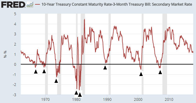
On a related matter, the conventional wisdom is that a steepening yield curve is bullish for the banking system because it results in the expansion of banks’ profit margins. While superficially correct, this ‘wisdom’ ignores the reality that one of the two main reasons for a major steepening of the yield curve is widespread, life-threatening problems within the banking system. For example, the following chart shows that over the past three decades the US yield curve experienced three major steepening trends: the late-1980s to early-1990s, the early-2000s and 2007-2011. All three of these trends were associated with economic recessions, while the first and third got underway when balance-sheet problems started to appear within the banking system and accelerated when it became apparent that most of the large banks were effectively bankrupt.

Here’s an analogy that hopefully helps explain the relationship (under the current monetary system) between major yield-curve trends and the economic/financial backdrop: Saying that a steepening of the yield curve is bullish because it eventually leads to a stronger economy and generally-higher bank profitability is like saying that bear markets are bullish because they eventually lead to bull markets; and saying that a flattening of the yield curve is bearish because it eventually — after many years — is followed by a period of severe economic weakness is like saying that bull markets are bearish because they always precede bear markets.

yieldcurve_161017

Both rising inflation expectations and increasing risk aversion tend to boost the general desire to own gold, whereas gold ownership becomes less desirable when inflation expectations are falling or economic/financial-system confidence is on the rise. Consequently, a steepening yield curve is bullish for gold and a flattening yield curve is bearish for gold.

The US yield curve’s trend has not yet reversed from flattening to steepening, meaning that its present situation is bullish for the stock market and bearish for the gold market. However, the yield curve is just one of seven fundamentals that factor into my gold model and one of five fundamentals that factor into my stock market model.

Print This Post Print This Post