New gold bull market will make 2008-2011 look tame

February 11, 2015

A few days ago the web site energyandgold.com published an interesting interview with Bob Moriarty. The interview is titled “Gold Bottom in, New Bull Market Will Make 2008-2011 Look Tame“, because that’s Bob’s outlook. Bob says a few nice words about me in the interview, but you shouldn’t hold that against him. He’s an astute observer of the markets.

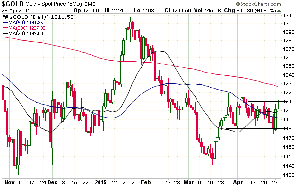
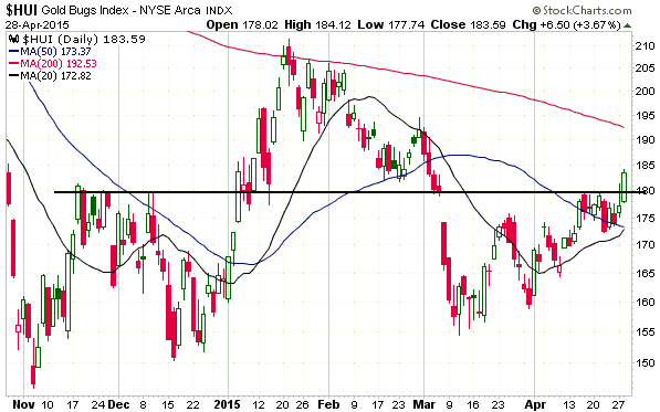
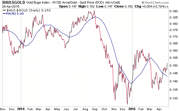
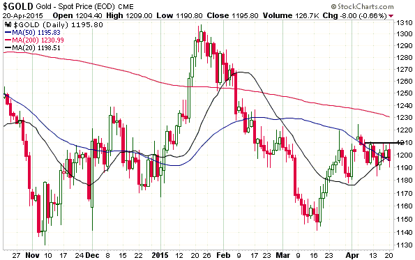
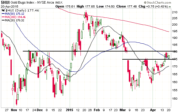
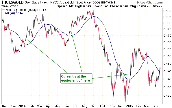
I think Bob’s outlook is plausible, but I’m not expecting anywhere near as much upside in gold-related investments this year as he is. The rebounds from the 2008 bottoms in gold and gold-mining stocks were very quick, but that’s primarily because 2008 was a crash within a continuing cyclical bull market. It wasn’t a cyclical bear market.

The speed with which gold and the mining stocks recover from their 2011-2014 drubbings will be determined by both fundamentals and psychology. Even if the fundamentals become unequivocally gold-bullish in the near future (they are currently either mixed or slightly bullish), history tells me that it could still be at least 12 months before a strong upward trend gets underway. For example, gold’s fundamentals were as bullish as they ever get in early-2001, but the bull market didn’t really get going until 2002.

However, it’s certainly possible that the sentiment shift will happen faster this time around, because the current situation is so far into unprecedented territory that the historical precedents can’t even be seen from here. The mal-investment fostered by central banks over the past several years is simply mindboggling.

For example, the fact that trillions of dollars of government bonds now trade at negative yields reflects mal-investment on a gigantic scale. It means that a huge quantity of wealth has been diverted towards bond speculation and government.

For another example, US corporations have spent hundreds of billions of dollars buying back their own shares instead of investing in business growth. This is a consequence of the perverted incentives created by the Fed.

So, I’m not betting on a rapid change of fortune for gold-related investments, but I can’t rule it out.

Print This Post Print This Post

Cambodia, Gresham’s Law and Corruption

February 9, 2015

Over the most recent Christmas and New Year holiday period, one of the places I visited (with wife and 15-year-old son) was Siem Reap in Cambodia. The town of Siem Reap is best known for, and is a popular tourist destination largely because of, its close proximity to the ruins of Angkor, the capital of Cambodia during the Khmer Empire (9th to 15th Century). Angkor contains the — in some cases largely intact or restored — remnants of some huge temples, including Angkor Wat. However, if (like me) you quickly get bored with temple viewing, Siem Reap is still worth visiting. The town is so vibrant and friendly, with so many interesting eating/drinking places, shops and markets, that I actually wouldn’t mind living there. But the purpose of this post isn’t to discuss the things to see and do in Siem Reap, it’s to discuss some economics-related observations I made while visiting that part of the world.

On arriving at the Siem Reap airport and spending about one hour making our way through the chaotic immigration section I was finally at the document-checking counter, where I had all five digits on both hands scanned for prints. After completing the tedious finger-scanning process I offered to provide a urine sample, but apparently it wasn’t necessary. I thought about giving it to them anyway, but then thought better of it.

What a totally counterproductive exercise in a place that is heavily reliant on tourism! Fortunately, it turned out that the airport was the only bad experience we had in Siem Reap. Not coincidentally, the airport is one of the few parts of the town that is totally controlled by the government. The government, by the way, claims to be democratically elected, but in reality Cambodia is a one-party state headed by a former member of the Khmer Rouge.

The main reason to bring up the airport experience isn’t to complain about the ridiculous security measures and the general inefficiency of the place, it’s because this is where I made the novice mistake of exchanging some US dollars for the local currency, known as the Riel. I didn’t convert much money, thinking that the airport exchange rate would be unattractive, but I shouldn’t have converted any. The reason is that everyone in Siem Reap prefers to deal in US dollars. To put it more accurately, they prefer US dollars to the Riel when receiving payment, although they are happy to give you change in Riel. So, in Siem Reap and perhaps all of Cambodia there are two monies: the money generally perceived to be good (the US$) and the money generally perceived to be not so good (the Riel). This leads me to Gresham’s Law. Cambodia is a good example of why the popular understanding of Gresham’s Law, although it might seem reasonable at first or even second glance, often doesn’t apply in practice.

The popular adaptation of Gresham’s Law is: bad money drives out good. This concept seems to make sense, because people will naturally prefer to hoard the good money and part with the bad money when buying things. However, it generally doesn’t work that way in practice because people will naturally prefer to receive the good money when selling things, so for a trade to take place it will often be necessary for the buyer to offer the good money.

That’s the popular understanding of Gresham’s Law, but the actual principle is: “When a government overvalues one type of money and undervalues another, the undervalued money will leave the country or disappear from circulation into hoards, while the overvalued money will flood into circulation.” That is, Gresham’s Law really only applies in the specific case where there are two equally acceptable types of money and the government fixes the exchange rate between the two. The classic example — and the most relevant example for hundreds of years prior to the last century — is where gold and silver are the most common media of exchange in an economy and the government fixes the gold/silver ratio too high or too low. Actually, even if the ratio is initially set at roughly the right level, changes in the supply of and the demand for the two metals over time will eventually result in one becoming over-valued relative to the other at the official exchange rate. This will lead to the relatively expensive (that is, over-valued) commodity being used progressively more in trade and the relatively cheap (that is, under-valued) commodity being progressively removed from circulation.

In Siem Reap the two types of money aren’t equally acceptable, and although there is an official exchange rate it seemed that people were generally able to trade at whatever rate they deemed appropriate. Consequently, the “bad money” is not driving out the “good money”. On the contrary, the “good money” is thriving as a medium of exchange.

My final Cambodia note is about corruption. Most people believe that all corruption is bad, but in terms of effect on the economy there is both good and bad corruption.

Good corruption is when a government regulation, that for no sensible reason makes it much more difficult for businesses to provide the service that their customers want, can be cheaply ‘got around’ by slipping some money into the pocket of a government rep. In other words, good corruption greases the wheels of commerce. It shouldn’t be required, but in the real world the government puts many unnecessary obstacles in the way of voluntary exchange. An example of good corruption is covered in Jeffrey Tucker’s article about former Washington D.C. mayor Marion Barry.

Bad corruption is when representatives of the government greatly increase the cost of doing business for the purpose of enriching themselves. It is Mafia-style extortion that puts additional obstacles in the way of voluntary exchange.

In Cambodia I saw examples of bad corruption that I suspect are just the tip of the iceberg. In particular, although the town of Siem Reap is a little chaotic (in a good way), it seems that a government licence is required for almost everything. Even setting up a stall selling fried grasshoppers by the side of the road well outside the main town requires a licence. This is not necessarily a big deal by itself, but I found out about cases where the requirement to get a licence made the cost of going into business prohibitive due to the amount of money that has to be paid ‘under the table’ in addition to the official licence fee. For example, I was told that to become a travel agent you must get a licence and to get the licence you must first pass an exam, but that regardless of how well you do in the exam you will not be given a passing grade unless you pay a relatively large bribe to the government-appointed examiner. This is bad corruption. Good corruption would entail slipping a small sum of money to someone to avoid the silly requirement of having to sit the exam.

In conclusion, Siem Reap is a part of the world where good and bad money openly compete, which is the way it should be. It is a great place to visit and perhaps even to live for a while, but I get the impression that it wouldn’t be a great place to set up a business.

Print This Post Print This Post

Spurred on by the Fed, banks are blowing bubbles again

February 7, 2015

(This post is a modified excerpt from a recent TSI commentary)

The year-over-year pace at which US commercial banks create new credit has accelerated — from a low of 1.2% at the beginning of last year to a recent high of around 8.5%. The relevant chart is displayed below. This is why the US monetary backdrop remained ‘easy’ over the past 12 months despite the gradual winding-down to zero of the Fed’s money-pumping. It is probably also why the US stock market was able to rise last year in the face of some serious headwinds.

bankcredit_070215

Modern-day banking has nothing to do with capitalism. It is, instead, a type of fascism or, to use a less emotive word, corporatism. In essence, this means that it is an unholy alliance between government and private enterprise, which involves the government — directly or via its agents, such as the Federal Reserve in the US — having extensive control over the private enterprise and the private enterprise being given special privileges.

In the US and most other developed countries, the bank-government relationship generally encompasses the following repeating sequence:

1. The government either forces or provides financial incentives to the private banks to expand credit in areas where the government wants more credit to flow. At the same time, the central bank makes sure that there is plenty of scope for banks to profit by borrowing short to lend long.

2. The politically-directed or central-bank-stimulated lending causes booms in some economic sectors. While the boom continues, politicians publicly give themselves pats on the back, central bankers bathe in the glory stemming from general confidence in the financial system, and private bankers pay themselves huge bonuses.

3. The boom inevitably turns to bust, leading to massive loan losses and asset write-offs at most banks. It becomes clear that many banks are bankrupt.

4. The government and its agents provide whatever financial support is needed and implement whatever regulatory changes are needed to ensure that the private banks stay afloat. This is done at the expense of the rest of the economy but is invariably sold to the public as being either helpful to the rest of the economy or a necessary evil to prevent a more painful outcome for the overall economy.

5. The private banks, following their near-death experience, ‘pull in their horns’ and focus on repairing their balance sheets. A result is that commercial bank credit creation grinds to a halt or goes into reverse.

6. The cessation of commercial bank credit expansion is viewed by the government and its agents as a drag on the economy and, therefore, as something that must be fought.

7. Return to Step 1.

There are signs that the US is currently transitioning from Step 2 to Step 3, with the shale-oil industry being the leading edge of the next deluge of commercial bank write-offs. However, it isn’t a foregone conclusion. I know that Step 3 is coming, but the exact timing is unknowable. It’s possible, for example, that the acceleration of bank credit creation in other parts of the economy could mask the effects of the collapsing shale-oil boom.

Print This Post Print This Post

Money supply and recession indicators

February 4, 2015

The following chart of euro-zone True Money Supply (TMS) was part of a discussion on monetary inflation in a TSI commentary published last Sunday.

The ECB introduced a new QE program about two weeks ago. This program is scheduled to get underway in March and will add to the euro-zone money supply, but my TMS chart indicates that the euro-zone’s monetary inflation rate has already accelerated. Specifically, the chart shows that the year-over-year (YOY) rate of growth in euro TMS began to trend upward during the second quarter of last year and ended the year above 9%, which is the highest it has been since the first half of 2010. Note that there was a money-supply surge late last year that pushed the YOY growth rate up from 6.4% in October-2014 to 7.3% in November-2014 to 9.3% in December-2014. In other words, the ECB has introduced a new money-pumping program at a time when the money-supply growth rate is already high and rising.

By the way, this is not short- or intermediate-term bearish for the euro. On the contrary, it will be a bullish influence on the euro/US$ exchange rate if it causes European equities to build on their recent relative strength.

The next chart shows the ISM Manufacturing New Orders Index.

The New Orders Index is a US recession indicator. Its message at this time is that a recession is not imminent, although the downturn of the past two months opens up the possibility that a recession signal will be generated within the next couple of months. I currently don’t expect it, but it could happen.

ISMneworders_040215

As a recession indicator the historical record of the New Orders Index is good, but not perfect. Sometimes it signals a recession that never comes. However, there is a leading indicator of US recession with a perfect track record, and I’m not talking about the yield curve. This indicator’s current position will be discussed in the next TSI commentary.

Print This Post Print This Post

Just when I thought it couldn’t get any worse…

February 3, 2015

Sorry to belabor a subject to which I’ve already devoted a lot of blog space, but just when I thought that the gold supply-demand analysis of Mineweb journalist Lawrence Williams couldn’t get any worse, he comes up with THIS. Not satisfied with wrongly portraying, in many articles, the shift of gold from outside to inside China as an extremely bullish price-driving fundamental and representative of an increase in global gold demand, he now wants you to believe that the transfer of gold from one China-based trader to another China-based trader constitutes an increase in overall Chinese gold demand. No, I’m not making that up. Read the above-linked article.

What he is specifically claiming is that an increase in overall Chinese gold demand occurs when someone in China takes delivery of gold from the Shanghai Gold Exchange (SGE). He seems to be oblivious of the fact that all the gold sitting in the SGE’s inventory is owned by someone, so in order for Trader Wong to satisfy an increase in his demand for physical gold by taking delivery, Trader Chang, the current owner of the gold held in the SGE inventory, must reduce his demand for physical gold by exactly the same amount. There can be no net change in demand as a result of such a transaction, and, as discussed in previous posts, the price effect will be determined by whether the buyer (Wong) or the seller (Chang) is the more motivated.

Mr. Williams then goes on to say:

…withdrawals from the [Shanghai Gold] Exchange for the first 3 weeks of the year have come to over 200 tonnes — and with total global new mined gold production running at around 60 tonnes a week according to the latest GFMS estimates, this shows that the SGE on its own is accounting for comfortably more than this so far this year. GFMS has also seen a fall in global scrap supplies — the other main contributor to the total world gold supply — which it sees as continuing through 2015 so the Chinese SGE withdrawal figures so far are, on their own, accounting for around 85% of ALL new gold available to the market. So where’s the rest of the world’s (including India) gold supply coming from?

The answer is that the gold could be coming from almost anywhere. Furthermore, it’s quite likely that most of the gold that ‘flows’ into China and India does not come from the current year’s mine production.

Would someone please point out to Mr. Williams that gold mined 200 years ago is just as capable of satisfying today’s demand as gold mined last month, and that the total aboveground gold inventory is at least 170,000 tonnes and possibly as much as 200,000 tonnes. This aboveground gold inventory, not the 60 tonnes/week of new mine production, is the supply side of the equation.

Print This Post Print This Post

Chris Powell goes off on a tangent

February 2, 2015

Chris Powell has written an article in reply to my blog post “Looking for (gold price) clues in all the wrong places“. Actually, that’s not strictly true. He has written an article that purports to be a reply to my blog post, but completely ignores my central point. Instead, he shifts the discussion back to his manipulation hobbyhorse. Was this deliberate misdirection to avoid addressing my argument? You might very well think that; but of course I couldn’t possibly comment.

Here’s a hypothetical situation that will hopefully further explain the main point I’m trying to get across. Assume that Fred is looking for an opportunity to buy 1 million Microsoft shares, that Jack is looking for an opportunity to sell 1M Microsoft shares, that the current share price is $40 and that there is temporarily no one else looking to do a trade in these shares. Initially Jack offers his shares for sale at $42 and Fred bids $38, so no trade takes place. Subsequently, Jack reduces his offer price to $38 and the sale is completed at that price. The fact that the price fell $2 indicates that Jack, the seller, was more motivated than Fred, the buyer, but what if you knew nothing except that 1M shares ‘flowed’ from Jack to Fred? What would this ‘flow’ tell you about the price? The answer is: precisely nothing.

In my hypothetical example, the only way to know whether the buyer or the seller was the more motivated is to look at the price change. It’s the same story in all the financial markets, including the gold market. The price of something could go up on rising volume or it could go up on falling volume or it could go down on rising volume or it could go down on falling volume. In fact, it is possible for the price of something to make a large move in either direction on NO volume.

My point, again, is that the price isn’t determined by the volume or the ‘flow’; it’s determined by the relative eagerness of buyers and sellers. Therefore, from a practical investing/speculating perspective the most useful information is that which provides clues about the likely future intensity of buying relative to selling. In the gold market, these clues will be indicators of confidence in central banks and confidence in the economy.

This point cannot be refuted by quoting Henry Kissinger or a Chinese newspaper. It’s based on logic and economic reality.

Print This Post Print This Post

Yet another useless article about gold supply and demand

January 31, 2015

A recent article at Mineweb discusses the latest gold-market analysis of Gold Fields Mineral Services (GFMS). As far as past or likely future gold price movements are concerned, every sentence in this article is either completely wrong or completely irrelevant.

The GFMS analysis discussed in the article follows the typical, wrongheaded pattern of adding up the flows between different parts of the market and using these flows to estimate supply and demand. It’s the same mistake I’ve addressed many times in the past, most recently in a 26th January blog post. The mistake is largely based on the misconception that current mine production constitutes the supply side of the equation, rather than just a small increment to an existing aboveground inventory.

If you start with a totally wrong premise, you will probably end up with a ludicrous conclusion. In this case the ludicrous conclusion is that gold supply is currently greater than gold demand.

In a market that clears (such as the gold market), supply can never be greater than demand and demand can never be greater than supply. Supply and demand must always be equal, with the price constantly changing to whatever it needs to be to maintain the balance.

Claiming that the supply of gold exceeds the demand for gold would be like claiming that the supply of dollars exceeded the demand for dollars. Such claims create the impression that there is a pile of gold or dollars somewhere that nobody wants or owns, because current demand has already been fully satisfied by the rest of the supply. The reality is that all gold and all dollars are always held/owned by someone, with the price (or purchasing power) adjusting to keep the supply equal to the demand.

From a supply-demand perspective, the only significant difference between gold and the US$ is that the supply of dollars regularly changes a lot (by 8% or more) from one year to the next, whereas the annual rate of change in the total aboveground gold supply is always around 1.6%. The reason, of course, is that considerable real resources (labour, materials and energy) must be employed to increase the aboveground gold supply, whereas the supply of dollars can be increased at no cost at the whim of central and commercial bankers.

That’s why I care about changes in US$ supply and do not care about changes in gold-mine production.

Print This Post Print This Post

Comparing Real Performance

January 27, 2015

This post is a slightly-modified excerpt from a recent TSI commentary.

Here is chart that compares the long-term inflation-adjusted (IA) performances of several markets. This chart makes some interesting points.

One of the most interesting points is that market volatility increased dramatically in the early-1970s when the current monetary system was ushered in. This shows that the generally higher levels of monetary inflation and the larger variations in the rate of monetary inflation that occurred after the official link to gold was abandoned didn’t only affect nominal prices. Real prices were affected in a big way and boom-bust oscillations were hugely amplified. As an aside, economists of the Keynesian School are oblivious to the swings in relative ‘real’ prices caused by monetary inflation and the depressing effects that these policy-induced price swings have on economic progress.

A second point is that commodities in general (the green line on the chart) have experienced much smaller performance oscillations than the two monetary commodities (gold and silver). This is consistent with my view that there aren’t really any long-term broad-based commodity bull markets, just gold bull markets in which most commodities end up participating.

A third point is that apart from the CRB Index, the markets and indices included in the chart have taken turns in leading the real performance comparison. The chart shows that gold is the current leader, closely followed by the Dow Industrials Index (since January-1959, the percentage gain in gold’s real price is slightly greater than the percentage gain in the Dow’s real price). However, if dividends were included, that is, if total returns were considered, the Dow would currently be in the lead. This will change.

    Chart Notes:

1) I use a method of adjusting for the effects of US$ inflation that was first described in a 2010 article. This method isn’t reliable over periods of two years or less, but it should come close to reflecting reality over the long term.

2) To make it easier to compare relative performance, the January-1959 starting value of each of the markets included in the above chart was set to 100. In other words, the chart shows performance assuming that each market started at 100.

3) The monthly performance of the scaled IA silver price peaked at more than 2600 in early-1980, but for the sake of clarity the chart’s maximum Y-axis value was set to 1500. In other words, the chart doesn’t show the full extent of the early-1980 upward spike in the IA silver price.

Print This Post Print This Post

Looking for (gold price) clues in all the wrong places

January 26, 2015

Every transaction in a market involves an increase in demand for the traded item on the part of the buyer and an exactly offsetting decrease in the demand for the traded item on the part of the seller, which means that neither a purchase nor a sale implies a market-wide change in demand or price. This is obvious, so why does so much gold-market analysis focus on the quantities of gold shifting from one geographical area to another or from one part of the market to another?

I don’t know the answer to the above question, but I do know that focusing on the changes in gold location is pointless if your goal is to find clues regarding gold’s prospects. For example, while there could be a reason for wanting to know the amount of gold being transferred to China (I can’t think of a reason, but maybe there is one), the information will tell you nothing about the past or the likely future performance of the gold price. For another example, the amount of gold shifting into or out of ETF inventories could be of interest, but the shift in location from an ETF inventory to somewhere else or from somewhere else to an ETF inventory is not a driver of the gold price (as I explained in a previous blog post, changes in ETF inventory are effects, not causes, of the price trend).

Over recent years many gold bulls have cited the net-buying of gold by the geographical region known as China as a reason to expect higher prices. Prior to that it was often the net buying of gold by India that was cited as a reason to be bullish. The point that is being missed in such arguments is that regardless of whether gold’s price trend is bullish or bearish, some parts of the world will always be net buyers and other parts of the world will always be net sellers of gold, with the two exactly offsetting each other. At some future time it is possible that China will become a net seller and the US will become a net buyer. If so, will the same pundits that have wrongly cited the buying of China as a reason to be bullish then start wrongly citing the buying of the US as a reason to be bullish? Unfortunately, they probably will.

What determines gold’s price trend isn’t the amount of gold bought, since the amount bought will always equal the amount sold. Instead, the price trend is determined by the general urgency to sell relative to the general urgency to buy (with the relative urgency to buy/sell being strongly influenced by confidence in the two senior central banks). To put it another way, if the average buyer is more motivated than the average seller, the price will rise, and if the average seller is more motivated than the average buyer, the price will fall. So, how do we know whether the buyers or the sellers are the more motivated group?

The only reliable indication is the price itself. If the price is rising we know, with 100% certainty, that buyers are generally more motivated than sellers. In other words, we know that demand is trying to increase relative to supply. And if the price is falling we know, with 100% certainty, that sellers are generally more motivated than buyers. In other words, we know that demand is trying to decrease relative to supply.

That’s why statements along the lines of “demand is rising even though the price is falling” are just plain silly.

Print This Post Print This Post

Gold versus Copper

January 22, 2015

One of the most interesting aspects of the recent steep downward trend in the copper price is that it occurred in parallel with a rising trend in the gold price. This doesn’t guarantee anything, but it is consistent with what should be happening if the commodity markets have begun the transition from cyclical bear to cyclical bull.

By way of explanation, long-term broad-based rising trends in commodity prices are always driven by bad monetary policy. A consequence is that gold, due to its nature, will generally turn higher in advance of most other commodities. In effect, there are no long-term broad-based commodity bull markets, just gold bull markets that most commodities end up participating in.

A good example occurred during 2001-2002. As illustrated by the chart displayed directly below, in 2001 the copper price continued to trend downward for 7-8 months and fell by more than 20% after gold’s price trend reversed upward. 

gold_copper_2001_220115

As illustrated by the next chart, there was a ‘head fake’ during the first quarter of last year, with gold rising while the copper price tanked. A similar situation has developed since early-November.

gold_copper_220115

If gold bottomed on a long-term basis last November, then copper should do the same within the next few months.

Print This Post Print This Post