Gold’s true fundamentals turn bullish

July 5, 2018

I update gold’s true fundamentals* every week in commentaries and charts at the TSI web site, but my most recent blog post on the topic was on 30th April. At that time the fundamental backdrop was gold-bearish, but there has since been a change.

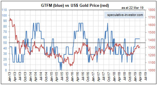
My Gold True Fundamentals Model (GTFM) turned bearish in mid-January 2018 and was still bearish at the end of the week before last (22nd June). There were fluctuations along the way, but at no time between mid-January and late-June was the fundamental backdrop supportive of the gold price. However, at the end of last week (29th June) the GTFM turned bullish. The deciding factor was a small, but significant, widening of credit spreads.

Here is a chart comparing the GTFM (in blue) with the US$ gold price (in red).

The upshot is that for the first time in more than 5 months the gold market has a ‘fundamental’ tail-wind, which is a prerequisite for a substantial rally. For reasons that I’ve mentioned in TSI commentaries I’m expecting a tradable 2-month rally from a July low rather than a substantial rally, but my expectations will change if the evidence changes.

*Note that I use the word “true” to distinguish the actual fundamental drivers of the gold price from the drivers that are regularly cited by gold-market analysts and commentators. According to many pontificators on the gold market, gold’s fundamentals include the volume of metal flowing into the inventories of gold ETFs, China’s gold imports, the volume of gold being transferred out of the Shanghai Futures Exchange inventory, the amount of “registered” gold at the COMEX, India’s monsoon and wedding seasons, jewellery demand, the amount of gold being bought/sold by various central banks, changes in mine production and scrap supply, and wild guesses regarding JP Morgan’s exposure to gold. These aren’t true fundamental price drivers. At best, they are distractions.

Print This Post Print This Post

Can silver rally without gold?

June 29, 2018

[This blog post is an excerpt from a recent TSI commentary]

The article titled “Silver’s Critical Role In Electrification May Fuel Its Rise” contains some interesting comments about the silver market, but with one minor exception the information presented in this article has no bearing on silver’s risk/reward as a speculation or investment. The minor exception is the high (by historical standards) gold/silver ratio, which suggests that the silver price is likely to rise relative to the gold price over the next few years. However, none of the information about silver ‘fundamentals’ presented in the article is relevant to the silver price.

It isn’t relevant for the same reasons that most of the information presented by the ‘experts’ about gold fundamentals is also not relevant: It treats the annual output of the mining sector as if it were the total supply (annual mine production is a small fraction of the total supply) and it confuses flows from one part of the market to another with changes in total demand (every ‘flow’ involves an increase in demand on the part of the buyer and an exactly offsetting decrease in demand on the part of the seller). Furthermore, it isn’t relevant for another reason that can be illuminated by asking the question: within the past 80 years, when was there a major silver rally in the absence of a gold rally?

The answer is that over the past 80 years there hasn’t been a single major silver rally in the absence of a gold rally. The best rally in silver without a concurrent rally in gold was the 6-month price spike that began in Q3-1997. This rally resulted from an attempt to manipulate the price upward on the back of Warren Buffett’s silver accumulation; it did not result from any of the ‘fundamental’ drivers cited by commentators trying to make the case that silver can rally strongly without gold.

The historical record persuasively argues that large silver rallies don’t happen in the absence of large gold rallies. This tells us that either economic/financial-system confidence drives the silver market in the same way that it drives the gold market or that the big trends in silver simply follow the big trends in gold.

The bottom line is that there does not appear to be a good reason to expect the silver price to move substantially higher independently of the gold price.

Print This Post Print This Post

Why the yield curve changes direction ahead of a recession

June 18, 2018

[This post is an excerpt from a TSI commentary]

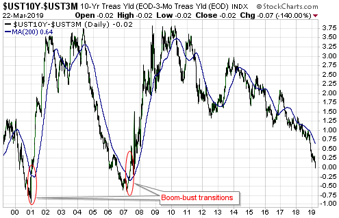
Conventional wisdom is that an inversion of the yield curve (short-term interest rates moving above long-term interest rates) signals that a recession is coming, but this is only true to the extent that a recession is always coming. A reversal in the yield curve from flattening to steepening is a far more useful signal.

What a yield curve inversion actually means is that the interest-rate situation has become extreme, but there is no telling how extreme it will become before the eventual breaking point is reached. Furthermore, although there was a yield-curve inversion prior to at least the past seven US recessions, Japan’s most recent recessions were not preceded by inverted yield curves and there is no guarantee that short-term interest rates will rise by enough relative to long-term interest rates to cause the yield curve to become inverted prior to the next US recession. In fact, a good argument can be made that due to the extraordinary monetary policy of the past several years the start of the next US recession will NOT be preceded by a yield curve inversion.

Previous US yield curve inversions have happened up to 18 months prior to the start of a recession, and as mentioned above it’s possible that there will be no yield curve inversion before the next recession. Therefore, we wouldn’t want to be depending on a yield curve inversion for a timely warning about the next recession or financial crisis. However, the yield curve can provide us with a much better, albeit still imperfect, recession/crisis warning in the form of a confirmed trend reversal from flattening to steepening. This was discussed in numerous TSI commentaries over the years and was also covered in a blog post last December.

There are two reasons that a reversal in the yield curve from flattening to steepening is a more useful recession/crisis warning signal. First, it is timelier. Second, it should work regardless of whether or not the yield curve becomes inverted.

Now, from a practical speculation standpoint it is not essential to understand WHY the yield curve reverses from flattening to steepening ahead of major economic problems bubbling to the surface. It is enough to know that it does. However, if you understand why the curve has reversed direction ahead of previous recessions you will understand why it either should or might not reverse direction in a timely manner in the future. After all, if extraordinary monetary policy could prevent the yield curve from becoming inverted ahead of the next recession then perhaps it also could prevent the yield curve from reversing course the way it has in the past.

With regard to understanding the why, the first point to grasp is that the boom phase of the cycle is characterised by borrowing short-term to lend/invest long-term. This puts upward pressure on short-term interest rates relative to long-term interest rates, meaning that it causes the yield curve to flatten. Also, when the boom is mature and is approaching its end there will be a scramble for additional short-term financing to a) complete projects that were started when monetary conditions were easier and b) address cash shortages that have arisen due to completed projects not delivering the predicted cash flows. This puts further upward pressure on short-term rates relative to long-term rates, and could, although won’t necessarily, cause the yield curve to become inverted.

Next, as the boom nears its end the quantity of loan defaults will begin to rise and the opportunities to profit from short-term leverage will become scarcer. Everything will still seem fine to casual observers, central bankers, the average economist and the vast majority of commentators on the financial markets, but it will now be apparent to a critical mass of astute operators (investors, speculators and financiers) that many of the investments that were incentivised by years of easy money were ill-conceived. These operators will begin shifting towards ‘liquidity’ and away from risk.

The aforementioned increasing desire for the combination of safety and liquidity leads to greater demand for cash and gold. But more importantly as far as this discussion is concerned, it boosts the demand for short-term Treasury debt relative to long-term Treasury debt (thus putting downward pressure on short-term interest rates relative to long-term interest rates). The reason is that the shorter the term of the Treasury debt, the lower the risk of an adverse price movement. For example, if you lend $10B to the US government via the purchase of 3-month T-Bills then in three months’ time you will have something worth $10B, but if you lend $10B to the US government via the purchase of 10-year T-Notes then in three months’ time you could have something that is worth significantly more or less than $10B.

As an aside, what an investor focused on boosting liquidity really wants is cash, but if he has billions of dollars then cash is not a viable option. This is because the cash would have to be deposited in a bank, which means that the investor would be lending the money to a bank and taking the risk of a massive loss due to bank failure. Lending to the US government is a much safer choice.

In summary, it’s mainly the desire for greater liquidity and safety that begins to emerge at the tail-end of a boom that causes the yield curve to stop flattening and start steepening. As demonstrated by the events of the past few years the central bank has substantial power to postpone the end of a boom, but eventually a breaking point will be reached and when it is the yield curve’s trend will change from flattening to steepening.

Print This Post Print This Post

What is fiat currency?

June 11, 2018

The term “fiat” is often associated with irredeemable-paper or electronic currency, but existing only in paper or electronic form is not the defining characteristic of fiat currency. In fact, paper or electronic currency is not necessarily “fiat” and hard commodity currency can be “fiat”.

Regardless of the form it takes, fiat currency is simply currency by government decree. If the government dictates that a certain ‘thing’ is money and must be accepted in payment for goods, services and debts, then that ‘thing’ is a fiat currency.

Obviously, all of today’s national currencies are fiat currencies. Not so obviously, gold was a fiat currency during the Gold Standard era. It could be claimed — without any argument from me — that during the Gold Standard era gold would have been the most widely used currency without the government making it so, but this is beside the point. In the situation where the government has commanded that gold is money, gold is a fiat currency.

Also not so obviously considering what has been written on the topic in other places, Bitcoin is not a fiat currency. If anything it is the opposite of a fiat currency, because it was created by the private sector and is not supported in any way by the government. This doesn’t mean that Bitcoin is a good currency, as there is a lot more to being a good currency than being outside the direct control of government.

Summing up, people should be careful when applying the word “fiat” to currency/money. The word is routinely used to mean irredeemable or non-physical, but that’s not what it actually means.

Print This Post Print This Post

The useless and dangerous “money velocity” concept

June 5, 2018

In a blog post about three years ago I explained that in the real world there is money supply and there is money demand; there is no such thing as money velocity. “Money velocity” only exists in academia and is not a useful economics concept. In this post I’ll try to make the additional point that in addition to being useless, it can be dangerous.

Before getting to why the money velocity concept can be dangerous, it’s worth quickly reviewing why it is useless. In this vein, here are the main points from the blog post linked above:

1) The price (purchasing power) of money is determined in the same way as the price of anything else: by the interplay of supply and demand. The difference is that money is on one side of almost every transaction, so at any given time there will be millions of different prices for money. This is why it makes no sense to come up with a single number (e.g. the CPI) to represent the purchasing power of money.

2) Money velocity, or “V”, comes from the Equation of Exchange. This equation is often expressed as M*V = P*Q, or, in more simple terms, as M*V = nominal GDP, where “M” is the money supply. In essence, “V” is a fudge factor that is whatever it needs to be to make one side of the ultra-simplistic and largely meaningless Equation of Exchange equal to the other side.

3) The Equation of Exchange can be written: V = GDP/M. Consequently, whenever you see a chart of “money velocity” what you are really seeing is a chart showing nominal GDP divided by some measure of money supply. During a long period of relatively fast monetary inflation the line on such a chart naturally will have a downward slope.

4) Over the past two decades the pace of US money-supply growth has been relatively fast. Hence the downward trend in the GDP/M ratio (a.k.a. money velocity) over this period. Refer to the following chart for details.

5) During the 2-decade period of declining “V” there were multiple economic booms and busts, not one of which was predicted by or reliably indicated by “V”.

velocity_040618

That’s why “money velocity” is useless in describing/analysing how the world works. Unfortunately, there are many influential economists who believe that the simplistic Equation of Exchange can be put to good use when figuring out what’s happening in the world of human action and what should be done about it. These economists, some of whom are in senior positions at central banks, view “money velocity” not only as a valid real-world concept, but also as an important causal factor in the economy.

If you believe that changes in “V” cause changes in economic growth, with a higher “V” bringing about faster growth, then during periods of economic weakness you will be in favour of policies that are specifically designed to boost “V”. In particular, you will be in favour of policies that result in or promote faster spending for the sake of spending.

Of course, if the supply of money is constant then the calculated value of “V” will be high during periods of strong growth and low during periods of weak or no growth. However, the cause is the growth and the change in “V” is a calculated effect of the growth.

Thinking that growth can be boosted via policies designed to increase “V” is similar to the mistake made by Herbert Hoover during the first few years of the Great Depression. He knew that prices tended to rise during economic booms and fall during economic depressions, so he concluded that a depression could be avoided if prices were prevented from falling. That is, he confused cause and effect. This led to efforts to prop-up prices, especially the price of labour. Not surprisingly, these efforts were counter-productive.

Summing up, the belief that “money velocity” is a useful real-world concept is not only wrong, but also dangerous if it is held by people with the power to influence central-bank or government policy.

Print This Post Print This Post

Why it’s different this time

May 29, 2018

[The following is an excerpt from a commentary posted at TSI last week.]

One of the financial world’s most dangerous expressions is “this time is different”, because the expression is often used during investment bubbles as part of a rationalisation for extremely high market valuations. Such rationalisations involve citing a special set of present-day conditions that supposedly transforms a very high valuation by historical standards into a reasonable one. However, sometimes it actually is different in the sense that all long-term trends eventually end. Sometimes, what initially looks like another in a long line of price moves that run counter to an old secular trend turns out to be the start of a new secular trend in the opposite direction. We continue to believe that the current upward move in interest rates is different, in that it is part of a new secular advance as opposed to a reaction within an on-going secular decline. Here are two of the reasons:

The first and lesser important of the reasons is the price action, one aspect of which is the performance of the US 10-year T-Note yield. With reference to the following chart, note that:

a) The 2016 low for the 10-year yield was almost the same as the 2012 low, creating what appears to be a long-term double bottom or base.

b) The 10-year yield has broken above the top of a well-defined 30-year channel.

c) By moving decisively above 3.0% last week the 10-year yield did something it had not done since the start of its secular decline in the early-1980s: make a higher-high on a long-term basis.

The more important of the reasons to think that the secular interest-rate trend has changed is the evidence that the bond market’s performance from early-2014 to mid-2016 constituted a major blow-off. The blow-off and the resulting valuation extreme are not apparent in the US bond market, but they are very obvious in the euro-zone bond market.

In the euro-zone, most government debt securities with durations of 2 years or less rose in price to the point where they had negative yields to maturity, and some long-term bonds also ended up with negative yields. For example, the following chart shows that the yield on Germany’s 10-year government bond fell from around 2% in early-2014 to negative 0.25% in mid-2016.

Although yields have trended upward in the euro-zone since Q3-2016, German government debt securities with durations of 5 years or less still trade with negative yields to maturity. Even more remarkable considering that Italy’s new government is contemplating a partial debt default and a large increase in the budget deficit, Italy’s 2-year government bond yield moved out of negative territory only two weeks ago and is about 220 basis points below the equivalent US yield. To be more specific, you can buy a US 2-year Treasury note today and get paid about 2.5% per year or you can buy an Italian government 2-year note today and get paid about 0.3% per year.

Why would anyone lend money to the Italian government for 2 years at close to 0% today when there is a non-trivial chance of default during this period? Why would anyone have lent money to the Italian government or even to the more financially-sound European governments over the past three years at rates that guaranteed a nominal loss if the debt was held to maturity?

There are two reasons, the first being the weakness of the euro-zone banking system. The thinking is that you lock in a small loss by purchasing government bonds with negative yields to maturity, but in doing so you avoid the risk of a large or even total loss due to bank failure (assuming the alternative is to lend the money to a private bank). The main reason, however, is the ECB’s massive bond-buying program. This program was widely anticipated during 2014 and came into effect in early-2015.

With the ECB regularly hoovering-up large quantities of bonds almost regardless of price, speculators could pay ridiculously-high prices for bonds and be safe in the knowledge that they could offload their inventory to the ECB at an even higher price.

Negative interest rates and negative yields-to-maturity could not occur in a free market. It took the most aggressive central-bank interest-rate manipulation in history to bring about the situation that occurred in Europe over the past few years.

We don’t think it’s possible for the ECB to go further without completely destroying the euro-zone’s financial markets. Also, if it isn’t obvious already it should become obvious within the next couple of years that the aggressive bond-buying programs conducted by the ECB, the Fed and other central banks did not work the way they were advertised. Therefore, even if it were technically possible for the major central banks to go further down the interest-rate suppression path, they won’t be permitted to do so.

That’s why it’s a very good bet that the secular downward trend in interest rates is over.

Print This Post Print This Post

Incomplete silver COT analysis, revisited

May 21, 2018

In a blog post a week ago I discussed why silver’s Commitments of Traders (COT) situation was nowhere near as bullish as it had been portrayed in numerous articles over the preceding two months. This prompted some criticism that involves a misunderstanding of how I use the COT data. Before I address the criticism, a brief recap is in order.

As stated in last week’s post, the enthusiastically-bullish interpretation of silver’s COT situation fixated on the positioning of large speculators (“NonCommercials”) in Comex silver futures. It was based on the fact that over the past two months the large specs had reduced their collective net-long silver exposure to its lowest level in a very long time, indicating that these traders had become more pessimistic about silver’s prospects than they had been in a very long time. This was clearly a bullish development given the contrary nature of speculative sentiment.

I then explained that two components of silver’s overall COT situation cast doubt on the validity of the bullish interpretation.

The first was that near important bottoms in the silver price the open interest (OI) in silver futures tends to be low, but in early-April of this year the OI hit an all-time high.

The second was that whereas the positioning of large specs in silver futures pointed to depressed sentiment, the positioning of small speculators (“NonReportables”) pointed to extreme optimism. This was evidenced by the fact that over the past two months these traders (the proverbial ‘dumb money’) had, as a group, accumulated their greatest net-long exposure in 9 years. It would be very unusual for a big rally to begin at the time when the ‘dumb money’ was positioned for a big rally.

The latest COT report showed minimal change in the positioning of the small specs. As illustrated by the following chart from goldchartsrus.com, their collective net-long exposure is down from its late-March peak but remains near the top of its 3-year range (and its 10-year range).

The main criticism of last week’s blog post was that the size of the total “NonCommercial” (large-spec) position is about 10-times the size of the total “NonReportable” (small-spec) position and therefore that what the “NonCommercials” are doing is an order of magnitude more important than what the “NonReportables” are doing.

My response is: not if the COT information is being used as a sentiment indicator, which is the only way I use it.

The reason it is useful to know the sentiment of the small traders in any financial market is NOT that these traders are the movers and shakers in the market. They obviously aren’t. If they were they wouldn’t be “small” traders and wouldn’t be classed as “NonReportables” in the COT reports. It is useful to know the sentiment of these minor players because as a group they tend to be wrong when they become extremely bullish or extremely bearish. They are the ‘dumb money’. As I wrote last week and repeated above, it would be very unusual for a big rally to begin at the time when the ‘dumb money’ was positioned for a big rally.

Not surprisingly, then, there was no big rally (or any rally worth trading) in the silver market over the past two months.

Print This Post Print This Post

Incomplete silver COT analysis

May 14, 2018

During March and April a number of articles appeared at precious-metals-focused web sites describing the silver market’s Commitments of Traders (COT) situation as extremely bullish. However, this unequivocally bullish interpretation overlooked aspects of the COT data that were bearish for silver. Taking all aspects of the data into consideration, my interpretation at the time (as presented in TSI commentaries) was that silver’s COT situation was neutral and that the setup for a large rally was not yet in place.

The enthusiastically-bullish interpretation of silver’s COT situation fixated on the positioning of large speculators in Comex silver futures. As illustrated by the following chart, over the past two months the large specs (called “NonCommercials” on the chart) first went ‘flat’ and then went net-short. This suggested that large specs had become more pessimistic about silver’s prospects than they had been in a very long time, which was clearly a bullish development given the contrary nature of speculative sentiment.

silverCOT_largespec_140518
Chart source: http://www.goldchartsrus.com/

However, two components of silver’s overall COT situation cast doubt on the validity of the bullish interpretation.

The first is that near important bottoms in the silver price the open interest (OI) in silver futures tends to be low, but in early-April of this year the OI hit an all-time high.

The second and more significant is that whereas the positioning of large specs in silver futures pointed to depressed sentiment, the positioning of small specs (the proverbial dumb money) pointed to extreme optimism. This is evidenced by the following chart, which shows that over the past two months the small specs (called “NonReportable” on the chart) reached their greatest net-long exposure in 9 years. It would be very unusual for a big rally to begin at the time when the ‘dumb money’ was positioned for a big rally.

silverCOT_smallspec_140518
Chart source: http://www.goldchartsrus.com/

The upshot is that silver’s COT situation was not price-supportive at any stage over the past two months. This is mainly because the bullish implications of the unusually-low net-long exposure of large specs was counteracted by the bearish implications of the unusually-high net-long exposure of small specs.

Print This Post Print This Post

US Recession Watch

May 7, 2018

[The following is an excerpt from a commentary posted at TSI last week]

The US economic expansion that began in mid-2009 has been much weaker than average, but, as indicated by the chart displayed below, it is also much longer than average. In fact, it is simultaneously the weakest and the second-longest expansion on record. Due to the advanced age of the expansion and the signs of weakness that have appeared over the past three months in economic statistics and the stock market, recession warnings are becoming more common. However, when we take an impartial look at the most reliable leading indicators of recession we arrive at the conclusion that these warnings are premature.


Chart source: http://realinvestmentadvice.com/bull-markets-actually-do-die-of-old-age/

The three leading indicators of US recession that we care about are the ISM New Orders Index (NOI), Real Gross Private Domestic Investment (RGPDI) and the yield curve. Not one of these indicators is close to giving a recession warning, which is why we say that the increasingly-common warnings of recession are premature.

The NOI, for instance, has declined each month since making a 13-year high in December-2017, but it remains far above the level that it would have to drop below (the red line on the following chart) to warn of a recession.

Also, there are not even tentative signs of major trend reversals in either RGPDI or the yield curve. That’s because last month the US yield curve became its flattest in more than 10 years (a recession is signaled by a major shift from flattening to steepening) and because the data published at the end of last week revealed that RGPDI hit a new all-time high in Q1-2018. RGPDI’s trend generally reverses downward at least two quarters prior to the start of a recession.

Note that the vertical red lines on the following chart mark the starting points of the last two recessions.

Based on the latest data, we roughly estimate the recession start-time probabilities as follows:
- Q2-2018: 0%
- Q3-2018: 10%
- Q4-2018: 30%
- Some time in 2019: >80%

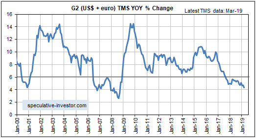
The main reason for our high 2019 recession probability estimate is the decline in the G2 (US plus euro-zone) monetary inflation rate illustrated by the following chart. The inflation rate bounced in March, but it’s likely that the preceding decline was large enough to bring the artificial boom to an end.

Print This Post Print This Post

An update on gold’s true fundamentals

April 30, 2018

I update gold’s true fundamentals* every week in commentaries and charts at the TSI web site, but my most recent blog post on the topic was on 20th March. At that time the fundamental backdrop was gold-bearish. What’s the current situation?

The fundamental backdrop (from gold’s perspective) is little changed since 20th March. In fact, it has not changed much since early this year. My Gold True Fundamentals Model (GTFM), a weekly chart of which is displayed below, turned bearish during the first half of January and was still bearish at the end of last week. There have been fluctuations along the way, but at no time over the past 3.5 months has the fundamental backdrop been supportive of the gold price.

GTFM_270418

It’s possible for a tradable rally in the US$ gold price to get underway at a time when the fundamental backdrop is not gold-bullish, but for this to happen the sentiment situation as indicated by the Commitments of Traders data would have to be very supportive or the US$ would have to be very weak. Currently, the fundamental backdrop is bearish, the sentiment situation is neutral and the Dollar Index has just broken out to the upside. Therefore, as things stand today there is no good reason to expect that a substantial gold rally will get underway in the near future.

Based on how I expect the fundamentals to shift over the weeks ahead my guess is that a substantial gold rally will begin from a May-June low. However, there is more to be lost than gained by ‘jumping the gun’ and buying a short-term trading position now in anticipation of such a rally.

*Note that I use the word “true” to distinguish the actual fundamental drivers of the gold price from the drivers that are regularly cited by gold-market analysts and commentators. According to many pontificators on the gold market, gold’s fundamentals include the volume of metal flowing into the inventories of gold ETFs, China’s gold imports, the volume of gold being transferred out of the Shanghai Futures Exchange inventory, the amount of “registered” gold at the COMEX, India’s monsoon and wedding seasons, jewellery demand, the amount of gold being bought/sold by various central banks, changes in mine production and scrap supply, and wild guesses regarding JP Morgan’s exposure to gold. These aren’t true fundamental price drivers. At best, they are distractions.

Print This Post Print This Post