Revisiting the gold-backed Yuan fantasy

November 27, 2018

[This is an excerpt from a commentary posted at TSI about three weeks ago]

In an article titled “China’s monetary policy must change” Alasdair Macleod discusses a path that China’s government could take to make the Yuan gold-backed and thus bring about greater economic stability in China. Keith Weiner pointed out some flaws in the Macleod article, including the fact that the sort of Gold Standard that involves pegging a national currency to gold is just another government price-fixing scheme and therefore doomed to fail. We will single out an error in the article that Keith didn’t address and then briefly explain why a gold-backed Yuan is a pipe dream.

This excerpt from the article contains the error we want to focus on:

China’s manufacturing economy will be particularly hard hit by the rise in interest rates that normally triggers a credit crisis. Higher interest rates turn previous capital investments in the production of goods into malinvestments, because the profit calculations based on lower interest rates and lower input prices become invalid.

No, higher interest rates do not turn previous capital investments in the production of goods into malinvestments. A rise in interest rates can help reveal malinvestments for what they are, but it doesn’t create them.

Malinvestment occurs on a grand scale when the banking system creates a large amount of money out of nothing, generating false interest-rate signals and making it seem as if the amount of real savings in the economy is much greater than is actually the case. In response to the misleading (artificially low) interest rates and the increased future demand that these interest rates imply (more saving in the present implies more consumption in the future), investments are made in productive capacity. Many of these investments will prove to be ill-conceived, because future demand will turn out to be lower than expected. The investments only appeared to make sense due to the false impressions created by banks loaning copious quantities of new money into existence.

Another way to look at the situation is that a build-up of real savings requires a temporary reduction in consumption. Think of it as a savings-consumption trade-off. People abstain from consumption in the short term so that they will be able to consume more in the long term. When that happens on an economy-wide basis, interest rates move lower.

The falling interest rate indicates that savings are being increased and, by extension, that consumption will be higher in the future. In other words, the falling interest rate is a message that long-term investments in productive capacity are likely to pay off. The problem is that when money is created in large amounts out of nothing, interest rates tend to fall at the same time as consumption is increasing. So, entrepreneurs are being told (by the falling interest rate) that consumption will be greater in the future and to invest accordingly, but at the same time consumers are spending aggressively and ‘tapping themselves out’. Naturally, this doesn’t end well.

The crux of the matter is that malinvestment stems from artificially low interest rates. Also, once it has happened, it has happened. Rising interest rates can be part of the process via which the mistakes are revealed, but the mistakes won’t disappear if interest rates are prevented from rising. Putting it another way, it is not possible to avoid the painful consequences (economic recession or depression) that follow a period during which malinvestment was rife. This is relevant, because the Macleod article argues that interest rates could be kept low in China by linking the Yuan to gold and that by doing this the amount of existing investment that falls into the ‘mal’ category could be greatly reduced.

The reality is that regardless of what happens to interest rates in the future, the extent of the previous malinvestment is such that China’s economy will experience either a collapse or a very long period (probably at least a decade) of virtual stagnation. Given the control that the government has over the banking industry, we guess the latter.

The point is that linking the Yuan to gold wouldn’t be a way around the massive problems that are already baked into the cake. In any case this is a side issue, because there are two simpler reasons that the idea of a gold-backed Yuan is a non-starter.

The first reason is that in a world in which most international trades are US$-denominated, tying any currency apart from the US$ to gold would result in that currency’s exchange rate becoming as volatile as the US$ gold price. In fact, the exchange rate of the gold-backed currency would be totally determined by the performance of the US$ gold price. For example, if the US$ gold price were to rise by 20% in quick time then so would the exchange rate (against the US$) of the gold-backed currency.

The second and more important reason is that any government that implemented a Gold Standard would be relinquishing control of its currency. There would be no further scope for the manipulation of interest rates and currency exchange rates. Also, there no longer would be any scope for debt monetisation in particular and monetary stimulus in general. If we were to make an ordered list of the governments that are LEAST likely to give up these powers, China’s government would be at the top.

Summing up, linking the Yuan to gold would not prevent China’s economy from suffering the consequences of the widespread malinvestment of the past decade and probably would lead to much greater volatility in the prices of imports and exports. Most importantly, there is no way that the control freaks who lead the Communist Party of China are going to implement a monetary system that severely restricts their ability to intervene.

Print This Post Print This Post

The cost of government debt is immediate

November 19, 2018

Most warnings about large increases in government indebtedness revolve around future repayment obligations. For example, there is the concern that greatly increasing the government debt in the present will necessitate much higher taxes in the future. For another example, there is the concern that if the debt load is cumbersome at a time of very low interest rates, then as interest rates rise the interest expense will come to dominate the budget and lead to an upward debt spiral as more money is borrowed to pay the interest on earlier debt. Although these concerns are valid they miss two critical points, including the main problem with government borrowing.

The first of the missed points is that there is no intention to repay the debt or even to reduce the total amount of debt. This is one way that government debt is very different to private debt. Nobody would ever lend money to a private organisation unless there was a good reason to believe that the debt eventually would be repaid, but when it comes to the government the plan is for the total debt to grow indefinitely. It will grow faster during some periods than other periods, but it will always grow. Therefore, it makes no sense to agonise over how the debt will be repaid. It simply won’t be repaid or even reduced.

The current debt-based monetary system has been designed to expand…and expand…until it collapses and is replaced by something else.

Of course, the idea of debt repayment gets plenty of lip service. It has to be that way to avoid a premature collapse. The old Russian joke “we pretend to work and they pretend to pay us” springs to mind, but in this case it’s “the government pretends to care about debt repayment and bond investors pretend to believe them”. It’s a game, and for bond investors one of the guidelines of the game is “you’ll be fine as long as there are still plenty of people pretending to believe the government’s promise to pay”.

A consequence is that the rate of increase in government debt only matters to the extent that it affects the timing of the monetary system’s collapse.

The second of the missed points, and the main problem with government borrowing, is that the costs of the borrowing are immediate as well as long-term. The reason is that with one exception, every dollar added to the government’s debt pile results in a dollar less invested in the private sector. In effect, government debt accumulation adds to government spending at the expense of private-sector investment. This is a negative for economic progress, although it can give a short-term boost to economic activity in the same way that activity gets boosted by hurricane damage.

The one exception mentioned above is when the government debt is monetised by the banking industry (the central bank or the commercial banks). In this case it appears that new savings are magically created to finance the government’s deficit spending, but what actually happens is that misleading price signals are generated. In particular, interest rates are artificially lowered. The ramifications are less negative in the short-term and more negative in the long-term.

Summing up, when the government goes further into debt the biggest problem isn’t that it places a burden on future generations, since the debt will never be repaid anyway. The biggest problem is the immediate dampening effect it has on economic progress.

Print This Post Print This Post

Gold Inflation

November 12, 2018

Here are two long-term charts illustrating the annual rate at which gold is extracted from the ground. The second of these charts shows why mine production can be ignored when trying to understand what happened to the gold price over the preceding few years or figure out what’s likely to happen to the gold price over the next few years.

The first chart shows the amount of gold produced by the global mining industry during each year from 1900 through to 2017 (data sourced from the US Geological Survey). The second chart shows the percentage increase in the world’s above-ground gold supply during each year (1900-2017) resulting from that year’s new mine production. In effect, the second chart shows the gold inflation rate.

Notice that over the past 70 years the annual rate of gold inflation has almost always been between 1.5% and 2.0% and has never strayed far from the 1.5%-2.0% range. In other words, regardless of what’s happening in the world, the total supply of gold increases by approximately the same tiny amount each year.

Over the past 60 years, trend changes in the annual rate of gold inflation appear to be lagged reactions to major price changes, with the 7-10 year lag being due to the time it takes from a major price-related incentive to appear and new mines to be brought into production. For example, the upward trend in the gold inflation rate that began in the early-1980s was probably a reaction to the major price advance that began in the early-1970s.

goldprodn_121118

goldinflation_121118

Print This Post Print This Post

The stocks-bonds interplay

November 2, 2018

It’s normal for the stock market to ignore a rising interest-rate trend for a long time. The reason is that while the interest rate is a major determinant of the value of most corporations, the interest rate that matters for equity valuation isn’t the current one. What matters is the level of interest rates for a great many years to come. Therefore, a rise in interest rates only affects the stock market to the extent that it affects the general perception of where interest rates will be over the next decade or longer.

To further explain, the value of a company is the sum of the present values of all its future cash flows, with the present value of each future cash flow determined via the application of a discount rate (interest rate). Nobody knows what these cash flows will be or what the appropriate discount rate should be, but guesses, also known as forecasts, are made. Clearly, when discounting a set of cash flows spanning, say, the next 30 years, it won’t make sense to simply use the current interest rate. Instead, the analyst doing the calculation will have to make a stab at what will happen to interest rates in the future.

The analyst’s ‘stab’ naturally will be influenced by what is happening in the present, but the future interest rate levels that are plugged into valuation models won’t be adjusted in response to what are considered to be normal fluctuations in the current interest rate. It’s only when the current interest rate breaks out of an established range that it affects expectations in a big way.

That, in a nutshell, is why it isn’t a fluke that the 3rd October downside breakout in the bond market (represented by TLT in the following chart) coincided with the start of a rapid downward re-pricing in the stock market.

TLT_011118

In addition to stocks being influenced by big moves (breakouts from ranges) in bonds, bonds are influenced by big moves in stocks. That’s especially so when important stock-market support levels are breached with little warning. For example, within a few days of the 3rd October downside breakout in the bond market setting in motion a sharp decline in the stock market, the stock market’s weakness was helping to prop-up the bond market. Interestingly, though, the quick 10% decline in the S&P500 Index from its peak led to only a minor rebound in the bond market, despite there being a record-high speculative net-short position in bond futures. As illustrated above, TLT didn’t even manage to rebound by enough to test its 3rd October downside breakout and has dropped back to near its early-October low in response to this week’s recovery in the stock market.

The bond market’s lacklustre response to the recent equity weakness suggests that equities will have to weaken further before the interest-rate trend transforms from a stock-market head-wind to a stock-market tail-wind. Also, the fact that the bond market has already dropped back to near its October low suggests that the stock market will be unable to make significant additional gains without pushing interest rates to new multi-year highs. This, in turn, suggests that there is minimal scope for additional short-term strength in the stock market.

Print This Post Print This Post

Revisiting the age-old relationship between interest rates and prices

October 22, 2018

There is an age-old relationship between prices and interest rates that Keynesian economists have called a paradox (“Gibson’s Paradox”). The relationship was clearer during the Gold Standard era, but as I explained in a previous post it is still apparent if prices are measured in gold.

To understand “Gibson’s Paradox” and why it actually isn’t a paradox, refer to the earlier post linked above. Suffice to say that when money is sound or at least a lot sounder than it is today, interest rates don’t drive prices and prices don’t drive interest rates; instead, on an economy-wide basis both prices (in general) and risk-free interest rates are driven by changes in societal time preference. Moreover, as mentioned above and explained in my earlier post, even with today’s massive, continuous manipulation of interest rates by central banks the relationship is still evident, but only when interest rates are compared to a wholesale price index denominated in gold.

The commodity/gold ratio is the price of a broad-based basket of commodities in gold terms. In essence, it is a wholesale price index using gold as the monetary measuring stick. Also, the risk-free US interest rate that is least affected by the direct manipulation of the Fed is the yield on the 30-year T-Bond, so if the age-old relationship still works then what we should see is a positive correlation between the commodity/gold ratio and the T-Bond yield. Or, looking at it from a different angle, what we should see is a positive correlation between the gold/commodity ratio and the T-Bond price. That’s exactly what we do see.

Using the Goldman Sachs Spot Commodity Index (GNX) to represent commodities, the following chart shows that the age-old relationship has worked over the past 12 years when gold is the monetary measuring stick.

gold_USB_LT_221018

The next chart zooms in on the most recent 2 years and shows that over the past three weeks there has been a significant divergence, with the gold/commodity ratio turning upward and the T-Bond price staying on a downward path. It’s a good bet that this divergence will be eliminated within the next two months via either a decline in the gold/commodity ratio to a new multi-year low or a rebound in the T-Bond. My money is on the latter.

gold_USB_221018

Print This Post Print This Post

Credit spreads and the stock market

October 16, 2018

This post was prompted by a recent article authored by the always thought-provoking Pater Tenebrarum (a pseudonym) at acting-man.com. The article looks at the relationship between credit spreads and the stock market, in particular the historical tendency for credit spreads to begin widening prior to substantial stock market declines and thus to act as timely warning signals of impending stock market trouble. The conclusion is: “…it seems…more likely that a stock market decline will put pressure on junk bonds, instead of weakness in junk bonds providing advance warning of an impending stock market decline. The stock market sell-off in the past week did in fact very slightly lead a surge in high yield spreads.” I don’t know that this conclusion is wrong, but at this time the evidence to support it is not persuasive.

It first should be understood that credit spreads generally begin widening ahead of bear markets, but they generally DON’T lead short-term stock-market corrections. Therefore, the fact that they didn’t warn of the October-2018 sell-off is not meaningful at this time. It will become meaningful only if the October-2018 sell-off proves to be the first decline in a bear market, which is unlikely.

The fact that the most recent stock market sell-off appeared to slightly lead an up-tick (not a surge) in high yield spreads is also not meaningful. The following chart shows that junk bonds often trend with equities (the chart compares the iShares High Yield Corporate Bond ETF with the S&P500 ETF), so actually it is normal for short-term stock market corrections to go hand-in-hand with minor expansions of credit spreads. That’s what happened over the past 2 weeks, what happened in January-February of this year and what happened on numerous other occasions in the past.

HYG_SPY_161018

The above-linked article makes the interesting point that credit spreads in the euro-zone and the US have diverged over the past year, with the former embarking on a widening trend in late-October of last year while the latter continued to contract. If credit spreads were still useful leading indicators of major stock-market trends then this divergence should have been accompanied by dramatic relative weakness in European equities. Since it was accompanied by dramatic relative weakness in European equities this is hardly evidence that credit spreads have lost their usefulness.

Could the influence of QE prevent credit spreads from signaling a trend reversal ahead of the next equity bear market?

I don’t see how. QE led to yield-chasing behaviour, which, in turn, caused credit spreads to become a lot narrower than they would have been. Having been compressed to artificially small quantities, credit spreads should if anything be more sensitive than usual to changes in the financial and economic backdrops.

Summing up, credit spreads have a strong tendency to widen ahead of equity bear markets. It could be different this time, but right now I can’t think of a good reason why it should be different. In any case, there is no need to rely on just one leading indicator.

Print This Post Print This Post

The ultimate financial crisis will be inflationary

October 15, 2018

I’ve read many comments to the effect that the next financial crisis will be like 2007-2008, only worse. However, the sole reason that many people are talking about a coming 2008-like crisis is because the happenings of 2008 are still fresh in the memory. Market participants often expect the next crisis to look like the last one, but it never does. Consequently, the general prediction about the next financial crisis with the highest probability of success is that it won’t be anything like 2008. It could, for example, revolve around an inflation scare rather than a deflation scare. In fact, the current monetary system’s ultimate financial crisis, meaning the crisis that leads to a new monetary system, will have to be inflationary.

The ultimate financial crisis will have to be inflationary, because deflation scares provide ‘justification’ for central bank money-pumping and thus enable the long-term credit expansion to continue with only minor interruptions. To put it another way, a crisis won’t be system-threatening as long as it can be ameliorated by central banks doing what they do best, which is promote inflation.

A related point is that a crisis won’t be system-threatening as long as it involves an increase in demand for the official money. The 2007-2008 crisis was such an animal. Like every other crisis in the US since 1940 it did not involve genuine deflation, almost regardless of how the word deflation is defined. The money supply continued to grow, the total supply of credit did no worse than flatten out, and, as illustrated by the following long-term chart, there was nothing more than a downward blip in the Consumer Price Index. However, with the stock market losing more than half its value and commodity prices collapsing, for 6-12 months it sure felt like deflation was happening.

CPI_LT_151018
Chart source: dshort

What actually happened during 2008 was a deflation scare, as opposed to genuine deflation. I define a deflation scare as a period when the total supply of money and credit continues to grow, but a surge in the demand for money makes it seem as if the economy is experiencing severe deflation.

Since there is no limit to the amount of new money and credit that can be created out of nothing by the central bank, it will always be possible for the central bank to keep the current system going in the face of a crisis that involves a surge in the demand to hold the official money. The problem (for the monetary authorities) will occur when the crisis involves a plunge in the demand for the official money. In such a situation the central bank’s most powerful weapon becomes not just ineffective, but counter-productive*.

The bottom line is that regardless of its other details, if the next crisis involves deflation or a deflation scare then it will be just another bump in the road. It will prompt another bout of aggressive money-pumping that will alleviate the perceived shortage of money and eventually inflate new investment bubbles. Only a crisis that entails a decline in the desire to hold the official money can be an existential threat to the monetary system.

*Creating money out of nothing is always counter-productive if the goal is to hasten long-term economic progress, but it can be productive if the goal is to prolong the existence of a debt-based monetary system.

Print This Post Print This Post

The battle between bearish fundamentals and bullish sentiment continues

October 8, 2018

In a 13th August blog post I noted that for the first time this year the sentiment backdrop had become decisively supportive of the gold price. I also noted that the fundamental backdrop remained unequivocally gold-bearish, and then attempted to answer the question: What will be the net effect of these counteracting forces? My answer was that regardless of sentiment there could not be an intermediate-term upward trend in the gold price until the fundamentals turned gold-bullish, but a $100 short-term rebound was possible even without a significant fundamental improvement. What’s the current situation?

The current situation is similar. Since my 13th August post the sentiment backdrop has become slightly more bullish, the fundamental backdrop has become slightly more bearish, and the price is roughly unchanged at around $1200. Therefore, it’s fair to say that the battle between bearish fundamentals and bullish sentiment has been a draw thus far.

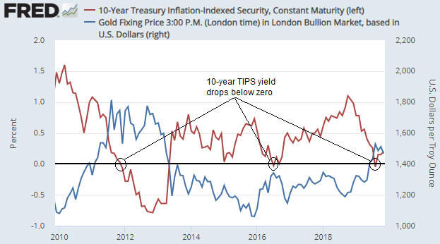
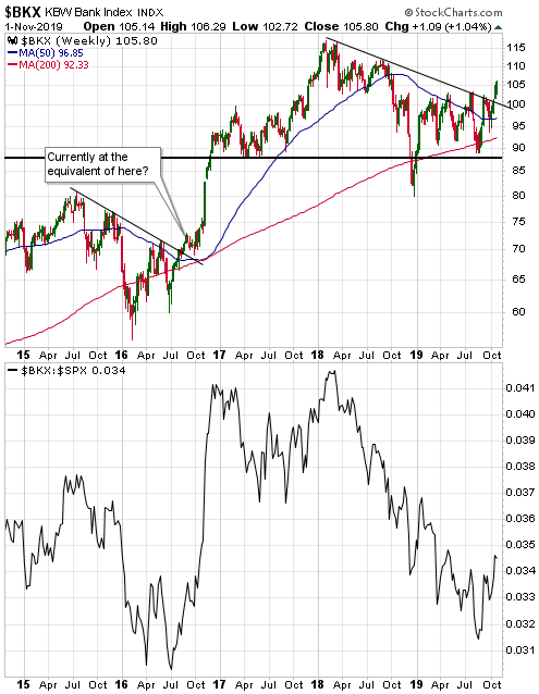
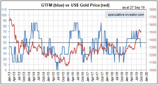
Just to recap, the most important fundamental drivers of the US$ gold price are credit spreads, the yield curve, the real interest rate (the TIPS yield), the relative strength of the banking sector, the US dollar’s exchange rate, the bond/dollar ratio and the general trend of commodity prices. These are the inputs to my Gold True Fundamentals Model (GTFM), a chart of which is displayed below.

Apart from a short period from late-June to mid-July when it was ‘whipsawed’, the GTFM has been continuously bearish since mid-January. No wonder the gold market has struggled this year.

GTFM_081018

The upshot is that due to the bullish sentiment a bounce in the gold price of up to $100 is still a realistic short-term possibility, but due to the bearish fundamentals a much larger rally is not.

The fundamental backdrop is always shifting, so the fact that it is gold-bearish right now doesn’t mean that it will remain so for a long time to come. For example, additional weakness in the stock market would improve gold’s true fundamentals if it caused a significant decline in economic confidence and fostered the belief that the Fed will put its rate-hiking program on hold. However, until/unless such a shift happens, expectations regarding gold’s short-term prospects should be modest.

Print This Post Print This Post

Five years is a long time to be wrong

October 3, 2018

In a few previous blog posts (for example, HERE) I discussed the limitations of sentiment as a market timing tool. It certainly can be helpful to track the public’s sentiment and use it as a contrary indicator, and some of my most successful trades have been partly based on sentiment extremes. However, these days I place less weight on sentiment than I did in the past.

As mentioned in earlier posts, there is no better example of sentiment’s limitations as a market timing tool than the US stock market’s performance over the past few years. This is evidenced by the following chart from Yardeni.com. The chart shows the performance of the Dow Jones Industrials Index over the past 31 years with vertical red lines to indicate the weeks when the Investors Intelligence (II) Bull/Bear ratio was at least 3.0 (a bull/bear ratio of 3 or more suggests extreme optimism within the surveyed group).

Notice that while vertical red lines (indicating extreme optimism) coincided with some important price tops, there were plenty of times when a vertical red line did not coincide with an important price top. Also, notice that with the exception of a multi-quarter period during 2015-2016 when the market was in correction mode, optimism has been extreme almost continuously since Q4-2013.

In effect, sentiment has been consistent with a bull market top for the bulk of the past five years, but there is still no evidence in the price action that the bull market has ended. On the contrary, while there is a high risk of a significant correction in the short term, the long-term leading indicators I track point to the bull market extending well into 2019.

Regardless of what happens from here, five years is a long time for a contrarian to be wrong.

IIbullbear_031018

Print This Post Print This Post

There will be warnings!

September 18, 2018

[This blog post is a slightly-modified excerpt from a TSI commentary published about three weeks ago. Not much has changed in the meantime.]

If you rely on the mainstream financial press for your information then you could be forgiven for believing that financial crises happen with no warning. However, there are always warnings if you know where to look.

Here are four leading indicators of financial stress and/or economic confidence that are both easy to monitor and worth monitoring. It’s likely that all four of these indicators will issue timely warnings prior to the next financial crisis and a virtual certainty that at least two of them will.

1) The yield curve, as depicted on the following chart by the 10yr-2yr yield spread.

As explained in many previous commentaries, the yield curve ‘flattening’ to an extreme and then beginning to steepen warns that an inflation-fueled boom has begun to unravel. For example, the yield curve reached its maximum ‘flatness’ in November-2006 and provided clear evidence of a reversal in June-2007. That was the financial crisis warning. By August of 2007 the ‘steepening’ trend was accelerating.

The yield curve’s current situation looks more like Q4-2006 than Q3-2007. It is nothing like 2008.

2) Credit spreads, as depicted on the following chart by the difference between the Merrill Lynch US High Yield Master II Effective Yield and the yield on the 10-Year T-Note.

Credit spreads start to widen, indicating a decline in economic confidence and/or a rise in the perceived risk of default at the junk end of the debt market, well before a recession or crisis. For example, evidence of a new widening trend in credit spreads emerged in July-2007 and by November-2007 it was very obvious that trouble was brewing.

Note that when it comes to warning of a coming crisis, credit spreads are far more likely to generate a false positive signal than a false negative signal, that is, they are far more likely to cry wolf when there’s no wolf than to remain silent when there is a wolf.

Right now they are silent.

3) The short-term interest rate at which banks lend to other banks versus the equivalent interest rate at which the US federal government borrows money, as depicted on the following chart by the LIBOR-UST3M spread.

When trouble begins to brew in parts of the banking system it gets reflected by higher interest rates being charged for short-term inter-bank loans well before it becomes common knowledge. This causes the spread between 3-month LIBOR (the average 3-month interbank lending rate) and the 3-month T-Bill yield to increase. For example, the LIBOR-UST3M spread was languishing at around 0.20% in early-2007, indicating minimal fear within the banking system, but then began to rise steadily and reached 0.75% in June-2007. This was an early warning sign of trouble. The spread then pulled back into July-2007 before rocketing up to 2.25% in August-2007. This constituted a very loud warning. After that the spread became very volatile and moved as high as 4.5% at the peak of the Global Financial Crisis in October-2008.

At the moment the LIBOR-UST3M spread is languishing at around 0.20%.

4) The gold price relative to industrial metals prices, as depicted on the following chart by the gold/GYX ratio (the US$ gold price divided by the Industrial Metals Index).

The gold/GYX ratio acts like a credit spread. This is because gold’s performance relative to the industrial metals sector tends to go in the same direction as economic confidence. In particular, when confidence begins to decline in the late stage of a boom or the early stage of a bust, the gold/GYX ratio begins to trend upward.

The following chart illustrates the long-term positive correlation between gold/GYX and a credit spread indicator in the form of the IEF/HYG ratio.

The gold/GYX ratio recently bounced from the bottom of its 7-year range. If the bounce continues and gold/GYX exceeds its early-2018 high it would be the first sign of a declining trend in economic confidence.

Currently, none of the above indicators is warning that a financial crisis is imminent or even that a financial crisis is starting to develop. The probability could change as new information becomes available, but based on the present values of the best leading indicators there is almost no chance that a financial crisis will erupt within the next three months.

A stock market crash is a different ‘kettle of fish’, because while a financial crisis always will be accompanied by a large decline in the stock market it is possible for a large decline in the stock market to occur in the absence of a financial crisis. The 1987 stock market crash is an excellent example.

While the four indicators mentioned above should issue timely warnings prior to a financial crisis, they may not warn of a stock market crash that isn’t part of a broader crisis. As is the case with a financial crisis, though, a stock market crash won’t happen ‘out of the blue’. In particular, the stock market won’t make a new all-time high one day and crash the next. This is because it takes time (generally at least two months) from the ultimate price high to create the sentiment backdrop that makes a crash possible.

In summary, short-term stock market risk is high, but there are no warning signs that a financial crisis is brewing or that a stock market crash (as opposed to, say, a 10% correction) is a realistic short-term possibility.

Print This Post Print This Post