Gold and the ‘Real’ Interest Rate

September 10, 2019

[This blog post is an excerpt from a commentary published at TSI on 1st September 2019.]

It’s well known that the US$ gold price often trends in the opposite direction to the US real interest rate. This relationship is illustrated by the following chart in which the real interest rate is represented by the yield on the 10-year TIPS (Treasury Inflation Protected Security).

Notice that the 10-year TIPS yield has just gone negative and that the previous two times that this proxy for the real interest rate went negative the gold price was at an important peak. Specifically, the real interest rate going negative in August-2011 coincided with a long-term top in the gold price and the real interest rate going negative in July-2016 coincided with an intermediate-term top in the gold price. If gold tends to benefit from a lower real interest rate, why would the gold price reverse downward shortly after the real interest rate turned negative?

Considering only the 2016 case the answer to the above question seems obvious, because in July-2016 the TIPS yield reversed course and began trending upward soon after it dipped into negative territory. In other words, the downward reversal in the gold price coincided with an upward reversal in the real interest rate. However, in 2011-2012 the real interest rate continued to trend downward for more than a year after the gold price peaked.

We think there are two reasons why the gold price didn’t make additional gains in 2011-2012 after the real interest rate turned negative. First and foremost, the real interest rate is just one of several fundamental gold-price drivers (the 10-year TIPS yield is one of seven inputs to our Gold True Fundamentals Model), and after August-2011 the upward pressure exerted by a falling real interest rate was counteracted by the downward pressure exerted by other fundamental influences. Second, in August-2011 a further significant decline in the real interest rate had been factored into the current gold price.

The risk at the moment is that on a short-term basis the bullish fundamental backdrop, including the potential for a further decline in the ‘real interest rate’, is fully discounted by the current price. This risk is highlighted by the fact that the total speculative net-long position in Comex gold futures is very close to an all-time high. It is also highlighted by the fact that the RSI displayed in the bottom section of the following weekly chart is almost as high as it ever gets.

Print This Post Print This Post

The market leads the Fed…sort of

August 27, 2019

The relationship between short-term market interest rates and the interest rates set by the Fed is a complicated one. The market makes predictions about what the Fed is going to do and moves in anticipation, but at the same time the Fed’s interest-rate settings are influenced by what’s happening to market interest rates. Also, market interest rates are determined by factors other than what the Fed is doing or expected to do to its official rate targets, and as a result there are times when the market and the Fed seem to be at odds with each other.

At the moment there is no doubt that the market is leading the Fed. In particular, the Fed has been swayed towards rate cutting partly by the fact that the market has discounted rate cuts. This can be established by comparing recent movements in market interest rates with changes in the Fed’s interest rate targets, which I’ll get to shortly. It can also be established by referring to the Fed’s own statements. For example, the minutes of the July FOMC meeting included the following assessment:

Participants observed that current financial conditions appeared to be premised importantly on expectations that the Federal Reserve would ease policy to help offset the drag on economic growth stemming from the weaker global outlook and uncertainties associated with international trade as well as to provide some insurance to address various downside risks.

In essence, the Fed has admitted here to being worried that if it doesn’t cut rates like the market expects then financial conditions could get a lot worse. The implication is that if the market expects the Fed to cut rates, then to avoid disappointing the market (and risking the deterioration of financial conditions) the Fed will cut rates.

I mentioned above that the market’s current leadership can be established by comparing recent movements in market interest rates with changes in the Fed’s interest rate targets. Displayed below is a chart that makes this case. The chart shows the performance of the 2-year Treasury yield and indicates the last two interest-rate changes made by the Fed. Notice that:

1) The 2-year market interest rate began trending downward in early-November of 2018.

2) The Fed made its last rate hike during the second half of December 2018, that is, the Fed was still in rate-hiking mode six weeks after a short-term market interest rate began trending downward.

3) The Fed made its first rate cut at the end of July 2019. By that time, the 2-year market interest rate had been trending downward for almost 9 months.

UST2Y_270819

It’s reasonable to assume that additional Fed rate cuts are on the way. Bear in mind, however, that a few additional rate cuts have already been factored into market prices, so market prices won’t necessarily respond in the obvious way to future Fed rate cuts. Also bear in mind that market interest rates probably will begin trending upward while the Fed and other central banks are still in rate-cutting mode.

Print This Post Print This Post

Gold and freight rates point to an industrial metals rally

August 20, 2019

[This post is a modified excerpt from a recent TSI commentary]

Gold tends to lead the industrial metals sector at intermediate-term bottoms, that is, the US$ gold price tends to make an intermediate-term bottom and commence a multi-quarter (or multi-year) upward trend in advance of the Industrial Metals Index (GYX). Evidence of this can be found on the following chart comparison of the US$ gold price and GYX. Specific examples are:

a) The gold price reversed upward in April of 2001 and GYX did the same in November of that year.

b) The gold price reversed upward in October-November of 2008 and GYX did the same in February-March of 2009.

c) The gold price reversed upward in December of 2015 and GYX followed suit in January of 2016.

Gold’s most recent intermediate-term bottom was in August of 2018. It has since trended upward and over the past two months the trend accelerated. GYX, however, continued to make lower lows until June of 2019. It’s too early to tell if GYX’s June-2019 low was the intermediate-term variety, but regardless of whether or not it makes a new low within the next couple of months the performance of the gold market suggests that the industrial metals sector will commence an intermediate-term rally before the end of this year.

GYX_gold_200819

The Baltic Dry Index (BDI) is also predicting an industrial metals rally

The BDI is an index of dry bulk shipping rates. I generally don’t use it as an economic or a financial-market indicator, because it is influenced as much by changes in the supply of shipping capacity as by changes in the global demand for commodities. However, intermediate-term trends in the BDI often match intermediate-term trends in the Industrial Metals Index (GYX). Also, large short-term divergences between the BDI and GYX tend to be important, with one or the other subsequently making a big catch-up move in quick time.

As illustrated by the following chart, a large divergence has opened up over the past four months due to the BDI rocketing up to a 5-year high while GYX languishes near a 2-year low. This divergence could be closed by either a dramatic plunge in the BDI or a substantial rally in the industrial metals sector. I suspect it will be the latter.

GYX_BDI_200819

Print This Post Print This Post

Why a euro collapse will precede a US$ collapse

August 5, 2019

The euro may well gain in value relative to the US$ over the next 12 months, but three differences between the monetary systems of the US and the euro-zone guarantee that the euro will collapse (cease being a useful medium of exchange) before the US$ collapses.

The first difference is to do with the euro-zone system being an attempt to impose common monetary policy across economically and politically disparate countries. This is a problem. A central planning agency imposing monetary policy within a single country is bad enough because it generates false price signals and in so doing reduces the rate of economic progress. However, when monetary policy (the combination of interest-rate and money-supply manipulations) is implemented across several economically-diverse countries the resulting imbalances grow and become troublesome more quickly.

As an aside, money is supposed to be a medium of exchange and a yardstick, not a tool for economic manipulation. Therefore, it is inherently no more problematic for different countries to use a common currency than it is for different countries to use common measures of length or weight. On the contrary, a common currency makes international trading and investing more efficient. For example, there were long periods in the past when gold was used simultaneously and successfully as money by many different countries. However, if a currency can be created out of nothing then there is no getting around the requirement to have an institution that oversees/manages it. The euro therefore could not be ‘fixed’ by simply eliminating the ECB. The ECB and the one-size-fits-all monetary policy it imposes are indispensable parts of the euro-zone system.

The second difference is linked to the concept that a government with a captive central bank cannot become insolvent with respect to obligations in its own currency. For example, due to the existence of the Fed the US government will always have access to as much money as it needs to meet its obligations, regardless of how much debt it racks up. Putting it another way, should all other demand for Treasury debt disappear the Fed will still be there to monetise whatever amount of debt the US government issues. Consequently, the US government will never be forced to directly default on its debt.

It’s a different story in the euro-zone, however, because the ECB is not beholden to any one government. The provision of ECB financial support to one euro-zone government therefore requires the acquiescence of other governments. This hasn’t been a stumbling block to date and the ECB has provided whatever support was needed to prevent financially-stressed euro-zone governments from directly defaulting on their debts, but eventually a point will be reached when the governments of some countries balk at their interest rates and money being distorted as part of an effort to prop-up the finances of other governments. At that point there will be direct default on euro-zone government debt or the disintegration of the monetary union.

Once it becomes clear that direct default on government debt is a risk to be reckoned with, ‘capital’ will flee the euro-zone at a rapid rate. This is because the main (only?) reason to own government bonds is that they are supposedly risk free.

The third critical difference between the US and euro-zone monetary systems is similar to the second difference. In the US there is a symbiotic relationship between the Fed and the government, with one institution always prepared to support the other in a time of crisis. One consequence of this relationship is the impossibility — as discussed above — of the US government ever being forced to directly default on its debt. Another consequence is the impossibility of the Fed ever becoming bankrupt.

Several years ago there was much speculation that the Fed would go broke due to large losses on the bonds it was buying in its QE operations, but this speculation was never well-informed. Up until now the Fed has made out like the bandit it is on its ‘investments’ in Treasury and mortgage-backed securities, but even if these securities had collapsed in value it would not have resulted in the Fed going bust. It simply would have led to a line being added to the Fed’s balance sheet to keep the books in balance.

Again, though, it’s a different story in the euro-zone. Should the ECB begin to incur large losses on its bond portfolio there is no certainty that it would be able to keep going about its business as usual. To do so would require the support of governments/countries that never benefited from and never whole-heartedly agreed with the programs that led to the pile-up of low-quality bonds on the ECB’s balance sheet.

Summing up, the US monetary system is problematic in that it gets in the way of economic progress, but it is much less fragile than the euro-zone monetary system. That’s why the euro-zone system will be the first to collapse.

Print This Post Print This Post

The stock market’s “true fundamentals”

July 29, 2019

Below is an excerpt from a recent TSI commentary.

An investment’s true fundamentals exert pressure on its price. It is not unusual for the price to trend in the opposite direction to the fundamentals for a while, but if fundamentals-related pressure consistently acts in one direction then the price should eventually fall into line by trending in that direction. Our “true fundamentals” models for gold, the US stock market, the Dollar Index and commodities (the GSCI Commodity Index) are attempts to quantify the magnitude and direction of fundamentals-related pressure.

We have a lot of confidence in our Gold True Fundamentals Model (GTFM), because we understand why it should work and we know that it has worked well over a long enough period to rule out luck/randomness. It isn’t a short-term timing indicator, but all intermediate-term trends in the US$ gold price over the past 17 years* have been in line with the fundamentals as reflected by the GTFM. However, we have less confidence in our other true fundamentals models.

We recently have given more thought to the construction of our Equity True Fundamentals Model (ETFM), which is designed to indicate the direction and magnitude of fundamentals-related pressure on the US stock market (as represented by the S&P500 Index).

The version of the ETFM that we have been using takes into account credit spreads, the yield curve, the real interest rate (as indicated by the 10-year TIPS yield), the relative strength of the banking sector and the G2 monetary inflation rate, with the monetary inflation rate given a greater weighting than the other inputs. However, we now think it was a mistake to put extra emphasis on monetary inflation. This is because although the rate of change in the money supply is the most important long-term driver of the stock market, the time between a trend change in monetary inflation and the effects of this trend change becoming evident in the stock market is long and variable.

In an effort to make the ETFM more useful over the intermediate-term (6-18 month) periods that are of primary interest to us we have made two changes to the Model’s construction. First, we have reduced the emphasis on monetary inflation so that it has the same weighting as the Model’s other inputs. Second, the ISM New Orders Index (NOI) has been added as an input to the Model. This input will be set to 1 when the NOI is 55 or above and set to 0 when the NOI is below 55. This is being done because a) the stock market tends to perform much better when the NOI is greater than 55 than when the NOI is less than 55, and b) there is a strong tendency for the NOI to fall below 55 PRIOR to periods of significant stock market weakness, meaning that weakness in the NOI is not simply a reaction to weakness in the stock market.

The above changes didn’t make a big difference to the historical performance of the ETFM, but they did make the Model a little more sensitive to shifts in the fundamental winds. This is a plus, because the original model wasn’t sensitive enough. Note, as well, that these changes did not alter the current signal. Both the original ETFM and the new/improved ETFM switched from neutral to bearish on 19th April 2019.

Here is a chart comparing the new ETFM (the blue line) with the SPX since the start of 2002. Stock market fundamentals are considered to be bearish when the ETFM is below 50, neutral when the ETFM equals 50 and bullish when the ETFM is above 50.

The true fundamentals are equity-bearish at the moment. If they remain bearish then the price eventually WILL fall into line. Furthermore, the longer the price trends upward or stays elevated in parallel with a bearish fundamental backdrop, the faster the eventual downward price move is likely to be.

*For some of the GTFM inputs we don’t have data prior to the early-2000s, so we can’t compare the GTFM and the gold price during earlier periods.

Print This Post Print This Post

Interest rates and the stock market

July 23, 2019

There is no simple relationship between interest rates and the stock market. In particular, a lower interest rate doesn’t necessarily lead to a higher stock market and a higher interest rate doesn’t necessarily lead to a lower stock market.

The conventional wisdom on this topic is based largely on what happened over the past few decades. Clearly, US equities generally fared well after interest rates embarked on a long-term downward trend in the early 1980s and generally fared poorly when interest rates were in a rising trend during the 10-14 year period prior to the early 1980s. Also, the inverse relationship (a lower interest rate leads to a higher stock market and a higher interest rate leads to a lower stock market) seemed to make sense and was incorporated into a popular stock market valuation tool called “The Fed Model”.

The Fed Model compares the earnings yield of the S&P500 Index (the reciprocal of the S&P500′s P/E ratio, expressed as a percentage) with the 10-year T-Note yield to determine if the stock market is over-valued or under-valued. The higher the S&P500 yield relative to the 10-year T-Note yield, the better the value supposedly offered by the stock market. An implication is that if the 10-year yield is very low, the S&P500 can have a very high P/E ratio and still not be over-valued. For example, according to the Fed Model the S&P500 is attractively valued today. This is because even though the current P/E ratio is almost as high as it ever gets (excluding the 1999-2000 bubble period), the current earnings yield is well above the current 10-year T-Note yield.

However, the simple relationship between interest rates and the stock market only makes sense at a superficial level. It doesn’t hold up under deeper analysis. The reason is that the current value of a company is the sum of all of that company’s future cash flows discounted at some rate, and in most cases it will not be appropriate to use today’s interest rate to discount cash flows that won’t happen until many years or even decades into the future.

When picking a rate at which to discount distant cash flows it would be more reasonable to use a long-term average interest rate than to use the current interest rate. Furthermore, there is no good reason why the change in the interest rate over the next 12 months should significantly affect the interest rate used to discount cash flows that are expected to occur 10-20 years into the future.

But if it is wrong to assume that the stock market should trend inversely to the interest rate over long periods, then why did this assumption prove to be correct over the bulk of the past 50 years?

The first part of the answer is that over the very long term the stock market swings from under-valued to over-valued and back again and that in the early 1980s a bond market under-valuation extreme happened to coincide with a stock market under-valuation extreme. The second part of the answer is that financial market history goes back much further than 50 years and the simple relationship on which the Fed Model is based is not apparent prior to 1970. In essence, the theory that a lower interest rate leads to a higher stock market and a higher interest rate leads to a lower stock market is an artifact of the past 50 years.

The above statement is supported by the following charts. The charts show the Dow Industrials Index and the 10-year T-Note yield from the beginning of 1925 through to the end of 1968.

The US stock market (as represented by the Dow Industrials in this case) was in a secular bearish trend from 1929 until 1942. Apart from an upward spike due to fear of government default in 1931, the 10-year yield was in a downward trend during this bearish stock market period. The stock market then embarked on a secular bullish trend that didn’t end until the late-1960s. The 10-year yield was in an upward trend during this bullish stock market period. That is, the long-term relationship between interest rates and the stock market during 1929-1968 was the opposite of what it was over the past 50 years.

DJIA_10YTNote_170719

Print This Post Print This Post

The coming T-Bond decline

July 16, 2019

A large divergence between two fundamentally-correlated market prices is important because such a divergence usually will be closed via a big move in one or both prices. However, divergences sometimes build for an inconveniently long time before they start to matter.

The gold/commodity ratio (the US$ gold price divided by the GSCI Spot Commodity Index) and the T-Bond are strongly correlated over the long term. They also tend to be well correlated over shorter timeframes, but significant short-term divergences sometimes occur. One such divergence has been developing since the beginning of this year, with the T-Bond making a sequence of higher highs while the gold/commodity ratio stays below its late-December high. Note that even the recent surge to a new 5-year high by the US$ gold price was not enough to push the gold/GNX ratio above its late-December high.

The current divergence and previous similar divergences (higher highs for the T-Bond in parallel with lower highs for the gold/commodity ratio) are illustrated by the following chart. The previous similar divergences led to large declines in the T-Bond price and I can think of no reason to expect that it will be different this time.

USB_goldGNX_150719

Print This Post Print This Post

Gold and Inflation Expectations

July 8, 2019

[This post is an excerpt from a recent TSI commentary]

Gold tends to perform well relative to commodities in general when inflation expectations are FALLING. The evidence is presented below in chart form.

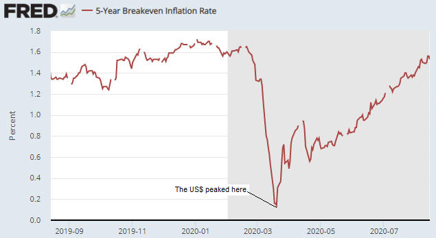
The first of the following charts shows the Expected CPI, which in this case is determined by subtracting the yield on the 5-year TIPS (Treasury Inflation Protected Security) from the yield on the 5-year T-Note. In effect, the chart shows the average annual “inflation” rate that the market expects the US government to report over the next 5 years. We’ve labeled all of the important highs and lows on this chart.

The second of the following charts shows the gold/commodity ratio (the US$ gold price divided by the GSCI Spot Commodity Index). The labels on this chart correspond to the labels on the first chart. For example, point A on the first chart is the same time as point A on the second chart.

Notice that in every case over the 6-year period covered by the following charts, a high for inflation expectations (the Expected CPI) is associated with a low for the gold/commodity ratio and a low for inflation expectations is associated with a high for the gold/commodity ratio.

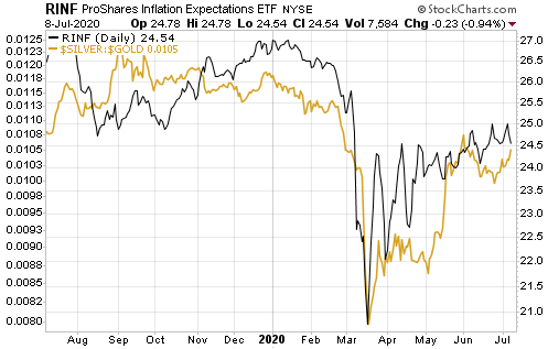
The relationship we tried to show above is more clearly demonstrated by the next chart. On this chart the commodity/gold ratio (as opposed to the gold/commodity ratio) is compared to the ProShares Inflation Expectations ETF (RINF). The correlation clearly is strong, with commodities consistently outperforming gold when inflation expectations are rising and underperforming gold when inflation expectations are falling.

An implication of the above charts is that if inflation expectations are close to an intermediate-term bottom then the financial world is close to the start of a 6-12 month period during which the industrial metals perform better than gold. Alternatively, a further decline in inflation expectations (increasing fear of deflation) would lead to additional relative strength in gold.

We realise that the above message is the opposite of what most people believe about gold, but a lot of what most people believe about gold is not accurate. Of particular relevance to this discussion, gold has never been a hedge against “price inflation”.

Gold tends to perform relatively well during periods when financial-system and/or economic confidence is on the decline. The declining confidence sometimes will go hand-in-hand with rapid “price inflation”, but it isn’t reasonable to expect gold to be a useful hedge against what generally is considered these days to be normal “inflation”. In fact, part of the reason for the strong INVERSE relationship between the gold/commodity ratio and inflation expectations is the general view that “inflation” of 2%-3% is beneficial.

Our view is that the next three months could be dicey, especially if there’s another sharp decline in the stock market. However, we think that by the end of this year inflation expectations will be significantly higher and industrial metals such as copper and platinum will be significantly more expensive relative to gold.

Print This Post Print This Post

US monetary inflation with and without the Fed

June 25, 2019

[This post is a slightly-modified excerpt from a TSI commentary published about two weeks ago.]

The way that most new money was created over the past 10 years was different to how it was created during earlier cycles. During earlier cycles almost all new money was loaned into existence by commercial banks, but in the final few months of 2008 the Fed stopped relying on the commercial banks and began its own money-creation program (QE).

The difference is important because most of the money created by commercial banks is injected into the ‘real economy’ (the first receivers of the new money are businesses and the general public), whereas all of the money created by the Fed is injected into the financial markets (the first receivers of the new money are bond traders). The Fed’s new money eventually will find its way to Main Street (as opposed to Wall Street), but the rate of monetary inflation experienced by the ‘real economy’ during the years following the Global Financial Crisis was a lot lower than suggested by the change in the US True Money Supply (TMS). Consequently, there may have been a lot less mal-investment during the current cycle than during the years leading up to the 2007-2009 crisis.

Don’t get us wrong — there has been a huge amount of ill-conceived and misdirected investment due to the Fed’s money-pumping and associated suppression of interest rates. Due to these bad investments, corporate balance sheets are now much weaker, on average, than otherwise would be the case. In particular, the corporate world collectively has gone heavily into debt and in a lot of cases the debt has not been used productively. For example, it has been used to buy back shares or fund high-priced acquisitions. This will have very negative consequences for the stock market within the next few years, but wasting money on share buy-backs and over-paying for assets does not cause the business cycle.

The ‘boom’ phase of the business cycle happens when artificially-low interest rates prompt investment, on an economy-wide scale, in new production facilities and construction projects that would not have seemed viable in the absence of the distorted interest-rate signal. The ‘bust’ phase of the business cycle kicks off when it starts to become apparent that, due to rising construction/production costs and/or less consumer demand than forecast, the aforementioned investments either cannot be completed or will generate a lot less cash than originally expected. Widespread liquidation ensues, and — as long as policy-makers don’t do too much to ‘help’ — resources eventually get reallocated in a way that meshes with sustainable consumer demand. The economy recovers.

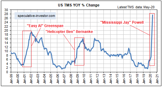
The above is background information for the following charts. The first chart shows the year-over-year (YOY) rate of change in US True Money Supply (TMS), a.k.a. the US monetary inflation rate. The second chart shows the US monetary inflation rate without the Fed’s direct additions and deletions*.

Note that the second chart does not show what would have happened to the US monetary inflation rate in the absence of the Fed. Regardless of whether the Fed is creating new money or not, it exerts a strong influence on the commercial banks. What we have tried to do with the second chart is isolate the monetary inflation that causes the business cycle.

Prior to late-2008 the charts are very similar, but from late-2008 onwards there are some big divergences. The most obvious divergence was in 2009, when the rate of growth in TMS extended the rapid upward trend that began in 2008 while the rate of growth in “TMS minus Fed” collapsed to well below zero. Also worth mentioning is that the rate of growth in “TMS minus Fed” was in negative territory from August-2013 to June-2014, a period during which the rate of growth in TMS never dropped below 7%.

The swings in the “TMS minus Fed” growth rate explain some of the important swings in the US economy. For example, the rapid increase in “TMS minus Fed” during 2011-2012 almost certainly is linked to the mad rush to invest in the shale oil industry, and the 2013-2014 plunge in “TMS minus Fed” would be partly responsible for the collapse of the shale-oil investment boom during 2014-2015. Although it was focused on a single industry, this was a classic case of the mal-investment that results in a boom-bust cycle.

Over the past 18 months the TMS growth rate has extended its major downward trend, but the “TMS minus Fed” growth rate has rebounded. This rebound could delay the start of a recession.

*We assume that the amount of money added by the Fed equals the increase in the Fed’s holdings of securities minus the increase in Reverse Purchase Agreements.

Print This Post Print This Post

The “true fundamentals” are still in gold’s favour

June 10, 2019

After spending almost all of 2018 in bearish territory, gold’s true fundamentals* (as indicated by my Gold True Fundamentals Model – GTFM) have spent all of this year to date in bullish territory. Refer to the following chart comparison of the GTFM (the blue line) and the US$ gold price (the red line) for the details.

GTFM_100619

A market’s true fundamentals are akin to pressure. Due to sentiment and other influences a market can move counter to the fundamentals for a while, but if the fundamentals continue to act in a certain direction then the pressure will build up until the price eventually falls into line. Also, even if it isn’t sufficient to bring about a significant rally, the upward pressure stemming from a bullish fundamental backdrop will tend to create a price floor. That’s what happened with gold during March and April.

As was the case when I last addressed this topic at the TSI Blog, the most important GTFM input that is yet to turn bullish is the yield curve (as indicated by the 10year-2year and 10year-3month yield spreads). This input shifting from bearish to bullish requires a reversal in the yield curve from flattening (long-term rates falling relative to short-term rates) to steepening (long-term rates rising relative to short-term rates). If the reversal is driven primarily by falling short-term interest rates it indicates a boom-to-bust transition, such as occurred in 2000 and 2007, whereas if the reversal is driven primarily by rising long-term interest rates it points to increasing inflation expectations.

As illustrated below, at the end of last week there was no evidence of such a trend change in the 10year-3month yield spread.

yieldcurve_10y3m_100619

To get a gold bull market there probably will have to be a sustained trend reversal in the yield curve. I think that will happen during the second half of this year, but it hasn’t happened yet. Also, when it does happen my guess is that it will be driven by rising long-term interest rates (indicating rising inflation expectations), not falling short-term interest rates. That’s an out-of-consensus view right now, because inflation expectations are low/falling and almost everyone has come to the conclusion that an aggressive Fed rate-cutting campaign will get underway in the near future.

Another GTFM input that could shift from bearish to bullish in the near future and thus add to the upward pressure on the gold price is the currency exchange rate input. At the moment, all it would take to bring about this shift is a weekly close in the Dollar Index about half a point below last week’s close.

My guess is that there will be some corrective activity in the gold market over the coming 1-2 weeks, but as long as the GTFM stays in bullish territory the fundamentals-related upward pressure should enable the gold price to make new multi-year highs within the next few months.

*I use the term “true fundamentals” to distinguish the actual fundamental drivers of the gold price from the drivers that are regularly cited by gold-market analysts and commentators. According to many pontificators on the gold market, gold’s fundamentals include the volume of metal flowing into the inventories of gold ETFs, China’s gold imports, the volume of gold being transferred out of the Shanghai Futures Exchange inventory, the amount of “registered” gold at the COMEX, India’s monsoon and wedding seasons, jewellery demand, the amount of gold being bought/sold by various central banks, changes in mine production and scrap supply, and wild guesses regarding JP Morgan’s exposure to gold. These aren’t true fundamental price drivers. At best, they are distractions.

Print This Post Print This Post