Print This Post Print This Post

The ECB’s monetary machinations

October 3, 2014

The ECB recently launched a two-pronged attack aimed at boosting bank lending to the private sector. These ‘prongs’ are the TLTRO (Targeted Longer Term Refinancing Operation), which got underway on 18th September, and the ABS (Asset Backed Security) and Covered Bond Purchase Program, which will soon get underway. Will these schemes be successful?

That depends on what constitutes success. The schemes cannot possibly foster economic progress, because creating money and credit out of nothing distorts price signals, redistributes wealth from savers to speculators and generally makes the economy less efficient. So, if success is defined as bringing about a stronger economy then failure is guaranteed. However, if success is defined as increasing the size of the ECB’s balance sheet by 1 trillion euros and adding 1 trillion euros to the money supply, then the schemes will probably, but not necessarily, be successful.

The challenge faced by the ECB as it tries to prod the commercial banks into lending more money to the private sector is the dearth of lending opportunities open to the banks. Due to the after-effects of the credit bubble that blew-up in 2008 and the ensuing years during which wealth was siphoned out of the real economy to prevent the holders of government bonds from suffering any losses (part of what we referred to back in 2010 as “the no bondholder left behind policy”), the euro-zone’s pool of willing and qualified private-sector borrowers has experienced severe shrinkage.

The new ABS purchase program is supposed to encourage the commercial banks to be more aggressive in their search for lending opportunities, in that the ECB is effectively saying “if you securitise it, we will buy it”. In other words, the ECB is effectively saying to the banks: “If you make new loans and bundle the loans into a security that can be sold, then you will definitely have a buyer for the security at an attractive price. You will therefore be able to shift the risk from your balance sheet to our balance sheet.” The extent to which the commercial banks will take advantage of this ‘generous’ offer is unknown.

The new ABS purchase program appears to have a better chance than the TLTRO of promoting increased bank lending to the private sector. The reason is that the ABS program enables banks to shift the risk of loan default to someone else (to the ECB and ultimately to tax-payers throughout the euro-zone), whereas the TLTRO is supposed to encourage banks to add risk to their own balance sheets. The TLTRO could still work, though, because the senior managements of banks are often guided by the same type of short-term thinking as most politicians. Just like the average politician is focused on doing/saying whatever it takes to win the next election, the average bank CEO is focused on doing whatever it takes to make the next quarterly and annual earnings reports look good.

Some analysts and commentators are concerned that the ECB’s new money-and-credit creation schemes won’t do enough to bring about the “inflation” that — according to their crackpot theories — the euro-zone needs. Therefore, they believe that the ECB should resort to Fed-style QE (outright large-scale monetisation of government bonds). This prompts me to address the question: Why hasn’t the ECB resorted to Fed-style QE? After all, it is blatantly obvious that Mario Draghi is as ignorant about economics as his Federal Reserve counterpart.

It’s first worth noting that the ECB does not appear to be facing a legal obstacle to the sort of QE programs implemented by the Fed. The ECB is legally prohibited from buying government bonds directly from any euro-zone government, but it is able to buy government bonds in the secondary market. In this respect it is in the same boat as the Fed. Like the ECB, the Fed is legally prohibited from buying US Treasury bonds directly from the US government, but it can buy as many Treasury bonds as it wants from Primary Dealers.

Rather than being legally constrained, the ECB appears to be politically constrained. Whereas some euro-zone governments and national central banks would be in favour of a full-blown QE program, other euro-zone governments and central banks, most notably the German government and the Bundesbank, would be very much against it. That’s why the ECB is coming up with half-measures. At this stage Draghi & Co. can’t get approval for the large-scale monetisation of government bonds, but they can get approval for a monetisation program that will supposedly result in additional credit to private businesses.

Lastly, if the ECB is determined to add 1 trillion euros to its balance sheet and the money supply over the coming 12 months then it will almost certainly find a way of doing so. If the ABS purchase program and the TLTRO don’t do the trick, then some other method will be concocted.

Print This Post Print This Post
Does the debt/GDP ratio drive the gold price?

September 29, 2014

The article linked HERE answers yes to the above question. The correct answer is no.

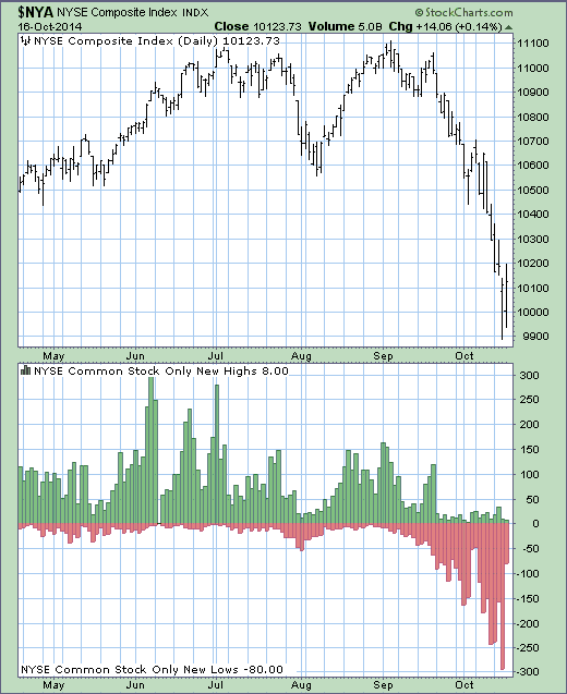
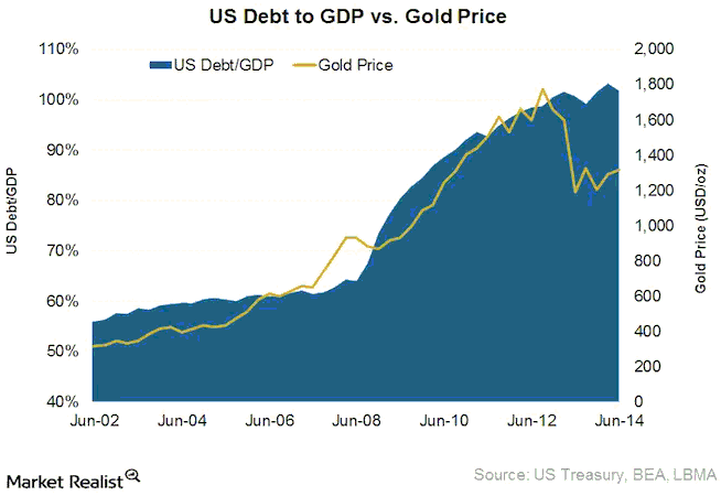
The above-linked article presents the following graph as evidence that the debt/GDP ratio (US federal government debt divided by US GDP, in this case) does, indeed, drive the US$ gold price. However, this is a classic example of cherry-picking the timescale of the data to demonstrate a relationship that isn’t apparent over other timescales. It is also a classic example of confusing correlation with causation. Many things went up in price during the 2002-2014 period covered by this graph. Should we assume that all of these price rises were caused by the increase in the US government-debt/GDP ratio?

By the way, graphs like this were far more visually appealing — although no more valid — three years ago, because the positive correlation ended in 2011. Since 2011, the debt/GDP ratio has continued its relentless advance while the gold price has trended downward. A similar graph that was popular for a while showed a strong positive correlation between the gold price and the US monetary base from the early-2000s through to 2011-2012, which created the impression that the gold price would continue to rise as long as the US monetary base continued to do the same. Again, though, this impression was the result of confusing correlation and causation.

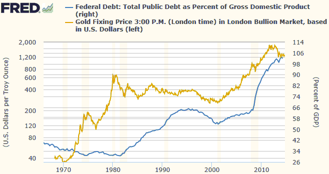
Here’s a chart showing the relationship between the gold price and the US debt/GDP ratio over a much longer period. This chart’s message is that there is no consistent relationship between these two quantities. For example, the huge gold bull market of the 1970s occurred while the debt/GDP ratio was low with a slight downward bias and actually ended at around the time that the debt/GDP ratio embarked on a major upward trend. In fact, from the early-1970s through to the mid-1990s there appeared to be an INVERSE relationship between the gold price and the debt/GDP ratio, but this is just a coincidence. It doesn’t imply that gold was hurt by a rising debt/GDP ratio and helped by a falling debt/GDP ratio; it implies that the debt/GDP ratio isn’t a primary driver of gold’s price tend. For another example, the gold price and the debt/GDP ratio rose in parallel during 2001-2006, but the rise in the debt/GDP ratio during this period was slow and was not generally considered to be a reason for concern. Therefore, it wasn’t the driver of gold’s upward trend.

The theory that the US government debt/GDP ratio is an important driver of the US$ gold price seems to be solely based on the 3-year period from late-2008 through to late-2011, when the two rocketed upward together.

The reality is that a rising US debt/GDP ratio can be a valid part of a bullish gold story, but only to the extent that it helps to bring about lower real interest rates and/or a steeper yield curve and/or a weaker US dollar and/or rising credit spreads. It isn’t directly bullish for gold, which is why a long-term comparison of the US$ gold price and the US debt/GDP ratio shows no consistent relationship. The same can be said about a rising US monetary base.

Print This Post Print This Post
Sentiment and momentum extremes

September 26, 2014

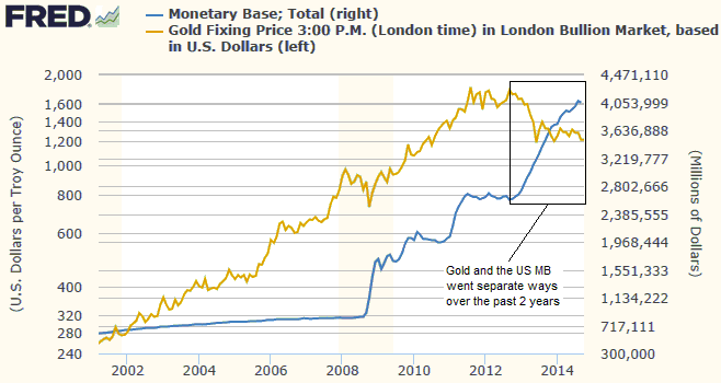
A number of markets are currently at sentiment and momentum extremes. Generally, the Dollar Index is very extended to the upside in terms of both sentiment and momentum, whereas the markets that benefit from a weaker US$ are very extended to the downside in terms of both sentiment and momentum. With regard to the markets that are stretched to the downside, here are some of the most extreme cases based on Market Vane bullish percentages and daily RSIs (Relative Strength Indexes) over the first four days of this week. Note that a market is considered to be ‘oversold’ when its daily RSI(14) drops to 30, while a daily RSI reading of 20 or lower is a rarely-reached extreme.

1) The following extreme daily RSI(14) readings were recorded during the past four days:

– 19.2 for the Continuous Commodity Index (CCI)

– 14.3 for the TSXV Venture Exchange Composite Index (CDNX), a proxy for junior Canadian resource stocks

– 14.5 for platinum

– 15.4 for silver

– 16.4 for the silver/gold ratio

– 16.2 for the Yen (note: the daily RSIs for the euro and the Pound went below 20 earlier this month, but are now a little higher)

2) The following extremely low Market Vane bullish percentages were recorded over the past four days:

– 22% for silver (the lowest level in more than 10 years and possibly a multi-decade low)

– 20% for corn

– 14% for wheat (one of lowest levels ever, in any market)

Negative sentiment and momentum extremes do not necessarily mean that a price low is imminent. The meaning is that there will be a lot of potential energy to drive a rally after the price trend reverses.

Print This Post Print This Post
The coming US monetary tightening

September 23, 2014

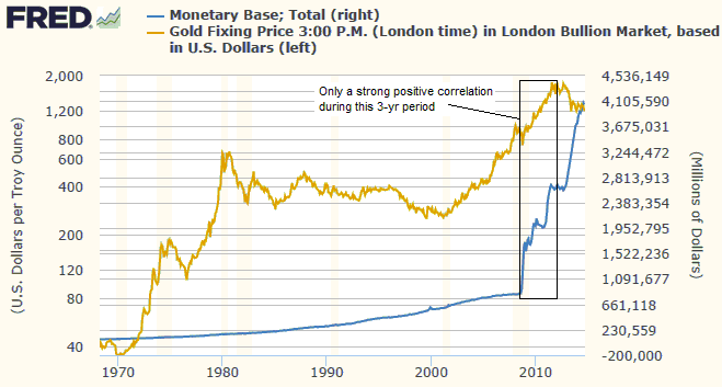
Over the past 12 months I’ve written extensively at TSI about the myths surrounding US bank reserves and the relationship between bank lending and bank reserves. For example, I’ve explained that bank reserves cannot be loaned into the economy and that in the real world — as opposed to the world described in economics textbooks — banks do NOT expand credit by ‘piggybacking’ on their reserves. As part of these bank-reserve writings I addressed the reasoning behind the Fed’s decision to start paying interest on reserves, reaching the conclusion that the decision had been taken to enable the Fed Funds Rate (FFR) to be hiked in the future without contracting the supplies of reserves and money. Last week there was confirmation from the horse’s mouth that my conclusion was correct, as well as some other interesting information on how an eventual tightening of US monetary policy will proceed.

As implied above, the Fed confirmed last week that when it finally gets around to moving the FFR upward, it will do so primarily by adjusting the interest rate it pays on excess reserve balances. If not for the existence of this relatively new policy tool, the only way that the FFR could be hiked would be via the traditional method involving reductions in the supplies of reserves and money. Moreover, considering the immense quantity of excess reserves now in the banking system, there would need to be a large reduction in the supply of reserves just to achieve a 0.25% increase in the FFR. Trying to shift the FFR upward via the traditional method would therefore quickly ignite a financial crisis.

The other interesting information conveyed by the Fed last week is that the size of its balance sheet will be reduced by ceasing to reinvest repayments of principal on the securities it holds. For example, if the Fed currently owns a bond with 3 years remaining duration, then — assuming that it has embarked on a policy normalisation route — it will not reinvest the proceeds when the bond’s principal is repaid in three years’ time. Instead, the principal repayment will bring about a reduction in the Fed’s balance sheet and a reduction in the money supply.

This means that the Fed plans to reduce the size of its balance sheet — and tighten monetary policy — at a snail’s pace.

Print This Post Print This Post
Lower US living standards are an INTENDED consequence of Fed policy

September 21, 2014

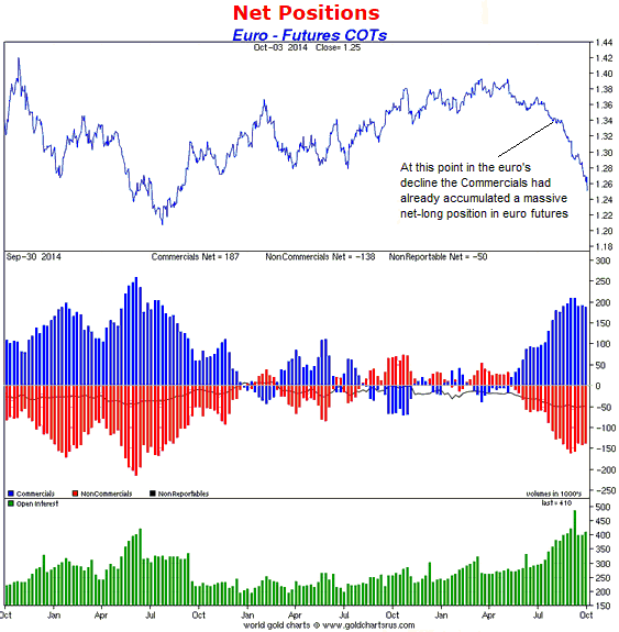
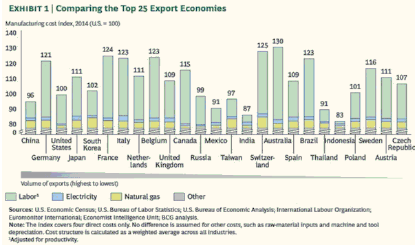
The following chart is very interesting. I found it in John Mauldin’s latest “Thoughts from the Frontline” letter, although it was created by the Boston Consulting Group. It compares the cost of manufacturing in the top 25 exporting countries.

mfg_cost_170914

According to this chart, Australia is now the most expensive country to manufacture stuff. Manufacturing costs in Australia are now 30% higher than in the US, almost 20% higher than in Japan, almost 10% higher than in Germany, and about 5% higher than in Switzerland. The cost of manufacturing in the US is now slightly below the average — at around the same level as South Korea, Russia, Taiwan and Poland. This means that the Fed is almost half way to its goal of reducing US living standards to the point where the average factory worker in the US can compete on a cost basis with the average factory worker in Indonesia.

The above comment is only partly tongue-in-cheek. Many pro-free-market commentators discuss the decline in US living standards as if it were an unintended consequence of the Fed’s policies, but there is nothing unintended about it. It is a deliberate objective. The Fed will never come out and say “we are doing what we can to reduce living standards”, but a policy that is designed to boost asset prices, support capital-consuming businesses and promote investments that would never see the light of day in the absence of artificially low interest rates, all while minimising “wage inflation”, is also designed to reduce real wages and, therefore, to reduce living standards. The Fed surely doesn’t want to reduce US living standards to Indonesian levels, but that’s the direction in which its efforts are deliberately pointed.

I’ve explained in TSI commentaries that the root of the problem is unswerving commitment to bad economic theory. Under the Keynesian theories that all central bankers religiously follow, wealth is something that just exists. There is no careful and deep consideration given to how the wealth came to be and why some countries managed to accumulate a lot of wealth while other countries remained poor. According to these theories, people spend more during some periods due to a vague notion called rising “animal spirits”. This causes the amount of wealth to grow. Then, after a while, the mysterious “animal spirits” begin to subside, causing people to start spending less. This leads to a reduction in the amount of wealth. Under this perception of the world, one of the central bank’s primary tasks is to combat the unfathomable and destabilising natural force that drives the shifts in spending. This is done by indirectly manipulating prices throughout the economy, including the real price of labour.

The so-called counter-cyclical policies are destined to backfire, but the nature of the eventual backfiring is often difficult to predict. In broad terms, there are two possibilities: There could be a surge in inflation fear followed by a collapse in asset prices, a recession and a moonshot in deflation fear, or the collapse in asset prices and its knock-on effects could happen without a preceding surge in inflation fear. In both cases, the asset-price collapse and recession would likely usher-in a new round of ‘stimulative’ policy, because the devotion to bad theory prevents the right lessons from being learned.

Print This Post Print This Post
Gold mining CEOs are generally clueless about gold

September 12, 2014

The CEOs of commodity-producing companies are usually knowledgeable about the supply of and the demand for their company’s products, but gold-mining CEOs are exceptions. The vast majority of gold-mining CEOs have almost no understanding of supply and demand in the gold market.

For example, like most gold-market analysts and commentators, most gold-mining CEOs wrongly believe that the change in annual gold production is an important driver of the gold price. In particular, they talk about “Peak Gold” as if a leveling-off or a downward trend in global gold-mine production would be very supportive for the gold price. This means that they don’t understand that the gold-mining industry’s contribution to the total supply of gold currently equates to only 1.5% per year, and, therefore, that changes in industry-wide gold production will always be dwarfed — in terms of effect on the gold price — by changes in investment/speculative demand. (And by the way, changes in investment/speculative demand cannot be quantified by looking at transaction volumes.)

Gold CEOs’ general cluelessness about the gold market is reflected by the performance of the World Gold Council (WGC). Every year, the WGC produces a pile of completely irrelevant information about gold.

Fortunately, understanding the gold market has nothing to do with being a good CEO of a gold-mining company. A good gold-mining CEO is someone who a) implements strategies that keep total costs at relatively low levels, b) prudently manages country, local-community, environmental and other political risks, c) ensures that the balance sheet remains healthy, and d) only makes acquisitions that are accretive.

Print This Post Print This Post
The ECB’s cunning new plan

September 8, 2014

Last Thursday (4th September) the ECB introduced a cunning new plan to spur growth in the euro-zone, the first part of which involves cutting official interest-rate targets by 0.1%. The benchmark refinancing rate has been reduced to 0.05%, because 0.15% was obviously too high, and the deposit rate has gone further into negative territory, because it obviously wasn’t negative enough. The actions have been taken due to “inflation” and inflation expectations being too low.

Inflation of any kind is the last thing that Europe needs, but from the Keynesian perspective, which is the perspective of all central bankers, it is critical that both inflation and inflation expectations are well above zero. The reason is that in the back-to-front world in which Keynesians are mired, consumption spending comes first and is the driving force of the economy. Furthermore, according to Keynesian logic if people believe that prices are going to be lower in the future they will put off their spending, which will set in motion a vicious deflationary spiral of price declines leading to reduced spending, leading to additional price declines, and so on.

Keynesian logic explains why the computer and smartphone manufacturers never sell anything. Everyone knows that if they wait a year they will be able to buy a better smartphone and a better computer at a lower price, so nobody ever buys these products. As a consequence, the entire computer and smartphone industries have zero sales year after year.

Getting back to the ECB, a goal of reducing the cost of credit to zero is to generate some “price inflation”, which, according to the theories that inform the decisions of central bankers, will boost immediate consumption and cause the economy to grow faster. But if a faster rate of price inflation is what they want, then what they will have to do is increase the rate of monetary inflation. In this regard, taking an overnight interest rate down from 0.15% to 0.05% is probably not going to do much. If the ECB is serious about generating “inflation” then what it really needs to do is implement a Fed-style QE program.

Which brings me to the second part of the ECB’s cunning new plan. The ECB announced that it would begin monetising covered bonds and asset-backed securities (ABS)*, including real-estate-backed securities, next month, with the details to be announced at next month’s ECB meeting. Depending on its size and mechanics, this asset monetisation program could certainly cause prices to rise. To the extent that it does cause prices to rise it will benefit banks and speculators at the expense of savers, productive businesses and wage earners.

Fortunately or unfortunately, depending on your perspective, due to the limited availability of eligible collateral the QE program announced by the ECB last week might be restricted in size to about 200B euros. This means that it might not be large enough to have much effect on the euro-zone money supply.

*Banks create asset-backed securities by pooling mortgages and other loans. Covered bonds are similar, but the underlying assets are ‘ring-fenced’ on the bank’s balance sheet, which means that the assets are still there if the bank goes bust.

Print This Post Print This Post
The global boom/bust indicator

September 5, 2014

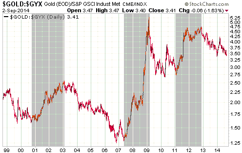
The gold market is generally weak relative to the industrial metals markets during the boom phase of the inflation-fueled, central-bank-sponsored boom/bust cycle and strong relative to the industrial metals markets during the bust phase of the cycle. In other words, the gold/GYX ratio (gold relative to the Industrial Metals Index) tends to fall during the booms, which are periods when economic confidence rises while mal-investment sets the stage for an economic contraction, and rise during the busts, which are periods when the mistakes of the past come to the fore. This is due to gold’s historical role as a store of purchasing power and a hedge against uncertainty.

By shading the bust periods in grey, I’ve indicated the global booms and busts on the following chart of the gold/GYX ratio. During the 16-year period covered by the chart there have been three busts: the recession of 2001-2002 that followed the bursting of the NASDAQ bubble, the global financial crisis and “great recession” of 2007-2009, and the euro-zone sovereign debt and banking crisis of 2011-2012.

The booms tend to fall apart more quickly than they build up, so the rising trends in the gold/GYX ratio tend to be shorter and steeper than the falling trends.

gold_GYX_030914

Gold/GYX’s current situation looks most similar to Q2-2007. At that time the ratio tested its late-2006 bottom and then reversed upward, marking the end of the boom that began in 2003. However, gold will soon have to start strengthening relative to industrial metals such as copper in order for the 2007 similarity to be maintained. If this doesn’t happen and the gold/GYX ratio breaks decisively below its December-2013 bottom, it will indicate that the boom is going to extend into 2015.

I want to stress that gold’s relationship to the boom/bust cycle is primarily about its performance relative to other commodities, especially the industrial metals. It is not about gold’s performance in US$ terms. For example, from mid-2005 through to mid-2006 gold performed poorly relative to the industrial metals, but this was a good time to be long gold and a very good time to be long gold stocks. It’s just that the industrial metals handily outperformed gold during this period, which makes sense considering the global economic and financial-market backdrop at the time. For another example, from May through November of 2008 gold performed extremely well relative to the industrial metals. This makes sense considering the global economic and financial-market backdrop of the period, but it was a bad time to be long gold and a very bad time to be long gold stocks.

Print This Post Print This Post
The “Widowmaker Trade”

September 1, 2014

Over the past 15 years there have always been very compelling reasons to short Japanese Government Bonds (JGBs), but almost everyone who has attempted to make money by shorting JGBs has ended up losing money. The consistency with which bearish JGB speculators have lost money over a great many years led to the short-selling of JGBs becoming known as the “widowmaker trade” and spawned the saying: “you can’t claim to be a speculator until you’ve lost money shorting JGBs”.

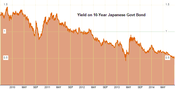
As evidenced by the steady downward trend on the following Bloomberg.com chart of the 10-year JGB yield, anyone who has attempted to short the JGB since the beginning of this year has lost money. In other words, the “widowmaker trade” is still living up to its name. Moreover, with the exception of a few days during early-April of last year, the 10-year JGB yield has never been lower than it is right now.

JGByield

Actually, despite the steady upward grind in price and downward grind in yield, I doubt that many speculators have lost money shorting JGBs this year. The reason is that the market for JGBs no longer functions like a real market. It has effectively been squashed by the gigantic boot of the Bank of Japan (BOJ).

Due to the BOJ’s policy of buying-up every piece of government debt it can get its hands on, the JGB is so over-priced that there are no buyers apart from the BOJ. At the same time, nobody in their right mind would bet against a high-priced investment that was being supported by a totally committed buyer with infinitely deep pockets. Consequently, for all intents and purposes the JGB market is dead.

Given the proclivity of the US monetary authorities to copy Japan’s worst policy choices, speculators who believe that they will make a fortune over the years ahead by shorting US government bonds should probably re-think their stance. After all, if a Keynesian remedy fails dismally in Japan, it can only be because the remedy wasn’t implemented aggressively enough.

Print This Post Print This Post
Interest rate suppression stupidity

September 1, 2014

It is illogical to expect an artificially-low interest rate to help the economy. This is because the best-case scenario resulting from interest-rate suppression is a wealth transfer from savers to speculators. In other words, the best case is a ‘wash’ for the overall economy. The realistic case, however, is very much a negative for the overall economy, because in addition to punishing savers an artificially low interest rate will cause mal-investment and thus make the economy less efficient.

Furthermore, thanks to the Japanese experience of the past two decades there is now a mountain of recent empirical evidence to support the logic outlined above. Japan’s policymakers have tried and tried again to propel their economy to the mythical “escape velocity” by pushing interest rates down to absurdly low levels and keeping them there, but every attempt has failed. Unfortunately, the fact that interest-rate suppression has been a total bust in Japan has not dissuaded other central banks from going down the same path.

The root of the problem is devotion to bad economic theory. If you are convinced that lowering the interest rate, pumping money into the economy and ramping-up government spending is beneficial, then from your perspective a failure of such measures to sustainably boost the rate of economic growth can only mean that the measures weren’t aggressive enough. If the interest rate is reduced to zero and the economy remains sluggish, then a negative interest rate must be needed. If the economy doesn’t become strong in response to 10% annual money-supply growth, then 15% or 20% annual monetary expansion is obviously required. If a hefty boost in government spending fails to kick-start the economy, then it must be the case that government spending wasn’t boosted enough.

The alternative is that the theory underlying the policy is completely wrong, but this possibility must never be acknowledged.

Print This Post Print This Post

Still not much monetary inflation in Japan

August 22, 2014

A popular view is that the Bank of Japan (BOJ) is inflating the Yen to oblivion. This view is wrong. The reality is that while there is certainly a risk that the BOJ will eventually inflate Japan’s money supply at a fast pace, it is not currently doing so.

The spectacular QE program introduced by the BOJ in April of last year did have some effect on the money supply, but the effect was nowhere near as great as generally believed. As illustrated by the chart displayed below, the year-over-year (YOY) rate of increase in Japan’s M2 money supply rose from around 3% in early-2013 to just above 4% near year-end, but 4% is a long way from the explosive growth that most analysts thought would result from the BOJ’s new Yen-depreciation policy. Furthermore, the YOY rate of increase in Japan’s M2 has since drifted down to 3% and appears to be on its way back to the long-term average of 2% (I think it will be back at 2% by October). This means that Japan is still maintaining the world’s lowest monetary inflation rate, which prompts me to ask: Why are so many analysts still blindly assuming that the BOJ is rapidly expanding the Yen supply? Why aren’t they spending the 15 minutes that would be needed to validate — or in this case invalidate — their assumptions by checking the money-supply figures available at the BOJ web site?

An implication of the above is that the supply side of the Yen’s supply-demand equation remains bullish for the Yen’s exchange rate. However, for most currency traders this doesn’t matter. The reason is that the supply side dominates very long-term trends in the foreign exchange market, but the demand side often dominates over periods of up to 2 years.

Print This Post Print This Post

T-Bonds are still defying almost everyone’s expectations

August 19, 2014

One of the main reasons that T-Bonds continue to rise in price (fall in yield) is that most speculators continue to bet on a price decline (a rise in long-term interest rates). In other words, the sentiment backdrop remains supportive. It’s worth noting, for example, that despite the strong and consistent upward trend of the past 9 months, there is still a substantial speculative net-short position across the 30-year T-Bond and 10-year T-Note futures markets. Therefore, higher T-Bond/T-Note prices and lower long-term interest rates probably lie in store.

That being said, the iShares 20+ Year Treasury ETF (TLT) is now a) very ‘overbought’ by some measures (momentum, not sentiment), b) within 2% of intermediate-term resistance at 120, and c) within 6% of its mid-2012 all-time high. A test of resistance at 120 will almost surely happen and a test of the all-time high will possibly happen prior to the next intermediate-term peak, but a sustained break into all-time-high territory is very unlikely.

TSI was short-term bullish on US Treasury bonds from mid-December of last year through to mid-August of this year, but turned short-term “neutral” in a report published on 17th August. I expect to see additional gains in the T-Bond price and additional declines in the T-Bond yield over the next few months, but the short-term risk/reward is no longer skewed towards reward. It is also not skewed towards risk, meaning that it doesn’t yet make sense to bet against this market.

Print This Post Print This Post

The coming mother-of-all economic busts

August 18, 2014

The extent to which monetary stimulus weakens an economy’s foundations and gets in the way of real progress will be proportional to the aggressiveness of the stimulus. This is because the greater the monetary stimulus, the greater the part within the overall economy that will end up being played by ‘bubble activities’ (businesses, projects, investments and speculations that only seem viable due to artificially low interest rates and a constant, fast-flowing stream of new money). That’s why the unprecedented (at that time) monetary stimulus of 2001-2005 led to the most severe economic fallout in more than 50 years, and why the even more over-the-top monetary stimulus of 2008-2013 has paved the way for an economic downturn of even greater severity than that of 2007-2009.

I’ll be writing more about the coming economic bust (aka severe recession or depression) over the next several months, especially if signs appear that it will soon get underway. For now, here are a few preliminary thoughts:

1) The next economic bust is likely to be worse than, and different from, the one that occurred during 2007-2009. What I mean is that the next bust is unlikely to be an amplified version of what happened previously. The main reason is that almost everyone, including the monetary central planners, will be prepared for a repeat of 2007-2009. Of particular relevance, whereas the Fed didn’t start to pump money into the economy until almost 12 months after the start of the 2007-2009 financial crisis and economic recession (the Fed began to cut its targeted interest rate in September of 2007, but it didn’t begin to monetise assets in a way that boosted the monetary inflation rate until September of 2008), it’s likely that the next time around the Fed will be much quicker to ramp up the money supply.

2) Due to the much quicker application of monetary ‘accommodation’ to counteract future economic weakness, the next bust could be associated with sharply rising commodity prices. This would be due to commodity hoarding in reaction to the belief that money is being trashed.

3) In the lead-up to and during the next economic bust, gold will probably be the best investment because it is the most logical commodity for large investors to hoard. It is the most logical commodity-refuge due to its global liquidity, its globally recognised value, the fact that the amount of gold used in commercial/industrial applications is trivial compared to the amount of gold held for monetary/investment/speculative purposes, and the distinct possibility that a collapse of or an existential threat to the current monetary system would result in gold returning to its traditional role as money.

4) The next economic bust won’t be caused by a geopolitical event, such as the disintegration of Ukraine and/or Iraq, but it will likely be exacerbated by restrictions placed on international trade due to increasing geopolitical tension.

5) The timing of the next bust is currently unknown. Two years ago I thought that it would be well underway by now, but it’s clear that negative real interest rates have a remarkable ability to postpone the day of reckoning. My current guess is that it will begin in 2015.

6) Three things I expect to see shortly before the start of the next economic bust are: a) the S&P500 Index dropping well below its 200-day moving average; b) evidence across the financial markets of a general increase in risk aversion (e.g. widening credit spreads, strength in gold relative to most other commodities); and c) a decline in the US monetary inflation rate to below 7%.

Print This Post Print This Post

Beware the “streaming” deal!

August 17, 2014

Here’s something I wrote at TSI last April:

In a market environment where debt and equity financing is often either expensive or difficult for a junior gold (or silver) miner to obtain, a streaming deal can look attractive. This is a deal whereby a miner sells the right to purchase part of its future production at a very low price (usually no more than $400/oz for gold) in exchange for an upfront payment, with the upfront payment generally being used to finance the development or expansion of a mine. The company buying the future production “stream” will typically be Franco Nevada (FNV), Royal Gold (RGLD), Silver Wheaton (SLV) or Sandstorm Gold (SAND).

While a “streaming” deal can look like a reasonable way for a junior miner to meet its short-term financing needs at the cost of reduced future profitability, the risk is that by entering into the streaming deal the junior miner has completely relinquished its opportunity to make a profit in the future. This is because most gold mines have slim profit margins after all costs are accounted for. Due to these typically-slim margins, a miner that agrees to sell 10%-20% of its future production to a royalty or streaming company at a nominal price could end up with nothing for its own stockholders even if it doesn’t encounter major operational problems. In effect, the mine could end up being operated solely for the benefit of the royalty/streaming company.

The upshot is: beware of junior mining companies that have entered into streaming deals. Before you invest in such a company, make sure that there will be plenty of money left over for the stockholders of the junior miner after the royalty/streaming company has taken its share and ALL costs are taken into account. And bear in mind that Franco Nevada, Royal Gold and Silver Wheaton have very high valuations for a reason. The reason is that they tend to get the better of these deals.

I was reminded of this by the “streaming” deal announced by True Gold Mining (TGM.V) last week. TGM is a stock I’m long. The stock market is less concerned than I am about the negatives of streaming deals, but I wish that TGM’s management had opted for a different method of financing the construction of the Karma gold mine.

Print This Post Print This Post

More thoughts on speculators versus commercials in the gold market

August 15, 2014

In the gold market, the Commercials are NOT the proverbial “smart money” with respect to forecasting price direction. If they were then they wouldn’t have been net-short gold futures, to one degree or another, during the entire 2001-2011 upward trend in the gold price.

The Commercials are also not the “dumb money” with respect to forecasting price direction. This is because, as a group, they do not bet on price direction. Instead, they generally attempt to make money on spreads and commissions, regardless of price direction. Furthermore and as previously explained, the Commercial position in the futures market is simply the inverse of the Speculative position. In order for speculators, as a group, to increase their long exposure and drive the price upward, the Commercials, as a group, MUST increase their short exposure. A rise in the Commercial net-short position to a high level is therefore a function of basic mathematics — a necessary offset to a rise in the speculative net-long position to an equivalent high level. We realise that this assessment has the disadvantage of being nowhere near as interesting as the idea that Commercial traders are conspiring to keep a lid on the gold price, but it has the advantage of being factually correct.

Recently, the relatively high speculative net-long position (and the offsetting relatively high Commercial net-short position) in gold futures has been acting as a bearish hook. The problem for the short-term bears who are ‘hanging their hats’ on the COT data is that while it is correct to view a sharp rise in the speculative net-long position as a sign that the market is short-term ‘overbought’ and vulnerable to a significant pullback, there are no absolute benchmarks when it comes to the COT sentiment indicator (that’s all it is: a sentiment indicator). So, although the recent peak of 166K contracts in the total speculative net-long position in Comex gold futures is high relative to where this indicator has been over the past year, it could be low relative to where this indicator goes over the next two months. It’s possible, for example, that a rally in the gold price to the low-$1400s within the next two months will be accompanied by a rise in the total speculative net-long position to 250K contracts. Imagine how bearish the COT-focused analysts will be if that happens!

Print This Post Print This Post

Speculators versus Commercials in the gold market

August 12, 2014

Speculators, not commercial traders, drive price trends in the gold market. The proof of this is the simple fact that the speculative net-long position in gold futures almost always trends in the same direction as the gold price (an increase in the speculative net-long position almost always accompanies an increase in price and a decrease in the speculative net-long position almost always accompanies a decrease in price). It is therefore fair to say that in the gold market, speculators are price makers and commercials are price takers.

An example is the 2-week period ended 1st July 2014. During this period a definitive upward reversal in the short-term price trend coincided with a large increase in the speculative net-long position. Specifically, the price quickly rose from $1272 to $1328 while the speculative net-long position in COMEX gold futures jumped by about 80K contracts.

As dictated by basic arithmetic, the 80K-contract increase in the speculative net-long position during the 2-week period ended 1st July went hand-in-hand with an 80K-contract increase in the commercial net-short position. These changes in the speculative and commercial positions are two sides of the same coin. One would not be possible without the other.

In general terms, speculators, as a group, could never increase their long exposure to gold futures unless commercial traders (primarily bullion banks), as a group, were prepared to take the other side of the trade and increase their short exposure to gold futures, and speculators could never reduce their net-long position (or become net-short) unless commercials were prepared to reduce their net-short position (or become net-long). This means that those commentators who rail against the short-selling of gold futures by bullion banks and other commercial traders are effectively railing against the buying of gold futures by speculators.

Moving on, a superficial comparison of the gold price and the commercial net-position in gold futures could lead to the conclusion that the commercials are always on the wrong side of the market, except at short-term price extremes. For example, ‘the commercials’ were relentlessly net-long during the final six years of gold’s 1980-2001 secular bear market and have been relentlessly net-short since the beginning of gold’s secular bull market. Looking only at futures positioning could therefore lead to the impression that the commercials have lost a fortune trading gold, but such an impression would be wrong. The reality is that the bullion banks (the biggest commercial traders) generally don’t care which way the gold price trends, because they generally don’t make their money by betting on price trends. Instead, their goal is to make money regardless of price direction by taking advantage of spreads (for example, spreads between the cash and futures prices and spreads between different futures contracts) and the charging of commissions.

Print This Post Print This Post

Evidence of manipulation?

August 11, 2014

The following chart from Kitco.com shows how gold traded during three 24-hour periods: 4th August, 5th August and 6th August. The green line shows the 6th August trading and is the line in which we are interested.

Notice the near-vertical surge beginning at 8.00am NY Time on 6th August. This represents a sudden increase in buying from ‘out of the blue’.

When this type of price action happens in the opposite direction, that is, when a sudden increase in selling pressure causes a near-vertical price drop, it is always cited by some commentators as evidence of manipulation, but when the sudden price change or price acceleration is to the upside it is never cited as evidence of manipulation. Instead, it is supposedly due to gold’s bullish fundamentals coming to the fore. The logic (using the word very loosely) goes something like this:

1. Markets that are free of manipulation always move in synch with the fundamentals. (Reality: No, they don’t.)
2. Gold’s fundamentals are always bullish. (Reality: No, they aren’t. For example, gold’s fundamentals were bearish from mid-2012 through to mid-2013 and only turned unequivocally bullish in April-2014.)
3. Therefore, whenever the gold price falls it must be due to manipulation. (Reality: Two wrongs don’t make a right.)

The fact is that there are just as many sudden, ‘inexplicable’ price rises in the gold market as there are sudden, ‘inexplicable’ price declines, but the manipulation-centric bloggers and newsletter writers only tell you about the latter. Also, experienced traders know that these sudden and often-unpredictable price moves happen in ALL commodity futures markets.

Print This Post Print This Post

Future “inflation” and the Fed’s madness

August 10, 2014

Prior to 2002 the Fed would tighten monetary policy in reaction to outward signs of rising “price inflation” and loosen monetary policy in reaction to outward signs of falling “price inflation”, but beginning in 2002 the Fed became far more biased towards loose monetary policy. This bias is now so great that it seems as if the Fed has become permanently loose.

The following chart comparing the Fed Funds Rate (FFR) target set by the Fed with the Future Inflation Gauge (FIG) clearly illustrates the change in the Fed’s tactics over the past two decades. The Future Inflation Gauge is calculated monthly by the Economic Cycle Research Institute (ECRI) and should really be called the Future CPI Gauge, because it is designed to lead the CPI by about 11 months.

The chart shows that prior to 2002 the FFR tended to follow the FIG. After the FIG warned of rising “price pressures” the Fed would start hiking the FFR, and after the FIG started signaling reduced upward pressure on the CPI the Fed would start cutting the FFR. (Note: My chart begins in 1994, but the relationship between the FFR and the FIG that I just described goes back much further.) During 2002-2004, however, the Fed not only didn’t hike its targeted interest rate in response to a sharp increase in the FIG, it continued to cut the FFR.

The Fed’s decision to maintain an ultra-loose stance during 2002-2004 was the fuel for the real estate investment bubble and set the stage for the collapse of 2007-2009.

There was a lesson to be learned from what happened during 2002-2007, but the Fed clearly learned the wrong lesson. The lesson that should have been learned was: Don’t provide monetary fuel for bubble activities, because the eventual economic fallout will be devastating. Unfortunately, the lesson that was actually learned by the Fed was: An economic bust can be avoided forever by keeping monetary policy loose forever. The result is that the divergence between the FFR and the FIG that arose during the first half of the last decade is nothing compared to the divergence that is now in progress. The FIG has been working its way higher since early-2009 and just hit a 5-year high, while the Fed’s ZIRP (Zero Interest Rate Policy) remains firmly entrenched.

Zooming in on the shorter-term fluctuations, last year’s small decline in the FIG suggested that there wouldn’t be a significant increase in the CPI’s growth rate until at least the final few months of this year, while the rise in the FIG that began late last year suggests that “price inflation” will start to become apparent in the CPI during the final quarter of this year and could be perceived as a serious problem during the first half of next year. This probably means that by early next year the T-Bond bears will start to look correct and the Fed will start to feel irresistible pressure to begin a rate-hiking program. Unfortunately, the US economy is now so rife with ‘bubble activities’ (businesses, projects, investments and speculations that are only viable due to artificially low interest rates and a rapid stream of new money) that a severe downturn is likely to follow an attempt by the Fed to ‘normalise’ its monetary policy.

By ignoring investment bubbles and erring far more in favour of “inflation” than it has ever done in the past, the Fed has set the stage for the mother-of-all economic busts. If the bust doesn’t begin earlier it is likely to begin soon after the Fed starts to raise its targeted interest rate.

Print This Post Print This Post

Relative popularity as international ‘money’

August 6, 2014

A lot of nonsense has been written over the past several years, and continues to be written, about a general shift away from the US$ towards alternatives such as the euro and the Yuan. For record purposes, here are some facts:

1) Shares of global trade settlement, according to SWIFT (Society for Worldwide Interbank Financial Telecommunication):
- In June-2014 the US dollar’s share was 40.2%, which is UP from 29.7% in January-2012
- In June-2014 the euro’s share was 31.3%, which is DOWN from 44% in January-2012
- In June-2014 the Yuan’s share was 1.5%, which is UP from 0.3% in January-2012

2) Shares of global FX turnover, according to the BIS:
- In 2013 the US dollar’s share was 87.1%, which is UP from 84.9% in 2010
- In 2013 the euro’s share was 33%, which is DOWN from 39% in 2010
- In 2013 the Yuan’s share was 2.2%, which is UP from 0.9% in 2010

So, the US$ has gained in popularity over the past few years as an international medium of exchange for use in both trade and investing. The Yuan has also gained in popularity, but none of its gain has come at the expense of the US$ and its share of global trade and capital flows remains trivial. The euro has been the big loser.

Print This Post Print This Post