Print This Post Print This Post

Gold mining stocks breaking down

January 12, 2016

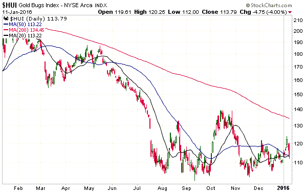
The Gold BUGS Index (HUI) dropped sharply on Monday 11th January, but managed to hold above its 50-day and 20-day moving averages by the barest of margins. It therefore hasn’t yet fallen by enough to signal an end to the rebound that began on 17th November.

HUI_110116

However, while the HUI is hanging on by the skin of its teeth, several high-profile gold-mining stocks have already broken out to the downside. For example:

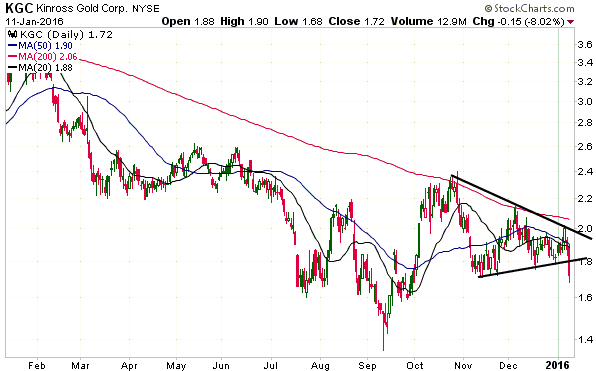
1. Despite offering excellent value, KGC clearly broke below support on Monday and appears to be heading for a test of its September low.

KGC_110116

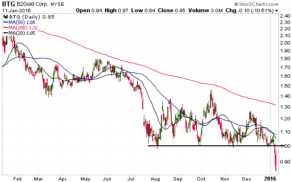
2. B2Gold (BTG) broke out to the downside last Friday and extended its decline on Monday. It does not yet offer great value and the recent downside breakout projects significant additional weakness prior to a sustained bottom, but it sure looks ‘oversold’.

BTG_110116

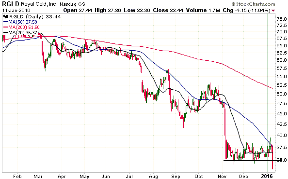
3. Royal Gold (RGLD), one of the world’s lowest risk and highest-quality gold stocks, made a new bear-market low on Monday. The price action suggests that the stock is on its way to $30, but the risk/reward is very attractive at $35 or lower.

RGLD_110116

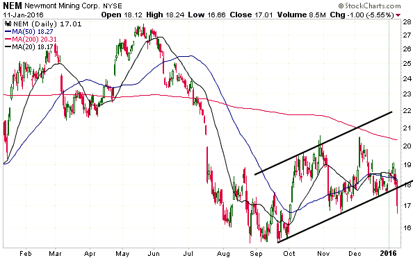
4. Newmont Mining (NEM) plunged below the bottom of a 3-month price channel on Monday and appears to be heading for a test of its September low.

NEM_110116

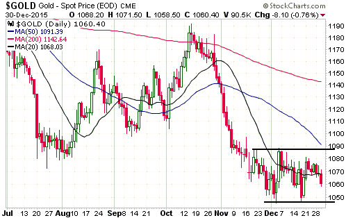
With the US$ gold price having broken above resistance at $1088 last week and having held above its breakout level during the pullback of the past two trading days, why has the gold-mining sector been so weak?

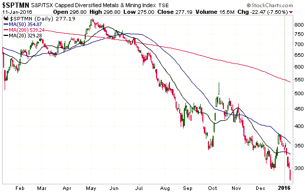
I think it’s mainly because of what’s happened to non-gold mining stocks. As illustrated below, the Diversified Metals and Mining Index (SPTMN) has fallen by about 20% over the past 5 trading days and plunged to a new bear-market low on Monday 11th January. The gold-mining sector is certainly capable of bucking a general downward trend in mining stocks, but it would take a lot of strength in the gold price to offset the downward pull caused by the sort of general mining collapse seen over the past few days.

SPTMN_110116

Print This Post Print This Post

The proverbial “cash on the sidelines”

January 11, 2016

One of the most ridiculous arguments in favour of a rising stock market is that there is a large amount of cash on the sidelines. Regardless of the stock market’s actual prospects, this argument will always be complete nonsense.

The reason is that all of the cash in the economy — every single dollar of it — is always effectively on the sidelines, because money must always be held by someone. Money never goes into any market; it just gets shuffled around between the bank accounts of buyers and sellers. For example, when Bill buys Microsoft shares from Bob, no money goes into Microsoft or into the stock market. What happens is that money gets transferred from Bill (the buyer) to Bob (the seller), with the total amount of money on the ‘sidelines’ and the total amount of money in the economy remaining unchanged. It’s the same story with every other transaction involving the use of money to buy something. It’s amazing that you can become the chief executive or the chief investment officer of a company with billions of dollars under management and not understand this basic monetary concept.

The fact is that the amount of cash on the sidelines at any time is simply a function of the preceding amount of monetary inflation. If the money supply has grown then the amount of “cash on the sidelines” will have grown by the same amount. A consequence is that the amount of cash on the sidelines grows almost every year, regardless of whether the stock market rises or falls. For example, the amount of cash on the sidelines in the US was a lot higher just prior to the 2008 market collapse than it was three year’s earlier and the amount of cash on the sidelines will almost certainly be at a new all-time high a year from now irrespective of what happens to the stock market in the meantime.

So, equity permabulls, stop insulting my intelligence by telling me that stock prices will be supported by the record amount of “cash on the sidelines”.

Print This Post Print This Post

Gold makes a new all-time high!

January 7, 2016

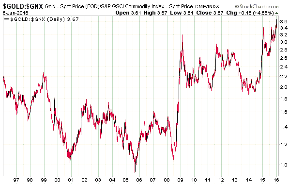
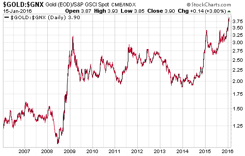
Gold is obviously not close to making a new all-time high in terms of the US$ or any of the other major currencies, but it has just made a new all-time high relative to the basket of commodities included in the Goldman Sachs Spot Commodity Index (GNX). This means that gold has never been more expensive relative to commodities in general than it is today.

Just imagine how expensive gold would be if it weren’t the victim of a never-ending price suppression scheme!*

gold_GNX_060116

*Just in case it isn’t obvious, I’m being sarcastic.

Print This Post Print This Post

Minimum Wage Wrongheadedness

January 6, 2016

Both the proponents and the opponents of a government-imposed minimum wage tend to use data in an effort to make their respective cases. In particular, if they are in favour of a higher minimum wage they cite examples of increases in the minimum wage being followed by stable or lower unemployment to supposedly refute the argument that higher unemployment would result from a government-enforced wage hike for the lowest earners, while those on the opposite side of the fence cite examples where a higher rate of unemployment followed a minimum-wage increase. However, whether arguing for or against the minimum wage or a higher minimum wage, such arguments are misguided. The reality is that there are so many influences on the general level of employment that it isn’t possible to separate-out the effects of the minimum wage.

As is usually the case with questions regarding the effects of a policy on the overall economy, questions about the consequences of minimum wage legislation cannot be properly answered by referring to historical data. For one thing and as noted above, it will never be possible to identify what changes in the employment situation stemmed from the minimum-wage change and what changes were due to the myriad other influences. To put it another way, although economists like to use the term “ceteris paribus” (meaning: with all else being the same) in their writings, in the real world all else is never the same. In the real world there will always be countless differences between the same economy during different time periods and between different economies during the same time period. Furthermore, unlike the physical sciences it is not possible to do experiments in economics in which a single input is adjusted and the resultant change in the output observed/measured.

In economics, the overall effect of a policy must be deduced from first principles. In the case of the minimum wage, the principle of relevance is the law of supply and demand. To be more specific, the relevant principle is that, “ceteris paribus”, the quantity of a good demanded will fall as its price rises. The fact that all else is never the same in the real world means that it will never be possible to separately measure the effect on employment of increasing the minimum wage, but it is axiomatic that artificially raising the price of anything, including the price of labour, will result in the demand for that thing being lower than would otherwise be the case. That is, it is axiomatic that fixing the minimum price of labour significantly above where it would be in a free market will result in higher unemployment. No data are required.

As an aside, those in favour of hiking the minimum wage almost always word their arguments to make it seem as if the legislation only imposes restrictions on employers, but it’s important to appreciate that the legislation also restricts job-seekers. There are undoubtedly people who would gladly accept payment below the government-set “minimum wage” in order to gain the skills and experience that would make them more valuable to employers in the future, but minimum-wage laws prevent these people from offering their services for less than the limit set by the government. Do-gooders would prefer that these people were dependents of the State rather than be productive and get paid less than some arbitrary lower limit.

In conclusion, advocating for a higher government-mandated minimum wage and including as part of your case the assertion that employment will not be adversely affected is equivalent to holding up a sign that reads: “I am clueless about the most basic principle of economics”.

Print This Post Print This Post

Are rising interest rates bullish or bearish for gold?

January 5, 2016

I’ve seen articles explaining that rising interest rates are bearish for gold and I’ve seen articles explaining that rising interest rates are bullish for gold, so which is it? Are rising interest rates bullish or bearish for gold? The short answer is no — rising interest rates are neither bullish nor bearish for gold. Read on for the much longer answer.

I’ll begin by noting what happened to nominal interest rates during the long-term gold bull markets of the past 100 years. Interest rates generally trended downward during the gold bull market of the 1930s, upward during the gold bull market of the 1960s and 1970s, and downward during the gold bull market of 2001-2011. Therefore, history’s message is that the trend in the nominal interest rate does not determine gold’s long-term price trend.

History tells us that gold bull markets can unfold in parallel with rising or falling nominal interest rates, but this shouldn’t be interpreted as meaning that interest rates don’t affect whether gold is in a bullish or bearish trend. The nominal interest rate is not important, but the REAL interest rate definitely is. Specifically, low/falling real interest rates are bullish for gold and high/rising real interest rates are bearish. For example, when gold was making huge gains during the 1970s in parallel with high/rising nominal interest rates, real interest rates were generally low. This is because gains in inflation expectations were matching, or exceeding, gains in nominal interest rates (the real interest rate is the nominal interest rate minus the EXPECTED rate of currency depreciation). Also, the 2001-2011 bull market occurred in parallel with generally low real interest rates.

Very low real interest rates are artifacts of central banks. In the US, for example, the Fed’s actions ensured that the real short-term interest rate on “risk free” (meaning: no direct default risk) debt spent a lot of time in negative territory during the 1970s and during 2001-2011. In effect, “very low real interest rates” means “excessively loose monetary policy”.

Something else that affects gold’s price trend is the DIFFERENCE between long-term and short-term interest rates (the yield-spread, or yield curve), with a rising yield-spread (steepening yield curve) being bullish for gold and a falling yield-spread (flattening yield curve) being bearish. It works this way because a rising trend in long-term interest rates relative to short-term interest rates generally indicates either falling market liquidity (associated with increasing risk aversion and a flight to safety) or rising inflation expectations, both of which are bullish for gold.

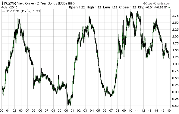
As is the case with the real interest rate, under the current monetary system the yield-spread tends to be a symptom of what central banks are doing. If money were sound and free of central bank manipulation, then the yield-spread would spend most of its time near zero (the yield curve would be almost horizontal) and would experience only minor fluctuations, but thanks to the attempts by central banks to ‘stabilise’ the markets the yield-spread experiences huge swings. For example, the following chart shows the huge swings in the US 10yr-2yr yield-spread since 1990. The periodic up-swings in this chart were generally due to the Fed exerting irresistible downward pressure at the short end of the curve while the discounting by the market of currency depreciation risk caused interest rates at the long end to be ‘sticky’.

yieldspread_040116

Last but not least, gold is influenced by the economy-wide trend in credit spreads (the differences between interest rates on high-quality and low-quality debt securities). Gold, a traditional haven in times of trouble, tends to do relatively well when credit spreads are widening and relatively poorly when credit spreads are contracting. This is because widening credit spreads typically indicate declining economic confidence.

If the three main interest-rate drivers (the real interest rate, the yield-spread and credit spreads) are gold-bullish then there’s a high probability that gold will be in a strong upward trend in terms of all currencies and most commodities. By the same token, if the three main interest-rate drivers are gold-bearish then there’s a high probability that gold will be in a strong downward trend in both nominal and real terms. However, it’s not uncommon for the interest-rate conditions to be mixed. The past year is a good example of a mixed interest-rate backdrop for gold in that during this period the credit-spread situation was generally gold-bullish (credit spreads were widening) while the real interest rate and yield-spread trends were generally gold-bearish. The net effect of this interest-rate backdrop was slightly bearish for gold.

In summary, gold benefits from low/falling real interest rates, an increasing yield-spread (a steepening yield curve), and widening credit spreads, each of which can occur when nominal interest rates are rising or falling. You can therefore ignore the “rising interest rates are bearish for gold” and the “rising interest rates are bullish for gold” arguments. The relationship between gold and interest rates is not that simple.

Print This Post Print This Post

Charts of interest, 30th December 2015

December 31, 2015

The following charts are discussed in an email sent to TSI subscribers.

1) The US$ Gold Price

gold_301215

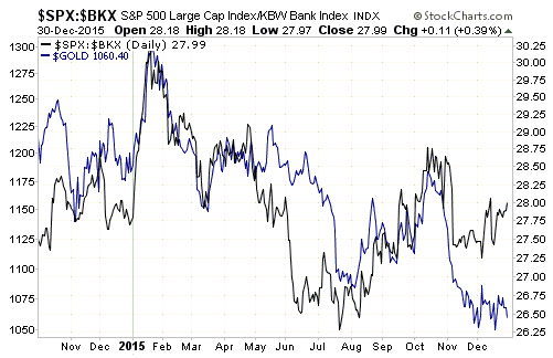
2) Gold versus the relative strength of the banking sector (as indicated by the SPX/BKX ratio)

SPX_BKX_301215

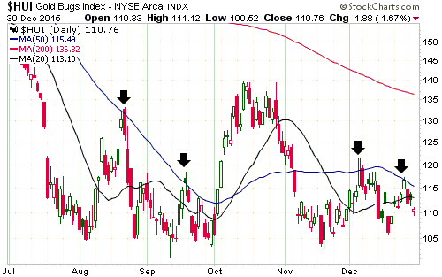
3) The HUI

HUI_301215

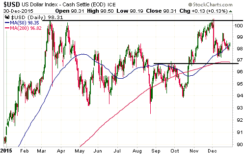
4) The Dollar Index

US$_301215

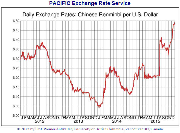
5) The US$/Yuan Exchange Rate

Yuan_301215

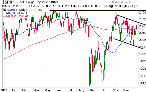
6) The S&P500 Index

SPX_301215

7) The Europe 600 Banks Index (FX7)

FX7_301215


Print This Post Print This Post

Charts of interest

December 27, 2015

The following charts are discussed in an email sent to TSI subscribers on 27th December.

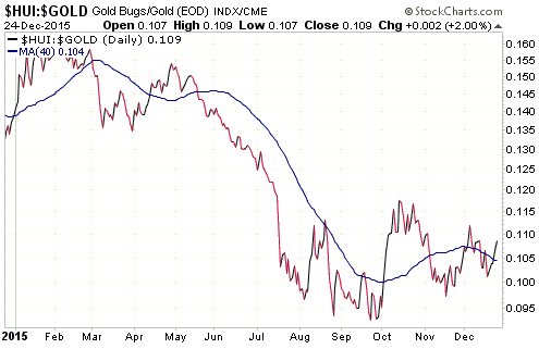
1) The HUI/gold ratio

HUI_gold_271215

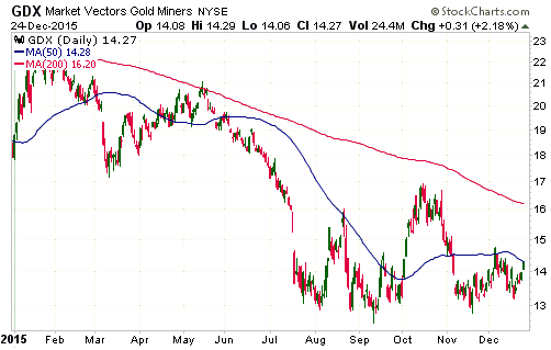
2) The Gold Miners ETF (GDX) — down by 22% year-to-date (YTD)

GDX_271215

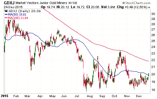
3) Junior Gold Miners ETF (GDXJ) — down by 16% YTD

GDXJ_271215

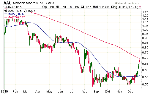
4) Almaden Minerals (AAU) — down by about 30% YTD but up by about 30% over the past 4 weeks

AAU_271215

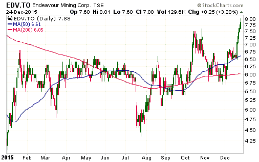
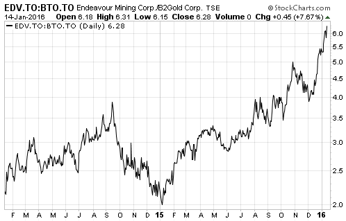
5) Endeavour Mining (EDV.TO) — up by about 90% YTD and at a 12-month high

EDV_271215

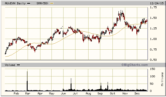
6) Evolution Mining (EVN.AX) — up by 125% YTD

EVN_271215

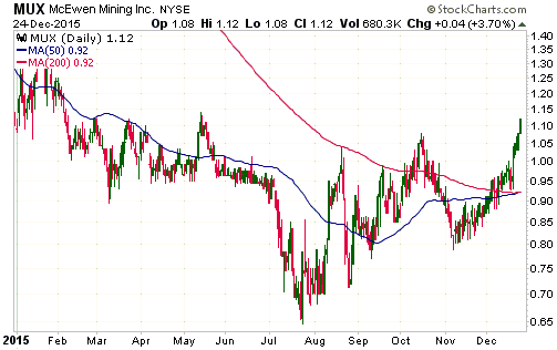
7) McEwen Mining (MUX) — roughly flat YTD in US$ terms, but up by almost 20% in C$ terms

MUX_271215

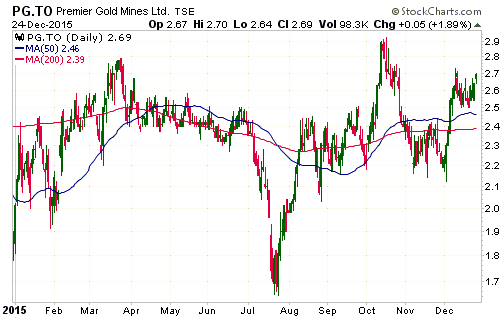
8) Premier Gold (PG.TO) — up by about 40% YTD

PG_271215

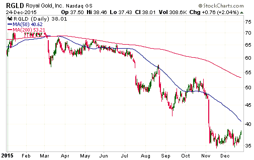
9) Royal Gold (RGLD) — down by 37% YTD. The early-November plunge to the mid-$30s caused RGLD to offer reasonable value — and caused us to become interested in having exposure to this stock — for the first time in several years.

RGLD_271215

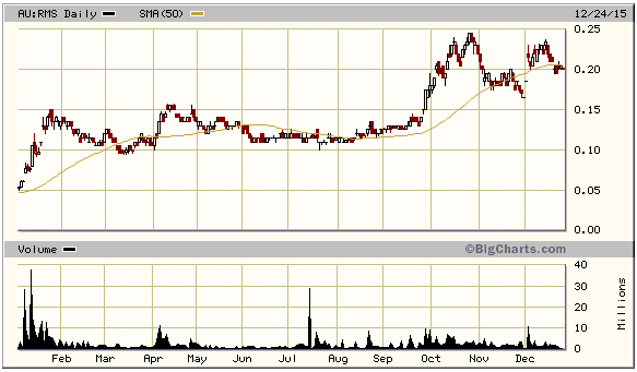
10) Ramelius Resources (RMS.AX) — up 300% YTD

RMS_271215

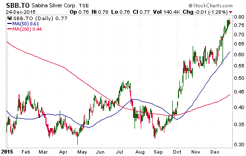
11) Sabina Gold and Silver (SBB.TO) — up by about 110% YTD

SBB_271215

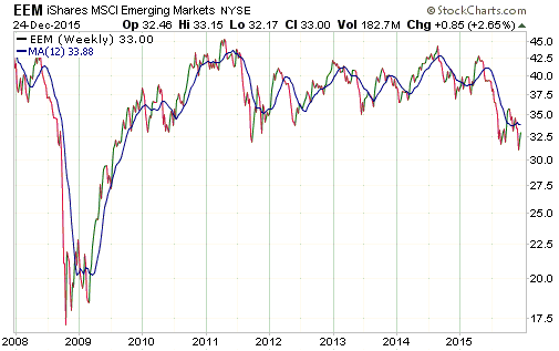
12) Emerging Markets Equity ETF (EEM) with 12-week moving average — intermediate-term ‘oversold’ and at an 11-year low relative to the S&P500, but very high relative to commodities and potentially ‘on the edge of a cliff’.

EEM_weekly_271215

Print This Post Print This Post

Falling Dominoes

December 16, 2015

The decline in house prices that began in 2006 wasn’t the cause of the 2007-2009 economic bust. The cause was widespread mal-investment resulting from monetary inflation and the Fed’s interest-rate manipulation. However, the 2006 reversal in house prices set off a series of falling economic dominoes due to the fact that the housing market was where a disproportionately large amount of the mal-investment and associated debt happened to be. The reason for mentioning this is that the 2014 downward price reversal in the oil market might have played the same role as the 2006 downward reversal in the housing market, because this time around a disproportionately large amount of the mal-investment and associated debt happened to be linked directly or indirectly to the booming oil industry.

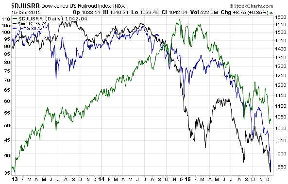
A lot of high-yield debt was linked both directly and indirectly to the booming US oil industry, which is why proxies for the US high-yield bond market reversed downward at almost the same time as the oil price in mid-2014. With ETFs such as JNK (the Barclays High Yield Bond Fund) and HYG (the iShares High Yield Bond Fund) having made new 6-year daily-closing lows on Monday 14th December there is little doubt that the US high-yield corporate bond market is immersed in a cyclical bearish trend. In effect, the falling of the oil domino knocked down the high-yield bond-market domino.

Another of the dominoes to fall in reaction to the oil reversal is the railroad industry. The railroad business boomed due to a large increase in the demand for rail cars to carry oil from the oil-fields and supplies to the oil-fields. In this case the reaction was delayed, as it wasn’t until late last year that investors began to connect the dots. Last week the Dow Jones US Railroad Index (DJUSRR) made a new 2-year low and is clearly immersed in a cyclical bear market.

The following chart provides a visual representation of the falling dominoes discussed above. Notice that HYG (the blue line), an ETF proxy for high-yield bonds, began to fall almost immediately after the oil price (the black line) turned down, whereas DJUSRR (the green line) trended upward for an additional 5 months before toppling over.

DJUSRR_HYG_oil_151215

There’s a high risk that economic dominoes will continue to fall until there are none left standing, but be warned that it could be a very drawn-out process. During the preceding cycle there was a 2-year gap from the reversal in the housing market to a general capitulation, and this time around the monetary backdrop is more bullish.

Print This Post Print This Post

Unintended Consequences

December 14, 2015

This post is an excerpt from a commentary posted at TSI about two months ago.

Whenever the government intervenes in the economy in order to bring about what it deems to be a more beneficial outcome than would have occurred in the absence of intervention, there will be winners and losers but the overall economy will invariably end up being worse off. Moreover, it is not uncommon for one of the long-term results of the intervention to be the diametric opposite of the intended result.

A great example of the actual result of government intervention being the opposite of the intended result is contained in a chart that formed part of a recent article at ZeroHedge.com. The chart, which is displayed below, shows the home ownership rate in the US.

Here, in brief, is the story behind the above chart.

During the Clinton (1993-2000) and Bush (2001-2008) administrations the US Federal Government decided that it would be beneficial if a larger number and a broader range of people were home-owners. The government therefore began making a concerted effort to not only increase the US home-ownership rate, but also to make home loans easier to obtain for less-qualified buyers.

This was achieved in part by the more aggressive implementation, beginning in 1993, of the Community Reinvestment Act (CRA) of 1977. Under the cover of the CRA, banks were forced to reduce their lending standards for lower-income groups in general and ‘minorities’ in particular. For example, government regulations created during the 1990s set bank loan-approval criteria and quotas with the aim of increasing loan quantities, and even went so far as to require the use of “innovative or flexible” lending practices to address the credit needs of low-and-moderate-income (LMI) borrowers. Of course, banks that are forced by the government to lower their standards when assessing the loan applications of less-qualified borrowers must also lower their standards for other borrowers, because they can’t reasonably approve an application from one customer and then reject an application from a better-qualified customer.

An increase in the home-ownership rate was also achieved by assigning an “affordable housing mission” to the government-sponsored enterprises (Fannie Mae and Freddie Mac). To make it possible for Fannie and Freddie to achieve this mission their automated underwriting systems were modified to accept loans with characteristics that would previously have been rejected. In addition, Fannie and Freddie cited the new “mission” as a reason that their mortgage portfolios should not be constrained.

At this point we would be remiss not to mention the helping hand provided by the Fed. Without the Fed’s aggressive money-pumping and lowering of interest rates during 2001-2003 there would have been less credit and less money available to the buyers of homes. The Fed’s actions ensured that there would be a credit bubble, while the government’s actions ensured that the residential housing market would be the focal point of the bubble.

The above chart shows that the government was initially — and predictably — successful in its endeavours. The home-ownership rate sky-rocketed as it became possible for almost anyone to borrow money to buy a house. The chart also shows that the home-ownership rate has since collapsed to its lowest level since the 1960s. This collapse was a natural consequence of the credit bubble, in that household balance-sheets were drastically weakened by the taking-on of debt-based leverage during the bubble and the post-bubble plunge in asset prices.

The bottom line is that the interventions designed to increase home ownership ultimately contributed to the home-ownership rate falling to the point where it is now at a multi-generational low. Not just an unintended consequence, but the opposite of the intended consequence.

Print This Post Print This Post

The ridiculous and relentless fuss over the COMEX gold inventory

December 11, 2015

I’ve often been impressed by the ability of gold-focused bloggers, newsletter writers and journalists to turn a blind eye to the gold market’s genuine fundamentals and to fixate on factors that either have no bearing on the gold price or amount to unadulterated hogwash. Depending on how they are presented, the stories that are regularly told about the COMEX gold inventory and its relationship to the gold price can fall into either the irrelevant category or the hogwash category.

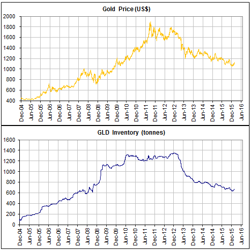
I’ve mentioned numerous times in the past, including in an 18th August blog post, that the amount of gold in COMEX warehouses and the inventories of gold ETFs follow the major price trend, meaning that changes in these high-profile inventories are effects, not causes, of major changes in the gold price. That’s the long-term relationship. On a short-term basis there is no consistent relationship between inventory levels and the gold price.

There is therefore nothing strange about the fact that the post-2011 bear market in gold has been accompanied by an overall decline in COMEX and gold ETF inventories, just as there was nothing strange about the overall rise in COMEX and gold ETF inventories during the preceding bull market.

I’ve also briefly pointed out in the past that the large rise in the ratio of COMEX “registered” gold to COMEX gold open interest in no way indicates a shortage of physical gold or that a COMEX delivery problem is brewing.

Various sites have been presenting the aforementioned ratio for years as if it were a dramatic, price-impacting development. A recent example is the ZeroHedge article posted HERE, which contains the following chart. This chart certainly creates the impression that something is horribly wrong. A more distant example is the JSMineset article posted HERE, which is from July-2013 and forecasts a COMEX crisis within 90 days due to the critical shortage of deliverable gold.

Fortunately, early this week a logical and well-informed article on the topic was posted HERE. You should read the full article as long as you are willing to let facts get in the way of a good story, but two of the key points are:

1) The amount of “registered” gold is NOT the total amount of gold available for delivery.

2) Although it’s unlikely to give you any meaningful information, if you really want to spend time comparing open interest and physical gold inventory then it’s only the open interest in the current delivery month that matters.

It’s hard enough to figure-out the gold market when considering only the true fundamentals. There’s no need to further muddy the waters by introducing spurious information, unless the goal is to draw readers with exciting stories rather than to be accurate.

Print This Post Print This Post

Negative interest rates are due to bad theory

December 9, 2015

If something very strange happens and continues over an extended period, people get accustomed to it and come to view it as normal. That’s especially so when the strange set of circumstances is the result of a policy that, as a result of devotion to a wrong theory or strategy, is widely considered to be a reasonable response to a problem.

A good example is the “Patriot Act”, which was introduced in the wake of the 911 attacks. This act dramatically increased the legal ability of the US government to violate individual property rights in the name of greater security and was widely viewed as extraordinary when it was first proposed, but in 2011 there was barely a mention in the mainstream media when President Obama signed a 4-year extension for some of the most controversial parts of the act. With some modifications forced upon the government by the revelations of Edward Snowden, another 4-year extension was approved with minimal public protest in 2015 under the Orwellian name “USA Freedom Act”. My point is, whereas 20 years ago most people would have been horrified by the provisions of the Patriot Act, today most people couldn’t care less. Today, the powers granted by the Patriot Act are generally accepted as normal.

Another good example is the downward drift into negative territory of government bond yields in Europe. As recently as two years ago it was believed by almost everyone that zero was the lower bound for a bond’s nominal yield. At that time, the idea that nominal bond yields would fall to zero was almost unthinkable, and anyone who predicted that a sizable percentage of the bonds issued by European governments would soon trade at negative nominal yields would have been perceived as a lunatic. Today, however, about one-third of the euro-zone’s sovereign debt is trading with a negative yield-to-maturity and people are becoming accustomed to this new reality. Also, the ECB just reduced its official deposit rate from negative 0.20% to negative 0.30%, which only surprised the financial markets because most traders were expecting it to be pushed even further into negative territory.

A point that deserves to be emphasised is that even though the financial world is becoming inured to the situation, it is completely absurd for interest rates and nominal bond yields to be negative. The reason is that regardless of whether the economy is experiencing inflation or deflation, having money in the present should always be worth more than having a promise to pay the same quantity of money in the future. To put it another way, it should never make sense for people throughout the economy to choose to incur a cost for temporarily relinquishing ownership of money.

But obviously it does make sense, because it’s happening! The question is why.

A number of factors had to come together to make negative interest rates possible, including persistently-low inflation expectations in the face of rapid monetary inflation. However, the overarching cause is unswerving devotion to bad economic theory. Persistently-low inflation expectations only enabled the application of bad theory to be taken to a far greater extreme than it had ever been taken before.

The bad theory is that the economy can be made stronger by artificially lowering the rate of interest. If you have the power to manipulate interest rates and you are totally committed to this theory, then a failure of the economy to strengthen following a lowering of the interest rate will cause you to bring about a further interest-rate decline. As long as you remain steadfast in your belief that a lower interest rate should help and as long as rising inflation expectations don’t get in the way, continuing economic weakness will lead you further and further down the interest-rate suppression path.

The Fed currently looks less radical than the ECB, because, while the ECB has pushed its targeted interest rate into negative territory and shows no sign of changing course, the Fed is probably about to take a small step into positive territory with its own targeted interest rate. However, the senior members of the Fed and the ECB are guided by the same bad theories, so it is certainly possible that the next time the US economy slides into recession the US will end up with a negative Fed Funds Rate. In fact, if the US economy slides into recession in 2016 then a negative Fed Funds Rate will become a good bet.

In conclusion, today’s negative interest rate situation would have been viewed as nonsensical as recently as a few years ago and will be viewed as nonsensical by the historians who write about the 2010s in decades to come. However, the financial world is not only becoming accustomed to this absurd situation, it is now common to view negative interest rates as appropriate.

Print This Post Print This Post

Secrets of successful newsletter writing, part 1

December 7, 2015

To develop a popular newsletter or blog focusing on finance and investment, you don’t need to offer anything of real value. You just need to adopt all or most of the following guidelines/suggestions.

1) H.L.Mencken wrote: “The whole aim of practical politics is to keep the populace alarmed (and hence clamorous to be led to safety) by menacing it with an endless series of hobgoblins, all of them imaginary.” The same approach can be applied to the financial writing business. Specifically, the main goal of practical newsletter-writing and blogging is to keep the readership alarmed (and hence clamorous for advice) by menacing it with an endless series of hobgoblins, most of them imaginary.

2) If your analyses and recommendations prove to be on the mark then give yourself a very public ‘pat on the back’ for having been incredibly prescient, but if your analyses and recommendations prove to be off the mark then put the blame on market manipulation and quickly move on. Never acknowledge the possibility that your analysis was wrong.

3) Grab every opportunity to re-write the history of your own performance with the aim of creating the impression that your forecasting record is much better than is actually the case. This will work because a) if you claim often enough and assertively enough that you correctly predicted a major market move, it will eventually be perceived as the truth, and b) most of your old readers won’t remember and most of your new readers won’t check what you wrote in the past.

4) Word any ‘analysis’ in such a way that you will be right regardless of what happens. Here are some examples:

a) A non-specific forecast of higher volatility is always good, because it will always be possible to subsequently find a market or a region in which volatility increased.

b) Present multiple scenarios that essentially cover all possible outcomes.

c) Present forecasts/assessments in the format: Bullish above A$, bearish below B$. When the price moves above A$ or below B$, generate a new forecast in the same format. This way you will always be 100% accurate without ever providing useful information.

5) Emphasise the forecasts/recommendations that have worked and forget to mention, or only mention in passing, the ones that didn’t work. For example, publish a list showing the large gains made by some of your past recommendations and add a note to the effect that not all of your recommendations resulted in such spectacular success. This has the advantage of creating a totally false impression of your performance without actually being a lie.

Print This Post Print This Post

Price Index Bias and Obsession

December 4, 2015

There are many ways of calculating purchasing power by means of index numbers, and every single one of them is right, from certain tenable points of view; but every single one of them is also wrong, from just as many equally tenable points of view. Since each method of calculation will yield results that are different from those of every other method, and since each result, if it is made the basis of practical measures, will further certain interests and injure others, it is obvious that each group of persons will declare for those methods that will best serve its own interests. At the very moment when the manipulation of purchasing power is declared to be a legitimate concern of currency policy, the question of the level at which this purchasing power is to be fixed will attain the highest political significance.

The above paragraph contains remarkable foresight considering that it was written by Ludwig von Mises way back in 1934 (it is from the preface to the 1934 English edition of “Theory of Money and Credit”). In particular:

1) There are now more ways than ever of coming up with a number that purportedly represents the change in money purchasing power (PP), with different groups advocating on behalf of different numbers depending on their agendas. For one example, the US government likes the Consumer Price Index (CPI), because its rate of increase has been very slow for a long time (enabling cost-of-living adjustments to be minimised) and because the calculation methodology can always be changed by the government if the result deviates too far from what’s deemed acceptable. For another example, the Fed likes the Personal Consumption Expenditures (PCE) calculation, because it tends to be even lower than the CPI and therefore shows the Fed in a more positive light and gives it more flexibility. For a third example, at the other end of the spectrum there are the perennial forecasters of hyperinflation who are always on the lookout for ‘evidence’ supporting their outlook. This group likes the Shadowstats CPI, even though the Shadowstats calculation contains a basic error that makes the result unrealistic and leads to ridiculous conclusions regarding GDP growth.

2) The manipulation of PP is most definitely now deemed to be a legitimate concern of currency policy. In fact, it is generally deemed to be the primary concern.

3) The question of the level at which PP is to be fixed has attained the highest political significance, with senior policy-makers throughout the developed world having almost simultaneously arrived at the conclusion that 2% is the correct level for the rate of annual PP loss. As a consequence, economies and financial markets are now being constantly pummeled by central-bank interventions designed to ensure that monetary savings lose about 2% of their PP every year.

It would be nice if prices returned to being indicators of genuine supply and demand, as opposed to being the effects of the central bank’s latest attempts to make an arbitrary index of prices match an arbitrary target.

Print This Post Print This Post

Keeping an open mind about the US stock market

December 2, 2015

I have kept an open mind over the past few months as to whether the July-September decline in US equities was the first leg of a new cyclical bear market or a correction within an on-going cyclical bull market. There were hints that it was the former, but there was nothing definitive in the indicators I follow and the price action was consistent with either possibility. The jury is still out, although there has been a probability shift over the past couple of weeks. Before I discuss this shift I’ll do a quick recap for the benefit of blog readers who aren’t TSI subscribers.

During the first half of July this year I thought that there was almost no chance of the US stock market experiencing a bona fide crash over the ensuing few months, but — for reasons outlined in TSI commentaries at the time — I thought there was a good chance of the S&P500 Index (SPX) falling by 10%-20% from a July peak to a bottom by mid-October and that a put-option position was a reasonable way to trade this likely outcome. Then, when there was a discontinuity at the start of the US trading session on Monday 24th August with prices gapping sharply lower across the board, I sent an email to TSI subscribers saying that all bearish positions should be exited immediately. My view was that the 24th August mini-panic would be followed by a multi-week rebound and then a decline to test the low by mid-October, but regardless of what the future held in store the 24th August price action created a very obvious profit-taking opportunity for anyone who was betting on lower prices.

Subsequent price action could aptly be described as noncommittal. There was a successful test of the 24th August low in late-September followed by a strong rebound to a high in early-November, none of which was surprising. Also, this price action didn’t provide any important new clues, because I considered a successful test of the August low followed by a rebound to at least the 200-day MA to be likely regardless of whether we were dealing with a bull-market correction or the early stages of a new bear market.

I’ll now deal with the probability shift mentioned in the first paragraph.

Although I was keeping an open mind regarding the nature of the July-September downturn, if someone had held a gun to my head a few weeks ago and forced me to pick a side I would have chosen the ‘new bear market’ scenario. That is no longer the case.

The jury is still out and for practical investing/speculating purposes there is no need to pick a side, but the probabilities have recently shifted in favour of the ‘bull market correction’ scenario. Displayed below is a chart that illustrates one of the reasons for this probability shift. It is a monthly chart of the S&P500 Index (SPX) with a 20-month moving-average (MA).

This chart shows that once a bear market got underway in 2000 and 2007 and the SPX had achieved a monthly close below its 20-month MA, it did not achieve a monthly close above this MA until the bear market was over. However, in 2011 and again this year, a monthly close below the 20-month MA was quickly reversed.

SPX_monthly_011215

If a cyclical bear market was in progress then the SPX should have weakened enough in November to give another monthly close below its 20-month MA, but it didn’t. Instead, it managed a second consecutive monthly close above this MA. This is a meaningful divergence from the price action in the early stages of the preceding two cyclical bear markets and is more consistent with the bull-market correction scenario.

There is other evidence to support the ‘bull market correction’ scenario, but, as I said, the evidence is not yet conclusive. In fact, in a TSI commentary scheduled for tomorrow I’m going to show two important indicators that support the ‘equity bear market’ scenario. Moreover, the bull market is ‘long in the tooth’, valuations are high and earnings growth (on a market-wide basis) is non-existent, so even if the long-term bullish trend is still in progress there’s a high risk that it will end sometime next year.

Print This Post Print This Post

The Fed’s massive and unprecedented shift

November 30, 2015

This post is a slightly-modified excerpt from a recent TSI commentary.

In the US, the commercial banks can create money and the Fed can create money. A chart showing the change in the US money supply therefore won’t directly tell us if the Fed was a creator of new money during the period covered by the chart. However, unlike the commercial banks, when the Fed monetises debt it boosts bank reserves as well as the money supply, which means that we can quickly identify the periods during which the Fed was a direct creator of new money by looking at a chart of the total quantity of US bank reserves. Such a chart is displayed below.

With reference to this chart, notice the huge rises in bank reserves during the periods labeled “QE1″, “QE2″ and “QE3″. These are the times when the Fed was directly creating new money. The downward/sideways drifts in bank reserves prior to the start of “QE1″, between the QE programs and since the end of “QE3″ are times when the Fed was not directly creating new money. The US money supply still increased during these ‘non-QE’ periods, but it increased due to the actions of commercial banks rather than the direct intervention of the Fed.

To put the 2008-2015 period into perspective, here is a chart showing the total quantity of US bank reserves going back to 1959. Notice that for decades prior to 2008, total bank reserves hovered just above zero. There was a lot of monetary inflation during this period, but almost none of it was due to the direct creation of money by the Fed.

As an aside, if you compare the above chart of bank reserves with a chart of commercial bank credit you will see that over the past few decades there has been no relationship between bank reserves and the quantity of money loaned into existence by US commercial banks. That’s why, as I wrote in a recent blog post (https://tsi-blog.com/2015/10/the-zero-reserve-banking-system/), it’s more realistic to think of the US as now having a zero-reserve banking system as opposed to a fractional-reserve banking system. Bank reserves are a throw-back to an earlier monetary system, when gold was held in reserve and receipts for gold circulated within the economy. It makes no sense to have dollars backed by dollars, especially since the quantity of dollars held in reserve in no way determines/limits the quantity of dollars loaned into existence or held in bank deposits.

An extraordinary situation can start to seem ordinary if it persists for long enough, so the main point I wanted to reiterate with the help of the above charts is that the past several years constitute a massive and unprecedented departure from the Fed’s traditional mode of operation. An implication is that the Fed’s next monetary tightening program, which may or may not tentatively begin with a tiny rate hike in December, will not look like any previous monetary tightening program. The “uncharted waters” cliche is now very appropriate.

Print This Post Print This Post

Stealing Deflation

November 27, 2015

If you listen to the top central bankers of the world talk for long enough you will come away with the impression that central banks are attempting to give us “price inflation”, as if rising prices were beneficial. However, nobody wants to pay more for stuff. In fact, rational people prefer to pay less, not more. Therefore, when central banks claim to be giving us “price inflation” what they are really doing is stealing the “price deflation” from which we would otherwise benefit.

We are told that a general expectation of rising prices is important, because if people start expecting prices to be lower in the future then they will curtail their spending in the present. This, apparently, will lead to an economically-disastrous downward spiral in which the general expectation of lower prices leads to reduced spending and reduced spending leads to even lower prices.

The economic ‘logic’ contained in the idea that expectations of higher prices are needed to promote present-day spending explains why companies like Apple can never sell anything. After all, who in their right mind would buy an Apple product today when they can be sure that a better product will be available at a lower price by this time next year?

And just imagine how bad it would be if prices trended lower throughout the entire economy the way they do in the computing and mobile communications industries. There would be almost no spending anywhere! That operation to save your life that you have scheduled for next week could be postponed until healthcare charges have declined to much lower levels. And all of the eating you were planning on doing over the next few months could be delayed indefinitely in anticipation of more attractive food prices. And there would never be a good reason to buy a house or a car because each year you did without these things, the more of a bargain they would become and the better off you would be for not having bought earlier.

Also, try to imagine how bad it must have been before there were central banks to guarantee a continuous rise in the general price level. If expectations of rising prices are needed to promote spending and growth, then in pre-central-bank days, when money often increased in purchasing-power from one year to the next, there must have been almost no spending anywhere in the economy. That is, there must have been relentless economic contraction. Thankfully, we now have people like Ben Bernanke, Janet Yellen, Mario Draghi and Haruhiko Kuroda to save us from such a predicament.

The point that hopefully hasn’t been totally obscured by my sarcasm is that central bankers are thieves. They are stealing our deflation. It isn’t fair to compare them with common burglars, though, because common burglars don’t claim to be doing you a favour while they make off with your valuables.

Print This Post Print This Post
Why is the gold price so high?

November 24, 2015

With the US$ gold price near a 5-year low, the above question probably seems strange. However, the US$ isn’t the only measure of price.

It is also reasonable to measure gold’s price in terms of other commodities. This is because although gold isn’t just a commodity, under the current monetary system its price should never become divorced from the prices of other commodities. Short-term divergences between gold and the broad-based commodity indices will occur in response to macro-economic developments, but, for example, there isn’t going to be a major upward trend in the gold price while the prices of most other commodities are in major downward trends.

When measured in terms of other commodities, gold’s current price is high. For example, the following chart shows that gold made a new 20-year high relative to the Goldman Sachs Spot Commodity Index (GNX) in January and has recently moved back to near its high.

gold_GNX_231115

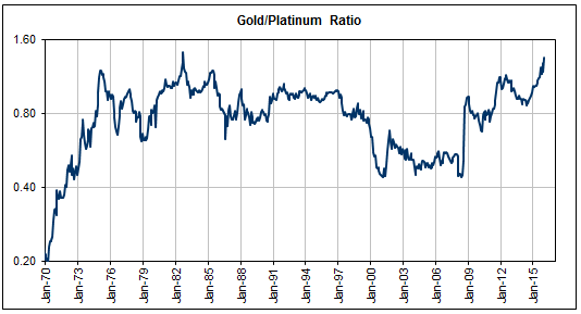
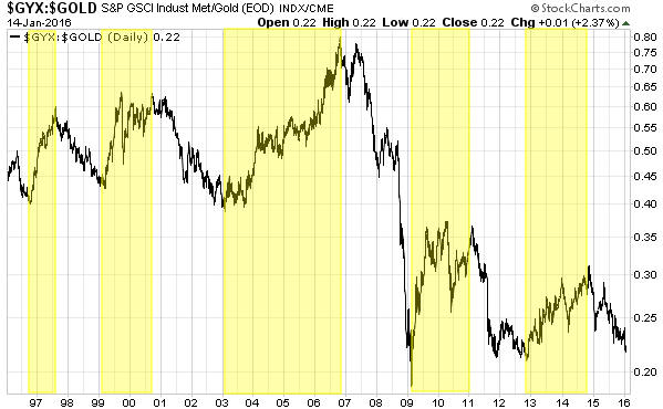
And if we measure gold in terms of other metals rather than commodities in general, it’s a similar story. In particular, the following charts show that a) relative to the Industrial Metals Index (GYX) gold is only 6% below its 2011-2012 highs and within 15% of the 20-year high that was reached at the crescendo of the 2008-2009 global financial crisis, b) gold is at a 20-year high relative to platinum, and c) gold is close to the top of its 20-year range relative to silver.

gold_GYX_231115

gold_plat_231115

gold_silver_231115

Gold normally performs relatively poorly during economic booms and relatively well during economic busts. Gold’s current relatively high price is therefore indicative of a weak global economic situation.

If the global economic backdrop becomes superficially better over the months/quarters ahead and the Fed hikes interest rates as per its current tentative plan, then even if the gold price rises in US$ terms next year it will probably fall in terms of the broad-based commodity indices and most other metals. That, of course, is a big if.

Print This Post Print This Post
ZeroHedge creates drama out of nothing

November 22, 2015

There was a post at ZeroHedge.com on 20th November titled “Fed To Hold An “Expedited, Closed” Meeting On Monday“. The title suggests that something strange is afoot, that is, that the Fed is up to something out of the ordinary. Hence the emphasis on the words “Expedited” and “Closed”.

To make sure that its readers get the message, the post goes on to state:

Given how awesome everything appears to be, judging by stocks and the tidal wave of FedSpeak of the last week confirming that rates are rising in December, we found it at least marginally ‘odd’ that out of the blue, the Fed would announce an ‘expedited, closed’ meeting on Monday…

Odd? Out of the blue? Really?

The author of the ZeroHedge post forgot to mention that these “expedited, closed” meetings happen with monotonous regularity. The one scheduled for Monday 23rd November will be the third one this month. And there were four in October, three in September, two in August and five in July. You can find the notice for the coming meeting and the records of previous similar meetings at http://www.federalreserve.gov/aboutthefed/boardmeetings/201511.htm.

Even the topic under discussion at the 23rd November meeting will be routine. The purpose of the meeting is: “Review and determination by the Board of Governors of the advance and discount rates to be charged by the Federal Reserve Banks.” A meeting with the same purpose happens every month. For example, there was one on 26th October, one on 15th September, one on 31st August and one on 27th July.

Always be aware of the agenda/bias of the news sources you use.

Print This Post Print This Post
Gold’s “commercial” traders are different because gold is different

November 20, 2015

In a typical commodity market the traders known as “commercials” are usually hedging their exposure to the physical commodity when they buy or sell futures contracts. For example, in the oil market the most important “commercials” include oil producers, who are naturally ‘long’ the physical commodity and often sell futures contracts to hedge this exposure, and manufacturers of oil-based products, who are effectively ‘short’ the physical commodity (by virtue of the fact that oil is one of their biggest costs) and often buy futures contracts to hedge this exposure. However, the gold market is different.

Some of the commercial traders operating in the gold market are traditional hedgers. Mining companies and jewellery manufacturers, for example. But given that the existing aboveground stock of gold dwarfs the annual supply of new gold and that the amount of gold that changes hands for store-of-value, investment and speculative purposes dwarfs the amount of gold bought/sold for more traditional commercial uses such as fashion jewellery and electronics, a reasonable and knowledgeable person would expect that traditional commercial traders would play a relatively small role in the gold market. A reasonable and knowledgeable person would be right.

In the gold market the dominant commercials are not traditional hedgers. They are also not speculators, in that they rarely take positions that rely on the gold price moving in a particular direction. They are spread traders, meaning that they make their profits by trading the differences in price between the physical and futures markets.

For example, if speculative buying of gold futures causes the futures price to rise relative to the spot price by a sufficient amount it will create an essentially risk-free arbitrage opportunity for a commercial to sell the futures and buy the physical, and if speculative selling of gold futures causes the futures price to fall relative to the spot price by a sufficient amount it will create an essentially risk-free arbitrage opportunity for a commercial to buy the futures and sell the physical. For another example, if gold buying by hoarders of physical gold causes the cash (physical) price to rise relative to the futures price by a sufficient amount it will create an essentially risk-free arbitrage opportunity for a commercial to sell the physical and buy the futures, and if the ‘dishoarding’ of physical gold causes the cash (physical) price to fall relative to the futures price by a sufficient amount it will create an essentially risk-free arbitrage opportunity for a commercial to buy the physical and sell the futures. In other words, commercial trading in the gold market is mostly about arbitrage.

The difference between commercial trading in the gold market and commercial trading in all other commodity markets is tied to gold’s long history as money. Strangely, many gold ‘experts’ assert that gold is different due to its dominant monetary and store-of-value roles, but then insist on applying a traditional commodity-style method of supply-demand analysis. Unsurprisingly, the result is a pile of hogwash.

Print This Post Print This Post