Print This Post Print This Post

Which political team do you support?

April 24, 2018

Most people support a political party in the same way they support a sports team. The support is through thick and thin, regardless of the policies that are being proposed/enacted. And criticism of their team is not tolerated, because, well, it’s their team. People love to be part of a team.

One consequence of the team-spirit aspect of politics is that the average person doesn’t decide the appropriateness and efficacy of a policy by objective analysis, but rather by who is proposing/implementing the policy. If the policy is put forward by Party A then the supporters of Party A will claim it is a good idea and the supporters of Party B will be critical, whereas if the identical policy is put forward by Party B then the Party B supporters will be in favour of it and the Party A supporters will be critical. In some cases a policy put forward by a particular party will be so obviously bad that the more rational supporters of that party will be unable to come out openly in favour of it, in which case they usually will remain silent. They are like the one-eyed sports fans who shout abuse when the referee makes a bad decision in the opposing team’s favour but turn a blind eye when the referee makes a bad decision in their team’s favour.

Another consequence of the tendency towards blind support of a political team and the associated unwillingness to objectively analyse the merits of policies is that people tend to embrace a set of beliefs covering many different socioeconomic issues, even if the beliefs are not consistent. This is because the set of beliefs is associated with their team and advocated by the leaders of their team. A knock-on effect is that if you know where someone stands on one hot-button issue, examples of which are climate change, gun control, immigration and abortion, in most cases you will know where they stand on all hot-button issues. That’s even though it doesn’t logically follow that a particular belief on, for example, gun control should be linked to a particular belief on, for example, climate change or abortion.

One of the most curious aspects of the strong identification with a particular political team and the animosity that members of one team often feel for members of the opposing team is that in practice the teams are very similar. At each election a sizable proportion of the population will vote for what they believe is a change of direction, but regardless of the outcome of the election nothing will really change. The leaders of the different teams will spew forth different rhetoric and there will be some differences in the policy details, but regardless of the election result there will be no meaningful change in the overall governmental approach. The main reason is that in a typical modern-day two (or more) party democracy, each of the major parties will be in favour of a powerful, intrusive government. In effect, when people vote to remove the team that’s currently in power they are voting for a change in the facade, not a change in the structure.

It would be great if the average person, instead of labeling himself/herself as a member of a particular political team (Republican, Democrat, Conservative, Liberal, Labour, etc.) and blindly supporting that team’s policies, either impartially assessed each policy proposal and railed against bad policy regardless of its origin or simply admitted to not being well-enough informed to have an opinion. Unfortunately, that’s never going to happen.

Print This Post Print This Post

A dramatic upward reversal in US monetary inflation

April 21, 2018

[Here is an excerpt from a commentary posted at TSI about a week ago]

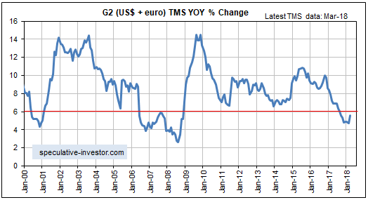
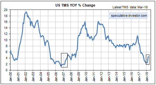
In February of this year the year-over-year rate of growth in the US True Money Supply, a.k.a. the US monetary inflation rate, was only 2.4%. This was its lowest level since March of 2007 and not far from a multi-decade low. In March of this year, however, the monetary inflation rate almost doubled — to around 4.6%. Refer to the following chart for more detail. What caused the reversal and what effect will it have on the economy and the financial markets?

The Fed has been slowly removing money from the economy via its QT program, so March’s money-supply surge wasn’t caused by the central bank. The main cause also wasn’t the commercial banking industry, because although there has been an up-tick in the rate of bank credit expansion over the past month it is nowhere near enough to explain the increase in TMS.

We can’t be certain, but by a process of elimination we conclude that the sharp upward reversal in the US monetary inflation rate was due to money coming into the US from overseas. If so, the most likely driver would be the repatriation of corporate profits due to the tax changes approved near the end of last year.

In other words, it’s likely that March’s TMS surge was due more to the way that the banking system accounts for existing US dollars than an increase in the total supply of US dollars.

If the monetary inflation reversal has more to do with a change in the way existing US dollars are accounted for than a sudden large increase in the pace of new dollar creation, then the effects on the economy and the financial markets will be minimal. In any case, after the monetary inflation rate has moved high enough for long enough to set in motion an artificial boom, a drop to a relatively low inflation level will inevitably lead to a bust (an economic recession and a large decline in the stock market, often accompanied by a banking crisis). For example, the pronounced rebound in the TMS growth rate from Q4-2006 to Q3-2007 did not stop the recession, the equity bear market and the banking crisis of 2007-2009.

This means that as a result of the 2017 decline in the monetary inflation rate to near a 20-year low, the die has been cast.

The big unknown right now is the timing of the bust that will occur in response to last year’s precipitous decline in the monetary inflation rate. Will it get underway during the second half of this year or will it wait until next year?

Print This Post Print This Post

Bull market correction or bear market?

April 17, 2018

In previous blog posts (e.g. HERE) I explained the limitations of sentiment as a market timing tool. Since the public is invariably wrong at price extremes, it certainly can be helpful to track the public’s sentiment and use it as a contrary indicator. However, whereas price extremes always coincide with sentiment extremes, sentiment extremes often don’t coincide with price extremes. This is especially the case during long-term bull markets, when sentiment is capable of staying very optimistic for years. It’s therefore best to think of a sentiment extreme as a necessary, but not a sufficient, condition for a price extreme.

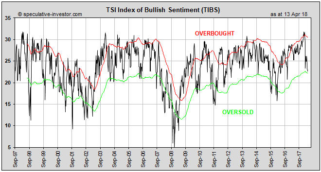
With regard to US stock market sentiment there was an optimistic extreme in January of this year. This is evidenced by the TSI Index of Bullish Sentiment (TIBS) hitting a 20-year high at that time. Refer to the following weekly chart for details. Note that TIBS is a weighted average of four sentiment surveys (Investors Intelligence, Market Vane, Consensus-inc and American Association of Individual Investors), the 5-day moving average of the equity put/call ratio and the 5-day moving average of the VIX.

What is the probability that January’s optimistic extreme coincided with the top of the equity bull market?

TIBS_180418

The answer is: quite low. While sentiment was consistent with a major top and valuations, on average, were definitely high enough to usher in a major top, an end to the long-term upward trend was not signaled by several important indicators. For example, there would normally be a pronounced widening of credit spreads at or before a bull market top, but credit spreads remain near their narrowest levels of the past 10 years. For another example, there is likely to be a reversal in the yield curve from flattening to steepening at or prior to a bull market top, but at the end of last week the US yield curve was at its ‘flattest’ in more than 10 years. For a third example, there has been more strength in market internals over the past two months than there normally would be if we were dealing with the early stage of a bear market.

So, despite the rampant optimism evident in January-2018, the decline that followed the January peak probably will turn out to be a bull-market correction.

Print This Post Print This Post

The short that keeps on giving?

April 10, 2018

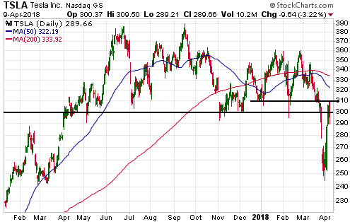
Among the list of stock selection and trading ideas maintained at the TSI web site there was, until the week before last, a Tesla (TSLA) put option position. The position was exited — and a large profit recorded — after the stock’s recent plunge from well above $300 to the $250s. However, this stock could present multiple opportunities over the coming 12 months to profit on the dark (bearish) side as it makes its way along the path to zero. TSLA could become the short that keeps on giving.

In fact, the fast rebound from the 2nd April low in the mid-$240s to the 9th April high of $309.50 may have already created the next such opportunity. The reason is that the rebound appears to have ended near the top of the former major support at $300-$310, the implication being that the stock has completed a successful test of its breakdown.

TSLA_090418

The company is clearly in trouble. It is hemorrhaging cash and running out of money, it is suffering production problems, it has possibly engaged in fraudulent accounting and is under investigation, and it will soon be faced with much greater competition from companies that are far more adept at vehicle manufacturing. And yet, it still sports an extremely high market valuation.

TSLA bears will have to remain on guard, though, because Elon “the carnival barker” Musk is still capable of whipping up enthusiasm.

Print This Post Print This Post

Trade as a zero sum game

April 9, 2018

[This blog post is an excerpt from a TSI commentary published on 27th March 2018]

The policies of the Trump Administration are being influenced by the view that international trade is a zero sum game, where whoever receives the most money is the winner at the expense of whoever receives the most goods. Under this line of thinking, which sometimes goes under the name “mercantilism”, policies are beneficial if they increase the amount of money coming into the country relative to the amount of money going out of the country. As discussed below, it’s the wrong way to look at the world.

Another way of framing the mercantilist position is that the winner is the one who ends up with the larger amount of the medium of exchange and the loser is the one who ends up with the larger amount of real wealth. For reasons we’ll get into in a moment there are actually no winners and losers, but if it were true that one side was getting the better deal then surely it would be the one that ended up with the most real wealth; especially these days, when the medium of exchange is created out of nothing by the banking system.

Also, it’s important to understand that countries don’t trade with each other. For example, the US doesn’t trade with China. What we mean is that a country is not an economic entity that buys and sells. Instead, individuals in one country trade with individuals in another country and in each transaction both sides believe that they are benefiting (otherwise the transaction wouldn’t happen). While it is technically possible to lump together all the transactions undertaken by the individuals in one region and arrive at the conclusion that ‘we’ have a trade deficit or ‘we’ have a trade surplus, in the real world there is no ‘we’ when it comes to trade.

Unfortunately, however, governments pay attention to the meaningless lumping-together of millions of individual transactions, and if the result happens to be what is commonly called a deficit then the government will often conclude that it should place obstacles in the way of many transactions. You may think that you are benefiting from a deal with a foreign seller, but according to the government you are creating a problem for the collective ‘we’ and must be hindered or stopped.

The Trump Administration is in the spotlight at the moment for having undertaken three sets of protectionist measures over just the past two months. There were the tariffs on imported washing machines and solar panels announced in January, the tariffs on imported steel and aluminium announced at the beginning of March and the as-yet-unspecified tariffs on $60B of Chinese imports announced last week. However, the US government does not have a monopoly on counter-productive mercantilism. Far from it! The same sort of ‘reasoning’ that has informed the trade-related missteps of the US government over the past two months is informing the actions of most governments around the world.

For example, other governments are threatening to impose their own tariffs in response to the US tariffs, which is something they would not do unless they wrongly believed that such restrictions could benefit their own economies. For another example, the large quantity of US$-denominated reserves collectively held by central banks around the world has almost nothing to do with the US$ being the official reserve currency and almost everything to do with exchange-rate management designed, using terribly flawed logic, to gain an international trade advantage. Refer to the May-2015 post at the TSI Blog for more colour on this issue.

There is nothing that any one government can do directly to change the wrongheaded protectionist ways of other governments. The best that any single government can do is to not become part of the problem. The ideal situation is that no side erects barriers to international trade, but the second-best situation for any one country is that its own government opts not to erect barriers. Just because some other government decides to impose economic sanctions on its own citizens doesn’t mean that your government is justified in doing the same.

Print This Post Print This Post

Money Matters

March 30, 2018

[This blog post is an excerpt from a recent TSI commentary]

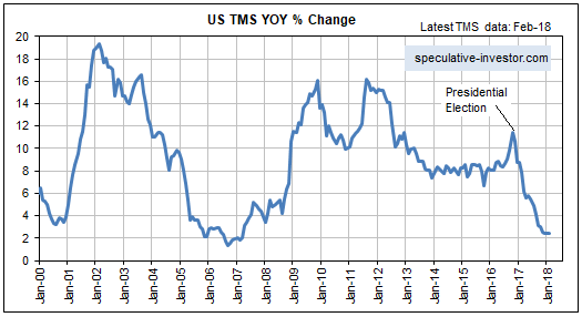
The year-over-year rate of growth in the US True Money Supply (TMS) was around 11.5% in October of 2016 (the month before the US Presidential election) and is now only 2.4%, which is near a 20-year low. Refer to the following monthly chart for details. In terms of effects on the financial markets and the economy, up until recently the US monetary inflation slowdown was largely offset by continuing rapid monetary inflation elsewhere, most notably in Europe. However, the tightening of US monetary conditions has started to have noticeable effects and these effects should become more pronounced as the year progresses.

The tightening of monetary conditions eventually will expose the mal-investments of the last several years, which, in turn, will result in a severe recession, but the most obvious effect to date is the increase in interest rates across the entire curve. The upward acceleration in interest rates over the past six months has more than one driver, but it probably wouldn’t have happened if money had remained as plentiful as it was two years ago.

It would be a mistake to think that the tightening has been engineered by the Fed. The reality is that the Fed has done very little to date.

The Fed has made several 0.25% increases in its targeted interest rates, but the main effect of these rate hikes is to increase the amount of money the Fed pays to the commercial banks in the form of interest on reserves (IOR). It doesn’t matter how you spin it, injecting more money into banks ain’t monetary tightening!

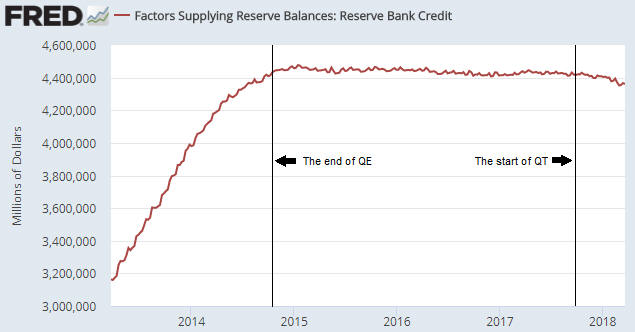
The Fed’s actual efforts on the monetary loosening/tightening front over the past 5 years are encapsulated by the following weekly chart of Reserve Bank Credit (RBC). This chart shows that there was a rapid rise in RBC during 2013-2014 that ended with the completion of QE in October-2014. For the next three years RBC essentially flat-lined, which is what should be expected given that the Fed was neither quantitatively easing nor quantitatively tightening during this period. In October-2017 the Fed introduced its Quantitative Tightening (QT) program. To date, this program has resulted in only a small reduction in RBC, but the plan is for the pace of the QT to ramp up.

Strangely, the most senior members of the Fed appear to believe that their baby-step rate hikes constitute genuine tightening and that the contraction of the central bank’s balance sheet is neither here nor there. The reality is the opposite.

So, the Fed is not responsible for the large decline in the US monetary inflation rate and the resultant tightening of monetary conditions that has occurred to date.

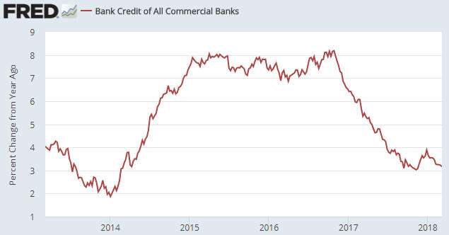
The responsibility for the tightening actually lies with the commercial banks. As illustrated by the next chart, the year-over-year rate of growth in commercial bank credit was slightly above 8% at around the time of the Presidential election in late-2016 and is now about 3%.

We won’t be surprised if a steepening yield curve prompts commercial banks to collectively increase their pace of credit creation over the next two quarters, but with the Fed set to quicken the pace of its QT the US monetary inflation rate probably will remain low by the standards of the past two decades. At the same time, the ECB will be taking actions that reduce the monetary inflation rate in the euro-zone. This could lead to stock and bond market volatility during the second half of this year that dwarfs what we’ve witnessed over the past two months.

Print This Post Print This Post
Another look at gold’s true fundamentals

March 20, 2018

The major long-term driver of the gold price is confidence in the official money and in the institutions (governments, central banks and private banks) that create/promote/sponsor the official money. As far as long-term investors are concerned the gold story is therefore a simple one: gold will be in a bull market when confidence in the financial establishment (money, banks and government) is in a bear market and gold will be in a bear market when confidence in the financial establishment is in a bull market.

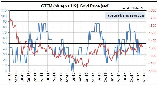
In real time it often doesn’t seem that simple, though, because on a weekly, monthly or even yearly basis a lot can happen to throw an investor off the scent. However, the risk of being thrown off the scent can be reduced by having an objective way of measuring the ebbs and flows in the confidence that drives, among other things, the performance of the gold market. That’s why I developed the Gold True Fundamentals Model (GTFM). The GTFM is determined mainly by confidence indicators such as credit spreads, the yield curve, the relative strength of the banking sector and inflation expectations, although it also takes into account the US dollar’s exchange rate and the general commodity-price trend.

An alternative to objective measurement is to rely on gut feel, but gut feel is notoriously unreliable in such matters because it is, by definition, influenced by personal biases. For example, it will be influenced by “projection bias”. This is the assumption that if you perceive things in a certain way, then most other people will perceive them in the same way. Projection bias plays a big part in a lot of gold market analysis. The market analyst will observe central bank or government actions that from his/her perspective are blatantly counter-productive, and go on to assume, often wrongly, that most market participants will view the actions in the same way.

Another alternative is to assume that gold’s fundamentals are always bullish and therefore that any large or lengthy price decline must be the result of a grand price-suppression scheme. Given its absurdity it’s amazing how popular this line of thinking has become in the gold market. Then again, it’s a line of thinking that has been aggressively promoted over the past two decades and has a certain emotional appeal.

Due to the effects of market sentiment the gold price occasionally will diverge from its ‘true fundamentals’ (as indicated by the GTFM) for up to a few months, but ALL substantial upward and downward trends in the gold price over the past 15 years have been consistent with the fundamental backdrop.

Does this invalidate the idea that manipulation happens in the gold market?

Of course not. Every experienced and knowledgeable trader/investor knows that all financial markets have always been subject to manipulation and always will be subject to manipulation. It does, however, invalidate the idea that there has been a successful long-term gold-price-suppression program.

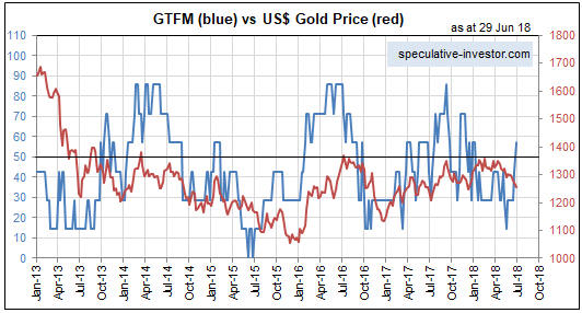
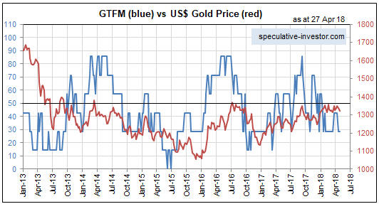
The current situation (as at the end of last week) is that gold’s true fundamentals, as indicated by the GTFM, have been bearish for the past 10 weeks. Also, the true fundamentals have spent more time in bearish territory than bullish territory since the second half of last September. Refer to the following chart comparison of the GTFM and the US$ gold price for details.

GTFM_200318

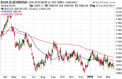
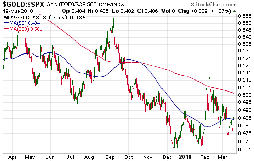
Now, considering the fundamental backdrop it seems that the gold price has held up remarkably well over the past several months, but that conclusion only emerges if your sole measuring stick is the US$. When performance relative to the other senior currency (the euro) and the world’s most important equity index (the S&P500) are taken into account it becomes clear that the gold market has been weak. Here are the relevant charts.

gold_euro_200318

gold_SPX_200318

The fundamental backdrop is continually shifting and potentially could turn gold-bullish within the next few weeks. It just isn’t bullish right now. Also, there could be a strong rally in the US$ gold price in the face of neutral-bearish fundamentals. If so, we would be dealing with a US$ bear market as opposed to a gold bull market.

In a gold bull market the ‘value’ of an ounce of gold rises relative to the major equity indices and both senior currencies. For this to happen the true fundamentals would have to be decisively bullish most of the time.

Print This Post Print This Post
The rising interest-rate trend

March 5, 2018

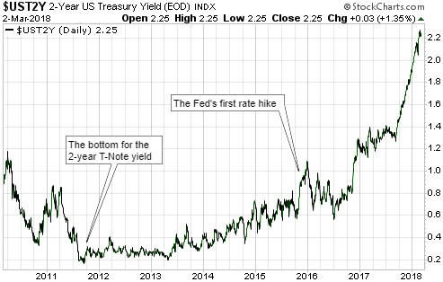
The rising interest-rate trend in the US isn’t new and isn’t related to the Fed’s so-called “policy normalisation” program. However, it has only just started to matter.

That the rising interest-rate trend isn’t new and isn’t related to the Fed’s rate-hiking efforts is clearly illustrated by the following chart. This chart shows that the US 2-year T-Note yield began trending upward in 2011 — more than 6 years ago and more than 4 years prior to the Fed’s first rate hike.

UST2Y_050318

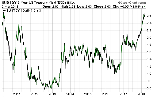
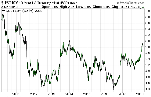
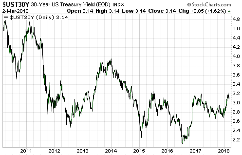
As we go further out in duration we find later beginnings to the rising-yield trend. This is evidenced by the following three charts, the first of which shows that the 5-year yield bottomed in mid-2012, the second of which shows that the 10-year yield double-bottomed in mid-2012 and mid-2016, and the third of which shows that the 30-year yield continued to make lower lows until mid-2016. But even in the case of the 30-year yield the rising trend is now more than 18 months old.

UST5Y_050318

UST10Y_050318

UST30Y_050318

Given that US interest rates have been rising for more than 6 years at the short end and more than 18 months at the long end, why has the trend suddenly begun to draw a lot of attention in the mainstream press?

The answer is: because rising yields on credit instruments have begun to put downward pressure on equity prices. The stock market is capable of ignoring rising interest rates for long periods, as has been demonstrated by the market action of the past few years. However, if a rising interest-rate trend persists for long enough it transforms, as far as the stock market is concerned, from an irrelevance to the most important thing.

The way that interest rates gradually turned upward over several years despite the relentless downward pressure applied by the central bank suggests that we are dealing with the end of a very long-term decline. In other words, there’s a good chance that we are now in the early stages of a 1-2 decade (or longer) rising interest-rate trend. But how could that be, when debt levels are very high and the economy-wide savings rate is very low?

Under the current monetary regime, major upward trends in interest rates are not driven by the desire to consume more in the present (the desire to save less) or by rapidly-increasing demand for borrowed money to invest in productive enterprises. That, in essence, is a big part of the problem — interest-rate trends do not reflect what they should reflect. Instead, major upward trends in interest rates are driven primarily by rising inflation expectations, or, to put it more aptly, by declining confidence in money.

Of particular relevance, under the current monetary regime it is not only possible for a large, general increase in the desire to save to be accompanied by rising interest rates, it is highly probable that when a large rise in interest rates happens it will be accompanied by a general desire to save more. It’s just that the desire for greater savings won’t manifest itself as a greater desire to hold cash. It will, instead, manifest itself as a desire to hold more of something with near-cash-like liquidity that is not subject to arbitrary devaluation by central banks and governments. Gold is the most obvious example.

Print This Post Print This Post
The warning shots of 2007

February 26, 2018

[This post is a slightly-modified excerpt from a recent TSI commentary]

For a market analyst there is an irresistible temptation to seek out one or more historical parallels to the current situation. The idea is that clues about what’s going to happen in the future can be found by looking at what happened following similar price action in the past. Sometimes this method works, sometimes it doesn’t.

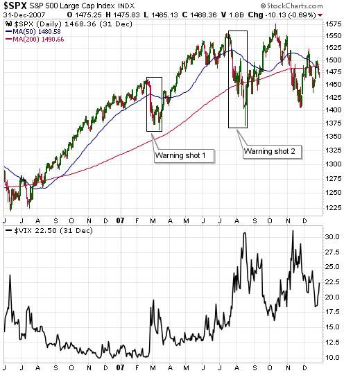
Assuming that the decline from the January-2018 peak is a short-term correction that will run its course before the end March (my assumption since the correction’s beginning in late-January), the recent price action probably is akin to what happened in February-March of 2007. In late-February of 2007 the SPX had been grinding its way upward in relentless fashion for many months. The VIX was near an all-time low and there was no sign in the price action that anything untoward was about to happen, even though some cracks had begun to appear in the mortgage-financing and real-estate bubbles. Then, out of the blue, there was a 5% plunge in the SPX. On the following daily chart this plunge is labeled “Warning shot 1″.

After the February-March ‘hiccup’ the SPX resumed its bull market. Both the stock market and the economy were believed to be in good shape, with the problems that had emerged in the realm of sub-prime mortgage lending generally considered to be contained to that relatively-unimportant part of the economy. No less of an authority than Ben Bernanke assured us that these problems were, indeed, contained.

The upward trend continued until mid-July, at which point another ‘out of the blue’ plunge began. This time the decline lasted 5 weeks and wiped 11% off the SPX. On the following daily chart it is labeled “Warning shot 2″.

The July-August decline was taken more seriously by almost everyone, including the Fed’s senior management. It was taken seriously enough, in fact, to prompt a reversal in the Fed’s monetary policy. The Fed entered rate-cutting mode.

During the weeks following the August-2007 low there was still widespread optimism. The overall economy was supposedly still strong, the Fed was being supportive and, as everyone knows, you should never fight the Fed.

The SPX went on to make a marginal new high in October-2007 and then commenced a bear market that over the ensuing 17 months would result in a loss of almost 60%.

The SPX was more stretched to the upside in January of 2018 than it was in February of 2007 and the more recent plunge was twice as big, but we could be dealing with Warning Shot 1. Also, this time around there may not be a second warning shot.

Print This Post Print This Post
Gold Leads Silver

February 20, 2018

It is widely believed that silver leads gold during bull markets for these metals. I wonder how this belief first arose and persists to this day given that it is contrary to the historical record.

It is partially true that silver outperforms gold during precious-metals bull markets. In particular, it’s true that silver tends to achieve a greater percentage gain than gold from bull-market start to bull-market end. It’s also the case that silver tends to do better during the final year of a cyclical bull market and during the late stages of the intermediate-term rallies that happen within cyclical bull markets. However, the early stages of gold-silver bull markets are characterised by relative strength in gold.

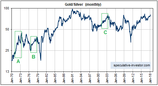
Gold’s leadership in the early stages of bull markets is evidenced by the following long-term chart of the gold/silver ratio. The boxes labeled A, B and C on this chart indicate the first two years of the cyclical precious-metals bull markets of 1971-1974, 1976-1980 and 2001-2011, respectively. Clearly, gold handily outperformed silver during the first two years of each of the last three cyclical precious-metals bull markets that occurred within secular bull markets.

gold_silver_200218

Now, in the same way that all poodles are dogs but not all dogs are poodles, the fact that gold tends to strengthen relative to silver in the early years of a precious-metals bull market doesn’t mean that substantial strength in gold relative to silver is indicative of a precious-metals bull market in its early years. For example, there was relentless strength in gold relative to silver from mid-1983 until early-1991 that took the gold/silver ratio as high as 100, but there was no precious-metals bull market during this period.

Between mid-1983 and early-1991 there was, however, a multi-year period when gold, silver, most other metals and mining stocks offered very profitable trading opportunities on the long side. I’m referring to 1985-1987. We are probably in a similar period today, with the next buying opportunity likely to arrive before the end of this quarter.

Print This Post Print This Post
For gold and bitcoin, the cost of mining follows the price

February 14, 2018

The amount of gold mined in a year is only about 1.5% of the total existing stock of gold, which is why changes in gold production have almost no effect on the gold price. It is also why changes in the cost of mining gold do not affect the gold price. In fact, cause and effect works the other way around — the change in the market price of gold determines, with a lag, the average cost of mining gold. To put it another way, the cost of mining gold follows the price of gold.

What happens is that as the gold price rises, mineral deposits or parts of deposits that were previously uneconomic become economic and start being mined. The mining of this lower-grade/higher-cost gold pushes up the average cost of production. And as the gold price falls, lower-grade/higher-cost gold is left in the ground and the average cost of production moves downward. Of course, there are substantial time-lags involved, because it takes years to bring a new mine into production and because mine plans won’t be changed in response to a price trend until the trend has been in progress for long enough to appear sustainable.

Adding to the tendency for the mining cost to follow the price is that after the price has been trending upward for a long period there will be less focus on cost control and more focus on growth, with the opposite being the case after the price has been trending downward for a long period.

Perhaps not surprisingly given that the Bitcoin system was designed to mimic gold in some respects, the relationship between the bitcoin mining cost and the bitcoin price is the same as the relationship between the cost of mining gold and the gold price. That is, the average cost of mining a bitcoin moves up and down with the price. That’s why, several years ago, it was profitable to mine bitcoins when the price was less than $1 and why the average cost of mining a bitcoin has since risen to around US$5,000.

One difference between gold and bitcoin is that the bitcoin mining industry can respond very quickly to changes in price. Whereas it probably will take at least a strong 3-year trend in the gold price to bring about a substantial change in the average cost of mining an ounce of gold, it takes almost no time to put a new bitcoin mining rig into operation and even less time to turn it off.

The way the Bitcoin distributed ledger system is designed, the computational gymnastics that have to be performed to add new blocks to the ‘chain’ and create new bitcoins scale up and down based on the total amount of computing power dedicated to the task. And the amount of computing power dedicated to the task will be dictated by the price. That is, the lower the price the smaller will be the total amount of resource (computing power and electricity) channeled into obtaining the reward of a new bitcoin, thus reducing the difficulty of performing the computations that verify transactions and the associated mining cost.

Therefore, if the price of a bitcoin falls from its current level of around $8,500 to only $100, mining bitcoins will remain a profitable business. It’s just that the quantity of resources being consumed/wasted by the mining process will be a small fraction of what it is today. Alternatively, if the price of a bitcoin skyrockets to $100,000 then the cost of mining bitcoin will also skyrocket, meaning that the quantity of resources being consumed by a process that adds nothing to the general standard of living will be vastly greater than it is today.

Returning to gold, a popular argument is that gold is an inefficient form of money due to the high cost of adding a new ounce to the existing stockpile. However, the relatively high cost of mining an ounce of gold is incurred regardless of whether or not gold is money; it is incurred because humans want to own gold and value it highly.

To further explain, well before gold was used as money, people liked to have it in their possession because of its physical characteristics: its look, feel, weight, malleability and extraordinary resistance to deterioration. In fact, it was the widespread desire to own gold that led to gold becoming money. And now that gold is no longer money (due to government command, not market preference), billions of people still desire it enough to cause the price and the mining cost to be relatively high. Allowing gold to be money again would therefore impose no additional cost.

Bitcoin is obviously different, in that its high price and associated high production cost are due solely to the possibility that it will, at some future time, be widely used as a medium of exchange. I think that the probability of this possibility is close to zero and therefore that the price of a bitcoin will eventually drop to near zero, but at the same time I think that the blockchain idea is brilliant.

Print This Post Print This Post
What everyone is missing about the US tax cuts

January 29, 2018

The changes to US taxes that were approved late last year have drawn acclaim and criticism, but in most cases both those who view the tax changes positively and those who view the tax changes negatively are missing two important points.

Most criticism of the tax changes boils down to one of three issues. The first is that the tax cuts favour the rich. This is true, but any meaningful tax cut will have to favour the people who pay most of the tax. Furthermore, contrary to the Keynesian belief system a tax cut will bring about the greatest long-term benefit to the overall economy if it favours people who are more likely to save/invest the additional income over people who are more likely to immediately spend the additional income on consumer items.

The second criticism is that corporations, the main beneficiaries of the tax changes, will invest only a minor portion of their additional corporate profit in employment-generating business growth. This criticism is valid as far as it goes, because most large, listed corporations will use the additional income for stock re-purchases and dividend payments, while most small businesses will not be presented with new expansion potential by virtue of receiving a boost to their after-tax profits.

The third area of criticism is that the tax cuts will result in a large increase in the government’s debt, in effect meaning that the government is swapping a promise to steal less money from the private sector in the near future for a promise to steal more money from the private sector in the distant future. Again, this is true.

Those who view the tax changes in a positive light assert that corporate America will respond to the lowered taxes by making large additional investments in growth. Also, some supporters of the tax cuts either invoke the fictitious “Laffer Curve” to argue that the tax cuts will lead to higher government tax revenue and thus pay for themselves or argue that government debt is never repaid and therefore that an increase in government debt doesn’t matter.

While it is certainly true that the US government’s debt will never be repaid it doesn’t follow that an increase in government debt doesn’t matter.

The reason that an increase in government debt always matters, regardless of whether the debt ever gets repaid in full or even in part, is that unless the debt investors have access to a virtual printing press then every additional dollar invested in government debt implies a dollar less invested in the private sector. It must be this way because the dollars that are invested in government debt have to come from somewhere. If they aren’t being created out of nothing by the central bank or a commercial bank* then they must be drawn away from alternative investments. For example, if the recently-implemented US tax cuts resulted in $1T being added to the total US government debt burden over the next 5 years then an effect of the tax cuts over this period would be a $1T reduction in investment in the private sector. This $1T reduction in investment would be offset by whatever additional investment was stimulated by the increased incomes of corporations and high-net-worth individuals, but it would be only a partial offset because the beneficiaries of the tax cuts would invest much less than 100% of their additional income.

In other words, deficit-funded tax cuts result in a net reduction in productive investment. This, not the increase in the government debt per se, is an important point that is being missed by almost everyone.

The other important point that is generally being missed is that the US federal government’s tax revenue is likely to be greater in the 2018 than it was in 2017, leading to a reduced government deficit. There are two reasons for this. First, regardless of whether or not retained corporate profits held outside the US are repatriated, corporate America will have to foot a large repatriation tax bill in 2018. This should either fully or mostly offset any tax benefit collectively received by corporations in 2018. Second, the monetary-inflation-fueled economic boom should continue for another two quarters at least, giving a hefty boost to capital-gains tax payments.

The increase in the government’s tax revenue during the first year of the new tax regime will undoubtedly prompt the fans of the Laffer Curve to give themselves public pats on the back, but it’s likely that 2018′s reduced government deficit will be followed by an explosive rise in the deficit during 2019-2020 as revenues collapse in response to the combination of lower tax rates and an economic recession.

*The outcome would be different if the dollars invested in government debt were created out of nothing. Instead of the increased investment in government debt being ‘funded’ by reduced investment in the private sector (corporate bonds, etc.), the new money would cause price distortions and promote bubble activities. The short-term consequences would be superficially positive, but the long-term consequences would be dire.

Print This Post Print This Post
Apple Confusion

January 22, 2018

A press release from Apple last week generated a lot of excitement about the new investments in the US that will be stimulated by Trump’s tax cuts, but it seems to me that apart from paying $38B of extra tax Apple is not planning to do anything that it wouldn’t have done in the absence of the tax cuts. This is what I gleaned from dissecting the above-linked press release:

1) Apple estimates that the new investment it plans to make over the next 5 years will ‘create’ an additional 20,000 US jobs, but what Apple counts as job creation is hugely different from Apple’s direct employment. Specifically, the company employs 84,000 people in the US but estimates that it is responsible for creating 2 million US jobs. The non-Apple employees involved in developing new iOS apps account for about 80% of this 2 million jobs number.

2) Additional job ‘creation’ of 20K amounts to only a 1% increase, but how much of this 1% increase is related to the tax cuts? As discussed below, possibly none of it.

3) Apple and other US companies with profits held outside the US are required to pay a one-off repatriation tax regardless of whether or not the profits are repatriated. Apple has stated that it will be making a repatriation tax payment of $38B, but has not stated that it will be bringing any of its overseas money back to the US.

4) Regardless of whether or not Apple shifts some of its foreign-held money to the US it is unlikely that this shift will result in additional capital investment in the US. The reason is that at no time over the past several years were Apple’s US investment plans constrained in any way by inadequate access to cheap financing. In other words, there is unlikely to be a significant change in Apple’s US capital investment plans due to the tax changes.

5) The concluding sentence in the above point is supported by the figures contained in last week’s press release from the company. The press release trumpets “350B contribution to the US economy over the next 5 years”, but goes on to mention that in addition to new investments this $350B includes Apple’s current rate of spending. The current rate of spending is $55B/year, which amounts to $275B over 5 years assuming no “inflation”. Allowing for a small amount of “inflation” would bring the amount up to around $300B. The $350B also includes the $38B repatriation tax, so we can quickly account for about $338B of the planned $350B without allowing anything for ‘new’ investments.

Apple is a great company and it will almost certainly invest heavily in the US economy over the next 5 years, but no more heavily than it would have invested in the absence of the “tax reform”.

Kudos to Apple management for creating the false impression, via a cleverly worded press release, that massive new investment would result from the tax changes. Politically, this was a smart move.

Print This Post Print This Post
Oil, the Yuan and the dollar-based monetary system

January 16, 2018

[This post is an excerpt from a commentary posted at TSI about two weeks ago]

Some commentators have made a big deal over the Yuan-denominated oil futures contract that will soon begin trading in Shanghai, but in terms of effect on the global currency market this appears to be a very small deal.

With or without a Yuan-denominated oil futures market there is nothing preventing the suppliers of oil to China from accepting payment in Yuan. In fact, some of the oil imported by China is already paid for in Yuan. Having a Yuan-denominated oil futures contract may encourage some additional oil trading to be done in China’s currency because it would enable suppliers to reduce their risk via hedging, but the main issue is that the Yuan is not a useful currency outside China. Unless an international oil exporter was interested in making a large investment in China, getting paid in Yuan would create a problem of what to do with the Yuan.

In any case, the monetary value of the world’s daily oil consumption is less than 0.1% of daily trading volume on the foreign exchange market, and the foreign exchange market is dominated by the US$. Despite the popular (in some quarters) notion that the US$ is in danger of losing its leading role within the monetary system, at last count the US$ was on one side of 88% of all international transactions. The euro, the world’s other senior fiat currency, was at around 30% (and falling). The Yuan’s share of the global currency market is very small (less than 3%), and according to the following chart could be in a declining trend.

The point we were trying to make in the above paragraph is that a change in how any country pays for its oil imports will not have a big effect on the global currency market. Actually, the cause-effect works the other way around. The pricing of oil in US dollars is not, or at least is no longer, even a small part of the reason that the US$ dominates the global currency system, but the fact that the US$ dominates the global currency system causes most international oil exporters to demand payment in US dollars.

The US$ sometimes rises and sometimes falls in value relative to other currencies, but it always dominates global money flows. Like it or not, that’s the nature of today’s monetary system.

The current monetary system is US$-based and in all likelihood will remain so until it collapses and gets replaced by something different. In other words, it’s unlikely — we almost would go as far as to say impossible — for the current system to persist while another currency gradually superseded the US$. The reason is that there is no viable alternative to the US$ among today’s other major fiat currencies.

We don’t have a strong opinion on what the post-collapse “something different” will be. One possibility is a system based on gold, but there could also be an attempt to create a global fiat currency. The world’s political leadership and financial establishment would certainly favour the latter possibility, but we fail to see how it could work as it would essentially be the botched euro experiment on a much grander scale.

Print This Post Print This Post
A reality check regarding China purchases of US debt

January 12, 2018

1. According to news reports, unnamed senior government officials in China have recommended slowing or halting the purchase of US Treasury securities.

2. If China’s government really was planning to reduce its investment or rate of investment in US government debt, why would it announce the change beforehand given that doing so would potentially lower the market value of its holdings?

3. The only reason to make the announcement is if there is no intention to implement a change but there is something to be gained by making the threat.

4. Clearly, the announcement is part of a negotiation strategy regarding China-US trade.

5. The reality is that China’s government buys and sells Treasury securities and other international reserve assets as part of its effort to manage (that is, manipulate) the Yuan’s exchange rate. When the Yuan is strengthening, international reserves will be bought — using newly-created local currency — to slow or stop the advance. When the Yuan is weakening, international reserves will be sold to slow the decline. That’s why China’s stash of US Treasury debt trended upward for many years prior to 2014 (when the Yuan was strengthening relative to the US$), trended downward during 2014-2016 (when the Yuan was weakening relative to the US$), and trended upward over the past 12 months (when the Yuan was strengthening relative to the US$).

6. China’s total investment in US Treasury securities was significantly greater 4 years ago than it is today. This is evidenced by the following chart, which shows that the combined Treasury holdings of China and Belgium (Belgium must be added to get the complete picture because that’s where China’s government keeps its custodial accounts) dropped from about 1.65 trillion in early-2014 to 1.2 trillion in May-2017. It’s likely that the holding is now about $100B larger, which implies that China’s government has been a net seller of about $350B of Treasury debt over the past four years.

ChinaTholding_110118

7. China’s government will continue to do what it has been doing — buy US Treasury debt when it feels the need to weaken the Yuan and sell US Treasury debt when it feels the need to strengthen/support the Yuan.

8. There are good reasons to expect that yields on US T-Bonds and T-Notes will be significantly higher in 6 months’ time, but the recent deliberately-misleading news emanating from China is not one of them.

Print This Post Print This Post
Monetary Policy Madness?

January 8, 2018

In a recent newsletter John Mauldin wrote: “It is monetary policy madness to raise rates and undertake quantitative tightening at the same time.” However, this is exactly what the Fed plans to do in 2018. Has the Fed gone mad?

If mad is defined as diverging in an irrational way from normal practice then the answer to the above question is no. The Fed is following the same rule book it has always followed.

It should first be understood that earlier rate-hiking campaigns were always accompanied by quantitative tightening (QT). Otherwise, how could the Fed have caused its targeted interest rate (the Fed Funds rate) to rise? The Fed is powerful, but not powerful enough to command the interest rate to perform in a certain way. Instead, it has always manipulated the rate upward by reducing the supply of reserves to the banking system via a process that also reduces the money supply within the economy; that is, via QT. In other words, far from there being something unusual about the Fed simultaneously raising rates and undertaking QT, it is standard procedure.

What’s unusual about the current cycle is the scale. Having created orders of magnitude more money and bank reserves than normal during the easing part of the cycle the Fed must now implement QT on a much larger scale than ever before. At least, that’s what the Fed must do if it follows its rule book.

A plausible argument can be made that the Fed should now deviate from its rule book, but the argument isn’t that the economy is too weak to cope with tighter monetary policy. The correct argument is that the damage in the form of misdirected investment and resource wastage was done by the earlier quantitative easing (QE) programs and this damage cannot be undone or even mitigated by deflating the money supply. In effect, the incredibly loose monetary policy of 2008-2014 has made a painful economic denouement inevitable. At this point, reducing the money supply — as opposed to stopping the inflation of the money supply, which would be beneficial as it would prevent new mal-investment from being added to the pile — would exacerbate the pain for no good reason.

In other words, the damage done by monetary inflation cannot be subsequently undone by monetary deflation.

A plausible argument can also be made that for the first time ever the Fed now has the option of hiking interest rates without doing any QT. This is due to its ability to pay interest on bank reserves. This ability was acquired about 9 years ago solely for the purpose of enabling the Fed to hike its targeted interest rate while leaving the banking system inundated with “excess reserves” (refer to my March-2015 blog post for more detail). That is, this ability was acquired so that the Fed would not be forced to undertake QT at the same time as it was hiking rates.

However, the Fed is not going to deviate from its rule book. This is mainly because the Fed’s leadership believes that a new QE program will be required in the future.

To explain, a Fed decision not to implement QT would create an expectations-management problem in the future. Specifically, an announcement by the Fed that it was going to maintain its balance sheet at the current bloated level would be a tacit admission that QE involved a permanent addition to the money supply rather than a temporary exchange of money for securities. If the Fed were to admit this then the next time a QE program was announced there would be a surge in inflation expectations.

There has been monetary policy madness in spades over the past two decades, but within this context there is nothing especially mad about the Fed’s plan to raise rates and undertake quantitative tightening at the same time.

Print This Post Print This Post
You can bet on the continuing popularity of superficial economics

January 1, 2018

It is appropriate to think of Keynesian economics as superficial economics*, because this school of thought generally considers what’s seen and ignores what’s unseen. To put it another way, Keynesianism focuses on the readily-observable situation and the immediate/direct effects of a policy while paying little or no attention to why the current situation came about and the indirect (not immediately obvious) consequences of a policy. This leads to nonsensical conclusions, such as that the economy can sometimes be helped by the destruction of wealth (the idea being that after assets are destroyed people can be ‘gainfully’ employed rebuilding them).

To further explain, when a shop window is broken the typical Keynesian would account for the additional work and income of the glazier hired to fix the window but would make no effort to understand how the shopkeeper would have allocated his scarce resources if his window had remained intact. And in a case where resources are ‘idle’, the Keynesian would focus exclusively on the direct effect of using increased government spending or central bank money-printing to put these resources to work. He would pay scant attention to why the resources were idle in the first place and would ignore the longer-term effects of creating artificial demand for some resources and forcing the private sector to fund projects that it would otherwise choose not to fund**.

Due to its shallow nature, Keynesian economics is not useful when attempting to understand the real-world drivers of production and consumption. However, it can be put to good use when attempting to understand and predict the actions of policy-makers.

Aside from the fact that almost all politicians are economically illiterate, if your overriding goal is to win the next election then what you want are policy-related effects that are short-term, obvious and direct. What you want is to be able to point to a bunch of guys in hard hats hammering away on a government-funded project, and say: “Without the bill I sponsored, these guys would not have jobs”. The longer-term economic negatives aren’t relevant because not one voter in a thousand will see the link between these negatives and the “stimulus” bill.

There will come a day when Keynesian economics has been totally discredited again***, but until that day there will be many opportunities to make money by betting on policy-makers acting stupidly.

    *In a blog post in May-2015 I suggested that Keynesian Economics should be renamed ASS (Ad-hoc, Superficial and Shortsighted) Economics.

    **The “idle resources” fallacy that underlies the justifications for various government stimulus programs was debunked by William Hutt in a book published way back in 1939 and was more more briefly — but still thoroughly — debunked by Robert Murphy in a January-2009 article.

    ***Keynesian economics was discredited during the 1970s but subsequently managed to claw its way back to a position of great influence. It is resilient because it seemingly gives politicians the scientific justification for doing what they already want to do, which is make themselves appear benevolent — and thus garner the support of more than 50% of the voters — by spending the money of some people to provide short-term benefits to other people.

Print This Post Print This Post
It’s not a gold bull market

December 26, 2017

A popular view is that a new cyclical gold bull market commenced in December-2015. If so, the gold bull is now two years old. At the same time, the following weekly chart shows that the gold/SPX ratio (the US$ gold price divided by the S&P500 Index) recently made a 10-year low. Is it possible for gold to be hitting 10-year lows relative to the SPX two years into a gold bull market?

gold_SPX_261217

If the sole measuring stick is a depreciating currency then the answer is yes, but if a more practical measuring stick is used then the answer is no.

I explained in an earlier blog post that for a bull-market definition to be practical it must take into account the fact that what people really want from an investment is an increase in purchasing power, not just an increase in price. Unfortunately, it isn’t possible to accurately determine how an investment is doing in purchasing-power terms, but a reasonable alternative is to eliminate the poor measuring stick known as fiat currency from the equation by looking at the performances of different investments relative to each other. The ones that are in bull markets are the ones that are relatively strong.

The definition I arrived at was: An investment is in a bull market if it is in a multi-year upward trend in nominal currency terms AND relative to its main competition.

As also explained in the post linked above, measuring one market against another works especially well for gold bullion and the SPX. This is because they are effectively at opposite ends of an investment seesaw, with the SPX doing best when confidence in money, central banking and government is rising and gold doing best when confidence in money, central banking and government is falling.

I think that it makes no sense to define what happened since December-2015 as a gold bull market. I also think that it is important not to get hung up on bull/bear labels. Bull market or not, January through August of 2016 was a great time to own gold-mining stocks. And bull market or not, the period since August-2016 has been a not-so-great time to be heavily invested in gold-mining stocks.

Rather than being committed to the theory that a gold bull market began in December-2015 or the opposing theory that a gold bear market remains in force, it is better to use sentiment, price action and fundamentals to identify good buying and good selling opportunities in real time.

Print This Post Print This Post
The yield curve and the boom-bust cycle

December 15, 2017

[This post is an excerpt from a TSI commentary published on 6th December]

The central bank is not the root cause of the boom-bust cycle. The root cause is fractional reserve banking (the ability of banks to create money and credit out of nothing). The central bank’s effect on the cycle is to extend the booms, make the busts more severe and prevent the investment errors of the boom from being fully corrected prior to the start of the next cycle. Consequently, there are some important relationships between interest rates and the performance of the economy that would hold with or without a central bank, provided that the practice of fractional reserve banking was widespread. One of these relationships is the link between a reversal in the yield curve from flattening to steepening and the start of an economic recession/depression.

Unfortunately, the data we have at our disposal doesn’t go back anywhere near as far as we’d like, where “as far as we’d like” in this case means 150 years or more. For example, the data we have for the 10year-2year spread, which is our favourite indicator of the US yield curve, only goes back to the mid-1970s.

For a longer-term look at the performance of the US yield curve the best we can do on short notice is use the Fed’s data for the 10year-3month spread, which goes back to the early-1960s. However, going back to the early-1960s is good enough for government work and is still satisfactory for the private sector.

As explained in many previous commentaries, the boom phase of the cycle is characterised by borrowing short-term to lend/invest long-term in order to take advantage of the artificial abundance of cheap financing enabled by the creation of money and credit out of nothing. This puts upward pressure on short-term interest rates relative to long-term interest rates, meaning that it causes the yield curve to flatten.

At some point, usually after the boom has been in progress for several years, it becomes apparent that some of the investments that were incentivised by the money/credit inflation were ill-conceived. Losses start being realised, the quantity of loan defaults begins to rise, and the opportunities to profit from short-term leverage become scarcer. At this point everything still seems fine to casual observers, central bankers, the average economist and the vast majority of commentators on the financial markets, but the telltale sign that the cycle has begun the transition from boom to bust is a trend reversal in the yield curve. Short-term interest rates begin to fall relative to long-term interest rates, that is, the yield curve begins to steepen.

The following monthly chart of the 10year-3month spread illustrates the process described above. On this chart, the boom periods roughly coincide with the major downward trends (the yield-curve ‘flattenings’) and the bust periods roughly coincide with the major upward trends (the yield-curve ‘steepenings’). The shaded areas are the periods when the US economy was officially in recession.

The black arrows on the chart mark the major trend reversals from flattening to steepening. With two exceptions, such a reversal occurred shortly before the start of every recession.

The first exception occurred in the mid-1960s, when a reversal in the yield spread from a depressed level was not followed by a recession. It seems that something happened at that time to suddenly and temporarily elevate the 10year yield relative to the 3month yield.

The second exception was associated with the first part of the famous double-dip recession of 1980-1982. Thanks to the extreme interest-rate volatility of the period, the yield spread reversed from down to up shortly before the start of the recession in 1980, which is typical, but during the first month of the recession it plunged to a new low before making a sustained reversal.

Due to the downward pressure being maintained on short-term interest rates by the Fed, the yield curve reversal from flattening to steepening that signals an imminent end to the current boom probably will happen with the above-charted yield spread at an unusually high level. We can’t know at what level or exactly when it will happen, but it hasn’t happened yet.

Print This Post Print This Post
Interesting Links

December 11, 2017

1) Stockman on fire

Former Reagan budget director and current proprietor of the eponymous “David Stockman’s Contra Corner” was on fire in the Bloomberg interview linked below. Within the space of 8 minutes he manages to explain:

a) Why the tax reform package being negotiated in the US will add upwards of $1.5 trillion to the US federal debt over the next several years without prompting a significant increase in domestic investment or providing any other real help to the US economy.

b) That former Trump National Security Advisor Flynn was caught in a perjury trap as part of a political witch-hunt and that the entire “Russiagate” drama is an attempt to unravel last year’s election.

c) That a US fiscal crisis is ‘baked into the cake’ and that the impending deficit-funded tax cut will accelerate the crisis.

2) Mortgage fraud in China

Imagine if one bank robber sued another on the basis that the loot from the robbery was not divvied up in the agreed-upon way. This is similar to a recent court case in China that involved one participant in a fraudulent property transaction suing another — and winning! — on the basis that the ill-gotten gains were not dispersed as originally agreed.

The article linked below discusses the above-mentioned case and the fraudulent practices that are now prevalent throughout China’s residential real-estate market as buyers, sellers, banks, property agents, property valuers and mortgage brokers break the rules in an effort to profit from the investment bubble. It’s a familiar story.

https://www.reuters.com/investigates/special-report/china-risk-mortgages/

Print This Post Print This Post