Print This Post Print This Post

The myth of gold-stock leverage

September 10, 2018

A few years ago I wrote a couple of pieces explaining why gold mining is a crappy business. The main reason is the malinvestment that periodically afflicts the industry due to the boom-bust cycle caused by monetary inflation.

To recap, when the financial/banking system appears to be in trouble and/or economic confidence is on the decline, the perceived value of equities and corporate bonds decreases and the perceived value of gold-related investments increases. However, gold to the stock and bond markets is like an ant to an elephant, so the aforementioned shift in investment demand results in far more money making its way towards the gold-mining industry than can be used efficiently. Geology exacerbates the difficulty of putting the money to work efficiently, in that gold mines typically aren’t as scalable as, for example, base-metal mines or oil-sands operations.

In the same way that the malinvestment fostered by the creation of money out of nothing causes entire economies to progress more slowly than they should or go backwards if the inflation is rapid enough, the bad investment decisions fostered by the periodic floods of money towards gold mining have made the industry inefficient. That is, just as the busts that follow the central-bank-sponsored economic booms tend to wipe out all or most of the gains made during the booms, the gold-mining industry experiences a boom-bust cycle of its own with even worse results. The difference is that the booms in gold mining roughly coincide with the busts in the broad economy.

Gold, itself, is not afflicted by the rampant malinvestment that periodically occurs within the gold-mining sector. Regardless of what’s happening in the world, an ounce of gold is always an ounce of gold. It is neither efficient nor inefficient; it just is.

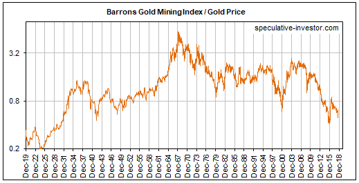
A consequence is that gold bullion increases in value relative to gold-mining stocks over the long term. This is evidenced by the fact that the gold-mining sector, as represented on the following chart by the Barrons Gold Mining Index up to 1996 and the HUI thereafter, has been in a downward trend relative to gold bullion since 1968. 1968!!

Yes, we are talking about a 50-year downward trend in the value of gold-mining stocks relative to gold bullion. For how many more decades will this trend have to continue before analysts stop referring to gold-mining stocks as leveraged plays on the metal?

BGMI_gold_100918

There’s no reason to expect the above trend to end while the current monetary system is in place. This doesn’t mean that gold-mining stocks should be ignored, as these stocks can generate huge profits for traders who remember to sell when the selling is good. It means that if you want long-term exposure to gold then you should own gold, not the stocks of companies that mine gold.

Print This Post Print This Post

Gold at the Crossroads

August 27, 2018

[This post is a modified excerpt from a TSI commentary published last month]

Although I’m not in total agreement with it, I can highly recommend Erik Norland’s article titled “Gold: At the Crossroads of Fiscal and Monetary Policies.” The article is informative and, unlike the bulk of gold-related commentary, actually deals with fundamental developments that could be important influences on gold’s price trend.

The article was published in early-May and states that the U.S. is in a mid-to-late stage recovery. While that statement was probably correct at the time, evidence has since emerged that the economy has entered the “Late-Expansion” stage.

Note that the “Late-Expansion” stage could extend well into 2019 or perhaps even into 2020 and that the best leading indicators of recession should issue timely warnings when this stage is about to end. By the way, the extension of the Late-Expansion stage is why the industrial metals markets probably will commence new intermediate-term rallies later this year.

My only substantial disagreement with the above-linked article is associated with the relationship between gold and fiscal policy. Parts of the article are based on the premise that expansionary fiscal policy and its ‘ballooning’ effect on federal debt are bullish for gold. This premise is false; expansionary fiscal policy is not, in and of itself, either bullish or bearish for gold.

The effects that fiscal policy and the associated change in government debt have on the gold price will be determined by their effects on economic confidence. Of particular relevance, there’s no good reason to assume that an increase in government debt will bring about a decline in economic confidence, which is what it would have to do to be bullish for gold. In fact, if an increase in government indebtedness is largely the result of reduced taxes then it could lead to increased economic confidence for a considerable time and thus put DOWNWARD pressure on the gold price.

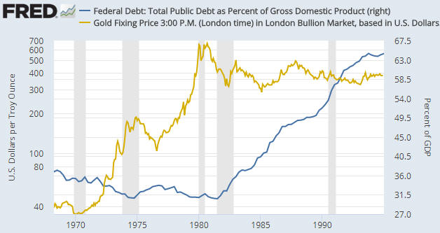
That there should not be a consistent positive correlation between the gold price and the extent of US government indebtedness is borne out by the empirical evidence. In particular, the following chart shows that there was a NEGATIVE correlation between the US$ gold price and the US government-debt/GDP ratio between 1970 and 1995, with debt/GDP drifting lower during the long-term gold bull market of the 1970s and then trending upward during the first 15 years of gold’s long-term bear market.

The wrong assertion that an increase in the government’s debt burden is necessarily bullish for gold appears to rely on what happened during 1995-2011, in that during this 17-year period there was a positive correlation between the gold price and the US government-debt/GDP ratio. You must take a wider-angle view to realise that this 17-year period is an example of correlation not implying causation. The fact is that over the past 50 years the overarching correlation between the gold price and the debt/GDP ratio has been negative for more time than it has been positive.

The steadfast belief that rising US government debt is bullish for the US$ gold price is similar to the steadfast belief that geopolitical conflict is bullish for the gold price. They are both superstitions. The gold price has never made sustainable gains in reaction to international military conflict or the threat of the same, and the gold price is just as likely to fall as it is to rise in parallel with increasing government indebtedness.

The lagged response of the economy to the central bank’s monetary machinations is the key to long-term trends in the gold price. Therefore, it isn’t correct to say that gold is at the crossroads of fiscal and monetary policies (the theme of the above-linked article). It is correct, however, to say that gold is at the crossroads of bubble activities and the reduction of monetary fuel to support such activities.

The current US economic boom is like the cartoon character that has run over the edge of a cliff, but hasn’t looked down yet. The character can continue running without any support as long as it doesn’t look down. At this stage, investors in stocks, bonds and other assets that have been propelled to sky-high valuations by monetary inflation are acting as if the temporary props put in place by the central bank still exist, so they don’t yet perceive the need for the support that gold can offer. Unfortunately, unlike in the cartoons when the time from running over the cliff to the point of recognition is always a few seconds or less, there’s no way to know in advance how long an artificial economic boom will persist after the monetary support is removed.

Print This Post Print This Post

Sentiment pitfalls, the gold edition

August 20, 2018

In a couple of blog posts last year I discussed the limitations of sentiment as a market timing tool. With the most reliable sentiment indicators now revealing extreme negativity towards gold, it’s timely to revisit this topic using the current gold market situation as an example.

There are two sentiment pitfalls that I mentioned in the earlier posts that are especially relevant to the current gold-market situation. The first is linked to the fact that sentiment generally follows price, making it a near certainty that the overall mood will be at an optimistic extreme near an important price top and a pessimistic extreme near an important price bottom. Putting it another way, there is nothing like a strongly-rising price to get the speculating community and the general public bullish and there is nothing like a steep price decline to get them bearish, so it’s perfectly natural that price-tops will be associated with optimism and price-bottoms will be associated with pessimism. The problem is that while an important price extreme will always be associated with a sentiment extreme, a sentiment extreme doesn’t necessarily imply an important price extreme.

Gold’s current Commitments of Traders (COT) situation shows that relative to the past 15 years, speculative sentiment is now at a pessimistic extreme. This implies that there is now plenty of sentiment-related fuel to propel the gold price upward over the months ahead, but it doesn’t imply that the price is close to a sustainable low. If the price continues to trend downward then speculators, as a group, will continue to lose interest in being long and gain interest in being short. Of course, when a sustainable price bottom is reached it WILL coincide with very negative sentiment, because, as I said, sentiment follows price.

The second potential pitfall is that what constitutes a sentiment extreme will vary over time, meaning that there are no absolute benchmarks. In particular, what constitutes dangerous optimism in a bear market will often not be a problem in a bull market and what constitutes extreme fear/pessimism in a bull market will often not signal a good buying opportunity in a bear market.

At the moment, gold is not in a bull market. It is either still immersed in the bear market that began in 2011 or immersed in a long-term basing pattern. Either way, it isn’t reasonable to blindly assume that what constituted a sentiment extreme during the period since 2001, the bulk of which involved a gold bull market, constitutes a sentiment extreme today.

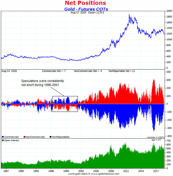
If we look back further than 2001 we see that the current speculative positioning in gold futures is not necessarily indicative of an extreme. For example, the following chart from goldchartsrus.com shows that speculators in Comex gold futures were consistently net-short during 1996-2001.

goldCOT_200818

My guess is that the gold price will rebound strongly from whatever low it makes during August-September. However, unless the fundamentals make a sustainable turn in gold’s favour (right now the fundamental backdrop is unequivocally bearish for gold) it’s likely that at some future point the COT data for gold will reveal much greater negativity on the part of the speculating community than exists today.

Print This Post Print This Post

The next major gold rally

August 17, 2018

[This post is a brief excerpt from a recent TSI commentary]

During the first three quarters of 2016 we were open to the possibility that a new cyclical gold bull market got underway in December of 2015, but over the past 18 months we have been consistent in our opinion that the December-2015 upward reversal in the US$ gold price did NOT mark the start of a bull market. Since late-2016 there have been some interesting rallies in the gold price, but at no time has there been a good reason to believe that we were dealing with a bull market. That’s still the case. The question is: what will it take to set a new cyclical gold bull market in motion?

The simple answer is that it will take a US equity bear market. However, this is not a practical answer because in real time there often will be no way of differentiating the first 6-9 months of an equity bear market from an intermediate-term bull-market correction. The most practical answer we can come up with is that it will take an upward reversal in the yield curve.

It has become popular to argue that due to extraordinary monetary policy the yield curve is not as important as it was in the past, but we strongly disagree. In our opinion the yield curve is, if anything, more important now — in the face of extraordinary monetary policy — than it has ever been.

The potential for the US yield curve to invert in the not-too-distant future is a red herring. Except to the extent that it influences the psychology of senior Fed officials, whether or not the curve inverts is neither here nor there. It’s the reversal from ‘flattening’ to ‘steepening’ that matters, regardless of whether the reversal happens before or after the curve inverts.

If the next major reversal of the yield curve is driven primarily by falling short-term interest rates then it will signal the onset of an economic bust. An economic bust would naturally coincide with an equity bear market and the start of a gold bull market. On the other hand, if the next major reversal of the yield curve is driven primarily by rising long-term interest rates then it will signal the onset of an inflationary blow-off that likely would go hand-in-hand with a powerful 1-2 year rally in the gold price and the prices of most other commodities.

Last week the 10yr-2yr yield spread, a proxy for the US yield curve, fell to within 2 basis points of the 10-year low reached in mid-July. Therefore, at this time there is no sign of an upward reversal.

Print This Post Print This Post

Gold: Bearish fundamentals, bullish sentiment

August 13, 2018

For the first time this year, about two weeks ago the sentiment backdrop became decisively supportive of the gold price and remains so. At the same time, the fundamental backdrop is unequivocally bearish for gold. What will be the net effect of these counteracting forces?

Before attempting to answer the above question let’s briefly review the most important sentiment and fundamental indicators.

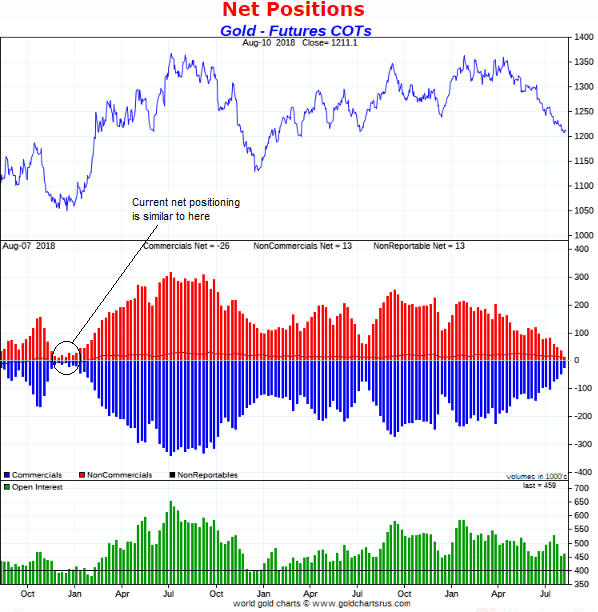
The following chart from goldchartsrus.com shows that at Tuesday 7th August (the date of the latest COT data) the net positioning of traders in gold futures was similar to what it was in December-2015, which is when a powerful 7-month rally was about to begin. Therefore, in terms of net positioning the COT situation (the most useful of all the gold-market sentiment indicators) is as bullish as it has been in many years.

The one concern is that while the open interest (the green bars in the bottom section of the following chart) is well down from where it was a month ago, it is still more than 50K contracts above where it was at the December-2015 and December-2016 price lows (the two most important price lows of the past five years). The open interest may have to drop to 400K contracts or lower before there is a strong, multi-month rally.

goldCOT_130818

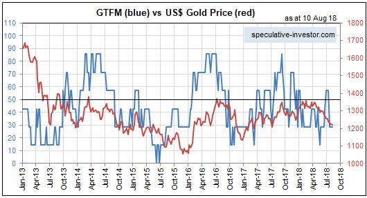
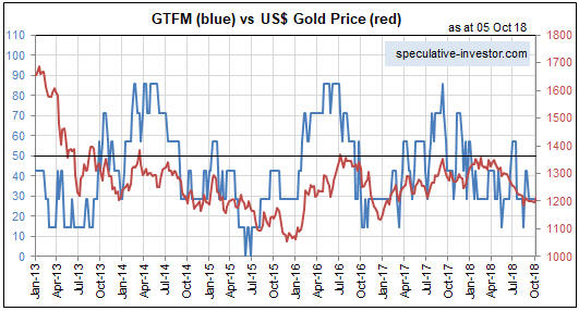
There are a number of important fundamental drivers of the US$ gold price, including credit spreads, the yield curve, the real interest rate (the TIPS yield), the relative strength of the banking sector and the US dollar’s exchange rate. The most important seven gold-market fundamentals are incorporated into our Gold True Fundamentals Model (GTFM), a chart of which is displayed below.

The GTFM was ‘whipsawed’ between late-June and mid-July, in that during this short period it shifted from bearish to bullish and then back to bearish. Apart from this 2-3 week period it has been continuously bearish since mid-January.

GTFM_130818

Returning to the question posed in the opening paragraph, regardless of what happens on the sentiment front there will not be an intermediate-term upward trend in the gold market until the fundamental backdrop turns gold-bullish. The fundamentals are constantly in flux and potentially will turn bullish within the next few weeks, but at this time there is no good reason to expect that an intermediate-term gold rally is about to begin.

However, with the right sentiment situation a strong short-term rally can occur in the face of bearish fundamentals. This is what happened between late-June and early-September of 2013. During this roughly 2-month period there was a $200 increase in the gold price in the face of a gold-bearish fundamental backdrop.

The gold market was far more ‘oversold’ in late-June of 2013 than it is today, but it is sufficiently depressed today to enable a short-term rebound of at least $100 even without a significant improvement (from gold’s perspective) in the fundamentals.

That doesn’t mean that we should expect a $100+ rebound to get underway in the near future, only that — thanks to the depressed sentiment — the potential is there. Before the potential starts being realised the price action will have to signal a reversal.

Print This Post Print This Post

A different look at the US yield curve

August 6, 2018

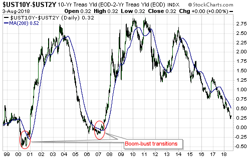
The US yield curve, as indicated by the spread between the 10-year and 2-year T-Note yields, made a new 10-year extreme over the past fortnight, meaning that it recently became the ‘flattest’ it has been in more than 10 years. While this may indicate that the boom is nearing its end, it definitely indicates that the transition from boom to bust has not yet begun.

As explained numerous times in the past, the ‘flattening’ of the yield curve (short-term interest rates rising relative to long-term interest rates) is a characteristic of a monetary-inflation-fueled economic boom. It doesn’t matter how flat the yield curve becomes or even if it becomes inverted, the signal that the boom has ended and that a bust encompassing a recession is about to begin is the reversal of the curve’s major trend from flattening to steepening. To put it another way, the signal that the proverbial chickens are coming home to roost is short-term interest rates peaking RELATIVE TO long-term interest rates and then beginning to decline relative to long-term interest rates. This generally will happen well before the Fed sees a problem and begins to cut its targeted short-term interest rate.

The following chart highlights the last two major reversals of the US yield curve from flattening to steepening. These reversals were confirmed about 6 months prior to the recessions that began in March-2001 and December-2007.

The fact that the yield curve is still hitting new extremes in terms of ‘flatness’ suggests that the next US recession will not begin before 2019.

yieldcurve_060818

The above is essentially a repeat of what I’ve written in the past, but an additional point warrants a mention. The additional point is that while it would be almost impossible for the US economy to transition from boom to bust without a timely reversal in the yield curve from flattening to steepening, there is a realistic chance that the next yield-curve trend reversal from flattening to steepening will NOT signal the onset of an economic bust/recession. That’s why I do not depend solely on the yield curve when determining recession probabilities.

The reason that the next yield-curve trend reversal from flattening to steepening will not necessarily signal the onset of an economic bust/recession is that there are two potential drivers of such a reversal. The reversal could be driven by falling short-term interest rates or rising long-term interest rates. If it’s the former it signals a boom-bust transition, but if it’s the latter it signals rising inflation expectations.

As an aside, regardless of whether a major yield-curve reversal from flattening to steepening is driven by the unravelling of an artificial boom or rising inflation expectations, it is bullish for gold. By the same token, a major reversal in the yield curve from steepening to flattening is always bearish for gold.

With the T-Bond likely to strengthen for at least the next two months there is little chance that rising long-term interest rates will drive a yield curve reversal during the third quarter of this year, but it’s something that could happen late this year or during the first half of next year.

Print This Post Print This Post

Have the Chinese pegged the gold price?

July 30, 2018

Governments and central banks lost interest in the gold price decades ago, but stories about how governments are supposedly controlling the gold price never lose their appeal. One of the latest stories is that since the inclusion of the Yuan in the IMF’s SDR (Standard Drawing Rights) basket in October-2016, the Chinese government has pegged the SDR-denominated gold price to 900 +/- a few percent. According to The Macro Tourist’s 25th July blog post, this story has been told by Jim Rickards. The Macro Tourist suggests a different story*, which involves the Chinese government (or someone else) having pegged the Yuan-denominated gold price. Both stories are based on gold’s narrow trading range relative to the currency in question over the past two years.

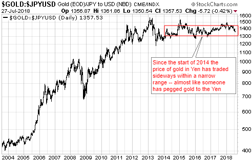
If we are going to play this game then I can tell an even better story. My story is that the Japanese government took control of the gold market in early-2014 and has since been keeping the Yen-denominated gold price at 137,000 +/- 5%. They lost control in early-2015 and again in early-2018, but in both cases they quickly brought the market back into line.

Here’s the chart that ‘proves’ my version of events:

gold_Yen_300718

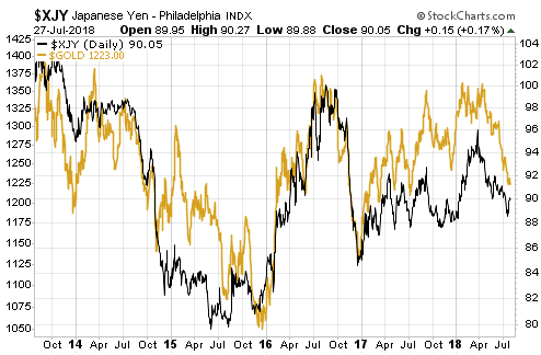
The narrow sideways range of the Yen gold price over the past 4.5 years is due to the Yen being the major currency to which gold has been most strongly correlated. Here’s a chart that illustrates the strong positive correlation between Yen/US$ and gold/US$:

goldvsYen_300718

My story about the Japanese government pegging the gold price makes as much sense as the stories about the Chinese government pegging the gold price. That is, my story makes no sense.

It will be possible to find price data to substantiate almost any manipulation story. Also, with sufficient imagination there is no limit to the manipulation stories that can be concocted to explain any price action. For example, you can always look at a period of range-trading in the gold market and conclude that a government (the same organisation that makes a mess of everything else it tries to do) is adeptly managing the price. Alternatively, you can look for a more plausible explanation or perhaps just acknowledge that not all price action has a single, simple explanation.

Like all financial markets the gold market is, of course, manipulated, but even if there were a desire to do so (there isn’t) it would not be possible under today’s monetary system for any government to directly control the gold price over a period of years or alter major trends in the gold price.

*In general the Macro Tourist blog provides level-headed commentary on the financial markets and doesn’t plunge into the murky world of gold-manipulation story-telling. Even in this case I think the main point of the post is to show that gold is stretched to the downside and may be good for a short-term trade, but some people will take the post as more evidence that the gold market is dominated by nefarious forces.

Print This Post Print This Post

The “Productivity of Debt” Myth

July 23, 2018

Page 4 in Hoisington Investment Management’s latest Quarterly Review and Outlook contains a discussion about the falling productivity of debt problem. According to Hoisington and many other analysts, the problem is encapsulated by the falling trend in the amount of GDP generated by each additional dollar of debt, or, looking from a different angle, by the rising trend in the amount of additional debt required to generate an additional unit of GDP. However, there are some serious flaws in the “Productivity of Debt” concept.

There are three big problems with the whole “it takes X$ of debt to generate Y$ of GDP” concept, the first being that GDP is not a good indicator of the economy’s size or progress.

For one thing, GDP is a measure of spending, not a measure of wealth creation. It’s possible, for example, for GDP to grow rapidly during a period when wealth is being destroyed on a grand scale. This could happen during war-time and it could also happen as the result of massive government spending on make-work projects. It’s also possible for GDP to grow slowly at a time when the rate of economic progress is high. This can happen because GDP is dominated by consumption. It omits all business-to-business expenditure and misses a lot of value-adding investment.

For another thing, GDP is strongly influenced by changes in the money supply. Of particular concern, even though an increase in the money supply cannot possibly cause a sustainable increase in economy-wide wealth, it will usually boost GDP.

Therefore, comparing anything with GDP is problematic.

The second flaw in the “it takes X$ of debt to generate Y$ of GDP” concept is that it involves comparing a flow (annual GDP) to a stock (the cumulative total of debt). There are times when it can make sense to compare a stock to a flow, but care must be taken when doing so. I’ll use a hypothetical example to show one of the pitfalls.

Assume that over the course of a year an economy goes from a GDP of $10T and a total debt of $50T to a GDP of $10.4T and a total debt of $52T. This could prompt the claim that it took $2T of additional debt to boost GDP by $0.4T, or that $5 of additional debt was needed for every $1 of additional GDP. However, it could also be said that a 4% increase in debt was associated with a 4% increase in GDP. The second way of expressing the same change seems far less worrisome.

In any case, the above two flaws in the typical productivity-of-debt analysis pale in comparison with the third flaw, which is that the entire concept of debt productivity is meaningless. The fact is that debt doesn’t cause economic growth and ‘excessive debt’ (whatever that is) doesn’t inhibit economic growth.

An economy can grow with or without an increase in debt, because per-capita economic growth is caused by savings and capital investment. An increase in debt can accelerate the pace of real growth by acting as a means by which savings are channeled to where they can be invested to the best effect, but the transfer of savings can also occur via the exchange of money for equity. For example, most exploration-stage mining companies and most technology start-ups are equity-financed not debt-financed. There is, of course, debt that is used to finance consumption rather than investment, but that type of debt can’t grow the economy over the long term because it necessarily involves a present-future trade-off — more spending in the present leads to less spending in the future.

The central problem is unsound money, not excessive debt. More specifically, the problem is that when banks make loans they create money out of nothing. It’s this creation of money out of nothing and the subsequent exchange of nothing for something, not the build-up of debt, that leads to reduced productivity. If all debt involved the lending/borrowing of real savings then no amount of debt could ever make the overall economy less efficient. Of course, if all debt involved the lending/borrowing of real savings then the total amount of debt would be a small fraction of what it is today.

Print This Post Print This Post

No currency manipulation by China’s government, yet

July 18, 2018

[This is a brief excerpt from a commentary posted at TSI last week]

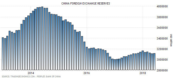
In the 2nd July Weekly Update we discussed the risk posed by the recent weakening of China’s currency (the Yuan), and commented: “We won’t know for sure until China’s central bank publishes its international currency reserve figure for June, but the recent weakening of the Yuan does not appear to be the result of a deliberate move by China’s government.” We now know for sure — the Yuan’s pronounced weakness during the month of June was NOT the result of government manipulation. In fact, it can be more aptly described as the result of an absence of manipulation.

We know that this is so because of what happened to China’s currency reserves in June. As indicated by the final column on the following chart, almost nothing happened (there was no significant change). This means that China’s government made no attempt to either strengthen or weaken its currency last month.

To further explain, for China’s government to engineer weakness in the Yuan’s foreign exchange value it must add to its international currency reserves by exchanging its own currency (that it creates ‘out of thin air’) for foreign currency. By the same token, for China’s government to increase the Yuan’s relative value it must use its international currency reserves to purchase Yuan. Consequently, periods when China’s currency reserve is increasing are periods when China’s government is attempting to weaken the Yuan and periods when China’s currency reserve is decreasing are periods when China’s government is attempting to strengthen the Yuan.

The above chart therefore tells us that China’s government was trying to weaken the Yuan up to mid-2014 and strengthen the Yuan from mid-2014 until the end of 2016. The chart also seems to indicate that there was a tentative attempt to weaken the Yuan during 2017, but 2017′s gradual increase in China’s foreign currency stash was most likely driven by changing market valuation. We are referring to the fact that because reserves are reported in US dollars and held as debt securities, the reported value of the reserves can be altered by a change in exchange rates or bond prices. In particular, the reported reserve figure will have an upward bias during periods when the US$ is weak relative to other major currencies, as it was throughout 2017.

The bottom line is that China’s government has not yet weaponised the Yuan’s FX value in its economic war with the US government, but it is also not standing in the way when the Yuan weakens in response to market forces.

Print This Post Print This Post

The current message from the most useful sentiment indicator

July 10, 2018

As I’ve noted in the past, the Commitments of Traders (COT) information is nothing other than a sentiment indicator. Moreover, for some markets, including gold, silver, copper, the major currencies and Treasury bonds, the COT reports are by far the best indicators of sentiment. This is because they reflect how the broad category known as speculators is betting. Sentiment surveys, on the other hand, focus on a relatively small sample and are, by definition, based on what people say rather than what they are doing. That’s why for some markets, including the ones mentioned above, I put far more emphasis on the COT data than on sentiment surveys.

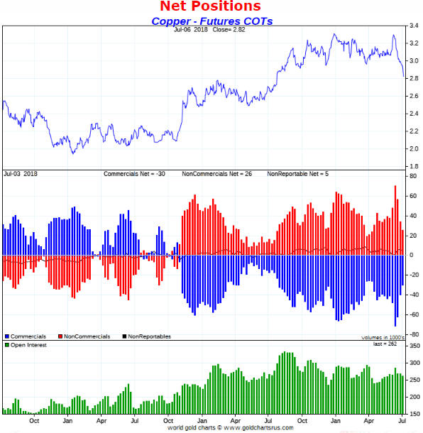
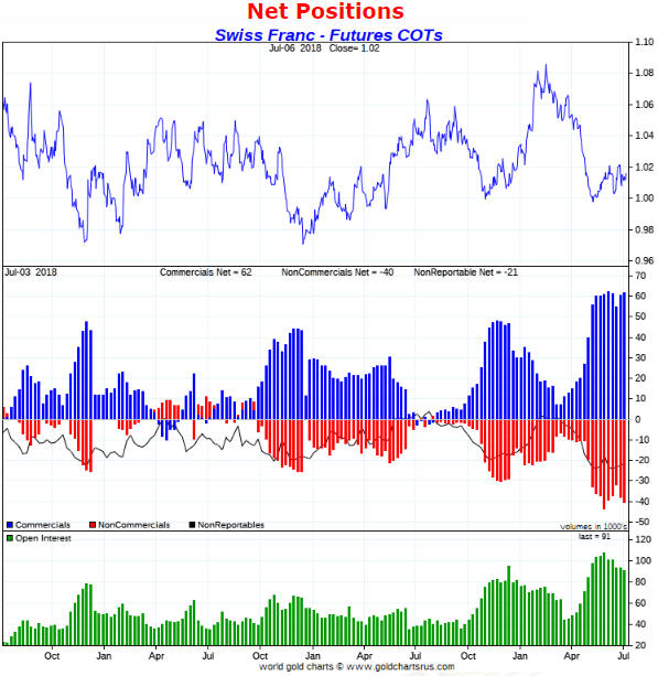
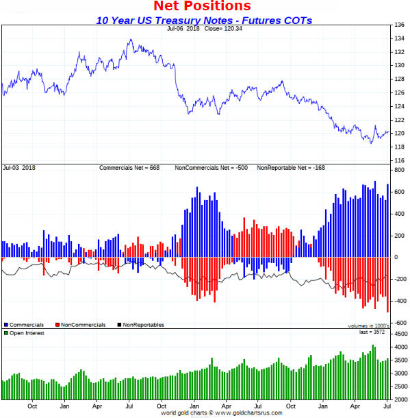
In this post I’ll summarise the COT situations for five markets with the help of charts from “Gold Charts ‘R’ Us“. I’ll be focusing on the net positioning of speculators in the futures markets, although useful information can also be gleaned from gross positioning and open interest.

Note that what I refer to as the total speculative net position takes into account the net positions of large speculators (non-commercials) and small traders (the ‘non-reportables’) and is the inverse of the commercial net position. The blue bars in the middle sections of the charts that follow indicate the commercial net position, so the inverse of each of these bars is considered to be the total speculative net position.

I’ll start with gold.

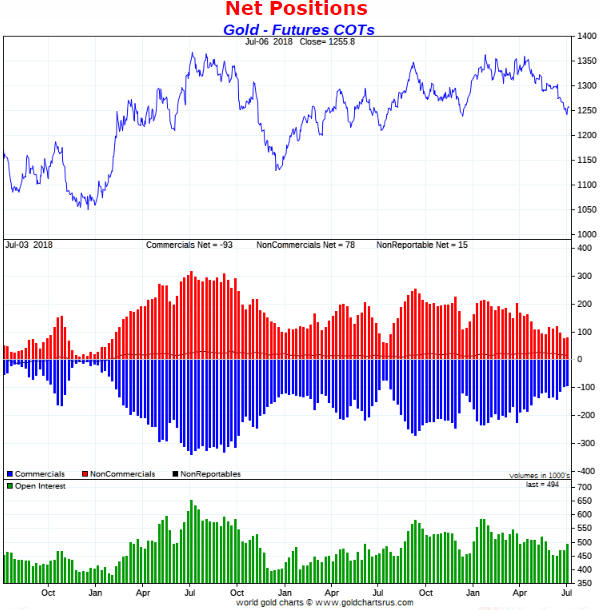
Gold’s COT situation was almost unchanged over the latest week. Ignoring everything except sentiment (as indicated by the COT data), gold is in a similar position now to where it was in early-July and early-December of last year. This suggests the potential for a 2-month rally to the $1350-$1400 range, but not much more than that.

goldCOT_100718

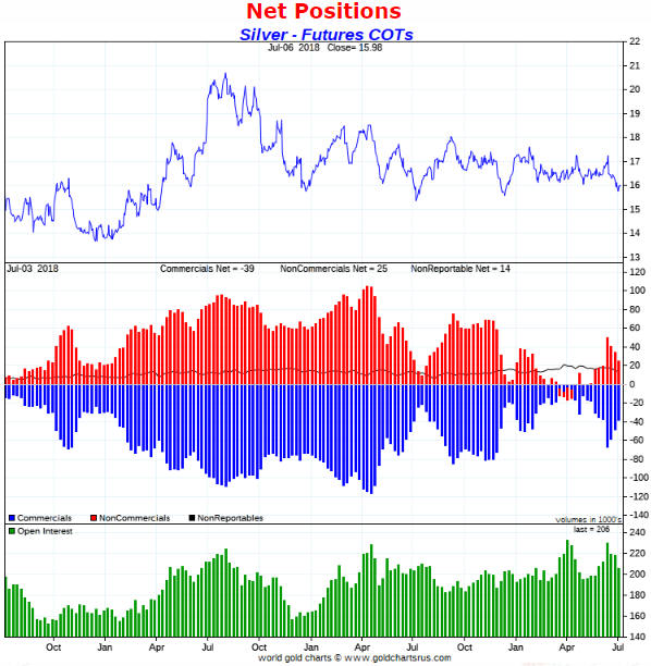
Silver’s COT situation has been a source of controversy over the past four months. Some analysts argued that it was extremely bullish, whereas I argued (for example: HERE) that at no point over this period was the COT situation conducive to a significant silver rally. I’m therefore not surprised that there hasn’t been a significant silver rally.

Four weeks ago silver’s COT situation became slightly bearish, but it has since improved and I now view it as neither a tail-wind nor a head-wind for the silver price. However, silver will rally if gold rallies. It’s that simple.

silverCOT_100718

Four weeks ago the speculative net-long position in Comex copper futures became extreme. This didn’t guarantee that a large price decline was in store, but it pointed to substantial downside risk in the price.

Copper’s COT situation is now similar to what it was near short-term price bottoms in July and December of last year, so there’s a decent chance of a multi-week price rebound.

copperCOT_100718

Of the major currencies, the Swiss franc (SF) has the most bullish COT situation. The COT information certainly doesn’t preclude one more decline in the SF to a new low for the year, but it suggests that the SF will trade significantly higher within the next three months.

SFCOT_100718

I expect that long-dated US Treasury securities will trade at much lower prices (much higher yields) within the next 2 years, but during April-May of this year I began to anticipate a multi-month price rebound (yield pullback) in this market. This was mainly due to sentiment as indicated by the COT situation. Of particular relevance, the total speculative net-short position in 10-year T-Note futures had risen to an all-time high.

Despite a price rebound from the May low, the speculative net-short position in 10-year T-Note futures remains near the all-time high reached in late-May. Therefore, it’s a good bet that the T-Note/T-Bond price rebound is not close to being complete.

TNoteCOT_100718

Print This Post Print This Post

Gold’s true fundamentals turn bullish

July 5, 2018

I update gold’s true fundamentals* every week in commentaries and charts at the TSI web site, but my most recent blog post on the topic was on 30th April. At that time the fundamental backdrop was gold-bearish, but there has since been a change.

My Gold True Fundamentals Model (GTFM) turned bearish in mid-January 2018 and was still bearish at the end of the week before last (22nd June). There were fluctuations along the way, but at no time between mid-January and late-June was the fundamental backdrop supportive of the gold price. However, at the end of last week (29th June) the GTFM turned bullish. The deciding factor was a small, but significant, widening of credit spreads.

Here is a chart comparing the GTFM (in blue) with the US$ gold price (in red).

The upshot is that for the first time in more than 5 months the gold market has a ‘fundamental’ tail-wind, which is a prerequisite for a substantial rally. For reasons that I’ve mentioned in TSI commentaries I’m expecting a tradable 2-month rally from a July low rather than a substantial rally, but my expectations will change if the evidence changes.

*Note that I use the word “true” to distinguish the actual fundamental drivers of the gold price from the drivers that are regularly cited by gold-market analysts and commentators. According to many pontificators on the gold market, gold’s fundamentals include the volume of metal flowing into the inventories of gold ETFs, China’s gold imports, the volume of gold being transferred out of the Shanghai Futures Exchange inventory, the amount of “registered” gold at the COMEX, India’s monsoon and wedding seasons, jewellery demand, the amount of gold being bought/sold by various central banks, changes in mine production and scrap supply, and wild guesses regarding JP Morgan’s exposure to gold. These aren’t true fundamental price drivers. At best, they are distractions.

Print This Post Print This Post

Can silver rally without gold?

June 29, 2018

[This blog post is an excerpt from a recent TSI commentary]

The article titled “Silver’s Critical Role In Electrification May Fuel Its Rise” contains some interesting comments about the silver market, but with one minor exception the information presented in this article has no bearing on silver’s risk/reward as a speculation or investment. The minor exception is the high (by historical standards) gold/silver ratio, which suggests that the silver price is likely to rise relative to the gold price over the next few years. However, none of the information about silver ‘fundamentals’ presented in the article is relevant to the silver price.

It isn’t relevant for the same reasons that most of the information presented by the ‘experts’ about gold fundamentals is also not relevant: It treats the annual output of the mining sector as if it were the total supply (annual mine production is a small fraction of the total supply) and it confuses flows from one part of the market to another with changes in total demand (every ‘flow’ involves an increase in demand on the part of the buyer and an exactly offsetting decrease in demand on the part of the seller). Furthermore, it isn’t relevant for another reason that can be illuminated by asking the question: within the past 80 years, when was there a major silver rally in the absence of a gold rally?

The answer is that over the past 80 years there hasn’t been a single major silver rally in the absence of a gold rally. The best rally in silver without a concurrent rally in gold was the 6-month price spike that began in Q3-1997. This rally resulted from an attempt to manipulate the price upward on the back of Warren Buffett’s silver accumulation; it did not result from any of the ‘fundamental’ drivers cited by commentators trying to make the case that silver can rally strongly without gold.

The historical record persuasively argues that large silver rallies don’t happen in the absence of large gold rallies. This tells us that either economic/financial-system confidence drives the silver market in the same way that it drives the gold market or that the big trends in silver simply follow the big trends in gold.

The bottom line is that there does not appear to be a good reason to expect the silver price to move substantially higher independently of the gold price.

Print This Post Print This Post
Why the yield curve changes direction ahead of a recession

June 18, 2018

[This post is an excerpt from a TSI commentary]

Conventional wisdom is that an inversion of the yield curve (short-term interest rates moving above long-term interest rates) signals that a recession is coming, but this is only true to the extent that a recession is always coming. A reversal in the yield curve from flattening to steepening is a far more useful signal.

What a yield curve inversion actually means is that the interest-rate situation has become extreme, but there is no telling how extreme it will become before the eventual breaking point is reached. Furthermore, although there was a yield-curve inversion prior to at least the past seven US recessions, Japan’s most recent recessions were not preceded by inverted yield curves and there is no guarantee that short-term interest rates will rise by enough relative to long-term interest rates to cause the yield curve to become inverted prior to the next US recession. In fact, a good argument can be made that due to the extraordinary monetary policy of the past several years the start of the next US recession will NOT be preceded by a yield curve inversion.

Previous US yield curve inversions have happened up to 18 months prior to the start of a recession, and as mentioned above it’s possible that there will be no yield curve inversion before the next recession. Therefore, we wouldn’t want to be depending on a yield curve inversion for a timely warning about the next recession or financial crisis. However, the yield curve can provide us with a much better, albeit still imperfect, recession/crisis warning in the form of a confirmed trend reversal from flattening to steepening. This was discussed in numerous TSI commentaries over the years and was also covered in a blog post last December.

There are two reasons that a reversal in the yield curve from flattening to steepening is a more useful recession/crisis warning signal. First, it is timelier. Second, it should work regardless of whether or not the yield curve becomes inverted.

Now, from a practical speculation standpoint it is not essential to understand WHY the yield curve reverses from flattening to steepening ahead of major economic problems bubbling to the surface. It is enough to know that it does. However, if you understand why the curve has reversed direction ahead of previous recessions you will understand why it either should or might not reverse direction in a timely manner in the future. After all, if extraordinary monetary policy could prevent the yield curve from becoming inverted ahead of the next recession then perhaps it also could prevent the yield curve from reversing course the way it has in the past.

With regard to understanding the why, the first point to grasp is that the boom phase of the cycle is characterised by borrowing short-term to lend/invest long-term. This puts upward pressure on short-term interest rates relative to long-term interest rates, meaning that it causes the yield curve to flatten. Also, when the boom is mature and is approaching its end there will be a scramble for additional short-term financing to a) complete projects that were started when monetary conditions were easier and b) address cash shortages that have arisen due to completed projects not delivering the predicted cash flows. This puts further upward pressure on short-term rates relative to long-term rates, and could, although won’t necessarily, cause the yield curve to become inverted.

Next, as the boom nears its end the quantity of loan defaults will begin to rise and the opportunities to profit from short-term leverage will become scarcer. Everything will still seem fine to casual observers, central bankers, the average economist and the vast majority of commentators on the financial markets, but it will now be apparent to a critical mass of astute operators (investors, speculators and financiers) that many of the investments that were incentivised by years of easy money were ill-conceived. These operators will begin shifting towards ‘liquidity’ and away from risk.

The aforementioned increasing desire for the combination of safety and liquidity leads to greater demand for cash and gold. But more importantly as far as this discussion is concerned, it boosts the demand for short-term Treasury debt relative to long-term Treasury debt (thus putting downward pressure on short-term interest rates relative to long-term interest rates). The reason is that the shorter the term of the Treasury debt, the lower the risk of an adverse price movement. For example, if you lend $10B to the US government via the purchase of 3-month T-Bills then in three months’ time you will have something worth $10B, but if you lend $10B to the US government via the purchase of 10-year T-Notes then in three months’ time you could have something that is worth significantly more or less than $10B.

As an aside, what an investor focused on boosting liquidity really wants is cash, but if he has billions of dollars then cash is not a viable option. This is because the cash would have to be deposited in a bank, which means that the investor would be lending the money to a bank and taking the risk of a massive loss due to bank failure. Lending to the US government is a much safer choice.

In summary, it’s mainly the desire for greater liquidity and safety that begins to emerge at the tail-end of a boom that causes the yield curve to stop flattening and start steepening. As demonstrated by the events of the past few years the central bank has substantial power to postpone the end of a boom, but eventually a breaking point will be reached and when it is the yield curve’s trend will change from flattening to steepening.

Print This Post Print This Post
What is fiat currency?

June 11, 2018

The term “fiat” is often associated with irredeemable-paper or electronic currency, but existing only in paper or electronic form is not the defining characteristic of fiat currency. In fact, paper or electronic currency is not necessarily “fiat” and hard commodity currency can be “fiat”.

Regardless of the form it takes, fiat currency is simply currency by government decree. If the government dictates that a certain ‘thing’ is money and must be accepted in payment for goods, services and debts, then that ‘thing’ is a fiat currency.

Obviously, all of today’s national currencies are fiat currencies. Not so obviously, gold was a fiat currency during the Gold Standard era. It could be claimed — without any argument from me — that during the Gold Standard era gold would have been the most widely used currency without the government making it so, but this is beside the point. In the situation where the government has commanded that gold is money, gold is a fiat currency.

Also not so obviously considering what has been written on the topic in other places, Bitcoin is not a fiat currency. If anything it is the opposite of a fiat currency, because it was created by the private sector and is not supported in any way by the government. This doesn’t mean that Bitcoin is a good currency, as there is a lot more to being a good currency than being outside the direct control of government.

Summing up, people should be careful when applying the word “fiat” to currency/money. The word is routinely used to mean irredeemable or non-physical, but that’s not what it actually means.

Print This Post Print This Post
The useless and dangerous “money velocity” concept

June 5, 2018

In a blog post about three years ago I explained that in the real world there is money supply and there is money demand; there is no such thing as money velocity. “Money velocity” only exists in academia and is not a useful economics concept. In this post I’ll try to make the additional point that in addition to being useless, it can be dangerous.

Before getting to why the money velocity concept can be dangerous, it’s worth quickly reviewing why it is useless. In this vein, here are the main points from the blog post linked above:

1) The price (purchasing power) of money is determined in the same way as the price of anything else: by the interplay of supply and demand. The difference is that money is on one side of almost every transaction, so at any given time there will be millions of different prices for money. This is why it makes no sense to come up with a single number (e.g. the CPI) to represent the purchasing power of money.

2) Money velocity, or “V”, comes from the Equation of Exchange. This equation is often expressed as M*V = P*Q, or, in more simple terms, as M*V = nominal GDP, where “M” is the money supply. In essence, “V” is a fudge factor that is whatever it needs to be to make one side of the ultra-simplistic and largely meaningless Equation of Exchange equal to the other side.

3) The Equation of Exchange can be written: V = GDP/M. Consequently, whenever you see a chart of “money velocity” what you are really seeing is a chart showing nominal GDP divided by some measure of money supply. During a long period of relatively fast monetary inflation the line on such a chart naturally will have a downward slope.

4) Over the past two decades the pace of US money-supply growth has been relatively fast. Hence the downward trend in the GDP/M ratio (a.k.a. money velocity) over this period. Refer to the following chart for details.

5) During the 2-decade period of declining “V” there were multiple economic booms and busts, not one of which was predicted by or reliably indicated by “V”.

velocity_040618

That’s why “money velocity” is useless in describing/analysing how the world works. Unfortunately, there are many influential economists who believe that the simplistic Equation of Exchange can be put to good use when figuring out what’s happening in the world of human action and what should be done about it. These economists, some of whom are in senior positions at central banks, view “money velocity” not only as a valid real-world concept, but also as an important causal factor in the economy.

If you believe that changes in “V” cause changes in economic growth, with a higher “V” bringing about faster growth, then during periods of economic weakness you will be in favour of policies that are specifically designed to boost “V”. In particular, you will be in favour of policies that result in or promote faster spending for the sake of spending.

Of course, if the supply of money is constant then the calculated value of “V” will be high during periods of strong growth and low during periods of weak or no growth. However, the cause is the growth and the change in “V” is a calculated effect of the growth.

Thinking that growth can be boosted via policies designed to increase “V” is similar to the mistake made by Herbert Hoover during the first few years of the Great Depression. He knew that prices tended to rise during economic booms and fall during economic depressions, so he concluded that a depression could be avoided if prices were prevented from falling. That is, he confused cause and effect. This led to efforts to prop-up prices, especially the price of labour. Not surprisingly, these efforts were counter-productive.

Summing up, the belief that “money velocity” is a useful real-world concept is not only wrong, but also dangerous if it is held by people with the power to influence central-bank or government policy.

Print This Post Print This Post
Why it’s different this time

May 29, 2018

[The following is an excerpt from a commentary posted at TSI last week.]

One of the financial world’s most dangerous expressions is “this time is different”, because the expression is often used during investment bubbles as part of a rationalisation for extremely high market valuations. Such rationalisations involve citing a special set of present-day conditions that supposedly transforms a very high valuation by historical standards into a reasonable one. However, sometimes it actually is different in the sense that all long-term trends eventually end. Sometimes, what initially looks like another in a long line of price moves that run counter to an old secular trend turns out to be the start of a new secular trend in the opposite direction. We continue to believe that the current upward move in interest rates is different, in that it is part of a new secular advance as opposed to a reaction within an on-going secular decline. Here are two of the reasons:

The first and lesser important of the reasons is the price action, one aspect of which is the performance of the US 10-year T-Note yield. With reference to the following chart, note that:

a) The 2016 low for the 10-year yield was almost the same as the 2012 low, creating what appears to be a long-term double bottom or base.

b) The 10-year yield has broken above the top of a well-defined 30-year channel.

c) By moving decisively above 3.0% last week the 10-year yield did something it had not done since the start of its secular decline in the early-1980s: make a higher-high on a long-term basis.

The more important of the reasons to think that the secular interest-rate trend has changed is the evidence that the bond market’s performance from early-2014 to mid-2016 constituted a major blow-off. The blow-off and the resulting valuation extreme are not apparent in the US bond market, but they are very obvious in the euro-zone bond market.

In the euro-zone, most government debt securities with durations of 2 years or less rose in price to the point where they had negative yields to maturity, and some long-term bonds also ended up with negative yields. For example, the following chart shows that the yield on Germany’s 10-year government bond fell from around 2% in early-2014 to negative 0.25% in mid-2016.

Although yields have trended upward in the euro-zone since Q3-2016, German government debt securities with durations of 5 years or less still trade with negative yields to maturity. Even more remarkable considering that Italy’s new government is contemplating a partial debt default and a large increase in the budget deficit, Italy’s 2-year government bond yield moved out of negative territory only two weeks ago and is about 220 basis points below the equivalent US yield. To be more specific, you can buy a US 2-year Treasury note today and get paid about 2.5% per year or you can buy an Italian government 2-year note today and get paid about 0.3% per year.

Why would anyone lend money to the Italian government for 2 years at close to 0% today when there is a non-trivial chance of default during this period? Why would anyone have lent money to the Italian government or even to the more financially-sound European governments over the past three years at rates that guaranteed a nominal loss if the debt was held to maturity?

There are two reasons, the first being the weakness of the euro-zone banking system. The thinking is that you lock in a small loss by purchasing government bonds with negative yields to maturity, but in doing so you avoid the risk of a large or even total loss due to bank failure (assuming the alternative is to lend the money to a private bank). The main reason, however, is the ECB’s massive bond-buying program. This program was widely anticipated during 2014 and came into effect in early-2015.

With the ECB regularly hoovering-up large quantities of bonds almost regardless of price, speculators could pay ridiculously-high prices for bonds and be safe in the knowledge that they could offload their inventory to the ECB at an even higher price.

Negative interest rates and negative yields-to-maturity could not occur in a free market. It took the most aggressive central-bank interest-rate manipulation in history to bring about the situation that occurred in Europe over the past few years.

We don’t think it’s possible for the ECB to go further without completely destroying the euro-zone’s financial markets. Also, if it isn’t obvious already it should become obvious within the next couple of years that the aggressive bond-buying programs conducted by the ECB, the Fed and other central banks did not work the way they were advertised. Therefore, even if it were technically possible for the major central banks to go further down the interest-rate suppression path, they won’t be permitted to do so.

That’s why it’s a very good bet that the secular downward trend in interest rates is over.

Print This Post Print This Post
Incomplete silver COT analysis, revisited

May 21, 2018

In a blog post a week ago I discussed why silver’s Commitments of Traders (COT) situation was nowhere near as bullish as it had been portrayed in numerous articles over the preceding two months. This prompted some criticism that involves a misunderstanding of how I use the COT data. Before I address the criticism, a brief recap is in order.

As stated in last week’s post, the enthusiastically-bullish interpretation of silver’s COT situation fixated on the positioning of large speculators (“NonCommercials”) in Comex silver futures. It was based on the fact that over the past two months the large specs had reduced their collective net-long silver exposure to its lowest level in a very long time, indicating that these traders had become more pessimistic about silver’s prospects than they had been in a very long time. This was clearly a bullish development given the contrary nature of speculative sentiment.

I then explained that two components of silver’s overall COT situation cast doubt on the validity of the bullish interpretation.

The first was that near important bottoms in the silver price the open interest (OI) in silver futures tends to be low, but in early-April of this year the OI hit an all-time high.

The second was that whereas the positioning of large specs in silver futures pointed to depressed sentiment, the positioning of small speculators (“NonReportables”) pointed to extreme optimism. This was evidenced by the fact that over the past two months these traders (the proverbial ‘dumb money’) had, as a group, accumulated their greatest net-long exposure in 9 years. It would be very unusual for a big rally to begin at the time when the ‘dumb money’ was positioned for a big rally.

The latest COT report showed minimal change in the positioning of the small specs. As illustrated by the following chart from goldchartsrus.com, their collective net-long exposure is down from its late-March peak but remains near the top of its 3-year range (and its 10-year range).

The main criticism of last week’s blog post was that the size of the total “NonCommercial” (large-spec) position is about 10-times the size of the total “NonReportable” (small-spec) position and therefore that what the “NonCommercials” are doing is an order of magnitude more important than what the “NonReportables” are doing.

My response is: not if the COT information is being used as a sentiment indicator, which is the only way I use it.

The reason it is useful to know the sentiment of the small traders in any financial market is NOT that these traders are the movers and shakers in the market. They obviously aren’t. If they were they wouldn’t be “small” traders and wouldn’t be classed as “NonReportables” in the COT reports. It is useful to know the sentiment of these minor players because as a group they tend to be wrong when they become extremely bullish or extremely bearish. They are the ‘dumb money’. As I wrote last week and repeated above, it would be very unusual for a big rally to begin at the time when the ‘dumb money’ was positioned for a big rally.

Not surprisingly, then, there was no big rally (or any rally worth trading) in the silver market over the past two months.

Print This Post Print This Post
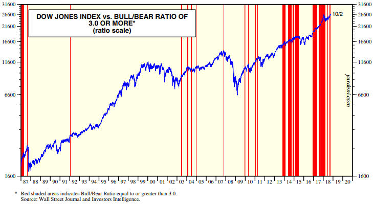
Incomplete silver COT analysis

May 14, 2018

During March and April a number of articles appeared at precious-metals-focused web sites describing the silver market’s Commitments of Traders (COT) situation as extremely bullish. However, this unequivocally bullish interpretation overlooked aspects of the COT data that were bearish for silver. Taking all aspects of the data into consideration, my interpretation at the time (as presented in TSI commentaries) was that silver’s COT situation was neutral and that the setup for a large rally was not yet in place.

The enthusiastically-bullish interpretation of silver’s COT situation fixated on the positioning of large speculators in Comex silver futures. As illustrated by the following chart, over the past two months the large specs (called “NonCommercials” on the chart) first went ‘flat’ and then went net-short. This suggested that large specs had become more pessimistic about silver’s prospects than they had been in a very long time, which was clearly a bullish development given the contrary nature of speculative sentiment.

silverCOT_largespec_140518
Chart source: http://www.goldchartsrus.com/

However, two components of silver’s overall COT situation cast doubt on the validity of the bullish interpretation.

The first is that near important bottoms in the silver price the open interest (OI) in silver futures tends to be low, but in early-April of this year the OI hit an all-time high.

The second and more significant is that whereas the positioning of large specs in silver futures pointed to depressed sentiment, the positioning of small specs (the proverbial dumb money) pointed to extreme optimism. This is evidenced by the following chart, which shows that over the past two months the small specs (called “NonReportable” on the chart) reached their greatest net-long exposure in 9 years. It would be very unusual for a big rally to begin at the time when the ‘dumb money’ was positioned for a big rally.

silverCOT_smallspec_140518
Chart source: http://www.goldchartsrus.com/

The upshot is that silver’s COT situation was not price-supportive at any stage over the past two months. This is mainly because the bullish implications of the unusually-low net-long exposure of large specs was counteracted by the bearish implications of the unusually-high net-long exposure of small specs.

Print This Post Print This Post
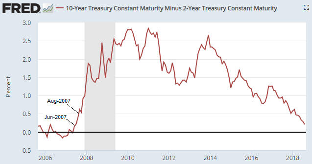
US Recession Watch

May 7, 2018

[The following is an excerpt from a commentary posted at TSI last week]

The US economic expansion that began in mid-2009 has been much weaker than average, but, as indicated by the chart displayed below, it is also much longer than average. In fact, it is simultaneously the weakest and the second-longest expansion on record. Due to the advanced age of the expansion and the signs of weakness that have appeared over the past three months in economic statistics and the stock market, recession warnings are becoming more common. However, when we take an impartial look at the most reliable leading indicators of recession we arrive at the conclusion that these warnings are premature.


Chart source: http://realinvestmentadvice.com/bull-markets-actually-do-die-of-old-age/

The three leading indicators of US recession that we care about are the ISM New Orders Index (NOI), Real Gross Private Domestic Investment (RGPDI) and the yield curve. Not one of these indicators is close to giving a recession warning, which is why we say that the increasingly-common warnings of recession are premature.

The NOI, for instance, has declined each month since making a 13-year high in December-2017, but it remains far above the level that it would have to drop below (the red line on the following chart) to warn of a recession.

Also, there are not even tentative signs of major trend reversals in either RGPDI or the yield curve. That’s because last month the US yield curve became its flattest in more than 10 years (a recession is signaled by a major shift from flattening to steepening) and because the data published at the end of last week revealed that RGPDI hit a new all-time high in Q1-2018. RGPDI’s trend generally reverses downward at least two quarters prior to the start of a recession.

Note that the vertical red lines on the following chart mark the starting points of the last two recessions.

Based on the latest data, we roughly estimate the recession start-time probabilities as follows:
- Q2-2018: 0%
- Q3-2018: 10%
- Q4-2018: 30%
- Some time in 2019: >80%

The main reason for our high 2019 recession probability estimate is the decline in the G2 (US plus euro-zone) monetary inflation rate illustrated by the following chart. The inflation rate bounced in March, but it’s likely that the preceding decline was large enough to bring the artificial boom to an end.

Print This Post Print This Post

An update on gold’s true fundamentals

April 30, 2018

I update gold’s true fundamentals* every week in commentaries and charts at the TSI web site, but my most recent blog post on the topic was on 20th March. At that time the fundamental backdrop was gold-bearish. What’s the current situation?

The fundamental backdrop (from gold’s perspective) is little changed since 20th March. In fact, it has not changed much since early this year. My Gold True Fundamentals Model (GTFM), a weekly chart of which is displayed below, turned bearish during the first half of January and was still bearish at the end of last week. There have been fluctuations along the way, but at no time over the past 3.5 months has the fundamental backdrop been supportive of the gold price.

GTFM_270418

It’s possible for a tradable rally in the US$ gold price to get underway at a time when the fundamental backdrop is not gold-bullish, but for this to happen the sentiment situation as indicated by the Commitments of Traders data would have to be very supportive or the US$ would have to be very weak. Currently, the fundamental backdrop is bearish, the sentiment situation is neutral and the Dollar Index has just broken out to the upside. Therefore, as things stand today there is no good reason to expect that a substantial gold rally will get underway in the near future.

Based on how I expect the fundamentals to shift over the weeks ahead my guess is that a substantial gold rally will begin from a May-June low. However, there is more to be lost than gained by ‘jumping the gun’ and buying a short-term trading position now in anticipation of such a rally.

*Note that I use the word “true” to distinguish the actual fundamental drivers of the gold price from the drivers that are regularly cited by gold-market analysts and commentators. According to many pontificators on the gold market, gold’s fundamentals include the volume of metal flowing into the inventories of gold ETFs, China’s gold imports, the volume of gold being transferred out of the Shanghai Futures Exchange inventory, the amount of “registered” gold at the COMEX, India’s monsoon and wedding seasons, jewellery demand, the amount of gold being bought/sold by various central banks, changes in mine production and scrap supply, and wild guesses regarding JP Morgan’s exposure to gold. These aren’t true fundamental price drivers. At best, they are distractions.

Print This Post Print This Post