In finance, a “black swan” is a major event that ‘comes out of the blue’. In a 13th February article in the New York Times, Mark Spitznagel succinctly explains why a large stock market decline is coming to the US and why it won’t be a black swan.
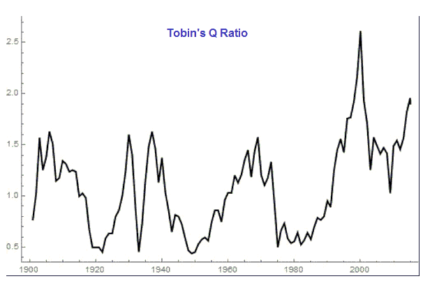
The coming large stock market decline won’t be a black swan because, while its timing is unpredictable, the market’s valuation has reached a level that has always been the precursor to a large decline. This point is made in the above-linked article via a chart of Tobin’s Q Ratio (re-produced below), which is similar to a price-to-book ratio for the entire stock market. Since 1900, Tobin’s Q Ratio was only higher than its current level near the peak of the dot-com bubble.
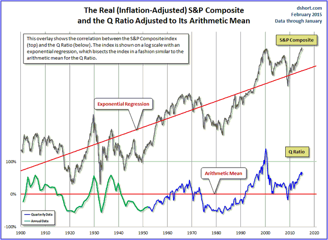
More information on Tobin’s Q Ratio, including the following long-term chart comparison of the “inflation”-adjusted S&P Composite Index and the Q Ratio, can be found in Doug Short’s article posted HERE.
Why does the Q Ratio periodically get so far out of whack? After all, shouldn’t a market economy contain negative feedback that prevents such massive oscillations?
The answer is that we aren’t dealing with a free market; we are dealing with a market subject to intervention by non-market forces, chief among them over the past several decades being the central bank. As neatly explained by Mr. Spitznagel:
“When rates are naturally low, caused by an abundance of patient savers, businesses have the incentive to spend on investment and production; this creates a negative feedback on the ratio. When they are artificially low, and savers are impatiently leveraging, businesses instead have the incentive to spend on stock buybacks and dividends in order to attract the investors who yearn for yields beyond what the artificially distorted market is offering. This drives the ratio, and stock markets, ever higher. Bubbles are not natural and inevitable.”
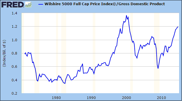
Furthermore, it’s not as if the Q Ratio has somehow been skewed such that it is painting a far different picture from other value-based indicators with good long-term track records. For example, the message of the Q Ratio is echoed by the messages of the Shiller P/E ratio (the Cyclically-Adjusted P/E, or CAPE) and the Wilshire5000/GDP ratio, the latter of which is depicted below. Notice that the Wilshire5000/GDP ratio is now about 15% higher than it was at the 2007 major peak, although, like Tobin’s Q Ratio, it hasn’t made it back to the all-time high reached at the crescendo of the dot-com bubble.
The point is that nobody should be surprised when the next bear market in US equities turns out to be of historic proportions. But of course, almost everyone will be surprised.


