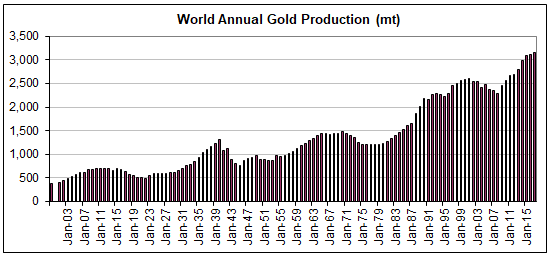
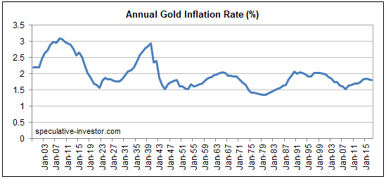
Here are two long-term charts illustrating the annual rate at which gold is extracted from the ground. The second of these charts shows why mine production can be ignored when trying to understand what happened to the gold price over the preceding few years or figure out what’s likely to happen to the gold price over the next few years.
The first chart shows the amount of gold produced by the global mining industry during each year from 1900 through to 2017 (data sourced from the US Geological Survey). The second chart shows the percentage increase in the world’s above-ground gold supply during each year (1900-2017) resulting from that year’s new mine production. In effect, the second chart shows the gold inflation rate.
Notice that over the past 70 years the annual rate of gold inflation has almost always been between 1.5% and 2.0% and has never strayed far from the 1.5%-2.0% range. In other words, regardless of what’s happening in the world, the total supply of gold increases by approximately the same tiny amount each year.
Over the past 60 years, trend changes in the annual rate of gold inflation appear to be lagged reactions to major price changes, with the 7-10 year lag being due to the time it takes from a major price-related incentive to appear and new mines to be brought into production. For example, the upward trend in the gold inflation rate that began in the early-1980s was probably a reaction to the major price advance that began in the early-1970s.
 Print This Post


