Print This Post Print This Post

Why the Fed’s balance sheet reduction will be more interesting than watching paint dry

September 25, 2017

Janet Yellen has quipped that the Fed’s balance-sheet reduction program, which will start at $10B/month in October-2017 and steadily ramp up to $50B/month over the ensuing 12 months, will be as boring as watching paint dry. However, like many financial-market pundits she is underestimating the effects of the Fed’s new monetary plan.

In the old days, hiking the Fed Funds rate (FFR) involved reducing the quantity of bank reserves and the money supply, but that is no longer the case. Hiking the FFR is now achieved by raising the interest rate that the Fed pays to banks on reserves held at the Fed, which means that hiking the FFR now leads to the Fed injecting reserves into the banking system. This was explained in previous blog posts, including “Tightening without tightening (or why the Fed pays interest on bank reserves)“, “New tools for manipulating interest rates“, and “Loosening is the new tightening“.

In other words, under the new way of operating that was implemented in the wake of the Global Financial Crisis, hiking the FFR does not tighten monetary conditions. In fact, given that hikes in the FFR now result in more money being pumped INTO the banking system, an argument could be made that a hike in the FFR is now more of a monetary loosening than a monetary tightening. It is therefore not surprising that the rate hikes implemented by the Fed over the past two years had no noticeable effect on anything.

I mentioned in a blog post a few weeks ago that there has been a significant tightening of US monetary conditions since late last year, but this has not been due to the actions of the Fed. Rather, the rate of US monetary inflation has dropped substantially over the past 10 months due to a decline in the pace of commercial-bank credit expansion. As an aside, the substantial drop in the US monetary inflation rate would have affected the stock market in a bearish way by now if not for the offsetting effect of rapid euro-zone monetary inflation.

The Fed’s first genuine step along the monetary tightening path will happen within the next few weeks when it begins to shrink its balance sheet*. When this happens it will mark a momentous change in the monetary backdrop, and given that it will happen after the US monetary inflation rate has already tumbled it is likely to have financial-market consequences that are far more exciting than watching paint dry.

*The fact that the balance-sheet reduction will take place via the non-reinvestment of proceeds received from maturing securities rather than the selling of securities is neither here nor there. An X$/month balance-sheet reduction is an X$/month balance-sheet reduction, regardless of how it occurs.

Print This Post Print This Post

Home ownership bounces from a 50-year low

September 19, 2017

In a 2015 blog post titled “Unintended Consequences” I explained that policies implemented by the Clinton and Bush administrations to boost the rate of home ownership not only had unintended consequences, but the opposite of the intended consequence. This post is a brief update on the US home ownership situation.

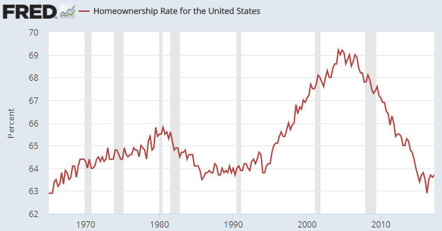
As evidenced by the following chart, the government was initially successful in its endeavours. The home-ownership rate sky-rocketed during the second half of the 1990s and the first half of the 2000s as it became possible for almost anyone to borrow money to buy a house. As also evidenced by the following chart, the home-ownership rate subsequently collapsed. The collapse was an inevitable consequence of people throughout the economy first responding to the Fed’s and the government’s incentives to take on excessive debt and then finding themselves in drastically-weakened financial situations.

The home ownership rate ended up bottoming in Q2-2016 at a 50-year low.

homeownership_190917

No one in the government or at the Fed has ever admitted culpability for the mortgage-related debt binge that led to the spectacular rise and equally-spectacular fall in the US home-ownership rate. Apparently, it was a market failure.

Print This Post Print This Post

Commodities and the Commodity Currencies

September 18, 2017

[This blog post is an excerpt from a TSI commentary published about two weeks ago.]

The Australian Dollar (A$) and the Canadian Dollar (C$) are called “commodity currencies” for a reason. The reason is that regardless of what’s happening in their associated local economies, on a multi-year basis they will usually trend in the same direction as broad-based commodity indices.

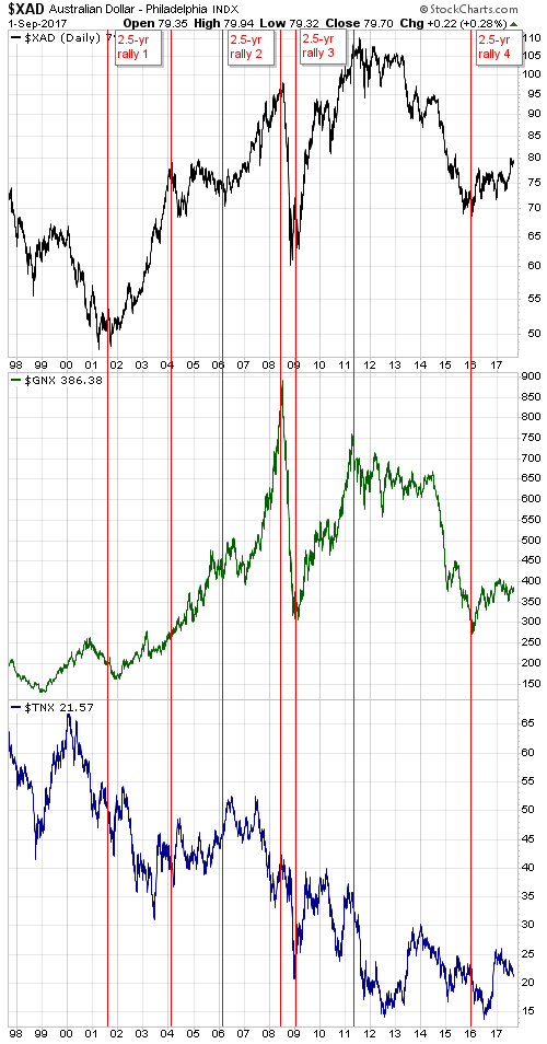
Since 2001 there have been three major rallies in the A$, each lasting about 2.5 years. These 2.5-year rallies are indicated by vertical red lines and notes on the following chart. Our assumption, which is also indicated on the following chart, is that the fourth 2.5-year A$ rally began in early-2016. In other words, we are guessing that the A$ upward trend that began in early-2016 will continue until around mid-2018. As well as being based on the lengths of previous major upward trends, this guess is based on what we expect from commodity prices.

Speaking of commodity prices, in addition to the A$ the chart shows the GSCI Spot Commodity Index (GNX). Unsurprisingly, each of the 2.5-year A$ rallies indicated on the chart coincided with an upward-trending GNX. In terms of price direction, the main difference between the post-2001 performance of the A$ and the post-2001 performance of GNX is that GNX trended upward from the beginning of 2002 until its blow-off top in mid-2008 whereas the A$ experienced a flat 2-year correction during 2004-2005.

Mainly for interest’s sake (pun intended), the chart also shows the yield on the 10-year T-Note. The 10-year interest rate had a downward bias during two of the A$’s 2.5-year rallies and an upward bias during the third rally. We expect that it will have an upward bias over the course of the current (fourth) rally.

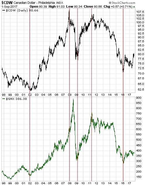
The next chart shows the relationship between the C$ and commodity prices as represented by GNX. If anything, with one notable 6-month exception the positive correlation between the C$ and GNX has been even stronger than the positive correlation between the A$ and GNX. The notable exception occurred during the first half of 2008, when a speculative blow-off move to the upside in the commodity markets was accompanied by a decline in the C$. This divergence was a warning that the commodity-price gains would prove to be temporary.

We are expecting the upward trends in the commodity indices and the commodity currencies to extend well into next year, although it’s likely that short-term corrections will begin soon.

Print This Post Print This Post

Revisiting the US yield curve

September 11, 2017

In a blog post in February of last year I explained that an inversion of the US yield curve has never been a recession signal. Instead, the genuine recession signal has always been the reversal in the curve from ‘flattening’ (short-term interest rates rising relative to long-term interest rates) to ‘steepening’ (short-term interest rates falling relative to long-term interest rates) after an extreme is reached. It just so happens that under normal monetary conditions an extreme usually isn’t reached and the reversal therefore doesn’t occur until after the yield curve becomes inverted.

The fact is that it doesn’t matter how ‘flat’ or inverted the yield curve becomes, there’s a good chance that the monetary-inflation-fueled economic boom will be intact as long as short-term interest rates are rising relative to long-term interest rates. The reason, in a nutshell, is that the boom periods are dominated by borrowing short to lend or invest long, a process that puts upward pressure on short-term interest rates relative to long-term interest rates. It’s when short-term interest rates begin trending downward relative to long-term interest rates that we know the boom is in trouble.

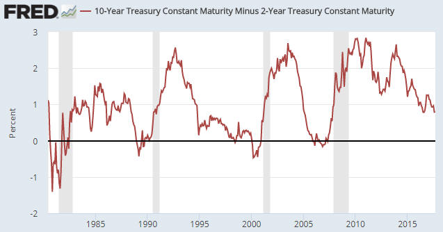
The following chart shows that the spread between the 10-year T-Note yield and the 2-year T-Note yield is much narrower now than it was a few years ago. This means that there has been a substantial flattening of the US yield curve. Also, the chart shows no evidence of a trend reversal. This implies that the inflation-fueled boom is still intact.

yieldcurve_110917

Print This Post Print This Post

The most useful leading indicator of the global boom-bust cycle

September 1, 2017

The long-term economic oscillations between boom and bust are caused by changes in the money-supply growth rate. It can therefore make sense to monitor such changes, but doing so requires knowing how to calculate the money supply. Unfortunately, most of the popular monetary aggregates are not useful in this regard because they either include quantities that aren’t money or omit quantities that are money.

What “Austrian” economists refer to as TMS (True Money Supply) is the most accurate monetary aggregate. Whereas popular measures such as M2, M3 and MZM contain credit instruments, TMS only contains money. Specifically, TMS comprises currency (notes and coins), checkable deposits and savings deposits.

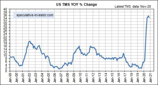
The following chart shows the year-over-year TMS growth rate (the monetary inflation rate) in the US. It has fallen sharply over the past 8 months — from around 11% to around 5% — and is now at its lowest level since 2008.

The chart displayed above suggests that the US economic boom* is on its last legs. It may well be, but the 2002-2006/7 boom continued for almost 2 years after the US monetary inflation rate fell to near its current level in early-2005.

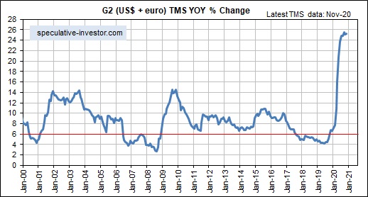
The reason for the long delay during 2005-2007 between the decline in the US TMS growth rate to a level that ordinarily would have ended the boom in less than 12 months and the actual ending of the boom was the offsetting effect of rapid monetary inflation in the euro-zone. This prompted me to develop a monetary aggregate that I call “G2 TMS”, which combines the US and euro-zone money supplies. Here is a monthly chart showing the growth rate of G2 TMS.

The rate of change in the G2 TMS growth rate has been the most useful leading indicator of the global boom-bust cycle over the past two decades. Of particular significance, a decline in the G2 TMS growth rate from well above 6% to below 6% warns of a shift from boom to bust within 12 months.

At the end of July the G2 TMS growth rate was slightly above the boom-bust transition level.

*An economic boom is defined as a multi-year period during which the creation of a lot of money out of nothing causes an unsustainable increase in economic activity.

Print This Post Print This Post