This post is a modified excerpt from a recent TSI commentary.
The following table shows the amount of monetary inflation in a number of different countries/regions. Specifically, the table shows the amount by which the money supplies of Australia, China, the Euro-Zone (EZ), Hong Kong, Japan, the UK and the US have grown over the past year, the past 2 years and the past 4 years. In those cases where it was easy for me to do the calculation I’ve used TMS (True Money Supply) as the monetary aggregate, but in other cases I’ve used M1 or M2. In China’s case I show results for both M1 and M2, because due to the lack of detail provided by the People’s Bank of China I’m not sure which of these measures is closest to TMS.
| Country / Region | Money Supply Aggregate | 1-Year % Growth | 2-Year % Growth | 4-Year % Growth |
| Australia | TMS | 13.2 | 26.9 | 44.4 |
| China | M1 | 2.9 | 8.4 | 26.7 |
| China | M2 | 9.9 | 23.1 | 68.2 |
| Euro-Zone | TMS | 12.2 | 18.4 | 30.6 |
| Hong Kong | M2 | 8.3 | 22.2 | 54.1 |
| Japan | M2 | 3.6 | 7.1 | 13.4 |
| UK | TMS | 5.2 | 11.6 | 22.3 |
| US | TMS | 7.7 | 16.2 | 47.2 |
Here’s some information that can be gleaned from the above table:
1) Japan continues to have a relatively slow rate of monetary inflation, despite popular opinion to the contrary. In particular, although it has now been 2 years since the BOJ began to implement the greatest QE program in world history, over the past 2 years Japan’s money supply has only increased by 7.1%. This compares to 2-year increases of 16.4% for the US, 18.2% for Europe and 26.9% for Australia. How much longer will the general perception of what’s happening in Japan diverge from the reality of what’s happening in Japan?
2) The rate of monetary inflation in the EZ is accelerating relative to the rates of monetary inflation elsewhere. That’s why the table reveals that the 12-month rate of inflation in the EZ is now second-only to that of Australia. Furthermore, if the table showed growth figures for the past 6 months it would reveal that the EZ is now leading by a wide margin in the race to inflate (a.k.a. the race to the bottom).
3) Although its M2 money supply is still growing at close to 10%/year, there has been a significant tightening of China’s monetary conditions over the past 18 months. This is — at least in part — both a cause and an effect of the deflation of the country’s property bubble. It seems that in a command economy where non-performing loans never have to be recognised as such, it is possible for a massive credit-fueled investment bubble to deflate gradually.
4) The supply of Hong Kong dollars has increased by 54% over the past 4 years. This monetary inflation and the mimicking of US interest-rate policy, both of which are required to maintain the HK$-US$ peg, explain Hong Kong’s real estate bubble and high cost of living. The HK$-US$ peg hasn’t made sense for a long time and has become the main cause of a huge inflation problem in Hong Kong.
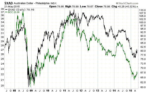
5) Considering the relatively fast pace of Australia’s money-supply growth and the A$’s resulting over-valuation, it’s remarkable that the A$’s exchange rate stayed so high for so long. The reason it didn’t buckle sooner is that the commodity price trend tends to overwhelm all other influences on the A$’s trend. This is illustrated by the following chart of the A$ and the Continuous Commodity Index Fund (GCC). An implication is that almost regardless of its inflation rate, the A$ will turn higher at around the same time as the general commodity price trend turns higher, which, by the way, probably just happened or will happen within the next few months.

