Print This Post Print This Post

The coiling has ended

April 29, 2015

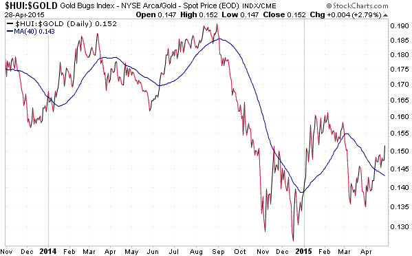
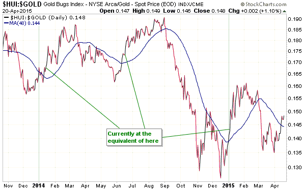
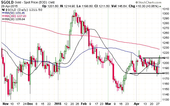
At the beginning of last week I wrote that gold and the HUI were coiling, the implication being that a sharp 1-3 week move in one direction or the other would soon begin. There was no way of knowing the direction of the move, although the performance of the HUI/gold ratio relative to its 40-day moving average (MA) suggested that the direction would be up.

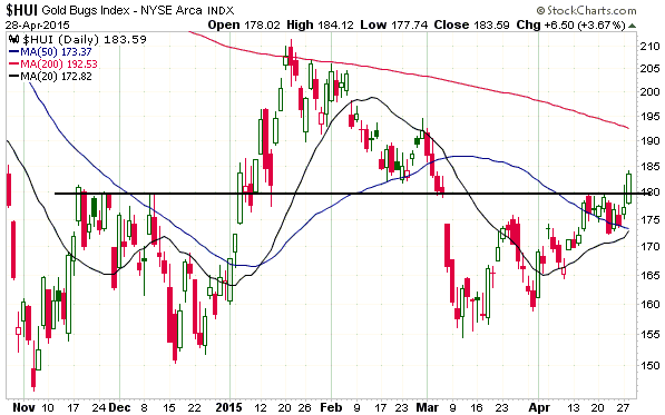
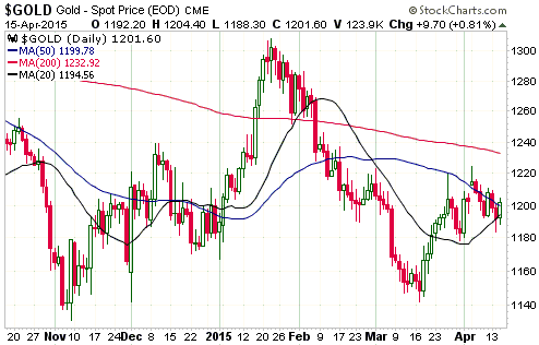
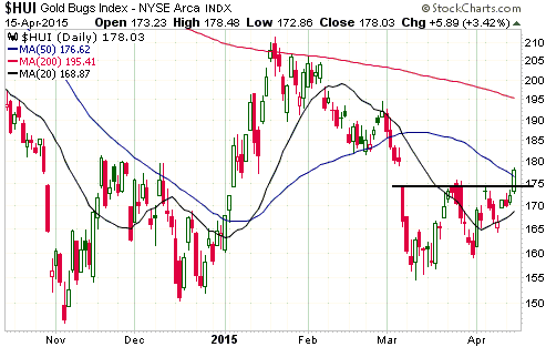
There were multiple head fakes last week, with a) gold bullion almost breaking out to the downside last Friday, b) the HUI chopping around near its 50-day MA, and c) the HUI/gold ratio being the only consistent indicator by sustaining its upside breakout. At this stage it looks like the HUI/gold ratio was sending the correct message, because both gold bullion and the HUI closed above the tops of their recent trading ranges on Tuesday 28th April.

gold_280415

HUI_280415

HUI_gold_280415

The minor upside breakouts in gold-related stuff happened on the day before the Fed is scheduled to issue its next policy statement, which is out of character considering how gold has traded over the past 9 months. As noted in a commentary posted at TSI a few days ago, gold had closed lower over the course of the 5 trading days leading up to each of the past 6 FOMC meetings and would have stretched the negative pre-FOMC sequence to 7 if it had closed below $1201.80 on 28th April. Instead, it rebounded strongly and closed at $1211.50.

My thinking was that if the gold price had fallen over the first 2 trading days of this week it would have set the stage for a significant post-FOMC rebound, because the most likely outcome of this week’s FOMC meeting is a statement with almost no wording changes. No meaningful change to the wording of the Fed’s statement would mean that a June rate hike had effectively been taken off the table, which short-term speculators would undoubtedly view as gold-bullish (it’s actually irrelevant, but short-term moves are being driven by sentiment).

However, it seems that speculators have jumped the gun. As a result, buying in advance of Wednesday’s FOMC statement is now riskier. My guess is that gold and the gold-mining stocks will extend their gains if the Fed signals “no rate hike in June”, but there is now more downside risk associated with an unexpectedly ‘hawkish’ Fed statement.

Print This Post Print This Post

Money is never backed by anything

April 27, 2015

One of the criticisms of the current monetary system is that the money isn’t backed by anything. However, while there are some big problems with the current system, this criticism isn’t valid. The reason is that money is never backed by anything.

Taking the specific case of the US dollar, the view that the US$ should be backed by something and the related view that the absence of backing implies a major flaw is a hangover from the Gold Standard. Under the Gold Standard that existed in the US prior to the early-1930s, a US dollar represented and was exchangeable into a fixed amount of gold.

The critical point is that under the Gold Standard the US$ wasn’t money; gold was money. The US dollars in circulation were receipts or IOUs that entitled the bearer to a certain amount of gold (money). The dollar itself wasn’t money. At most, it was a “money substitute”.

Today’s paper dollars are not IOUs or receipts. They are not “money substitutes”, they are money proper. Consequently, they do not need to be backed by anything. In fact, if they were backed by something then whatever was doing the backing would be money and the dollar itself would be a money substitute rather than actual money.

The situation isn’t as clear with regard to dollars in bank deposits as it is with regard to paper dollars, as the dollars in bank deposits are backed by the promise of the banking system to convert from electronic to paper on demand. It could therefore be argued that electronic dollars in bank deposits are money substitutes rather than money, although it is reasonable to count them in the money supply because the central bank has the ability to meet any demand for the conversion of electronic dollars into paper dollars.

The fact that today’s money isn’t backed by anything is therefore not the problem. If gold were money then the money also wouldn’t be backed by anything. That’s the nature of money. The problem, instead, is that for something to be GOOD money its supply should be fairly stable and it should be widely perceived to have value outside its role as a medium of exchange. The US dollar and all of today’s official monies fail to meet either of these requirements, whereas cryptocurrencies such as Bitcoin fail to meet the second requirement.

Print This Post Print This Post

Why gold mining companies should never hedge

April 24, 2015

A hedging program can make sense for a gold producer, but hedging is something that — with a small number of exceptions — gold producers should never do. This is not because there will always be a direct cost or an opportunity cost associated with any hedging program, it’s because gold producers are so damn bad at it.

In order to optimise cash flow and make short-term financial performance more predictable, it will generally make sense for a gold producer to forward-sell some of its future production, either via a bullion bank or the futures market, after a run-up in the gold price to near a 6-month high. Provided that the total amount forward sold never exceeds more than half of the next 12 months of production, this type of hedging program would always smooth cash flows and would often increase cash flows. It would create an opportunity cost in a very strong gold market, but the cost would not be substantial because all production beyond the coming 12 months would remain unhedged.

However, gold-mining executives have proved over and over again that when it comes to the timing of their hedging moves, they are the proverbial dumb money. They get scared and put hedges in place following a large price decline and then get pressured into removing the hedges at great cost following a large price rise.

In other words, rather than locking-in relatively high prices for a portion of future production by hedging when the market is ‘overbought’, if they hedge at all it is usually when the market is ‘oversold’. Consequently, their hedges tend to lock-in relatively low prices for a portion of future production.

And it’s not just the hedging of future sales that gold-mining executives routinely make a mess of. They are usually just as bad when it comes to hedging their costs. For one example, Barrick Gold chose to mitigate the risk of future gains in the oil price by purchasing some oil production, the idea being that what its gold-mining business lost due to a higher oil price would be partially offset by increased profits from the oil business. The problem is that it made the purchase in mid-2008 — right at the secular peak for the oil price. For another example, the senior management of Gold Fields (GFI) implemented a hedging program covering the bulk of the company’s oil exposure through to the end of 2015. The problem is that the program was put into place just prior to last year’s oil price crash and therefore prevents GFI shareholders from obtaining any benefit from the lower oil price this year.

When trading or investing it is of vital importance to acknowledge your own weaknesses. For example, there is no shame in being a poor short-term trader provided that in recognition of this reality you risk very little money on short-term trades. Gold mining executives should acknowledge that they are hopeless at hedging and should stop trying to do it.

Print This Post Print This Post

Gold is not a play on “CPI inflation”

April 22, 2015

I have never been in the camp that exclaims “buy gold because the US is headed for hyperinflation!”. Instead, at every step along the way since the inauguration of the TSI web site in 2000 my view has been that the probability of the US experiencing hyperinflation within the next 2 years — on matters such as this there is no point trying to look ahead more than 2 years — is close to zero. That is still my view. In other words, I think that the US has a roughly 0% probability of experiencing hyperinflation within the next 2 years. Furthermore, at no time over the past 15 years have I suggested being ‘long’ gold due to the prospect of a rapid rise in the CPI. This is partly because at no time during this period, including the present, has a rapid rise in the CPI seemed like a high-probability intermediate-term outcome, but it is mainly because gold has never been and is never likely to be a play on “CPI inflation”.

Gold is a play on the economic weakness caused by bad policy and on declining confidence in the banking establishment (led by the Fed in the US). That’s why cyclical gold bull markets are invariably born of banking/financial crisis and/or recession, and why a cyclical gold bull market is more likely to begin amidst rising deflation fear than rising inflation fear.

There are times when the declining economic/monetary confidence that boosts the investment demand for gold is linked to expectations of a rapid increase in “price inflation”, but it certainly doesn’t have to be. For example, the entire run-up in the gold price from its 2001 bottom to its 2011 peak had nothing to do with the CPI. Also, an increase in the rate of “CPI inflation” would only ever be bullish for gold to the extent that it brought about declining confidence in the economy or the banking establishment, as indicated by credit spreads, real interest rates, the BKX/SPX ratio and the yield curve. Since it’s possible for the CPI to accelerate upward without a significant decline in confidence, it’s possible that an upward acceleration in the CPI would not be bullish for gold.

The bottom line is that as far as the gold market is concerned, the CPI is more of a distraction than a driver. 

Print This Post Print This Post

Gold and the HUI are coiling

April 21, 2015

The US$ gold price has essentially gone nowhere in a boring way over the past 2 weeks, which probably means that a sharp 1-3 week move is about to start. The question is: In which direction?

Obviously, no one knows the answer to this question. The most we can do is look for clues in the price action.

On the minus side, gold closed below its 20-day moving average (MA) on Monday 20th April. This was the first daily close below this MA since mid-March and in isolation would be a sign that the price was rolling over to the downside. On the plus side, however, the price managed to hold at the 50-day MA on Monday. More importantly, the gold-stock indices made small gains despite an $8 decline in the gold price. This small bullish divergence between the bullion and the mining stocks tilts the odds in favour of the next $30+ move being to the upside.

Here are the relevant charts:

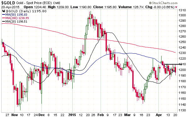
1. The first chart shows that gold has near-term resistance at $1210. A daily close above $1210 would suggest that the price was headed to at least $1230 and possibly as high as the $1280s.

gold_200415

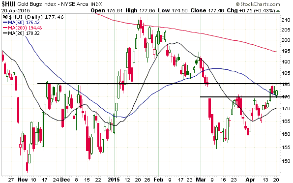
2. The next chart shows that the HUI has managed to hold last week’s minor upside breakout, but has more resistance at 180. There is near-term (1-3 week) upside potential to 195.

HUI_200415

3. The final chart paints the most bullish picture.

HUI_gold_200415

Gold’s true fundamentals (the fundamentals that many gold bulls studiously ignore as they instead choose to fixate on irrelevancies such as the amount of gold being imported by China) are neutral and gold/euro does not yet appear to be close to completing the intermediate-term correction from its January-2015 ‘overbought’ extreme, so the start of a major gold rally is probably not imminent. In other words, if the recent choppy price action leads to a quick advance over the next couple of weeks it probably won’t mean that we’ve seen the last opportunity to buy gold below $1200.

Print This Post Print This Post

If you owe the bank $100M and you can’t pay, the bank has a problem

April 18, 2015

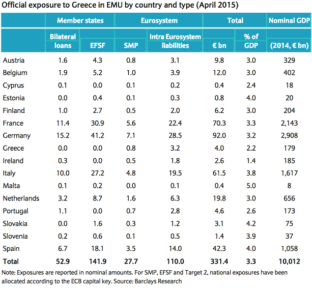
There’s an old saying that goes something like: If you owe the bank $100K and you can’t pay then you have a problem, but if you owe the bank $100M and you can’t pay then the bank has a problem. This saying applies to the current negotiations between the Greek government and the other euro-zone (EZ) governments regarding the Greek government’s ability to obtain additional support from its official-sector creditors. In particular, it explains why the governments of Germany, France, Italy, Spain, etc. are very keen for Greece to remain part of the EZ.

The following table shows the official-sector EZ exposure to Greek government debt. More specifically, the table shows the direct and indirect (via supranational organisations) financial exposure of each EZ member state to the bonds issued by Greece’s government. Total exposure amounts to about 330B euros, with individual exposure typically being in the 3%-4% of GDP range. In nominal euro terms, the states with by far the biggest exposure are Germany (92B), France (70.3B), Italy (61.5B) and Spain (42.3B).

Greece_Exposure_170415

If Greece leaves the EZ and the Greek government defaults on its debt, how will the political leaders of the remaining EZ members explain the resultant hit to their taxpayers? If they were honest (which, of course, they aren’t), the explanation would be along the lines of:

“On my watch we transferred an amount of money equivalent to more than 3% of our country’s GDP from you, the taxpayer, to various programs designed to bail out your counterparts in Greece. Actually, that’s not true. Far from being bailed out by the money transferred from your good-selves, the Greek government was saddled with a vastly greater debt burden and Greece’s economy was pummeled further into the ground. It was actually the private holders of Greek government bonds who were bailed out. Why? Well, in my defense, Greece’s economy was in the toilet anyway and I was advised that there would be a euro-zone-wide financial crisis if the bond-holders weren’t bailed out. I’m aware that the current crisis is much worse than the crisis we avoided by implementing the bailout, but there’s no point crying over spilt milk. So, please let bygones be bygones and vote for me anyway.”

The desire to avoid having to make a sanitised version of the above speech will be a powerful motivator as Greece-related deadlines approach over the weeks immediately ahead.

Print This Post Print This Post

Charts of interest

April 16, 2015

The following charts relate to an email that will soon be sent to TSI subscribers.

CHART 1 – THE US$ GOLD PRICE

gold_150415

CHART 2 – THE HUI

HUI_150415

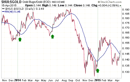
CHART 3 – THE HUI/GOLD RATIO

HUI_gold_150415

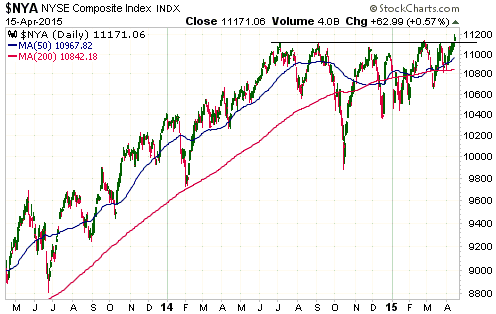
CHART 4 – THE NYSE COMPOSITE INDEX

NYA_150415

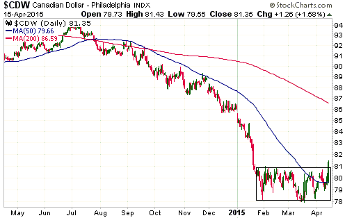
CHART 5 – THE CANADIAN DOLLAR

C$_150415

Print This Post Print This Post

Poor gold-stock performance is mostly due to poor gold-mining-business performance

April 15, 2015

This post is a slightly-modified excerpt from a recent TSI commentary.

If you are speculating in gold-mining stocks it is important to have your eyes wide open and to not be hoodwinked by the pundits who argue that the current low prices for these stocks imply extremely good value. The fact is that at the current gold price not a single senior gold-mining company is under-valued based on traditional valuation standards such as price/earnings and price/free-cash-flow. Also, while some junior gold-mining companies are very under-valued, most are not. In other words, the low price of the average gold-mining stock is not a stock-market anomaly; it’s an accurate reflection of the performance of the underlying business.

The relatively poor operational performance of the gold-mining industry is not something new. It is not something that has just emerged over the past few years or even over the past two decades, meaning that it can’t be explained by, for example, the advent of ETFs (the gold and gold-mining ETFs actually boosted the prices of both gold and the stocks owned by the ETFs during 2004-2011). The cold, hard reality is that with the exception of the banking industry, which usually gets bailed out once per decade at the expense of the rest of the economy, since 1970 the gold-mining industry has wasted capital at a faster pace than any other industry. That’s why the gold-mining-stock/gold-bullion ratio is in a multi-generational decline that shows no sign of reversing.

It’s certainly true that a lot of money can be made via the judicious speculative buying of stocks in the gold-mining sector, because these stocks periodically generate massive gains. It’s just that in real terms (relative to gold) they end up giving back all of these gains and then some.

Print This Post Print This Post

The official CPI versus the Shadowstats.com CPI

April 13, 2015

Even the most well-meaning and rigorous attempt to come up with a single number (a price index) that reflects the change in the purchasing power (PP) of money is bound to fail. The main reason is that disparate items cannot be added together and/or averaged to arrive at a sensible result. For example, in one transaction a dollar might buy one potato, in another transaction it might buy 1/30,000 of a new car and in a third transaction it might buy 1/200 of a medical checkup. What’s the average of one potato, one-thirty-thousandth of a new car and one-two-hundredth of a medical checkup? The creators of price indices claim to know the answer, but obviously there is no sensible answer. However, in this post I’m going to ignore the conceptual problem with price indices and briefly explore the question: Which is probably closer to reality — the official CPI or the CPI calculated by Shadowstats.com?

Unlike many other members of the ‘sound money camp’, I’ve never been a fan of the Shadowstats CPI and I’ve only ever mentioned it in TSI commentaries to note that it is just as bogus as the official CPI. It always seemed to me that the Shadowstats number was derived by adding an approximately constant fudge-factor to the official (bogus) CPI to essentially arrive at another bogus number that, regardless of the message being sent by real-world experience, was always much larger than the official number. As illustrated by the following chart from the Shadowstats web site, since the late-1990s the growth-rate difference between the official and Shadowstats CPIs has consistently been about 7%/year.

From my perspective the Shadowstats CPI never appeared to be doing a better job than the official number of reflecting the dollar’s change in purchasing power. I therefore never paid any attention to it and never bothered to analyse why, given that the only differences between the Shadowstats calculation and the official calculation were the changes in calculation methodology that were implemented by the BLS (Bureau of Labor Statistics) since the early-1980s, there would be such a big difference between the official and the Shadowstats numbers. However, Ed Dolan has recently taken the time to analyse and explain the difference in a 31st March article at EconoMonitor.com.

The above-linked article starts by comparing the price changes of similar items that actually took place between 1980 and 2014 to show that the official CPI appears to under-estimate the change in the dollar’s PP and that the Shadowstats CPI appears to over-estimate the change in the dollar’s PP, with the magnitude of the Shadowstats over-estimation being vastly greater than the official under-estimation. It goes on to show that using the Shadowstats CPI to convert nominal GDP to real GDP leads to nonsensical results. For example, according to the real GDP calculation based on the Shadowstats CPI, the output of the US economy is no higher today than it was in 1990. This is a patently false result. Lastly, it attempts to answer the question: Has John Williams, the proprietor of Shadowstats.com, simply made a calculation error?

The answer, apparently, is yes. It seems that in the calculation of the Shadowstats CPI the effects of the same change to the official methodology are counted multiple times. Consequently, the rate of CPI growth estimated by Shadowstats has consistently been at least 4.5%/year too high over the past 15 years, even by Shadowstats’ own methodology.

I’ll be very interested to see whether John Williams can explain-away the apparent multiple-counting of the same BLS changes and, if not, whether the Shadowstats calculations are revised to remove this major error.

Print This Post Print This Post

The crappy gold-mining business revisited

April 11, 2015

[This post is a slightly-modified excerpt from a recent TSI commentary.]

Last October I wrote a piece that explained why gold mining had been such a crappy business since around 1970 and why it was destined to remain so as long as the current monetary system was in place. The explanation revolved around a boom-bust cycle and the associated mal-investment linked to the monetary machinations of central banks.

The crux of the matter is that when the financial/banking system appears to be in trouble or it is widely feared that central banks are playing fast and loose with the official money, the stock and bond markets are perceived to be less attractive and gold-related investments are perceived to be more attractive. However, gold to the stock and bond markets is like an ant to an elephant, so the aforementioned shift in investment demand results in far more money making its way towards the gold-mining industry than can be used efficiently. Geology exacerbates the difficulty of putting the money to work efficiently, in that gold mines typically aren’t as scalable as, for example, base-metal mines or oil-sands operations.

In the same way that the mal-investment fostered by the Fed’s monetary inflation has caused the US economy to effectively stagnate over the past 15 years, the bad investment decisions fostered by the periodic floods of money towards gold mining have made the industry inefficient. That is, just as the busts that follow the central-bank-caused economic booms tend to wipe out all the gains made during the booms, the gold-mining industry experiences a boom-bust cycle of its own with even worse results. The difference is that the booms in gold mining roughly coincide with the busts in the broad economy.

In a nutshell, the relatively poor performance of the gold-mining industry over the past several decades is an illustration of what the Fed and other central banks have done, and are continuing to do, to entire economies.

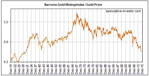
Obviously, gold itself is not made less valuable by the monetary-inflation-caused inefficiencies and widespread wastage that periodically beset the gold-mining industry. That’s why gold bullion has been making higher highs and higher lows relative to the average gold-mining stock since the late-1960s, and why the following weekly chart shows that the BGMI/gold ratio (the Barrons Gold Mining Index relative to gold bullion) is now at its lowest level since the 1920s.

When the next bust gets underway in the broad economy, the surging demand for gold will temporarily generate huge real gains for gold-stock investors. At the same time it will lead to yet another round of massive mal-investment in the gold-mining industry that ensures the eventual elimination of these gains

Print This Post Print This Post

Production must precede consumption, and the reason is not rocket science

April 10, 2015

In a recent article, John Mauldin dealt with the question: is economic growth driven by consumption or production? Unfortunately, he made a dog’s breakfast out of an attempt to explain why the correct answer is “production”. I’ll try to do better.

That there is even a much-debated question here is evidence of the great depths to which the science of economics has sunk. It would be like a debate between two groups of mathematicians, with one group arguing that 2 + 2 = 4 and the other group arguing that 2 + 2 = 17. Incredibly, in the world of economics the equivalent of the 2 + 2 = 17 group has gained the ascendancy. And within this leading group, the Keynesians dominate.

One of the fundamental tenets of Keynesian economics is that consumption drives economic growth, with an increase in consumption (a.k.a. aggregate demand) causing the economy to grow and a decrease in consumption causing the opposite. According to Mr. Mauldin, on the other side of the fence we have “Austrian” economist Friedrich Hayek, who “asserted that it is actually production that stimulates the economy and drives consumption.”

On a side note, “stimulates the economy” is a Keynesian phrase that an economist from the Austrian school would not normally use (economies aren’t “stimulated”), so I doubt that Hayek ever spoke/wrote in those terms. More importantly, the knowledge that production drives consumption and therefore economic growth predates Hayek by about 150 years. It is called Say’s Law and was part of the 1803 publication titled “A Treatise on Political Economy”. Say’s Law can be expressed as “production funds consumption” and “people produce in order to consume”. Because Say’s Law is demonstrably true, the “Austrians” adopted it.

The easiest and clearest way to see that an increase in production must come before an increase in consumption in order for the resulting growth to be sustainable is to consider a barter economy. An economy that uses money will tend to be more complex than one based on barter, because money facilitates specialisation (the division of labour) and intermediate stages of production, but the same basic principles apply.

When a barter economy is considered it becomes obvious that in order for someone to consume more he must first produce more, because what someone spends is what he produces. To put it another way, someone can’t spend what he or someone else hasn’t already produced. For example, a potato farmer spends potatoes, a cobbler spends shoes, and a baker spends bread. Consequently, if a baker who produces X loaves of bread per day wants to consume more on a permanent basis, he must first increase his production to X+Y loaves per day.

But how could our hypothetical baker spend more bread if there didn’t already exist demand for more bread?

The simple answer is that he couldn’t. There would have to be more demand for bread at some price. Perhaps by investing in a new oven or finding some other way to produce bread more efficiently the baker would be able to increase his production by, say, 30% and simultaneously reduce the price per loaf by 10%, enabling his customers to afford to buy more bread and increasing his own ability to consume.

Of course, if the bread market were saturated then it would not be possible for our baker to increase his production and therefore his consumption, but within the economy at any given time there will always be many things that people want more of. It’s a matter of targeting the things for which there is demand, and this is where prices come in. Prices transmit information, which is why it is so important that they not be distorted by “monetary stimulus” and other interventions. Prices tell people what to produce more of, and in cases where there is temporarily much greater demand than supply they ration the available supply. For some entrepreneurs, it can also be a matter of targeting the things for which there is currently no demand but for which there could be huge demand in the future. For example, there was no demand for the iPhone before Apple made the first one, but then, suddenly, millions of people around the world wanted an iPhone.

The bottom line is that in the real world there must be an increase in production before there can be a sustainable increase in consumption, because it’s the increase in production that funds the increase in consumption. This is as axiomatic as 2 + 2 = 4.

Print This Post Print This Post

Charts of interest

April 7, 2015

The market action is getting more interesting. Here are three examples:

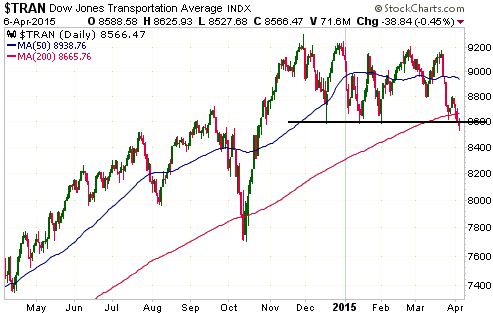
1) Although the S&P500 Index and most other important US stock indices ended Monday’s session with gains, the Dow Transportation Average (TRAN) lost ground and has marginally breached support at 8600. It is now at its lowest level since last October — a significant bearish divergence.

Due to Monday’s marginal breach of support, the stage is set for some informative price action over the days ahead. TRAN is going to either follow through to the downside and confirm its breakout or quickly reverse upward and indicate that the downside breakout was false. Each of these possible outcomes contains clues about what the future holds in store.

TRAN_070415

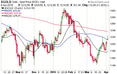
2) Due to the much-worse-than-expected US employment report that was published when the financial markets were closed last Friday, it was very likely that there would be a decent bounce in the gold price when trading resumed on Monday. The gold price quickly rose to the $1220s on Monday and in doing so traded above its late-March spike high, but it subsequently gave back about half of its gains and ended the day at its 50-day MA. This price action is not bullish, but the set-up is still in place for additional near-term gains.

Critical support is at $1178.

gold_070415

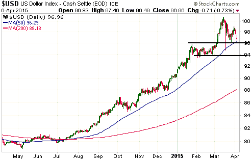
3) I continue to think that the Dollar Index made a multi-month top in March, but the market is stubbornly refusing to either validate or invalidate this view. A daily close below 94 would remove all doubt that a multi-month top is in place, while a daily close below support near 96 would be a preliminary signal. Given the recent economic data, the Dollar Index has done remarkably well to remain above 96 until now. Even last Friday’s lousy employment report wasn’t a sufficient catalyst for a breakdown.

US$_070415

Print This Post Print This Post

A paper loss is real

April 7, 2015

There’s a school of thought to the effect that if the market price of a stock you own has fallen below the price at which you bought, you haven’t really suffered a loss unless you sell. If you don’t sell, all you have is a “paper loss”. While technically correct, this is an amateurish and dangerous way to look at things. If you view a paper loss as materially different from and of lesser consequence than a realised loss, then you are essentially deluding yourself. Incredibly, some newsletter writers encourage this form of self delusion.

There will usually be a chance that a stock in your account that is currently ‘under water’ will recover and move into profit. The probability of this happening could, in fact, by very high, but it is important to acknowledge the reality that it is now showing a loss and that a recovery is not guaranteed. The simplest way to do this is to regularly — say, at the end of every week — mark your portfolio to market. In doing so, a “paper loss” is accounted for in the same way as a realised loss and a “paper gain” is accounted for in the same way as a realised gain.

By taking the simple step of regularly marking your portfolio to market you will be facing up to reality and avoiding the counter-productive behaviour, when things are going badly, of ‘sticking your head in the sand’. Accordingly, you will be putting yourself in a position where decisions can be based to a greater extent on facts and to a lesser extent on hope — a position where you will be less likely to kid yourself.

Of course, almost all good practice in the world of investing/speculating is easier said than done.

Print This Post Print This Post

The ECB is trying to follow in the Fed’s bubble-blowing footsteps

April 3, 2015

This post is a slightly-modified excerpt from a recent TSI commentary.

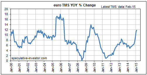
The monetary data published by the ECB last week showed that the rate of euro-zone TMS (True Money Supply) growth continued to accelerate in February — to a year-over-year rate of 11.8%, from 11.4% in January and ‘only’ 6.4% last October. Here’s a chart that puts the current monetary inflation rate into perspective.

The ECB didn’t begin its new QE program until March, so the above chart doesn’t include any of the effects of this new program. In fact, the effects of the new program probably won’t start becoming apparent until the April monetary data are published in late-May.

In one way, the current situation in Europe is similar to the situation in the US during the final few months of 2012. Back then, the Fed embarked on an aggressive new money-pumping program despite the year-over-year rate of US TMS growth already being in double digits and despite the prices of US stocks and bonds being near multi-year or all-time highs. Now we have the ECB embarking on an aggressive new money-pumping program despite the year-over-year rate of euro-zone TMS growth already being in double digits and despite the prices of European stocks and bonds being near multi-year or all-time highs.

The QE program introduced by the Fed in late-2012 did not help the US economy, but it did inflate a new stock market bubble. It also encouraged stock buybacks at the expense of capital investment, incentivised the continued accumulation of debt at a time when both the private and public sectors were already over-indebted, and fostered an investment boom in the shale-oil industry that’s now in the process of collapsing.

Apart from the specific example of the oil-investment boom, it’s possible that the QE program recently introduced by the ECB will end up having similar effects.

Print This Post Print This Post

Bernanke’s gibberish revisited

April 1, 2015

Yesterday I published a short piece dealing with the logical fallacies and self-contradictions in one of Ben Bernanke’s early blogging efforts. David Stockman has since published a more in-depth demolition of the same Bernanke post, titled “Central Banking Refuted In One Blog — Thanks Ben!“.

Stockman starts with Bernanke’s absurd assertion that because the Fed’s actions determine the money supply and the short-term interest rate, the Fed has no choice other than to set the short-term interest rate somewhere. He points out that as originally designed/envisaged, the Fed “had no target for the Federal funds rate; no remit to engage in open market buying and selling of securities; and, indeed, no authority to own or discount government bonds and bills at all.” Instead, “[the] entire purpose of the original Fed’s rediscounting tool was to augment liquidity in the banking system at market determined rates of interest. This modus operandi was the opposite of today’s monetary central planning model. Back then, the rediscount window at each of the twelve Reserve Banks had no remit except the humble business of examining collateral.

According to Stockman: “…in 1913 there was no conceit that a relative handful of policy makers at the White House, or serving on Congressional fiscal committees or at a central bank could improve upon the work of millions of producers, consumers, workers, savers, investors, entrepreneurs and even speculators. Society’s economic output, living standards and permanent wealth were a function of what the efforts of its people added up to after the fact — not what the state exogenously and proactively targeted and pretended to deliver.

Stockman’s point, in a nutshell, is that the machinations of today’s Fed represent one of the most egregious examples of mission creep in world history.

For anyone interested in economics and economic history there’s a lot of useful information in the Stockman post. For example, Stockman notes that during the 40 years prior to the 1913 birth of the Fed, “the US economy had grown at a 4% compound rate — the highest four-decade long growth rate before or since — without any net change in the price level; and despite the lack of a central bank and the presence of periodic but short-lived financial panics largely caused by the civil war-era national banking act.

In fact, Bernanke’s short post and Stockman’s lengthy rebuttal make an interesting contrast. The former is gibberish, whereas the latter displays a good understanding of economic theory and history.

Print This Post Print This Post