Print This Post Print This Post

Yet another useless article about gold supply and demand

January 31, 2015

A recent article at Mineweb discusses the latest gold-market analysis of Gold Fields Mineral Services (GFMS). As far as past or likely future gold price movements are concerned, every sentence in this article is either completely wrong or completely irrelevant.

The GFMS analysis discussed in the article follows the typical, wrongheaded pattern of adding up the flows between different parts of the market and using these flows to estimate supply and demand. It’s the same mistake I’ve addressed many times in the past, most recently in a 26th January blog post. The mistake is largely based on the misconception that current mine production constitutes the supply side of the equation, rather than just a small increment to an existing aboveground inventory.

If you start with a totally wrong premise, you will probably end up with a ludicrous conclusion. In this case the ludicrous conclusion is that gold supply is currently greater than gold demand.

In a market that clears (such as the gold market), supply can never be greater than demand and demand can never be greater than supply. Supply and demand must always be equal, with the price constantly changing to whatever it needs to be to maintain the balance.

Claiming that the supply of gold exceeds the demand for gold would be like claiming that the supply of dollars exceeded the demand for dollars. Such claims create the impression that there is a pile of gold or dollars somewhere that nobody wants or owns, because current demand has already been fully satisfied by the rest of the supply. The reality is that all gold and all dollars are always held/owned by someone, with the price (or purchasing power) adjusting to keep the supply equal to the demand.

From a supply-demand perspective, the only significant difference between gold and the US$ is that the supply of dollars regularly changes a lot (by 8% or more) from one year to the next, whereas the annual rate of change in the total aboveground gold supply is always around 1.6%. The reason, of course, is that considerable real resources (labour, materials and energy) must be employed to increase the aboveground gold supply, whereas the supply of dollars can be increased at no cost at the whim of central and commercial bankers.

That’s why I care about changes in US$ supply and do not care about changes in gold-mine production.

Print This Post Print This Post

Comparing Real Performance

January 27, 2015

This post is a slightly-modified excerpt from a recent TSI commentary.

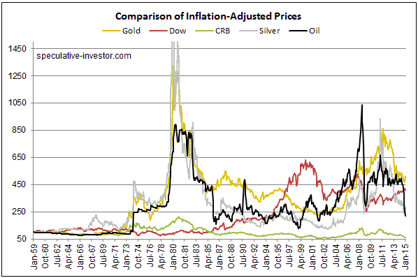
Here is chart that compares the long-term inflation-adjusted (IA) performances of several markets. This chart makes some interesting points.

One of the most interesting points is that market volatility increased dramatically in the early-1970s when the current monetary system was ushered in. This shows that the generally higher levels of monetary inflation and the larger variations in the rate of monetary inflation that occurred after the official link to gold was abandoned didn’t only affect nominal prices. Real prices were affected in a big way and boom-bust oscillations were hugely amplified. As an aside, economists of the Keynesian School are oblivious to the swings in relative ‘real’ prices caused by monetary inflation and the depressing effects that these policy-induced price swings have on economic progress.

A second point is that commodities in general (the green line on the chart) have experienced much smaller performance oscillations than the two monetary commodities (gold and silver). This is consistent with my view that there aren’t really any long-term broad-based commodity bull markets, just gold bull markets in which most commodities end up participating.

A third point is that apart from the CRB Index, the markets and indices included in the chart have taken turns in leading the real performance comparison. The chart shows that gold is the current leader, closely followed by the Dow Industrials Index (since January-1959, the percentage gain in gold’s real price is slightly greater than the percentage gain in the Dow’s real price). However, if dividends were included, that is, if total returns were considered, the Dow would currently be in the lead. This will change.

    Chart Notes:

1) I use a method of adjusting for the effects of US$ inflation that was first described in a 2010 article. This method isn’t reliable over periods of two years or less, but it should come close to reflecting reality over the long term.

2) To make it easier to compare relative performance, the January-1959 starting value of each of the markets included in the above chart was set to 100. In other words, the chart shows performance assuming that each market started at 100.

3) The monthly performance of the scaled IA silver price peaked at more than 2600 in early-1980, but for the sake of clarity the chart’s maximum Y-axis value was set to 1500. In other words, the chart doesn’t show the full extent of the early-1980 upward spike in the IA silver price.

Print This Post Print This Post

Looking for (gold price) clues in all the wrong places

January 26, 2015

Every transaction in a market involves an increase in demand for the traded item on the part of the buyer and an exactly offsetting decrease in the demand for the traded item on the part of the seller, which means that neither a purchase nor a sale implies a market-wide change in demand or price. This is obvious, so why does so much gold-market analysis focus on the quantities of gold shifting from one geographical area to another or from one part of the market to another?

I don’t know the answer to the above question, but I do know that focusing on the changes in gold location is pointless if your goal is to find clues regarding gold’s prospects. For example, while there could be a reason for wanting to know the amount of gold being transferred to China (I can’t think of a reason, but maybe there is one), the information will tell you nothing about the past or the likely future performance of the gold price. For another example, the amount of gold shifting into or out of ETF inventories could be of interest, but the shift in location from an ETF inventory to somewhere else or from somewhere else to an ETF inventory is not a driver of the gold price (as I explained in a previous blog post, changes in ETF inventory are effects, not causes, of the price trend).

Over recent years many gold bulls have cited the net-buying of gold by the geographical region known as China as a reason to expect higher prices. Prior to that it was often the net buying of gold by India that was cited as a reason to be bullish. The point that is being missed in such arguments is that regardless of whether gold’s price trend is bullish or bearish, some parts of the world will always be net buyers and other parts of the world will always be net sellers of gold, with the two exactly offsetting each other. At some future time it is possible that China will become a net seller and the US will become a net buyer. If so, will the same pundits that have wrongly cited the buying of China as a reason to be bullish then start wrongly citing the buying of the US as a reason to be bullish? Unfortunately, they probably will.

What determines gold’s price trend isn’t the amount of gold bought, since the amount bought will always equal the amount sold. Instead, the price trend is determined by the general urgency to sell relative to the general urgency to buy (with the relative urgency to buy/sell being strongly influenced by confidence in the two senior central banks). To put it another way, if the average buyer is more motivated than the average seller, the price will rise, and if the average seller is more motivated than the average buyer, the price will fall. So, how do we know whether the buyers or the sellers are the more motivated group?

The only reliable indication is the price itself. If the price is rising we know, with 100% certainty, that buyers are generally more motivated than sellers. In other words, we know that demand is trying to increase relative to supply. And if the price is falling we know, with 100% certainty, that sellers are generally more motivated than buyers. In other words, we know that demand is trying to decrease relative to supply.

That’s why statements along the lines of “demand is rising even though the price is falling” are just plain silly.

Print This Post Print This Post

Gold versus Copper

January 22, 2015

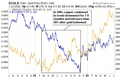
One of the most interesting aspects of the recent steep downward trend in the copper price is that it occurred in parallel with a rising trend in the gold price. This doesn’t guarantee anything, but it is consistent with what should be happening if the commodity markets have begun the transition from cyclical bear to cyclical bull.

By way of explanation, long-term broad-based rising trends in commodity prices are always driven by bad monetary policy. A consequence is that gold, due to its nature, will generally turn higher in advance of most other commodities. In effect, there are no long-term broad-based commodity bull markets, just gold bull markets that most commodities end up participating in.

A good example occurred during 2001-2002. As illustrated by the chart displayed directly below, in 2001 the copper price continued to trend downward for 7-8 months and fell by more than 20% after gold’s price trend reversed upward. 

gold_copper_2001_220115

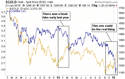
As illustrated by the next chart, there was a ‘head fake’ during the first quarter of last year, with gold rising while the copper price tanked. A similar situation has developed since early-November.

gold_copper_220115

If gold bottomed on a long-term basis last November, then copper should do the same within the next few months.

Print This Post Print This Post

The meaning of negative bond yields

January 19, 2015

Some government bonds are now being quoted with negative yields. Taking an extreme example, Swiss government bonds are now being quoted with negative yields for all maturities up to 10 years. This prompts the question: Who, in their right mind, would pay a government for the ‘privilege’ of lending the government money?

The zero or negative bond yields are almost certainly related in part to the desire by large cash-holders to ensure a return of cash, even if doing so guarantees a small nominal loss. By way of further explanation, if you have $100K of cash to park somewhere you can put it in an insured bank deposit and be guaranteed of getting your money back, but what do you do if you have $1B of cash? If you put this money into a bank account then only a trivial portion will be covered by the government’s deposit insurance, meaning that the failure of the bank could result in a substantial portion of your money being wiped out. To avoid the risk of a large loss due to bank failure it might seem reasonable for you to lend the money to the government at a yield that is certain to result in a small loss. In this case, the small loss stemming from the negative yield on your bond investment is a form of insurance that guarantees the return of almost all of your money.

In other words, at a time when “inflation” risk is perceived to be low and there are concerns about the safety of commercial banks, it could make sense for a large holder of cash to lend the money to the government at a small negative yield.

That being said, it’s important to remember that we aren’t really dealing with 0% or negative bond yields, we are dealing with 0% or negative yields to maturity. The bond yields themselves are still positive.

To further explain, consider the simple hypothetical case of a 1-year bond with par value of $100 that pays interest of $2 at the end of the 1-year duration. If the bond is trading at its par value then both the yield and the yield to maturity (YTM) will be 2%, but both yields will be something other than 2% when the bond’s price deviates from $100. For example, if the bond’s price rises to $103 then the yield falls to 1.94% ($2/$103) and the YTM falls to negative 0.97%. The YTM in this example takes into account the fact that if the bond is held until maturity then the buyer of the bond at $103 will receive a $2 interest payment plus a $100 principle payment, or a total return of $102 versus an outlay of $103. The $1 loss on the $103 investment equates to a return of negative 0.97%.

An implication is that someone who doesn’t plan to hold until maturity can still make a profit on a bond with a negative YTM. For example, someone who buys a Swiss government bond with a YTM of negative 0.1% today will have the opportunity of selling at a profit if the YTM subsequently falls to negative 0.2%. The current ridiculous valuations of some government bonds could therefore be partly explained by the belief that valuations will become even more ridiculous in the future, thus enabling today’s buyers to exit at a profit.

That is, in addition to the willingness to accept a small loss for a guarantee that almost all of the money will be returned, the “greater fool theory” could be at work in the government bond market. In this regard, a government bond having a negative YTM is not that different from an internet stock with no revenue being assigned a multi-hundred-million-dollar valuation based on “eyeballs”. It’s just another in a long line of examples of the madness of crowds, a madness that is often rooted in central bank policy.

Print This Post Print This Post

The SNB gets religion, sort of

January 16, 2015

In a shot out of the blue, on Thursday 15th January the Swiss National Bank (SNB) suddenly removed the Swiss-Franc/Euro cap that was put in place in August of 2011. Due to the cap that was imposed by the SNB way back then, the SF has effectively been pegged to the euro over the past three-and-a-bit years. Since the SF was a chronically stronger currency than the euro, maintaining this peg forced the SNB to massively expand its balance sheet by monetising huge quantities of euro-denominated bonds.

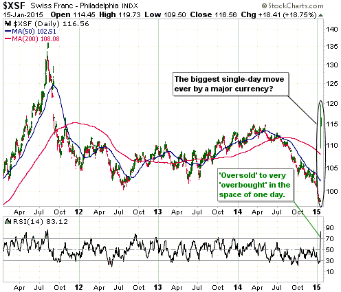
It seems that the SNB belatedly came to see that continuing to peg the SF to the euro created the risk that the SF would become excessively weak and unstable. The sensible, but surprising, decision was therefore made to eliminate the peg. A result was a gigantic single-day surge in the SF relative to all other currencies, not just the euro. For example, the following chart shows that the SF gained almost 20% relative to the US$ on Thursday. As far as we know, this is the biggest single-day move by a major currency in at least 50 years.

It should be noted, however, that the SNB’s shift to a more prudent monetary stance was only half-hearted, because at the same time as it announced the removal of the SF/euro cap it also announced that official 3-month interest rates would be set between NEGATIVE 0.25% and NEGATIVE 1.25%. In effect, the SNB is saying that it will pay speculators to short the SF.

SF_150115

Print This Post Print This Post

Why the US$ has been rallying and why it could soon stop

January 15, 2015

In early October of last year I published an article (an excerpt from a TSI commentary) dealing with why the US$ was rallying. The point I tried to get across in this article was that rather than the main cause of the euro’s weakness — and the Dollar Index’s associated strength — being the fear that the ECB was going to stimulate (meaning: inflate the money supply) more aggressively, the main cause was the fear that the ECB would be unable to stimulate aggressively enough to sustain the bull markets in European stocks and bonds.

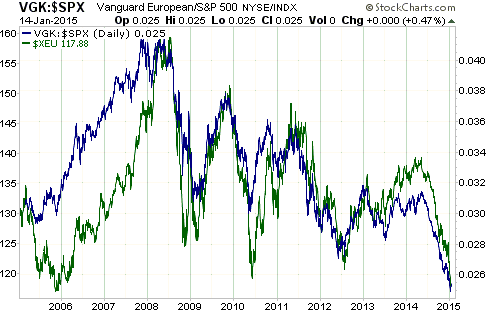
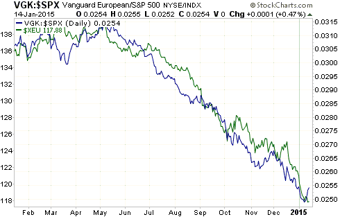
The argument I made at that time was based on the strong positive correlation over many years between the euro and the performance of European equities relative to US equities (as indicated by the VGK/SPX ratio). Specifically, the fact that relative strength in European equities invariably went with a rising euro and relative weakness in European equities invariably went with a falling euro implied that bullish influences on European equities would also tend to be bullish for the euro. At a time when inflation fears are low, nothing is more bullish for the broad stock market than monetary inflation.

Consequently, it was clear to me then, and it is just as clear to me now, that if the market starts to believe that the ECB will have greater ‘success’ in its efforts to pump more money, then the euro will rally on the back of relative strength in European equities.

Here are charts (one long-term and one short-term) that illustrate the relationship between currency performance and relative equity performance that I’m talking about.

euro_VGKSPX_LT_140115

euro_VGKSPX_ST_140115

Print This Post Print This Post

2015 Surprises

January 13, 2015

Here is a slightly-modified excerpt from a commentary posted at TSI last week:

Following the lead of Doug Kass I am now going to present a list of financial-market surprises for the year ahead. These are events/developments that are expected by very few market participants and commentators, but in my view have either a greater than 50% chance of happening (in the cases of surprises 1 to 6) or at least a high-enough probability of happening to be worthy of serious consideration (in the cases of surprises 7 to 9). Here’s the list:

1) The Fed continues to make noises about ‘normalising’ monetary policy, but ends up doing almost nothing. At most, there is a single 0.25% rate hike. One reason is the fear that economic weakness elsewhere in the world, primarily the euro-zone, will weigh on the US economy. Another reason is the absence of an obvious “price inflation” problem. A third reason is the Fed’s unwavering commitment to the absurd Keynesian idea that an economy can be strengthened by punishing savers.

2) US Treasury yields defy the majority view by ending the year flat-to-lower. More specifically, the 30-year T-Bond yield is roughly unchanged over the course of the year, but yields decline in the middle and at the short end of the curve. Of all the Treasury securities, the 5-year T-Note experiences the largest decline in yield as traders belatedly realise that the Fed will not be taking any significant steps towards ‘policy normalisation’ during 2015 or 2016.

3) Gold defies the numerous calls for a decline to US$1000 or lower. It does no worse than test its 2014 low during the first half of the year and commences a major upward trend by the middle of the year. As is always the case, gold’s bullish trend is driven by declining confidence in central banking and rising concern about ‘tail risk’. A related surprise is that the gold-mining indices outperform gold bullion.

4) Despite superficially lousy fundamentals, concerns about future supply reductions/disruptions cause oil to commence a cyclical bull market during the second half of the year.

5) The recovery in the oil price comes too late to prevent widespread debt default and bankruptcy within the US oil-and-gas industry. Due to the many knock-on effects of large-scale retrenchment within this industry, including slowdowns in all the businesses that indirectly benefited from the flood of money channeled into the drilling of shale deposits, it becomes clear that the collapse in the oil price was a net-negative for the US economy.

6) The Yen ends 2015 more than 10% higher than it ended 2014 as the Yen supply continues to grow at a comparatively slow annualised rate of less than 5% and carry-traders exit their positions in reaction to increasing risk aversion.

7) The S&P500 never closes above its December-2014 peak and generally works its way lower throughout the year.

8) The Russian currency (the Ruble) and stock market (RSX) bottom-out during the first half of the year and end 2015 with net gains.

9) The copper price trades below US$2.30/pound during the first half of the year within the context of a deflation scare and downwardly-revised forecasts for global economic growth.

Print This Post Print This Post

Liquidate Everything!

January 12, 2015

In his memoirs, US President Herbert Hoover says that he received the following advice from Secretary of the Treasury Andrew Mellon after the stock market crash of 1929:

Liquidate labor, liquidate stocks, liquidate the farmers, liquidate real estate. It will purge the rottenness out of the system. High costs of living and high living will come down. People will work harder, live a more moral life. Values will be adjusted, and enterprising people will pick up the wrecks from less competent people.” According to Hoover, Mellon “insisted that, when the people get an inflation brainstorm, the only way to get it out of their blood is to let it collapse” and that “even a panic was not altogether a bad thing.

In other words, if Hoover’s recollection was correct (it probably was), Mellon’s advice was for the government to stay out of the way and let the markets clear.

Paul Krugman and many others have blamed the course of action recommended by Mellon for the severity of the Great Depression of the 1930s. The problem with this line of argument is that Hoover strenuously disagreed with Mellon’s advice and chose not only to ignore it, but to do the exact opposite!

Hoover was an engineer by education who believed that the economy could be managed as if it were a giant engineering project. He was an aggressively interventionist president who thought that the economic pain that the stock market crash suggested was coming could be lessened by, among other things, preventing prices from falling and replacing private-sector demand with public-sector demand. He was a consistent critic of free (unregulated) markets and a relentless advocate for a greatly expanded role for government. He was actually a pre-Keynes Keynesian (Keynes was a prominent figure in economics at the time, but he hadn’t yet written the book that would become the bible for government economic meddling).

As an aside, during the 1932 presidential election campaign FD Roosevelt lambasted Hoover for being fiscally imprudent. In fact, FDR went as far as describing the Hoover Administration as “the most reckless and extravagant…of any peacetime government anywhere, any time.” However, after taking over the Presidency FDR quickly forgot almost everything he had said during the election campaign and greatly extended the interventionist approach initiated by his predecessor.

I strongly believe that Mellon’s advice was sound, but the point I want to make right now is that this advice cannot logically be blamed for worsening the economic downturn of the 1930s, regardless of whether or not it was sound. This is because the advice was not followed.

Print This Post Print This Post

Hong Kong in 1938

January 7, 2015

Here is some fascinating video footage showing Hong Kong in 1938.

The narration sounds like it was produced by the British Ministry of Propaganda and some of the narrator’s comments are patronising to the point of being funny. This mouthful is my favourite:

Under tolerant and wise British rule, with willing oriental assistance, has grown a modern Western city in an Eastern setting, where more than a million contented Chinese dwell in harmony, merging their ancient civilisation, culture and manners with those of the 20 thousand Europeans who guide or minister to them.

Video source: https://www.youtube.com/watch?v=hIHTrmz4hTI

Print This Post Print This Post

Tell me, again, how the end of the Fed’s QE program will be bearish for gold

January 7, 2015

This post is a reiteration of the points I made in my 16th December article and includes updated charts. The main point is that there are times, like now, when less ‘accommodative’ monetary policy is absolutely not bearish for gold.

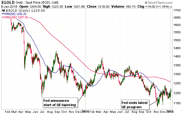
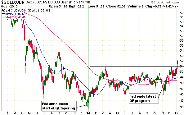
The Fed announced the beginning of its QE “tapering” on 18th December 2013. The following charts show that within a few days of this announcement gold made a major bottom in non-US$ terms (the gold/UDN ratio is a proxy for gold’s performance in terms of a basket of important currencies excluding the US$) and an intermediate-term bottom in US$ terms.

The Fed then methodically “tapered” its QE program during 2014 and announced the completion of the program on 29th October. The following charts also show that within a few days of this announcement gold bottomed in both non-US$ terms and US$ terms.

Over the past two days gold broke out to the upside in non-US$ terms and appears to have completed a long-term base.

gold_060115

gold_UDN_060115

As I explained in the above-linked article, the critical point to understand is that gold’s perceived value moves in the opposite direction to confidence in central banking and the economy. During periods when a general belief takes hold that the central bank’s money-pumping is improving the economy’s prospects, the money-pumping turns out to be an intermediate-term bearish influence on the gold market. However, the money-pumping distorts the economy in a way that eventually leads to substantial economic weakness.

A tightening of monetary conditions will begin to reveal the distortions (mal-investments) caused by the preceding ‘monetary accommodation’, which is why the demand for gold will sometimes increase as the Fed becomes more restrictive. In such a situation gold isn’t gaining ground because the Fed is tightening, it is gaining ground because tighter monetary conditions are shining a light on the economic damage caused by the earlier money-pumping.

In simpler terms, gold gets hurt by the boom and helped by the bust, so anything that perpetuates the boom is bearish for gold and anything that helps bring on the bust that inevitably follows an inflation-fueled boom is bullish for gold.

Print This Post Print This Post

Revisiting the ‘problem’ with leveraged ETFs

January 6, 2015

My 3rd November blog post explained why leveraged ETFs should only ever be used for short-term trades. To set the scene, here is an excerpt from this earlier post:

The crux of the matter is that leveraged ETFs are designed to move by 2 or 3 times the DAILY percentage changes of the target indexes. They are NOT designed to move by 2 or 3 times the percentage change of the target indexes over periods of longer than one day. Due to the effects of compounding, their percentage changes over periods of much longer than one day will usually be less — and sometimes substantially less — than 2-times (in the case of a 2X ETF) or 3-times (in the case of a 3X ETF) the percentage changes in the target indexes.

In the earlier post I presented tables to show that the greater the volatility of an index and the greater the leverage provided by an ETF linked to the index, the worse the likely performance of the leveraged ETF over extended periods. The worse, that is, relative to the performance superficially implied by the daily percentage change relationship between the index and the leveraged ETF. I concluded that leveraged ETFs are only suitable for short-term trades and that a trade should be very short-term if it involves a 3X ETF and/or a volatile market.

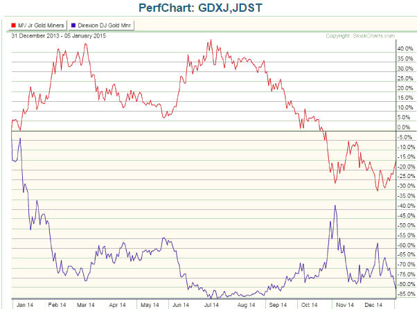
To illustrate how badly a leveraged ETF can perform relative to the performance superficially implied by the daily percentage change relationship between the leveraged ETF and the market to which it is linked, here is a chart comparing the performances of GDXJ (the Junior Gold Miners ETF) and JDST (the Junior Gold Miners 3X Bear ETF) since the end of 2013. JDST is designed to have a daily percentage change that is roughly three times the INVERSE of GDXJ’s daily percentage change, so it is an ETF that someone would buy if they were bearish on GDXJ. For example, on a day when GDXJ lost 5%, JDST would gain about 15%, and on a day when GDXJ gained 5%, JDST would lose about 15%.

Given that GDXJ is presently about 15% lower than it was at the end of 2013, people who are unfamiliar with how leveraged ETFs work would likely jump to the conclusion that a JDST position purchased at the end of 2013 and held through to the present would show a healthy profit. However, this conclusion could not be further from the truth, because JDST has lost 81% of its value over the period in question.

GDXJvsJDST_050115

The dismal performance of JDST is a trap for the novice trader, but it is not a design flaw. As outlined in my 3rd November post, it is a mathematical function of how the leverage works and simply means that this type of ETF should only ever be used in trades with timeframes of no more than a few weeks.

Print This Post Print This Post

Charts of interest

January 3, 2015

The following charts are referenced in a market update to be emailed to TSI subscribers prior to Monday 5th January.

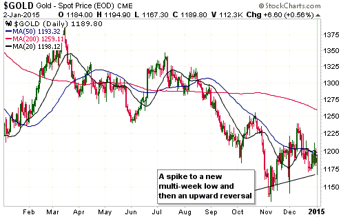
Chart 1: Gold in US$ terms

GOLD_020115

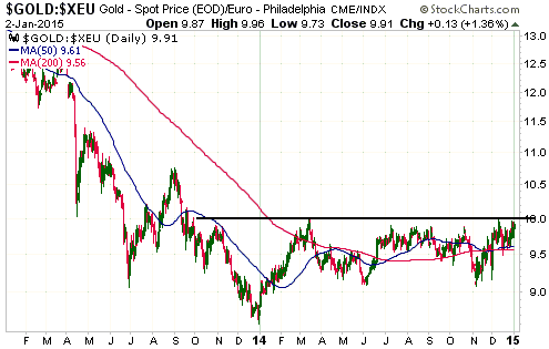
Chart 2: Gold in euro terms

gold_euro_020115

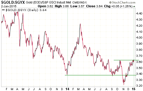
Chart 3: Gold relative to the Industrial Metals Index

gold_GYX_020115

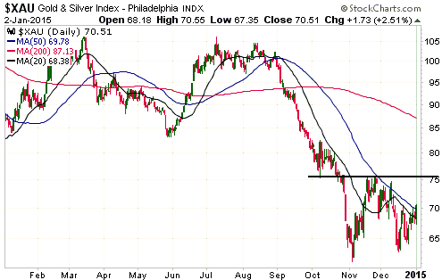
Chart 4: XAU

xau_020115

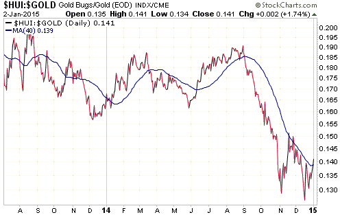
Chart 5: Gold stocks relative to gold bullion (HUI/gold)

HUI_gold_020115

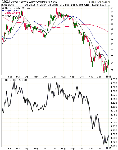
Chart 6: Junior gold miners (GDXJ) and juniors relative to seniors (GDXJ/GDX)

gdxj_020115

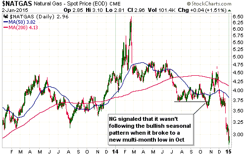
Chart 7: Natural Gas

natgas_020115

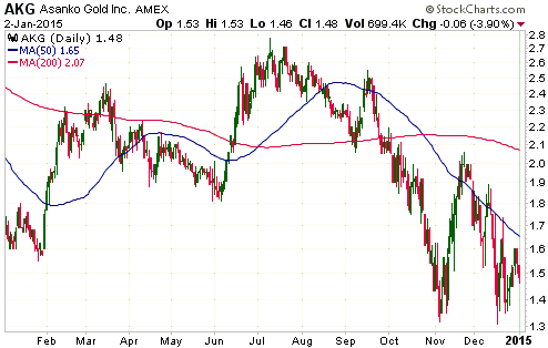
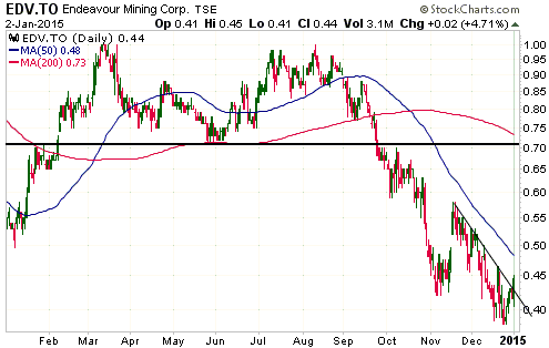
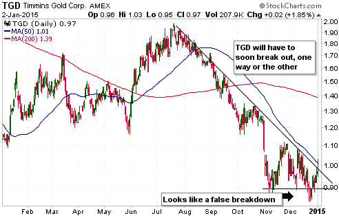
Charts 8, 9 & 10: Asanko Gold (AKG), Endeavour Mining (EDV.TO) and Timmins Gold (TGD)

AKG_020115

EDV_020115

TGD_020115

Print This Post Print This Post