
Inserted below is a chart that compares the long-term inflation-adjusted (IA) performances of several markets. This chart makes some interesting points, such as:
1) Market volatility increased dramatically in the early-1970s when the current monetary system was introduced. This shows that the generally higher levels of monetary inflation and the larger variations in the rate of monetary inflation that occurred after the official link to gold was abandoned didn’t only affect nominal prices. Real prices were affected in a big way and boom-bust oscillations were hugely amplified. As an aside, economists of the Keynesian School are oblivious to the swings in relative ‘real’ prices caused by monetary inflation and the depressing effects that these policy-induced price swings have on economic progress.
2) Commodities in general (the green line on the chart) experienced much smaller performance oscillations than the two ‘monetary’ commodities (gold and silver). This is consistent with my view that there aren’t really any long-term broad-based commodity bull markets, just gold bull markets driven by monetary distortions in which most commodities end up participating. The “commodity super-cycle” has always been a fictional story.
3) Apart from the Commodity Index (GNX), the markets and indices included in the chart have taken turns in leading the real performance comparison. The chart shows that gold and the Dow Industrials Index are the current leaders with nearly-identical percentage gains since the chart’s January-1959 starting point. Note, however, that if dividends were included, that is, if total returns were considered, the Dow would currently have a significant lead.
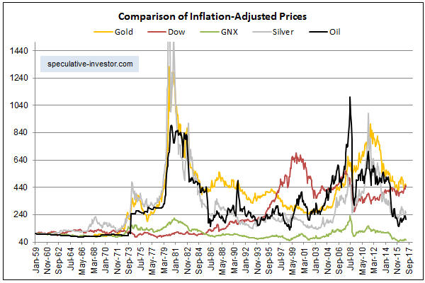
Chart Notes:
a) I use a method of adjusting for the effects of US$ inflation that was first described in a 2010 article. This method isn’t reliable over periods of two years or less, but it should come close to reflecting reality over the long term.
b) To make it easier to compare relative performance, the January-1959 starting value of each of the markets included in the above chart was set to 100. In other words, the chart shows performance assuming that each market started at 100.
c) The monthly performance of the scaled IA silver price peaked at more than 2600 in early-1980, but for the sake of clarity the chart’s maximum Y-axis value was set to 1500. In other words, the chart doesn’t show the full extent of the early-1980 upward spike in the IA silver price.
d) The commodity index (the green line on the chart) uses CRB Index data up to 1992 and Goldman Sachs Spot Commodity Index (GNX) data thereafter.