
Two months ago I posted a short article in which I discussed an example of how the change in an economic statistic was greatly exaggerated — in order to paint a misleading picture — by showing the percentage change of a percentage. I’ll now discuss another example of using the same trick to make the change in an economic number seem far more dramatic than was actually the case.
Before getting to the specific example, the general point is that when analysing economic data — or any other data for that matter — it won’t make sense to consider the percentage of a percentage unless it’s the second derivative that you are primarily interested in. When you take the percentage change of a percentage you cause a change in the underlying number from 0.5 to 1.0 to become the same as a change in the underlying number from 5 to 10 or 100 to 200, but in the real world the change in an economic number from 5 to 10 will usually have vastly different implications to the change in the same number from 0.5 to 1.0. For example, there is a huge difference between a change in the rate of GDP growth from 0.5% to 1.0% and a change in the rate of GDP growth from 5% to 10%, but both constitute a 100% increase in the rate of growth.
On a related matter, it can also be problematic to look at percentage changes of economic numbers when the numbers are fluctuating near zero. This is because a move from one miniscule value to another can be large in percentage terms. For example, a move from 0.01 to 0.03 is a 200% increase.
The specific example that prompted this post appeared in John Mauldin’s recent article titled “Negative Rates Nail Savers“. The gist of the Mauldin piece is completely correct, but during the course of the long article some mistakes were made. I’m zooming-in on the mistake contained in the following excerpt:
“Here is a long-term chart of the federal funds rate, the Fed’s main policy tool:
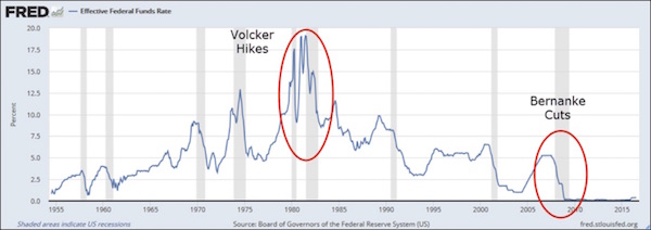
The gray vertical bars represent recessions. You can see how the Fed has historically dropped rates in response to recessions and then tightened again when those recessions ended. I red-circled the particularly drastic loosening and retightening under Paul Volcker in the early 1980s and Ben Bernanke’s cuts to near-zero in 2008.
To this day, the Volcker rate hikes are legendary. No Fed chair has ever done anything like that, before or since. You hear it all the time. Problem: it’s not true.
Here is the same chart again, this time with a log scale on the vertical axis. This adjusts the rate changes to be proportionate with percentage rises and falls. The percentage change between 5% and 10% is the same as between 10% and 20%, since both represent a doubling of the lower number.
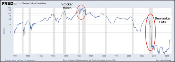
Looking at it this way, the Volcker hikes are tame, almost unnoticeable. Meanwhile the Bernanke cuts dwarf all other interest rate changes since 1955. Nothing else is even close. Bernanke’s rate cuts were far, far more aggressive than Volcker’s rate hikes.”
The fact that looking at it this way “the Volcker hikes are tame, almost unnoticeable” should have told Mr. Mauldin that it was the wrong way to look at it. Moreover, looking at it Mr. Mauldin’s preferred way, even the tiny up-tick in the Fed Funds Rate last December makes Volcker’s hikes seem tame. After all, when the Fed nudged the target Fed Funds Rate up from 0.125% to 0.375% last December it could be described as a 200% rate increase (since 0.375 is three-times 0.125). This means that by taking the percentage change of a percentage, or in this case by charting percentages using a log scale, it can be shown that last December’s rate hike was the most aggressive monetary tightening in the Fed’s history!
I suspect that Mr. Mauldin’s mistake was innocent, but a sure way to reduce the credibility of an otherwise good argument is to use flawed statistical methods to support it.