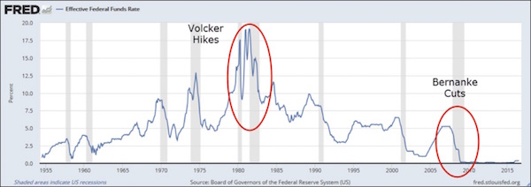
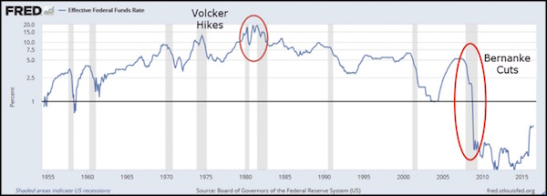
Prior to 2002 the Fed would tighten monetary policy in reaction to outward signs of rising “price inflation” and loosen monetary policy in reaction to outward signs of falling “price inflation”, but beginning in 2002 the Fed became far more biased towards loose monetary policy. This bias is now so great that it seems as if the Fed has become permanently loose.
The following chart comparing the Fed Funds Rate (FFR) target set by the Fed with the Future Inflation Gauge (FIG) clearly illustrates the change in the Fed’s tactics over the past two decades. The Future Inflation Gauge is calculated monthly by the Economic Cycle Research Institute (ECRI) and should really be called the Future CPI Gauge, because it is designed to lead the CPI by about 11 months.
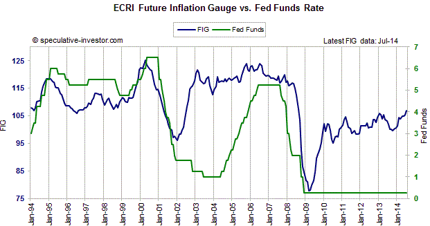
The chart shows that prior to 2002 the FFR tended to follow the FIG. After the FIG warned of rising “price pressures” the Fed would start hiking the FFR, and after the FIG started signaling reduced upward pressure on the CPI the Fed would start cutting the FFR. (Note: My chart begins in 1994, but the relationship between the FFR and the FIG that I just described goes back much further.) During 2002-2004, however, the Fed not only didn’t hike its targeted interest rate in response to a sharp increase in the FIG, it continued to cut the FFR.
The Fed’s decision to maintain an ultra-loose stance during 2002-2004 was the fuel for the real estate investment bubble and set the stage for the collapse of 2007-2009.
There was a lesson to be learned from what happened during 2002-2007, but the Fed clearly learned the wrong lesson. The lesson that should have been learned was: Don’t provide monetary fuel for bubble activities, because the eventual economic fallout will be devastating. Unfortunately, the lesson that was actually learned by the Fed was: An economic bust can be avoided forever by keeping monetary policy loose forever. The result is that the divergence between the FFR and the FIG that arose during the first half of the last decade is nothing compared to the divergence that is now in progress. The FIG has been working its way higher since early-2009 and just hit a 5-year high, while the Fed’s ZIRP (Zero Interest Rate Policy) remains firmly entrenched.
Zooming in on the shorter-term fluctuations, last year’s small decline in the FIG suggested that there wouldn’t be a significant increase in the CPI’s growth rate until at least the final few months of this year, while the rise in the FIG that began late last year suggests that “price inflation” will start to become apparent in the CPI during the final quarter of this year and could be perceived as a serious problem during the first half of next year. This probably means that by early next year the T-Bond bears will start to look correct and the Fed will start to feel irresistible pressure to begin a rate-hiking program. Unfortunately, the US economy is now so rife with ‘bubble activities’ (businesses, projects, investments and speculations that are only viable due to artificially low interest rates and a rapid stream of new money) that a severe downturn is likely to follow an attempt by the Fed to ‘normalise’ its monetary policy.
By ignoring investment bubbles and erring far more in favour of “inflation” than it has ever done in the past, the Fed has set the stage for the mother-of-all economic busts. If the bust doesn’t begin earlier it is likely to begin soon after the Fed starts to raise its targeted interest rate.
 Print This Post