[This blog post is an excerpt from a commentary posted at TSI about three weeks ago]
TARGET2 is the system set up in the euro-zone to clear inter-bank payments. The Bundesbank (Germany’s central bank) describes it as a payment system that enables the speedy and final settlement of national and cross-border payments. The problem is that often there is no “final settlement” under TARGET2. Instead, credits and debits can build up indefinitely.
To understand the issue it first must be understood that although the 19 countries that comprise the euro-zone use a common currency, the euro-zone isn’t really a unified monetary system. It is more like 19 separate monetary systems, each of which is overseen by a National Central Bank (NCB). These NCBs are, in turn, overseen and coordinated by the ECB. TARGET2 is the means by which money is transferred quickly and efficiently between these 19 separate monetary systems. The transfer may well be quick and efficient, but, as noted above, it often doesn’t result in final settlement.
Further explanation is provided by the Bundesbank, as follows:
“…both the Bundesbank and the Banque de France will be involved in a cross-border payment transaction made in settlement of a German export to France, for instance. That transaction begins when the French importer’s commercial bank in France debits the purchase amount from the importer’s account and submits a credit transfer in TARGET2 to the German exporter’s commercial bank in Germany. The Banque de France then debits the amount from the TARGET2 account it operates for the French commercial bank and posts a liability owed to the Bundesbank. For its part, the Bundesbank posts a claim on the Banque de France and credits the amount to the German commercial bank’s TARGET2 account. The transaction is concluded when the commercial bank credits the amount in question to the account it operates for the German exporter.
At the end of the business day, all the intraday bilateral liabilities and claims are automatically cleared as part of a multilateral netting procedure and transferred to the ECB via novation, leaving a single NCB liability to, or claim on, the ECB.
Viewed in isolation, the transaction used as an example above leaves the Banque de France with a liability to the ECB and the Bundesbank with a claim on the ECB at the end of the business day. These claims on, or liabilities to, the ECB are generally referred to as TARGET2 balances.”
The example given above by the Bundesbank refers to a German export to France, but the same process would apply when someone transfers money from a bank deposit in one EZ country to a bank deposit in another EZ country. For example, the electronic wiring of funds from a commercial bank account in Italy to a commercial bank account in Luxembourg would leave the Banca d’Italia with a liability to the ECB and the Banque Centrale du Luxembourg with a claim on the ECB.
The process described above means that there is never any net clearing of cross border payments at the NCB level. Unless the money flowing in one direction (into Country X) equals the money flowing in the opposite direction (out of Country X), credit/debit balances will build up and there is no limit to how large these balances can become.
As illustrated by the following chart from Yardeni.com, this is not just a hypothetical issue. The NCBs of some EZ countries, most notably Germany and Luxembourg, now have huge positive TARGET2 balances, and the NCBs of some other EZ countries, most notably Italy and Spain, now have huge negative TARGET2 balances.
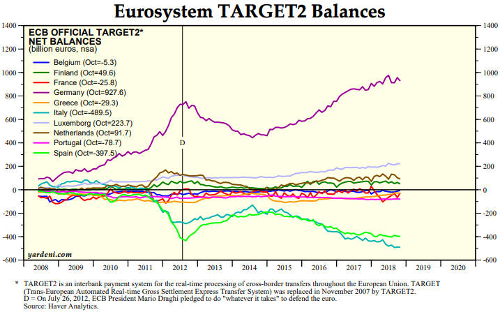
As at October-2018, the central bank of Germany was owed 928 billion euros by the TARGET2 system, while together the central banks of Italy and Spain owed 887 billion euros to the TARGET2 system. Is this a problem?
The system is so strange that there doesn’t appear to be a clear-cut answer to the above question, at least not one that we can fathom. It could be a huge problem or it could be no problem at all.
The Bundesbank is sitting there with an asset valued at almost 1 trillion euros that will never pay any interest and cannot be collected. At first blush this appears to be a huge problem. It implies that at some point the asset will have to be written off, perhaps leading to a very expensive bailout funded by German taxpayers. But then again, due to the way the current monetary system works it may well be possible for TARGET2 balances to grow indefinitely with no adverse consequences. That’s why we haven’t devoted any commentary space to this issue in the past.
If we were forced to give an answer to the above question it would be that rising interest rates, burgeoning government debt levels and private bank failures will become system-threatening issues in the EZ long before the TARGET2 balances pose a major threat.
 Print This Post