Interest rate suppression stupidity

Print This Post Print This Post

Interest rate suppression stupidity

It is illogical to expect an artificially-low interest rate to help the economy. This is because the best-case scenario resulting from interest-rate suppression is a wealth transfer from savers to speculators. In other words, the best case is a ‘wash’ for the overall economy. The realistic case, however, is very much a negative for the overall economy, because in addition to punishing savers an artificially low interest rate will cause mal-investment and thus make the economy less efficient.

Furthermore, thanks to the Japanese experience of the past two decades there is now a mountain of recent empirical evidence to support the logic outlined above. Japan’s policymakers have tried and tried again to propel their economy to the mythical “escape velocity” by pushing interest rates down to absurdly low levels and keeping them there, but every attempt has failed. Unfortunately, the fact that interest-rate suppression has been a total bust in Japan has not dissuaded other central banks from going down the same path.

The root of the problem is devotion to bad economic theory. If you are convinced that lowering the interest rate, pumping money into the economy and ramping-up government spending is beneficial, then from your perspective a failure of such measures to sustainably boost the rate of economic growth can only mean that the measures weren’t aggressive enough. If the interest rate is reduced to zero and the economy remains sluggish, then a negative interest rate must be needed. If the economy doesn’t become strong in response to 10% annual money-supply growth, then 15% or 20% annual monetary expansion is obviously required. If a hefty boost in government spending fails to kick-start the economy, then it must be the case that government spending wasn’t boosted enough.

The alternative is that the theory underlying the policy is completely wrong, but this possibility must never be acknowledged.

Print This Post Print This Post

Seven rate cuts priced in for next year

[This blog post is an excerpt from a commentary published at speculative-investor.com about one week ago]

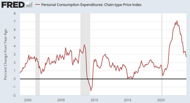
The latest calculation of the Personal Consumption Expenditures (PCE) Index, an indicator of “inflation”, was reported on Friday morning (22nd December) in the US. The following chart shows that the latest number extended the downward trend in the index’s year-over-year (YOY) growth rate, which is now 2.6%. Moreover, the “core” version of the PCE Index, which apparently is the Fed’s favourite inflation gauge, has risen at an annualised rate of only 1.9% over the past six months. This essentially means that the Fed’s inflation target has been reached. What does this mean for the financial markets?

An implication of the on-going downward trends in popular indicators of inflation is that the Fed will slash its targeted interest rates next year. That’s a large part of the reason why the stock and bond markets have been celebrating over the past two months.

It’s important to understand, however, that the markets already have priced in a decline in the Fed Funds Rate (FFR) from 5.50% to 3.75% (the equivalent of seven 0.25% rate cuts). This means that for the rate-cut celebrations to continue, the financial world will have to find a reason to price in more than seven rate cuts for next year. Not only that, but for the rate-cut celebrations to continue in the stock market the financial world will have to find a reason to price in more than seven 2024 rate cuts while also finding a reason to price in sufficient economic strength to enable double-digit corporate earnings growth during 2024. That’s a tall order, to put it mildly.

Our view is that the Fed will end up cutting the FFR to around 2.0% by the end of next year, meaning that we are expecting about twice as much rate cutting as the markets currently have priced in. The thing is, our view is predicated on the US economy entering recession within the next few months, and Fed rate-cutting in response to emerging evidence of recession has never been bullish for the stock market. On the contrary, the largest stock market declines tend to occur while the Fed is cutting its targeted rates in reaction to signs of economic recession.

Fed rate cuts in response to emerging evidence of recession are, however, usually bullish for Treasury securities and gold. That’s why we expect the upward trends in the Treasury and gold markets to continue for many more months, with, of course, corrections along the way.

Print This Post Print This Post

Can the government create wealth by going into debt?

Some economists/analysts argue that the government creates wealth in the private sector via deficit-spending. From an accounting perspective they are right, in that when the government borrows and then spends X$ the private sector is left with the same amount of dollars plus an asset in the form of government debt securities worth X$. This implies that every dollar of government deficit-spending immediately adds a dollar to the private sector’s wealth, regardless of whether or not the spending contributes to the pool of real resources. This is counterintuitive. After all, given that every government is very good at deficit spending, there would be no poverty in the world if it really were possible for the government to create wealth in the private sector simply by putting itself further into debt. So, what’s the problem with the aforementioned accounting?

There are multiple problems, the first of which I’ll explain via a hypothetical case. Fred Smith is operating a basic Ponzi scheme. He is issuing $1,000 bonds that have a very attractive yield and using money from new investors to pay the interest on existing bonds and to finance a lavish lifestyle for himself. Using the same accounting that was used above to ‘explain’ how government deficit-spending creates wealth, every time Fred issues a new bond and spends the proceeds the total amount of wealth in the economy ex-Fred increases by $1,000.

The government is like Fred. For all intents and purposes, the government is running a Ponzi scheme because a) the interest and principal payments to existing investors are financed by issuing new debt, and b) there is no intent to ever pay-off the debt (the total debt increases every year). As was the case in the Fred example, every time the government issues a new bond and spends the proceeds the total amount of wealth in the economy ex-government increases by the amount paid for the bond.

Just as it would not make sense to view a dollar invested in Fred’s Ponzi scheme as having the equivalent effect on actual wealth as a dollar invested productively, it does not make sense to equate investment in government bonds with investment in productive assets.

That’s not the only problem, because if government bonds are purchased with existing money then an increase in government indebtedness must result in reduced investment in private sector debt or equity. In this case, therefore, government deficit-spending ‘crowds out’ private-sector investment, which is a problem in that politically-motivated spending by the government is likely to contribute less to the total pool of real wealth than economically-motivated spending by the private sector.

But what if government debt is purchased by the central bank or commercial banks with newly-created money, as occurs when the central bank implements a Quantitative Easing (QE) program? In this case there is no ‘crowding out’ of private sector investment.

According to MMT (Modern Monetary Theory) proponents as well as most Keynesians and Monetarists, the money supply increase that occurs when government debt is purchased using newly-created money is not a problem until/unless it leads to a large rise in the “general price level” as indicated by statistics such as the CPI. However, a rise in the general price level is not the only problem that can be caused by creating money out of nothing. It’s not even the main problem. The main problem is the distortions to interest rates and other price signals that the new money brings about. These distortions can lead to mal-investment on a grand scale.

In conclusion, sometimes a concept can be counterintuitive primarily because it is wrong. In accounting terms it can seem as if the government can ‘magically’ create wealth via deficit-spending, but only if you treat investment in government debt as equivalent to investment in productive endeavours and ignore the fact that creating money out of nothing tends to cause mal-investment.

Print This Post Print This Post

US monetary deflation intensifies

[This blog post is an excerpt from a recent commentary published at speculative-investor.com]

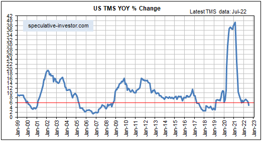
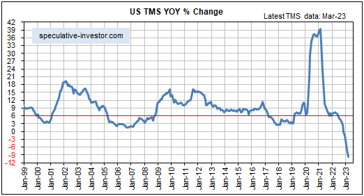
The US money-supply data for March-2023, which were published on Tuesday of this week, reveal that the monetary inflation rate has continued its ‘swan dive’. As illustrated below, the year-over-year growth rate of US True Money Supply (TMS) is now around negative 10%, that is, at the end of March-2023 the US money supply was about 10% smaller than it was a year earlier. The last time there was a double-digit annual percentage contraction in the US money supply was the early-1930s.

The Fed has signalled that it will maintain downward pressure on the money supply via its QT program, so a further decline in the monetary inflation rate is likely unless commercial banks lend enough new money into existence to counteract the Fed. So, what are the chances of the commercial banks generating enough new credit in the short-term to counteract the Fed?

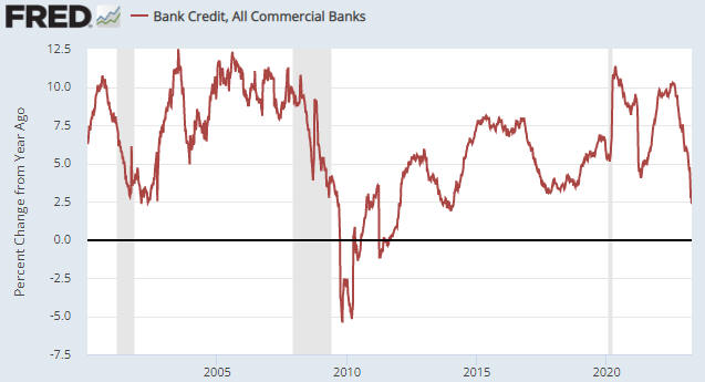
Given the stresses that recently have emerged in the banking system combined with the trend towards tighter commercial bank lending standards that was well underway before last month’s banking panic and the plunge in the rate of bank credit growth illustrated by the following chart, the chances are slim to none. That is, a further monetary contraction appears to be in store.

Just to recap, in 2020 the Fed flooded the US economy and financial markets with dollars in an effort to make it seem as if the government could impose major restrictions on economic activity for several months without causing widespread hardship. Then, throughout 2021 the Fed acted as if the monetary deluge of 2020 would have only minor inflationary effects, mainly because major effects were yet to appear in backward-looking statistics such as the CPI. During the first half of 2022 the Fed finally realised that its prior actions had caused a major inflation problem, and in response it embarked on an aggressive monetary tightening program. However, by the time the Fed started tightening, the monetary inflation rate already had collapsed from a high of almost 40% to around 7% and the rate of CPI growth was within three months of its cycle peak.

Now we have the Fed still in tightening mode even though a) the US economy has just experienced the largest money-supply shrinkage since the Great Depression and b) the CPI growth rate is about 10 months into a cyclical decline. Why? Mainly because the backward-looking CPI hasn’t yet fallen far enough to reach the Fed’s arbitrary target.

At some point during the second half of this year the Fed will realise that its monetary tightening has gone too far, and at around the same time it will start coming under political pressure to create the illusion of prosperity in the lead-up to the November-2024 Presidential Election. It then undoubtedly will begin to lean in the opposite direction, again with its eyes firmly fixed on the rear-view mirror (backward-looking data). This will set the scene for the next great inflation wave.

The Federal Reserve is like a loose cannon on the deck of a ship in a storm. It is crashing into things and generally wreaking havoc, although unlike an actual loose cannon it pretends to be the opposite of what it is. It pretends to be a force for financial and economic stability.

The problem is the institution itself rather than the current leadership. The current leadership is inept and dangerous due a lack of understanding of what’s happening in the world, a lack of understanding of how its own actions affect long-term progress, and a strong belief that it knows what’s best. However, giving an individual or a committee the power to manipulate the money supply and interest rates would be problematic even if those doing the manipulating were competent.

Print This Post Print This Post

Is a yield curve reversal in progress?

[This blog post is an excerpt from a TSI commentary published last week]

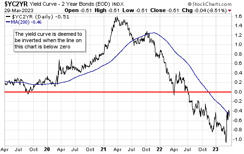
The US 10yr-2yr yield spread, a proxy for the US yield curve, has rebounded sharply over the past couple of weeks (refer to the following daily chart), from more than 100 basis points below zero to ‘only’ about 50 basis points below zero. Is this the start of a steepening trend for the US yield curve?

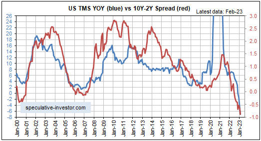
There is one good reason to believe that the recent upturn shown on the above chart did NOT mark the start of a new trend. The reason is the relationship between the monetary inflation rate (the blue line) and the 10yr-2yr yield spread (the red line) illustrated on the chart displayed below. This chart shows that the yield spread tends to follow the monetary inflation rate and that the monetary inflation rate was still in a downward trend at the end of February-2023.

Further to the above chart, a yield curve inversion is caused by a large decline in the monetary inflation rate and a major shift in the yield curve to a new steepening trend is caused by a major upward reversal in the monetary inflation rate. Currently there is no sign of an upward reversal in the monetary inflation rate.

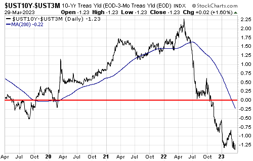
As an aside, the 10yr-2yr spread is just one indicator of the yield curve. The 10yr-3mth spread (see chart below) is equally important and made a new inversion extreme on Monday of this week. In other words, there is no evidence of a shift towards steepening in the 10yr-3mth spread.

Perhaps it will be different this time and a yield curve shift to a steepening trend will precede a money-supply growth rate reversal, but we wouldn’t bet on it. As long as monetary conditions as indicated by the monetary inflation rate are still tightening, there will be upward pressure on short-term interest rates relative to long-term interest rates. This is because short-term interest rates will be kept relatively high by the increasingly urgent desire for short-term financing, while long-term zero-risk interest rates will reflect the expected eventual effects on prices and economic activity of today’s tight monetary conditions.

Print This Post Print This Post

The Anti-Bank

[This blog post is an excerpt from a commentary published at TSI last week]

The senior central banks (the Fed and the ECB) hiked their interest rate targets over the past several days and have stated that more rate hikes will be needed to quell the inflation that they, themselves, created*. However, the pressure to stop hiking and to start cutting is building and probably will continue to do so over the next few months. This is important for most financial markets and is especially important for the gold market.

A problem facing the central banks is that they can ‘ring fence’ the banking industry, especially in the US where the major banks are in good financial shape, but they cannot protect the entire financial system without turning from monetary tightening to monetary loosening. Of particular relevance, whereas the banking system is mostly transparent (from the perspective of central banks) and can be supported by targeted measures such as the new Bank Term Funding Program (BTFP), many transactions in the so-called “Shadow Banking System” involve counterparties that are not subject to bank regulations and occur outside the central banks’ field of view. The best example is the Repo (Repurchase Agreement) market, which should not be confused with the Fed’s Reverse Repo facility.

Whereas the Fed’s Reverse Repo facility is well defined in terms of size (currently about US$2.3 trillion) and participants, and is of course within the Fed’s control, the Repo market is even bigger (we are talking multi-trillions of dollars of transactions per day) and involves hedge funds and corporations as well as various financial institutions (banks, MMFs, primary dealers, brokers, pension funds, etc.). A Repo is simply a transaction in which one firm sells securities (typically Treasuries) to another firm and agrees to buy the securities back at a slightly higher price in the future (typically the next day). The difference between the sell price and the buy price is known as the “repo rate”, which effectively is an interest rate. Normally the repo rate is very close to the Fed Funds Rate.

The Fed was forced to intervene in the Repo market in September-2019 to address a liquidity crunch that caused short-term interest rates to spike well above the Fed’s target, and again in 2020 in reaction to a sudden cash shortage caused by the COVID lockdowns. It did this by expanding its balance sheet and creating money out of nothing — a moderate amount of money in reaction to the September-2019 cash crunch and a massive amount of money in reaction to the lockdowns. Most of the time, however, the Repo market just chugs along in the background like the plumbing system that distributes water around a large commercial building.

In a nutshell, the problem for the senior central banks is that while the commercial banking system can be prevented from blowing up while monetary tightening continues, the monetary tightening eventually will lead to blow-ups among other financial operators that are big enough to disrupt the workings of the financial system. The specific major blow-ups usually can’t be identified ahead of time, but if the tightening continues they will happen (actually, there already has been more than enough tightening to set the scene for such events). And when they happen they will not only stop the central banks from doing additional rate hikes, they probably will result in emergency rate cuts and balance-sheet expansions.

The above comments are in the gold section because this is the stuff that really matters for gold. Gold is not the anti-dollar, as it is sometimes labelled. It is also not a hedge against inflation, although like many other ‘hard’ assets it has retained its value over the very long-term. Instead, it is reasonable to think of gold as the anti-bank or the anti-financial-system. As a result, gold’s price is driven by confidence in the financial system and the main official supporters of the financial system (the government and the central bank), which can be quantified to a meaningful extent using certain ratios and interest-rate spreads. Falling confidence leads to a higher valuation for gold, rising confidence leads to a lower valuation for gold.

*That’s not exactly what they are saying, in that they are not accepting blame for the inflation problem. They are saying that more rate hikes are needed to quell the inflation that has arisen due to exogenous and unforeseeable forces.

Print This Post Print This Post

Fed Fighting

[This blog post is an excerpt from a TSI commentary published on 12th March 2023]

The financial markets have been fighting the Fed since October of last year and especially since the start of this year, in two ways. The first involves bidding-up stock prices in anticipation of a ‘Fed pivot’, which we have described as a self-defeating strategy. The second involves factoring lower interest rates into bond prices, which we thought made sense. What is the current state of play in the battle between the markets and the Fed?

Just to recap, we wrote in many previous commentaries that stock market bulls would get the monetary policy reversal on which they were betting only AFTER the SPX plunged to new bear-market lows and the economic data had become weak enough to remove all doubt that a recession was underway. In other words, a very weak stock market was one of the prerequisites for the policy reversal. That, in essence, is why bidding-up prices in anticipation of a policy reversal was/is viewed as a self-defeating strategy. Also worth reiterating is that previous equity bear markets were not close to complete when the Fed made its first rate cut. This implies that if we are still months away from the Fed’s first rate cut then we could be a year away from the final bear market low.

Regarding the other aspect of the Fed fighting, we have written that interest rates probably would move much lower over the course of 2023 due to an economic recession, an extension of the downward trend in inflation expectations and a collapse in the year-over-year CPI growth rate. This meant that from our perspective the financial markets were right to be factoring lower interest rates into Treasury securities with durations of two years or more. However, in the 16th January 2023 Weekly Update we cautioned: “…the recent eagerness of traders to push-up asset prices in anticipation of easier monetary policy has, ironically, extended the likely duration of the Fed’s monetary tightening. Therefore, while the markets probably are right to discount lower interest rates over the coming year, ‘fighting the Fed’ has created a high risk of interest rates rising over the next 1-3 months.

Partly due to equity traders attempting to ‘front run’ the Fed, the monetary tightening has been extended and interest rates rose markedly from mid-January through to the first half of last week. The 10-year and 30-year Treasury yields have remained below their October-2022 cycle highs, but the 2-year Treasury yield, which had signalled a downward reversal late last year, made new highs over the past fortnight.

The following chart shows the surge in the 2-year Treasury yield from a multi-month low in mid-January to a new cycle high during the first half of last week. It also shows that there was a sharp decline during the second half of last week. Will the latest downward reversal stick?

We suspect that it will. It’s likely that 10-year and 30-year Treasury yields have reversed downward after making lower highs, and that the 2-year Treasury yield has made a sustainable downward reversal from a slightly higher high for the cycle. This is the case because other markets are signalling the start of a shift away from risk.

There’s a good chance that within the next few months stock market bulls will get the Fed pivot they have been betting on. However, they probably will get it with the SPX at 3000 or lower.

Print This Post Print This Post

The Rebuilding of Ukraine

[This blog post in an excerpt from a recent TSI commentary]

It is clear that Russia’s invasion of Ukraine has escalated into a major war. It is also clear that the conflict has evolved into a NATO proxy war against Russia. We don’t know how it will end and the extent to which the shooting will expand beyond Ukraine’s borders, but it’s very likely to result in the near-complete destruction of Ukraine. This almost certainly means that during the years following some form of peace agreement, there will be an effort to rebuild Ukraine funded by…you.

At the moment there’s no point attempting to analyse the ramifications of the Ukraine rebuilding in detail, because there’s no way of knowing when the war will end. It could end within the next two months or it could drag on for another two years. The issues we want to address in brief today are that the rebuilding effort will 1) be colossal (probably trillions of dollars), 2) cause a large and sudden increase in the demand for industrial commodities, and 3) be funded mainly by the citizens of the countries that provided military assistance to Ukraine. The entire episode will be a Keynesian stimulus program writ large. You destroy an entire country and then pay to bring it back to the way it was, creating a veritable tidal wave of “aggregate demand” in the process.

Regarding how the rebuilding will be funded, the key is that under the current monetary system anything that is paid for by the government initially will appear to be free. For example, since the start of the Russia-Ukraine war the US government has spent or committed to spend about US$105B to assist in Ukraine’s defence. This spending, which equates to about $800 per US household, has widespread support within the electorate, but how much support would it have if every household had received a bill for $800 for “military assistance to Ukraine”? Undoubtedly a lot less.

The reason that the Ukraine assistance and many other large government spending programs are either supported or ignored by the general public is that from the perspective of most people there is no cost. Nobody gets a bill or immediately has to pay higher taxes to cover the spending. Instead, the government just adds more debt to the ever-growing pile. Furthermore, sometimes the debt is purchased by the central bank with money created out of nothing, in which case there isn’t even a need for private investors to part with any money to fund the government deficit-spending.

Almost regardless of how high the cost of supporting Ukraine’s military efforts, it will be minor compared to the cost that eventually will be incurred in the rebuilding of Ukraine. However, for the reason outlined above, the huge cost initially won’t appear to be a major problem because it won’t adversely affect the personal finances of most people. There simply will be an addition to the existing pile of government debt. It won’t be until a year or two later, when the large demand for scarce resources resulting from the debt-financed rebuilding has caused interest rates and the cost of living to sky-rocket, that the adverse effects will be apparent to the general public.

Industrial metals such as copper, zinc, and nickel, and specialty metals such as lithium and the rare-earths, are among the resources that should have the greatest increases in demand relative to supply once the Ukraine rebuilding gets underway. This is because shortages of these commodities are already in the works due to the “energy transition” to which the political world is committed. An implication is that having investments linked to the production of these commodities will be a way for people to profit from or protect themselves against the “inflation” that will be unleashed after the fighting stops and governments set about trying to repair what they destroyed.

That reconstruction will follow the destruction is something to be aware of. Urgent action is not required, however, because at this time there are no signs that the destruction is about to end.

Print This Post Print This Post
US Recession Watch

[This blog post is an excerpt from a commentary published at TSI on 4th December]

At least one of two things should happen to warn that an official US recession is about to begin. One is a decline in the ISM Manufacturing New Orders Index (NOI) to below 48 and the other is a reversal of the yield curve’s trend from flattening/inverting to steepening. For all intents and purposes the first signal triggered in July-2022 when the NOI dropped to 48, whereas the second signal probably won’t trigger until the first half of next year.

The following monthly chart shows that the NOI dropped to a cycle low of 47.1 in September-2022, ticked up in October and returned to its cycle low in November, leaving the message unchanged. The NOI is signalling that a recession has started or will start soon.

The following chart also shows that the NOI dropped below 40 during the recession period of the early-2000s and dropped below 30 during the 2007-2009 Global Financial Crisis and the 2020 COVID lockdowns. We expect that it will drop below 30 next year.

The first of the two daily charts displayed below shows that the 10yr-2yr yield spread, our favourite yield curve indicator, plunged well into negative (inverted) territory during July and remains there. The second chart shows that the 10yr-3mth yield spread, which apparently is the Fed’s favourite yield curve indicator, finally followed suit over the past two months and is now as far into inverted territory as the 10yr-2yr spread.

One of our consistent messages over the past few months has been that a more extreme inversion of the US yield curve would occur before there was a major reversal to steepening. There were two reasons for this. First, the monetary inflation rate (the primary driver of the yield curve) was set to remain in a downward trend until at least early-2023. Second, it was likely that declining inflation expectations would put downward pressure on yields at the long end while the Fed’s rate-hiking campaign supported yields at the short end. For these reasons, we wrote over the past few months that by early 2023 both the 10yr-2yr and 10yr-3mth spreads could be 100 basis points into negative (inverted) territory.

As recently as two months ago our speculation that the 10yr-2yr and 10yr-3mth spreads would become inverted to the tune of 100 basis points (1.00%) by early-2023 looked extreme, especially since the 10yr-3mth spread was still above zero at the time. With both of these spreads now having become inverted by around 80 basis points, that’s no longer the case.

We doubt that the aforementioned yield spreads will move significantly more than 100 basis points into negative territory, because we expect that during the first quarter of next year economic reality (extreme weakness in the economic statistics and the stock market) will hit the Fed like a ton of bricks. This should bring all monetary tightening efforts to an abrupt end, causing interest rates at the short end to start falling faster than interest rates at the long end, that is, causing the yield curve to begin a major steepening trend.

Our conclusion over the past four months has been that the US economy had commenced a recession or would do so in the near future. Due to recent up-ticks in some coincident and lagging economic indicators, we now think that the first quarter of 2023 is the most likely time for the official recession commencement.

Print This Post Print This Post
Money supply confirms the bust

[This blog post is an excerpt from a commentary published at TSI last week]

We have referred to the 6% level for the year-over-year US True Money Supply (TMS) growth rate (the US monetary inflation rate) as the boom-bust threshold, because transitions from economic boom to economic bust generally don’t begin until after the TMS growth rate has made a sustained move below this level. It was different this time, however, because according to other indicators the US economy entered the bust phase of the monetary-inflation-driven boom-bust cycle during the first quarter of this year with the TMS growth rate still above 6%. Why was it different this time and what’s the current situation?

We outlined the most likely reasons why it was different this time in previous commentaries, most recently in the 27th July Interim Update. Here’s the relevant excerpt from our 27th July commentary:

We think that the current bust began at a higher rate of monetary inflation than in the past for two main reasons. The first is that the Fed was still in monetary-loosening mode at the peak of the economic boom. This had never happened before and resulted in even greater wastage of real savings/resources than in previous booms. The second reason is that due to decades of increasing central bank manipulation of money and interest rates, the economy has become structurally weaker and therefore the collapse of a boom now requires less relative monetary tightening than in the past.

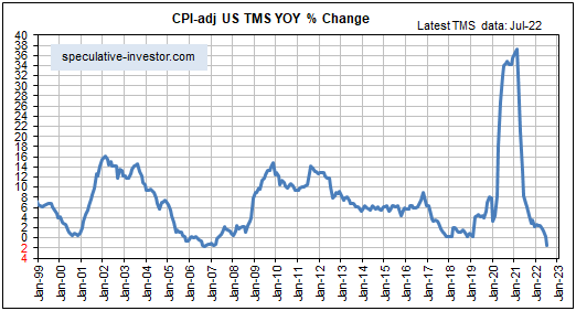
The main new point we want to make today is that the US money-supply data for July-2022, which were published on Tuesday of this week, reveal that the monetary inflation rate has now confirmed the bust by moving well below the 6% boom-bust threshold. This is illustrated by the first of the two monthly charts displayed below. Furthermore, the second of the following charts shows that the year-over-year TMS growth rate minus the year-over-year percentage change in the Median CPI*, an indicator of the real (inflation-adjusted) change in the US monetary inflation rate, has plunged to near a multi-decade low.

As an aside, from the end of last year to the end of July this year the US True Money Supply increased by $580B. This figure comprises the change in currency in circulation, the change in commercial bank demand and savings deposits, and the change in the amount of money held by the US government in the Treasury General Account (TGA) at the Fed. It is very roughly equal to the increase in commercial bank credit plus the increase in Federal Reserve credit minus the increase in the Fed’s Reverse Repo program. Over the aforementioned period the Fed’s direct actions REDUCED the US money supply by about $210B, but the Fed’s actions were more than offset by the money-creating actions of the commercial banking industry.

With the Fed still on the tightening path, it’s unlikely that the lines on the above charts have bottomed. One implication is that the yield curve probably will become more inverted over the next few months. Another implication is that it would be difficult to be too bearish with regard to the US stock market’s 6-12 month prospects.

*A price index calculated by the Cleveland Fed

Print This Post Print This Post
US monetary inflation and boom-bust update

[This blog post is an excerpt from a TSI commentary published last week]

The phenomenal rise in the US monetary inflation rate from early-2020 to early-2021 set in motion an economic boom. There remains some doubt as to whether the boom is over, but the weight of evidence indicates that it probably is.

Booms contain the seeds of their own destruction, meaning that a painful economic bust becomes inevitable after there has been sufficient monetary inflation to foster a boom. Usually, the boom begins to unravel after the pace at which new money is being created (loaned into existence by commercial banks and/or electronically ‘printed’ by the central bank) drops below a critical level, but note that the bust phase cannot be postponed indefinitely by maintaining a rapid level of money-supply growth. On the contrary, an attempt to keep the boom going via an ever-increasing pace of money creation will cause the eventual bust to be the hyper-inflationary kind, which is the worst kind because it crushes the prudent along with the imprudent.

Over the past few decades a boom-to-bust transition for the US economy didn’t begin until after the monetary inflation rate (the year-over-year True Money Supply (TMS) growth rate) dropped below 6%. However, due to the structural damage to the economy resulting from the Fed’s manipulations of money and interest rates over many decades and especially over the past decade, it’s possible that this time around a bust will begin with the monetary inflation rate at a higher level than in the past. That is, even though the latest money-supply figures* reveal that the year-over-year TMS growth rate remains slightly above the 6% boom-bust threshold (refer to the monthly chart below), it’s possible that the US economy has entered the bust phase of the cycle.

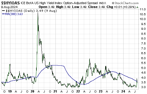
Actually, it’s LIKELY that the US economy has entered the bust phase. This is because even though the monetary inflation rate has not yet dropped below our boom-bust threshold, it has dropped far enough to bring about a significant widening of credit spreads and cause the 10Y-2Y yield-spread to become inverted briefly in early-April.

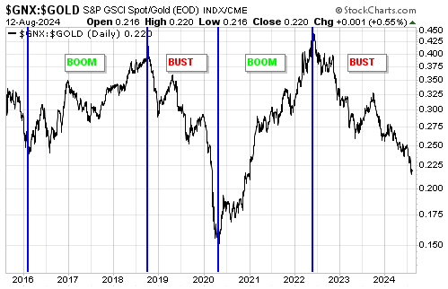
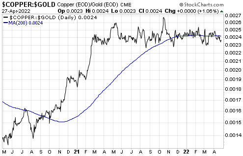
The most important boom-bust timing indicator that is yet to signal an end to the boom is the gold price relative to the prices of industrial metals such as copper. As illustrated by the following chart, since peaking last October the copper/gold ratio has chopped around at a high level. It must make a sustained break below its March-2022 low to signal the sort of relative strength in gold that would be consistent with the bust phase of the cycle.

*The Fed published the money-supply data for March-2022 on Tuesday 26th April.

Print This Post Print This Post
A secular trend has changed

[This blog post is an excerpt from a recent TSI commentary]

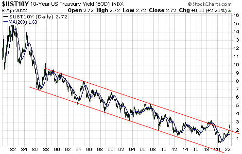
For 36 years the yield on the 10-year T-Note moved lower within the channel drawn on the following chart. Depending on how the lines are drawn, an upside breakout from this channel may or may not have just occurred. If an upside breakout has occurred or occurs later this year following a pullback over the next few months, would this confirm the end of the secular downward trend in interest rates?

UST10Y_blog_110422

It’s not that simple. Obviously, an upside breakout from the long-term channel would be consistent with the trend having changed from down to up, but prices often generate misleading signals via failed breaks below chart-based support or above chart-based resistance. However, there are fundamental reasons to be confident that a long-term trend change has occurred.

The fundamental reasons revolve around the monetary and fiscal responses to the pandemic in 2020, which in combination created such a massive inflation problem that the forces putting downward pressure on interest rates have been overwhelmed. The official response to COVID wasn’t the straw that broke the camel’s back, it was the bazooka that blew the camel to pieces.

There were two parts to the official COVID response that set the stage for a directional change in the secular interest-rate trend. First, there was the imposition of widespread lockdowns that caused the prices of most commodities to collapse and prompted a panic into Treasury securities, leading to a blow-off move to the downside in Treasury yields. Second, there was the effort by the Fed and the government to mitigate the short-term pain stemming from the lockdowns, which involved expanding the total US money supply by 40% in less than a year and ‘showering’ the population with money. The effort was very successful at mitigating short-term pain, but at the expense of economic progress and living standards beyond the short-term. The adverse effects of the actions taken to reduce/eliminate short-term pain during 2020 and the first half of 2021 will be evident for many years to come.

We thought that the secular downward trend in interest rates had ended shortly after the blow-off move in Q1-2020, and this opinion has been subsequently supported by a lot of evidence. However, all secular trends have tradable countertrend moves. We are anticipating a tradable move to the downside in US government bond yields over the next several months.

Print This Post Print This Post
US monetary inflation and the boom-bust cycle

[This blog post is an excerpt from a recent TSI commentary]

The phenomenal rise in the US monetary inflation rate from early-2020 to early-2021 fuelled a speculative mania in the stock market and set in motion an economic boom, while the subsequent plunge in the monetary inflation rate will lead to an equity bear market and an economic bust. A lot of speculation has been wrung-out of the stock market in parallel with the plunge in the pace of new money creation, but there remains some doubt as to whether or not the economic boom is over.

Just to recap, a boom is a surge in economic activity, involving both consumption and investing, in response to price signals caused by monetary inflation. It fosters the impression that great economic progress is being made, but most of the apparent gains achieved during the boom will prove to be ephemeral because the underlying price signals are false/misleading. It will turn out that there are insufficient resources (labour and materials) to complete projects and/or that resources cost a lot more than planned and/or that the consumption forecasts upon which business additions/expansions were based were far too optimistic. The realisation, stemming from rising costs and lower-than-forecast cash flows, that many of the investments made during the boom years were ill-conceived sets in motion the bust phase of the cycle. During the bust phase, boom-time investments get liquidated.

The economic bust will be ‘explained’ by Keynesians* as a collapse in aggregate demand stemming from a mysterious collapse in confidence (“animal spirits”) and will prompt policies aimed at creating a new boom (a new batch of false price signals upon which future investing mistakes will be based), thus perpetuating the cycle.

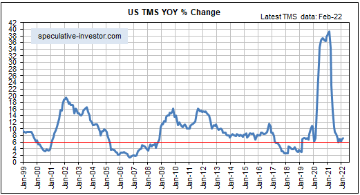
As mentioned above, there remains some doubt as to whether or not the latest US economic boom is over. Some indicators say it is, while others are yet to confirm. Also, although the monetary inflation rate has crashed from its February-2021 high, the following monthly chart shows that it is still slightly above the boom-bust threshold of 6%**.

We defined the threshold based on the historical record, in that over the past few decades a boom-to-bust transition for the US economy didn’t begin until after the monetary inflation rate dropped below 6%. However, due to the structural damage to the economy resulting from the Fed’s manipulations of money and interest rates over many decades and especially over the past decade, it’s possible that a bust will begin with the monetary inflation rate at a higher level than in the past.

In any case, the monetary inflation rate should never be used for timing purposes. There are other measures, such as credit spreads, that signal when the monetary inflation rate has risen far enough to set in motion a boom or fallen far enough to set in motion a bust. These measures suggest that the US economy is now in the early part of a bust, although the evidence is not yet conclusive.

*All senior central bankers and most politicians are Keynesians.

**Due to tough year-over-year comparisons, we thought that the US monetary inflation rate (the year-over-year rate of growth of the True Money Supply) would drop below 6% during the first two months of this year. The reason it didn’t is that more than $800B was added to the money supply over the course of those months. The 2-month money-supply surge to begin 2022 was due to a reduction in the Fed’s reverse repo program (this put about $300B back into circulation), an increase in commercial bank credit (this created about $240B of new money), Fed monetisation of securities (this created about $150B of new money) and, we suspect, the flight of some money to the US to escape the troubles in Europe.

Print This Post Print This Post
The shift from boom to bust may have begun

[This blog post is an excerpt from a commentary published at TSI on 6th March 2022]

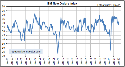
The latest leading economic data indicate that the US expansion is intact. This is the case even though the following monthly chart reveals that the ISM Manufacturing New Orders Index (NOI), one of our favourite leading economic indicators, has been working its way downward since hitting a cycle peak about 12 months ago. The reason is that it’s normal for the rate of improvement — which is what the NOI is measuring — to decline while the economy remains in the expansion phase. That being said, we’ve noted over the past two months that the pace of US economic activity is set to slow markedly during the first half of this year.

We wrote a month ago that due to “inflation” remaining near its cycle peak while the pace of economic activity slows, the ‘real’ GDP growth rate during the first quarter of this year could be close to zero. That was before Russia attacked Ukraine and the West imposed severe economic sanctions on Russia, causing additional large increases in commodity prices. As a result of these price increases, the official “inflation” statistics such as the CPI will be higher for longer and calculations of ‘real’ growth will be lower. This could well mean that the headline US GDP growth numbers will be negative in both Q1-2022 and Q2-2022.

Note that a sign of the downward pressure on economic activity resulting from high inflation is the decline in ‘real’ wages. The monthly US Employment Report issued on Friday 4th March contained an estimate that hourly earnings had increased by 5.1% year-over-year in nominal dollar terms. While this is high compared to the average of the past two decades, it’s likely that the cost of living increased by 8%-12% over the same period. This implies that real hourly earnings have fallen by at least a few percent over the past 12 months.

Will the Powell-led Fed make a series of rate hikes in the face of a shrinking economy in response to price rises that are due to supply disruptions? We don’t think so. A Volcker-led Fed would have begun hiking interest rates long ago, but “Mississippi Jay” is the most dovish Fed chairman ever. The Fed almost certainly will make a 0.25% rate hike this month, but we continue to suspect that it will then go on hold for the remainder of the year.

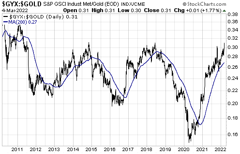
At this stage the leading recession indicators we follow do NOT point to a recession beginning within the next six months (two quarters of negative GDP growth can occur in the absence of a recession), but there’s now a high probability that a boom-to-bust transition will begin during the first half of this year. The recent widening of credit spreads is warning that this is the case, but to confirm a boom-to-bust transition the credit-spread widening will have to be joined by a downward trend reversal in the GYX/gold ratio (the Industrial Metals Index relative to the US$ gold price) and/or a downward trend reversal in the 2-year T-Note yield. The chart displayed below shows that the GYX/gold ratio ended last week at a multi-year high and near the level at which it peaked in 2014 and 2018.

As noted in previous TSI commentaries, the start of a boom-to-bust transition usually precedes the start of an official recession by at least a few quarters.

Print This Post Print This Post
Understanding the yield curve

The yield curve is said to be steepening when the gap between long-term interest and short-term interest rates is increasing, but the meaning of the steepening is different depending on whether it is being driven by rising long-term interest rates or falling short-term interest rates. Also, the yield curve is said to be flattening when the gap between long-term interest and short-term interest rates is decreasing, but the meaning of the flattening is different depending on whether it is being driven by falling long-term interest rates or rising short-term interest rates. The two possible yield curve trends (steepening or flattening) and the two main ways that each of these trends can come about results in four different yield curve scenarios as outlined below.

1) A steepening curve driven by rising long-term interest rates (that is, a steepening of the curve along with flat or rising short-term interest rates).

This is indicative of rising inflation expectations. It tends to be bullish for commodities, cyclical sectors of the stock market and relatively high-risk equities and credit. It is bearish for long-dated treasuries.

2) A steepening curve driven by falling short-term interest rates.

This is indicative of declining liquidity and a general shift away from risk. It is bullish for all treasury securities (especially short-dated treasuries) and gold. It is bearish for almost all equities and especially bearish for cyclical and relatively high-risk equities. It is also bearish for commodities and high-yield credit.

3) A flattening curve along with rising short-term interest rates.

This is indicative of an increasing urgency to borrow short to lend/invest long and a general shift towards risk. It tends to be bullish for most equities and high-yield credit. It is bearish for gold and short-dated treasury securities.

4) A flattening curve driven by falling long-term interest rates (that is, a flattening of the curve along with flat or falling short-term interest rates).

This is indicative of declining inflation expectations and increasing aversion to risk. It tends to be bullish for gold, long-dated treasuries and relatively low-risk equities. It tends to be bearish for cyclical stocks and high-yield credit.

In general, scenarios 1 and 3 arise during economic booms, scenario 2 is a characteristic of an economic bust and scenario 4 occurs during a boom-to-bust transition.

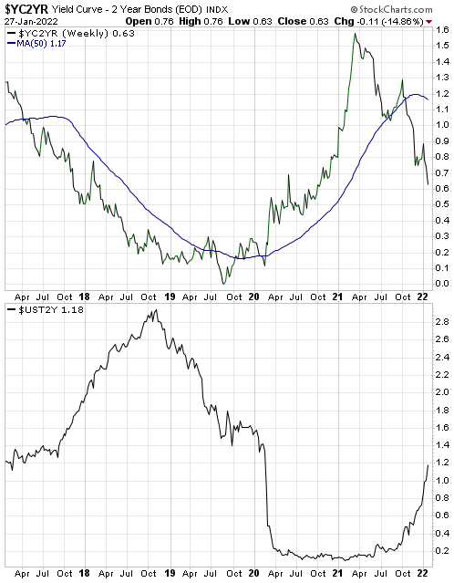
The top section of the following chart shows that the 10yr-2yr yield spread, which is one of the most popular measures of the US yield curve, has been declining (indicating a flattening yield curve) since March of 2021. The bottom section of the same chart shows that the yield-curve flattening has occurred in parallel with a rising 2-year yield, meaning that for the past several months we have had yield curve scenario 3. This is evidence that the boom continues. However, a shift to yield curve scenario 4 (indicating a boom to bust transition) could happen soon.

yieldcurve_blog_280122

Print This Post Print This Post
Revisiting the most important gold fundamental

There are seven inputs to my Gold True Fundamentals Model (GTFM), one of which is an indicator of US credit spreads (a credit spread is the difference between the yield on a relatively high-risk bond and the yield on a relatively low-risk bond of the same duration). In a blog post on 12th April I wrote that if I had to pick just one fundamental to focus on at the moment, it would be credit spreads.

The average credit spread is the most reliable indicator of economic confidence. When economic confidence is high or in a rising trend, credit spreads will be narrow or in a narrowing trend. And when economic confidence is low or in a declining trend, credit spreads will be wide or in a widening trend. It therefore isn’t surprising that over the past 25 years there was a pronounced rise in US credit spreads prior to the start of every period of substantial weakness in the US economy and every substantial gold rally. This is as it should be.

Credit spreads being narrow or in a narrowing trend is a characteristic of an economic boom caused by creating lots of money out of nothing. In fact, the main reason for the popularity of inflation policy (pumping up the money supply) is that the policy initially leads to rising economic confidence as evidenced by narrowing credit spreads. It is only much later that the negative effects of the policy bubble to the surface, but by then enough time will have passed that the link between cause and effect will be obscured and the negative effects can be blamed on exogenous events as opposed to bad policy.

In my 12th April post I included a chart that showed a proxy for the average US credit spread. The chart’s message at the time was that credit spreads had been in a strong narrowing trend (reflecting rising economic confidence) for about 12 months and had become almost as low/narrow as they ever get. This implied that anyone who over the preceding several months had been betting on a large stock market decline or a large rally in the gold price had been betting against both logic and history. I pointed out that economic confidence was probably about as high as it would get, but that it could stay at a high level for more than a year.

An update of the same chart is displayed below. It shows that nothing has changed, in that over the ensuing period credit spreads essentially drifted sideways near their multi-decade lows. This means that the economic boom remains in full swing.

CreditSpread_230621

During an economic boom it isn’t a good idea to trade gold from the long side, except for the occasional multi-month trade after the gold market becomes ‘oversold’ in sentiment and momentum terms. However, if the economic boom is accompanied by rising inflation expectations and interest rates, as is the case with the boom that kicked off last year, it usually will pay to be long industrial commodities in general and energy in particular.

Print This Post Print This Post
When will the next US recession begin?

[This blog post is an excerpt from a TSI commentary published last week]

Our view for the past 11-12 months has been that last year’s US recession ended in June plus/minus one month, making it the shortest recession in US history. The latest leading economic data indicate that the recovery is intact and that the strong GDP growth reported for the first quarter of this year will continue.

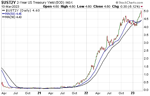
Of particular relevance, the following monthly chart shows that the ISM New Orders Index (NOI), one of our favourite leading economic indicators, remains near the top of its 20-year range. The ISM NOI leads Industrial Production by 3-6 months.

The performances of leading and coincident economic indicators show that the US economy remains in the boom phase of the boom-bust cycle, meaning that the economic landscape remains bullish for industrial commodities relative to gold. Therefore, the small amount of relative strength demonstrated by gold over the past two months is probably part of a countertrend move that will run its course within the next three months.

A year ago our view was that there would be a strong rebound in economic activity fueled by monetary stimulus, fiscal stimulus and the release of pent-up demand after COVID-related restrictions were removed, but that the rebound would be short-lived. Specifically, we were looking for the US economy to recover rapidly during the second half of 2020, level off during the first half of 2021 and return to recession territory by the first half of 2022. This view was revised in response to leading indicators and by October of last year we were expecting the period of strong growth to extend through the first half of 2021.

Based again on leading indicators, we now expect the period of above-average GDP growth to continue throughout 2021, albeit with a slower growth rate during the second half than during the first half. Furthermore, the probability of the US economy re-entering recession territory as soon as the first half of 2022 is now extremely low. To get a recession within the next 12 months there will have to be another shock of similar magnitude to the virus-related lockdowns of 2020.

As far as what happens beyond the first half of next year, it’s largely pointless trying to look that far ahead. One thing we can say is that the current position of the yield curve suggests that the next US recession will not begin earlier than 2023. To further explain this comment we will make use of the following chart of the US 10yr-2yr yield spread, a good proxy for the US yield curve.

A major yield-curve trend reversal from flattening (indicated by a falling line on the chart) to steepening (indicated by a rising line on the chart) generally occurs during the 6-month period prior to the start of a recession. After that, what tends to happen is:

a) The yield curve steepens throughout the recession and for 1-2 years after the recession is over.

b) The yield curve peaks and a long (3-year +) period of curve flattening gets underway.

c) The curve eventually gets as flat as it is going to get and reverses direction, warning that a recession will begin within the ensuing 6 months.

Currently, there is a lot of scope for curve steepening prior to peak ‘steepness’. To be more specific, right now the 10-year T-Note yield is about 1.5% above the 2-year T-Note yield, but previous periods of curve steepening didn’t end until the 10-year T-Note yield was at least 2.5% above the 2-year T-Note yield. Moreover, history tells us that there will be a multi-year period of curve flattening between the peak in yield-curve steepness and the start of a recession.

We expect that the current economic cycle will be compressed, but it still could take years for the yield curve to return to the position where it is warning of recession.

Due to unprecedented manipulation of interest rates it could be different this time, meaning that the end of the current boom could coincide with a yield curve that contrasts with the typical pre-recession picture. However, regardless of what happens to the yield curve near the end of the current boom there will be timely warnings of a boom-to-bust transition in the real-time data, including an upward reversal in credit spreads. At the moment, such warnings are conspicuous by their absence.

Print This Post Print This Post
The US economy is well into the boom phase

[Below is an excerpt from a commentary published at TSI last week. It is our latest monthly review of the short and intermediate term prospects of the US economy. Just to be clear, a boom is defined as a period during which monetary inflation and the suppression of interest rates create the FALSE impression of a strong/healthy economy.]

We think that last year’s US recession ended in June plus/minus one month, making it the shortest recession in US history. The latest data indicate that the recovery is well and truly intact.

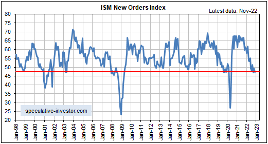
Of particular relevance, the following monthly chart shows that the ISM New Orders Index (NOI), one of our favourite leading economic indicators, remains near the top of its 20-year range following a pullback in January-2021 and a rise in February-2021.

The ISM NOI leads Industrial Production (IP), so it isn’t surprising that the year-over-year percentage change in IP has experienced a rapid rebound from its Q2-2020 trough (refer to the following monthly chart for the details). More importantly, based on the latest NOI number, other leading indicators and the inevitability of additional stimulus from both the Fed and the government, IP’s rebound is set to continue. The IP number for March-2021 will (not might) indicate year-over-year growth.

The performances of leading and coincident economic indicators show that we are well into the boom phase of the boom-bust cycle, meaning that the economic landscape remains bullish for industrial commodities and bearish for gold. Therefore, it’s reasonable to expect the continuation of the rising trend in the GYX/gold ratio (industrial metals relative to gold) clearly evident on the following chart. Be aware, though, that on a short-term basis this trend appears to be over-extended.

The economic strength that was predicted eight months ago by leading indicators and is starting to become apparent in coincident indicators is largely artificial. This means that it will evaporate soon after the Fed is forced by blatant evidence of an inflation problem to end the monetary stimulus.

Our thinking at this time is that the period of strong economic growth will be followed by a period of what is often called “stagflation”, that is, a period when “inflation” accelerates in parallel with slow or no economic growth, because the Fed is not going to stop creating new money at a fast pace and the US government is not going to stop spending at a fast pace anytime soon. If so, then during the post-boom period commodities could continue to do well but gold should outperform almost everything.

However, we’ve learned from bitter experience that during the boom it’s best NOT to look ahead to the inevitable economic denouement. Instead, the focus should be on “making hay while the sun shines”. Near the end of the boom there will be timely warnings in the real-time data, but at the moment such warnings are conspicuous by their absence. This means that the boom should continue for at least another three months and could continue for much longer than that.

Print This Post Print This Post
Gold mining stocks are trades, not investments

[This post is an excerpt from a commentary posted at TSI last month]

Gold mining is — to use technical jargon — a crappy business. It doesn’t have to be, it just works out that way due to irresistible incentives associated with the post-1970 monetary system. We explained why in TSI commentaries and some articles at the TSI Blog (for example, HERE) during 2014-2015.

The explanation revolves around the boom-bust cycle caused by the monetary machinations of the banking establishment (the central bank and the commercial banks). For the economy as a whole, malinvestment occurs during the boom phase of the cycle and the bust phase is when the proverbial chickens come home to roost (the investing mistakes are recognised and a general liquidation occurs). For the gold mining industry, however, the malinvestment occurs during the economy’s bust phase, because the boom for gold mining coincides with the bust for the broad economy.

To further explain, rapid monetary inflation distorts relative price signals and in doing so incentivises investments that for a while (usually at least a few years) create the impression that the economy is powering ahead. Eventually, however, many of these investments are revealed for what they are (ill-conceived), with the revelation stemming from rising costs, declining profits or the absence of profit, resource shortages within the economic sectors that ‘boomed’ the most, and rising short-term interest rates due to a scramble for financing to complete projects and/or deal with cash flow problems.

After it starts to become clear that many of the boom-time investments were based on unrealistic expectations, a general drive to become more liquid gets underway. Many people sell whatever they can in an effort to pay expenses and service debts, thus kicking off an economic bust (recession or depression).

For the average person, becoming more ‘liquid’ usually involves obtaining more cash. However, corporations and high-net-worth individuals often prefer other forms of ‘liquidity’, including Treasury Bills and gold. That, in essence, is why the demand for gold tends to rise during the bust phase of the economy-wide boom-bust cycle.

The rising demand for gold pushes up gold’s price relative to the prices of most other assets and commodities, which elevates the general interest in gold mining. Eventually there will be a flood of money towards the gold mining industry that boosts valuations and that the managers of gold mining companies will use for something. That something will be project developments or acquisitions.

Regardless of how high market valuations move or how costly new mine developments become, gold-mining company managers will never say: “We don’t want your money because there currently are no acquisitions or new projects that make economic sense.” Instead, they will take the money and put it to work, based on the assumption that current price trends can be extrapolated into the distant future. The result invariably will be an artificial boom in the gold mining industry characterised by a cluster of high-cost investments that eventually get revealed as ill-conceived. Massive write-offs and an industry-wide retrenchment will ensue as surely as night follows day, thus obliterating the wealth created by the industry during the boom.

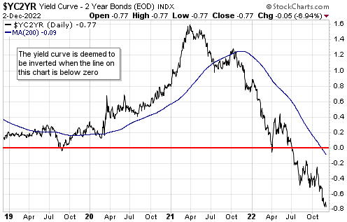
Gold itself is not made less valuable by the monetary-inflation-caused inefficiencies and widespread wastage that periodically beset the gold-mining industry. That’s why the gold mining sector, as represented on the following weekly chart by the Barrons Gold Mining Index prior to 1995 and the HUI thereafter, has been in a downward trend relative to gold bullion since 1968. That’s right — gold mining stocks, as a group, have been trending downwards relative to gold for more than 50 years!

BGMI_gold_291220

The trend illustrated by the above chart is a function of the current monetary system and won’t end before the current system is replaced. The trend could end within the next ten years, but it didn’t end in 2020 and almost certainly won’t end in 2021 or 2022. An implication is that if you want to make a long-term investment in gold, then buy gold. Gold mining stocks are for trading.

Print This Post Print This Post
The inflationary depression of the 2020s

[This blog post is an excerpt from a recent TSI commentary]

The 4-8 year period beginning in February of this year potentially will contain three or more official recessions and come to be referred to as the Depression of the 2020s. If so, unlike the Depression of the 1930s the Depression of the 2020s will be inflationary.

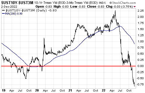
The Depression of the 1930s was deflationary in every sense of the word, but the primary cause of the deflation was the performance of the money supply. We don’t have the data to calculate True Money Supply (TMS) during the 1930s, but we have the following chart showing what happened to the M1 and M2 monetary aggregates from 1920 to 1953. The chart shows that there was a substantial contraction in the US money supply during 1929-1933 and that the money supply was no higher in 1938 than it had been at the start of the decade.

Clearly, the money-supply situation today could not be more different from the money-supply situation during the early-1930s*.

One reason for the difference is that during the 1930s the Fed was restricted by the Gold Standard. The Gold Standard was diluted in 1933, but throughout the 1930s the US$ was tethered to gold.

The final official link between the US$ and gold was removed in 1971. This made it possible for the Fed to do a lot more, but as far as we can tell the Fed actually didn’t do a lot more in the 1990s than it did in the 1960s. It has been just the past 20 years, and especially the past 12 years, that the Fed has transmogrified from an institution that meddles with overnight interest rates and bank reserves to a central planning agency that attempts to micro-manage the financial markets and the economy. After history’s greatest-ever mission creep, it now seems that there is nothing associated with the financial markets and the economy that is outside the Fed’s purview.

In parallel with the expansion of the Fed’s powers and mission there emerged the idea that for a healthy economy the currency must lose purchasing power at the rate of around 2% per year. This idea has come to dominate the thinking of central bankers, but it has never been justified using logic and sound economic premises. Instead, when asked why the currency must depreciate by 2% per year, a central banker will say something along the lines of: “If the inflation rate drops well below 2% then it becomes more difficult for us to implement monetary policy.”

As an aside, because of the way the Fed measures “inflation”, for the Fed to achieve its 2% “inflation” target the average American’s cost of living probably has to increase by at least 5% per year.

Due to the central-banking world’s unshakeable belief that money must continually lose purchasing power and the current authority of the central bank to do whatever it takes to achieve its far-reaching goals, the greater the perceived threat of deflation the more monetary inflation there will be. We saw an example of this during 2001-2002 and again during 2008-2009, but 2020 has been the best example yet. The quantity of US dollars created since the start of this year is greater than the entire US money supply in 2002.

It actually would be positive if deflation were the high-probability outcome that many analysts/commentators claim it is, because deflation is relatively easy to prepare for and because 1-2 years of severe deflation would set the stage for strong long-term growth. However, one of today’s dominant driving forces is the avoidance of short-term pain regardless of long-term cost, so there will be nothing but inflation until inflation is perceived to be the source of the greatest short-term pain. This doesn’t mean that a depression will be sidestepped or even postponed. What it means is that the next depression — which may have already begun — will be the inflationary kind.

*US True Money Supply (TMS) has expanded by 35% over the past 12 months.

Print This Post Print This Post