Full width

Commodities versus Gold

May 31, 2024

[This blog post is an excerpt from a recent commentary published at www.speculative-investor.com]

Gold is no longer money in the true meaning of the word*, but it still trades more like a currency than a consumable commodity and therefore should be analysed as a currency. In fact, in a currency hierarchy we would put gold at the top, then the US$, then a big drop to the euro, then another big drop the other major currencies. Consequently, it makes sense to analyse markets in gold terms as well as in terms of the US$ and other currencies, which is something we do regularly. For example, we pay close attention to the performances of the S&P500 Index (SPX) and the Spot Commodity Index (GNX) in gold terms. Now we are going to look at one aspect of the relationship between commodity prices in US$ terms and commodity prices in gold terms.

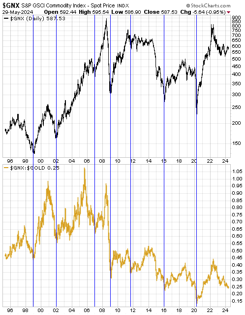
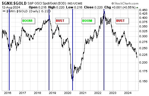
The following chart compares the general level of commodity prices in US$ terms (as represented by GNX) with the general level of commodity prices in gold terms (as represented by the GNX/gold ratio). The point we want to highlight today is that since 1995, GNX has made cycle lows in US$ terms and gold terms at the same time. These important lows are indicated by the vertical blue lines drawn on the chart.

Each of the lows in GNX and GNX/gold indicated by the vertical blue lines coincided with a recession and/or some form of debt crisis. Specifically, the April-2020 low coincided with the COVID crisis/recession, the January-2016 low coincided with the climax of the debt crisis in the US shale-oil sector, the late-2011 low coincided with the euro-zone sovereign debt crisis, the early-2009 low coincided with the climax of the Global Financial Crisis, the January-2007 low coincided with the climax of the initial phase of the US housing/mortgage bust, the early-2002 low coincided with the collapse of the dot.com equity bubble and the end of the 2001 recession, and the late-1998 low coincided with the climax of the Russian debt crisis and LTCM blow-up.

If past is prologue, then GNX won’t bottom in US$ terms until it has bottomed in gold terms. So, has GNX bottomed relative to gold?

As mentioned above, in the past the GNX/gold ratio has bottomed in parallel with a recession and/or some form of debt crisis, both of which are likely outcomes within the next 12 months but neither of which has happened during the current cycle. Therefore, there’s a good chance that the bottom for GNX still lies ahead and that the recent commodity rally is a countertrend move within an on-going cyclical decline.

*Money is defined by its function, not its physical characteristics. It is the general medium of exchange or a very commonly used medium of exchange within an economy. This means that if something is money it will be readily accepted by almost everybody in payment for goods, services, debts and assets. Other definitions have been concocted in an attempt to make the case that gold is still money, but all of these definitions are impractical.

Print This Post Print This Post

Gold and US Politics

May 21, 2024

[This blog post is an excerpt from a commentary published last week at www.speculative-investor.com.]

In the 11th March Weekly Update we noted that the rise in the US$ gold price in the face of tight US monetary policy and high (by the standards of the past decade) real US interest rates implied concern about what’s likely to happen to the US$ in the future. We went on to write:

At the moment this concern probably has more to do with the US government’s debt quantity spiralling out of control than the risk of the US economy entering recession in the near future. The underlying cause of concern, we suspect, is that the current administration appears to be willing to borrow/spend with complete abandon in its efforts to retain power, and there is no evidence that limiting the pace of government debt expansion is a priority on the other side of the political aisle.

As an example of what was being done to boost his re-election prospects, we mentioned the $10,000 tax credit for first-time home buyers that had just been proposed by President Biden. Here are some additional examples from the past month:

1) A new rule has expanded the definition of a “Public Assistance Household”, which, in turn, expands the number of households eligible for Supplemental Security Income (SSI). The new rule will go into effect on 30th September-2024 (about one month prior to the election) and probably will increase the number of SSI recipients from 7.5M to more than 40M.

2) Government Sponsored Enterprise (GSE) Freddie Mac has put forward a proposal that would enable it to buy second lien mortgages. As explained in the article posted HERE:

The aim is for Freddie to start buying fixed-rate second liens potentially by this summer, giving borrowers a way to tap an estimated $32 trillion of equity built up in U.S. homes in recent years. If approved, it would open the door for more borrowers to extract cash from their homes, without having to refinance at current 30-year fixed mortgage rates of about 7.2%.

If Freddie Mac’s proposal goes ahead it could inject as much as $850B into the economy. If Fannie Mae, another GSE operating in the US home mortgage market, were to follow suit then the total amount injected could be close to $2 trillion. Therefore, this is potentially a very big deal.

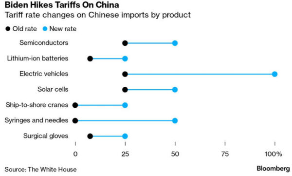
3) Earlier this week President Biden announced large tariff increases on products imported from China. The tariff hikes, which include an increase from 27.5% to 102.5% (!!) on the tariff applied to China-made Electric Vehicles (EVs), are illustrated by the following graph from the Bloomberg article posted HERE.

Tariffs are paid by the buyers (ultimately US consumers in this case), not the sellers, so the main effect of this week’s tariff increases will be higher prices in the US for some products, especially products associated with the so-called “energy transition”. The hope, of course, is that even though the economic effects of this initiative probably will be negative, the optics will prove to be favourable. In other words, the hope is that the tariff change will create the general impression that the Administration is taking actions that will help the US economy even if the opposite is true. Unfortunately, there is also a lot of support for tariffs on the other side of the US political aisle.

All of the above actions will result in the popular measures of inflation (e.g. the CPI) being higher over the next couple of years than otherwise would be the case, but if it goes ahead the one that will have the biggest effect on the financial markets in both the short-term and the long-term is opening the door for GSEs to purchase second lien mortgages. As mentioned above, this could result in almost $2 trillion being injected into the US economy. The monetary injection would occur over a period of years, but if Freddie Mac’s proposal soon gets approved then the financial world will start discounting the likely effects immediately. The effects would be bearish for the US$ and bullish for most assets and commodities priced in US dollars, including gold.

Print This Post Print This Post

Gold Market Update

April 23, 2024

[Here is a brief excerpt from a commentary published at www.speculative-investor.com on 21st April 2024]

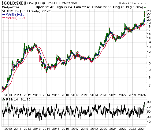
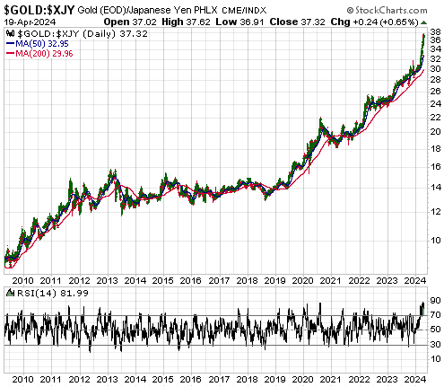
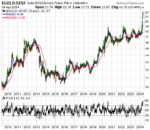
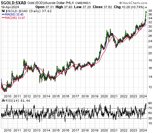
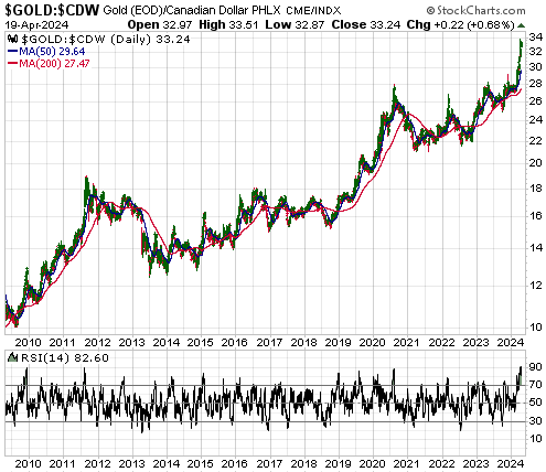
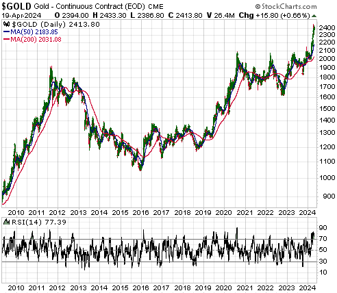
Gold recently became extremely overbought in momentum terms against ALL major fiat currencies. For example, the following daily charts show that based on the daily RSI(14), a momentum indicator included at the bottom of each chart, gold recently became as stretched to the upside as it was at any time over the past 15 years, including at the 2011 major peak, relative to the euro, the Yen, the Swiss franc, the Australian dollar and the Canadian dollar. Looking at it from a different angle, in momentum terms the euro, the Yen, the Swiss franc, the Australian dollar and the Canadian dollar recently became as stretched to the downside relative to gold as they have been at any time over the past 15 years.

Against the US$ gold did not become quite as stretched to the upside in momentum terms, because the US$ recently weakened by less than the other major currencies.

With gold having just hit a rare overbought extreme against all major fiat currencies, the probability is high that the gold price has either just set a multi-month price top or will soon do so. For two main reasons, however, it’s unlikely that the April-2024 extreme will mark the end of the cyclical rise in the gold price (meaning: the end of the cyclical decline in fiat currency).

The first reason is sentiment as indicated by the COT data, which still shows a healthy degree of speculator scepticism. Of particular relevance, despite gold’s spectacular recent price rise the collective net-long position of small traders (the proverbial dumb money) in gold futures remains not far from a 14-month low.

The current sentiment situation suggests that there is still a lot of scope for speculator long accumulation.

The second reason is the high probability that the fundamental backdrop as indicated by our Gold True Fundamentals Model (GTFM) will shift in gold’s favour over the next several months.

The GTFM turned bearish during the week before last due to a rise in the 10-year TIPS yield (a real interest rate proxy), but it returned to neutral last week due to the breakdown in the XLY/XLP ratio mentioned in the Stock Market section of today’s report. It stands a good chance of turning bullish in the not-too-distant future, because 1) a shift within the stock market from risk-on to risk-off has been confirmed, 2) US economic data probably will have a weakening trend, 3) the Fed (meaning: Powell) is looking for an excuse to loosen monetary policy, and 4) the Biden administration will be ‘pulling out all stops’ to make the economy appear healthy during the lead-up to the November-2024 election.

Print This Post Print This Post

An update on the “investment seesaw”

March 26, 2024

[This blog post is an excerpt from a recent commentary at specuative-investor.com]

We consider gold bullion and the S&P500 Index (SPX) to be effectively at opposite ends of an investment seesaw, with the SPX doing better when confidence in money, central banking and government is rising and gold doing better when confidence in money, central banking and government is falling. As discussed in a few TSI commentaries and blog posts over the past two years (for example, HERE), our investment seesaw concept was part of the inspiration for the Synchronous Equity and Gold Price Model (SEGPM) created by Dietmar Knoll.

In general terms, the SEGPM uses historical data to define a quantitative relationship between the SPX, the US$ gold price and the US money supply. More specifically, it is based on the fact that adding the SPX to 1.5-times the US$ gold price (and applying a scaling factor) has, over the long-term, resulted in a number that tracks the US money supply. Consequently, it indicates the extent to which the combination of the US stock market and gold is currently under/over-valued compared to the money supply and can provide clues regarding likely future price levels for gold and the SPX. For example, a forecast of likely future levels for the SPX and the money supply would project a likely future level for the US$ gold price.

The following monthly chart shows our version of the SEGPM. On this chart, the red line is US True Money Supply (TMS) and the blue line is the Gold-SPX Model (the sum of the S&P500 Index and 1.5-times the US$ gold price, multiplied by a scaling factor).

The Model’s current message is that at today’s levels of the money supply and the SPX, the gold price (around US$2150) is in the right ballpark. A much higher ‘fair value’ for gold would require a larger money supply and/or a lower SPX. For example, if the money supply were 5% larger and the SPX were around 4200 (about 20% lower than it is today), the Model would indicate a ‘fair value’ for gold of around US$3200/oz.

In the middle of last year (the last time we discussed the Gold-SPX Model) we thought that the low-$3000s for the US$ gold price was a plausible target for the first half of this year. While it is not out of the question that this target will be reached during the first half of this year, this is no longer a likely scenario because the SPX has performed much better than we thought it would. However, there is a good chance that the low-$3000s will be reached before the end of this year.

Print This Post Print This Post

The US economic bust continues, but a recession has been delayed

March 12, 2024

[This blog post is a brief excerpt from a commentary published at speculative-investor.com last week]

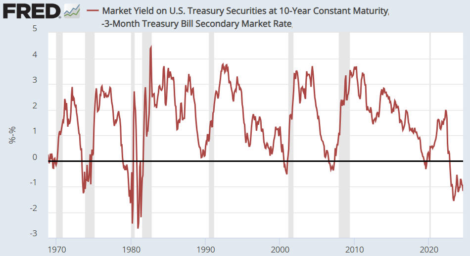
The combination of the ISM Manufacturing New Orders Index (NOI) and the yield curve, our two favourite high-frequency leading indicators of US recession, has been warning of imminent recession since September-2023. Clearly, the warning has not been timely in that no recession has materialised yet. Furthermore, a month ago we noted that while the message of the yield curve was unchanged, the NOI had just risen by enough to move well above its recession demarcation level of 48. Although this did not cancel its recession warning (it would have to move above 55 to do so), January’s rise to 52.5 was unexpected. Have subsequent data provided useful new clues?

The answer is yes and no. The following monthly chart shows that the NOI turned back down in February, meaning that its recession warning is intact. At the same time, the SPX made a new all-time high as recently as Monday 4th March. As previously advised, it would be unprecedented for the SPX to make a new 52-week high AFTER the official recession start time.

This means that recession warnings remain in place, but the earliest time for the start of a recession has been pushed out again. Specifically, the March-2024 new high for the SPX suggests that a recession will not start any sooner than May-2024.

By our reckoning, during the first half of 2022 the US economy entered the bust phase of the economic boom-bust cycle caused by monetary inflation (rapid monetary inflation causes a boom that inevitably is followed by a bust as the receding monetary tide exposes the boom-time mal-investments). The bust phase almost always culminates in a recession, although it doesn’t have to.

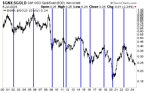
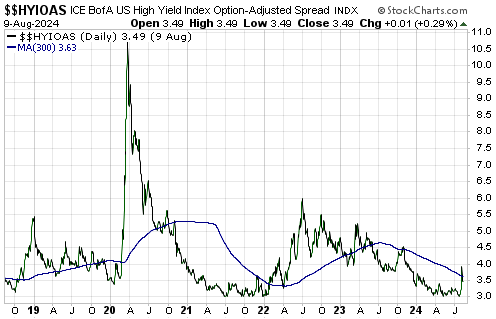
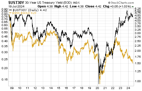
So far, the performances of commodity prices in both US$ terms and gold terms are consistent with an economy in the bust phase, in that the GSCI Spot Commodity Index (GNX) made a 2-year low in US$ terms in December-2023 and currently is near a 3-year low in gold terms. The following daily chart shows GNX in gold terms. What’s not consistent with the bust phase are credit spreads, which have returned to their boom-time levels. Note that the narrowness of credit spreads and the strong upward trend in the stock market are linked, in that they are both symptomatic of a widespread view that a new boom will begin without a preceding severe economic downturn.

The above-mentioned conflict will have to be resolved over the months ahead by credit spreads widening substantially in response to evidence of economic weakness or by the prices of industrial commodities rising substantially in response to evidence that a new boom has been ignited. We think that the former is by far the more likely outcome.

Print This Post Print This Post

Are gold mining stocks cheap?

February 1, 2024

[This blog post is an excerpt from a recent commentary at speculative-investor.com]

The HUI peaked at over 600 way back in 2011 with the gold price about $100 lower than it is today. However, this provides no information whatsoever regarding the HUI’s current value or upside potential. The reason is that the average cost of mining gold is much higher now than it was in 2011. Due to the ever-increasing cost of mining gold, over time it takes a progressively higher gold price to justify the same level for the HUI. Putting it another way, due to the increasing costs of mining gold and building new gold mines, the price of the average gold mining share is in a long-term downward trend relative to the price of gold. An implication is that the HUI isn’t necessarily cheap today just because it happens to be more than 60% below its 2011 level.

Over periods of two years or less, however, the ratio of a gold mining index such as the HUI to the price of gold bullion can be indicative of whether gold stocks are cheap or expensive. This is because the average cost of mining gold usually doesn’t change by a lot over periods of less than two years.

The following daily chart of the HUI/gold ratio suggests that at the moment they are cheap. In particular, the chart shows that at the end of last week the HUI/gold ratio was near the bottom of its 2-year range — very close to where it bottomed in September-2022 and October-November-2023.

This doesn’t mean that a substantial rally is about to begin. On the contrary, in the absence of a major geopolitical scare we doubt that there will be anything more than a countertrend rebound over the next few weeks. This is because the risk-on trend is still very much intact in the stock market, the gold/oil ratio has begun to trend downward due to temporary strength in the oil market and a downward correction in the bond market has not yet run its course. What it means is that in the short-term there is not much additional scope for gold mining stocks to weaken relative gold.

By the way, we did not expect that the HUI/gold ratio would re-visit its 2022-2023 lows at this time. Our expectation was for a normal correction from the late-December high, which would have taken the HUI/gold ratio no lower than its 40-day MA (the blue line on the chart) before the short-term upward trend resumed.

Gold mining stocks also look cheap at the moment relative to general mining stocks. This is evidenced by the following chart, which shows that the GDX/XME ratio has almost dropped back to its lows of 2022 and 2023 even though gold has been trending upward relative to the Industrial Metals Index (GYX) since the first half of 2022. The comparison of the GDX/XME ratio and the gold/GYX ratio suggests that gold stocks have some catching up to do.

A cycle peak for the GDX/XME ratio is ‘due’ this year, so the catching-up should begin soon. We suspect that gold mining stocks will reach their next cycle peaks relative to general mining stocks in the same way that a character in an Ernest Hemmingway novel described how he went bankrupt: “Gradually and then suddenly.”

So, a reasonable argument can be made that gold mining stocks, as a group, are cheap right now. At least, on an intermediate-term basis they are cheap relative to gold bullion and general mining stocks. This provides no information about likely performance over the next few weeks but creates a good set-up for large gains to be made within the next six months.

Print This Post Print This Post
The “Transitory Inflation” Myth

January 16, 2024

[This blog post is an excerpt from a recent commentary at speculative-investor.com]

The year-over-year growth rate of the US CPI was reported last Thursday to be 3.4%. This was 0.3% higher than the number reported for the preceding month and 0.2% higher than the average forecast, but the overall picture (refer to the chart below) is unchanged. The downward trend that began in June of 2022 is intact and we expect that the 2023 low will be breached during the first quarter of this year. However, the main purpose of this discussion is not to delve into the details of the latest CPI calculation but to debunk the persistent idea that the price inflation of 2020-2022 was mainly due to supply disruptions.

The idea that the price inflation of 2020-2022 was transitory and mainly due to supply disruptions is absurd, but many smart people continue to tout this wrongheaded notion. Based on the above chart a reasonable argument can be made that the rapid PACE of inflation (currency depreciation) was transitory, but not the inflation itself. Let’s consider what would have happened if disrupted supply actually had been the dominant driver the high “inflation” of the past few years.

The following chart shows the price of natural gas in Europe. This is an example of what happens when a supply disruption is the main cause of a large price rise. After the supply issue is resolved, the price falls back to near where it was prior to the disruption.

By the way, there are many commodities that over the past few years experienced spectacular price rises due to disrupted supply followed by equally spectacular price declines. We could, for instance, make the same point using a price chart of oil, wheat or coal.

The next chart shows the US Consumer Price Index (the index itself, as opposed to a rate of change). This chart makes the point that on an economy-wide basis, NONE of the currency depreciation of 2020-2022 has been relinquished. In fact, prices in general continue to rise, just at a slower pace.

It’s happening this way because the main driver of the inflation was a huge increase in the money supply combined with a huge increase in government deficit spending. In effect, all of the purchasing power loss that has occurred to date has been locked in and the best that people can expect from here is for their money to lose purchasing power at a reduced pace. In this respect the inflation is operating the same way as compound interest, except that instead of getting interest on interest people are experiencing cost-of-living increases on top of previous cost-of-living increases.

So, when someone tells you that supply disruptions were the main reason for the large general increase in prices, ask them why the general level of prices didn’t drop after the supply disruptions went away. And why are we now getting more price increases on top of the price increases of the past?

Print This Post Print This Post

Commodity Prices and the War Cycle

January 12, 2024

[This blog post is an excerpt from a recent commentary at speculative-investor.com]

Over the past few hundred years there has been a relationship between the extent of global military conflict and secular trends in commodity prices, with secular upward trends in commodity prices coinciding with increases in both the frequency and amplitude of military conflict. We’ve covered this topic in the past, but not recently (the most recent discussion was in 2017). Due to what has happened over the past two years, this is a good time for a revisit.

In his book “War Cycles Peace Cycles”, Richard Kelly Hoskins discussed the aforementioned relationship and presented a chart similar to the one displayed below. The chart depicts the secular trends in commodity prices over the past 260 years. Hoskins explained that most of the important military conflicts occurred during the up phases on the chart, and therefore referred to the secular commodity-price uptrends as “war cycles”. The secular commodity-price downtrends were termed “peace cycles”.

A plausible explanation for why long-term advances in commodity prices are accompanied by a general increase in military conflict is that war leads to more monetary inflation, government spending and government intervention in the economy, as well as large-scale resource wastage and supply disruptions — the perfect recipe for higher commodity prices. In addition, when structures get destroyed by war, the commodities that are embedded in these structures are destroyed and eventually get replaced as part of a rebuilding process, causing a large temporary increase in commodity demand. There is also a feedback mechanism whereby military conflict and the associated monetary inflation bring about higher commodity prices, while higher commodity prices add to international tensions and increase the probability of military conflict.

A new “war cycle” began with the secular low for commodity prices in 1999 and has been marked, to date, by the 9/11 terrorist attacks, the Afghanistan and Iraq Wars, the nebulous “War on Terror”, the “Arab Spring” uprisings, the overthrow of Libya’s government, the rise of the Islamic State organisation, an initial increase in tensions between “the West” and Russia in 2008 related to the expansion of NATO (in particular, talk of adding Ukraine and Georgia to NATO) and culminating in the annexation of Crimea by Russia in 2014, a long and devastating war in Yemen involving Yemeni factions and Saudi Arabia, a war in Syria, China’s provocative expansion in the South China Sea, a further increase in tensions between the West and Russia leading to Russia’s invasion of Ukraine in 2022, the Israel-Hamas war that began in October-2023 and the recent Houthi attacks on ships in the Red Sea.

At this stage the current war cycle has lasted about 25 years, while the average length of a war cycle during the period covered by the above chart is 33 years. Therefore, the historical record indicates that if the current cycle is close to the average length then we can ‘look forward’ to another 8 years or so of rising commodity prices and increasing geopolitical conflict.

Print This Post Print This Post
Seven rate cuts priced in for next year

December 28, 2023

[This blog post is an excerpt from a commentary published at speculative-investor.com about one week ago]

The latest calculation of the Personal Consumption Expenditures (PCE) Index, an indicator of “inflation”, was reported on Friday morning (22nd December) in the US. The following chart shows that the latest number extended the downward trend in the index’s year-over-year (YOY) growth rate, which is now 2.6%. Moreover, the “core” version of the PCE Index, which apparently is the Fed’s favourite inflation gauge, has risen at an annualised rate of only 1.9% over the past six months. This essentially means that the Fed’s inflation target has been reached. What does this mean for the financial markets?

An implication of the on-going downward trends in popular indicators of inflation is that the Fed will slash its targeted interest rates next year. That’s a large part of the reason why the stock and bond markets have been celebrating over the past two months.

It’s important to understand, however, that the markets already have priced in a decline in the Fed Funds Rate (FFR) from 5.50% to 3.75% (the equivalent of seven 0.25% rate cuts). This means that for the rate-cut celebrations to continue, the financial world will have to find a reason to price in more than seven rate cuts for next year. Not only that, but for the rate-cut celebrations to continue in the stock market the financial world will have to find a reason to price in more than seven 2024 rate cuts while also finding a reason to price in sufficient economic strength to enable double-digit corporate earnings growth during 2024. That’s a tall order, to put it mildly.

Our view is that the Fed will end up cutting the FFR to around 2.0% by the end of next year, meaning that we are expecting about twice as much rate cutting as the markets currently have priced in. The thing is, our view is predicated on the US economy entering recession within the next few months, and Fed rate-cutting in response to emerging evidence of recession has never been bullish for the stock market. On the contrary, the largest stock market declines tend to occur while the Fed is cutting its targeted rates in reaction to signs of economic recession.

Fed rate cuts in response to emerging evidence of recession are, however, usually bullish for Treasury securities and gold. That’s why we expect the upward trends in the Treasury and gold markets to continue for many more months, with, of course, corrections along the way.

Print This Post Print This Post
Why gold stocks underperform gold bullion

November 28, 2023

[This is a modified excerpt from a recent commentary at speculative-investor.com]

Gold bullion could be viewed as insurance or a portfolio hedge or a long-term investment or a long-term store of value, but a gold mining stock is none of these.

Gold mining stocks always should be viewed as either short-term or intermediate-term trades/speculations. During gold bull markets, you scale into them when they are oversold or consolidating and you scale out of them when they are overbought. The scaling in/out process obviates the need for accurate short-term timing, which is important because, as anyone who has followed the sector for many years will know, gold mining stocks tend to go down a lot more and up a lot more than initially expected.

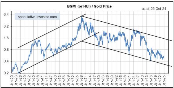
We include the following chart in a TSI commentary about once per year to remind our readers why gold mining stocks always should be viewed as trades. The chart shows more than 100 years of history of gold mining stocks relative to gold bullion, with gold mining stocks represented by the Barrons Gold Mining Index (BGMI) prior to 1995 and the HUI thereafter. The overarching message here is that gold mining stocks have been trending downward relative to gold bullion since 1968, that is, for 55 years and counting.

We’ve explained in the past that the multi-generational downward trend in the gold mining sector relative to gold is a function of the current monetary system and therefore almost certainly will continue for as long as the current monetary system remains in place. The crux of the matter is that as well as resulting in more mal-investment within the broad economy than the pre-1971 monetary system, the current monetary system results in more mal-investment within the gold mining sector.

Mal-investment in the gold mining sector involves ill-conceived acquisitions, mine expansions and new mine developments that turn out to be unprofitable, building mines in places where the political risk is high, and gearing-up the balance-sheet when times are good. It leads to the destruction of wealth over the long term. Physical gold obviously isn’t subject to value loss from mal-investment, hence the long-term downward trend in gold mining stocks relative to gold bullion.

The difference between the gold mining sector and most other parts of the economy is that the biggest booms in the gold mining sector (the periods when the bulk of the mal-investment occurs) generally coincide with busts in the broad economy, while the biggest busts in the gold mining sector (the periods when the ‘mal-investment chickens come home to roost’) generally coincide with booms in the broad economy. The developed world, including the US and much of Europe, currently is in the bust phase of the economic cycle, meaning that we are into a multi-year period when a boom is likely in the gold mining sector.

Print This Post Print This Post
New Recession Warnings

November 22, 2023

[This blog post is an excerpt for a commentary published at speculative-investor.com on 19th November 2023]

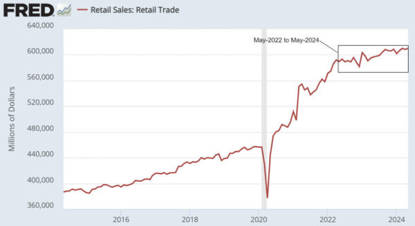
There was a government-spending-fuelled burst of economic activity in the US during the third quarter of this year that led to a high GDP growth number being reported for the quarter, but signs of weakness are now appearing in coincident economic indicators.

The most important of the aforementioned signs is the rise in Continuous Claims for Unemployment Insurance. With reference to the following weekly chart, Continuous Claims bottomed in September-2022, moved higher into April of this year, dropped back to a higher low during September and has just confirmed an upward trend by moving above its April-2023 high. This is consistent with our view that a US recession will begin before the end of this year, although based on the historical record the recession start date won’t become official until the second half of next year.

Another sign is the decline in the year-over-year (YOY) growth rate of Industrial Production (IP) to negative 0.70%, the lowest level since February-2021. The YOY growth rate of IP in October-2023 is similar to where it was in the month before the start of the 2001 recession and is well below where it was at the start of the 2007-2009 recession. Below is a chart of this coincident economic indicator.

It probably will be many months before the US coincident economic data become consistently weak. In the meantime, we expect to see — and should see, if our current outlook is correct — a gradual increase in the proportion of economic statistics that are worse than generally expected. We also expect to see a gradual shift away from the “soft landing” narrative (the belief that the US economy will make it through the monetary tightening without a recession) towards the recession narrative.

A few weeks ago (refer to the 30th October Weekly Update) we noted early signs that the financial world was starting to move away from the soft landing scenario. One of the indicators that we are tracking to check that this shift remains in progress is the January-2025 Fed Funds Futures (FFF) contract, a daily chart of which is displayed below. Note that the line on this chart moves in the opposite direction to interest rate expectations.

The substantial downward move on this chart from early-May through to mid-October reflects a major increase in the popularity of the soft landing scenario, while the relatively small upward move over the past few weeks is tentative evidence that a shift towards general belief in a less innocuous economic outcome has begun.

At this time, the soft landing narrative remains dominant. That’s why the SPX has rebounded to within 2% of its high for the year and the January-2025 FFF contract has retraced only a small part of its May-October decline. However, we expect that belief in a soft landing will dissipate over the next six months, leading to a substantial decline in the stock market and a substantial rise in the US$ gold price.

Print This Post Print This Post
Why junior gold mining stocks have performed so poorly

November 16, 2023

[This blog post is a brief excerpt from a recent commentary published at speculative-investor.com]

Why has the junior end of the gold mining world performed so poorly over the past two years. In particular, why has it performed so poorly over the past 12 months in parallel with a relatively strong gold market?

Understanding why begins with understanding that in the absence of a mining operation that can be used to PROFITABLY extract it from the ground, gold in the ground has option value only. The option could be valued by the market at almost zero or a lot depending on many factors, the most important variable being the public’s desire to speculate. Furthermore, a gold mining operation that generates losses year after year also has option value only, with the public’s desire to speculate again being the most important determinant of the option’s market value.

In other words, with the relatively illiquid stocks it comes down to the general public’s desire to speculate.

Hedge funds usually will focus on gold mining ETFs or the larger-cap gold stocks because they need the liquidity. Wealthy professional investors such as Eric Sprott typically will take positions via private placements with the aim of eventually exiting via a liquidity event such as a takeover. It’s the general public that determines performance at the bottom of the food chain and over the past two years the public has become progressively less interested in speculating. Hence, the market values of stocks with option value only have become a lot cheaper.

Although during the course of this year we have suggested directing most new buying in the gold sector towards profitable producers, we are still interested in gold stocks that have option value only. These are the stocks that will generate by far the largest returns after the general public starts getting interested in the sector. However, sparking that interest probably will require a minimum of all-time highs in the US$ gold price and gold mining indices such as the HUI breaking above their H1-2023 highs, which probably won’t happen until the first half of next year. In fact, based on the historical record, sparking the general public’s interest in speculative gold mining stocks could require the broad stock market to begin discounting the combination of a recovery from recession and much easier monetary conditions, which possibly won’t happen until the first half of 2025.

Until then, most (not all) new buying in the gold sector should be directed towards profitable producers, that is, towards the stocks of real businesses. But, only when they are oversold or consolidating. Don’t get excited and buy them after they have just gone up a lot.

Print This Post Print This Post