Full width

Gold Inflation

November 12, 2018

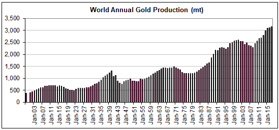
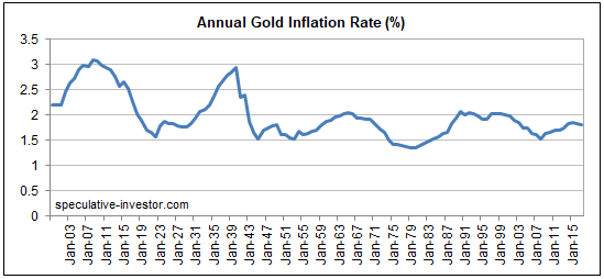
Here are two long-term charts illustrating the annual rate at which gold is extracted from the ground. The second of these charts shows why mine production can be ignored when trying to understand what happened to the gold price over the preceding few years or figure out what’s likely to happen to the gold price over the next few years.

The first chart shows the amount of gold produced by the global mining industry during each year from 1900 through to 2017 (data sourced from the US Geological Survey). The second chart shows the percentage increase in the world’s above-ground gold supply during each year (1900-2017) resulting from that year’s new mine production. In effect, the second chart shows the gold inflation rate.

Notice that over the past 70 years the annual rate of gold inflation has almost always been between 1.5% and 2.0% and has never strayed far from the 1.5%-2.0% range. In other words, regardless of what’s happening in the world, the total supply of gold increases by approximately the same tiny amount each year.

Over the past 60 years, trend changes in the annual rate of gold inflation appear to be lagged reactions to major price changes, with the 7-10 year lag being due to the time it takes from a major price-related incentive to appear and new mines to be brought into production. For example, the upward trend in the gold inflation rate that began in the early-1980s was probably a reaction to the major price advance that began in the early-1970s.

goldprodn_121118

goldinflation_121118

Print This Post Print This Post

The stocks-bonds interplay

November 2, 2018

It’s normal for the stock market to ignore a rising interest-rate trend for a long time. The reason is that while the interest rate is a major determinant of the value of most corporations, the interest rate that matters for equity valuation isn’t the current one. What matters is the level of interest rates for a great many years to come. Therefore, a rise in interest rates only affects the stock market to the extent that it affects the general perception of where interest rates will be over the next decade or longer.

To further explain, the value of a company is the sum of the present values of all its future cash flows, with the present value of each future cash flow determined via the application of a discount rate (interest rate). Nobody knows what these cash flows will be or what the appropriate discount rate should be, but guesses, also known as forecasts, are made. Clearly, when discounting a set of cash flows spanning, say, the next 30 years, it won’t make sense to simply use the current interest rate. Instead, the analyst doing the calculation will have to make a stab at what will happen to interest rates in the future.

The analyst’s ‘stab’ naturally will be influenced by what is happening in the present, but the future interest rate levels that are plugged into valuation models won’t be adjusted in response to what are considered to be normal fluctuations in the current interest rate. It’s only when the current interest rate breaks out of an established range that it affects expectations in a big way.

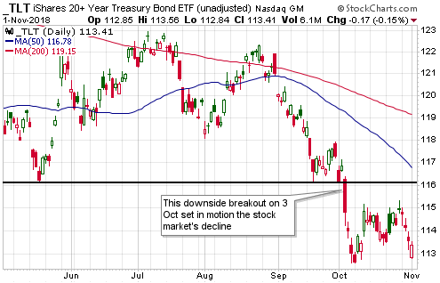
That, in a nutshell, is why it isn’t a fluke that the 3rd October downside breakout in the bond market (represented by TLT in the following chart) coincided with the start of a rapid downward re-pricing in the stock market.

TLT_011118

In addition to stocks being influenced by big moves (breakouts from ranges) in bonds, bonds are influenced by big moves in stocks. That’s especially so when important stock-market support levels are breached with little warning. For example, within a few days of the 3rd October downside breakout in the bond market setting in motion a sharp decline in the stock market, the stock market’s weakness was helping to prop-up the bond market. Interestingly, though, the quick 10% decline in the S&P500 Index from its peak led to only a minor rebound in the bond market, despite there being a record-high speculative net-short position in bond futures. As illustrated above, TLT didn’t even manage to rebound by enough to test its 3rd October downside breakout and has dropped back to near its early-October low in response to this week’s recovery in the stock market.

The bond market’s lacklustre response to the recent equity weakness suggests that equities will have to weaken further before the interest-rate trend transforms from a stock-market head-wind to a stock-market tail-wind. Also, the fact that the bond market has already dropped back to near its October low suggests that the stock market will be unable to make significant additional gains without pushing interest rates to new multi-year highs. This, in turn, suggests that there is minimal scope for additional short-term strength in the stock market.

Print This Post Print This Post

Revisiting the age-old relationship between interest rates and prices

October 22, 2018

There is an age-old relationship between prices and interest rates that Keynesian economists have called a paradox (“Gibson’s Paradox”). The relationship was clearer during the Gold Standard era, but as I explained in a previous post it is still apparent if prices are measured in gold.

To understand “Gibson’s Paradox” and why it actually isn’t a paradox, refer to the earlier post linked above. Suffice to say that when money is sound or at least a lot sounder than it is today, interest rates don’t drive prices and prices don’t drive interest rates; instead, on an economy-wide basis both prices (in general) and risk-free interest rates are driven by changes in societal time preference. Moreover, as mentioned above and explained in my earlier post, even with today’s massive, continuous manipulation of interest rates by central banks the relationship is still evident, but only when interest rates are compared to a wholesale price index denominated in gold.

The commodity/gold ratio is the price of a broad-based basket of commodities in gold terms. In essence, it is a wholesale price index using gold as the monetary measuring stick. Also, the risk-free US interest rate that is least affected by the direct manipulation of the Fed is the yield on the 30-year T-Bond, so if the age-old relationship still works then what we should see is a positive correlation between the commodity/gold ratio and the T-Bond yield. Or, looking at it from a different angle, what we should see is a positive correlation between the gold/commodity ratio and the T-Bond price. That’s exactly what we do see.

Using the Goldman Sachs Spot Commodity Index (GNX) to represent commodities, the following chart shows that the age-old relationship has worked over the past 12 years when gold is the monetary measuring stick.

gold_USB_LT_221018

The next chart zooms in on the most recent 2 years and shows that over the past three weeks there has been a significant divergence, with the gold/commodity ratio turning upward and the T-Bond price staying on a downward path. It’s a good bet that this divergence will be eliminated within the next two months via either a decline in the gold/commodity ratio to a new multi-year low or a rebound in the T-Bond. My money is on the latter.

gold_USB_221018

Print This Post Print This Post

Credit spreads and the stock market

October 16, 2018

This post was prompted by a recent article authored by the always thought-provoking Pater Tenebrarum (a pseudonym) at acting-man.com. The article looks at the relationship between credit spreads and the stock market, in particular the historical tendency for credit spreads to begin widening prior to substantial stock market declines and thus to act as timely warning signals of impending stock market trouble. The conclusion is: “…it seems…more likely that a stock market decline will put pressure on junk bonds, instead of weakness in junk bonds providing advance warning of an impending stock market decline. The stock market sell-off in the past week did in fact very slightly lead a surge in high yield spreads.” I don’t know that this conclusion is wrong, but at this time the evidence to support it is not persuasive.

It first should be understood that credit spreads generally begin widening ahead of bear markets, but they generally DON’T lead short-term stock-market corrections. Therefore, the fact that they didn’t warn of the October-2018 sell-off is not meaningful at this time. It will become meaningful only if the October-2018 sell-off proves to be the first decline in a bear market, which is unlikely.

The fact that the most recent stock market sell-off appeared to slightly lead an up-tick (not a surge) in high yield spreads is also not meaningful. The following chart shows that junk bonds often trend with equities (the chart compares the iShares High Yield Corporate Bond ETF with the S&P500 ETF), so actually it is normal for short-term stock market corrections to go hand-in-hand with minor expansions of credit spreads. That’s what happened over the past 2 weeks, what happened in January-February of this year and what happened on numerous other occasions in the past.

HYG_SPY_161018

The above-linked article makes the interesting point that credit spreads in the euro-zone and the US have diverged over the past year, with the former embarking on a widening trend in late-October of last year while the latter continued to contract. If credit spreads were still useful leading indicators of major stock-market trends then this divergence should have been accompanied by dramatic relative weakness in European equities. Since it was accompanied by dramatic relative weakness in European equities this is hardly evidence that credit spreads have lost their usefulness.

Could the influence of QE prevent credit spreads from signaling a trend reversal ahead of the next equity bear market?

I don’t see how. QE led to yield-chasing behaviour, which, in turn, caused credit spreads to become a lot narrower than they would have been. Having been compressed to artificially small quantities, credit spreads should if anything be more sensitive than usual to changes in the financial and economic backdrops.

Summing up, credit spreads have a strong tendency to widen ahead of equity bear markets. It could be different this time, but right now I can’t think of a good reason why it should be different. In any case, there is no need to rely on just one leading indicator.

Print This Post Print This Post

The ultimate financial crisis will be inflationary

October 15, 2018

I’ve read many comments to the effect that the next financial crisis will be like 2007-2008, only worse. However, the sole reason that many people are talking about a coming 2008-like crisis is because the happenings of 2008 are still fresh in the memory. Market participants often expect the next crisis to look like the last one, but it never does. Consequently, the general prediction about the next financial crisis with the highest probability of success is that it won’t be anything like 2008. It could, for example, revolve around an inflation scare rather than a deflation scare. In fact, the current monetary system’s ultimate financial crisis, meaning the crisis that leads to a new monetary system, will have to be inflationary.

The ultimate financial crisis will have to be inflationary, because deflation scares provide ‘justification’ for central bank money-pumping and thus enable the long-term credit expansion to continue with only minor interruptions. To put it another way, a crisis won’t be system-threatening as long as it can be ameliorated by central banks doing what they do best, which is promote inflation.

A related point is that a crisis won’t be system-threatening as long as it involves an increase in demand for the official money. The 2007-2008 crisis was such an animal. Like every other crisis in the US since 1940 it did not involve genuine deflation, almost regardless of how the word deflation is defined. The money supply continued to grow, the total supply of credit did no worse than flatten out, and, as illustrated by the following long-term chart, there was nothing more than a downward blip in the Consumer Price Index. However, with the stock market losing more than half its value and commodity prices collapsing, for 6-12 months it sure felt like deflation was happening.

CPI_LT_151018
Chart source: dshort

What actually happened during 2008 was a deflation scare, as opposed to genuine deflation. I define a deflation scare as a period when the total supply of money and credit continues to grow, but a surge in the demand for money makes it seem as if the economy is experiencing severe deflation.

Since there is no limit to the amount of new money and credit that can be created out of nothing by the central bank, it will always be possible for the central bank to keep the current system going in the face of a crisis that involves a surge in the demand to hold the official money. The problem (for the monetary authorities) will occur when the crisis involves a plunge in the demand for the official money. In such a situation the central bank’s most powerful weapon becomes not just ineffective, but counter-productive*.

The bottom line is that regardless of its other details, if the next crisis involves deflation or a deflation scare then it will be just another bump in the road. It will prompt another bout of aggressive money-pumping that will alleviate the perceived shortage of money and eventually inflate new investment bubbles. Only a crisis that entails a decline in the desire to hold the official money can be an existential threat to the monetary system.

*Creating money out of nothing is always counter-productive if the goal is to hasten long-term economic progress, but it can be productive if the goal is to prolong the existence of a debt-based monetary system.

Print This Post Print This Post

The battle between bearish fundamentals and bullish sentiment continues

October 8, 2018

In a 13th August blog post I noted that for the first time this year the sentiment backdrop had become decisively supportive of the gold price. I also noted that the fundamental backdrop remained unequivocally gold-bearish, and then attempted to answer the question: What will be the net effect of these counteracting forces? My answer was that regardless of sentiment there could not be an intermediate-term upward trend in the gold price until the fundamentals turned gold-bullish, but a $100 short-term rebound was possible even without a significant fundamental improvement. What’s the current situation?

The current situation is similar. Since my 13th August post the sentiment backdrop has become slightly more bullish, the fundamental backdrop has become slightly more bearish, and the price is roughly unchanged at around $1200. Therefore, it’s fair to say that the battle between bearish fundamentals and bullish sentiment has been a draw thus far.

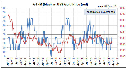
Just to recap, the most important fundamental drivers of the US$ gold price are credit spreads, the yield curve, the real interest rate (the TIPS yield), the relative strength of the banking sector, the US dollar’s exchange rate, the bond/dollar ratio and the general trend of commodity prices. These are the inputs to my Gold True Fundamentals Model (GTFM), a chart of which is displayed below.

Apart from a short period from late-June to mid-July when it was ‘whipsawed’, the GTFM has been continuously bearish since mid-January. No wonder the gold market has struggled this year.

GTFM_081018

The upshot is that due to the bullish sentiment a bounce in the gold price of up to $100 is still a realistic short-term possibility, but due to the bearish fundamentals a much larger rally is not.

The fundamental backdrop is always shifting, so the fact that it is gold-bearish right now doesn’t mean that it will remain so for a long time to come. For example, additional weakness in the stock market would improve gold’s true fundamentals if it caused a significant decline in economic confidence and fostered the belief that the Fed will put its rate-hiking program on hold. However, until/unless such a shift happens, expectations regarding gold’s short-term prospects should be modest.

Print This Post Print This Post

Five years is a long time to be wrong

October 3, 2018

In a few previous blog posts (for example, HERE) I discussed the limitations of sentiment as a market timing tool. It certainly can be helpful to track the public’s sentiment and use it as a contrary indicator, and some of my most successful trades have been partly based on sentiment extremes. However, these days I place less weight on sentiment than I did in the past.

As mentioned in earlier posts, there is no better example of sentiment’s limitations as a market timing tool than the US stock market’s performance over the past few years. This is evidenced by the following chart from Yardeni.com. The chart shows the performance of the Dow Jones Industrials Index over the past 31 years with vertical red lines to indicate the weeks when the Investors Intelligence (II) Bull/Bear ratio was at least 3.0 (a bull/bear ratio of 3 or more suggests extreme optimism within the surveyed group).

Notice that while vertical red lines (indicating extreme optimism) coincided with some important price tops, there were plenty of times when a vertical red line did not coincide with an important price top. Also, notice that with the exception of a multi-quarter period during 2015-2016 when the market was in correction mode, optimism has been extreme almost continuously since Q4-2013.

In effect, sentiment has been consistent with a bull market top for the bulk of the past five years, but there is still no evidence in the price action that the bull market has ended. On the contrary, while there is a high risk of a significant correction in the short term, the long-term leading indicators I track point to the bull market extending well into 2019.

Regardless of what happens from here, five years is a long time for a contrarian to be wrong.

IIbullbear_031018

Print This Post Print This Post

There will be warnings!

September 18, 2018

[This blog post is a slightly-modified excerpt from a TSI commentary published about three weeks ago. Not much has changed in the meantime.]

If you rely on the mainstream financial press for your information then you could be forgiven for believing that financial crises happen with no warning. However, there are always warnings if you know where to look.

Here are four leading indicators of financial stress and/or economic confidence that are both easy to monitor and worth monitoring. It’s likely that all four of these indicators will issue timely warnings prior to the next financial crisis and a virtual certainty that at least two of them will.

1) The yield curve, as depicted on the following chart by the 10yr-2yr yield spread.

As explained in many previous commentaries, the yield curve ‘flattening’ to an extreme and then beginning to steepen warns that an inflation-fueled boom has begun to unravel. For example, the yield curve reached its maximum ‘flatness’ in November-2006 and provided clear evidence of a reversal in June-2007. That was the financial crisis warning. By August of 2007 the ‘steepening’ trend was accelerating.

The yield curve’s current situation looks more like Q4-2006 than Q3-2007. It is nothing like 2008.

2) Credit spreads, as depicted on the following chart by the difference between the Merrill Lynch US High Yield Master II Effective Yield and the yield on the 10-Year T-Note.

Credit spreads start to widen, indicating a decline in economic confidence and/or a rise in the perceived risk of default at the junk end of the debt market, well before a recession or crisis. For example, evidence of a new widening trend in credit spreads emerged in July-2007 and by November-2007 it was very obvious that trouble was brewing.

Note that when it comes to warning of a coming crisis, credit spreads are far more likely to generate a false positive signal than a false negative signal, that is, they are far more likely to cry wolf when there’s no wolf than to remain silent when there is a wolf.

Right now they are silent.

3) The short-term interest rate at which banks lend to other banks versus the equivalent interest rate at which the US federal government borrows money, as depicted on the following chart by the LIBOR-UST3M spread.

When trouble begins to brew in parts of the banking system it gets reflected by higher interest rates being charged for short-term inter-bank loans well before it becomes common knowledge. This causes the spread between 3-month LIBOR (the average 3-month interbank lending rate) and the 3-month T-Bill yield to increase. For example, the LIBOR-UST3M spread was languishing at around 0.20% in early-2007, indicating minimal fear within the banking system, but then began to rise steadily and reached 0.75% in June-2007. This was an early warning sign of trouble. The spread then pulled back into July-2007 before rocketing up to 2.25% in August-2007. This constituted a very loud warning. After that the spread became very volatile and moved as high as 4.5% at the peak of the Global Financial Crisis in October-2008.

At the moment the LIBOR-UST3M spread is languishing at around 0.20%.

4) The gold price relative to industrial metals prices, as depicted on the following chart by the gold/GYX ratio (the US$ gold price divided by the Industrial Metals Index).

The gold/GYX ratio acts like a credit spread. This is because gold’s performance relative to the industrial metals sector tends to go in the same direction as economic confidence. In particular, when confidence begins to decline in the late stage of a boom or the early stage of a bust, the gold/GYX ratio begins to trend upward.

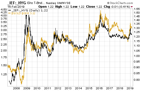
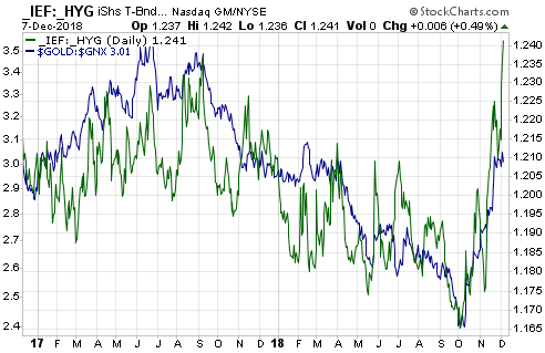
The following chart illustrates the long-term positive correlation between gold/GYX and a credit spread indicator in the form of the IEF/HYG ratio.

The gold/GYX ratio recently bounced from the bottom of its 7-year range. If the bounce continues and gold/GYX exceeds its early-2018 high it would be the first sign of a declining trend in economic confidence.

Currently, none of the above indicators is warning that a financial crisis is imminent or even that a financial crisis is starting to develop. The probability could change as new information becomes available, but based on the present values of the best leading indicators there is almost no chance that a financial crisis will erupt within the next three months.

A stock market crash is a different ‘kettle of fish’, because while a financial crisis always will be accompanied by a large decline in the stock market it is possible for a large decline in the stock market to occur in the absence of a financial crisis. The 1987 stock market crash is an excellent example.

While the four indicators mentioned above should issue timely warnings prior to a financial crisis, they may not warn of a stock market crash that isn’t part of a broader crisis. As is the case with a financial crisis, though, a stock market crash won’t happen ‘out of the blue’. In particular, the stock market won’t make a new all-time high one day and crash the next. This is because it takes time (generally at least two months) from the ultimate price high to create the sentiment backdrop that makes a crash possible.

In summary, short-term stock market risk is high, but there are no warning signs that a financial crisis is brewing or that a stock market crash (as opposed to, say, a 10% correction) is a realistic short-term possibility.

Print This Post Print This Post
The myth of gold-stock leverage

September 10, 2018

A few years ago I wrote a couple of pieces explaining why gold mining is a crappy business. The main reason is the malinvestment that periodically afflicts the industry due to the boom-bust cycle caused by monetary inflation.

To recap, when the financial/banking system appears to be in trouble and/or economic confidence is on the decline, the perceived value of equities and corporate bonds decreases and the perceived value of gold-related investments increases. However, gold to the stock and bond markets is like an ant to an elephant, so the aforementioned shift in investment demand results in far more money making its way towards the gold-mining industry than can be used efficiently. Geology exacerbates the difficulty of putting the money to work efficiently, in that gold mines typically aren’t as scalable as, for example, base-metal mines or oil-sands operations.

In the same way that the malinvestment fostered by the creation of money out of nothing causes entire economies to progress more slowly than they should or go backwards if the inflation is rapid enough, the bad investment decisions fostered by the periodic floods of money towards gold mining have made the industry inefficient. That is, just as the busts that follow the central-bank-sponsored economic booms tend to wipe out all or most of the gains made during the booms, the gold-mining industry experiences a boom-bust cycle of its own with even worse results. The difference is that the booms in gold mining roughly coincide with the busts in the broad economy.

Gold, itself, is not afflicted by the rampant malinvestment that periodically occurs within the gold-mining sector. Regardless of what’s happening in the world, an ounce of gold is always an ounce of gold. It is neither efficient nor inefficient; it just is.

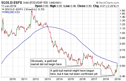
A consequence is that gold bullion increases in value relative to gold-mining stocks over the long term. This is evidenced by the fact that the gold-mining sector, as represented on the following chart by the Barrons Gold Mining Index up to 1996 and the HUI thereafter, has been in a downward trend relative to gold bullion since 1968. 1968!!

Yes, we are talking about a 50-year downward trend in the value of gold-mining stocks relative to gold bullion. For how many more decades will this trend have to continue before analysts stop referring to gold-mining stocks as leveraged plays on the metal?

BGMI_gold_100918

There’s no reason to expect the above trend to end while the current monetary system is in place. This doesn’t mean that gold-mining stocks should be ignored, as these stocks can generate huge profits for traders who remember to sell when the selling is good. It means that if you want long-term exposure to gold then you should own gold, not the stocks of companies that mine gold.

Print This Post Print This Post
Gold at the Crossroads

August 27, 2018

[This post is a modified excerpt from a TSI commentary published last month]

Although I’m not in total agreement with it, I can highly recommend Erik Norland’s article titled “Gold: At the Crossroads of Fiscal and Monetary Policies.” The article is informative and, unlike the bulk of gold-related commentary, actually deals with fundamental developments that could be important influences on gold’s price trend.

The article was published in early-May and states that the U.S. is in a mid-to-late stage recovery. While that statement was probably correct at the time, evidence has since emerged that the economy has entered the “Late-Expansion” stage.

Note that the “Late-Expansion” stage could extend well into 2019 or perhaps even into 2020 and that the best leading indicators of recession should issue timely warnings when this stage is about to end. By the way, the extension of the Late-Expansion stage is why the industrial metals markets probably will commence new intermediate-term rallies later this year.

My only substantial disagreement with the above-linked article is associated with the relationship between gold and fiscal policy. Parts of the article are based on the premise that expansionary fiscal policy and its ‘ballooning’ effect on federal debt are bullish for gold. This premise is false; expansionary fiscal policy is not, in and of itself, either bullish or bearish for gold.

The effects that fiscal policy and the associated change in government debt have on the gold price will be determined by their effects on economic confidence. Of particular relevance, there’s no good reason to assume that an increase in government debt will bring about a decline in economic confidence, which is what it would have to do to be bullish for gold. In fact, if an increase in government indebtedness is largely the result of reduced taxes then it could lead to increased economic confidence for a considerable time and thus put DOWNWARD pressure on the gold price.

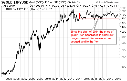
That there should not be a consistent positive correlation between the gold price and the extent of US government indebtedness is borne out by the empirical evidence. In particular, the following chart shows that there was a NEGATIVE correlation between the US$ gold price and the US government-debt/GDP ratio between 1970 and 1995, with debt/GDP drifting lower during the long-term gold bull market of the 1970s and then trending upward during the first 15 years of gold’s long-term bear market.

The wrong assertion that an increase in the government’s debt burden is necessarily bullish for gold appears to rely on what happened during 1995-2011, in that during this 17-year period there was a positive correlation between the gold price and the US government-debt/GDP ratio. You must take a wider-angle view to realise that this 17-year period is an example of correlation not implying causation. The fact is that over the past 50 years the overarching correlation between the gold price and the debt/GDP ratio has been negative for more time than it has been positive.

The steadfast belief that rising US government debt is bullish for the US$ gold price is similar to the steadfast belief that geopolitical conflict is bullish for the gold price. They are both superstitions. The gold price has never made sustainable gains in reaction to international military conflict or the threat of the same, and the gold price is just as likely to fall as it is to rise in parallel with increasing government indebtedness.

The lagged response of the economy to the central bank’s monetary machinations is the key to long-term trends in the gold price. Therefore, it isn’t correct to say that gold is at the crossroads of fiscal and monetary policies (the theme of the above-linked article). It is correct, however, to say that gold is at the crossroads of bubble activities and the reduction of monetary fuel to support such activities.

The current US economic boom is like the cartoon character that has run over the edge of a cliff, but hasn’t looked down yet. The character can continue running without any support as long as it doesn’t look down. At this stage, investors in stocks, bonds and other assets that have been propelled to sky-high valuations by monetary inflation are acting as if the temporary props put in place by the central bank still exist, so they don’t yet perceive the need for the support that gold can offer. Unfortunately, unlike in the cartoons when the time from running over the cliff to the point of recognition is always a few seconds or less, there’s no way to know in advance how long an artificial economic boom will persist after the monetary support is removed.

Print This Post Print This Post
Sentiment pitfalls, the gold edition

August 20, 2018

In a couple of blog posts last year I discussed the limitations of sentiment as a market timing tool. With the most reliable sentiment indicators now revealing extreme negativity towards gold, it’s timely to revisit this topic using the current gold market situation as an example.

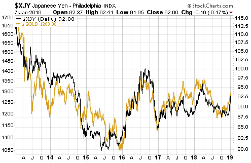
There are two sentiment pitfalls that I mentioned in the earlier posts that are especially relevant to the current gold-market situation. The first is linked to the fact that sentiment generally follows price, making it a near certainty that the overall mood will be at an optimistic extreme near an important price top and a pessimistic extreme near an important price bottom. Putting it another way, there is nothing like a strongly-rising price to get the speculating community and the general public bullish and there is nothing like a steep price decline to get them bearish, so it’s perfectly natural that price-tops will be associated with optimism and price-bottoms will be associated with pessimism. The problem is that while an important price extreme will always be associated with a sentiment extreme, a sentiment extreme doesn’t necessarily imply an important price extreme.

Gold’s current Commitments of Traders (COT) situation shows that relative to the past 15 years, speculative sentiment is now at a pessimistic extreme. This implies that there is now plenty of sentiment-related fuel to propel the gold price upward over the months ahead, but it doesn’t imply that the price is close to a sustainable low. If the price continues to trend downward then speculators, as a group, will continue to lose interest in being long and gain interest in being short. Of course, when a sustainable price bottom is reached it WILL coincide with very negative sentiment, because, as I said, sentiment follows price.

The second potential pitfall is that what constitutes a sentiment extreme will vary over time, meaning that there are no absolute benchmarks. In particular, what constitutes dangerous optimism in a bear market will often not be a problem in a bull market and what constitutes extreme fear/pessimism in a bull market will often not signal a good buying opportunity in a bear market.

At the moment, gold is not in a bull market. It is either still immersed in the bear market that began in 2011 or immersed in a long-term basing pattern. Either way, it isn’t reasonable to blindly assume that what constituted a sentiment extreme during the period since 2001, the bulk of which involved a gold bull market, constitutes a sentiment extreme today.

If we look back further than 2001 we see that the current speculative positioning in gold futures is not necessarily indicative of an extreme. For example, the following chart from goldchartsrus.com shows that speculators in Comex gold futures were consistently net-short during 1996-2001.

goldCOT_200818

My guess is that the gold price will rebound strongly from whatever low it makes during August-September. However, unless the fundamentals make a sustainable turn in gold’s favour (right now the fundamental backdrop is unequivocally bearish for gold) it’s likely that at some future point the COT data for gold will reveal much greater negativity on the part of the speculating community than exists today.

Print This Post Print This Post
The next major gold rally

August 17, 2018

[This post is a brief excerpt from a recent TSI commentary]

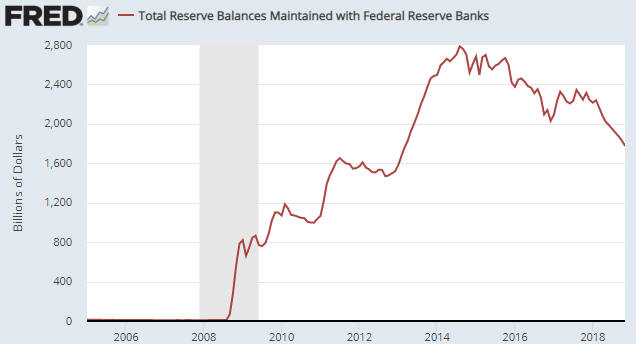
During the first three quarters of 2016 we were open to the possibility that a new cyclical gold bull market got underway in December of 2015, but over the past 18 months we have been consistent in our opinion that the December-2015 upward reversal in the US$ gold price did NOT mark the start of a bull market. Since late-2016 there have been some interesting rallies in the gold price, but at no time has there been a good reason to believe that we were dealing with a bull market. That’s still the case. The question is: what will it take to set a new cyclical gold bull market in motion?

The simple answer is that it will take a US equity bear market. However, this is not a practical answer because in real time there often will be no way of differentiating the first 6-9 months of an equity bear market from an intermediate-term bull-market correction. The most practical answer we can come up with is that it will take an upward reversal in the yield curve.

It has become popular to argue that due to extraordinary monetary policy the yield curve is not as important as it was in the past, but we strongly disagree. In our opinion the yield curve is, if anything, more important now — in the face of extraordinary monetary policy — than it has ever been.

The potential for the US yield curve to invert in the not-too-distant future is a red herring. Except to the extent that it influences the psychology of senior Fed officials, whether or not the curve inverts is neither here nor there. It’s the reversal from ‘flattening’ to ‘steepening’ that matters, regardless of whether the reversal happens before or after the curve inverts.

If the next major reversal of the yield curve is driven primarily by falling short-term interest rates then it will signal the onset of an economic bust. An economic bust would naturally coincide with an equity bear market and the start of a gold bull market. On the other hand, if the next major reversal of the yield curve is driven primarily by rising long-term interest rates then it will signal the onset of an inflationary blow-off that likely would go hand-in-hand with a powerful 1-2 year rally in the gold price and the prices of most other commodities.

Last week the 10yr-2yr yield spread, a proxy for the US yield curve, fell to within 2 basis points of the 10-year low reached in mid-July. Therefore, at this time there is no sign of an upward reversal.

Print This Post Print This Post