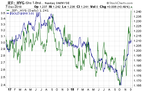
The ‘true fundamentals’ began shifting in gold’s favour in October of last year and by early-December the fundamental backdrop was gold-bullish for the first time in almost a year. However, there is not yet confirmation of a new gold bull market from the most reliable indicator of gold’s major trend. I’m referring to the fact that the gold/SPX ratio is yet to achieve a weekly close above its 200-week MA. Here’s the relevant chart:
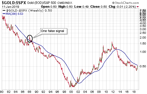
The significance of the gold/SPX ratio is based on the concept that the measuring stick is critical when determining whether something is in a bull market. If a measuring stick is losing value at a fast pace then almost everything will appear to be in a bull market relative to it. For example, pretty much everything in the world has been rising in value rapidly over the past few years when measured in terms of the Venezuelan bolivar. It should be obvious, though, that not everything can be simultaneously in a bull market. To determine which assets/investments are in a bull market we can’t only go by performance relative to any national currency; we must also look at the performances of assets/investments relative to each other.
That’s where the gold/SPX ratio comes in. Gold and the world’s most important equity index are effectively at opposite ends of the ‘investment seesaw’. Due to their respective natures, if one is in a long-term bull market then the other must be in a long-term bear market. In multi-year periods when they are both trending upward in dollar terms it means that the dollar is in a powerful bear market, not that gold and the SPX are simultaneously in bull markets.
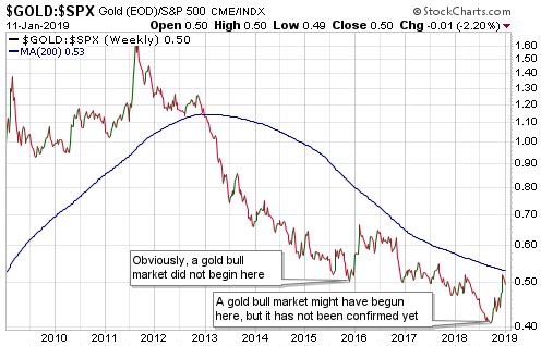
An implication — as noted on the following chart — is that a gold bull market did not begin in December-2015. Gold cannot be in a bull market and at the same time be making new 10-year lows relative to the SPX, which is what it was doing until as recently as August-2018. At least, it can’t do that if a practical and sensible definition of “bull market” is used.
It’s possible that a gold bull market got underway in August-2018, but as mentioned above this has not yet been confirmed.
 Print This Post