Full width

Checking on the China ‘gold fix’

May 27, 2016

On 19th April the Shanghai Gold Exchange (SGE) began quoting a twice-daily gold-price ‘fix’ in Yuan terms. Some pundits claimed that this would give the gold price a large and sustained boost. My view was that beyond short-lived fluctuations driven by the vagaries of speculative sentiment, it was irrelevant*. It was, in my opinion, just another in a long line of distractions from gold’s true fundamental drivers.

I went on to marvel, in a blog post on 26th April, at the inconsistency of those who regularly complain about gold-market manipulation by banks and also cheered the news that the Chinese government and its subservient banks had implemented a “Yuan gold fix”.

Is the manipulation-fixated pro-China camp totally oblivious to what happened over the past 10 years? It would have to be to not realise that modern-day China has been one of the greatest forces for global price distortion the world has ever known. The idea that China could be responsible for honest price discovery for any commodity gives stupid a bad name.

Anyhow, there is no evidence that the gold price is lower than it should be considering this market’s true fundamental price drivers. Of course, to know that this is the case you have to know what the true fundamentals are. You can’t, as many gold commentators do, blindly assume that gold’s fundamentals are always bullish regardless of what’s happening in the world. If you want to be logical you also can’t determine anything useful about the gold price by analysing the shifts in gold from one location to another.

If the implementation of the “Yuan gold fix” had been followed by the price explosion that some promoters were forecasting it would have been a lucky coincidence. As things turned out, the gold price has dropped a little over the past month, which is not surprising considering the fundamentals that matter.

*In a report posted at TSI on 17th April I wrote: “…the Yuan gold fix will have no effect on gold’s true fundamentals and will therefore have no effect on gold’s intermediate-term or long-term price trends. It shouldn’t even have an effect on gold’s short-term price performance, although whether it does or not will largely depend on the vagaries of speculative sentiment.”

Print This Post Print This Post

Which of these markets is wrong?

May 25, 2016

The following chart shows that the US$ oil price, the Canadian Dollar and the Yuan (represented on the chart by the WisdomTree Yuan Fund – CYB) have tracked each other closely over the past 15 months. When divergences have happened, they have always been quickly eliminated.

An interesting divergence has been developing over the past few weeks, with the Yuan having turned downward in mid-April, the C$ having turned downward at the beginning of May and the oil price having continued to rise. Either the currency market is wrong or the oil market is wrong. My money is on the oil market being wrong.

One reason to suspect that the oil market is wrong and that the divergence will therefore be eliminated by a decline in the oil price is recent history. In the second quarter of last year the C$ turned downward about 6 weeks ahead of the oil price and in the first quarter of this year there was an upturn in the Yuan followed by an upturn in the C$ and lastly an upturn in the oil price. That is, the currency market has been leading at turning points.

oil_CYB_C$_240516

Print This Post Print This Post

Nobody Knows Anything

May 24, 2016

Nobody Knows Anything” is a new book written by Bob Moriarty, the proprietor of the 321gold.com web site. It’s close to the book that I would write about investing, but Bob is a better writer than I so it is just as well that he wrote the book before I got around to it.

Achieving good returns by trading/investing in the stock market and other financial markets isn’t complicated. While a certain amount of information gathering and historical knowledge is required, achieving good returns has a lot to do with common sense. However, this doesn’t mean that it is easy. The problem is that we are most comfortable when running with the herd, but herds never have common sense and the investing herd always ends up losing money.

In the chapter on contrarian investing, Bob rightly points out that one of the keys to long-term investing success is not following the herd as it careens from one wealth-destroying blunder to the next.

Many people want to be told what the markets are going to do in the future and especially want to be given specific information about future crashes and spectacular price rises. This creates money-making opportunities for self-styled gurus.

As Bob explains in his book, there are no gurus. Nobody knows exactly when prices will rise, fall, peak and trough, but there is no shortage of people who will happily take your money in exchange for pretending to give you this extremely useful information. What these people are actually giving you are guesses dressed up to look like scientific analyses.

The fact is that in order to consistently buy low and sell high you don’t need to know, or even have an opinion about, when and at what level a market will peak or trough, but advice that helps you manage money prudently will not attract new readers/followers anywhere near as quickly as a big forecast such as “the market will peak on Date X and then plummet by 50%”. As I’ve noted in the past, there is an asymmetric risk/reward to making the big, bold forecast, because failed forecasts are soon forgotten whereas a single correct forecast (guess) about a dramatic market move can be used for promotional purposes forever.

There are many real-life examples in Bob’s book that are directly or indirectly related to the veritable industry that has grown up over the past 18 years around gold and silver manipulation. After explaining that all markets have always been manipulated, Bob delves into some of the silly stories that have been concocted and the terms that have been invented to promote the idea that the gold and silver markets have been subject to a successful multi-decade price-suppression scheme. Because it’s a fact that all financial markets are always manipulated to some extent, it is not difficult to find information that can add a ring of plausibility to a manipulation story that is not only wrong, but would be irrelevant to an investor or trader even if it were right.

Read the book to find out what Bob thinks about the “gold derivatives time bomb”, the possibility of a “commercial signal failure” in the gold market, the risk of a COMEX default, the notion that the “commercials” in the gold futures market are constantly trying to limit up-moves in the price, “naked shorts”, gold-plated tungsten bars, and the story that the 1998 Fed bailout of Long Term Capital Management (LTCM) was at least partly due to LTCM’s short position in gold.

The most important chapter in the book is probably the one titled “When to Sell”, because failing to take money off the table at an appropriate time gets many investors into trouble. Even in cases where an investor does a good job with the buy side of the equation and gets into a position where he has a large profit, dreams of the even greater profits to come will often prompt him not to sell. Instead, he hangs on…and hangs on…until eventually the large profit turns into a loss.

Bob draws on his experiences in the military (he was a fighter pilot during the Vietnam War) and in casinos to illustrate some of the points he wants to make about investing. These personal reminiscences from outside the world of investing are colourful and relevant.

At around 120 pages the book is short, but at the same time it is long on practical information. It is a stream of investing common-sense interspersed with historical examples and personal experiences. I think it would be an enjoyable read even if you aren’t involved in the financial markets, but it should be an especially enjoyable and useful read for anyone who speculates in the shares of junior gold, silver and other natural-resource companies.

Print This Post Print This Post
Money management and the gold mining rally

May 21, 2016

This blog post is a modified excerpt from a TSI commentary published a week ago.

Among other things, good money management involves trading around a core position, with the core position being in synch with the long-term trend. In particular, during a strong intermediate-term rally it involves 1) maintaining core exposure in line with the long-term bull market and 2) methodically scaling back to core exposure as prices move sharply upward.

BOTH of the aforementioned tactics must be used to mitigate the risk of suffering a large loss AND the risk of suffering a large opportunity cost. For example, if you don’t sell anything during a strong rally then you are guaranteed to suffer a large loss once the inevitable ensuing decline occurs and you won’t have either the financial or the emotional capacity to take advantage of future buying opportunities. For another example, if you sell everything when you think that the market is close to a top then it will just be a matter of time before you find yourself on the sidelines with no exposure as prices move much higher than you ever thought possible.

In more general terms, good money management involves embracing the reality that while it is possible to measure — by looking at sentiment and momentum indicators — when a market is stretched to the upside or the downside, it is not possible to RELIABLY predict market tops and bottoms. It is not even possible to reliably identify important market tops and bottoms at the time they are happening. Fortunately, and contrary to what some self-styled gurus will tell you, achieving well-above-average long-term performance does not require the reliable prediction of tops and bottoms.

With regard to my own money management, this year’s rally in the gold-mining sector was the first rally in years that was strong enough to prompt scaling back all the way to ‘core’ (long-term) exposure. This entailed selling almost half of my total position.

I might do a small amount of additional selling if there’s another leg higher within the next few weeks, but I have built up as much cash as I want so my next big move will be on the buy side. However, I will not do any buying into extreme strength. I will, instead, wait as long as it takes for the market to reach a sufficiently depressed level, secure in the knowledge that my core exposure covers me against the possibility of ‘surprising’ additional short-term strength.

Print This Post Print This Post
Charts of interest

May 18, 2016

Here are a few of the charts that currently have my attention.

1) The Canadian Dollar (C$). The C$ usually trends with commodity prices, so the owners of commodity-related investments should view the C$’s recent performance as a warning shot.

C$_170516

2) The Dow Trucking Index. The huge rebound in this index from its January low is a little strange given the evidence that the trucking industry is in a recession that is a long way from complete.

DJUSTK_170516

3) The gold/GYX ratio (gold relative to industrial metals). This ratio is a boom-bust indicator and an indicator of financial crisis. In January of this year it got almost as high as its 2009 peak (its all-time high) and remains close to its peak, so its current message is that an economic bust is in progress and/or that a financial crisis is unfolding.

I think that gold will weaken relative to industrial metals such as copper for at least 12 months after the stock market reaches a major bottom, but in the meantime a new all-time high for the gold/GYX ratio is a realistic possibility.

gold_GYX_170516

4) The HUI with a 50/20 MA envelope (a 20% envelope around the 50-day moving average). Although I think that the current situation has a lot more in common with the first half of 2001 than the first half of 2002, the way the HUI has clung to the top of its MA envelope over the past few months looks very similar to what it did during the first half of 2002.

HUI_MAenv_170516

5) The HUI/SPX ratio (the gold-mining sector relative to the broad US stock market). Over the course of this year to date the performance of the HUI/SPX ratio has been similar to its performance from November-2000 through to May-2001.

HUI_SPX_170516

6) The S&P500 Index (SPX). The SPX is standing at the precipice. The probability of a crash within the next two months is almost zero, but a tradable decline looks likely.

SPX_170516

7) The SPX/USB ratio (the broad US stock market relative to the Treasury Bond). Notice the difference between performance following the 2014 peak and performance following the major peaks of 1999-2000 and 2007.

SPX_USB_170516

Print This Post Print This Post
A simple relationship between gold, T-Bonds and the US$

May 16, 2016

A TSI subscriber recently reminded me of an indicator that I regularly cited in ‘the old days’ but haven’t mentioned over the past few years. The indicator is the bond/dollar ratio (the T-Bond price divided by the Dollar Index).

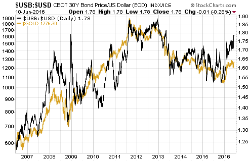
The bond/dollar ratio not only does a reasonable job of explaining trends in the US$ gold price, it does a much better job of explaining trends in the US$ gold price than does the Dollar Index in isolation. As evidence, here is a chart comparing the bond/dollar ratio (USB/USD) with the gold price followed by a chart comparing the reciprocal of the Dollar Index with the gold price. The first chart indicates a closer relationship than the second chart.

USBUSD_gold_160516

recipUS$_gold_160516

From a practical speculation standpoint, an inter-market relationship is most useful when it has a lead-lag aspect, that is, when one market usually reverses trend in advance of the other market. Unfortunately, that’s not the case here, in that gold and the bond/dollar ratio usually change direction at around the same time. For example, they both reversed upward late last year. The simple relationship does, however, help foster an understanding of why the gold price does what it does.

At the risk of casting aspersions on a good manipulation story, I note that the first of the above charts points to the US$ gold price generally having done what it should have done each step of the way over the past 10 years.

Print This Post Print This Post
Consequences of a Trump Presidency

May 10, 2016

Now that Donald Trump has managed — against the odds and much to the chagrin of ‘war party’ loyalists — to become the Republican Party’s nominee in the Presidential election to be held in November, it is worth considering what a Trump presidency would mean. Here are some preliminary thoughts.

First, I expect that with the Primary campaign out of the way Trump will start to downplay some of the most hare-brained ideas he has spouted to date, such as building a giant wall along the US-Mexico border and banning all Muslims from entering the US. It’s unlikely that these wildly foolish ideas will ever be turned into actual policies, and in any case even if President Trump tried to implement them it’s unlikely that he would obtain the required parliamentary approval.

Second, I doubt that President Trump would go ahead with his threat to implement hefty tariffs on imports from China, because I don’t think he is stupid enough to believe that imposing such restrictions on international trade could possibly benefit the US economy. My guess is that when he uttered the protectionist nonsense he was pandering to voters who are struggling economically and willing to believe that their problems could be quickly fixed by someone capable of doing smart trade deals with other world leaders. But if I am over-estimating his acumen and he genuinely believes what he is saying on this matter, then President Trump would effectively be pushing for similar trade barriers to the ones that helped make the Great Depression greater than it would otherwise have been.

As an aside, just because someone relentlessly promotes himself as a great deal-maker, doesn’t mean he actually is. Also, the problems facing the US have almost nothing to do with poor deal-making in the past and could not be solved by good deal-making in the future.

Third, I doubt that the result of the November Presidential election will have a big effect on the US economy. The way things are shaping up, whoever gets elected this November will end up presiding over a sluggish economy at best and a severe recession at worst. This is baked into the cake due to what the Fed and the government have already done.

Furthermore, both Trump and Clinton appear to be completely clueless regarding the causes of the economic problems facing the US, which means that economically-constructive policy changes are unlikely over the years immediately ahead irrespective of the election result. For example, Trump has expressed a liking for currency depreciation and artificially-low interest rates, which means that he is a supporter of the Fed’s current course of action even though he would prefer to have a Fed Chief who called himself/herself a Republican. Trump has also said that he would leave the major entitlement programs alone, even though these programs encompass tens of trillions of dollars of unfunded liabilities.

Fourth, it currently isn’t clear that any major financial market will have an advantage or disadvantage depending on who is victorious in November. For example, regardless of who wins in November it’s likely that evidence of an inflation problem will be more obvious during 2017-2018 than it is today, resulting in higher bond yields (lower bond prices). For another example, how the stock market performs from 2017 onward will depend to a larger extent on what happens over the next 6 months than on the election result. In particular, a decline in the S&P500 to below 1600 this year could set the stage for a strong stock market thereafter. For a third example, gold is probably going to be a good investment over the next few years due to the combination of declining real interest rates, rising inflation expectations and problems in the banking industry. This will be the case whether the President’s name is Trump or Clinton.

Fifth, based on what has been said by the two candidates and on Hillary Clinton’s actions during her long stretch as a Washington insider, every advocate of peace should be hoping for a Trump victory in November. The reason is that a vote for Clinton is a vote for the foreign-policy status quo, which means a vote for more humanitarian disasters and strategic blunders along the lines of the Iraq War, the destruction of Libya, the aggressive deployment of predator drones that kill far more innocent people than people who pose a genuine threat, the intervention in Ukraine that needlessly and recklessly brought the US into conflict with Russia, the inadvertent creation and arming of ISIS, and the haphazard bombing of Syria. Based on what he has said on the campaign trail, a vote for Trump would be a vote for foreign policy that was less concerned about regime change, less eager to intervene militarily in the affairs of other countries, and generally less offensive (in both meanings of the word).

Summing up, a Trump presidency would probably be a significant plus in the area of foreign policy (considering the alternative), but there isn’t a good reason to expect that the US economy and financial markets would fare any better or worse under Trump than they would under Clinton. At least, there isn’t a good reason yet.

Print This Post Print This Post
The scale of the gold market

May 9, 2016

This post is a modified excerpt from a recent TSI commentary.

The amount of gold flowing into and out of the SPDR Gold Trust (GLD) inventory is often portrayed as an important driver of the gold price, but it is nothing of the sort. As I’ve previously explained*, due to the way the ETF operates it can reasonably be viewed as an effect, but not a cause, of a change in the gold price. In any case, the amount of gold that shifts into and out of the GLD inventory is trivial in comparison to the overall market.

Since the beginning of December last year the average daily change in GLD’s physical gold inventory has been about 3 tonnes, or about 0.1M ounces. To most of us, 0.1M ounces of gold would represent huge monetary value (at US$1250/oz, 0.1M ounces is worth US$125M), but within the context of the global gold market it is a very small amount.

To give you an idea of how small I point out that over the same period (since the beginning of December last year) the average amount of gold traded per day via the LBMA (London Bullion Market Association) was around 20M ounces. Also over the same period, average daily trading volume on the COMEX was roughly 250K gold futures contracts. A futures contract covers 100 ounces, so the average daily trading volume on the COMEX was equivalent to about 25M ounces.

Very roughly, then, the combined average amount of gold traded per day via the facilities of the LBMA and the COMEX over the past few months was 45M ounces. This amount is 450-times greater than the average daily change in the GLD inventory and still covers only part of the overall market.

As an aside, over the past few months the average daily trading volume in GLD shares has been about 15M. A GLD share represents slightly less than 0.1 ounces of gold, so this equates to about 1.5M gold ounces. The volume of trading in GLD shares is therefore an order of magnitude more significant than the volume of physical gold going into and out of the GLD inventory, but it is still a long way from being the most influential part of the overall market.

Once you understand the scale of the overall gold market you will realise that many of the gold-related figures that are carefully tracked and often portrayed as important are, in reality, far too small to have a significant effect on price. For example, the quantity of gold that trades via the combined facilities of the LBMA and the COMEX on an average DAY is about 45-times greater than the quantity of gold sold in coin form by the US Mint in an average YEAR.

An obvious objection to the above is that I am conflating physical gold and “paper gold” (paper claims to current gold or future gold). Yes, I am doing exactly that. When considering price formation in the gold market it makes sense to consider the ‘physical’ and ‘paper’ components together because they are tightly linked by arbitrage-related trading. In particular, in the major gold-trading centres the price of a 400-oz good-delivery bar of physical gold is always closely related to the prices of futures contracts and the prices of other well-established paper claims to gold.

So, don’t be misled by analyses that focus on relatively minor shifts in physical gold location. Just because something can be counted (for example, the daily change in the GLD gold inventory) doesn’t mean it is worth counting, and just because something can’t be counted (for example, the total amounts of gold traded and hoarded by people throughout the world) doesn’t mean it isn’t important.

*My last two blog posts on the topic are HERE and HERE. The crux of the matter is that neither a rising gold price nor a rising GLD share price necessarily results in the addition of gold to GLD’s inventory. Additions of gold only happen if GLD’s share price rises relative to its net asset value and deletions of gold only happen when GLD’s share price falls relative to its net asset value, with the process driven by the arbitrage-trading of Authorised Participants.

Print This Post Print This Post
The relentless COMEX fear-mongering

May 6, 2016

321gold.com’s Bob Moriarty recently took someone to task for making the wrongheaded assertion that there was a high risk of the CME (usually still called the COMEX) defaulting due to the amount of paper claims to gold being orders of magnitude greater than the amount of physical gold in store. Bob makes the correct point that a default isn’t possible because the COMEX allows for cash settlement if necessary. However, the assertions being made by the default fear-mongers aren’t just wrong due to a failure to take into account the cash settlement provision; they would be complete nonsense even if there were no cash settlement provision. I’ve briefly explained why in previous blog posts (for example, HERE). In this post I’ll supply a little more detail.

I suspect that when it comes to the idea that a COMEX default is looming, ZeroHedge.com is “fear-monger zero*”. Every now and then ZeroHedge posts a chart showing the total Open Interest (OI) in COMEX gold futures divided by the amount of “Registered” gold in COMEX warehouses. An example is the chart displayed below, which was taken from the article posted HERE. The result of this division is supposedly the amount of gold that could potentially be demanded for delivery versus the amount of gold available for delivery, with extremely high numbers for the ratio supposedly indicating that there is a high risk of a COMEX default due to insufficient physical gold in storage. I say “supposedly”, because it actually indicates no such thing. The ratio routinely displayed by ZeroHedge — and other gold market ‘pundits’ who spout the same baloney — is actually meaningless.

ZH_goldcover_050516

One reason it is meaningless is that the amount of gold available for delivery is the amount of “Registered” gold PLUS the amount of “Eligible” gold, meaning the TOTAL amount of gold at the COMEX. It is true that only Registered gold can be delivered against a contract, but it is a quick and simple process to convert between Eligible and Registered. In fact, much of the gold that ends up getting delivered into contracts comes from the Eligible stockpile, with the conversion from Eligible to Registered happening just prior to delivery.

Taking a look at the ratio of COMEX Open Interest to total COMEX gold inventory via the following chart prepared by Nick Laird (www.sharelynx.com), we see that it has oscillated within a 3.5-6.5 range over the past 7 years and that nothing out of the ordinary happened over the past three years.

COMEXOI_TOTINV_050516

Another reason that the OI/Registered ratio regularly displayed by ZeroHedge et al is meaningless is that the total Open Interest in gold futures is NOT the amount of gold that could potentially be demanded for delivery. The amount of gold that could potentially be demanded for delivery is the amount of open interest in the nearest contract. For example, when ZeroHedge posted its dramatic “Something Snapped At The Comex” article in late-January to supposedly make the point that there were more than 500 ounces of gold that could potentially be called for delivery for every available ounce of physical gold, in reality there were about 15 ounces of physical gold in COMEX warehouses for every ounce that could actually have been called for delivery into the expiring (February-2016) contract.

Although it provides no information about the ability of short sellers to deliver against expiring futures contracts when called to do so, it is reasonable to ask why the ratio of total OI to Registered gold rose to such a high level. I can only guess, but I suspect that the following chart (also from www.sharelynx.com) contains the explanation.

The chart shows the cumulative stopped contract deliveries, or the amount of gold that was delivered into each expiring contract, in absolute terms and relative to open interest. Notice the downward trend beginning in late-2011. Notice also that the amount of gold delivered to futures ‘longs’ over the past two years is much less in both absolute and relative terms than at any other time over the past decade.

It is clear that as the gold price fell, the desire of futures traders to ‘stop’ a contract and take delivery of physical gold also fell. In other words, the unusually-small amount of gold maintained in the Registered category over the past two years reflects the unusually-low desire on the part of futures ‘longs’ to take delivery.

It’s a good bet that if a multi-year gold rally began last December (I think it did) then the desire to take delivery will increase over the next couple of years, prompting a larger amount of gold to be held in the Registered category.

COMEXDELIV_050516

In conclusion, the fact is that at no time over the past several years has there been even a small risk of either a COMEX default or the COMEX falling back on its cash settlement provision. However, this fact is obviously not as exciting as the fiction that is regularly published by scare-mongers in their efforts to attract readers and separate the gullible from their money.

*The equivalent of Patient Zero in an epidemiological investigation.

Print This Post Print This Post
A critical juncture for gold

May 4, 2016

The US$ gold price is testing important resistance defined by last year’s high, which opens up the possibility that a useful price signal will soon be generated. There are two ways that this could happen.

One way is for the price to achieve a weekly close above last year’s high of $1308. This wouldn’t necessarily point to immediate additional upside, but it would suggest that the overall advance from last December’s low was set to continue for another 1-2 months. The other is for the price to trade above last year’s high of $1308 during the week but fail to achieve a weekly close above this level. This would warn that the overall advance from last December’s low was over (meaning: a multi-month correction was probably getting started).

Note that not all price action contains clues about the future. For example, during the first two days of this week the US$ gold price consolidated below last year’s high, which doesn’t tell us anything useful.

gold_blog_030516

Gold’s true fundamentals* turned bullish early this year but are currently about as neutral as they get, with half of them bullish and the other half bearish. Moreover, of the two fundamental drivers that exerted the greatest influence over the past 12 months, one (the relative strength of the banking sector) recently turned bearish while the other (the real interest rate) is still bullish. This suggests that an additional large short-term rise in the gold price will depend on increased speculation in the futures market. Interestingly, Keith Weiner comes to a similar conclusion from a very different assessment of gold fundamentals.

*The gold market’s six most important fundamental drivers are the real interest rate, the yield curve, credit spreads, the relative strength of the banking sector, the US dollar’s exchange rate and the general trend for commodity prices.

Print This Post Print This Post
Making stuff up

April 30, 2016

This will be the shortest TSI blog post to date. I just wanted to point out that newsletter writers, bloggers and other posters on the internet who claim knowledge of what was discussed in secret conversations between high-level policy-makers are just making up stories. If you take this BS at face value, more the fool you.

Print This Post Print This Post
Who gets the new money first?

April 27, 2016

The main reason that monetary inflation (creating new money out of nothing) is an economic problem isn’t the effect it has on the economy-wide purchasing power of money. The general decline in money purchasing-power is very much a secondary negative. The primary negative revolves around the fact that new money does not get evenly spread throughout the economy. Instead, it gets injected at specific points, causing some people (the early recipients of the new money) to benefit at the expense of others and causing some prices to rise relative to others. One consequence is an undeserved transfer of wealth to the early recipients of the new money and another consequence is the falsification of price signals. I’ve discussed both of these consequences in detail in the past, but I have never homed-in on the question: Who gets the new money first?

The answer to the above question will depend on whether the new money is created by the private banks or the central bank, and in the case where the private banks are doing the bulk of the money-pumping it will vary from one cycle to the next. A comprehensive answer to the question would therefore require a lot more words than I want to use in this blog post, so rather than trying to cover all the possibilities I am narrowing-down the question to: Who gets the new money first when the Fed implements QE (Quantitative Easing)?

By the way, if you think that the Fed’s QE adds to bank reserves and doesn’t add to the total quantity of money available to be spent within the economy then you do not understand the mechanics of the QE process. An explanation of how the Fed’s QE creates money can be found HERE.

Since about 60% of the assets monetised in the Fed’s various QE programs were US government debt securities it could superficially appear that the government was the first receiver of most of the new money created by the Fed, but this was not actually the case. The government benefited from the Fed’s QE programs to the extent that these programs lowered the cost of debt*, but it’s unlikely that QE resulted in the government borrowing more than it would otherwise have borrowed. In other words, the amount of money borrowed by the government probably wouldn’t have been materially less if QE had never happened. It’s therefore more correct to view the government as an indirect beneficiary of the Fed’s QE rather than as an early receiver of the new money.

It helps to answer the question “who got the new money first in the Fed’s QE programs?” by re-wording it thusly: As a result of the Fed’s QE, who initially found themselves with a lot more money than would otherwise have been the case?

The answer is the group called “bond speculators”. This group comprises institutions and individuals, including banks, hedge funds and mutual funds, who invest in and trade large dollar-amounts of debt securities.

To explain, the government issued about $2.5T of debt that was purchased by the Fed with newly-created dollars. If not for the Fed, the issuing of this debt would have necessitated the transfer of $2.5T of money from “bond speculators” to the government. It is therefore fair to say that the Fed’s monetisation of Treasury debt left “bond speculators” with $2.5T of extra money. This money was naturally ‘invested’ in other financial assets, giving the prices of those assets a boost.

Under its QE programs the Fed also monetised (purchased with newly-created dollars) about $1.7T of mortgage-backed securities (MBSs). In this case the fact that “bond speculators” ended up with a lot of extra money is obvious, since the Fed replaced existing MBSs owned by “bond speculators” with cash created out of nothing.

In total, “bond speculators” found themselves with about 4.2 trillion additional dollars** courtesy of the Fed’s QE programs. The average productive salary-earner found himself with a negative real return on savings and negative real earnings growth courtesy of the same programs. And yet, Bernanke and Yellen appear to genuinely believe that the Fed’s actions were righteous.

    *The Fed’s debt monetisation not only lowered the interest rate on all new debt issued by the government, for the $2.5T of Treasury securities bought by the Fed the interest rate was effectively reduced to zero. This is because interest paid on government debt held by the Fed gets returned to the government.

    **Just to be clear, the Fed’s QE didn’t directly create $4.2T of additional wealth for “bond speculators”, since the Fed replaced bonds with money. Bond speculators initially had more money and less assets as the result of Fed asset monetisation, but the new money was a proverbial ‘hot potato’ and was quickly used to bid-up the prices of other bonds and financial assets.

Print This Post Print This Post