Full width

Interest rates and the stock market

July 23, 2019

There is no simple relationship between interest rates and the stock market. In particular, a lower interest rate doesn’t necessarily lead to a higher stock market and a higher interest rate doesn’t necessarily lead to a lower stock market.

The conventional wisdom on this topic is based largely on what happened over the past few decades. Clearly, US equities generally fared well after interest rates embarked on a long-term downward trend in the early 1980s and generally fared poorly when interest rates were in a rising trend during the 10-14 year period prior to the early 1980s. Also, the inverse relationship (a lower interest rate leads to a higher stock market and a higher interest rate leads to a lower stock market) seemed to make sense and was incorporated into a popular stock market valuation tool called “The Fed Model”.

The Fed Model compares the earnings yield of the S&P500 Index (the reciprocal of the S&P500′s P/E ratio, expressed as a percentage) with the 10-year T-Note yield to determine if the stock market is over-valued or under-valued. The higher the S&P500 yield relative to the 10-year T-Note yield, the better the value supposedly offered by the stock market. An implication is that if the 10-year yield is very low, the S&P500 can have a very high P/E ratio and still not be over-valued. For example, according to the Fed Model the S&P500 is attractively valued today. This is because even though the current P/E ratio is almost as high as it ever gets (excluding the 1999-2000 bubble period), the current earnings yield is well above the current 10-year T-Note yield.

However, the simple relationship between interest rates and the stock market only makes sense at a superficial level. It doesn’t hold up under deeper analysis. The reason is that the current value of a company is the sum of all of that company’s future cash flows discounted at some rate, and in most cases it will not be appropriate to use today’s interest rate to discount cash flows that won’t happen until many years or even decades into the future.

When picking a rate at which to discount distant cash flows it would be more reasonable to use a long-term average interest rate than to use the current interest rate. Furthermore, there is no good reason why the change in the interest rate over the next 12 months should significantly affect the interest rate used to discount cash flows that are expected to occur 10-20 years into the future.

But if it is wrong to assume that the stock market should trend inversely to the interest rate over long periods, then why did this assumption prove to be correct over the bulk of the past 50 years?

The first part of the answer is that over the very long term the stock market swings from under-valued to over-valued and back again and that in the early 1980s a bond market under-valuation extreme happened to coincide with a stock market under-valuation extreme. The second part of the answer is that financial market history goes back much further than 50 years and the simple relationship on which the Fed Model is based is not apparent prior to 1970. In essence, the theory that a lower interest rate leads to a higher stock market and a higher interest rate leads to a lower stock market is an artifact of the past 50 years.

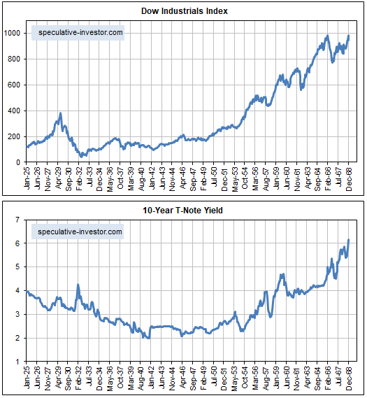
The above statement is supported by the following charts. The charts show the Dow Industrials Index and the 10-year T-Note yield from the beginning of 1925 through to the end of 1968.

The US stock market (as represented by the Dow Industrials in this case) was in a secular bearish trend from 1929 until 1942. Apart from an upward spike due to fear of government default in 1931, the 10-year yield was in a downward trend during this bearish stock market period. The stock market then embarked on a secular bullish trend that didn’t end until the late-1960s. The 10-year yield was in an upward trend during this bullish stock market period. That is, the long-term relationship between interest rates and the stock market during 1929-1968 was the opposite of what it was over the past 50 years.

DJIA_10YTNote_170719

Print This Post Print This Post

The coming T-Bond decline

July 16, 2019

A large divergence between two fundamentally-correlated market prices is important because such a divergence usually will be closed via a big move in one or both prices. However, divergences sometimes build for an inconveniently long time before they start to matter.

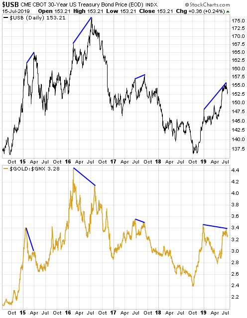
The gold/commodity ratio (the US$ gold price divided by the GSCI Spot Commodity Index) and the T-Bond are strongly correlated over the long term. They also tend to be well correlated over shorter timeframes, but significant short-term divergences sometimes occur. One such divergence has been developing since the beginning of this year, with the T-Bond making a sequence of higher highs while the gold/commodity ratio stays below its late-December high. Note that even the recent surge to a new 5-year high by the US$ gold price was not enough to push the gold/GNX ratio above its late-December high.

The current divergence and previous similar divergences (higher highs for the T-Bond in parallel with lower highs for the gold/commodity ratio) are illustrated by the following chart. The previous similar divergences led to large declines in the T-Bond price and I can think of no reason to expect that it will be different this time.

USB_goldGNX_150719

Print This Post Print This Post

Gold and Inflation Expectations

July 8, 2019

[This post is an excerpt from a recent TSI commentary]

Gold tends to perform well relative to commodities in general when inflation expectations are FALLING. The evidence is presented below in chart form.

The first of the following charts shows the Expected CPI, which in this case is determined by subtracting the yield on the 5-year TIPS (Treasury Inflation Protected Security) from the yield on the 5-year T-Note. In effect, the chart shows the average annual “inflation” rate that the market expects the US government to report over the next 5 years. We’ve labeled all of the important highs and lows on this chart.

The second of the following charts shows the gold/commodity ratio (the US$ gold price divided by the GSCI Spot Commodity Index). The labels on this chart correspond to the labels on the first chart. For example, point A on the first chart is the same time as point A on the second chart.

Notice that in every case over the 6-year period covered by the following charts, a high for inflation expectations (the Expected CPI) is associated with a low for the gold/commodity ratio and a low for inflation expectations is associated with a high for the gold/commodity ratio.

The relationship we tried to show above is more clearly demonstrated by the next chart. On this chart the commodity/gold ratio (as opposed to the gold/commodity ratio) is compared to the ProShares Inflation Expectations ETF (RINF). The correlation clearly is strong, with commodities consistently outperforming gold when inflation expectations are rising and underperforming gold when inflation expectations are falling.

An implication of the above charts is that if inflation expectations are close to an intermediate-term bottom then the financial world is close to the start of a 6-12 month period during which the industrial metals perform better than gold. Alternatively, a further decline in inflation expectations (increasing fear of deflation) would lead to additional relative strength in gold.

We realise that the above message is the opposite of what most people believe about gold, but a lot of what most people believe about gold is not accurate. Of particular relevance to this discussion, gold has never been a hedge against “price inflation”.

Gold tends to perform relatively well during periods when financial-system and/or economic confidence is on the decline. The declining confidence sometimes will go hand-in-hand with rapid “price inflation”, but it isn’t reasonable to expect gold to be a useful hedge against what generally is considered these days to be normal “inflation”. In fact, part of the reason for the strong INVERSE relationship between the gold/commodity ratio and inflation expectations is the general view that “inflation” of 2%-3% is beneficial.

Our view is that the next three months could be dicey, especially if there’s another sharp decline in the stock market. However, we think that by the end of this year inflation expectations will be significantly higher and industrial metals such as copper and platinum will be significantly more expensive relative to gold.

Print This Post Print This Post
US monetary inflation with and without the Fed

June 25, 2019

[This post is a slightly-modified excerpt from a TSI commentary published about two weeks ago.]

The way that most new money was created over the past 10 years was different to how it was created during earlier cycles. During earlier cycles almost all new money was loaned into existence by commercial banks, but in the final few months of 2008 the Fed stopped relying on the commercial banks and began its own money-creation program (QE).

The difference is important because most of the money created by commercial banks is injected into the ‘real economy’ (the first receivers of the new money are businesses and the general public), whereas all of the money created by the Fed is injected into the financial markets (the first receivers of the new money are bond traders). The Fed’s new money eventually will find its way to Main Street (as opposed to Wall Street), but the rate of monetary inflation experienced by the ‘real economy’ during the years following the Global Financial Crisis was a lot lower than suggested by the change in the US True Money Supply (TMS). Consequently, there may have been a lot less mal-investment during the current cycle than during the years leading up to the 2007-2009 crisis.

Don’t get us wrong — there has been a huge amount of ill-conceived and misdirected investment due to the Fed’s money-pumping and associated suppression of interest rates. Due to these bad investments, corporate balance sheets are now much weaker, on average, than otherwise would be the case. In particular, the corporate world collectively has gone heavily into debt and in a lot of cases the debt has not been used productively. For example, it has been used to buy back shares or fund high-priced acquisitions. This will have very negative consequences for the stock market within the next few years, but wasting money on share buy-backs and over-paying for assets does not cause the business cycle.

The ‘boom’ phase of the business cycle happens when artificially-low interest rates prompt investment, on an economy-wide scale, in new production facilities and construction projects that would not have seemed viable in the absence of the distorted interest-rate signal. The ‘bust’ phase of the business cycle kicks off when it starts to become apparent that, due to rising construction/production costs and/or less consumer demand than forecast, the aforementioned investments either cannot be completed or will generate a lot less cash than originally expected. Widespread liquidation ensues, and — as long as policy-makers don’t do too much to ‘help’ — resources eventually get reallocated in a way that meshes with sustainable consumer demand. The economy recovers.

The above is background information for the following charts. The first chart shows the year-over-year (YOY) rate of change in US True Money Supply (TMS), a.k.a. the US monetary inflation rate. The second chart shows the US monetary inflation rate without the Fed’s direct additions and deletions*.

Note that the second chart does not show what would have happened to the US monetary inflation rate in the absence of the Fed. Regardless of whether the Fed is creating new money or not, it exerts a strong influence on the commercial banks. What we have tried to do with the second chart is isolate the monetary inflation that causes the business cycle.

Prior to late-2008 the charts are very similar, but from late-2008 onwards there are some big divergences. The most obvious divergence was in 2009, when the rate of growth in TMS extended the rapid upward trend that began in 2008 while the rate of growth in “TMS minus Fed” collapsed to well below zero. Also worth mentioning is that the rate of growth in “TMS minus Fed” was in negative territory from August-2013 to June-2014, a period during which the rate of growth in TMS never dropped below 7%.

The swings in the “TMS minus Fed” growth rate explain some of the important swings in the US economy. For example, the rapid increase in “TMS minus Fed” during 2011-2012 almost certainly is linked to the mad rush to invest in the shale oil industry, and the 2013-2014 plunge in “TMS minus Fed” would be partly responsible for the collapse of the shale-oil investment boom during 2014-2015. Although it was focused on a single industry, this was a classic case of the mal-investment that results in a boom-bust cycle.

Over the past 18 months the TMS growth rate has extended its major downward trend, but the “TMS minus Fed” growth rate has rebounded. This rebound could delay the start of a recession.

*We assume that the amount of money added by the Fed equals the increase in the Fed’s holdings of securities minus the increase in Reverse Purchase Agreements.

Print This Post Print This Post
The “true fundamentals” are still in gold’s favour

June 10, 2019

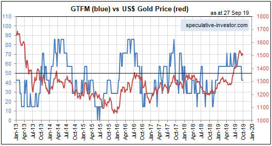
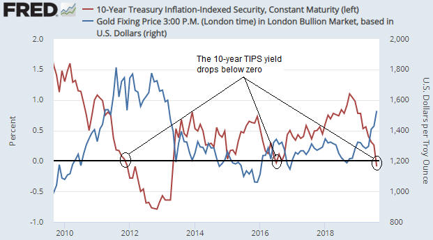
After spending almost all of 2018 in bearish territory, gold’s true fundamentals* (as indicated by my Gold True Fundamentals Model – GTFM) have spent all of this year to date in bullish territory. Refer to the following chart comparison of the GTFM (the blue line) and the US$ gold price (the red line) for the details.

GTFM_100619

A market’s true fundamentals are akin to pressure. Due to sentiment and other influences a market can move counter to the fundamentals for a while, but if the fundamentals continue to act in a certain direction then the pressure will build up until the price eventually falls into line. Also, even if it isn’t sufficient to bring about a significant rally, the upward pressure stemming from a bullish fundamental backdrop will tend to create a price floor. That’s what happened with gold during March and April.

As was the case when I last addressed this topic at the TSI Blog, the most important GTFM input that is yet to turn bullish is the yield curve (as indicated by the 10year-2year and 10year-3month yield spreads). This input shifting from bearish to bullish requires a reversal in the yield curve from flattening (long-term rates falling relative to short-term rates) to steepening (long-term rates rising relative to short-term rates). If the reversal is driven primarily by falling short-term interest rates it indicates a boom-to-bust transition, such as occurred in 2000 and 2007, whereas if the reversal is driven primarily by rising long-term interest rates it points to increasing inflation expectations.

As illustrated below, at the end of last week there was no evidence of such a trend change in the 10year-3month yield spread.

yieldcurve_10y3m_100619

To get a gold bull market there probably will have to be a sustained trend reversal in the yield curve. I think that will happen during the second half of this year, but it hasn’t happened yet. Also, when it does happen my guess is that it will be driven by rising long-term interest rates (indicating rising inflation expectations), not falling short-term interest rates. That’s an out-of-consensus view right now, because inflation expectations are low/falling and almost everyone has come to the conclusion that an aggressive Fed rate-cutting campaign will get underway in the near future.

Another GTFM input that could shift from bearish to bullish in the near future and thus add to the upward pressure on the gold price is the currency exchange rate input. At the moment, all it would take to bring about this shift is a weekly close in the Dollar Index about half a point below last week’s close.

My guess is that there will be some corrective activity in the gold market over the coming 1-2 weeks, but as long as the GTFM stays in bullish territory the fundamentals-related upward pressure should enable the gold price to make new multi-year highs within the next few months.

*I use the term “true fundamentals” to distinguish the actual fundamental drivers of the gold price from the drivers that are regularly cited by gold-market analysts and commentators. According to many pontificators on the gold market, gold’s fundamentals include the volume of metal flowing into the inventories of gold ETFs, China’s gold imports, the volume of gold being transferred out of the Shanghai Futures Exchange inventory, the amount of “registered” gold at the COMEX, India’s monsoon and wedding seasons, jewellery demand, the amount of gold being bought/sold by various central banks, changes in mine production and scrap supply, and wild guesses regarding JP Morgan’s exposure to gold. These aren’t true fundamental price drivers. At best, they are distractions.

Print This Post Print This Post
Mao versus Deng versus Xi

May 28, 2019

In 1961, Deng Xiao Ping uttered what is perhaps his most famous quotation: “I don’t care if it’s a white cat or a black cat. It’s a good cat so long as it catches mice.” This was interpreted to mean that being economically successful is more important than being loyal to any particular ideology.

Deng’s view that having a productive economy was more important than adhering rigidly to theories that were failing in practice brought him into conflict with Mao Tse Tung. It could be argued that Deng was more practical than Mao in that he was prepared to allow/encourage some elements of a market economy, although if the primary objective is holding onto political power then what’s practical is not necessarily what’s best for the country.

From a purely political perspective, Mao was practical. His policies generally had disastrous economic effects, but in addition to maintaining power he was able to stay popular with China’s peasant class (his political support base). He did this by creating the impression that there was always a revolution — of one form or another — to be fought. There were always enemies that had to be defeated, mountains that had to be climbed and sacrifices that had to be made in the present in order to set the stage for a brighter future.

The revolutionary feeling was sustained via a series of dramatic programs and policy shifts, chief among them being:

1. “The Hundred Flowers Campaign” of 1956-1957: Mao encouraged differing opinions on how China should be governed and even permitted public criticism of the Communist Party leadership.

2. “The Anti-Rightist Movement” of 1957-1959: Those who accepted Mao’s invitation to express anti-communist opinions under the “Hundred Flowers Campaign” were eliminated (purged, imprisoned, killed). Quite likely, the “Hundred Flowers Campaign” was just a ruse to identify anyone who could possibly be a threat to Mao.

3. “The Great Leap Forward” of 1958-1962: A 5-year plan focusing on the collectivisation of agriculture that caused widespread food shortages and resulted in the death of tens of millions of people (estimates of the famine-related death toll range from 20M to 45M). This disaster created the first serious rift between Mao and Deng, which eventually led to Deng being purged from the Communist party in the early days of the “Cultural Revolution”.

4. “The Cultural Revolution” of 1966 through to Mao’s death in 1976: Ostensibly a movement to topple the “ruling class”, spread power more evenly and stamp out counter-revolutionary activities, this was Mao’s most blatant attempt to keep China in a perpetual state of revolution. During the “Cultural Revolution”, anyone considered to have skills above those of the average person became a likely target for persecution. In addition, formal education all but ceased, countless works of art and historical buildings were destroyed, and Mao’s “Little Red Book” of quotations effectively became the bible. The result was social and economic chaos.

Fortunately for China, Deng was able to gain control of the Communist Party following Mao’s death. The reforms he implemented showed that even a modicum of economic freedom can go a long way towards improving living standards.

Interestingly, one of the most successful reforms of the Deng era was not the brainchild of Deng, but was, instead, developed by local farmers who were desperate to escape the poverty that collectivised agriculture had imposed upon them. In much the same way that America’s Pilgrims adopted private ownership of farmland in response to a communal system’s failure to produce sufficient food, the inhabitants of one small Chinese village decided, in 1978, to experiment with a new system under which individuals and families would have ownership of farmland. The experiment was a huge success, and was subsequently tried — also with great success — in some other villages. After learning of these experiments and the resultant large increases in agricultural productivity, Deng openly praised the participants and encouraged the nationwide adoption of the ‘new’ system. It is almost certain that the government’s reaction would have been very different if Mao had still been in power.

China’s political leaders between Deng Xiao Ping and Xi Jin Ping, the current leader, were really just place fillers. It’s clear that Xi is the most important leader of the Communist Party of China (CPC) since Deng.

Xi seems to be more like Mao than Deng, in that he places the supremacy of the Party above all other considerations and puts a strong emphasis on Communist ideology. He has made this clear in numerous speeches. For example:

At the October 2017 19th Party Congress, he said: “Government, military, society and schools, north, south, east and west, the Party is the leader of everything.”

And in March-2018, Xinhua (China’s official state-run press agency) quoted him as saying: “The Party exercises overall leadership over all areas of endeavor in every part of the country. A primary task of deepening reform of the Party and state institutions is to strengthen the CPC’s leadership in every sector.

The phrase “capitalism with Chinese characteristics” is not used in China, at least not by any high-ranking members of the CPC. Only Western pundits believe that China is shifting towards capitalism. In China the political system is often referred to as “socialism with Chinese characteristics”. Here are two examples from a Xi speech given last year at the Central Commission for Discipline Inspection (CCDI) Plenary Session:

[Party members should] understand the dialectical relationship between the grand vision of Communism and socialism with Chinese characteristics.

We cannot indulge ourselves in empty talk without working for the cause of socialism with Chinese characteristics and national rejuvenation. We can neither afford to lose the grand vision because realizing Communism is a long process.

And here’s an excerpt from a Xinhua article that quotes Xi making the same point:

The purpose of reviewing the Communist Manifesto is to understand and grasp the power of the truth of Marxism and write a new chapter of socialism with Chinese characteristics in the new era, Xi said. It’s necessary to “apply the scientific principles and the spirit of The Communist Manifesto to the overall planning of activities related to the great struggle, great project, great cause, and great dream,” he said. More efforts should be made to develop Marxism in the 21st century and in contemporary China, and write a new chapter of adapting Marxism to the Chinese context, Xi said.

Like Mao, Xi is attempting to galvanise support behind himself and the Party (Xi is now defined as the “core” of the Party) by promoting the idea that China and the Chinese people are under threat. In this regard he is being helped by having a ready-made enemy in the form of a US government that clearly is trying to contain China both economically and militarily. Moreover, the “trade war” and the US government restrictions on US corporations doing business with Huawei make Xi look prescient, because he has warned for many years that this sort of thing could happen and therefore that it was dangerous for Chinese manufacturers to rely on imported technology.

Unfortunately for Xi, innovation, which he correctly perceives to be lacking in China, won’t happen at the command of government.

Also like Mao, Xi does not tolerate any dissension. All views must be consistent with the goal of having a population unified in its beliefs in “socialism with Chinese characteristics” and the primacy of the Party in all aspects of life. Hence the draconian treatment of millions of Muslims in Xinjiang Province, the severe policing of opinions expressed in social media and the setting-up of the world’s largest domestic surveillance network.

In a way, China has come full circle. However, Xi has far greater technological and economic resources at his disposal than Mao could have ever dreamed of.

Print This Post Print This Post
The old Keynesian guidelines have been forgotten

May 21, 2019

[This blog post is an excerpt from a recent TSI commentary]

Keynesian economic theory is useless if the aim is to understand how the world of human production and consumption works, but it is useful when attempting to figure out the policies that will be implemented in the future. The reason is that government and central bank policy-making is dominated by Keynesian ideas.

One of the most prominent Keynesian ideas is that changes in aggregate demand drive the economy. This leads to the belief that the government can keep the economy on a steady growth path by boosting its deficit-spending (thus adding to aggregate demand) during periods when economic activity is too slow and running surpluses (thus subtracting from aggregate demand) during periods when economic activity is too fast.

To further explain using an analogy, in the Keynesian world the economy is akin to a bathtub filled with an amorphous liquid called “aggregate demand”. When the liquid level gets too low it’s the job of the government and the central bank to top it up, and when the liquid level gets too high it’s the job of the government and the central bank to drain it off. Keynesian economics therefore has been called “bathtub economics”. The real-world economy is nothing like a bathtub, but that doesn’t seem to matter.

In any case, the point we now want to make is that in the US the traditional Keynesian guidelines are no longer being followed. Gone are the days of ramping-up government deficit-spending in response to economic weakness and running surpluses or at least reducing deficits when the economy is strong. These days the US federal government applies non-stop Keynesian-style stimulus and regularly exhorts the central bank to do the same. So, debt-financed tax cuts were implemented in 2017 when the economy seemed to be performing well, and now, with the unemployment rate at a generational low, the stock market near an all-time high and GDP growth chugging along at around 3%/year, the US government is planning a US$2 trillion infrastructure spending spree and the executive branch of the government is demanding that the Fed cut interest rates from levels that are already very low by historical standards.

In other words, although the ‘Keynesian bathtub’ appears to be almost over-flowing, the US government is pushing for more demand-boosting actions. The strategy is now full-on ‘stimulus’ all the time. That’s part of why it doesn’t make sense to be anything other than long-term bullish on “inflation” and long-term bearish on Treasury bonds.

Print This Post Print This Post
Monetary Inflation Roundup

May 14, 2019

[This blog post is an excerpt from a recent TSI commentary]

Here is our monthly update on what’s happening on the monetary inflation front in a few different regions/countries.

The G2 (US plus euro-zone) monetary inflation rate dropped to a 10-year low in March-2019 and has now spent 19 months below the boom-bust threshold of 6%. Refer to the following chart for details.

The low rate of G2 monetary inflation stems from the very low rate of money-supply growth in the US. During March the year-over-year (YOY) rate of growth in euro supply was 7.6%, which although well down from a 2014 peak of 14% is still quite high. The rate of growth in US$ supply, however, was only 1.8%.

The slow (by modern standards) rate of G2 money-supply growth boosts the risk that a global recession will begin in 2019, but, as noted in the past, the monetary inflation rate is a long-term indicator that leads economic and financial-market conditions by amounts of time that can vary substantially from one cycle to the next. When attempting to predict the start time of the next recession we therefore rely on other leading indicators, three of which were discussed in last week’s Interim Update.

Australia’s monetary inflation rate has picked up a little over the past few months, but the country remains on the verge of monetary deflation.

The very slow money-supply growth has had an effect on Australia’s property market, in that over the past 12 months residential property prices have fallen by an average of 6.9% on a nationwide basis and 10.9% in Sydney (the largest and most expensive city in Australia). Refer to the article posted HERE for more detail.

Actually, the decline to near zero in Australia’s monetary inflation rate is both a cause and an effect of the slight (to date) deflation of the property investment bubble. Commercial banks have been making it more difficult for house buyers to obtain credit, leading to a pullback in prices and a slowdown in the pace at which new money is created.

In January-2019 the year-over-year (YOY) growth rate of China’s M1 money supply dropped to its lowest level since 1989. There was an insignificant up-tick in February, but the recent attempts by China’s government to promote credit expansion started to ‘bear fruit’ in March. Refer to the following chart for details.

We wonder if this is too little too late to kick-start a new surge in the demand for industrial commodities.

Hong Kong hasn’t escaped the general monetary-inflation slowdown. As illustrated below, the YOY rate of growth in HK’s M2 money supply has languished near a 10-year low in the 1%-4% range over the past several months.

Remarkably, HK’s low monetary inflation rate is yet to have a pronounced effect on the world’s most expensive real estate. Property prices dropped in HK during August-December of last year, but they rose in January and the majority view is that a rise to new highs is in store.

Due to the monetary backdrop, we think there’s a high risk of a double-digit decline in HK property prices over the next 12 months.

Almost everyone knows that the Bank of Japan (BOJ) has pumped a huge amount of money into the Japanese economy, so the lack of “price inflation” in Japan is something of a quandary. Analysts have let their imaginations run wild in an attempt to explain this strange set of circumstances, and the situation in Japan has even been cited as proof that increasing the money supply doesn’t cause prices to rise. However, anyone who didn’t blindly assume that the BOJ’s actions were leading to rapid money-supply growth and instead took the trouble to check what was actually happening to Japan’s money supply would quickly realise that explaining Japan’s lack of “price inflation” requires no stretch of the imagination. The fact is that Japan’s monetary inflation rate over the past 25 years has been consistent with an “inflation” rate of approximately zero.

The persistently low rate of monetary inflation in Japan is illustrated by the following chart. The chart shows that the YOY rate of increase in Japan’s M2 money supply averaged about 2% over the past 27 years and about 2.5% over the past 10 years. It is currently about 2.4%. Assuming productivity growth of 2%-3%, these money-supply figures are consistent with a flat general price level.

Note that QE in Japan is different from QE in the US. When the Fed implements QE it boosts the supply of bank reserves and the supply of money on a one-for-one basis (bank reserves aren’t counted in the money supply), but the BOJ’s QE adds far more to bank reserves than to the money supply. Note also that the Fed’s QE created a lot less “price inflation” than many people were expecting for the reasons outlined HERE.

The Japanese economy has benefited from the persistently slow rate of monetary inflation and the resulting stability of the currency, but at the same time it has been hurt by the massive diversion of resources to the government. The net result is an economy that isn’t exactly vibrant, but also isn’t that bad.

To summarise the above information, the pace at which new money is being created around the world remains unusually slow.

Print This Post Print This Post
What is GLD’s gold inventory telling us?

May 6, 2019

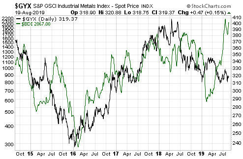
An increase in the amount of gold bullion held by GLD (the SPDR Gold Shares) and other bullion ETFs does not cause the gold price to rise. The cause-effect works the other way around and in any case the amount of gold that moves in/out of the ETFs is always trivial compared to the metal’s total trading volume. However, it is reasonable to view the change in GLD’s gold inventory as a sentiment indicator.

Ironically, an increase in the amount of physical gold held by GLD and the other gold ETFs is indicative of increasing speculative demand for “paper gold”, not physical gold. As I explained in previous blog posts (for example, HERE), physical gold only ever gets added to GLD’s inventory when the price of a GLD share (a form of “paper gold”) outperforms the price of gold bullion. It happens as a result of an arbitrage trade that has the effect of bringing GLD’s market price back into line with its net asset value (NAV). Furthermore, the greater the demand for paper claims to gold (in the form of ETF shares) relative to physical gold, the greater the quantity of physical gold that gets added to GLD’s inventory to keep the GLD price in line with its NAV.

Speculators in GLD shares and other forms of “paper gold” (most notably gold futures) tend to become increasingly optimistic as the price rises and increasingly pessimistic as the price declines. That’s the explanation for the positive correlation between the gold price and GLD’s physical gold inventory illustrated by the following chart. That’s also why intermediate-term trend reversals in the GLD gold inventory tend to follow reversals in the gold price. The thick vertical lines on the following chart mark the intermediate-term trend reversals in the US$ gold price.

GLDinventory_060519

Interestingly, the increase in the GLD inventory that occurred in parallel with the most recent upward trend in the gold price was relatively small. This suggests that the price rally was driven more by increasing demand for physical gold than by increasing demand for paper gold. Furthermore, the minor downward correction in the gold price since the February-2019 short-term peak has been accompanied by a disproportionately large decline in GLD’s physical inventory. In fact, at the end of last week GLD held about 30 tonnes less gold than it did when the gold price was bottoming in the $1170s last August. Again, this suggests that the gold price has been supported by demand for the physical metal.

In terms of influence on the gold price, speculative trading of gold futures is vastly more important than speculative trading of GLD shares. Therefore, assumptions about paper versus physical demand shouldn’t be based solely on the change in the GLD inventory. The situation in the gold futures market also must be taken into account.

I won’t get into the details in this post, but changes in futures-market positioning and open interest over the past few months are consistent with the idea that the demand for physical gold has been strong relative to the demand for paper gold.

The relatively strong demand for physical gold does not imply that a big gold-price rally is coming, but it does imply that the downside price risk is low.

Print This Post Print This Post
Gold, Commodities, and Bob Moriarty’s New Book

April 29, 2019

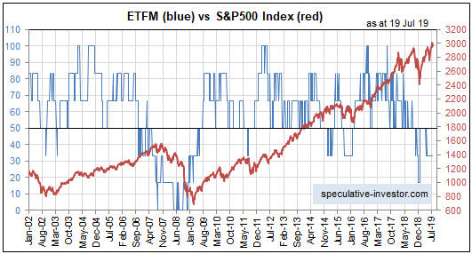
If you look hard enough you will always be able to find reasons that the gold price is about to rocket upward, because such reasons always exist regardless of whether gold’s prospects are bullish or bearish. More generally, searching for reasons that something specific is about to happen is a bad way to speculate or invest because it will always be possible to find evidence to support any preconceived view. Rather than attempting to justify preconceived views, it is much better to approach the markets with an open mind and to base buy/sell decisions on objective indicators with good long-term track records.

One of the financial world’s most reliable indicators is the gold/commodity (g/c) ratio. The g/c ratio is more predictable than the US$ gold price, or to be more accurate the g/c ratio has a more consistent relationship with other markets than does the US$ gold price. This is possibly because removing the ever-changing dollar from the equation suppresses ‘noise’ and amplifies ‘signal’.

The following chart is an example of the g/c ratio’s consistent, and therefore predictable, relationship with another market. It shows that almost all of the time the g/c ratio (as represented by the US$ gold price divided by the GSCI Spot Commodity Index) trends in the same direction as credit spreads (represented here by the IEF/HYG ratio).

The relationship depicted below is sufficiently reliable that if you know, or at least have a good idea regarding, what will happen to credit spreads over a certain period, then you will be able to accurately forecast whether gold will strengthen or weaken relative to the average commodity over the period. By the same token, knowledge about whether gold is poised to strengthen or weaken relative to the average commodity leads to a high-probability forecast about credit spreads.

gold_creditsp_290419

There are other inter-market relationships involving the g/c ratio that work just as well as the one mentioned above, and at the beginning of this year I used one of these to forecast that gold would be weak relative to commodities during the first half and strong relative to commodities during the second half of 2019. The first-half forecast has panned out to date. The second-half forecast still looks plausible but is subject to revision based on what happens to various indicators over the next couple of months.

Another of the financial world’s most reliable indicators is sentiment. An accurate reading of market sentiment doesn’t lead to specific conclusions about future price movements, and as discussed HERE there are pitfalls associated with using sentiment to guide buy/sell decisions. However, understanding how sentiment affects the markets can give an investor a decisive edge.

I’m not going to write about why or how sentiment can be used to good effect when attempting to time buys and sells in the financial markets. I’m also not going to mention the most useful indicators of market sentiment. The reason is that Bob Moriarty has covered this ground and more in his latest book: “Basic Investing in Resource Stocks: The Idiot’s Guide“. The Kindle version of the book is only US$6, or just a little more than the price of a large cappuccino at my local cafe.

Bob’s book is essential reading for anyone speculating in junior resource stocks, especially anyone who is inexperienced or hasn’t coped well with the huge swings in these stocks in the past.

At one point during the book I thought that Bob was making successful speculation in the stocks of small mining and oil companies seem too easy, because the hard reality is that even when you understand the most effective way to trade these stocks you still will stumble into traps from time to time. However, later in the book Bob warns the reader that large losses can happen even when all the ducks appear to be in a row. He does this by recounting some amusing stories about his own failed speculations and the management teams that helped to create these failures.

Even if you already know how to use sentiment and how to operate profitably at the speculative end of the stock market, you will get something out of the Bob Moriarty book linked above. It’s well worth the 6 bucks for the electronic version or the 12 bucks for the paper version.

Print This Post Print This Post
The pace of US money-supply growth slows to a crawl. Is this a major problem for the stock market?

April 22, 2019

A popular view is that the Fed has given up on monetary tightening and as a result the stock market should continue to trend upward over the months ahead. This view is based on flawed reasoning.

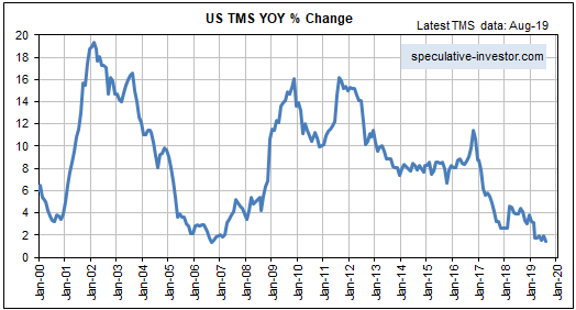
The reality is that the Fed possibly will give up on monetary tightening later this year, but currently the Fed is pulling quite firmly on the monetary reins via its on-going balance-sheet normalisation (that is, balance-sheet reduction) program. Moreover, the Fed’s on-going withdrawal of money from the economy is not being fully offset by the actions of the commercial banks, so the overall US money-supply situation is becoming increasingly restrictive. This is evidenced by the following chart of the year-over-year (YOY) change in US True Money Supply (TMS). The chart shows that in March-2019 the US monetary inflation rate made a 12-year low.

However, the unusually slow pace of US money-supply growth is not a good reason to be short-term bearish on the US stock market. This is partly because changes in the financial markets lag changes in the monetary backdrop by long and variable amounts of time. It is also because of a point that was covered in a TSI blog post about three weeks ago.

The point I’m referring to is that whether the overall monetary situation is ‘tightening’ or ‘loosening’ is not solely determined by the change in money supply. Instead, over periods of up to a few years the change in the demand for money (meaning: the change in the desire to hold/obtain cash as an asset) often will dominate the change in the supply of money.

In general terms, the change in overall liquidity is determined by the change in the supply of money relative to the change in the demand to hold cash or cash-like securities. As a consequence, it’s possible for the liquidity situation to be tight even if the monetary inflation rate is very high and/or rapidly increasing. A great example is the period from September-2008 to March-2009, when a large and fast increase in the US money supply was more than offset by a surge in the demand for money. Also, it’s possible for there to be abundant liquidity even if the monetary inflation rate is very low. A good example occurred over the past 3-4 months.

Although the supply side of the monetary equation tends to be dominated by the demand side of the equation over the short-to-intermediate-term, today’s unusually low monetary inflation rate is still significant. It means that only a small increase in the demand to hold cash could bring about another plunge in the stock market. To put it another way, due to the low monetary inflation rate the US stock market is far more vulnerable than usual to a short-term increase in risk aversion.

Taking a wider-angle view, the money-supply situation also leads to the conclusion that if a bear market did not begin last year (it most likely didn’t) then it will begin by the second half of next year at the latest. Other indicators will be required to narrow-down the timing.

Print This Post Print This Post
The gold/commodity ratio makes another T-Bond forecast

April 9, 2019

[In a blog post last October I mentioned that a recent divergence between the gold/commodity ratio and the T-Bond price had bullish implications for the T-Bond. A strong rebound in the T-Bond soon got underway. Another divergence between the gold/commodity ratio and the T-Bond price has since developed, this time with bearish implications for the T-Bond. A discussion of the most recent divergence was included in a TSI commentary published on 28th March and is reprinted below.]

The gold/commodity (g/c) ratio and the T-Bond price tend to move in the same direction. As previously explained, this tendency is associated with what Keynesian economists call a paradox (“Gibson’s Paradox”) and Austrian economists call a natural and perfectly understandable consequence of the relationship between time preference and prices. The reason for revisiting the gold-bond relationship today is that a significant divergence developed over the past three months and such divergences are usually important.

The following chart illustrates our point that the gold/commodity ratio (the US$ gold price divided by the GSCI Spot Commodity Index) and the T-Bond price move in the same direction most of the time. It also shows that over the past three months the two quantities have diverged, with the g/c ratio trending downward while the T-Bond price extended its upward trend and moved to a marginal new 12-month high.

Given that the relationship between the g/c ratio and the T-Bond has a solid fundamental basis, that is, given that it’s not a case of random correlation, it should continue to apply. Therefore, we expect that the divergence will close over the months ahead — via either a rise in the g/c ratio to above its December-2018 high or a decline in the T-Bond price to well below its February-2019 low.

The divergence probably will close via a decline in the T-Bond price, because if there is a leader in this relationship it is the g/c ratio. For example, in each of the three biggest divergences of the past five years (the areas inside the blue boxes drawn on the above chart), the g/c ratio reversed course months in advance of the T-Bond. The g/c ratio also led the T-Bond by 2-3 months at the Q3-2017 top and by a couple of weeks at the Q4-2018 bottom. In other words, the recent performance of the g/c ratio is a reason to be intermediate-term bearish on the T-Bond.

One realistic possibility is that the T-Bond is now topping similarly to how it bottomed between December-2016 and March-2017. Back then, both the g/c ratio and the T-Bond turned up at around the same time (in late December of 2016), but whereas the g/c ratio trended upward throughout the first quarter of 2017 the T-Bond made a marginal new low in March before commencing an upward trend of its own. This time around the g/c ratio and the T-Bond turned down at around the same time (in late December of 2018), but whereas the g/c ratio has continued along a downward path the T-Bond has risen to a marginal new multi-month high.

Print This Post Print This Post