Blog 2 Columns

Just when I thought it couldn’t get any worse…

February 3, 2015

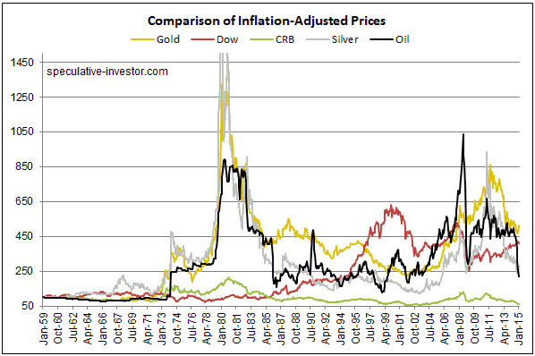
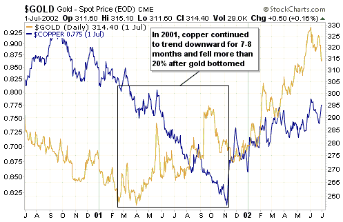
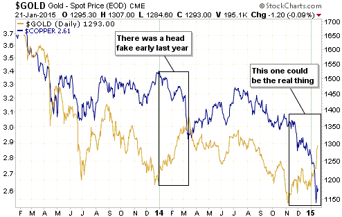
Sorry to belabor a subject to which I’ve already devoted a lot of blog space, but just when I thought that the gold supply-demand analysis of Mineweb journalist Lawrence Williams couldn’t get any worse, he comes up with THIS. Not satisfied with wrongly portraying, in many articles, the shift of gold from outside to inside China as an extremely bullish price-driving fundamental and representative of an increase in global gold demand, he now wants you to believe that the transfer of gold from one China-based trader to another China-based trader constitutes an increase in overall Chinese gold demand. No, I’m not making that up. Read the above-linked article.

What he is specifically claiming is that an increase in overall Chinese gold demand occurs when someone in China takes delivery of gold from the Shanghai Gold Exchange (SGE). He seems to be oblivious of the fact that all the gold sitting in the SGE’s inventory is owned by someone, so in order for Trader Wong to satisfy an increase in his demand for physical gold by taking delivery, Trader Chang, the current owner of the gold held in the SGE inventory, must reduce his demand for physical gold by exactly the same amount. There can be no net change in demand as a result of such a transaction, and, as discussed in previous posts, the price effect will be determined by whether the buyer (Wong) or the seller (Chang) is the more motivated.

Mr. Williams then goes on to say:

…withdrawals from the [Shanghai Gold] Exchange for the first 3 weeks of the year have come to over 200 tonnes — and with total global new mined gold production running at around 60 tonnes a week according to the latest GFMS estimates, this shows that the SGE on its own is accounting for comfortably more than this so far this year. GFMS has also seen a fall in global scrap supplies — the other main contributor to the total world gold supply — which it sees as continuing through 2015 so the Chinese SGE withdrawal figures so far are, on their own, accounting for around 85% of ALL new gold available to the market. So where’s the rest of the world’s (including India) gold supply coming from?

The answer is that the gold could be coming from almost anywhere. Furthermore, it’s quite likely that most of the gold that ‘flows’ into China and India does not come from the current year’s mine production.

Would someone please point out to Mr. Williams that gold mined 200 years ago is just as capable of satisfying today’s demand as gold mined last month, and that the total aboveground gold inventory is at least 170,000 tonnes and possibly as much as 200,000 tonnes. This aboveground gold inventory, not the 60 tonnes/week of new mine production, is the supply side of the equation.

Print This Post Print This Post

Chris Powell goes off on a tangent

February 2, 2015

Chris Powell has written an article in reply to my blog post “Looking for (gold price) clues in all the wrong places“. Actually, that’s not strictly true. He has written an article that purports to be a reply to my blog post, but completely ignores my central point. Instead, he shifts the discussion back to his manipulation hobbyhorse. Was this deliberate misdirection to avoid addressing my argument? You might very well think that; but of course I couldn’t possibly comment.

Here’s a hypothetical situation that will hopefully further explain the main point I’m trying to get across. Assume that Fred is looking for an opportunity to buy 1 million Microsoft shares, that Jack is looking for an opportunity to sell 1M Microsoft shares, that the current share price is $40 and that there is temporarily no one else looking to do a trade in these shares. Initially Jack offers his shares for sale at $42 and Fred bids $38, so no trade takes place. Subsequently, Jack reduces his offer price to $38 and the sale is completed at that price. The fact that the price fell $2 indicates that Jack, the seller, was more motivated than Fred, the buyer, but what if you knew nothing except that 1M shares ‘flowed’ from Jack to Fred? What would this ‘flow’ tell you about the price? The answer is: precisely nothing.

In my hypothetical example, the only way to know whether the buyer or the seller was the more motivated is to look at the price change. It’s the same story in all the financial markets, including the gold market. The price of something could go up on rising volume or it could go up on falling volume or it could go down on rising volume or it could go down on falling volume. In fact, it is possible for the price of something to make a large move in either direction on NO volume.

My point, again, is that the price isn’t determined by the volume or the ‘flow’; it’s determined by the relative eagerness of buyers and sellers. Therefore, from a practical investing/speculating perspective the most useful information is that which provides clues about the likely future intensity of buying relative to selling. In the gold market, these clues will be indicators of confidence in central banks and confidence in the economy.

This point cannot be refuted by quoting Henry Kissinger or a Chinese newspaper. It’s based on logic and economic reality.

Print This Post Print This Post

Yet another useless article about gold supply and demand

January 31, 2015

A recent article at Mineweb discusses the latest gold-market analysis of Gold Fields Mineral Services (GFMS). As far as past or likely future gold price movements are concerned, every sentence in this article is either completely wrong or completely irrelevant.

The GFMS analysis discussed in the article follows the typical, wrongheaded pattern of adding up the flows between different parts of the market and using these flows to estimate supply and demand. It’s the same mistake I’ve addressed many times in the past, most recently in a 26th January blog post. The mistake is largely based on the misconception that current mine production constitutes the supply side of the equation, rather than just a small increment to an existing aboveground inventory.

If you start with a totally wrong premise, you will probably end up with a ludicrous conclusion. In this case the ludicrous conclusion is that gold supply is currently greater than gold demand.

In a market that clears (such as the gold market), supply can never be greater than demand and demand can never be greater than supply. Supply and demand must always be equal, with the price constantly changing to whatever it needs to be to maintain the balance.

Claiming that the supply of gold exceeds the demand for gold would be like claiming that the supply of dollars exceeded the demand for dollars. Such claims create the impression that there is a pile of gold or dollars somewhere that nobody wants or owns, because current demand has already been fully satisfied by the rest of the supply. The reality is that all gold and all dollars are always held/owned by someone, with the price (or purchasing power) adjusting to keep the supply equal to the demand.

From a supply-demand perspective, the only significant difference between gold and the US$ is that the supply of dollars regularly changes a lot (by 8% or more) from one year to the next, whereas the annual rate of change in the total aboveground gold supply is always around 1.6%. The reason, of course, is that considerable real resources (labour, materials and energy) must be employed to increase the aboveground gold supply, whereas the supply of dollars can be increased at no cost at the whim of central and commercial bankers.

That’s why I care about changes in US$ supply and do not care about changes in gold-mine production.

Print This Post Print This Post

Comparing Real Performance

January 27, 2015

This post is a slightly-modified excerpt from a recent TSI commentary.

Here is chart that compares the long-term inflation-adjusted (IA) performances of several markets. This chart makes some interesting points.

One of the most interesting points is that market volatility increased dramatically in the early-1970s when the current monetary system was ushered in. This shows that the generally higher levels of monetary inflation and the larger variations in the rate of monetary inflation that occurred after the official link to gold was abandoned didn’t only affect nominal prices. Real prices were affected in a big way and boom-bust oscillations were hugely amplified. As an aside, economists of the Keynesian School are oblivious to the swings in relative ‘real’ prices caused by monetary inflation and the depressing effects that these policy-induced price swings have on economic progress.

A second point is that commodities in general (the green line on the chart) have experienced much smaller performance oscillations than the two monetary commodities (gold and silver). This is consistent with my view that there aren’t really any long-term broad-based commodity bull markets, just gold bull markets in which most commodities end up participating.

A third point is that apart from the CRB Index, the markets and indices included in the chart have taken turns in leading the real performance comparison. The chart shows that gold is the current leader, closely followed by the Dow Industrials Index (since January-1959, the percentage gain in gold’s real price is slightly greater than the percentage gain in the Dow’s real price). However, if dividends were included, that is, if total returns were considered, the Dow would currently be in the lead. This will change.

    Chart Notes:

1) I use a method of adjusting for the effects of US$ inflation that was first described in a 2010 article. This method isn’t reliable over periods of two years or less, but it should come close to reflecting reality over the long term.

2) To make it easier to compare relative performance, the January-1959 starting value of each of the markets included in the above chart was set to 100. In other words, the chart shows performance assuming that each market started at 100.

3) The monthly performance of the scaled IA silver price peaked at more than 2600 in early-1980, but for the sake of clarity the chart’s maximum Y-axis value was set to 1500. In other words, the chart doesn’t show the full extent of the early-1980 upward spike in the IA silver price.

Print This Post Print This Post

Looking for (gold price) clues in all the wrong places

January 26, 2015

Every transaction in a market involves an increase in demand for the traded item on the part of the buyer and an exactly offsetting decrease in the demand for the traded item on the part of the seller, which means that neither a purchase nor a sale implies a market-wide change in demand or price. This is obvious, so why does so much gold-market analysis focus on the quantities of gold shifting from one geographical area to another or from one part of the market to another?

I don’t know the answer to the above question, but I do know that focusing on the changes in gold location is pointless if your goal is to find clues regarding gold’s prospects. For example, while there could be a reason for wanting to know the amount of gold being transferred to China (I can’t think of a reason, but maybe there is one), the information will tell you nothing about the past or the likely future performance of the gold price. For another example, the amount of gold shifting into or out of ETF inventories could be of interest, but the shift in location from an ETF inventory to somewhere else or from somewhere else to an ETF inventory is not a driver of the gold price (as I explained in a previous blog post, changes in ETF inventory are effects, not causes, of the price trend).

Over recent years many gold bulls have cited the net-buying of gold by the geographical region known as China as a reason to expect higher prices. Prior to that it was often the net buying of gold by India that was cited as a reason to be bullish. The point that is being missed in such arguments is that regardless of whether gold’s price trend is bullish or bearish, some parts of the world will always be net buyers and other parts of the world will always be net sellers of gold, with the two exactly offsetting each other. At some future time it is possible that China will become a net seller and the US will become a net buyer. If so, will the same pundits that have wrongly cited the buying of China as a reason to be bullish then start wrongly citing the buying of the US as a reason to be bullish? Unfortunately, they probably will.

What determines gold’s price trend isn’t the amount of gold bought, since the amount bought will always equal the amount sold. Instead, the price trend is determined by the general urgency to sell relative to the general urgency to buy (with the relative urgency to buy/sell being strongly influenced by confidence in the two senior central banks). To put it another way, if the average buyer is more motivated than the average seller, the price will rise, and if the average seller is more motivated than the average buyer, the price will fall. So, how do we know whether the buyers or the sellers are the more motivated group?

The only reliable indication is the price itself. If the price is rising we know, with 100% certainty, that buyers are generally more motivated than sellers. In other words, we know that demand is trying to increase relative to supply. And if the price is falling we know, with 100% certainty, that sellers are generally more motivated than buyers. In other words, we know that demand is trying to decrease relative to supply.

That’s why statements along the lines of “demand is rising even though the price is falling” are just plain silly.

Print This Post Print This Post

Gold versus Copper

January 22, 2015

One of the most interesting aspects of the recent steep downward trend in the copper price is that it occurred in parallel with a rising trend in the gold price. This doesn’t guarantee anything, but it is consistent with what should be happening if the commodity markets have begun the transition from cyclical bear to cyclical bull.

By way of explanation, long-term broad-based rising trends in commodity prices are always driven by bad monetary policy. A consequence is that gold, due to its nature, will generally turn higher in advance of most other commodities. In effect, there are no long-term broad-based commodity bull markets, just gold bull markets that most commodities end up participating in.

A good example occurred during 2001-2002. As illustrated by the chart displayed directly below, in 2001 the copper price continued to trend downward for 7-8 months and fell by more than 20% after gold’s price trend reversed upward. 

gold_copper_2001_220115

As illustrated by the next chart, there was a ‘head fake’ during the first quarter of last year, with gold rising while the copper price tanked. A similar situation has developed since early-November.

gold_copper_220115

If gold bottomed on a long-term basis last November, then copper should do the same within the next few months.

Print This Post Print This Post

The meaning of negative bond yields

January 19, 2015

Some government bonds are now being quoted with negative yields. Taking an extreme example, Swiss government bonds are now being quoted with negative yields for all maturities up to 10 years. This prompts the question: Who, in their right mind, would pay a government for the ‘privilege’ of lending the government money?

The zero or negative bond yields are almost certainly related in part to the desire by large cash-holders to ensure a return of cash, even if doing so guarantees a small nominal loss. By way of further explanation, if you have $100K of cash to park somewhere you can put it in an insured bank deposit and be guaranteed of getting your money back, but what do you do if you have $1B of cash? If you put this money into a bank account then only a trivial portion will be covered by the government’s deposit insurance, meaning that the failure of the bank could result in a substantial portion of your money being wiped out. To avoid the risk of a large loss due to bank failure it might seem reasonable for you to lend the money to the government at a yield that is certain to result in a small loss. In this case, the small loss stemming from the negative yield on your bond investment is a form of insurance that guarantees the return of almost all of your money.

In other words, at a time when “inflation” risk is perceived to be low and there are concerns about the safety of commercial banks, it could make sense for a large holder of cash to lend the money to the government at a small negative yield.

That being said, it’s important to remember that we aren’t really dealing with 0% or negative bond yields, we are dealing with 0% or negative yields to maturity. The bond yields themselves are still positive.

To further explain, consider the simple hypothetical case of a 1-year bond with par value of $100 that pays interest of $2 at the end of the 1-year duration. If the bond is trading at its par value then both the yield and the yield to maturity (YTM) will be 2%, but both yields will be something other than 2% when the bond’s price deviates from $100. For example, if the bond’s price rises to $103 then the yield falls to 1.94% ($2/$103) and the YTM falls to negative 0.97%. The YTM in this example takes into account the fact that if the bond is held until maturity then the buyer of the bond at $103 will receive a $2 interest payment plus a $100 principle payment, or a total return of $102 versus an outlay of $103. The $1 loss on the $103 investment equates to a return of negative 0.97%.

An implication is that someone who doesn’t plan to hold until maturity can still make a profit on a bond with a negative YTM. For example, someone who buys a Swiss government bond with a YTM of negative 0.1% today will have the opportunity of selling at a profit if the YTM subsequently falls to negative 0.2%. The current ridiculous valuations of some government bonds could therefore be partly explained by the belief that valuations will become even more ridiculous in the future, thus enabling today’s buyers to exit at a profit.

That is, in addition to the willingness to accept a small loss for a guarantee that almost all of the money will be returned, the “greater fool theory” could be at work in the government bond market. In this regard, a government bond having a negative YTM is not that different from an internet stock with no revenue being assigned a multi-hundred-million-dollar valuation based on “eyeballs”. It’s just another in a long line of examples of the madness of crowds, a madness that is often rooted in central bank policy.

Print This Post Print This Post

The SNB gets religion, sort of

January 16, 2015

In a shot out of the blue, on Thursday 15th January the Swiss National Bank (SNB) suddenly removed the Swiss-Franc/Euro cap that was put in place in August of 2011. Due to the cap that was imposed by the SNB way back then, the SF has effectively been pegged to the euro over the past three-and-a-bit years. Since the SF was a chronically stronger currency than the euro, maintaining this peg forced the SNB to massively expand its balance sheet by monetising huge quantities of euro-denominated bonds.

It seems that the SNB belatedly came to see that continuing to peg the SF to the euro created the risk that the SF would become excessively weak and unstable. The sensible, but surprising, decision was therefore made to eliminate the peg. A result was a gigantic single-day surge in the SF relative to all other currencies, not just the euro. For example, the following chart shows that the SF gained almost 20% relative to the US$ on Thursday. As far as we know, this is the biggest single-day move by a major currency in at least 50 years.

It should be noted, however, that the SNB’s shift to a more prudent monetary stance was only half-hearted, because at the same time as it announced the removal of the SF/euro cap it also announced that official 3-month interest rates would be set between NEGATIVE 0.25% and NEGATIVE 1.25%. In effect, the SNB is saying that it will pay speculators to short the SF.

SF_150115

Print This Post Print This Post