April 16, 2015
The following charts relate to an email that will soon be sent to TSI subscribers.
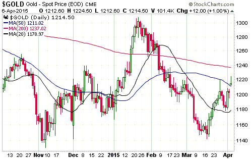
CHART 1 – THE US$ GOLD PRICE
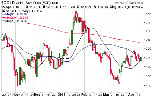
CHART 2 – THE HUI
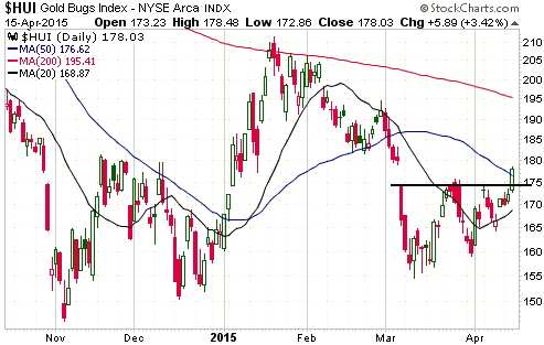
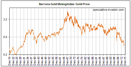
CHART 3 – THE HUI/GOLD RATIO
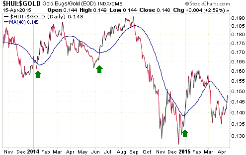
CHART 4 – THE NYSE COMPOSITE INDEX
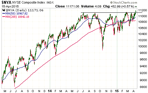
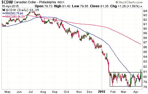
CHART 5 – THE CANADIAN DOLLAR
 Print This Post