Blog 2 Columns

What is GLD’s gold inventory telling us?

May 6, 2019

An increase in the amount of gold bullion held by GLD (the SPDR Gold Shares) and other bullion ETFs does not cause the gold price to rise. The cause-effect works the other way around and in any case the amount of gold that moves in/out of the ETFs is always trivial compared to the metal’s total trading volume. However, it is reasonable to view the change in GLD’s gold inventory as a sentiment indicator.

Ironically, an increase in the amount of physical gold held by GLD and the other gold ETFs is indicative of increasing speculative demand for “paper gold”, not physical gold. As I explained in previous blog posts (for example, HERE), physical gold only ever gets added to GLD’s inventory when the price of a GLD share (a form of “paper gold”) outperforms the price of gold bullion. It happens as a result of an arbitrage trade that has the effect of bringing GLD’s market price back into line with its net asset value (NAV). Furthermore, the greater the demand for paper claims to gold (in the form of ETF shares) relative to physical gold, the greater the quantity of physical gold that gets added to GLD’s inventory to keep the GLD price in line with its NAV.

Speculators in GLD shares and other forms of “paper gold” (most notably gold futures) tend to become increasingly optimistic as the price rises and increasingly pessimistic as the price declines. That’s the explanation for the positive correlation between the gold price and GLD’s physical gold inventory illustrated by the following chart. That’s also why intermediate-term trend reversals in the GLD gold inventory tend to follow reversals in the gold price. The thick vertical lines on the following chart mark the intermediate-term trend reversals in the US$ gold price.

GLDinventory_060519

Interestingly, the increase in the GLD inventory that occurred in parallel with the most recent upward trend in the gold price was relatively small. This suggests that the price rally was driven more by increasing demand for physical gold than by increasing demand for paper gold. Furthermore, the minor downward correction in the gold price since the February-2019 short-term peak has been accompanied by a disproportionately large decline in GLD’s physical inventory. In fact, at the end of last week GLD held about 30 tonnes less gold than it did when the gold price was bottoming in the $1170s last August. Again, this suggests that the gold price has been supported by demand for the physical metal.

In terms of influence on the gold price, speculative trading of gold futures is vastly more important than speculative trading of GLD shares. Therefore, assumptions about paper versus physical demand shouldn’t be based solely on the change in the GLD inventory. The situation in the gold futures market also must be taken into account.

I won’t get into the details in this post, but changes in futures-market positioning and open interest over the past few months are consistent with the idea that the demand for physical gold has been strong relative to the demand for paper gold.

The relatively strong demand for physical gold does not imply that a big gold-price rally is coming, but it does imply that the downside price risk is low.

Print This Post Print This Post

Gold, Commodities, and Bob Moriarty’s New Book

April 29, 2019

If you look hard enough you will always be able to find reasons that the gold price is about to rocket upward, because such reasons always exist regardless of whether gold’s prospects are bullish or bearish. More generally, searching for reasons that something specific is about to happen is a bad way to speculate or invest because it will always be possible to find evidence to support any preconceived view. Rather than attempting to justify preconceived views, it is much better to approach the markets with an open mind and to base buy/sell decisions on objective indicators with good long-term track records.

One of the financial world’s most reliable indicators is the gold/commodity (g/c) ratio. The g/c ratio is more predictable than the US$ gold price, or to be more accurate the g/c ratio has a more consistent relationship with other markets than does the US$ gold price. This is possibly because removing the ever-changing dollar from the equation suppresses ‘noise’ and amplifies ‘signal’.

The following chart is an example of the g/c ratio’s consistent, and therefore predictable, relationship with another market. It shows that almost all of the time the g/c ratio (as represented by the US$ gold price divided by the GSCI Spot Commodity Index) trends in the same direction as credit spreads (represented here by the IEF/HYG ratio).

The relationship depicted below is sufficiently reliable that if you know, or at least have a good idea regarding, what will happen to credit spreads over a certain period, then you will be able to accurately forecast whether gold will strengthen or weaken relative to the average commodity over the period. By the same token, knowledge about whether gold is poised to strengthen or weaken relative to the average commodity leads to a high-probability forecast about credit spreads.

gold_creditsp_290419

There are other inter-market relationships involving the g/c ratio that work just as well as the one mentioned above, and at the beginning of this year I used one of these to forecast that gold would be weak relative to commodities during the first half and strong relative to commodities during the second half of 2019. The first-half forecast has panned out to date. The second-half forecast still looks plausible but is subject to revision based on what happens to various indicators over the next couple of months.

Another of the financial world’s most reliable indicators is sentiment. An accurate reading of market sentiment doesn’t lead to specific conclusions about future price movements, and as discussed HERE there are pitfalls associated with using sentiment to guide buy/sell decisions. However, understanding how sentiment affects the markets can give an investor a decisive edge.

I’m not going to write about why or how sentiment can be used to good effect when attempting to time buys and sells in the financial markets. I’m also not going to mention the most useful indicators of market sentiment. The reason is that Bob Moriarty has covered this ground and more in his latest book: “Basic Investing in Resource Stocks: The Idiot’s Guide“. The Kindle version of the book is only US$6, or just a little more than the price of a large cappuccino at my local cafe.

Bob’s book is essential reading for anyone speculating in junior resource stocks, especially anyone who is inexperienced or hasn’t coped well with the huge swings in these stocks in the past.

At one point during the book I thought that Bob was making successful speculation in the stocks of small mining and oil companies seem too easy, because the hard reality is that even when you understand the most effective way to trade these stocks you still will stumble into traps from time to time. However, later in the book Bob warns the reader that large losses can happen even when all the ducks appear to be in a row. He does this by recounting some amusing stories about his own failed speculations and the management teams that helped to create these failures.

Even if you already know how to use sentiment and how to operate profitably at the speculative end of the stock market, you will get something out of the Bob Moriarty book linked above. It’s well worth the 6 bucks for the electronic version or the 12 bucks for the paper version.

Print This Post Print This Post

The pace of US money-supply growth slows to a crawl. Is this a major problem for the stock market?

April 22, 2019

A popular view is that the Fed has given up on monetary tightening and as a result the stock market should continue to trend upward over the months ahead. This view is based on flawed reasoning.

The reality is that the Fed possibly will give up on monetary tightening later this year, but currently the Fed is pulling quite firmly on the monetary reins via its on-going balance-sheet normalisation (that is, balance-sheet reduction) program. Moreover, the Fed’s on-going withdrawal of money from the economy is not being fully offset by the actions of the commercial banks, so the overall US money-supply situation is becoming increasingly restrictive. This is evidenced by the following chart of the year-over-year (YOY) change in US True Money Supply (TMS). The chart shows that in March-2019 the US monetary inflation rate made a 12-year low.

However, the unusually slow pace of US money-supply growth is not a good reason to be short-term bearish on the US stock market. This is partly because changes in the financial markets lag changes in the monetary backdrop by long and variable amounts of time. It is also because of a point that was covered in a TSI blog post about three weeks ago.

The point I’m referring to is that whether the overall monetary situation is ‘tightening’ or ‘loosening’ is not solely determined by the change in money supply. Instead, over periods of up to a few years the change in the demand for money (meaning: the change in the desire to hold/obtain cash as an asset) often will dominate the change in the supply of money.

In general terms, the change in overall liquidity is determined by the change in the supply of money relative to the change in the demand to hold cash or cash-like securities. As a consequence, it’s possible for the liquidity situation to be tight even if the monetary inflation rate is very high and/or rapidly increasing. A great example is the period from September-2008 to March-2009, when a large and fast increase in the US money supply was more than offset by a surge in the demand for money. Also, it’s possible for there to be abundant liquidity even if the monetary inflation rate is very low. A good example occurred over the past 3-4 months.

Although the supply side of the monetary equation tends to be dominated by the demand side of the equation over the short-to-intermediate-term, today’s unusually low monetary inflation rate is still significant. It means that only a small increase in the demand to hold cash could bring about another plunge in the stock market. To put it another way, due to the low monetary inflation rate the US stock market is far more vulnerable than usual to a short-term increase in risk aversion.

Taking a wider-angle view, the money-supply situation also leads to the conclusion that if a bear market did not begin last year (it most likely didn’t) then it will begin by the second half of next year at the latest. Other indicators will be required to narrow-down the timing.

Print This Post Print This Post

The gold/commodity ratio makes another T-Bond forecast

April 9, 2019

[In a blog post last October I mentioned that a recent divergence between the gold/commodity ratio and the T-Bond price had bullish implications for the T-Bond. A strong rebound in the T-Bond soon got underway. Another divergence between the gold/commodity ratio and the T-Bond price has since developed, this time with bearish implications for the T-Bond. A discussion of the most recent divergence was included in a TSI commentary published on 28th March and is reprinted below.]

The gold/commodity (g/c) ratio and the T-Bond price tend to move in the same direction. As previously explained, this tendency is associated with what Keynesian economists call a paradox (“Gibson’s Paradox”) and Austrian economists call a natural and perfectly understandable consequence of the relationship between time preference and prices. The reason for revisiting the gold-bond relationship today is that a significant divergence developed over the past three months and such divergences are usually important.

The following chart illustrates our point that the gold/commodity ratio (the US$ gold price divided by the GSCI Spot Commodity Index) and the T-Bond price move in the same direction most of the time. It also shows that over the past three months the two quantities have diverged, with the g/c ratio trending downward while the T-Bond price extended its upward trend and moved to a marginal new 12-month high.

Given that the relationship between the g/c ratio and the T-Bond has a solid fundamental basis, that is, given that it’s not a case of random correlation, it should continue to apply. Therefore, we expect that the divergence will close over the months ahead — via either a rise in the g/c ratio to above its December-2018 high or a decline in the T-Bond price to well below its February-2019 low.

The divergence probably will close via a decline in the T-Bond price, because if there is a leader in this relationship it is the g/c ratio. For example, in each of the three biggest divergences of the past five years (the areas inside the blue boxes drawn on the above chart), the g/c ratio reversed course months in advance of the T-Bond. The g/c ratio also led the T-Bond by 2-3 months at the Q3-2017 top and by a couple of weeks at the Q4-2018 bottom. In other words, the recent performance of the g/c ratio is a reason to be intermediate-term bearish on the T-Bond.

One realistic possibility is that the T-Bond is now topping similarly to how it bottomed between December-2016 and March-2017. Back then, both the g/c ratio and the T-Bond turned up at around the same time (in late December of 2016), but whereas the g/c ratio trended upward throughout the first quarter of 2017 the T-Bond made a marginal new low in March before commencing an upward trend of its own. This time around the g/c ratio and the T-Bond turned down at around the same time (in late December of 2018), but whereas the g/c ratio has continued along a downward path the T-Bond has risen to a marginal new multi-month high.

Print This Post Print This Post

Money supply is only part of the monetary story

April 2, 2019

[This blog post is an excerpt from a recent TSI commentary]

The Quantity Theory of Money (QTM) holds that the change in money Purchasing Power (PP) is proportional to the change in the Money Supply (MS). It’s a bad theory, because it doesn’t reflect reality.

There are three main reasons that QTM doesn’t work in the real world, the first being that money PP can’t be expressed as a single number. There is no such thing as the “general price level”. Instead, at any point in time there are millions of individual prices that cannot be averaged to arrive at something sensible. That being said, QTM wouldn’t work even if it were possible to determine the “general price level”.

The second reason that QTM doesn’t work in the real world is that new money never gets injected uniformly throughout the economy. A consequence is that different prices get affected in different ways at different times, depending on who the first receivers of the new money happen to be. For example, during normal times the commercial banks are responsible for almost all money creation, with new money entering the economy via loans to the banks’ customers, whereas during 2008-2014 most new US dollars were created by the Fed and injected into the financial markets via the purchasing of bonds.

However, even if there existed a single number that accurately represented money PP and new money was injected uniformly throughout the economy, the Quantity Theory of Money STILL wouldn’t work. The reason is that as is the case with the price of anything, the price of money is determined by supply AND demand. (As an aside, in the real world there is no such thing as money velocity.) In other words, the price (PP) of money never could be properly explained/understood by reference to only the supply of money. We’ll now expand on this point.

Over the very long term, changes in money supply dominate changes in money demand, where by money demand we mean the desire to hold cash as an asset rather than the desire to obtain money to facilitate current purchases. However, during periods of up to a few years the change in money demand often will dominate the change in money supply. A good example is September 2008 through to March 2009. During this period the Fed rapidly increased the money supply, but the Fed’s actions were overwhelmed by increasing demand for money. Furthermore, when prices suddenly started rising in March-April of 2009 it was not only because the money supply had grown, but also because the demand for money had begun to fall.

In relation to the above it’s important to understand that in addition to affecting the supply of money, the Fed and other central banks affect the demand for money. This is very relevant to the recent past. Over the past three months the Fed continued to reduce the money supply, but statements emanating from the Fed had the effect of reducing the desire to hold cash. The net effect was a general increase in ‘liquidity’ even while the Fed acted to reduce the money supply.

Unfortunately, there is no way to analyse the monetary situation that is both simple and accurate. In particular, there is no simple equation that indicates the real-world relationship between money supply and money purchasing-power.

Print This Post Print This Post
The fundamental backdrop remains slightly bullish for gold

March 26, 2019

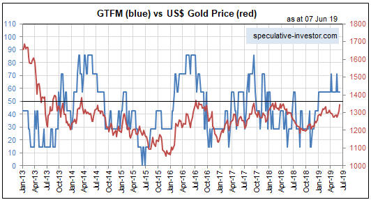
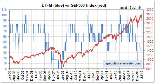
I haven’t discussed gold’s true fundamentals* at the TSI Blog since early December of last year, at which time I concluded: “All things considered, for the first time in many months the true fundamentals appear to be slightly in gold’s favour. If the recent trend in the fundamental situation continues then we should see the gold price return to the $1300s early next year…” The “recent trend in the fundamental situation” did continue, enabling my Gold True Fundamentals Model (GTFM) to turn bullish at the beginning of this year (after spending almost all of 2018 in bearish territory) and paving the way for the US$ gold price to move up to the $1300s.

The following weekly chart shows that after moving slightly into the bullish zone (above 50) at the beginning of January, the GTFM has flat-lined (the GTFM is the blue line on the chart, the US$ gold price is the red line). Based on the current positions of the Model’s seven inputs, its next move is more likely to be further into bullish territory than a drop back into bearish territory.

As an aside, the bullish fundamental backdrop does not preclude some additional corrective activity in the near future.

GTFM_260319

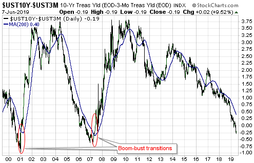
The most important GTFM input that is yet to turn bullish is the yield curve, as indicated by the 10year-2year yield spread or the 10year-3month yield spread. This input shifting from bearish to bullish requires a reversal in the yield curve from flattening (long-term rates falling relative to short-term rates) to steepening (long-term rates rising relative to short-term rates). If the reversal is driven primarily by falling short-term interest rates it indicates a boom-to-bust transition, such as occurred in 2000 and 2007, whereas if the reversal is driven primarily by rising long-term interest rates it points to increasing inflation expectations.

As illustrated below, at the end of last week there was no evidence of such a trend change in the 10year-3month yield spread.

The US$ gold price could rise to the $1400s during the second quarter of this year as part of an intermediate-term rally, but to get a gold bull market there probably will have to be a sustained trend reversal in the yield curve.

*I use the term “true fundamentals” to distinguish the actual fundamental drivers of the gold price from the drivers that are regularly cited by gold-market analysts and commentators. According to many pontificators on the gold market, gold’s fundamentals include the volume of metal flowing into the inventories of gold ETFs, China’s gold imports, the volume of gold being transferred out of the Shanghai Futures Exchange inventory, the amount of “registered” gold at the COMEX, India’s monsoon and wedding seasons, jewellery demand, the amount of gold being bought/sold by various central banks, changes in mine production and scrap supply, and wild guesses regarding JP Morgan’s exposure to gold. These aren’t true fundamental price drivers. At best, they are distractions.

Print This Post Print This Post
MMT: The theory of how to get something for nothing

March 12, 2019

[This blog post is a modified excerpt from a TSI commentary published about a month ago]

Modern Monetary Theory, or MMT for short, is gaining popularity in the US. It is based on the idea that under the current monetary system the government doesn’t have to borrow. Instead, it simply can print all the money it needs to fill the gap between its spending and its income. The only limitation is “inflation”. As long as “inflation” is not a problem the government can spend — using newly-created money to finance any deficit — as much as required to ensure that almost everyone is gainfully employed and to provide all desired services and infrastructure. It sounds great! Why hasn’t anyone come up with such an effective and easy-to-implement prosperity scheme in the past?

Of course it has been tried in the past. It has been tried countless times over literally thousands of years. The fact is that there is nothing modern about Modern Monetary Theory. It is just another version of the same old attempt to get something for nothing.

Most recently, MMT was put into effect in Venezuela. For all intents and purposes, the government of Venezuela printed whatever money it needed to pay for the extensive ‘free’ social services it promised to the country’s citizens. The MMT apologists undoubtedly would argue that the money-printing experiment didn’t work in Venezuela because the government didn’t pay attention to the “inflation” rate. It kept on printing money at a rapid pace after “inflation” became a problem. Our retort would be: “Great point! Who would have thought that a government with the power to print money couldn’t be trusted to stop printing as soon as an index of prices moved above an arbitrary level.”

In essence, MMT is based on the fiction that the government can facilitate an increase in overall economic well-being by exchanging nothing (money created ‘out of thin air’) for something, or by enabling the recipients of the government’s largesse to exchange nothing for something. It is total nonsense, although there is an obvious reason that it appeals to certain politicians. Its appeal to the political class is that it superficially provides an easy answer to the question that arises when politicians promise widespread access to valuable services free of charge. The question is: “Who will pay?” According to MMT, nobody pays until/unless “inflation” gets too high.

And what happens when inflation gets too high? Well, according to MMT the government simply ramps up direct taxation to reduce the spending power of the private sector, which supposedly quells the upward pressure on prices.

Therefore, MMT can be viewed as a case of heads the government wins, tails the private sector loses. As long as “inflation” is below an arbitrary level the government can extract whatever wealth it wants from the private sector indirectly by printing money, and if “inflation” gets too high the government can extract whatever wealth it wants from the private sector via direct taxation.

The crux of the issue is that new wealth can’t be created by printing money, but existing wealth will be redistributed. It’s like when a private counterfeiter prints new money for himself. When he spends that money he diverts real wealth to himself while contributing nothing to the economy. MMT is the same principle applied on a gigantic scale.

That being said, MMT does have its good points, just not the good points that its proponents claim.

As happens when money is loaned into existence under the current system, the application of MMT will affect relative prices as well as the so-called “general price level”. The reason is that the new money won’t be injected uniformly across the economy. However, it’s likely that the price increases stemming from the monetary inflation will be more uniform and direct under MMT than under the current system. In other words, under MMT the effects of monetary inflation should be reflected much sooner and to a far greater extent in the CPI than is the case with the current system.

That the application of MMT would lead quickly to what most people think of as “inflation” is a benefit, because the link between cause (monetary inflation) and effect (rising prices) would be obvious to almost everyone. A related benefit is that MMT would short-circuit the boom-bust cycle.

Booms happen when the Fractional Reserve Banking (FRB) system (with or without a central bank) expands credit and in doing so creates the impression that the quantity of real savings is much greater than is actually so. This prompts excessive investment in long-term business ventures that would not look viable in the absence of misleading interest-rate signals.

We assume that under MMT the commercial banks still would be lending new money into existence, but the temporary downward pressure on interest rates from the surreptitious money creation of the banks would be more than offset by the upward pressure on interest rates from the blatant money-printing of the government. The boom phase therefore would be very short, perhaps even barely noticeable. In effect, MMT would bypass the boom and go straight to the bust. Again, this would be beneficial because it would expose the link between cause (the application of a crackpot monetary theory) and effect (economic hardship for most people).

MMT is such an obviously silly idea that any economist, politician, journalist or financial-market commentator who advocates it should not be taken seriously. However, that they are being taken seriously opens up the possibility that MMT will be implemented in the not-too-distant future, with the ‘benefits’ outlined above.

Print This Post Print This Post
Uranium’s stealth upward trend

March 4, 2019

It’s likely that by the middle of the next decade, most new cars, trucks and buses will be Electric Vehicles (EVs). As a consequence, it’s a good bet that over the next several years the demand for both gasoline and diesel will shrink dramatically while the demand for electricity (to recharge EV batteries) experiences huge growth. Part of this demand growth will be satisfied by nuclear power, which is why uranium is an indirect play on the EV trend.

The uranium price might have begun to discount the aforementioned shift in demand in that it has been quietly trending upward since around April of last year (a weekly chart is displayed below). I say “quietly” because the rally has been accompanied by very little in the way of speculative enthusiasm. On the contrary, the rally that began last April has been accompanied by widespread scepticism.

This is an important sentiment change. Whereas every multi-month up-move in the uranium price prior to last year was greeted as if it heralded the beginning of a bull market, almost everyone has dismissed the most recent rally as just another counter-trend bounce. Being bearish on uranium has become easy, but bull markets begin when it’s easy to be bearish.

uranium_040319

I’m not convinced that a uranium bull market is underway, but I do think that for the uranium-mining sector the intermediate-term risk/reward is skewed decisively towards reward. The reason is that the mining stocks could achieve large price gains with or without a genuine bull market in the underlying commodity. All it would take, I think, is a move by the uranium price into the $30s to convince many speculators that a major trend reversal had occurred and prompt aggressive buying of uranium-mining equities.

It used to be that owning shares of the Global X Uranium Fund (URA) was the simplest and surest way of participating in a uranium-mining rally, but that is no longer the case due to the changes that were made to this fund last year. As outlined HERE, during the second quarter of last year the index that URA tracks was changed from the Solactive Global Uranium Total Return Index to the Solactive Global Uranium & Nuclear Components Total Return Index. Thanks to this change, seven of URA’s current top ten holdings have no correlation with the uranium price.

Nowadays, owning the shares of Cameco (CCJ) is the surest way of participating in a uranium-mining rally.

It looks to me like CCJ is not far from completing a 3-year base (see chart below). I like the idea of gradually building up a position on weakness while the basing process continues.

CCJ_040319

Print This Post Print This Post