The limitations of sentiment as a market timing tool

March 28, 2017

[The following discussion is a slightly-modified excerpt from a recent TSI commentary]

It’s important to state up front that despite the associated pitfalls, it can definitely be helpful to track the public’s sentiment and use it as a contrary indicator. This is because most participants in the financial markets get swept up by the general mood. They end up buying into the idea that prices are bound to go much higher despite valuations having already become unusually high or the idea that prices will continue to slide despite current valuations being unusually low. This causes them to be very optimistic near important price tops and either very pessimistic or totally disinterested near important price bottoms.

It will always be this way because 1) a major price/valuation trend can’t end until the fundamental story behind the trend has been fully embraced by ‘the public’, and 2) the public’s own buying/selling shifts the probability of success. For example, when the public gets enthusiastic about an investment its own buying pushes up the price of the investment to the point where future performance is guaranteed to be poor. Consequently, there is no chance that the investing public can ever collectively enter or exit any market at an opportune time.

There are, however, three potential pitfalls associated with using sentiment to guide buying/selling decisions.

The first is linked to the reality that sentiment generally follows price, which makes it a near certainty that the overall mood will be at an optimistic extreme when the price is near an important top and a pessimistic extreme when the price is near an important bottom. The problem is that while an important price extreme will always be associated with a sentiment extreme (extreme optimism at a price high and extreme pessimism at a price low), a sentiment extreme doesn’t necessarily imply an important price extreme. For example, if the price of an investment has been trending strongly upward for many months and is at an all-time high then sentiment indicators will almost certainly reveal great optimism even if the upward trend is still in its infancy. It is therefore dangerous to take large positions based solely on sentiment.

The second potential pitfall associated with using sentiment to guide buying/selling decisions is that what constitutes a sentiment extreme will vary over time, meaning that there are no absolute benchmarks. Of particular relevance, what constitutes dangerous optimism in a bear market will often not be a problem in a bull market and what constitutes extreme fear/pessimism in a bull market will often not signal a good buying opportunity in a bear market. In other words, context is critical when assessing sentiment. Unfortunately, the context is always a matter of opinion.

The third potential pitfall relates to the sentiment indicators that are based on surveys.

Regardless of what the surveys say, there will always be a lot of bears and a lot of bulls in any financial market. It must be this way otherwise there would be no trading and the market would cease to function. As a consequence, if a survey shows that almost all traders are bullish or that almost all traders are bearish it means that the survey has a very narrow focus. In other words, the survey must be dealing with only a small fragment of the overall market.

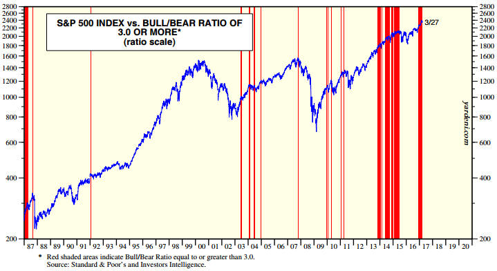
There is no better example of sentiment’s limitations as a market timing indicator than the US stock market’s performance over the past few years. To show what I mean I’ll use the results of the sentiment survey conducted by Investors Intelligence (II), which has the longest track record* and is probably the most accurate of the stock market sentiment surveys.

The following chart from Yardeni.com shows the performance of the S&P500 Index (SPX) over the past 30 years with vertical red lines to indicate the weeks when the II Bull/Bear ratio was at least 3.0 (a bull/bear ratio of 3 or more suggests extreme optimism within the surveyed group).

Notice that vertical red lines coincided with most of the important price tops (the 2000 top was the big exception), but that there were plenty of times when a vertical red line (extreme optimism) did not coincide with an important price top. Notice, as well, that optimism was extreme almost continuously from Q4-2013 to mid-2015 and that following a correction the optimistic extreme had returned by late-2016.

In effect, sentiment has been consistent with a bull market top for the past 3.5 years, but there is not yet any evidence in the price action that the bull market has ended.

IIbullbear_280317

The bottom line is that sentiment can be a useful indicator, but it does have serious limitations. It is just one medium-sized piece of a large puzzle.

*The II sentiment data goes back to 1963

Print This Post Print This Post

‘Real’ Performance Comparison

March 24, 2017

Inserted below is a chart that compares the long-term inflation-adjusted (IA) performances of several markets. This chart makes some interesting points, such as:

1) Market volatility increased dramatically in the early-1970s when the current monetary system was introduced. This shows that the generally higher levels of monetary inflation and the larger variations in the rate of monetary inflation that occurred after the official link to gold was abandoned didn’t only affect nominal prices. Real prices were affected in a big way and boom-bust oscillations were hugely amplified. As an aside, economists of the Keynesian School are oblivious to the swings in relative ‘real’ prices caused by monetary inflation and the depressing effects that these policy-induced price swings have on economic progress.

2) Commodities in general (the green line on the chart) experienced much smaller performance oscillations than the two ‘monetary’ commodities (gold and silver). This is consistent with my view that there aren’t really any long-term broad-based commodity bull markets, just gold bull markets driven by monetary distortions in which most commodities end up participating. The “commodity super-cycle” has always been a fictional story.

3) Apart from the Commodity Index (GNX), the markets and indices included in the chart have taken turns in leading the real performance comparison. The chart shows that gold and the Dow Industrials Index are the current leaders with nearly-identical percentage gains since the chart’s January-1959 starting point. Note, however, that if dividends were included, that is, if total returns were considered, the Dow would currently have a significant lead.

IAcomp_240316

Chart Notes:

a) I use a method of adjusting for the effects of US$ inflation that was first described in a 2010 article. This method isn’t reliable over periods of two years or less, but it should come close to reflecting reality over the long term.

b) To make it easier to compare relative performance, the January-1959 starting value of each of the markets included in the above chart was set to 100. In other words, the chart shows performance assuming that each market started at 100.

c) The monthly performance of the scaled IA silver price peaked at more than 2600 in early-1980, but for the sake of clarity the chart’s maximum Y-axis value was set to 1500. In other words, the chart doesn’t show the full extent of the early-1980 upward spike in the IA silver price.

d) The commodity index (the green line on the chart) uses CRB Index data up to 1992 and Goldman Sachs Spot Commodity Index (GNX) data thereafter.

Print This Post Print This Post

How falsehoods become facts

March 21, 2017

The more an invalid piece of information is quoted as if it were true, the closer it will come to being widely viewed as correct. Here are four examples that spring to mind:

1) The claim that there is a severe shortage of physical gold in Comex inventories, making a Comex default likely. This claim seemingly originated at ZeroHedge.com and was ‘supported’ by a chart showing the ratio of Open Interest to Registered Gold. Even though it was never true, the Comex gold shortage story started by Zero Hedge got picked up by numerous gold-focused sites/newsletters and quickly became accepted as fact within a significant portion of the “gold community”. I debunked the story multiple times at the TSI blog, including in the May-2016 post linked HERE.

2) The claim that the “science is settled” on the matter of Anthropogenic Global Warming. This claim is ridiculous, because:

a) Many scientists dispute the theory that the most recent warming period was primarily the result of human activity.

b) The models that were constructed over the past three decades to show what would happen to the climate under different CO2 emission outcomes haven’t worked.

c) The science is NEVER settled. Instead, it is constantly evolving as new information becomes available.

Despite being ridiculous, the “science is settled” claim has been quoted so often that many people now believe it to be a fact.

3) The claim that the Russian government colluded with the Trump team and conducted operations during the 2016 US Presidential campaign to hurt Clinton, including the hacking of DNC (Democratic National Committee) emails and the leaking of these emails to WikiLeaks. I don’t know for sure that this claim is false, but it is currently not supported by any evidence (WikiLeaks has stated that the emails did not come from Russian hacking). Despite being unsubstantiated by hard evidence and quite possibly being a completely fictitious story, the supposed Russian involvement in Trump’s election victory has now been mentioned so many times that it is widely viewed as confirmed.

4) Oxfam’s statement that the eight richest men in the world, between them, have the same amount of wealth as the bottom 50% of the population combined. This statement has been cited in countless articles and is generally considered to be evidence that all is not well with the global economy, but it is claptrap. As pointed out in Felix Salmon’s article at fusion.net:

…if you use Oxfam’s methodology, my niece, with 50 cents in pocket money, has more wealth than the bottom 40% of the world’s population combined. As do I, and as do you, most likely, assuming your net worth is positive. You don’t need to find eight super-wealthy billionaires to arrive at a shocking wealth statistic; you can take just about anybody.

All is certainly not well with the global economy, but you can’t properly make that point using a nonsensical statistic.

In conclusion, the more that a false statement or misleading number is quoted, the closer it will come to being generally perceived as factual. If it gets quoted enough its validity will no longer even be questioned.

I wonder if there is a lot less fact-checking and healthy scepticism these days, or if it just seems that way.

Print This Post Print This Post

The “petrodollar” is irrelevant

March 14, 2017

A recent article posted at Casey Research trumpets the view that the petrodollar system is on its last legs and that when it dies — quite possibly in 2017 — it will be a massively disruptive event for the US economy and the financial world, leading to an explosion in the gold price. The reality is that the so-called “petrodollar” is probably not about to expire, but even if it were the economic consequences for the US and the world would not be dramatic.

According to the “petrodollar system” theory, an agreement was reached in 1974 between the governments of the US and Saudi Arabia for the Saudis to do all of their oil transactions in US dollars and influence other OPEC members to do the same. In return, the US government vowed to support and protect the Saudi regime. Also according to this theory, the US economy benefits because the pricing of oil in US dollars creates additional global demand for US dollars and US assets.

The agreement might have happened, but there is no good reason that it would still be in effect. Considering the popularity of the US dollar in global trade and the size of the US economy, an agreement between the Saudi and US governments would no longer be required to entice the Saudis to price their oil exports in dollars. It would be inconvenient for them to do otherwise.

In any case, even if the “petrodollar” agreement happened and remains in effect to this day it would not be of great importance. The reason is that the international trading of oil accounts for only a minuscule fraction of international money flows.

To further explain, global oil production is about 96M barrels per day (b/d), but only part of this gets traded internationally. For example, US oil consumption is about 19M b/d, but the US now produces about 10M b/d so the US is a net importer of only about 9M b/d. The amount of oil that gets traded between countries and could therefore add to the international demand for US dollars is estimated to be around 50M b/d.

Assuming that all of the aforementioned 50M b/d of oil gets traded in US dollars, at an oil price of $50/barrel the quantity of dollars employed per year in the international trading of oil amounts to about 900 billion. In other words, the maximum positive effect on global US$ usage of the “petrodollar” system is about $900 billion per year.

Next, note that according to the most recent survey conducted by the Bank for International Settlements, as of April 2016 the average daily turnover in global foreign exchange markets was about $5.1 trillion. With the US$ estimated to be on one side of 88% of all FX trades, this means that an average of 4.5 trillion US dollars change hands every day on global FX markets.

Therefore, the quantity of US dollars traded per DAY on the FX markets, primarily for investing and speculating purposes, is roughly 5-times the amount of US dollars used per YEAR in the international oil trade. That’s why the so-called “petrodollar” is not important.

In conclusion, here’s a suggestion: Instead of focusing on outlandish reasons for buying gold, focus on the less exciting but vastly more plausible reasons that gold’s popularity could rise.

Print This Post Print This Post

What is the root cause of a gold bull market?

March 6, 2017

[This blog post is an excerpt from a recent TSI commentary]

If the future were 100% certain then there would be no reason to have any monetary savings. You could be fully invested all of the time and only raise cash immediately prior to cash being needed. By the same token, if the future were very uncertain then you would probably want to have a lot more cash than usual in reserve. This has critical implications for the gold market.

The answer to the question “What is the root cause of a gold bull market?” is related to the propensity to save. When there is an increase in uncertainty and/or the perceived level of economic/financial-market risk, people naturally want to save more and spend less. This is especially the case after an economy-wide inflation-fueled boom turns to bust, because in this situation debt levels will be high, many investments that were expected to generate large returns will be shown to have been ill-conceived, and it will be clear that much of what was generally believed about the economy was completely wrong.

The public’s first choice in such circumstances would be to hold more money, but central banks and governments typically respond to the factors that prompt people to save more by taking actions that reduce the value of money. Policy-makers do this because they are operating from the Keynesian playbook in which almost everything is backward. In the real world an increase in saving comes at the beginning of the economic growth path and an increase in consumption-spending comes at the end, but in the Keynesian world the economic growth path begins with an increase in consumption-spending. Moreover, in the back-to-front world imagined by Keynesian economists an increase in saving is considered bad because it results in less immediate consumption.

So, stuff happens that makes the public want to save more, but the central-planners then say: “If you save more in terms of money we will punish you!” They don’t actually say “we will punish you”, but they take actions that guarantee a real loss on cash savings. Also, in times of stress the most popular repositories of money (commercial banks) will often look unsafe.

Now, neither the actions taken by the central bank to reduce the appeal of saving in terms of the official money nor the appearance of increasing ‘shakiness’ in the normal repositories of money will do anything to reduce the underlying desire for more monetary savings. In fact, the panicked actions of the central bank can add to the uncertainty, thus leading to an even greater propensity to hold cash in reserve.

That’s where gold comes in. People want to save more money, but they can’t save in terms of the official money unless they are prepared to lock-in a negative real return on their savings and/or accept a greater risk of loss due to bank failure. They therefore opt for the next best thing: gold. Gold is almost as liquid and as transportable as money, but its supply is essentially fixed. Gold also has a very long history as a store of value and as money, so even though it is presently not money it is a good alternative to cash.

Long-term gold bull markets can therefore be viewed as periods when the public has an increasing propensity to save and when the actions of the authorities and/or the weakened financial positions of the commercial banks make it riskier to save in terms of the official money.

Print This Post Print This Post

Has the Fed been a long-term success?

March 1, 2017

To know whether or not the Fed has been a long-term success, the reason for the Fed’s creation must first be known. Here is the reason from the horse’s mouth: “It [the Fed] was created by the Congress to provide the nation with a safer, more flexible, and more stable monetary and financial system.” If this is the real reason then over the long-term the Fed has not been a success. In fact, it has been an abject failure.

That the Fed has blatantly not been successful in providing the nation with a more stable monetary and financial system is clearly evidenced by the following ultra-long-term chart from www.goldchartsrus.com. This chart shows that the Dow/gold ratio experienced much greater long-term volatility post-Fed than it did pre-Fed.

Dow_gold_010317

This doesn’t mean that the Fed hasn’t been a success, only that it hasn’t been a success if judged based on its publicly-stated purpose.

If the Fed was actually created to ensure that the government could borrow and spend with no rigid limit and to enable the banking industry to grow its collective balance sheet far beyond what would be possible under a less ‘flexible’ monetary system, then the Fed has been a resounding success.

Print This Post Print This Post

Bank de-regulation is less important than bank credit

February 28, 2017

[This blog post is a modified and updated excerpt from a commentary published at TSI about three weeks ago]

In response to the 2007-2009 financial crisis, policy-makers in the US who had absolutely no idea what caused the crisis enacted legislation that would supposedly prevent such a crisis from re-occurring. The legislation is called “The Wall Street Reform and Consumer Protection Act”, although it is better known as “Dodd-Frank”. Unsurprisingly, considering its origins, the Dodd-Frank legislation has done nothing to reduce financial-crisis risk but has made the US economy less efficient. Quite rightly, therefore, the Trump Administration is intent on repealing all or parts of it. What are the likely consequences?

If Dodd-Frank were scaled back in a meaningful way it could make interactions between customers and their banks more efficient, but without knowing exactly which parts of the legislation are going and which parts are staying it isn’t possible to quantify the consequences. For example, a part of the legislation that will probably go is the requirement for banks to retain at least 5% of any loans they securitise. Eliminating this requirement would be slightly helpful to banks, but would make very little difference to the overall economy.

What we can say is that the efficiency-related benefits of meaningfully scaling back Dodd-Frank would be long-term, meaning that they probably wouldn’t have a noticeable effect over the ensuing year.

As an aside, it’s worth mentioning that there is a risk associated with eliminating parts of the economy-hampering legislation known as Dodd-Frank. The risk is that de-regulation will get the blame when the next crisis occurs, and the Federal Reserve, the primary agent of economic instability, will again get away unscathed.

With regard to economic performance over the next 12 months, changes in the pace at which US banks collectively expand credit will likely be of far greater importance than changes in how the US banking industry is regulated. From a practical investing/speculating standpoint it therefore makes more sense to focus on the following chart than on the latest Dodd-Frank news.

The chart shows that after oscillating in the 7%-8% range for about 2 years, the year-over-year (YOY) rate of credit growth in the US banking industry has slowed markedly of late. As recently as late-October it was above 8%, but it’s now around 5.4%.

bankcredit_270217

The steep decline in the rate of bank credit growth during 2013 didn’t have any dramatic economic consequences, but that’s only because the Fed was rapidly expanding credit via its QE program at the time. With the Fed no longer directly adding credit and money to the financial system, keeping the credit-fueled boom alive depends on the commercial banks. In particular, there’s little doubt that a further significant decline in the rate of commercial-bank credit growth would have a noticeable effect on the economy.

On a long-term basis the effect of a further decline in the pace of credit expansion would actually be positive, but on an intermediate-term basis it would be very negative because many activities and asset prices, most notably stock prices, are now supported by nothing other than the creation of credit and money out of ‘thin air’.

Print This Post Print This Post

The only commodity supply-demand indicator that matters

February 22, 2017

For an industrial commodity with a liquid futures market, the “term structure” of the futures market is the most useful — perhaps even the only useful — indicator of whether physical supply is tight, abundant or somewhere in between.

The term structure of a commodity futures market is the prices of futures contracts for the commodity over all available expiration months. It can be displayed as a chart, with price along the vertical axis and the expiration months along the horizontal axis. Here are examples for oil and copper.

oil_term_210217

copper_term_210217

If a market is in “contango” then the later the delivery month the higher the price, resulting in the chart of the term structure being an upward-sloping curve. If a market is in “backwardation” then the earlier delivery months will have the higher prices and the term structure will be represented by a downward-sloping curve. It is also possible for the curve representing the term structure to have an upward slope over some future delivery periods and a downward slope over others. This often happens with commodities that experience large seasonal swings in production (e.g. grains) or consumption (e.g. natural gas), but it can also happen with other commodities.

For an industrial commodity such as oil or copper it will be normal for the term-structure curve to slope upwards, that is, for the market to be in “contango”, with the extent of the “contango” reflecting the cost of physical-commodity storage. To further explain, let’s say you are a large-scale commercial consumer of oil and you estimate that you will need X barrels of the stuff in August of this year. In this case, if you don’t want to assume any price risk you can either take delivery of physical oil immediately and store it until August or buy oil for delivery in August (August-2017 oil futures). It will make sense to buy the physical oil if the cost of storage and financing is less than the premium over the spot (cash) price that you would have to pay for the August futures contracts. Otherwise, it will make sense to buy the futures and take delivery when the oil is needed in August.

It is, however, possible for a commodity such as oil to go into backwardation, that is, for the later delivery months to trade at a discount to the earlier delivery months and the spot price. Such a situation would create a risk-free profit for a commercial trader with excess oil on hand (“excess oil” being oil that will be needed by the trader in the future but isn’t needed immediately), because the trader could sell his excess physical supply on the spot market and lock-in his future supply needs by purchasing futures contracts at a discount to spot. In doing so he would not only pocket the difference between the spot and futures prices, he would also save on storage costs.

Due to the attractive arbitrage opportunity that would be presented by backwardation, it’s a situation that will usually arise only if there’s a shortage of currently-available physical supply. Backwardation, or a downward-sloping term-structure curve, is therefore a clear sign that the physical market is tight. By the same token, if the physical supply situation is genuinely tight then the market will either be in backwardation or the positive slope of the term-structure curve will be much gentler than usual.

Sometimes the term-structure curve will have a steeper upward slope than usual, that is, the later delivery months will trade at larger-than-usual price premiums to the earlier delivery months and the spot price. This will create an opportunity for traders to make risk-free profits by selling the futures and buying the physical, unless there is presently so much physical supply bidding for storage space that the price of storage is high enough to eliminate the potential arbitrage profit. Since risk-free arbitrage opportunities tend to be fleeting, a term-structure curve with a sustained steeper-than-usual upward slope indicates an abundance of currently-available physical supply.

Looking at the “term structure” charts displayed above, it is apparent that the fundamental backdrop is currently supportive for the oil price. This, by the way, constitutes a significant bullish change over the past 1-2 months. It is also apparent that the fundamental backdrop is neutral for the copper price, in that the “term structure” for the copper market has a fairly normal upward slope. The copper market appears to be adequately supplied at this time, although a more thorough analysis would take into account the LME term structure in addition to the COMEX term structure.

What about the reported inventory levels for commodities such as oil and the base metals? Is this information useful?

In general, no, because a lot of aboveground supply is not held in the storage facilities that are covered by such reports. There will be times when a relative shortage or abundance of physical supply is correctly signaled by the widely-reported inventory levels, but in such cases the evidence of shortage or abundance will also appear in the “term structure”. And the “term structure” will be more reliable, meaning that it will generate fewer false signals.

A final point worth making is that a bearish supply-demand situation doesn’t necessarily mean that the price will fall and a bullish supply-demand situation doesn’t necessarily mean that the price will rise. For example, in January-February last year I wrote that a strong rally in the oil price would probably soon begin even though oil’s supply-demand situation was as price-bearish as it ever gets. Part of my reasoning was that with the oil price having already dropped to near a 50-year low in real terms, the worst-case scenario had been factored into the current price. Also, after the fundamentals become as bearish (or bullish) as they ever get, what’s the most likely direction of the next move?

Print This Post Print This Post

Trump will not really cut taxes

February 20, 2017

As the financial world waits with bated breath for details of Donald Trump’s “phenomenal” tax plan, it’s important to understand that regardless of what Trump announces on the tax front there will be no genuine tax cut. The reason is that for a tax cut to be genuine it must be funded by reduced government spending.

Tax cuts are unequivocally beneficial to the economy if they are genuine, but if a tax cut isn’t funded by reduced government spending, that is, by the government consuming less resources, then one way or another it will have to be funded by the private sector. It will just be another Keynesian stimulus program, and like all Keynesian stimulus programs it will potentially boost economic activity in the short-term at the cost of slower long-term progress.

It should be obvious that the private sector cannot benefit from a tax cut that it will have to pay for, but apparently it isn’t obvious because most people seem to believe that the government can consume more resources and at the same time the private sector can end up with more resources. This is an example of believing the impossible. Unfortunately, it’s not the only such example in the world of economics, in that many aspects of Keynesian theory involve belief in the impossible.

The cost of government is determined by what the government spends, not how much it collects in taxes. And we can be sure that during the next four years there is going to be a large rise in the cost of the US federal government, meaning that with or without a so-called tax cut the private sector (as a whole) is destined to end up with reduced resources under the Trump regime. We can also be sure that it would have ended up with reduced resources under a Clinton regime.

The reason, as explained in the article posted at http://crfb.org/papers/lame-duck-president-2017, is that spending increases in excess of revenue increases were ‘baked into the cake’ prior to the November-2016 Presidential election thanks to budgets dictated by previous presidents and Congresses. Getting a little more specific, the linked article points out that 150 percent of new revenue a decade from now is pre-committed to spending growth scheduled under laws that were in place prior to the 2016 election. Moreover, this should be viewed as an unrealistically-optimistic forecast because it assumes steady inflation-adjusted revenue growth. A more realistic forecast would account for the sizable decline in inflation-adjusted revenue that will be caused by a recession within the next few years.

The bottom line is that any cuts in the rates of US individual and corporate income taxes announced/implemented over the coming 12 months will be ‘smoke and mirrors’, because government spending is going to increase. It will essentially be a money-shuffling exercise to temporarily create the illusion that the burden of government is shrinking at the same time as it is growing.

Print This Post Print This Post

An age-old relationship between interest rates and prices

February 15, 2017

The chart displayed near the end of this discussion is effectively a pictorial representation of what Keynesian economists call a paradox* (“Gibson’s Paradox”) and Austrian economists call a natural and perfectly understandable relationship.

Gibson’s Paradox was the name given by JM Keynes to the observation that interest rates during the gold standard were highly correlated to wholesale prices but had little correlation to the rate of “inflation”, that is, that interest rate movements were connected to the level of prices and not the rate of change in prices. It was viewed as a paradox because most economists couldn’t explain it. According to conventional wisdom, interest rates should have been positively correlated with the rate of “price inflation”.

The problem is that most economists did not — and still do not — understand what interest rates are.

First and foremost, interest rates are the price of time. They reflect the fact that, all else being equal, humans place a higher value on getting something now than on getting exactly the same thing at some future time. Interest rates transcend money, because they exist even when money does not. With or without money and all else being equal, getting something now will always be worth more than getting the same thing in the future**. This is called time preference.

Time preference is the root of interest rates and the natural interest rate is a measure of societal time preference. That is, the natural interest rate is a measure of the general urgency to consume in the present or the amount that would have to be paid, on average, to make saving (the postponement of consumption) worthwhile. For example, the average 7-year-old child has a very high time preference, in that if you give the kid a choice between getting a desirable toy today or getting something more in 3 months’ time, the “something more” option won’t be chosen unless it is a LOT more, whereas a middle-aged adult with substantial savings is likely to have low time preference.

When interest rates are properly understood it becomes clear that the paradox named after Gibson is no paradox at all. The reason is that if the money is sound, as it mostly was under the Gold Standard, both interest rates and prices will move in the same direction in response to changes in societal time preference.

To further explain, during a period of rising time preference, that is, during a period when there is an increasing desire to consume in the present, the prices of goods will rise (on average) due to increasing demand and it will take a higher interest rate to encourage people to delay their spending. During a period of falling time preference, that is, during a period when there is an increasing desire to save, the prices of goods will fall (on average) and people will generally accept a lesser incentive (interest rate) to delay their spending.

In a nutshell, there is no paradox because, when the money is sound, interest rates don’t drive prices and prices don’t drive interest rates; instead, on an economy-wide basis*** both prices and interest rates are driven by changes in societal time preference.

That’s all well and good, but we no longer have sound money. Moreover, we have massive, continuous manipulation of interest rates by central banks. The signal that interest rates should send is therefore now being overwhelmed by central-bank-generated noise to the point where it’s a miracle (a testament to the resilience of entrepreneurial spirit, actually) that we still have a functioning economy. Quite remarkably, though, signs of the age-old relationship between interest rates and the price level can still be found if you know where to look.

The signs aren’t apparent when interest rates are compared with an official wholesale price index, because a great effort is expended by the central planners to ensure that the official money loses purchasing power year-in and year-out regardless of what’s happening in the world. However, the signs are apparent when interest rates are compared to a wholesale price index based on gold.

The commodity/gold ratio is the price of a broad-based basket of commodities in gold terms. In essence, it is a wholesale price index using gold as the monetary measuring stick. Although gold is no longer money in the true meaning of the term (it is no longer the general medium of exchange), it is still primarily held for what can broadly be called ‘monetary purposes’ and in many respects it trades as if it were still money. According to the age-old relationship discussed above and labeled “Gibson’s Paradox” by a confused JM Keynes, the commodity/gold ratio should generally move in the same direction as risk-free interest rates.

The risk-free US interest rate that is least affected by the direct manipulation of the Fed is the yield on the 30-year T-Bond, so what we should see is a positive correlation between the commodity/gold ratio and the T-Bond yield. Or, looking at it from a different angle, what we should see is a positive correlation between the gold/commodity ratio and the T-Bond price. That’s exactly what we do see.

Using the Goldman Sachs Spot Commodity Index (GNX) to represent commodities, the following chart shows that the age-old relationship has worked over the past 10 years when gold is the monetary measuring stick. It has also worked over the past 20 years, although there was a big divergence — possibly due to the ‘China effect’ on commodity prices or the ECB’s aggressive money pumping — in 2005.

I like this chart because it makes economic sense and because it can be helpful when trying to anticipate the next important turning point for the gold/commodity ratio and/or the T-Bond.

GCvsUSB_140217

*As a general rule, if your theory leads to a paradox then your theory is wrong.

    **There are many real-life examples of a premium being paid to receive a good in the future rather than the present, but in such cases all is not equal. That is, in such cases there will be a difference between the future good and the present good that makes the future good more valuable. For example, an oil refiner will generally pay more for a barrel of oil to be delivered in six months’ time than a barrel of oil to be delivered immediately, because if it doesn’t plan to refine the oil until 6 months from now it can save 6 months of storage costs by purchasing oil for future delivery. To put it another way, in this oil-refiner example a barrel of oil for immediate delivery is priced at a discount because it comes with 6 months of storage-related baggage.

    ***For any specific interest-rate-related transaction, credit risk will be very important. As a result, at any given time there will be a wide range of interest rates within an economy even if the money has no “inflation” risk. However, it is reasonable to think of time preference as an interest-rate floor that rises and falls. In effect, time preference determines the interest rate that would apply on average throughout the economy if there were no credit or inflation risks.

Print This Post Print This Post