Trying to solve the sentiment conundrum

July 3, 2017

[This post is a modified excerpt from a recent TSI commentary]

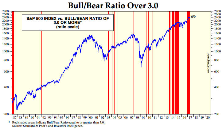
In a 12th June blog post I revisited the potential pitfalls in using sentiment as a market timing tool. As an example of a pitfall, the post included a chart of the Investors Intelligence (II) bull/bear ratio suggesting that US stock market sentiment had been consistent with a bull-market top for the bulk of the past four years. Even though the chart helped to make my point it is appropriate to question how sentiment, when used as a contrary indicator, could be so wrong for so long.

I’ve come up with a possible explanation for why measures of US stock-market sentiment that worked well as contrary indicators in the past have not been useful of late. The reason relates to the third of the potential pitfalls outlined in the above-linked blog post. Specifically:

…regardless of what sentiment surveys say, there will always be a lot of bears and a lot of bulls in any financial market. It must be this way otherwise there would be no trading and the market would cease to function. As a consequence, if a survey shows that almost all traders are bullish or that almost all traders are bearish then the survey must be dealing with only a small — and possibly not representative — segment of the overall market.

The explanation I’ve come up with is that prior to the past few years the II sentiment survey, which is a survey of investment advisors who regularly publish their views via newsletters, reflected the sentiment of the investing public, but this is not so much the case anymore. Prior to the past few years the advisors and the general public would become increasingly bullish or increasingly bearish together, with high levels of optimism invariably following persistent price strength and high levels of pessimism invariably following either persistent or dramatic price weakness. Over the past few years, however, the perceptions of these two groups took separate paths. Investment advisors became very optimistic in reaction to the strong upward trend in prices, but for the most part the general public remained unenthusiastic about the stock market.

The change described above can be illustrated by comparing the II bullish percentage with the AAII (American Association of Individual Investors) bullish percentage, which has been done on the chart displayed below. The AAII survey is based on the opinions of retail investors, that is, the general public.

The chart shows that prior to 2014 the II (the blue line) and AAII (the black line) bullish percentages typically moved up and down together within a similar range, but that from 2014 onward the II bullish percentage tended to be significantly higher. Furthermore, the distance between the two survey results has increased since early this year, with the II bullish percentage remaining above 50 and the AAII bullish percentage spending most of its time in the 25-35 range. The most recent results show an II bullish percent of 54.9 and an AAII bullish percent of 29.7.

IIvsAAII_030717

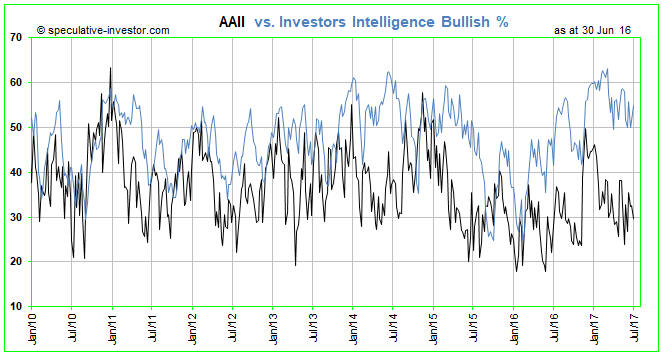
It seems that the general public’s stock-market sentiment has not reached an optimistic extreme during the current cycle. Does this mean that there’s a lot more price strength to come or does it mean that the next major price top will happen without the general public having fully embraced the upward trend?

I don’t know, but it’s definitely possible that the public will never fully embrace the latest bullish trend for the simple reason that it is financially incapable of doing so. Having had its savings decimated when earlier Fed-fueled investment booms inevitably collapsed it may not have the financial wherewithal to enthusiastically participate in the Fed’s latest bubble-blowing venture.

Print This Post Print This Post

Addressing Keith Weiner’s objections to “Gold’s True Fundamentals”

June 27, 2017

A 23rd June post at the TSI Blog described the model (the Gold True Fundamentals Model – GTFM) that I developed to indicate the extent to which the fundamental backdrop is bullish for gold. The GTFM is an attempt to determine a single number that incorporates the most important fundamental drivers of the gold price, where I define “fundamental driver” as something that happens in the economy or the financial markets that causes a significant change in the desire/urgency to own gold in some form. Keith Weiner subsequently posted an article objecting to some of my “fundamental drivers”, which would be fine except that his article contains several misunderstandings of these price drivers and/or how I am using them. The purpose of this post is to address these misunderstandings and provide a little more information on the GTFM’s components.

1. The ‘Real’ Interest Rate

Keith states: “The Real Interest Rate is the Nominal Interest Rate – inflation.” No, that’s not what the real interest rate is, although many people wrongly calculate it that way.

Keith and I agree that it is not possible to calculate the economy-wide change in money purchasing-power (PP), but even if it were possible to come up with a single number that represented prior “inflation” the real interest rate would not be the nominal interest rate minus this number. The reason, to explain using an example, is that the real return that will be obtained by someone who makes a 12-month investment today in an interest-bearing security will have nothing to do with the change in the PP of money over the preceding 12 months. Instead, the real return that will be obtained by this person will be determined by the change in money PP over the ensuing 12 months.

Now, we can obviously never know in advance what the real return on any interest-bearing security or deposit will be, but since the advent of Treasury Inflation-Protected Securities (TIPS) in 2003 it has been possible to roughly determine the real return on Treasury debt expected by the average bond trader. The TIPS yield, which is based on the EXPECTED rate of currency depreciation, is my ‘real’ interest rate proxy.

If there had been a TIPS market in the 1970s then it would probably be apparent that the large gains made by the gold price during that decade were related to a low/falling real interest rate, where the real interest rate is defined as the nominal interest rate minus the expected rate of currency depreciation. In any case, there has definitely been an inverse correlation between the TIPS yield (10-year or 5-year) and the gold price over the past 10 years. Furthermore, the correlation has strengthened over the past 2 years.

By the way, it’s the DIRECTION, not the value, of the TIPS yield that matters to gold and that is taken into account by the GTFM.

The inverse relationship between the TIPS yield and the gold price is far from perfect, the reason being that there are times when other price drivers are more influential. That’s why the ‘real interest rate’ has only a one-seventh weighting in the GTFM.

2. The Yield Curve

There has never been a strong and consistent short-term correlation between the gold price and the yield curve, but near major turning points the yield curve tends to be the dominant driver.

In broad terms, the boom phase of the central-bank-promoted boom-bust cycle is generally associated with a flattening yield curve and the bust phase is generally associated with a steepening yield curve. Gold generally performs better during the bust phase, when the curve is steepening. Somewhat counterintuitively, banks tend to do best during the long periods of yield-curve flattening. This can be demonstrated empirically and makes sense if you understand how the central-bank-promoted boom-bust cycle works.

A major flattening trend in the US yield curve got underway during the second half of 2011 and continues to this day. This flattening trend is associated with a boom, which, in turn, has temporarily helped the banks and reduced the desire to own gold.

3. Credit Spreads

The trend in credit spreads is one of the best measures of the overall trend in economic confidence, with widening spreads (yields on lower-quality bonds rising relative to yields on higher-quality bonds) being indicative of declining economic confidence. Gold tends to do relatively well during periods when economic confidence is on the decline, that is, during periods when credit spreads are widening. I have demonstrated this in the past using charts.

4. The Relative Strength of the Banking Sector

Keith writes: “We haven’t plotted it, but we assume bank stocks will outperform the broader stock market when the yield curve is steeping by way of falling Fed Funds rate. This is when the banks’ net interest margin is rising, and they are getting capital gains on their bond portfolio too. At the same time, credit spreads are narrowing, so the banks are getting capital gains on their junk bonds.

No, that’s not how it works. Refer to my yield curve comments above for a very brief explanation.

The banking sector will often fare poorly during major yield-curve steepening trends because a banking crisis is often a primary cause of the steepening trend. In any case, this indicator is based on the concept that the investment demand for gold will be boosted by declining confidence in the banking system and reduced by rising confidence in the banking system.

5. The US Dollar’s Exchange Rate

More often than not, the US$ gold price trends in the opposite direction to the Dollar Index. However, there are times when a crisis outside the US causes both a rise in the US$ on the FX market and a large rise in the US$ gold price. The fact that the inverse correlation between the gold price and the Dollar Index can break down in a big way at times is why the US dollar’s performance on the FX market only has a one-seventh weighting in the GTFM. To put it another way, if the gold price always moved in the opposite direction to the Dollar Index then there would be no reason for gold traders to consider anything except the Dollar Index.

6. The General Trend in Commodity Prices

I have included the general trend in commodity prices as indicated by the S&P GSCI Commodity Index (GNX) in the GTFM for the practical reason that there are times when it tips the balance. That is, there are times when a strong upward trend in commodity prices enables the US$ gold price to rise despite an otherwise slightly-bearish (for gold) fundamental backdrop and there are times when a strong downward trend in commodity prices causes the US$ gold price to fall despite an otherwise slightly-bullish fundamental backdrop.

7. The Bond/Dollar Ratio

There are fundamental reasons for the existence of a positive correlation between the bond/dollar ratio (the T-Bond price divided by the Dollar Index) and the US$ gold price, but I currently don’t have the time or the inclination to go into these reasons. Instead, for the sake of brevity I present the following chart-based comparison of the gold price and the bond-dollar ratio. The positive correlation is obvious and is evident over much longer periods than the 3-year period covered by this chart.

gold_USBUSD_260617

I hope the above goes at least part of the way towards explaining the components of my gold model.

Print This Post Print This Post

Gold’s True Fundamentals

June 23, 2017

[This post is a modified excerpt from a TSI commentary published a few weeks ago]

To paraphrase Jim Grant, gold’s perceived value in US$ terms is the reciprocal of confidence in the Fed and/or the US economy. Consequently, what I refer to as gold’s true fundamentals are measures of confidence in the Fed and/or the US economy. I’ve been covering these fundamental drivers of the gold price in TSI commentaries for almost 17 years. It doesn’t seem that long, but time flies when you’re having fun.

Note that I use the word “true” to distinguish the actual fundamental drivers of the gold price from the drivers that are regularly cited by gold-market analysts and commentators. According to many pontificators on the gold market, gold’s fundamentals include the volume of metal flowing into the inventories of gold ETFs, China’s gold imports, the volume of gold being transferred out of the Shanghai Futures Exchange inventory, the amount of “registered” gold at the COMEX, India’s monsoon and wedding seasons, jewellery demand, the amount of gold being bought/sold by various central banks, changes in mine production and scrap supply, and wild guesses regarding JP Morgan’s exposure to gold. These aren’t true fundamental price drivers. At best, they are distractions.

In no particular order, the gold market’s six most important fundamental price drivers are the trends in 1) the real interest rate, 2) the yield curve, 3) credit spreads, 4) the relative strength of the banking sector, 5) the US dollar’s exchange rate and 6) commodity prices in general. Even though it creates some duplication, the bond/dollar ratio should also be included.

Until recently I took the above-mentioned price drivers into account to arrive at a qualitative assessment of whether the fundamental backdrop was bullish, bearish or neutral for gold. However, to remove all subjectivity and also to enable changes in the overall fundamental backdrop to be charted over time, I have developed a model that combines the above-mentioned seven influences to arrive at a number that indicates the extent to which the fundamental backdrop is gold-bullish.

Specifically, for each of the seven fundamental drivers/influences I determined the weekly moving average (MA) for which a MA crossover catches the most trend changes in timely fashion with the least number of ‘whipsaws’. It’s a trade-off, because the shorter the MA the sooner it will be crossed following a genuine trend change but the more false trend-change signals it will cause to be generated. I then assign a value of 100 or 0 to the driver depending on whether its position relative to the MA is gold-bullish or gold-bearish. For example, if the yield-curve indicator is ABOVE its pre-determined weekly MA then it will be assigned a value of 100 by the model, because being above the MA points to a steepening yield-curve trend (bullish for gold). Otherwise, it will be zero. For another example, if the real interest rate indicator is BELOW its pre-determined weekly MA then it will be assigned a value of 100 by the model, because being below the MA points to a falling real-interest-rate trend (bullish for gold). Otherwise, it will be zero.

The seven numbers, each of which is either 0 or 100, are then averaged to arrive at a single number that indicates the extent to which the fundamental backdrop is gold-bullish, with 100 indicating maximum bullishness and 0 indicating minimum bullishness (maximum bearishness). The neutral level is 50, but the model’s output will always be either above 50 (bullish) or below 50 (bearish). That’s simply a function of having an odd number of inputs.

Before showing a chart of the Gold True Fundamentals Model (GTFM) it’s worth noting that:

1) The fundamental situation should be viewed as pressure, with a bullish situation putting upward pressure on the price and a bearish situation putting downward pressure on the price. It is certainly possible for the price to move counter to the fundamental pressure for a while, although it’s extremely likely that a large price advance will coincide with the GTFM being in bullish territory most of the time and that a large price decline will coincide with the GTFM being in bearish territory most of the time.

2) The effectiveness of fundamental pressure will be strongly influenced by sentiment (as primarily indicated by the COT data) and relative valuation (as primarily indicated by the gold/commodity ratio). For example, if the fundamental backdrop is bullish and at the same time the gold/commodity ratio is high and the COT data indicate that speculators are aggressively betting on a higher gold price then it is likely that the bullish fundamental backdrop has been factored into the current price and that the remaining upside potential is minimal. The best buying opportunities therefore occur when a bullish fundamental backdrop coincides with pessimistic sentiment and a low gold/commodity ratio.

Getting down to brass tacks, here is a weekly chart comparing the GTFM with the US$ gold price since the beginning of 2011.

GTFM_blog_230617

A positive correlation between the GTFM and the gold price is apparent on the above chart, which, of course, should be the case if the GTFM is a valid model. If you look closely it should also be apparent that the fundamentals (as represented by the GTFM) tend to lead the gold price at important turning points. For example, the GTFM turned down in advance of the gold price during 2011-2012 and turned up in advance of the gold price in 2015 (the GTFM bottomed in mid-2015 whereas the gold price didn’t bottom until December-2015).

The tendency for gold to react to, rather than anticipate, changes in the fundamentals is not a new development, as evidenced by gold’s delayed reaction to a major fundamental change in the late-1970s. I’m referring to the fact that by the second half of 1978 the monetary environment had turned decisively gold-bearish, but the gold price subsequently experienced a massive rally that didn’t culminate until January-1980.

The GTFM was slightly bearish over the past two weeks, but three of the model’s seven components are close to tipping points so it wouldn’t take much from here to bring about a shift into bullish territory or a further shift into bearish territory. The former is the more likely and could occur as soon as today (23rd June).

Print This Post Print This Post

The Central-Bank Moment

June 19, 2017

Hyman Minsky was an economist who popularised the idea that “stability leads to instability”. According to Minsky and his followers, credit expands rapidly during the good times to the point where a lot of borrowing is being done by financially fragile/vulnerable entities, thus sowing the seeds of a financial crisis. That’s why the start of a financial crisis is now often referred to as a “Minsky moment”. Unfortunately, Minsky’s analysis was far too superficial.

Minsky described a process during which financing becomes increasingly speculative. At the start, most of the debt that is taken on can be serviced and repaid using the cash flows generated by the debt-financed investment. At this stage the economy is robust. However, financial success and rising asset prices prompt both borrowers and lenders to take on greater risk, until eventually the economy reaches the point where the servicing of most new debt depends on further increases in asset prices. At this stage the economy is fragile, because anything that interrupts the upward trend in asset prices will potentially set in motion a large-scale liquidation of investments and an economic bust.

This description of the process is largely correct, but rather than drilling down in an effort to find the underlying causes Minsky takes the route of most Keynesians and assumes that the process occurs naturally. That is, underpinning Minsky’s analysis is the assumption that an irresistible tendency to careen from boom to bust and back again is inherent in the capitalist/market economy.

In the view of the world put forward by Keynesians in general and Minsky in particular, people throughout the economy gradually become increasingly optimistic for no real reason and eventually this increasing optimism causes them to take far too many risks. The proverbial chickens then come home to roost (the “Minsky moment” happens). It never occurs to these economists that while any individual could misread the situation and make an investing error for his own idiosyncratic reasons, the only way that there could be an economy-wide cluster of similar errors at the same time is if the one price that affects all investments is providing a misleading signal. The one price that affects all investments is, of course, the price of credit.

Prior to the advent of central banks the price of credit was routinely distorted by fractional reserve banking, which is not a natural part of a market economy. These days, however, the price of credit is distorted primarily by central banks, and the central bank is most definitely not a natural part of a market economy. Therefore, what is now often called a “Minsky moment” could more aptly be called a “central-bank moment”.

I expect the next “central-bank moment” to arrive within the coming 12 months. I also expect that when it does arrive it will generally be called a “Minsky moment” or some other name that deftly misdirects the finger of blame, and that central banks will generally be seen as part of the solution rather than what they are: the biggest part of the problem.

Print This Post Print This Post

The limitations of sentiment, revisited

June 12, 2017

In a blog post in March of this year I discussed the limitations of sentiment as a market timing tool. I wrote that while it can be helpful to track the public’s sentiment and use it as a contrary indicator, there are three potential pitfalls associated with using sentiment to guide buying/selling decisions. Here are the pitfalls again:

The first is linked to the reality that sentiment generally follows price, which makes it a near certainty that the overall mood will be at an optimistic extreme near an important price top and a pessimistic extreme near an important price bottom. The problem is that while an important price extreme will always be associated with a sentiment extreme, a sentiment extreme doesn’t necessarily imply an important price extreme.

The second potential pitfall is that what constitutes a sentiment extreme will vary over time, meaning that there are no absolute benchmarks. Of particular relevance, what constitutes dangerous optimism in a bear market will often not be a problem in a bull market and what constitutes extreme fear/pessimism in a bull market will often not signal a good buying opportunity in a bear market.

The third relates to the fact that regardless of what sentiment surveys say, there will always be a lot of bears and a lot of bulls in any financial market. It must be this way otherwise there would be no trading and the market would cease to function. As a consequence, if a survey shows that almost all traders are bullish or that almost all traders are bearish then the survey must be dealing with only a small — and possibly not representative — segment of the overall market.

I went on to write that there was no better example of sentiment’s limitations as a market timing indicator than the US stock market’s performance over the past few years. To illustrate I included a chart from Yardeni.com showing the performance of the S&P500 Index (SPX) over the past 30 years with vertical red lines to indicate the weeks when the Investors Intelligence (II) Bull/Bear ratio was at least 3.0 (a bull/bear ratio of 3 or more suggests extreme optimism within the surveyed group). An updated version of the same chart is displayed below.

The chart shows that while vertical red lines (indicating extreme optimism) coincided with most of the important price tops (the 2000 top being a big exception), there were plenty of times when a vertical red line did not coincide with an important price top. It also shows that optimism was extreme almost continuously from Q4-2013 to mid-2015 and that following a correction the optimistic extreme had returned by late-2016.

Sentiment was at an optimistic extreme late last year, at an optimistic extreme when I presented the earlier version of the following chart in March and is still at an optimistic extreme. In effect, sentiment has been consistent with a bull market top for the bulk of the past four years, but there is still no evidence in the price action that the bull market has ended.

Regardless of what happens from here, four years is a long time for a contrarian to be wrong.

IIbullbear_120617

Print This Post Print This Post

The “debt jubilee” nonsense

June 6, 2017

This post is a rehash of something I wrote at TSI last September in response to the article titled “The Gold Standard and Debt Jubilee“. The article is a confused jumble of Marxist, biblical and capitalist ideas/assertions, but its gist is that we need both a debt jubilee and a gold standard. My views are that a gold standard is not a worthwhile objective and that a debt jubilee would be both an economic and an ethical disaster.

If the market for money were free then gold would probably be money. However, there would NOT be a gold standard. A gold standard is, by definition, a monetary system imposed by government, whereas in a truly free market the government would have no role in determining what is/isn’t money.

Under a gold standard the government sets the rate at which money-substitutes such as dollar notes are convertible into gold. A gold standard is therefore a type of government price-fixing scheme.

It can certainly be argued that a gold standard would be a better monetary system than the one we have today, but there’s no reason to expect that it wouldn’t eventually transmogrify into what we have today. After all, the current system evolved from a gold standard.

That’s why I say that a gold standard is not a worthwhile objective. A worthwhile objective is to get the government out of the money business and allow people to use whatever money they want.

I’ll now turn to the “debt jubilee”, which entails wiping the slate clean of ALL existing debts. Here’s how it is described in the article linked above:

A “jubilee” is the complete renunciation of all debts. Any/all debt instruments become null-and-void. Debt Slavery is abolished. The Workers are allowed to retain the fruits of their labours, and use their productive efforts to build and improve their societies — rather than simply fattening financial Criminals.“*

And who would provide “the Workers” with all the capital equipment and education they need to be productive? And who would lend the money needed to fund new businesses, invent new products and conduct life-improving medical research? The financial criminals, perhaps?

Details, details.

There are all sorts of economic and ethical problems with the “debt jubilee” concept, but the biggest problem is that it amounts to the government stealing wealth from all lenders and giving it to all borrowers. The more profligate you were prior to the “jubilee” the more that you would ‘make out like a bandit’ as a result of the “jubilee”.

It would result in economic devastation, because many of the most productive members of society would be financially crushed and the ones who weren’t financially crushed would never lend their money again.

The dire economic consequences of a “debt jubilee” and the terrible injustice of it is why it has probably never happened in world history and probably never will happen.

As an aside, if a “jubilee” event ever occurred in the past it was during “biblical times”, but that’s hardly a selling point. These were times when there was no economic progress (there was no general improvement in living standards from one generation to the next), most people died before the age of one, the best the average person could reasonably hope for was basic subsistence, and slavery was both widespread and generally accepted.

The only type of debt for which a good-faith repayment effort is not justified is government debt. This is because government debt is repaid via theft. As the great Murray Rothbard eloquently put it: “The purchase of a government bond is simply making an investment in the future loot from the robbery of taxation.” The appropriate punishment for lending money to the government is a 100% loss on investment, so wiping the government’s debt-slate clean would be a good thing.

Fortunately, discussions about a “debt jubilee” are purely academic as it is not something that has a chance of happening. Moreover, nobody with respect for property rights and a reasonable understanding of economics would advocate it.

*Note that the “jubilee” definition used by the author of “The Gold Standard and Debt Jubilee” and that has become popular is not consistent with the way “jubilee” is described in the Old Testament. In particular, the original biblical description does NOT imply that debts are forgiven. Refer to “Five Myths about Jubilee” for more information.

Print This Post Print This Post

Random thoughts on Global Warming

June 2, 2017

1. Intellectual honesty requires that the issue be referred to as “Global Warming” and not “Climate Change”. The theory is that human-generated CO2 is causing the world to warm up, not that humans are causing the climate to change. The climate is always changing. It was changing long before humans existed and will be changing long after humans become extinct.

2. Anthropogenic Global Warming (AGW) is a hot/emotional topic because it is perceived as a potential excuse for more government intervention in the economy, that is, for a more powerful government.

3. Due to the above point, the more libertarian-minded a person the more likely that he will disbelieve the AGW theory and be on the lookout for evidence that refutes or is inconsistent with the theory, whereas the stronger a person’s belief in a big role for government the more likely that he will be a proponent of the AGW theory and on the lookout for evidence that supports the theory.

4. It should be a question for science, not politics, and the science is definitely not settled. There are very knowledgeable people on both sides of the debate, the models that link global temperature to prior changes in the amount atmospheric CO2 have generally not worked, and in any case the science is never settled (it is constantly evolving).

5. The real issue is pollution, not global warming or climate change. Pollution is a serious problem in many parts of the world.

6. Pollution is a property rights issue, or at least it should be. In countries where there is no or minimal respect for private property rights and particularly in countries with very powerful or all-powerful governments, pollution tends to be a bigger problem and the frequency of ecological disasters tends to be greater.

7. In a free country, the amount of pollution that was deemed acceptable would be determined by the law courts, not government regulation. It’s likely that the amount deemed acceptable when dealt with as a property rights issue by the law courts would generally be less than the amount allowed by current government regulations.

8. It is often the case that one side in the debate labels the other side in ways that are designed to make the other side look bad. For example, referring to AGW skeptics as “deniers” or “denialists” and AGW advocates as “alarmists” or “hysterics”. This is a form of ad hominem attack. A person who uses the aforementioned words to describe the other side may as well hold up a sign that reads “I’m not looking at the issue objectively”.

9. Characterising the issue as believers versus non-believers in climate change is a deliberate attempt to mislead (it’s a type of “straw man” argument) because there is no debate as to whether or not the climate is changing. Everyone with a modicum of general knowledge knows that the climate has always been changing and will always change. The issue under debate is the effect of man on the climate.

10. A scientist making an honest and rigorous attempt to determine the effect of man on climate must necessarily analyse the other influences on climate, chief among them being the sun. Furthermore, he must deal with questions like: Given that the Earth’s climate has always been cycling, with long periods of cooling followed by long periods of warming, and that the Earth was warmer during pre-industrialisation periods when human activity could not have had any effect whatsoever on climate, why should the latest warming cycle be attributed primarily to human activity?

11. Even if we assume that Global Warming is still happening, that it is a problem to be reckoned with and that it is caused by Man, the claim that the best solution is for the government to become more involved in policing economic activity is, at best, the triumph of hope and naïveté over experience, logic and good economic theory. If history has taught us anything it is that when the government tries to fix a problem by getting more involved in the economy it either causes the original problem to become worse or creates an even bigger problem elsewhere.

12. It is error alone that needs the support of government. Truth can stand by itself. (Thomas Jefferson)

Print This Post Print This Post

The World Gold Council’s gold market analysis is useless

May 30, 2017

A few weeks ago the World Gold Council (WGC) published its “Gold Demand Trends” report for the first quarter of 2017. These reports actually provide no information about gold demand and in my opinion are useless. In fact, they are worse than useless because they are misleading.

It is axiomatic that at any given time the total demand for gold equals the total supply of gold, which, in turn, equals the total aboveground gold inventory. The total aboveground gold inventory is somewhere between 150K and 200K tonnes, so at any given time the total demand for gold lies somewhere between 150K and 200K tonnes.

When new buyers enter the market they draw from the existing aboveground supply. These new buyers cannot possibly increase the total demand, because the increased demand on the part of people who add to their gold ownership will always be exactly offset by the decreased demand on the part of people who reduce their gold ownership.

A balance is maintained by the changing price. For example, if there are more buyers than sellers at a particular price or the buyers are more motivated than the sellers then the price will rise to establish a new balance. Therefore, a price rise is irrefutable evidence of a momentary rise in demand relative to supply and a price decline is irrefutable evidence of a momentary fall in demand relative to supply.

Importantly, the change in price is the ONLY reliable indication of an attempt by demand to rise or fall relative to supply. Any statement to the effect that a price rise was accompanied by reduced demand or that a price decline was accompanied by increased demand is therefore ludicrous.

The effect of the gold-mining industry is to increase the total aboveground gold supply by about 1.5% every year. Actually, as the result of gold mining both the total supply and the total demand increase by about 1.5% every year, since demand and supply must always be equal with price changing to maintain the balance.

Although gold miners are adding new gold to the total supply, the newly-mined gold is no more capable of satisfying current demand than gold that was mined in the distant past. Consequently, gold miners are similar to any other sellers. The one significant difference is that a gold miner will generally take whatever price is on offer, whereas most other owners of gold will have a price in mind at which they will sell (and below which they will not sell). In some cases this price will be a great distance above the current price and in other cases the owner of gold will intend to hold indefinitely regardless of how high the price rises. All of these intentions by the existing holders of gold contribute to the performance of the gold price.

Getting back to the WGC reports, what is being referred to as gold demand is actually just the sum of some easy-to-identify gold flows. In effect, these reports confuse trading volume with demand. Furthermore, they don’t even come close to accounting for all trading volume. What they essentially do is begin with the wrongheaded assumption that the total supply of gold equals the amount of annual mine production plus recycled gold plus producer hedging, or an amount of around 4,000 tonnes. They therefore begin with the assumption that the total supply of gold is about 1/50th of its actual amount. They then come up with a bunch of so-called (but not actual) demand figures, including the amount of gold moving into bullion ETFs and the amount of gold sold in jewellery form, that add up to about 4,000 tonnes.

As an aside, there will usually be a positive correlation between the gold price and the amount of gold moving into gold ETFs, but that’s only because the ETF inventory often FOLLOWS the price. I’ve discussed this in previous blog posts.

Summing up, the gold supply/demand reports put out by the WGC are based on numerous logical errors and misconceptions, such as ignoring the dominant role played by the aboveground gold stock, treating transfers from some sellers to some buyers as indicative of changing overall demand, and assuming that shifts in demand can be determined independently of price. Due to these deficiencies they are worse than useless.

Print This Post Print This Post

Why bad economic theories remain popular

May 26, 2017

Ludwig von Mises and Friedrich Hayek, the most prominent “Austrian” economists of the time, anticipated the 1929 stock market crash and correctly predicted the dire consequences of government attempts to artificially stimulate economic growth in the aftermath of the crash. John Maynard Keynes, on the other hand, was totally blindsided by the stock market crash and the economic disaster of the early 1930s. And yet, Keynes’s theories gained enormous popularity during the 1930s whereas the work of Mises and Hayek was largely ignored. Why was it so?

Keynes became popular because he told the politically powerful what they wanted to hear. In particular, he provided power-hungry politicians with intellectual support for the schemes they not only already had in mind, but in many cases were already putting into practice. Despite being riddled with errors, Keynes’ theories also appealed to many economists because the implementation of these theories would confer a lot more influence upon the economics fraternity. The fact is that in a free economy there wouldn’t be much for an economist to do other than teach economics. He/she would certainly never have the opportunity to be involved in the ‘management’ of the economy.

The points outlined in the above paragraph, along with Keynes’ charisma and salesmanship, explain why “Keynesian” economic theories became dominant, but it doesn’t explain how they managed to stay dominant in the face of an ever-growing mountain of evidence indicating that they result in long-term economic decline.

As far as I can tell, the theories have stayed popular for three  main reasons. First, not only do they mesh with the personal goals of almost all current politicians, but also there is now a huge government apparatus in place that depends upon the continued application of these theories. In other words, a large chunk of the population now has a vested interest in perpetuating the myth that the government should ‘manage’ the economy. Second, it usually isn’t possible to disprove an economic theory using data, because the same data can usually be interpreted in different ways and used to justify opposing theories. The hard reality is that in the science of economics you must start with the correct theory in order to correctly interpret the data. Third, Keynesianism is more like a stream of anecdotes than a coherent theory, in that under this so-called theory most things are ‘explained’ by unforeseeable events and unpredictable shifts in “animal spirits”. It is impossible to invalidate an intellectual position that is constantly changing.

A good example of how the same data can be interpreted in different ways in order to support conflicting theories is provided by the 1937-1939 collapse of the US economy. According to the “Austrians”, the fact that the US federal government propped up prices, drastically increased its spending, inflated the money supply, began interfering with many industries and generally did whatever it could to prevent the corrective process from running its course following the 1929 stock market crash guaranteed that all signs of economic recovery would quickly disappear as soon as the artificial support was scaled back. The mistake, according to the “Austrians”, was to provide the artificial support. According to the “Keynesians”, however, the mistake was to remove the artificial support prematurely. They argue that the government and the Fed should have continued to do whatever was needed to postpone a collapse, the idea being that with enough government assistance in the form of new money, new regulations, handouts, price controls and job-creating public works projects the economy would eventually gain enough strength to become self-supporting.

Unfortunately, when throwing ‘Keynesian stimulus’ in the form of more government spending, more credit and more monetary inflation at an economic downturn doesn’t lead to a self-sustaining recovery, the followers of Keynes will always have two comebacks. They can always assert that the stimulus would have worked if only it had been done more aggressively and/or that as bad as the economy has performed it would have performed even worse if not for the stimulus.

You can’t argue with that. At least, it’s an assertion that can never be unequivocally invalidated because it is never possible to go back in time and show what would have happened with different policies.

Print This Post Print This Post

What is a bull market?

May 22, 2017

[This post is a slightly-modified excerpt from a recent TSI commentary]

A reasonable definition of a bull market must be practical. This means that it must take into account the fact that what people really want from an investment is an increase in purchasing power, not just an increase in price. Figuring out whether or not an investment is in a bull market is therefore not as straightforward as observing its long-term trend in nominal currency terms.

Here’s a great example of why looking only at nominal price change doesn’t necessarily indicate whether or not something is in a bull market: Ten years ago, the price of everything in the world was in a powerful upward trend when price was expressed in terms of the Zimbabwe dollar. Obviously, it was far more reasonable in this case to say that the Zimbabwe dollar was in a bear market than to say that everything else was in a bull market.

The Zimbabwe example is extreme, but the fact is that all of today’s official currencies are losing purchasing power (PP). They are losing PP at different rates and some are losing PP quite slowly at the present time, but not one of them is likely to be a good measuring stick over a long period.

Unfortunately, determining whether or not an investment is gaining value in real terms is problematic due to the impossibility of coming up with a single number that reflects the economy-wide PP of money. We have a method of adjusting for the effects of monetary inflation that should be ‘in the right ballpark’ over periods of more than 5 years, but our method could be wildly inaccurate over periods of less than 2 years. Inflation-adjusting using the official CPI, on the other hand, is likely to be inaccurate over all periods and wildly inaccurate over the long-term.

In a world where the official currencies make poor measuring sticks due to their relentless and variable depreciation, looking at the relative performances of different investments is probably the best way to determine which ones are in bull markets. Furthermore, because they are effectively at opposite ends of an investment seesaw, with one doing best when confidence in money, central banking and government is rising and the other doing best when confidence in money, central banking and government is falling, this is a concept that works especially well for gold bullion and the S&P500 Index (SPX).

There will be times when both gold and the SPX are rising in US$ terms, but it should be possible to tell the one that is in a genuine bull market because it will be the one that is the stronger. More specifically, if the SPX/gold ratio is in a multi-year upward trend then the SPX is in a bull market and gold is not, whereas if the SPX/gold ratio is in a multi-year downward trend then gold is in a bull market and the SPX is not. There will naturally be periods of a year or longer when it will be impossible to determine whether a multi-year trend has reversed or is consolidating (we are now in the midst of such a period), but there is a moving-average crossover* that can be used to confirm a reversal in timely fashion.

In conclusion, it is reasonable to say that an investment is in a bull market if it is in a multi-year upward trend in nominal currency terms AND relative to its main competition.

*Crosses of the 200-week moving average by either the SPX/gold ratio or the gold/SPX ratio have confirmed bull-bear transitions with only two false signals since the early-1970s.

Print This Post Print This Post