The “Transitory Inflation” Myth

January 16, 2024

[This blog post is an excerpt from a recent commentary at speculative-investor.com]

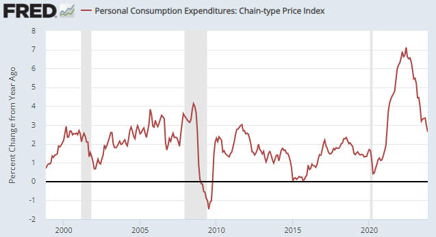
The year-over-year growth rate of the US CPI was reported last Thursday to be 3.4%. This was 0.3% higher than the number reported for the preceding month and 0.2% higher than the average forecast, but the overall picture (refer to the chart below) is unchanged. The downward trend that began in June of 2022 is intact and we expect that the 2023 low will be breached during the first quarter of this year. However, the main purpose of this discussion is not to delve into the details of the latest CPI calculation but to debunk the persistent idea that the price inflation of 2020-2022 was mainly due to supply disruptions.

The idea that the price inflation of 2020-2022 was transitory and mainly due to supply disruptions is absurd, but many smart people continue to tout this wrongheaded notion. Based on the above chart a reasonable argument can be made that the rapid PACE of inflation (currency depreciation) was transitory, but not the inflation itself. Let’s consider what would have happened if disrupted supply actually had been the dominant driver the high “inflation” of the past few years.

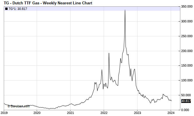
The following chart shows the price of natural gas in Europe. This is an example of what happens when a supply disruption is the main cause of a large price rise. After the supply issue is resolved, the price falls back to near where it was prior to the disruption.

By the way, there are many commodities that over the past few years experienced spectacular price rises due to disrupted supply followed by equally spectacular price declines. We could, for instance, make the same point using a price chart of oil, wheat or coal.

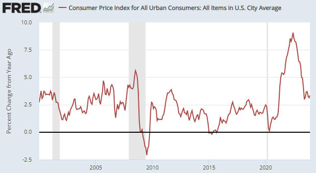
The next chart shows the US Consumer Price Index (the index itself, as opposed to a rate of change). This chart makes the point that on an economy-wide basis, NONE of the currency depreciation of 2020-2022 has been relinquished. In fact, prices in general continue to rise, just at a slower pace.

It’s happening this way because the main driver of the inflation was a huge increase in the money supply combined with a huge increase in government deficit spending. In effect, all of the purchasing power loss that has occurred to date has been locked in and the best that people can expect from here is for their money to lose purchasing power at a reduced pace. In this respect the inflation is operating the same way as compound interest, except that instead of getting interest on interest people are experiencing cost-of-living increases on top of previous cost-of-living increases.

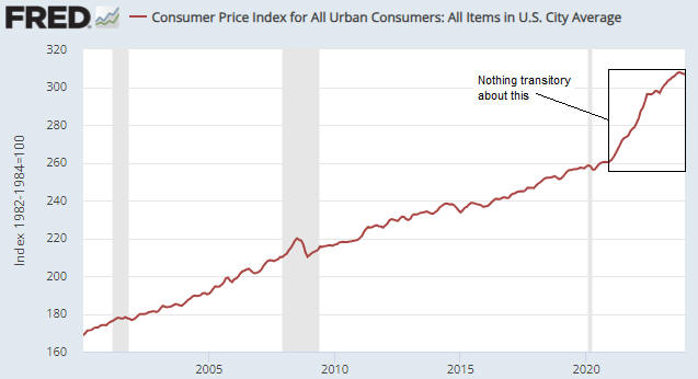
So, when someone tells you that supply disruptions were the main reason for the large general increase in prices, ask them why the general level of prices didn’t drop after the supply disruptions went away. And why are we now getting more price increases on top of the price increases of the past?

Print This Post Print This Post

Commodity Prices and the War Cycle

January 12, 2024

[This blog post is an excerpt from a recent commentary at speculative-investor.com]

Over the past few hundred years there has been a relationship between the extent of global military conflict and secular trends in commodity prices, with secular upward trends in commodity prices coinciding with increases in both the frequency and amplitude of military conflict. We’ve covered this topic in the past, but not recently (the most recent discussion was in 2017). Due to what has happened over the past two years, this is a good time for a revisit.

In his book “War Cycles Peace Cycles”, Richard Kelly Hoskins discussed the aforementioned relationship and presented a chart similar to the one displayed below. The chart depicts the secular trends in commodity prices over the past 260 years. Hoskins explained that most of the important military conflicts occurred during the up phases on the chart, and therefore referred to the secular commodity-price uptrends as “war cycles”. The secular commodity-price downtrends were termed “peace cycles”.

A plausible explanation for why long-term advances in commodity prices are accompanied by a general increase in military conflict is that war leads to more monetary inflation, government spending and government intervention in the economy, as well as large-scale resource wastage and supply disruptions — the perfect recipe for higher commodity prices. In addition, when structures get destroyed by war, the commodities that are embedded in these structures are destroyed and eventually get replaced as part of a rebuilding process, causing a large temporary increase in commodity demand. There is also a feedback mechanism whereby military conflict and the associated monetary inflation bring about higher commodity prices, while higher commodity prices add to international tensions and increase the probability of military conflict.

A new “war cycle” began with the secular low for commodity prices in 1999 and has been marked, to date, by the 9/11 terrorist attacks, the Afghanistan and Iraq Wars, the nebulous “War on Terror”, the “Arab Spring” uprisings, the overthrow of Libya’s government, the rise of the Islamic State organisation, an initial increase in tensions between “the West” and Russia in 2008 related to the expansion of NATO (in particular, talk of adding Ukraine and Georgia to NATO) and culminating in the annexation of Crimea by Russia in 2014, a long and devastating war in Yemen involving Yemeni factions and Saudi Arabia, a war in Syria, China’s provocative expansion in the South China Sea, a further increase in tensions between the West and Russia leading to Russia’s invasion of Ukraine in 2022, the Israel-Hamas war that began in October-2023 and the recent Houthi attacks on ships in the Red Sea.

At this stage the current war cycle has lasted about 25 years, while the average length of a war cycle during the period covered by the above chart is 33 years. Therefore, the historical record indicates that if the current cycle is close to the average length then we can ‘look forward’ to another 8 years or so of rising commodity prices and increasing geopolitical conflict.

Print This Post Print This Post

Seven rate cuts priced in for next year

December 28, 2023

[This blog post is an excerpt from a commentary published at speculative-investor.com about one week ago]

The latest calculation of the Personal Consumption Expenditures (PCE) Index, an indicator of “inflation”, was reported on Friday morning (22nd December) in the US. The following chart shows that the latest number extended the downward trend in the index’s year-over-year (YOY) growth rate, which is now 2.6%. Moreover, the “core” version of the PCE Index, which apparently is the Fed’s favourite inflation gauge, has risen at an annualised rate of only 1.9% over the past six months. This essentially means that the Fed’s inflation target has been reached. What does this mean for the financial markets?

An implication of the on-going downward trends in popular indicators of inflation is that the Fed will slash its targeted interest rates next year. That’s a large part of the reason why the stock and bond markets have been celebrating over the past two months.

It’s important to understand, however, that the markets already have priced in a decline in the Fed Funds Rate (FFR) from 5.50% to 3.75% (the equivalent of seven 0.25% rate cuts). This means that for the rate-cut celebrations to continue, the financial world will have to find a reason to price in more than seven rate cuts for next year. Not only that, but for the rate-cut celebrations to continue in the stock market the financial world will have to find a reason to price in more than seven 2024 rate cuts while also finding a reason to price in sufficient economic strength to enable double-digit corporate earnings growth during 2024. That’s a tall order, to put it mildly.

Our view is that the Fed will end up cutting the FFR to around 2.0% by the end of next year, meaning that we are expecting about twice as much rate cutting as the markets currently have priced in. The thing is, our view is predicated on the US economy entering recession within the next few months, and Fed rate-cutting in response to emerging evidence of recession has never been bullish for the stock market. On the contrary, the largest stock market declines tend to occur while the Fed is cutting its targeted rates in reaction to signs of economic recession.

Fed rate cuts in response to emerging evidence of recession are, however, usually bullish for Treasury securities and gold. That’s why we expect the upward trends in the Treasury and gold markets to continue for many more months, with, of course, corrections along the way.

Print This Post Print This Post

Why gold stocks underperform gold bullion

November 28, 2023

[This is a modified excerpt from a recent commentary at speculative-investor.com]

Gold bullion could be viewed as insurance or a portfolio hedge or a long-term investment or a long-term store of value, but a gold mining stock is none of these.

Gold mining stocks always should be viewed as either short-term or intermediate-term trades/speculations. During gold bull markets, you scale into them when they are oversold or consolidating and you scale out of them when they are overbought. The scaling in/out process obviates the need for accurate short-term timing, which is important because, as anyone who has followed the sector for many years will know, gold mining stocks tend to go down a lot more and up a lot more than initially expected.

We include the following chart in a TSI commentary about once per year to remind our readers why gold mining stocks always should be viewed as trades. The chart shows more than 100 years of history of gold mining stocks relative to gold bullion, with gold mining stocks represented by the Barrons Gold Mining Index (BGMI) prior to 1995 and the HUI thereafter. The overarching message here is that gold mining stocks have been trending downward relative to gold bullion since 1968, that is, for 55 years and counting.

We’ve explained in the past that the multi-generational downward trend in the gold mining sector relative to gold is a function of the current monetary system and therefore almost certainly will continue for as long as the current monetary system remains in place. The crux of the matter is that as well as resulting in more mal-investment within the broad economy than the pre-1971 monetary system, the current monetary system results in more mal-investment within the gold mining sector.

Mal-investment in the gold mining sector involves ill-conceived acquisitions, mine expansions and new mine developments that turn out to be unprofitable, building mines in places where the political risk is high, and gearing-up the balance-sheet when times are good. It leads to the destruction of wealth over the long term. Physical gold obviously isn’t subject to value loss from mal-investment, hence the long-term downward trend in gold mining stocks relative to gold bullion.

The difference between the gold mining sector and most other parts of the economy is that the biggest booms in the gold mining sector (the periods when the bulk of the mal-investment occurs) generally coincide with busts in the broad economy, while the biggest busts in the gold mining sector (the periods when the ‘mal-investment chickens come home to roost’) generally coincide with booms in the broad economy. The developed world, including the US and much of Europe, currently is in the bust phase of the economic cycle, meaning that we are into a multi-year period when a boom is likely in the gold mining sector.

Print This Post Print This Post