Revisiting the global boom/bust indicator
Posted By Steven Saville On March 2, 2015 @ 10:01 am In Uncategorized | Comments Disabled
This post is a slightly-modified excerpt from a recent TSI commentary.
Gold tends to fare relatively poorly during the booms, which are periods when confidence in central banks and the economy rises at the same time as mal-investment is setting the stage for a future period of great hardship, and fare relatively well during the busts, which are periods when the investing mistakes of the past come to the fore. Be aware, though, that the word “relatively” is critical to understanding gold’s relationship to the boom/bust cycle, because the relationship often doesn’t apply to gold’s performance in US$ terms.
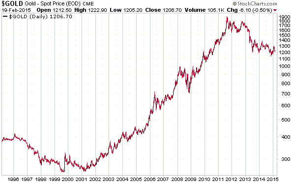
To show what I mean I’ll begin with a chart of the US$ gold price covering the past 20 years. There were booms and busts during this period that are not evident on this chart. In particular, 2001-2011 contained huge booms and busts, and yet the gold price trended steadily upward throughout. How could this be?
Armed with the 20/20 vision called hindsight, analysts who did not expect the large 2001-2011 rise in the US$ gold price and who were completely baffled by it while it was happening eventually came up with explanations/rationalisations for it. Some of the most popular explanations involved identifying other things that trended relentlessly upward during the 2001-2011 period and assuming that the rise in this other ‘thing’ caused the rise in the gold price.
For one example, prior to the past two years it was possible to create a chart that demonstrated a strong positive correlation between the gold price and the US federal-debt/GDP ratio, provided that you started your chart in the early-2000s (starting the chart much earlier would reveal that there was actually no consistent relationship between gold and the debt-GDP ratio*). For a second example, prior to the past two years it was also possible to create a chart that demonstrated a strong positive correlation between the gold price and the US Monetary Base, again provided that you started your chart in the early-2000s (as is the case with the supposed relationship between the gold price and the debt/GDP ratio, the relationship between gold and the US Monetary Base disappears when a longer-term view is taken**). For a third example, some analysts belatedly linked the 2001-2011 upward trend and subsequent downward reversal in the gold price to the goings-on in the “emerging” economies. This explanation is a top contender for the “grasping at straws” award, since, unlike the linking of gold to the debt/GDP ratio or the Monetary Base, it has absolutely no logical basis. Not only that, but the net buying of gold by India, China and Russia, the three most important “emerging” markets, was greater when the gold price was trending downward during 2012-2014 than when the gold price was trending upward during 2009-2011.
As intimated in the opening paragraph, the overarching driver of the gold price (the boom/bust cycle) only becomes clear when gold’s RELATIVE performance is viewed. More specifically, understanding why gold did what it did over a long period requires looking at how it performed relative to industrial metals.
The fact is that the gold market is generally weak relative to the industrial metals markets during the boom phase of the inflation-fueled, central-bank-sponsored boom/bust cycle and strong relative to the industrial metals markets during the bust phase of the cycle. In other words, the gold/GYX ratio (gold relative to the Industrial Metals Index) tends to fall during the booms and rise during the busts. This is due to gold’s historical role as a store of purchasing power and a hedge against uncertainty.
By shading the bust periods in grey, I’ve indicated the global booms and busts on the following chart of the gold/GYX ratio. During the 20-year period covered by this chart there were four busts: the multiple crises of 1997-1998 (the Asian financial crisis, the Russian debt default and the LTCM blowup), the recession of 2001-2002 that followed the bursting of the NASDAQ bubble, the global financial crisis and “great recession” of 2007-2009, and the euro-zone sovereign debt and banking crisis of 2011-2012. On a relative basis gold was clearly very strong during the busts and generally drifted lower during the intervening periods when confidence was rising.
Note that monetary-inflation-fueled booms tend to fall apart more quickly than they build up, which is why the rising trends in the gold/GYX ratio tend to be shorter and steeper than the falling trends.
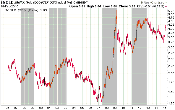
When gold/GYX made a new multi-year low last October it indicated that the global boom was going to extend into 2015, which it has certainly done. However, gold/GYX’s sharp rise from its November-2014 low to its January-2015 high could be an early warning that the boom is on its last legs.
Gold/GYX has pulled back far enough from its January peak that a solid break above that peak would now be a clear signal that the boom has ended or is about to end.
*Refer to https://tsi-blog.com/2014/09/does-the-debtgdp-ratio-drive-the-gold-price/ [1] for additional information
**Refer to https://tsi-blog.com/2014/10/does-the-monetary-base-drive-the-gold-price/ [2] for additional information
Article printed from TSI Blog: https://tsi-blog.com
Click here to print.