Interesting US oil-production and price-inflation charts
Posted By Steven Saville On March 16, 2015 @ 3:56 am In Uncategorized | Comments Disabled
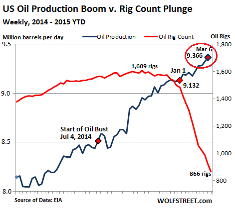
An article by Wolf Richter [1] contains some interesting charts showing the response of the US oil industry to the huge decline in the oil price. Two of these charts are displayed below.
The first chart shows that there has been a collapse in the rig count (the number of drilling rigs in operation), which is not surprising considering the magnitude of the price decline. It also shows that the daily oil production rate has continued to climb and has just hit a new all-time high, which is a little surprising.
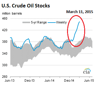
The second chart shows that with flagging oil demand and the on-going upward trend in oil supply, the amount of oil in storage in the US has moved sharply higher and is now about 21% above the year-ago level.
Can the oil price bottom while supply/demand fundamentals are becoming increasingly bearish? The answer is yes, because the market is always trying to look ahead. However, at this time there is no evidence in the price action of a bottom.
A WSJ blog post by Josh Zumbrun [2] contains charts suggesting that an upward reversal in US consumer prices is underway. The evidence is in data compiled by the “Billion Prices Project”, which “scrapes the Internet daily to capture changing prices online and has often foreshadowed subsequent changes in official price indexes.“
Here is one of several interesting charts from the above-linked post. The “PriceStats” index is calculated by the Billion Prices Project. Based on past performance, the turn that’s showing up in the PriceStats daily index probably won’t be captured by official measures of “inflation” until reports in late April.

Article printed from TSI Blog: https://tsi-blog.com
Click here to print.