
Depending on how it is manipulated, presented or interpreted, a set of data can be used to validate almost any theory or conclusion. For example, as I explained HERE, by changing the starting assumption the intraday London gold price data can be used to ‘prove’ either long-term suppression of the gold price or long-term elevation of the gold price. For another example, as I showed HERE, by cherry-picking the timescale of the data it is possible to demonstrate a relationship (in this case a relationship between the gold price and the US federal-debt/GDP ratio) that wouldn’t be apparent if a different timescale were chosen. I’ll now discuss a new example that was part of a 12th March article at Marketwatch.com.
I agree with the gist of the above-linked Marketwatch article, which is that the US stock market is stretched to the upside in a big way. However, the chart used in the article to make this point is a great example of data mining. Here is the chart.

The chart uses a 6-year rate of change (ROC) to suggest that the US stock market is almost as extended to the upside as it was at the top of the late-1990s mania, but why a 6-year ROC? Why not a 7-year or a 5-year ROC?
The answer is that only a 6-year ROC creates the impression that the author wants. A chart showing a 7-year ROC, for example, would actually appear to support an opposing view — that the market is not remotely stretched to the upside. As evidence I present the following chart of the Dow’s 7-year ROC. It makes the market look cheap!

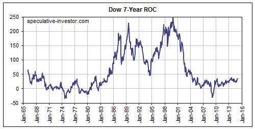
The reason that the 6-year ROC works so well to support the view that the market is dramatically extended to the upside is that the bottom of the major 2007-2009 bear market occurred exactly 6 years ago. What you are seeing in the past year’s spectacular rise in the market’s 6-year ROC is the reverse of the 2008-2009 crash. Even if the US stock market had traded sideways over the past year, the extraordinary market collapse of 2008-2009 would have ensured a moonshot in the 6-year ROC.
To put it another way, the near-vertical rise in the 6-year ROC over the past 12 months reflects the waterfall decline that happened many years ago. It does not reflect a manic upside blow-off in the current market.
If the market trades sideways from here then a year from now the 7-year ROC will show the moonshot that the 6-year ROC currently shows.
About Steven Saville
 Print This Post