
February 28, 2015
Here’s a chart illustrating a relationship I can’t explain. The chart shows that over the past three years, every short-term trend and almost every ripple in Japan iShares (EWJ) has been mimicked by London’s FTSE Index.
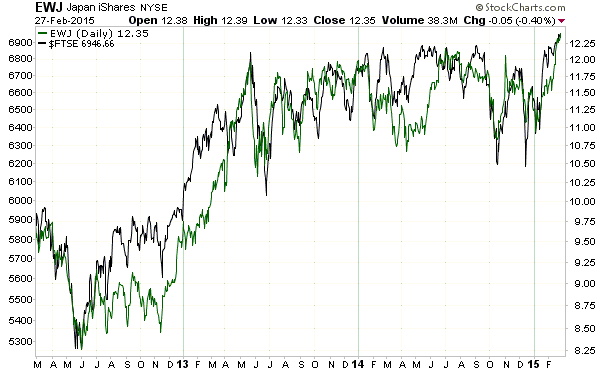
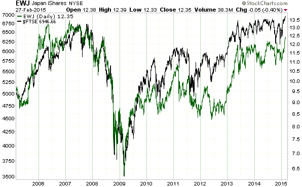
I have no idea why there has been such a strong positive correlation between the Japanese stock market’s performance in US$ terms and the UK stock market’s performance in Pound terms. Furthermore, it’s not like the relationship is a peculiarity of the past 3 years, as the following chart shows that it goes back at least 10 years.
About Steven Saville
 Print This Post